

Anatomy
Learn the anatomy of the uneditable and editable checklist
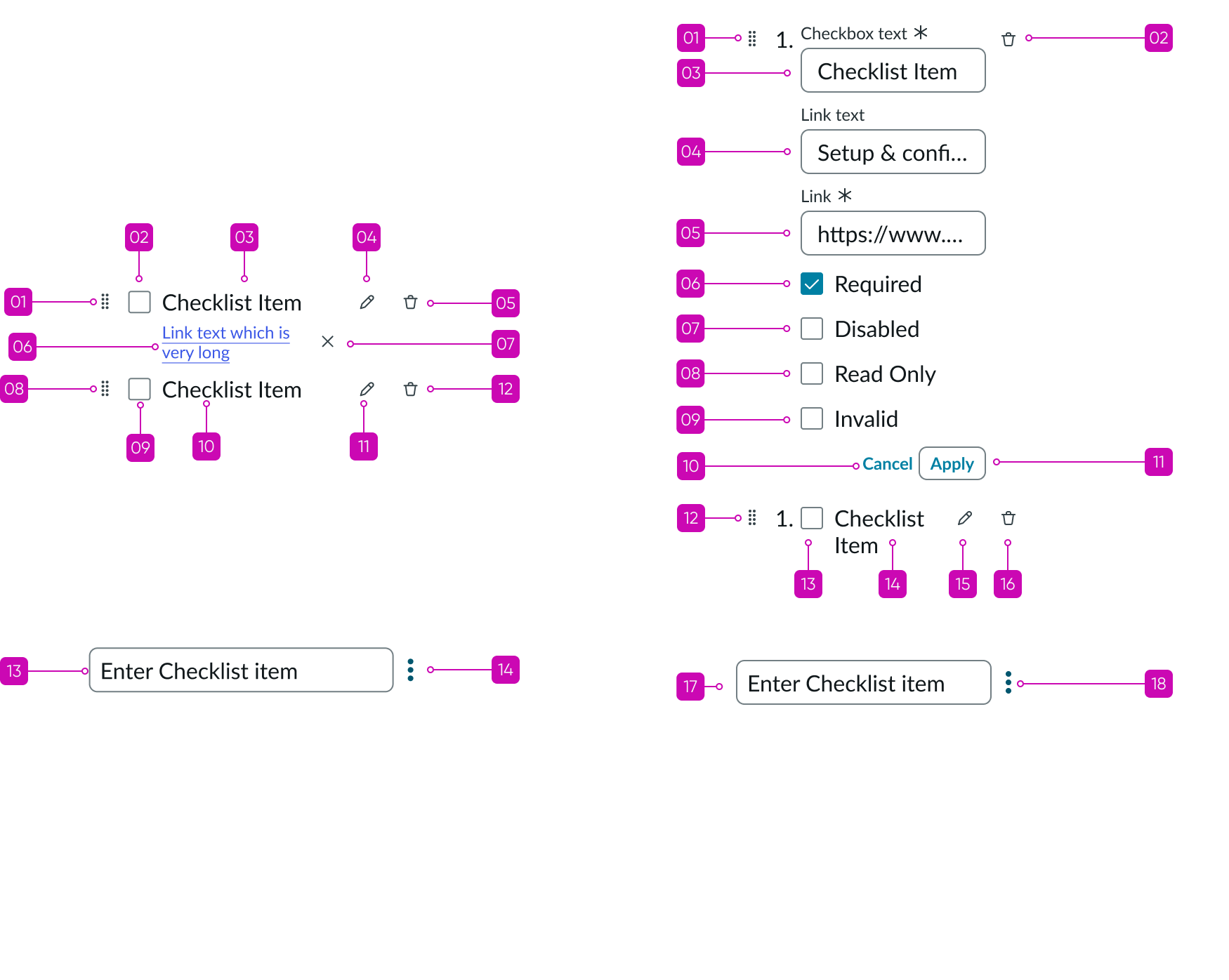
Uneditable (static) checklist
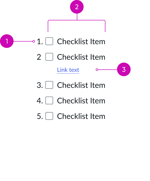
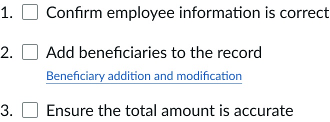
- Prefix (optional): Indicates the order of the checklist item
- Checkbox: Can be selected or unselected to indicate the status of the checklist item
- Text link: Navigates to the target location
- Add checklist item: Adds a checklist item
- Delete action: Contains the delete button to delete all checklist items
Editable checklist
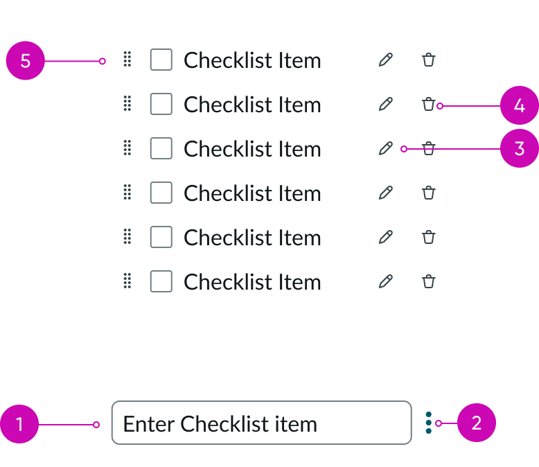
- Add item: Adds a checklist item
- Additional actions: Shows additional actions to perform on the new checklist item; users can delete all the checklist items
- Edit item: Edits the newly added checklist item; enables users to edit the checklist text, add link, and add item-level properties like required, disabled, and read-only
- Delete item: Deletes the checklist item
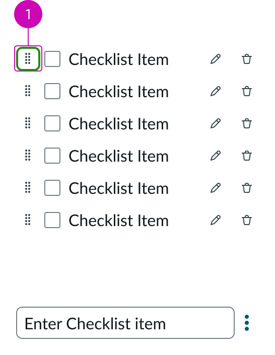
- Drag control: Moves the selected checklist item based on the user’s dragging motion; enables reordering the checklist
Subcomponents
See the usage guidelines for checkbox
See the usage guidelines for text link
See the usage guidelines for button bare
See the usage guidelines for button iconic
See the usage guidelines for button
See the usage guidelines for textarea
See the usage guidelines for input
Usage
Use checklist to select one or more separate items from an ordered or unordered list of checkboxes. If configured, a user can add, edit, or remove items in the checklist or drag and drop them to reorder the list.
Configurations
Learn how to customize checklist by configuring the available properties.
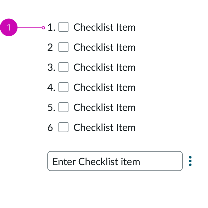
Prefixes
You can configure checklist to contain numeric or alphabetic prefixes in front of the checkbox items. Use this when the checklist items need to be ordered.
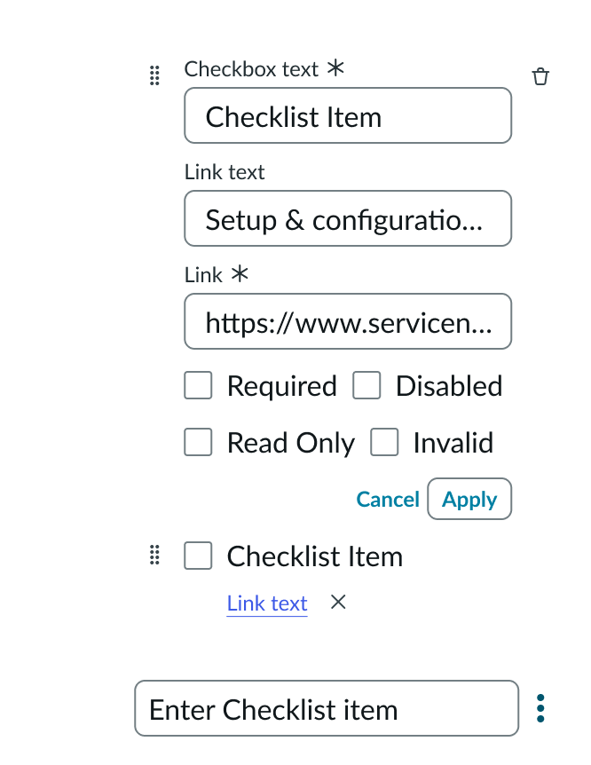
Checklist editing
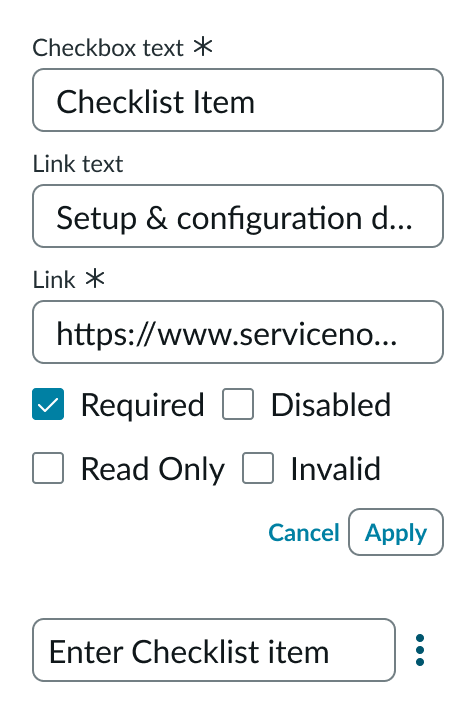
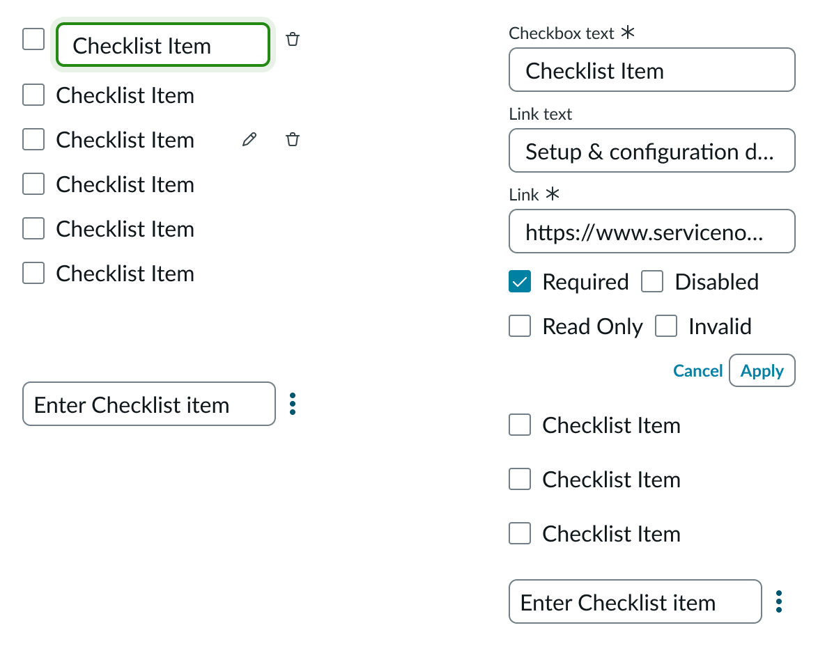
You can configure checklist to enable your end users to edit the checklist. Users with edit access can add, edit, delete, or reorder items in the checklist. Edit item and Remove item buttons are displayed when the user hovers over a checklist item. Selecting the Edit item button makes the checklist item editable and displays additional options like Add link, Required, Disabled, Read Only, and Invalid. The user can save changes by selecting the Apply button. The user can select and hold a checklist item to edit just the item text.
Additional field indicators (Required, Disabled, Read Only, and Invalid)
The user can select the corresponding toggle to mark a checklist item as required, disabled, read-only, or invalid. Required items do not allow end users to submit the checklist without selecting the item. Disabled items cannot be interacted with, they are represented with a greyed-out checkbox and item label. Read-only items do not support user interaction, they are represented by a blocked and greyed-out checkbox. Invalid items are represented by a red checkbox.
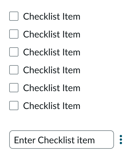
Checkboxes
You can configure checkboxes to appear as selected or not selected by default. You can also configure the checkboxes to display in a specific list order.
Links
You can configure checklist to display links for any checklist item or grant your end users access to edit the checklist. Users can add, edit, and delete links in a checklist or specify link text for a particular link address. Additionally, you can configure checklist to open all links in the current window or in a new window.
Loading spinner
You can configure a loading spinner to appear when the system is saving an end user’s changes to the checklist.
Design recommendations
Learn how to apply checklist in your design.
Use checklists when you want to do more than only indicate status of checklist items.

Avoid using checklists for only one item.
Alignment and positioning
You can place checklists in forms, lists, or side panels in an experience. Where you place the checklist determines how it aligns with the surrounding context. The checklist follows the guidelines of any adjacent, larger page element or structure (such as a list or side panel).
For left-to-right (LTR) languages, always place the prefix to the left of the checkbox.
UI text guidelines
These are some recommendations for using text within checklist.
Checklist labels
- Keep labels concise; refrain from using more than one sentence.
- Labels should be clear and unambiguous.
- Use sentence case for your checklist labels.
- Don't add a period to the end of a checkbox label; the exception to this is when a checkbox label is more than one sentence long.
- Start the label with a positive action that describes the selected state, such as "Close windows after quitting an application."
- Avoid using a negative action in the label, such as, "Don't send me email notifications"; this would mean that a user would have to select the option to turn off the setting.
Checklist text links
- Keep labels short.
- Don't write a generic or non-descriptive label (such as "click here" or "link"); the label should describe where the user goes when they select the link.
- Use consistent capitalization for all text links in your design.
- Only use symbols in a text link when they're necessary for understanding a word or phrase.
- Don't include a period in a text link.
Behavior
Learn how checklist behaves when the user interacts with the component.
States
Checklist has the following states: default, error, loading, and empty
Default
Checklist is in the default state when no one is interacting with it.
Shows the checklist in editing and non-editing mode when the user is not interacting with it.
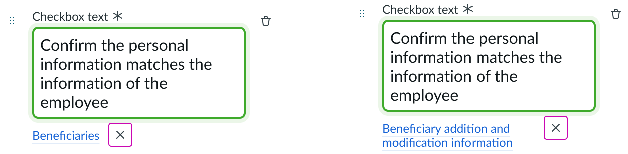
Error
Checklist enters the error state when the user selects “Apply”, and required fields are left empty. The form field error message disappears as soon as something is added to the empty field.
You can configure the contents of the form validation message that appears when a required field is in the error state.
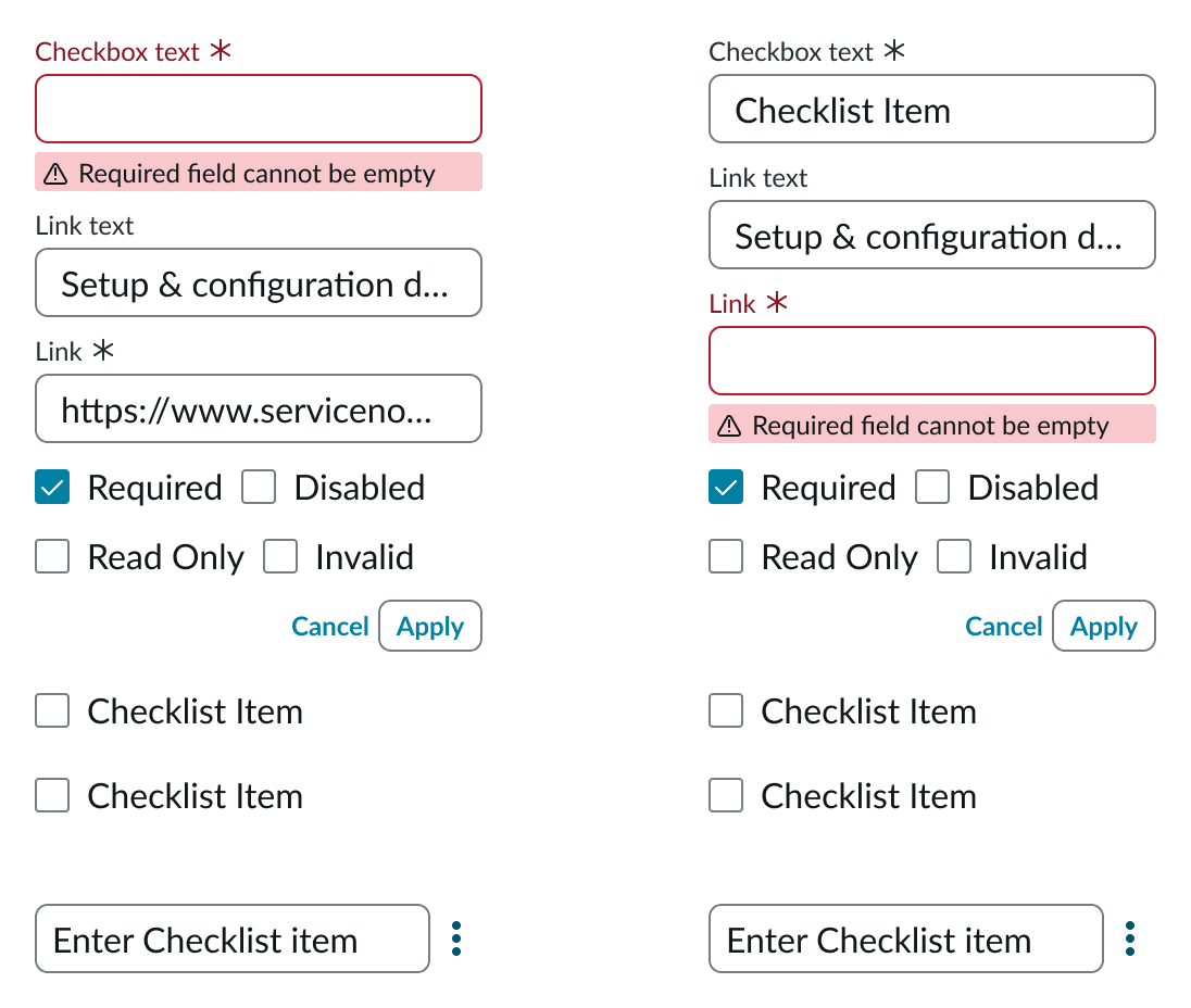
In the example on the left, the user is attempting to save a checklist item with a required field left empty. The example on the right shows the error message displayed when the user attempts to apply changes to the link with a required field left empty.
Loading
Checklist enters the loading state when loading data from the database or when the user selects the “Save” action to save their changes. If configured, the loader spinner appears to indicate that the checklist is loading new data.

The loader icon spins when checklist is saving changes, indicating the loading state.
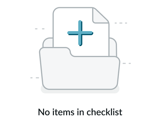
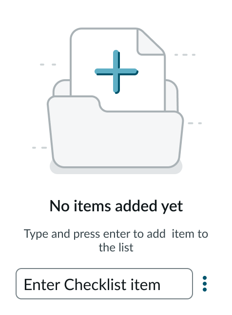
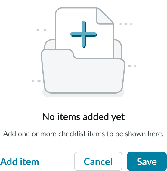
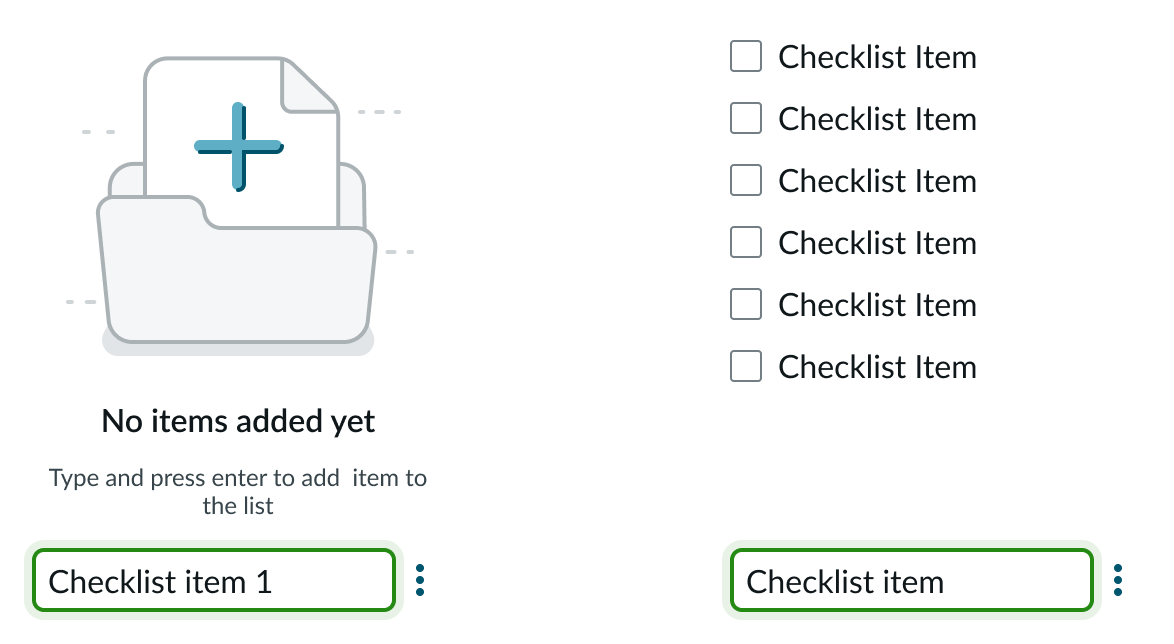
Empty
The empty state messages are dependent on the mode of the checklist and if the checklist is empty.
An error message advises users when no checkbox items are added for a non-editable list.
If an editable checklist doesn’t have any checkbox items, the error message includes the “Add item” action, allowing the user to add checkbox items.
If all checkbox items have been deleted in an editable checklist, the user has several available actions. The user can select the “Add item” action to add checklist items. Selecting “Save” displays the previous empty state message with the “Add item” action. Selecting “Cancel” cancels any changes and displays the previously saved state.
Responsive behavior
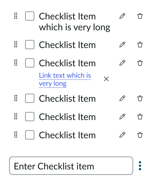
If the checkbox label or link is longer than the container, it wraps to the next line. When the link text wraps to a new line, the action icons move to align on the right.
In the example on the left, the link actions align to the link text when the link appears on a single line. When the link text wraps to a second line, as in the second example, the link actions align to the right.
Interactions
Learn about the ways that the user can interact with the component.
Selecting checkboxes
The user can select or unselect checkboxes by selecting the checkbox container or label.
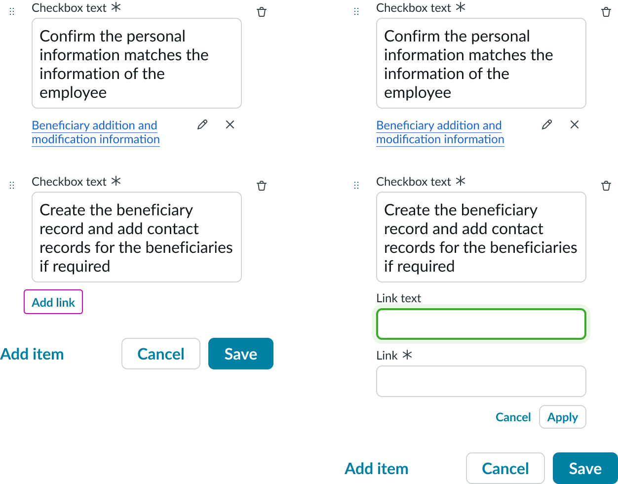
Editing a checklist item and link
With edit access, the user can edit the checkbox entry by putting the cursor in the text box. To edit the link and link text, the user selects the pencil icon next to the link. The user then makes the changes to the link or link text in the input fields that appear and selects “Apply.” To save the changes, the user selects “Save.”
In the example on the left, the user selects the checkbox text and places the cursor inside the text box to edit the content. To edit the link text or the URL, the user selects the pencil icon. The example on the right shows the input fields that appear for editing the link and its target.
Adding a checklist item and link
Users can add items to the checklist or add links. To add an item, the user enters the checklist item into the Create a checklist item field at the end of the checklist and presses the Enter or return key on the keyboard.
The user has the option to add a link to the new checklist item. When the user hovers over a checklist item, the Edit item and Remove item buttons appear. The user selects the Edit item button to show additional actions. The user selects the Add link button to add link details. The user selects “Apply” to add the new link and link text to the checkbox item. The user selects “Save” to save the new checkbox and link to the checklist.
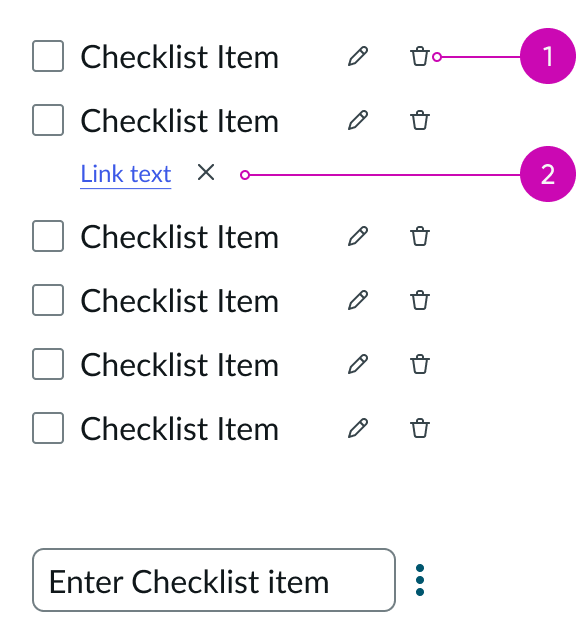
Removing a checklist item and link
To remove a checklist item, the user selects the trash icon next to the checkbox text input. To remove a link, the user selects the remove action next to the link text.
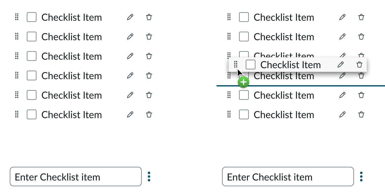
Reordering a checklist item
The user can reorder items in a checklist by dragging the checkbox by its drag handle and dropping it into a new location. As the user drags the checkbox item, an indicator appears to help the user position the item in its new location.
Truncation
Checkbox labels and links don’t truncate; they wrap to the next line.
Usability
Checklist complies with all internationalization and accessibility requirements.
Internationalization
When this component is used in a platform configured for a right-to-left (RTL) language, the checkbox moves to the right of the label and aligns with the right side of the container. If a prefix is used, the checkbox aligns to the left side of the prefix.
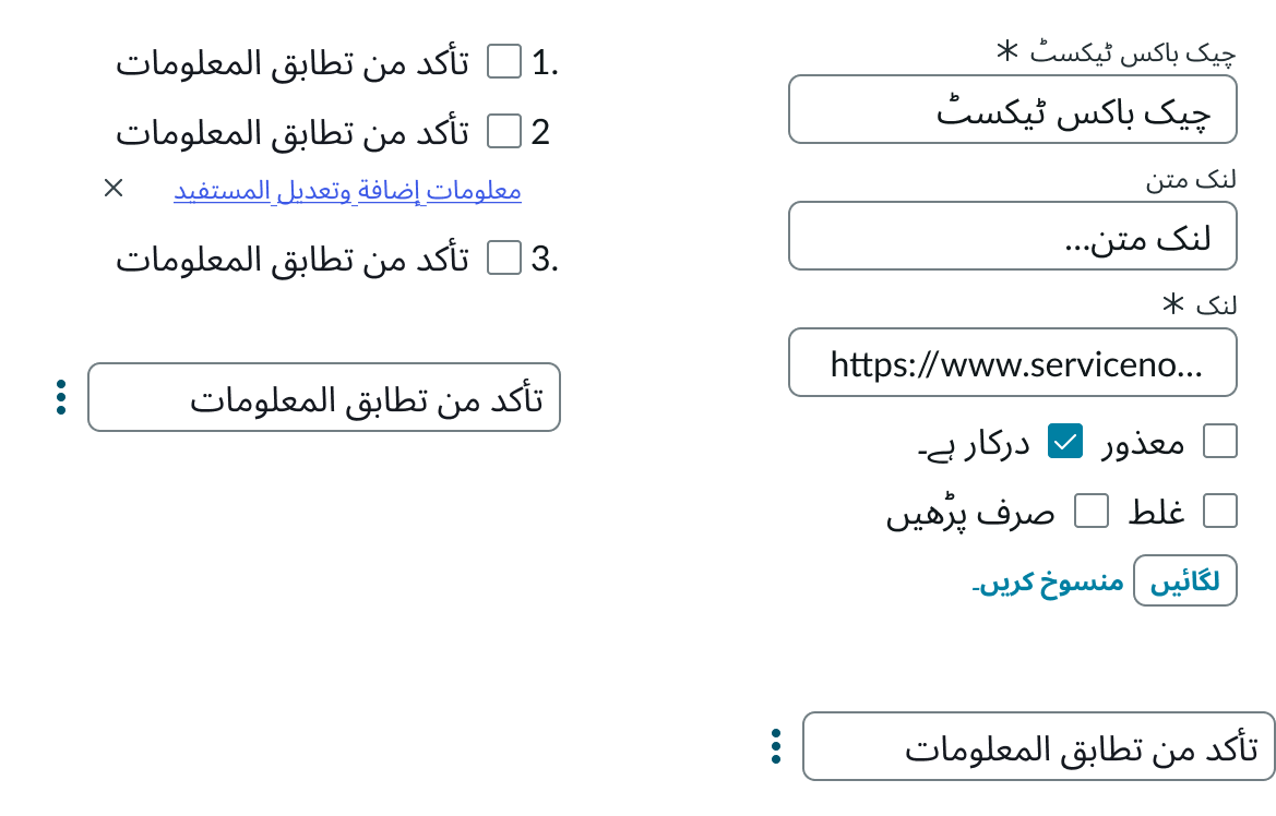
The image on the right shows the alignment in an editable checklist. All elements are flipped to flow from right to left.
Accessibility
Learn how to access the actionable elements of checklist through keyboard interactions and screen readers.
Checklist tab order
You can access the actionable elements of checklist with these keyboard keys.
The example on the left shows the tab order for a static checklist. The image on the right shows the tab order for an editable checklist
Keyboard interactions
Uneditable checklist focus
| #1 - With focus on checkbox |  |
|---|---|
| Tab | Moves focus to the next interactive element |
| Space | Selects or deselects a checkbox |
| #2 - With focus on link |  |
|---|---|
| Tab | Moves focus to the next interactive element |
| Enter | Launches the link and moves focus to the link target |
| #3 - With focus on Edit action |  |
|---|---|
| Tab | Moves focus to the next interactive element |
| Space or Enter | Activates the button and places focus on the first interactive element; if activating the button does not dismiss the current context, then focus remains on the button after activation |
Editable checklist focus
| #4 - With focus on text boxes (input) |  |
|---|---|
| Tab | Moves focus to the next interactive element |
| Enter | Does not perform an action |
Reordering focus
| #1 - With focus on the drag handle |  |
|---|---|
| Space or Enter | Toggles reorder mode to ON and keeps focus on the selected element |
| #2 - With focus on the drag handle in a pressed state |  |
|---|---|
| Arrow up or Arrow down | Moves position of the selected item up or down, marked with an indicator line |
| Space or Enter | Completes the action, toggles reorder mode to OFF, and keeps focus on the selected element |
| Esc | Exits reorder mode and keeps focus on the selected element; also discards any changes |
| Tab | Exits reorder mode, discards any changes, and moves focus to the next interactive element |
Screen readers
Screen readers announce the controls and content of checklist in the prescribed tab order. Screen readers identify the name and role of each element in the checklist.