Anatomy
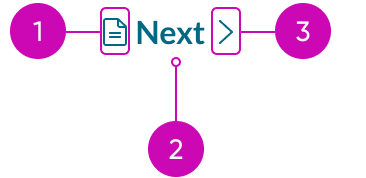
- Icon before (optional): You can place an icon at the beginning of the label; the icon size is proportional to the label size
- Label: The text that defines the button's action
- Icon after (optional): You can place an icon at the end of the label; the icon size is proportional to the label size
Usage

Use a button bare to provide the user with tertiary actions in a non-obtrusive way. Examples include a "Show More" option, a "Cancel" button in a modal, or a "Next" button in pagination.
Variants
Learn about button bare and find out how to use it in your design.
Colors
Button bare has the following variants: primary, secondary, and tertiary. The primary color variant emphasizes important actions in the display. Meanwhile, the secondary and tertiary color variants signify actions of lesser importance.
| Variant | No icon | With icon |
|---|---|---|
| Primary | ||
| Secondary | ||
| Tertiary |
Types
The button bare has the following types: text bare and text bare with icon.
Text bare
This type displays only text as the button bare. Use this type when you want to place a button bare with static text or labels.
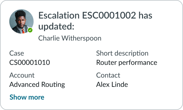
In this example, the “Show more” text is a button bare.
Text bare with icon
This type has an icon before or after the text label, but never both. Using an icon can provide the user with extra visual context regarding the purpose of the button bare.

The button bare with an icon placed before the label.

The button bare with an icon placed after the label.
Sizes
The button bare has the following sizes: small (sm) and medium (md). For both sizes, the icon is the same size as the text label. Size helps reinforce visual hierarchy, differentiate button types, and indicate button functions. Choose the size based on the importance of the action and the surrounding context.
Small
Use the small size when space is limited. You can also use this size for non-essential actions.

Medium
Use the medium size to match the size of surrounding components and context. Medium is the default size.

Configurations
Learn how to customize button by configuring the available properties.
Presets and controllers
This component has a preset configuration that sets properties and event handlers, making it ready for use. You can override preset values with a custom configuration if needed. Preset values won’t upgrade with updates. To avoid using presets, configure manually. One preset can apply to a single component instance. See presets for more info.
A preset is linked to a controller, which serves as a data resource. Controllers provide configuration data and event bindings for the component. Selecting a preset adds the required controller to the page, allowing new components to use its preset. For more on controllers, see controllers. For default presets, see view properties and events in the controller API.
Label
You can configure the label for your button. The default is “Button.”
Variant
Configure the variant for your button to assign your button’s level of priority. Options include primary, secondary, tertiary, as well as positive/negative primary and secondary.
Size
Configure the appropriate size for your button.
Identifier
You can assign a static or animated icon for your identifier. You can also set the icon to display to the left or right of the button label.
Padding
By default, block padding is available. You can choose to hide block padding or show inline padding.
Accessibility
You can configure the ARIA properties for your button, set high contrast, and enable the landmark focus keyboard shortcut to focus on the button.
Design recommendations
Learn how to apply button bare in your design.

Do use buttons for actions, i.e., submit a form, save a change, or show more information.

Don't use button bare in place of a text link. Buttons trigger actions while links redirect users to pages
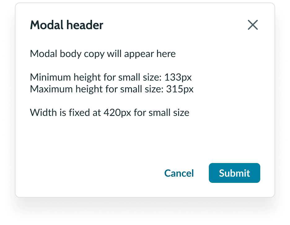
Do use button bare for lowest priority actions.
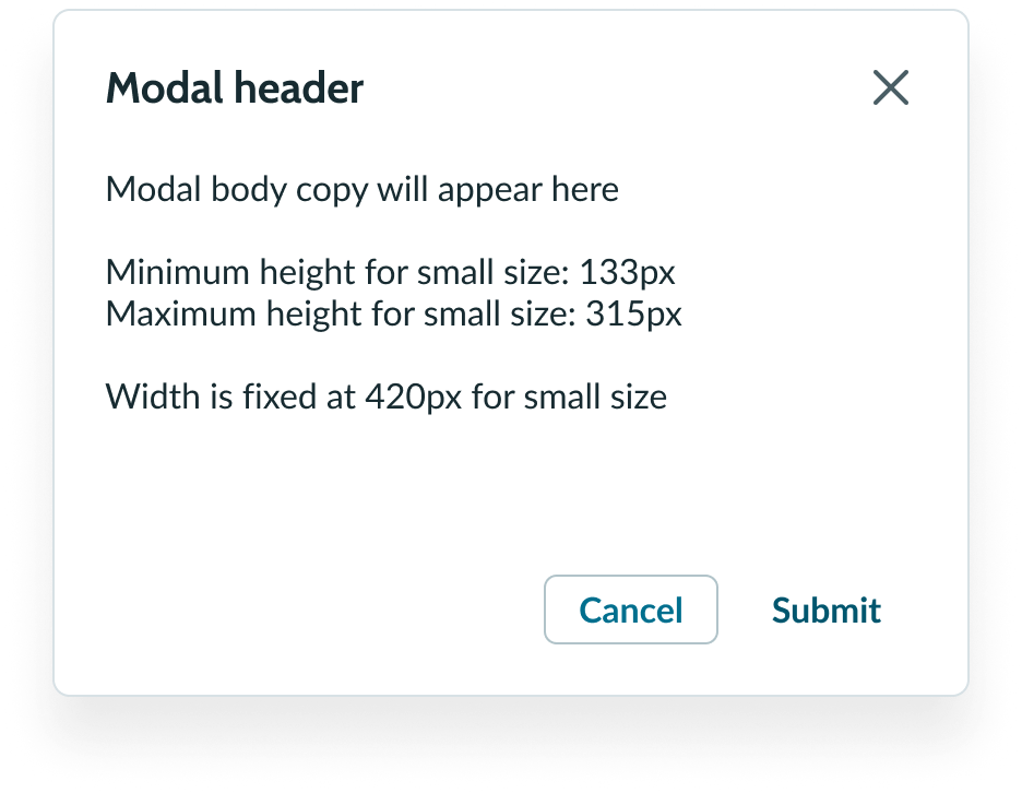
Don't use button bare as the primary CTA.
UI text guidelines
These are some recommendations for labeling a bare button:
- Start with a verb to describe a specific action. This sets the expectation of what happens next.
- Use short labels. Two words is ideal. Three is OK. If needed for clarity, four is acceptable.
- Avoid commas, periods, and other punctuation
- Add an object to the verb if additional context or clarity is needed
- For example, “Add table"
- Add an article (like “a” or “an”) to add a more human, conversational tone
- For example, “Add a person”
- Use the same verb tense if there are multiple buttons
- For example, two buttons could be “Apply” and “Close,” both of which are present tense
Accessibility
- Hiding padding introduces the risk of violating the WCAG 2.2 standard of Target Size, which mandates a minimum of 24x24 pixels between any two interactive elements.
- Verify adequate size+spacing between buttons with hidden padding and other such elements.
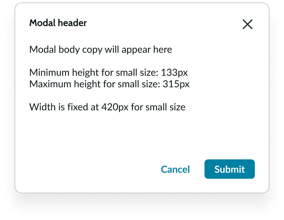
Do use button bare for lowest priority actions.
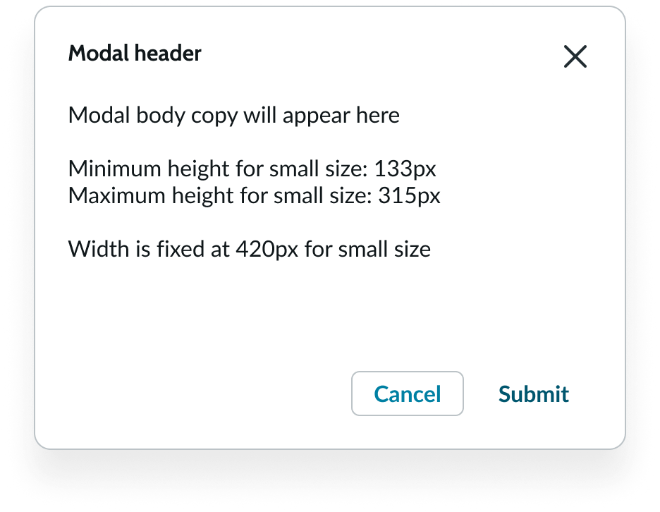
Don't use button bare as the primary CTA.

Do ensure adequate spacing with other interactive elements when padding is hidden.

Don’t hide padding without ensuring adequate spacing from other elements.
- Two bare buttons with padding hidden have a height of 14 px each. Spacing must be added to ensure an effective target size of 24 px.
- Two bare buttons with 5px of padding above and below ensure a minimum of 24px of effective target size.
Behavior
Learn how button bare behaves when the display changes or a user interacts with the component.
States
Button bare has the following states: default, hover, pressed, focus, and disabled.
| State | No icon | With Icon |
|---|---|---|
| Default | ||
| Hover | ||
| Pressed | ||
| Focus | ||
| Disabled |
Interactions
If a button action changes when the user interacts with it, clearly communicate this to a user in the button bare label. See example below.
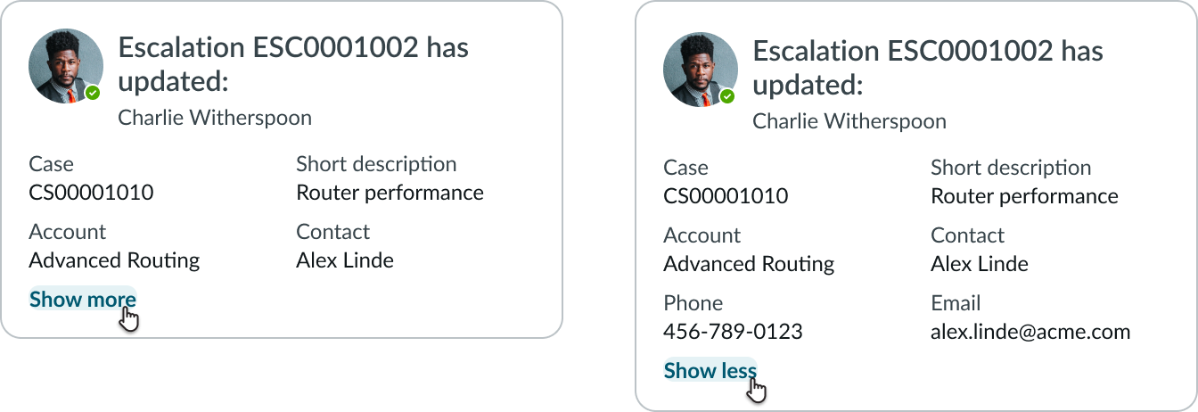
The “Show More” button bare clearly indicates what happens when a user interacts with it. The button bare changes to “Show less” after the user interacts with it to indicate the new action.
Truncation
If the button bare label is longer than the container, it truncates with an ellipsis. If the label also includes an icon, the text truncates with an ellipsis but the icon remains. The full label is available in a tooltip on hover.

An example of how the button bare label with an icon truncates.
Usability
Internationalization
When the display translates to a right-to-left (RTL) language, the icon for a button bare flips its positioning. The icon itself will also flip if it communicates direction.

