

Anatomy
Learn about the individual parts of playbook.
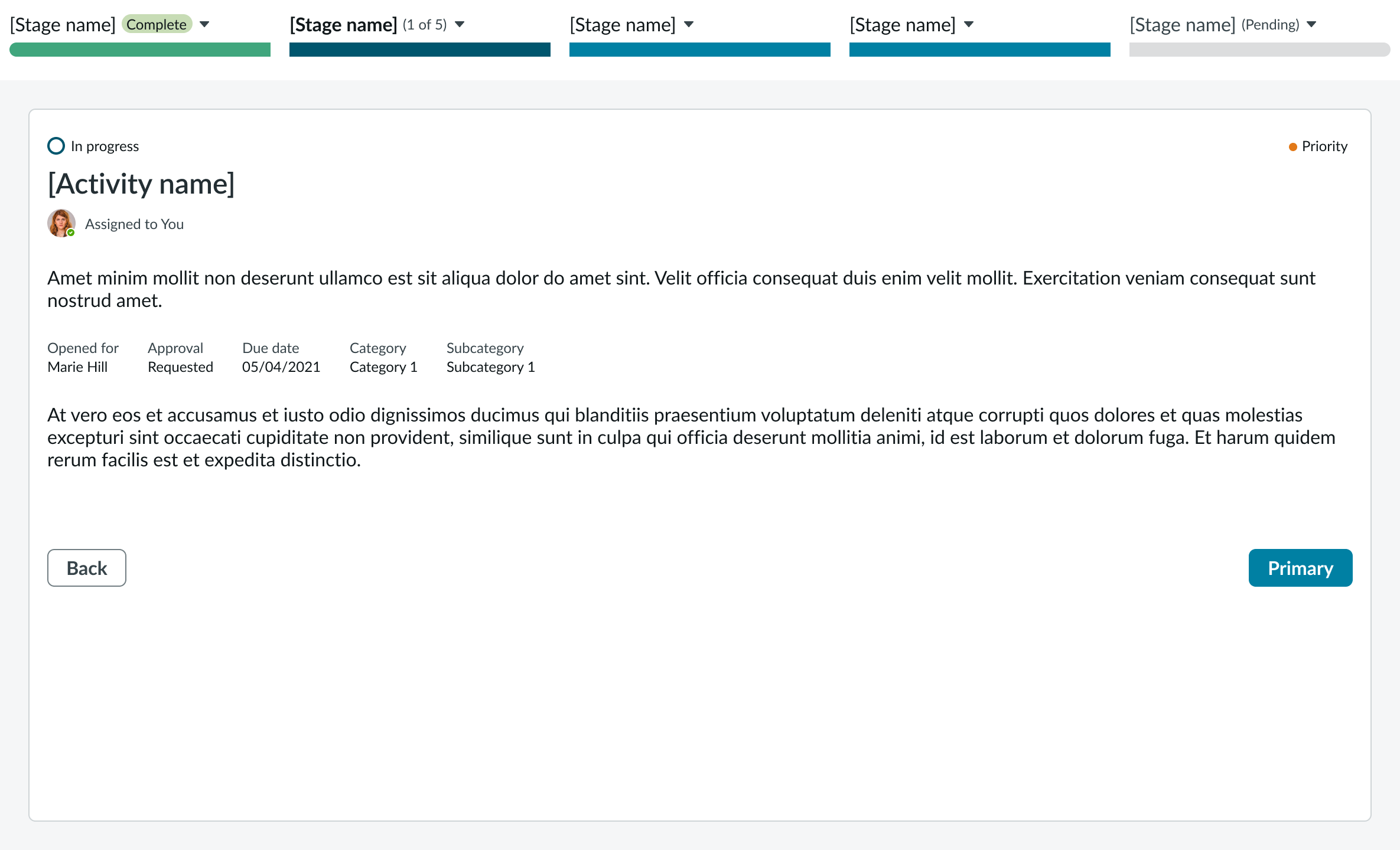
Playbook (horizontal view)
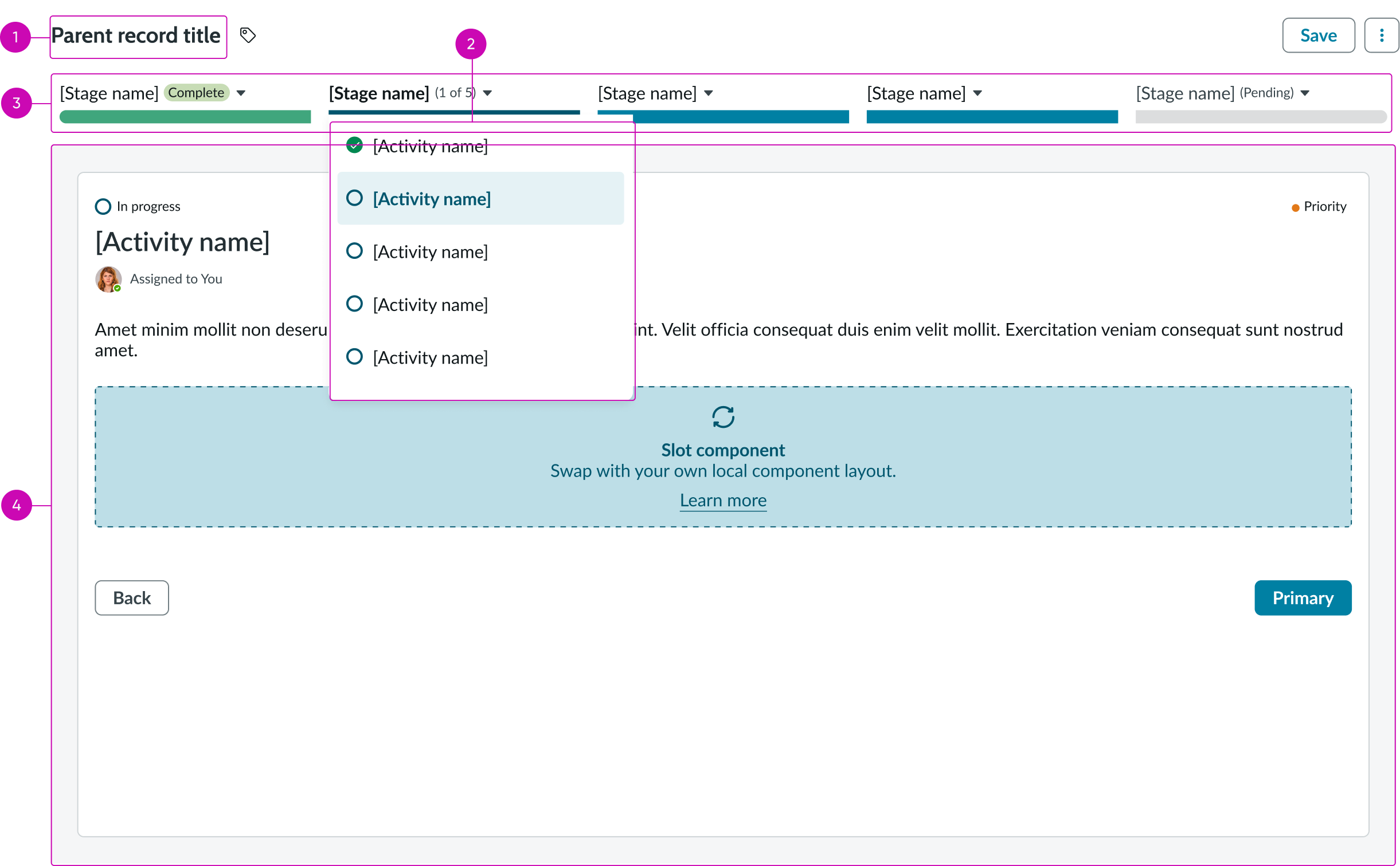
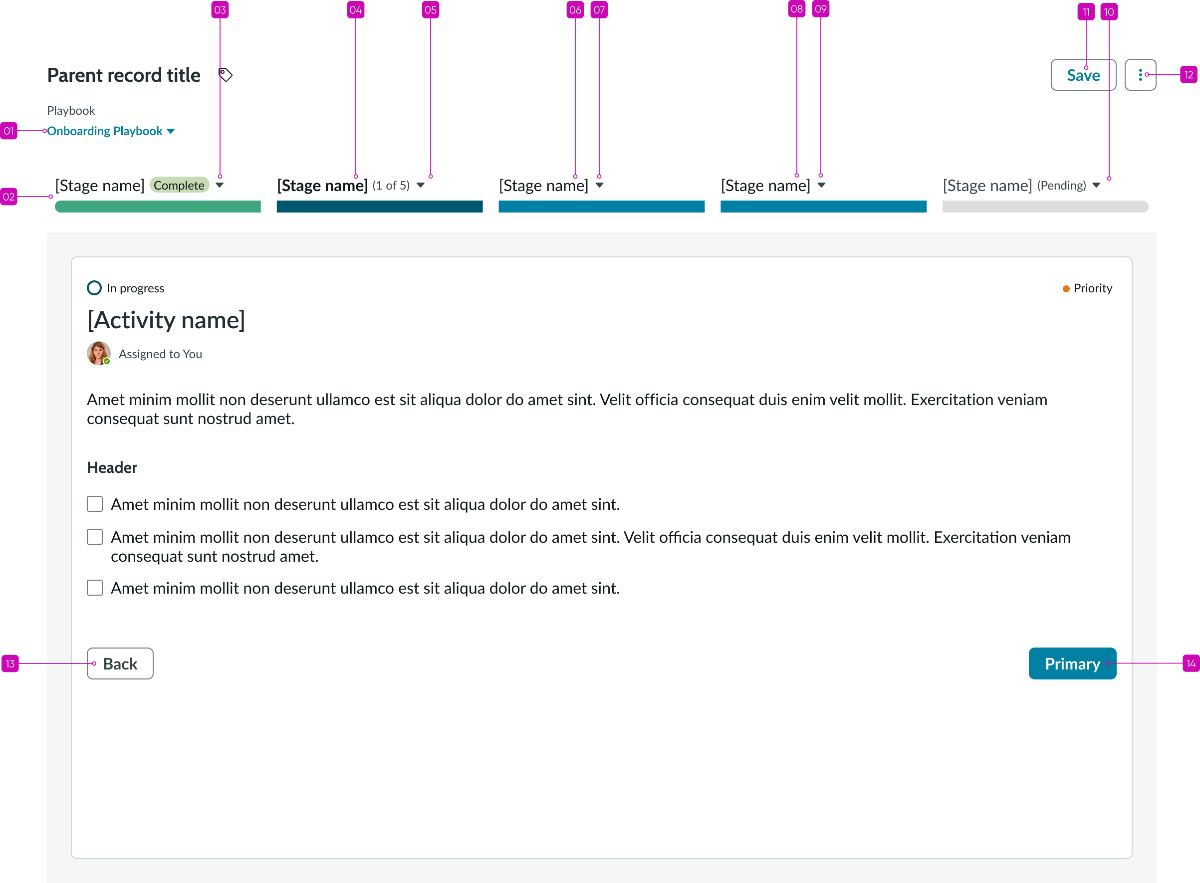
- Record title: Name of the running record
- Activity picker: A dropdown that lists activities available for the selected stage
- Stage picker (in horizontal view): Shows the stages for the selected playbook
- Activity viewer (in focused view): A pane that shows the details for one selected activity
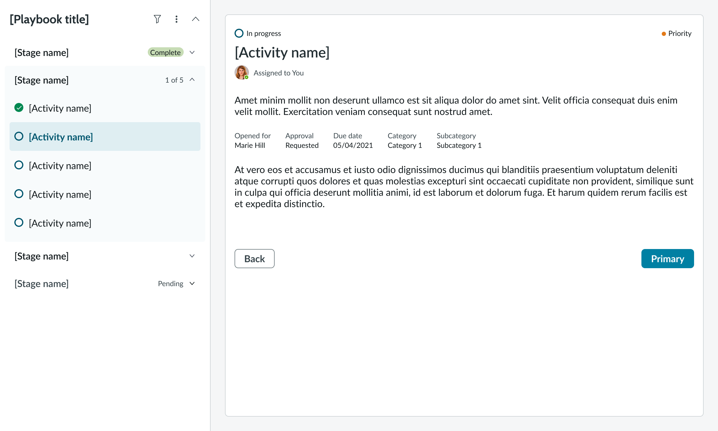
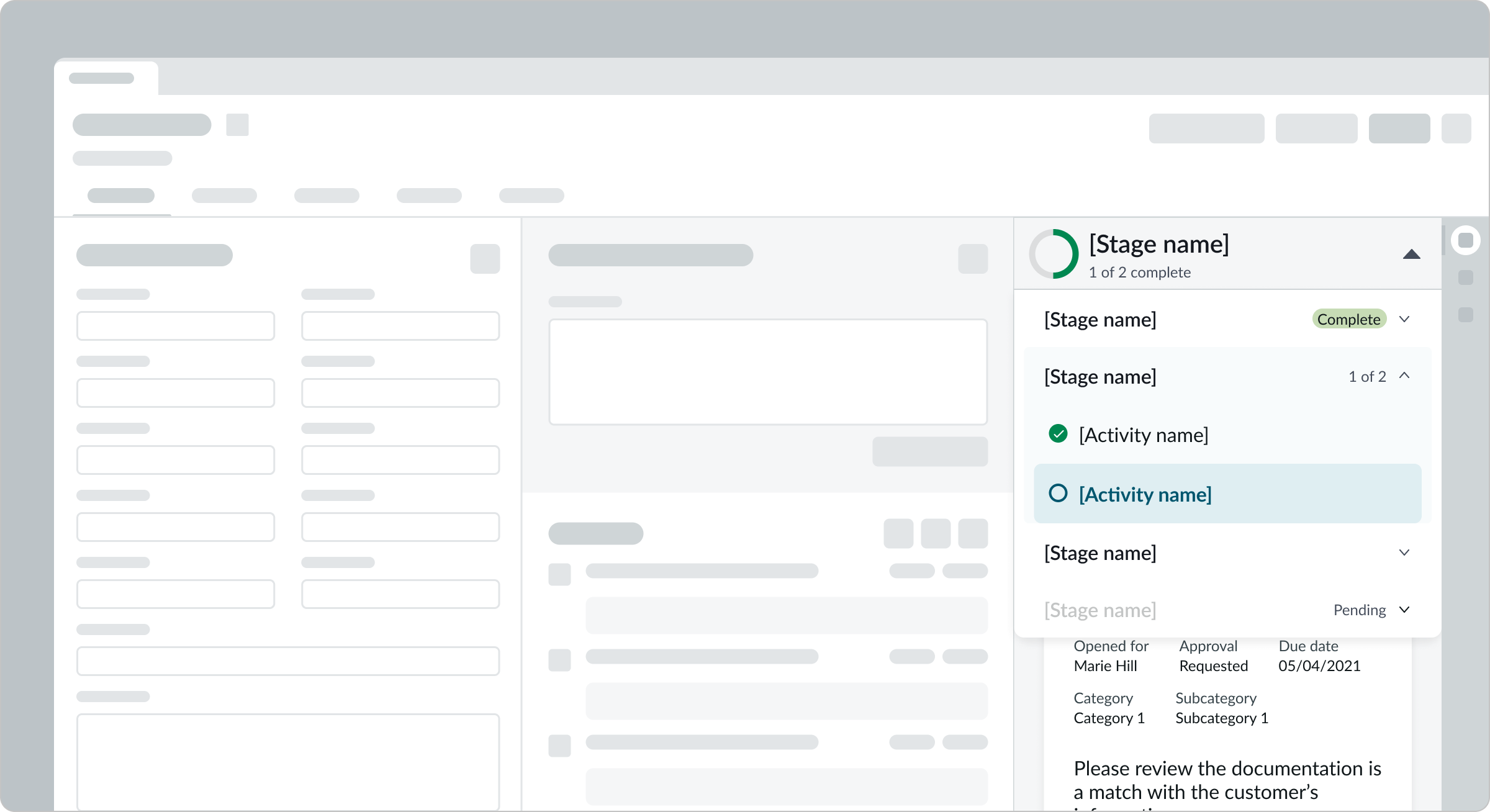
Playbook (vertical view)
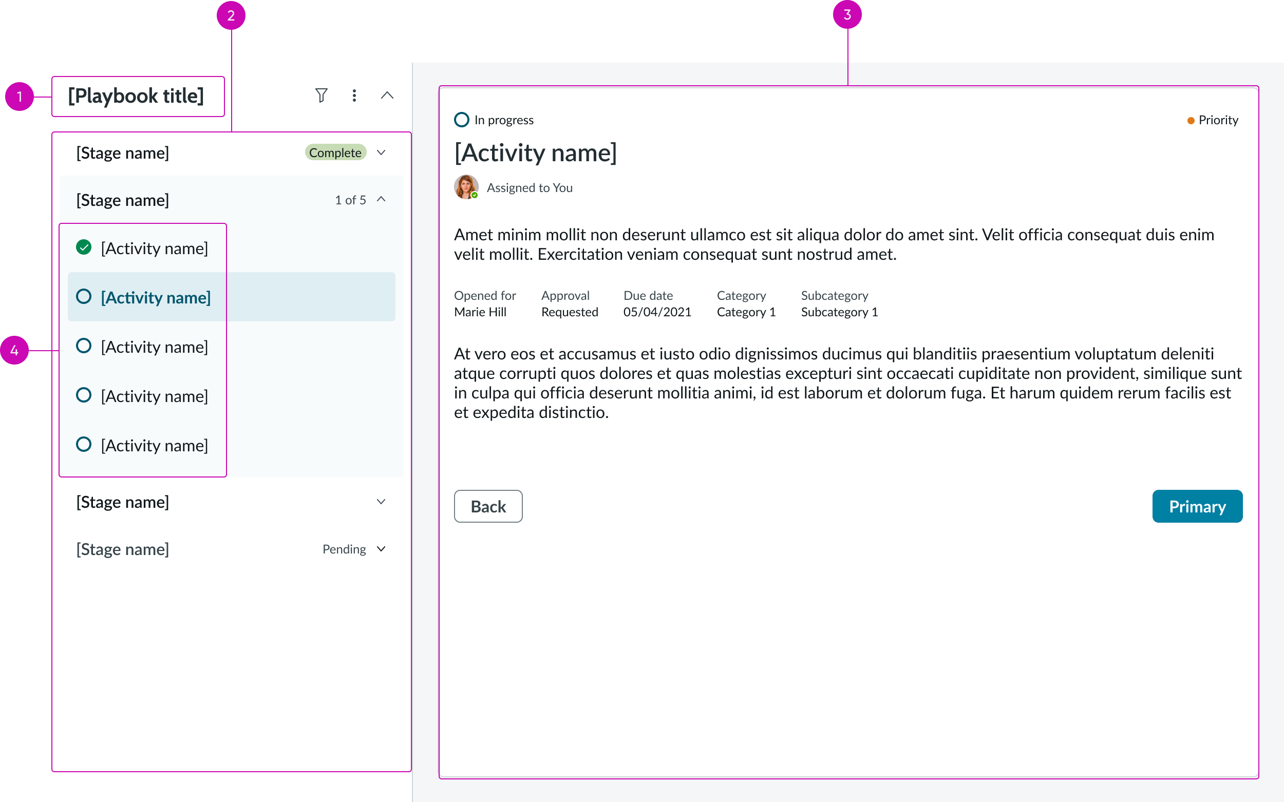
- Playbook title: Name of the open playbook
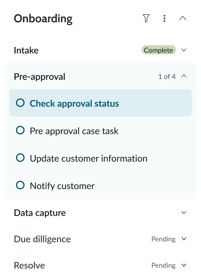
- Stage picker (in vertical view): Shows the stages for the selected playbook
- Activity viewer (in focused view): A pane that shows the details for one selected activity
- Activity picker: An expanded list of the activities available for the selected stage
Subcomponents
See the usage guidelines for Playbook stage picker
See the usage guidelines for Playbook activity picker
See the usage guidelines for Playbook activity viewer
Usage
Learn about the playbook component and find out how to use it in your design. You can use playbook to reduce visual clutter, keep focus on tasks, provide a flexible workflow, and create an experience that establishes clear context. Some specific use cases can include resolving a claim or onboarding a new patient.
Variants
Learn about the attributes of playbook.
Types
Playbook has variant types: stacked view and Focused view.
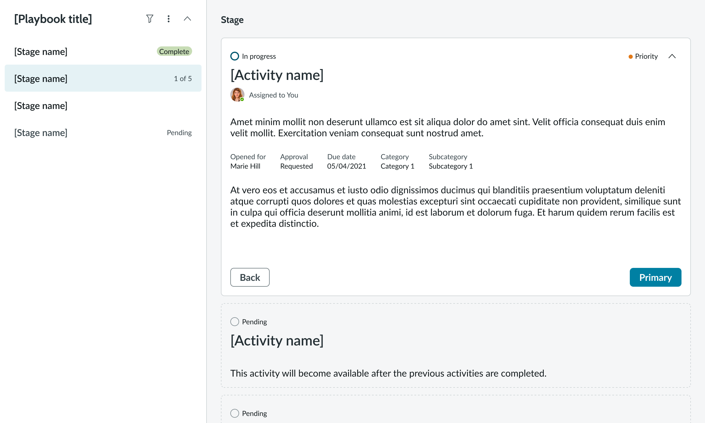
Stacked view
The playbook stacked view displays all of the stage activities in a list of activity cards. The selected activity displays the expanded view of the activity card. All other activity cards are collapsed by default.
Horizontal stacked view
Horizontal stacked view of a playbook with horizontal stage picker, cards for all activities, and the first card expanded.
Vertical stacked view
Vertical stacked view of a playbook with vertical stage picker, cards for all activities, and the first card expanded.
Focused view
The playbook focused view displays a single card for one activity at a time in the details area to provide a more focused view for users.
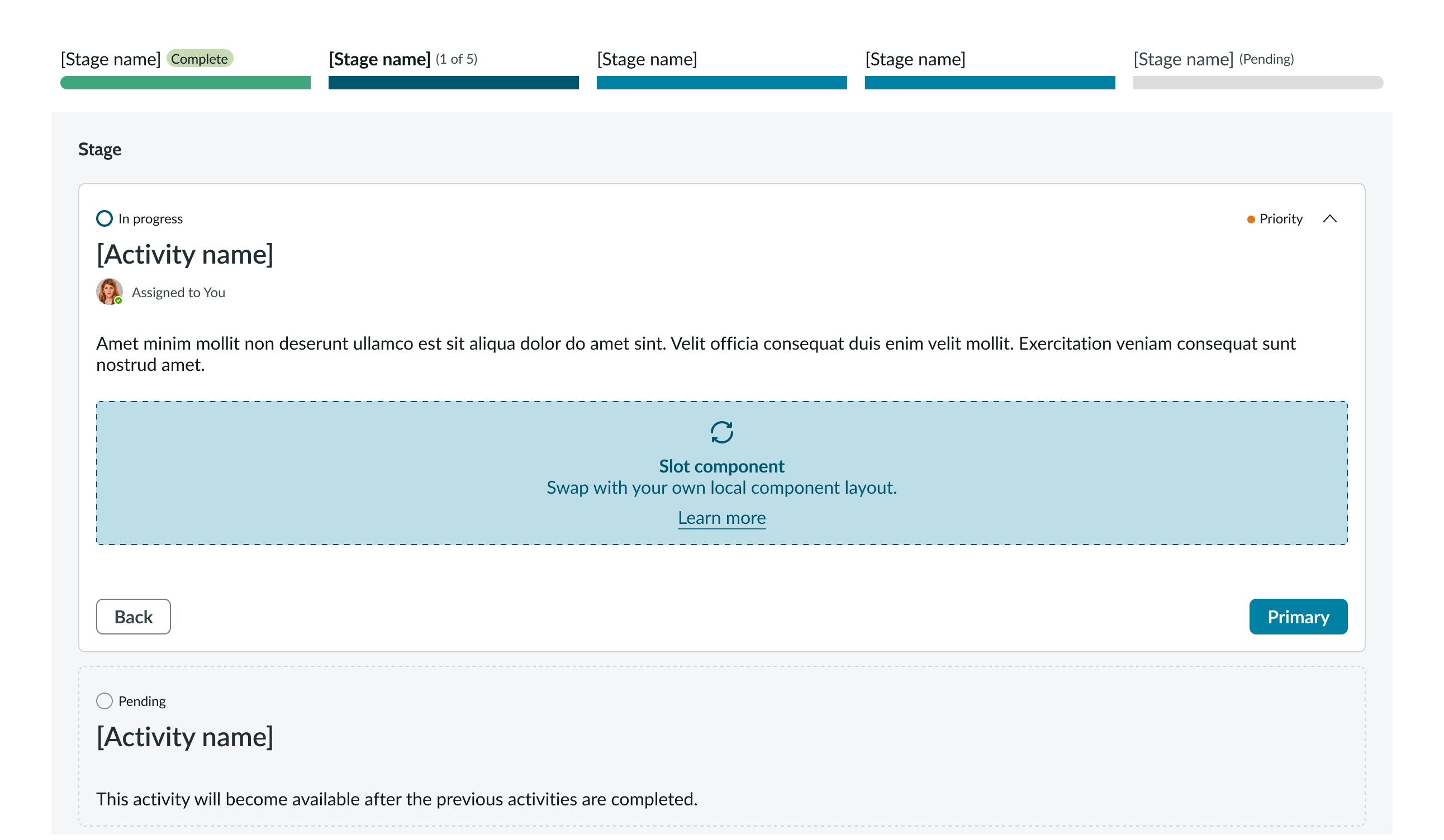
Horizontal focused view
In this example, the playbook uses the horizontal stage picker in the focused view.
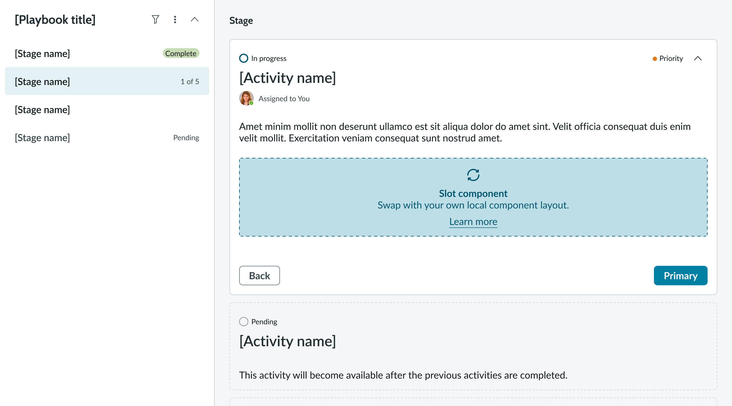
Vertical focused view
In this example, the playbook uses the vertical stage picker in the focused view.
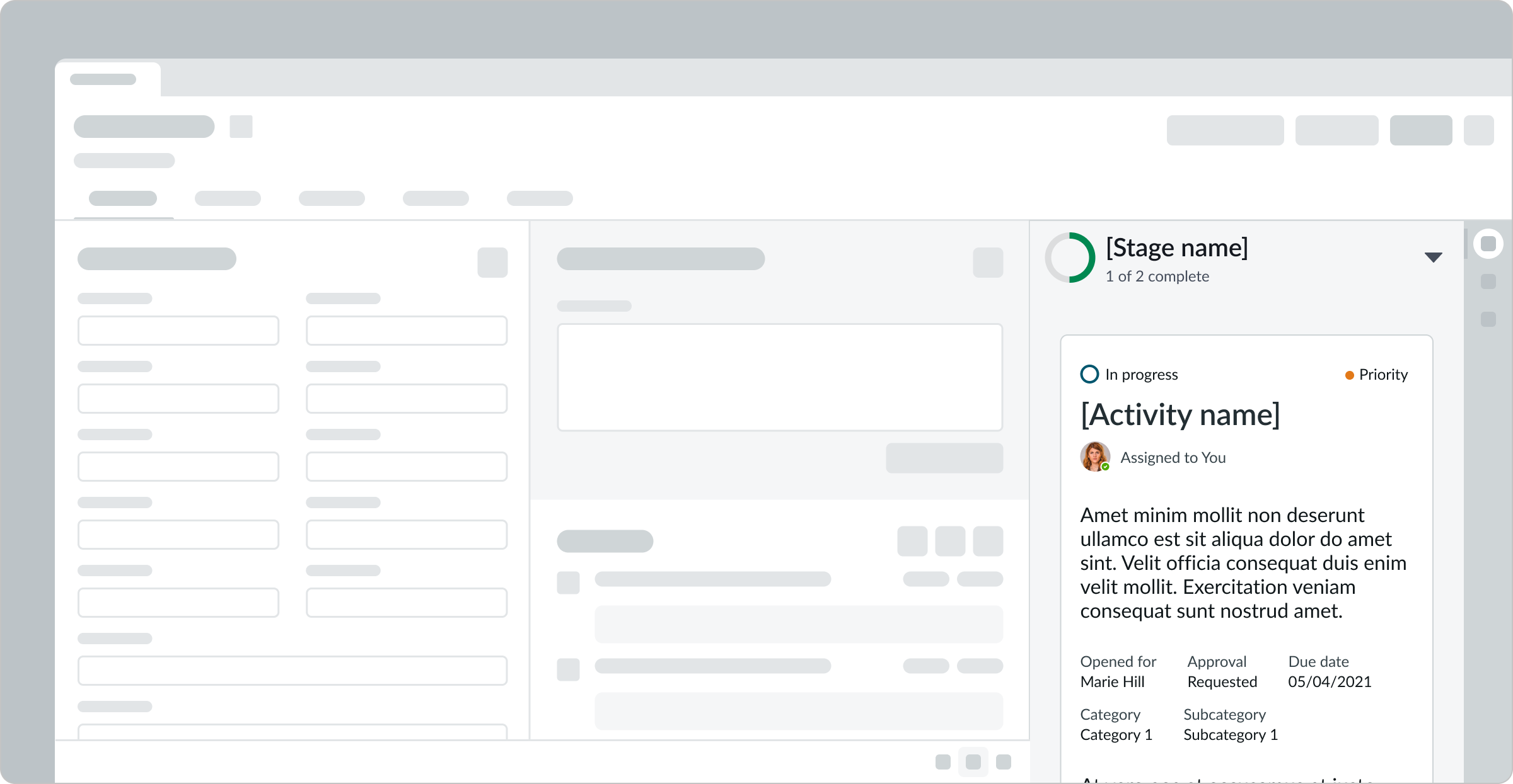
Sizes
The playbook component has the following sizes: full view and contextual sidebar.
Default
The playbook full view displays the navigation pane and activity pane together.
Compact
Playbooks appear in compact mode in small viewport sizes, such as the contextual side panel. Users can navigate to the activity pane by expanding the stage name dropdown.
Compact view with only first stage showing
Compact view with stages dropdown expanded
Configurations
Learn how to customize playbook by configuring the available properties.
Multiple running playbooks
You can run multiple playbooks for a record, but switching between them is a different experience for the user based on the display.
If they run multiple playbooks in the vertical view, they have to arrange the vertical stage pickers one above another.
Multiple running playbooks (horizontal)
If the user runs multiple playbooks in the horizontal view, they can access a dropdown playbook picker by selecting the current playbook name. The playbook picker appears right below the record header. Once selected, the playbook picker shows the dropdown with all the running playbook names to chose from. If the user picks another playbook, the whole page resets to show the new playbook.
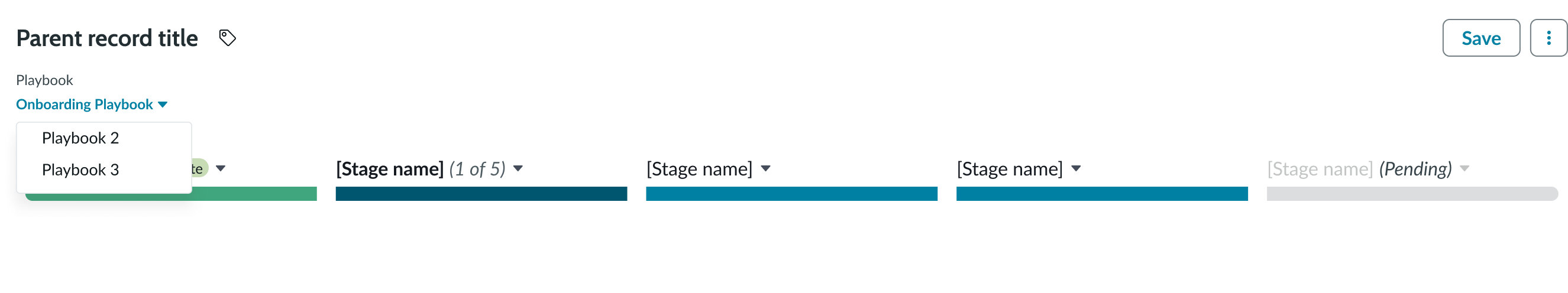
Multiple running playbooks (vertical)
If the user runs multiple playbooks in the vertical view, they have to arrange the playbooks so that they can quickly access each. The following image shows 2 playbooks running for the same record arranged one above the other. When the user selects another playbook, the whole page resets to show the new playbook.
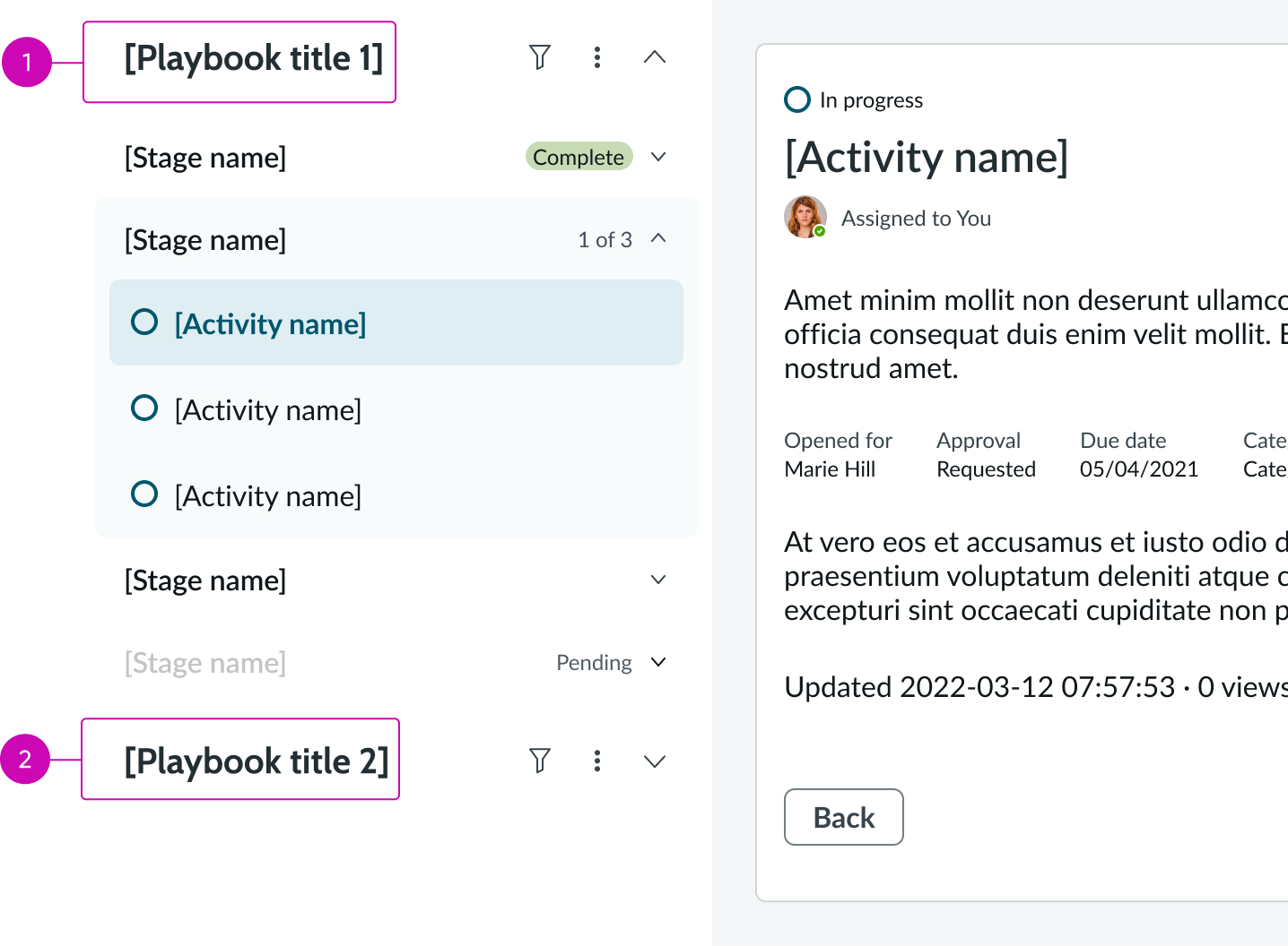
- Playbook title: Name of the first running playbook with the stage picker expanded
- Playbook title: Name of the second running playbook with the stage picker collapsed
Activities
Activity cards can feature forms, checklists, lists, attachments, and more.
By default, in stacked view activities are collapsed and ready to be completed - except for the initial activity already in progress. Focused view shows only one activity at a time.
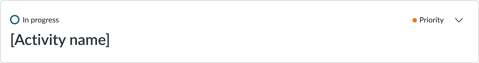
In this example, an activity is in a collapsed state.
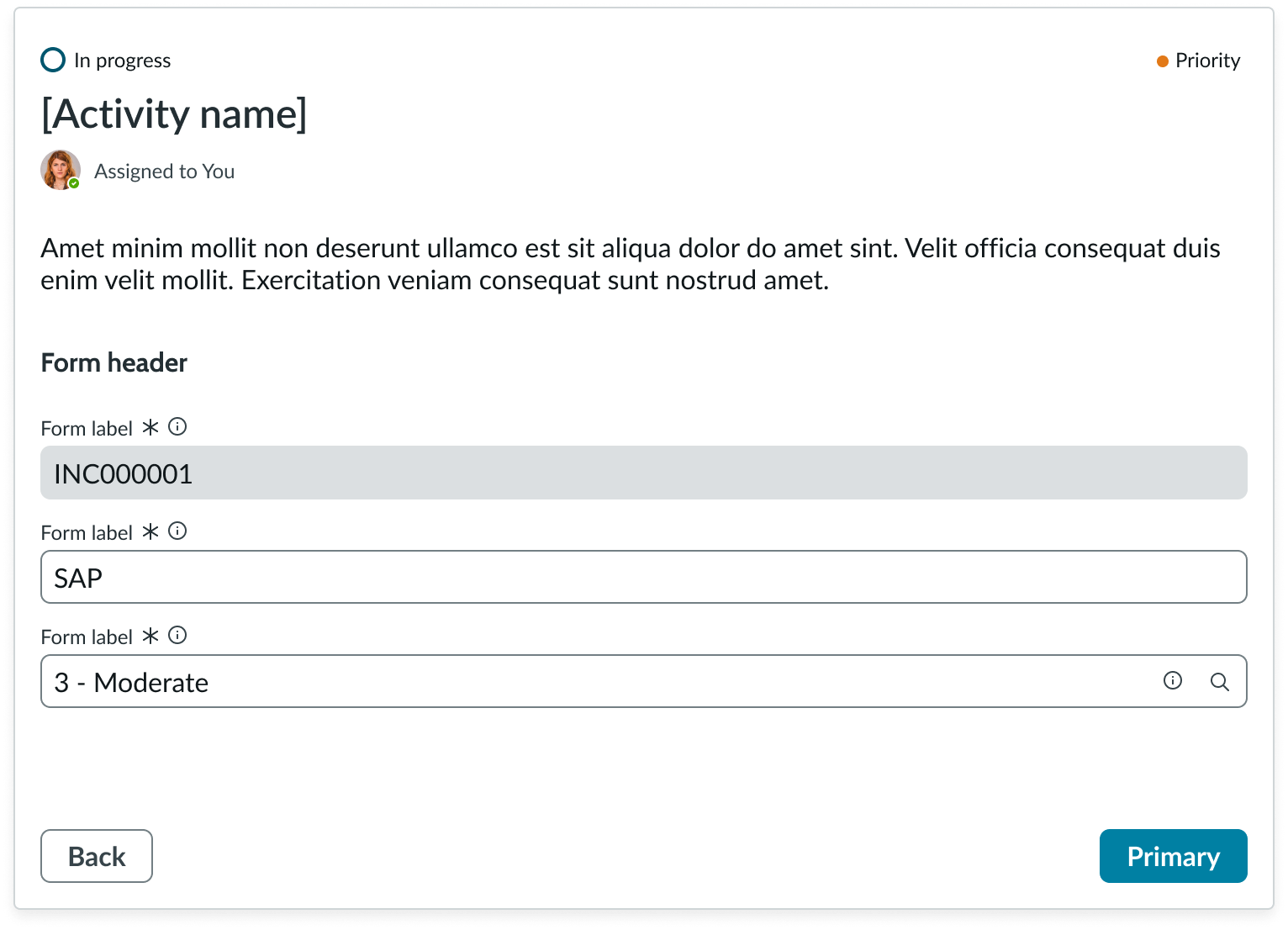
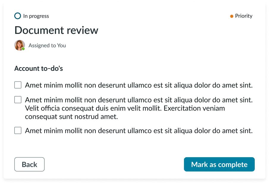
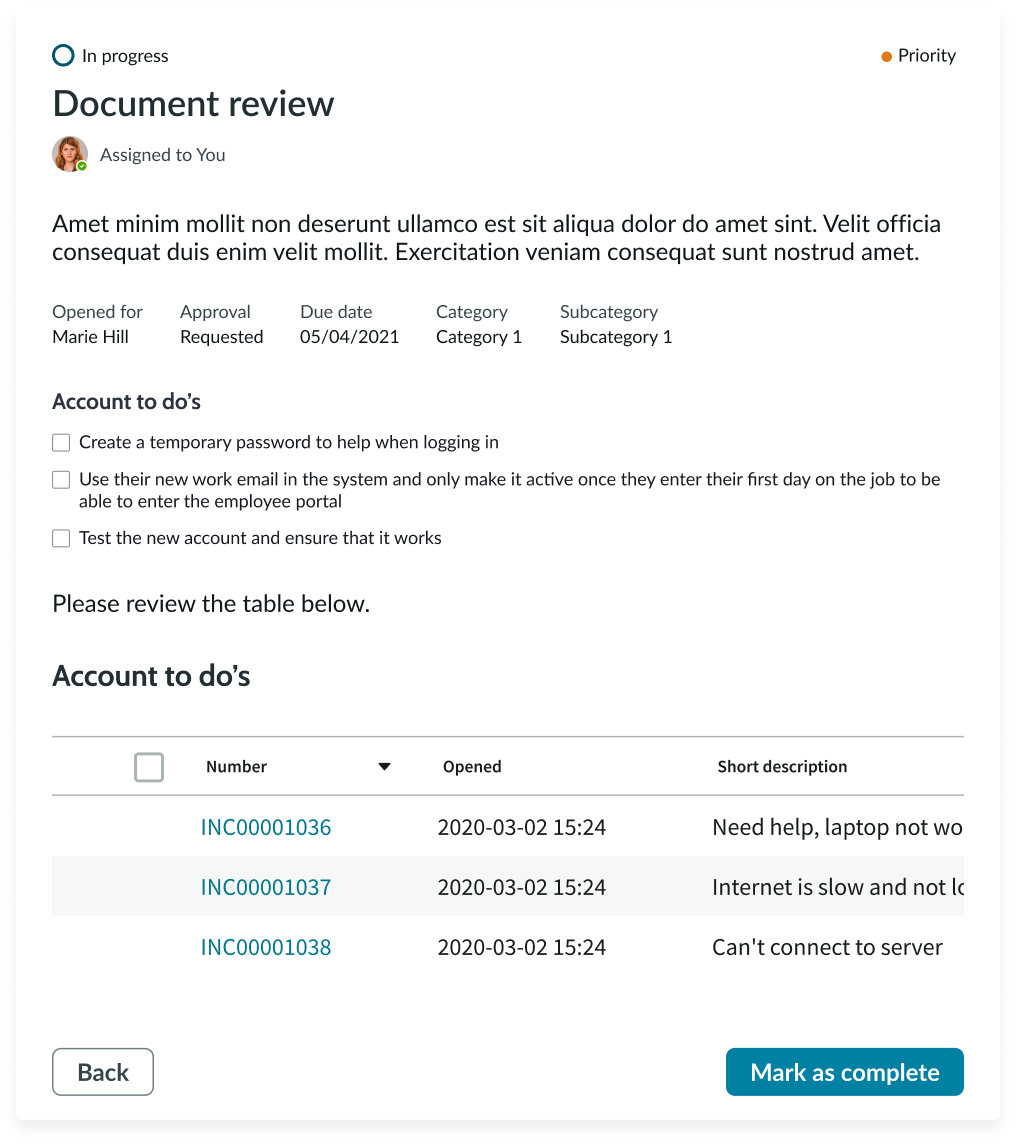
In this example, an activity is in an open state with a form.
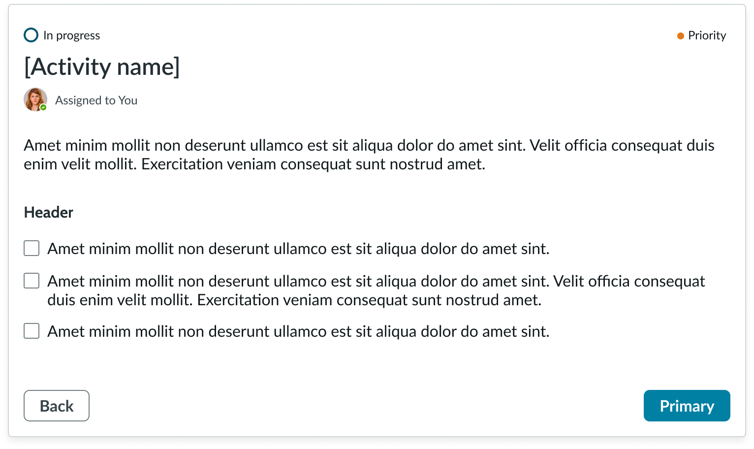
In this example, an activity is in an open state with a checklist.
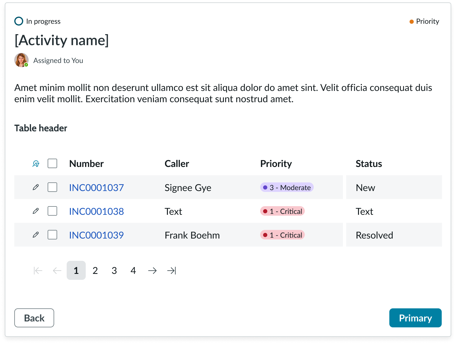
In this example, an activity is in an open state with a list.
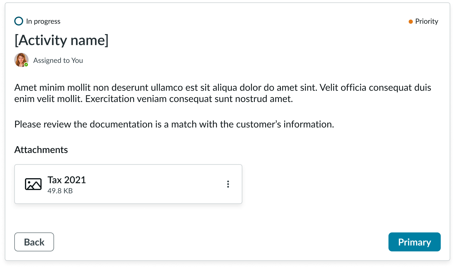
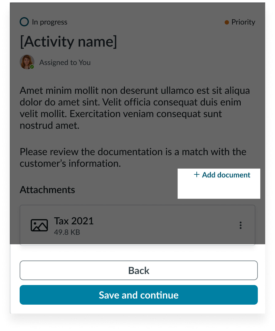
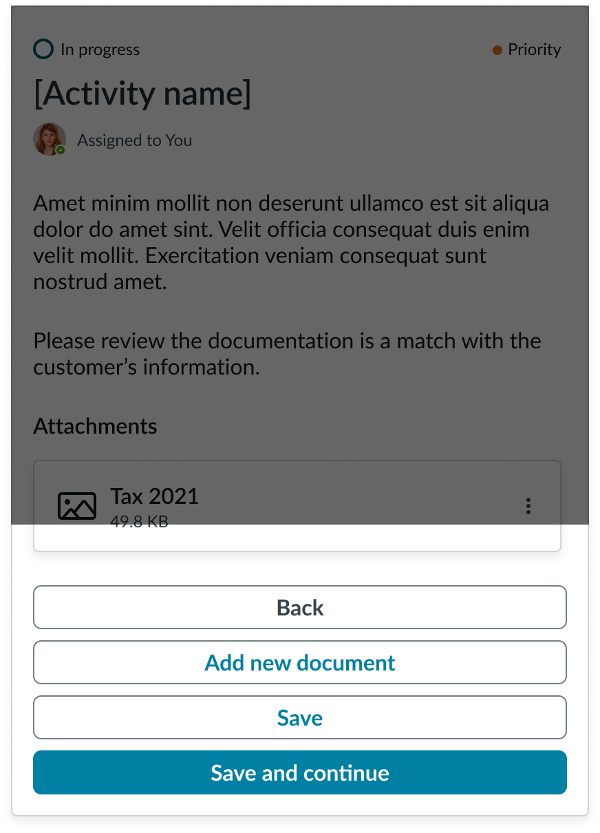
In this example, an activity is in an open state with an attachment.
Design recommendations
Learn how to apply playbook in your design.
Card information should be clear and concise, so a user can easily understand a task and act on it. Alternatively you can use focused view to better support complex content.
Avoid overloading content in a card or combining interactive components like simple lists and form fields.
Prioritize navigational actions with declarative actions. If needed, put activity-level actions in the activity UI.
Don’t overload the declarative actions. This increases cognitive load for the user and reduces space for the user to complete the activity.
UI text guidelines
These are some recommendations for using text within playbook:
- Headers and stage and activity titles should be short and precise, or they might truncate
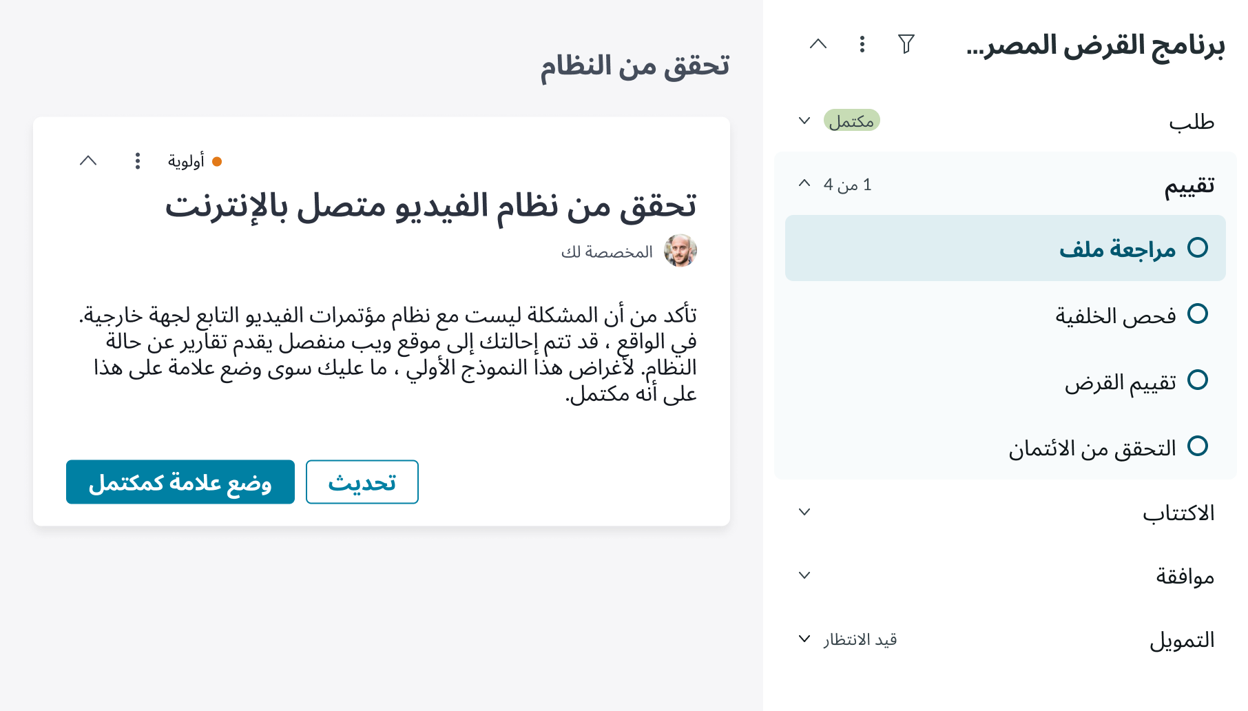
- Use actionable activity titles that start with verbs, such as "Check approval status"
- Keep all text labels informative and short to increase readability and scanning
- Ensure content is contextual and specific to offer guidance and support to the user
- If a component performs or supports an action, label it with a verb (like “Submit”)
- Button text should be concise, actionable, and clearly state what happens when a user makes the selection
Behavior
Learn how playbook behaves when the display changes or a user interacts with the component.
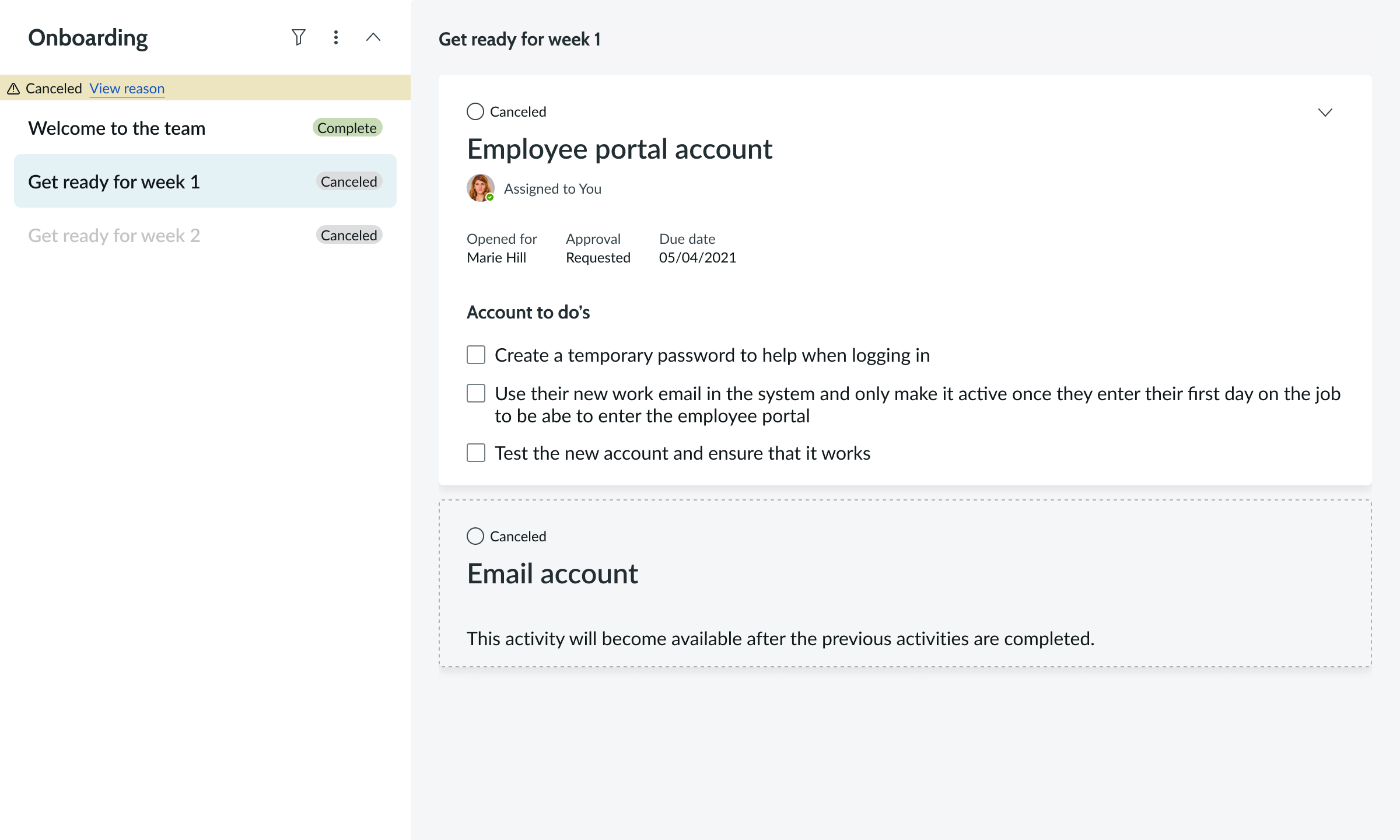
Canceled playbook
A playbook can be canceled, stopping all activities in progress, while stages with activities pending are also canceled.
Interactions
Learn how playbook responds when a user interacts with it.
Open a playbook
Users can open a playbook by selecting the caret icon next to the playbook title in the navigation pane. If a playbook is currently open, this action closes the playbook.
Actionable icons
Users can interact with any of the actionable icons in the top right corner of the navigation pane, which includes the filter and menu options.
Focused view
In focused view, the user can select a stage to open the list of activity items.
Truncation
When text in a playbook exceeds the width of the container or content area, the text truncates with an ellipsis, and a tooltip shows the full content on hover.
Usability
Playbook complies with all internationalization and accessibility requirements.
Internationalization
When the display translates to a right-to-left (RTL) language, the order of importance changes to right-to-left in the navigation panel and stage/activity panel but remains the same from top to bottom.
Accessibility
Learn how to access the actionable elements of playbook through keyboard interactions and screen readers.
Playbook tab order
This is the high-level tab order for playbook.
Note: For tab stop information about sub components of playbooks, see the individual component usage guidelines.
Keyboard interactions
You can access the actionable elements of playbook with these keyboard keys.
- Tab: Moves focus to the next interactive element
- Shift + Tab: Moves focus to the previous interactive element
- Down arrow: Moves focus to another playbook
- Up arrow: Moves focus to the previous playbook
- Enter/return or space bar: Triggers element action
Screen readers
When you apply ARIA labels to a component, screen readers announce the controls and content of playbook in the prescribed tab order.