

Anatomy
Learn about the individual parts of playbook stage picker.
Stage picker anatomy (horizontal view)

- Stage: Playbook stage title
- Stage status: If complete, shows highlighted “Complete”; if not, shows the number of completed activities and total number of activities in the stage
- Stage bar: Represents a stage; the color indicates the status of each stage or its interaction state; green for completed, dark blue for in progress and selected state, light blue for in progress and default state, and gray for pending state.
- Dropdown trigger: Opens a dropdown listing the stage activities
- Stage picker actions icon (vertical ellipsis): Opens a dropdown list of stage level actions
- Playbook actions menu (optional): Configurable actions for all stages
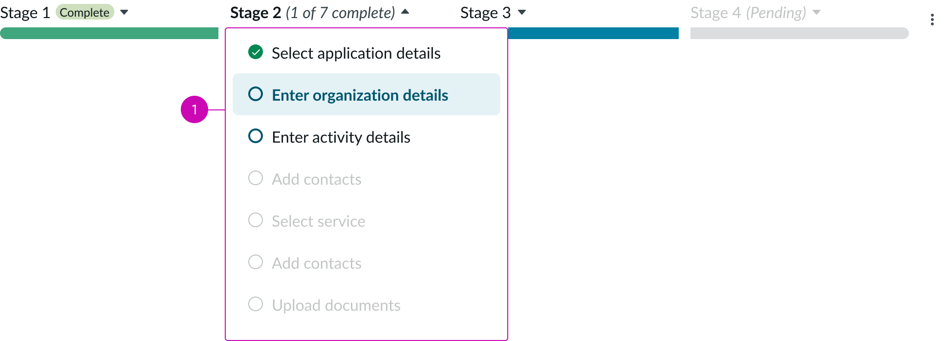
- Stage menu: Dropdown showing the stage activities
Stage picker anatomy (vertical view)
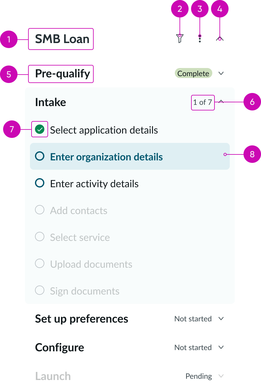
- Playbook title: Identifies the specific playbook
- Filter icon: Accesses a dropdown of available filters the user can select
- Playbook actions menu (optional): Configurable actions
- Collapse/expand chevron: Expands or collapses the entire nav for a particular playbook
- Stage: Playbook stage title
- Activities completed: Indicates the number of completed and total activities
- Status icon: Indicates the current status of the activity
- Selected stage: A user accesses the activities for a stage by selecting it
Subcomponents
See the usage guidelines for button.
See the usage guidelines for button icon.
See the usage guidelines for heading.
Usage
Stage picker summarizes the stages and activities that are part of an end-to-end process. This component shows users the progression of work through a playbook, displaying completed, in progress, and pending stages. Layout options include horizontal and vertical orientation.
A stage picker is repeated for each available playbook running on the same record.
Use stage picker to reduce clutter and focus on one stage at a time.
Variants
Playbook stage picker has the following variants.
Types
Stage picker component has the following types.
Horizontal view
By default, the stage picker horizontal view displays up to 5 stages for a playbook.

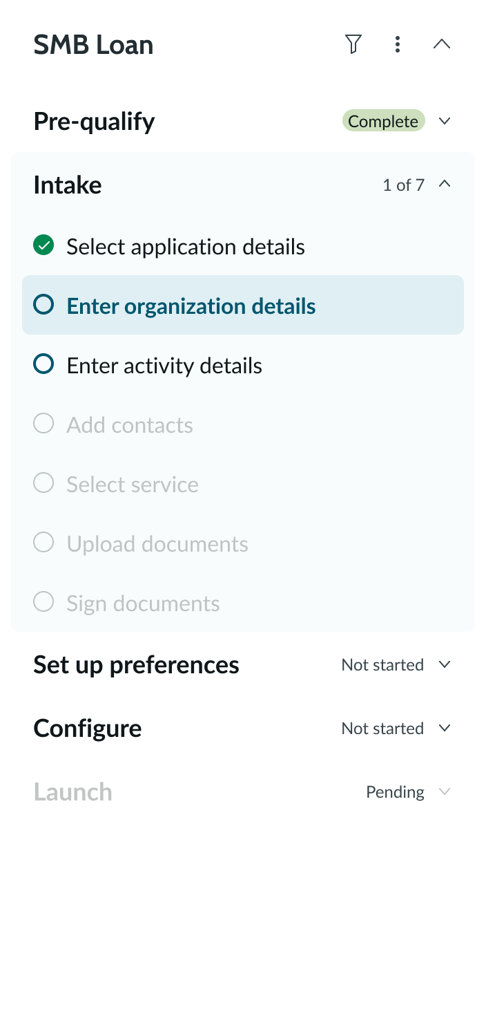
Vertical view (stacked)
The stage picker vertical view displays a navigable vertical list of all stages for a playbook.
Configurations
Learn how to customize playbook stage picker by configuring the available properties.
View
You can specify either the horizontal view or vertical view.
Visible horizontal stages
For the horizontal view, this is the maximum number of visible stages. When the number of stages exceeds this value, a scrolling arrow appears at the end of the stage picker. When a user scrolls to view additional stages, a scrolling arrow appears at the beginning. The default is 5 stages.

Number of filters
You can display the number of filters applied next to the stage picker filter icon. By default, the filter number doesn’t appear.
Design recommendations
Learn how to apply playbook stage picker in your design.
UI text guidelines
These are some recommendations for using text within playbook:
- Headers, stage, and activity titles should be short and precise, or they might truncate
- Use actionable activity titles that start with verbs, such as "Check approval status"
- Keep all text labels informative and short to increase readability and scan-ability
- Ensure content is contextual and specific to offer guidance and support to the user
- If a component performs or supports an action, label it with a verb (like “Submit”)
- Button text should be concise, actionable, and clearly state what happens when a user makes the selection
Behavior
Learn how playbook stage picker behaves when the display changes or a user interacts with the component.
Stage states
Playbook stage picker states have the following states.
| State | Example |
|---|---|
| Default |  |
| Hover |  |
| Focused |  |
| Selected |  |
| Disabled |  |
Status
The following status appear for each stage name. They indicate the current status of the stage.
| Status | Example |
|---|---|
| In progress |  |
| Complete |  |
| Not started |  |
| Pending (not selectable) |  |
Status icons
The following status icons appear for each stage state. They indicate the current status of the stage.
| State | Example |
|---|---|
| Complete |  |
| In progress |  |
| Pending |  |
| Skipped |  |
| Error |  |
| Cancelled |  |
Interactions
Learn how playbook stage picker responds when a user interacts with it.
Selected
When a user selects a stage, all the activities for the stage become accessible.
Stage actions
When users place their pointer on a stage, the actions icon (vertical ellipsis) appears. Selecting this icon opens a dropdown list of stage-level actions.

Playbook filters
Users can apply a filter to the activities of a single stage by selecting the filter icon at the end of stage picker and choosing a filter option. This applies in both horizontal and vertical playbooks.
Playbook actions
Users can access a dropdown of additional actions by selecting the actions icon (vertical ellipsis) next to the filter icon.
Truncation
When the stage name exceeds the text area width, the text truncates with an ellipsis. When a user places the pointer on the ellipsis, a tooltip shows the full name. Note that the stage text area has a small buffer on each side of the stage name.
Usability
Playbook stage picker complies with all internationalization and accessibility requirements.
Internationalization
When the display translates to a right-to-left (RTL) language, the order of importance changes to right-to-left in the playbook stage picker, but remains the same from top to bottom.

Accessibility
Learn how to access the actionable elements of playbook stage picker through keyboard interactions and screen readers.
Playbook stage picker tab order

Keyboard interactions
Users can interact with the playbook stage picker using the keyboard.
- Tab: Moves focus to the next interactive element in the UI
- Shift + Tab: Moves focus to the previous interactive element in the UI
- Esc: Dismisses displayed tooltip
- Enter/return: Triggers an action associated with an interactive element when in focus, such as opening an actions menu
- Arrow up, down, right, left: Moves focus through menu options when opened
Screen readers
When you apply ARIA labels to a component, screen readers announce the controls and content of playbook stage picker in the prescribed tab order.