

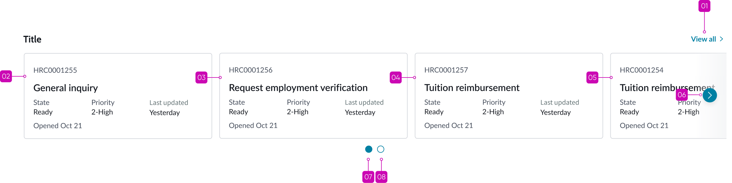
Anatomy
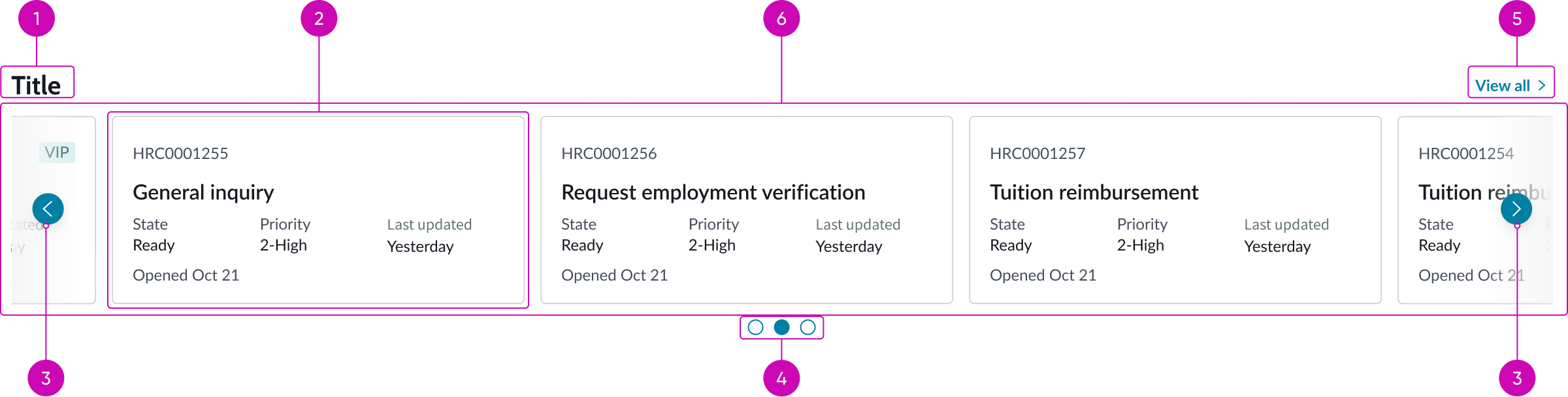
- Carousel title (optional): Bolded title of the carousel
- Carousel item: An item in the carousel; can be a card or any other UI Builder component
- Navigation controls: Previous and next buttons that allow user to navigate between the available carousel items or item sets
- Dot indicator (optional): Displays the number of available items or item sets in the carousel, with the current item set highlighted; the dots can also be used to navigate within the carousel
- Link (optional): When selected, navigates the user to a particular page in the experience, such as the list page
- Content area: Area that displays the carousel items; can be configured to show a single item or item sets
Subcomponents
See usage guidelines for bare button
See documentation on repeaters
See usage guidelines for single score
Usage
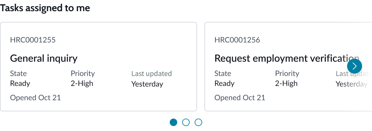
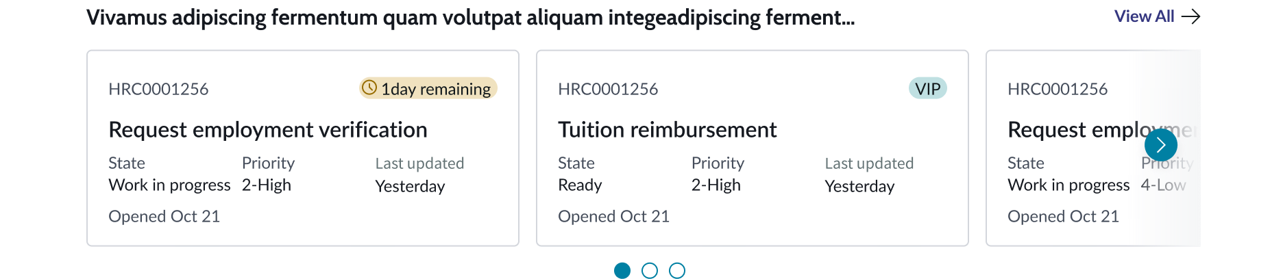
Carousel can be used to display several content items in the same space, such as cards, banners, or single score components. Below are 3 examples of use cases of the carousel component.
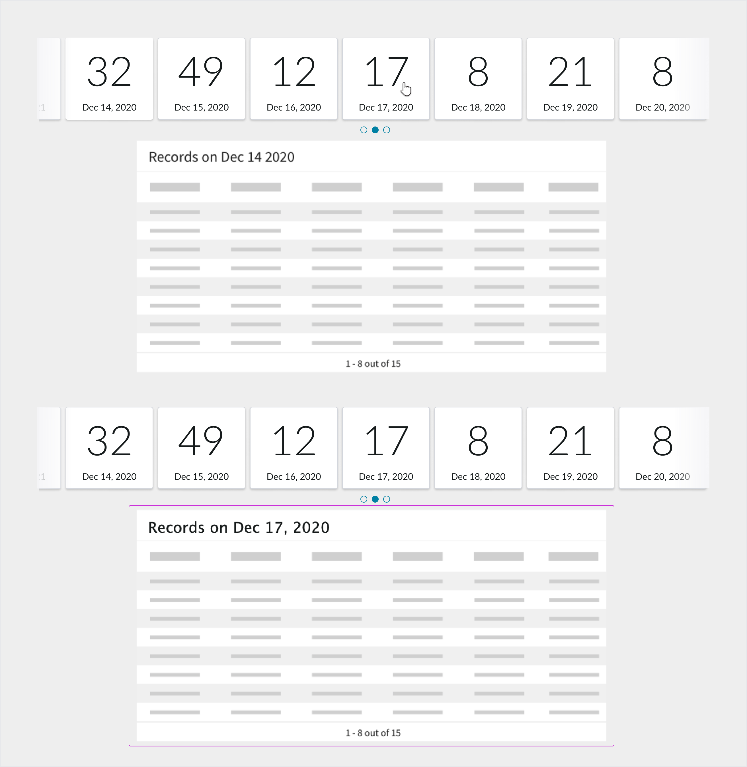
Workspace
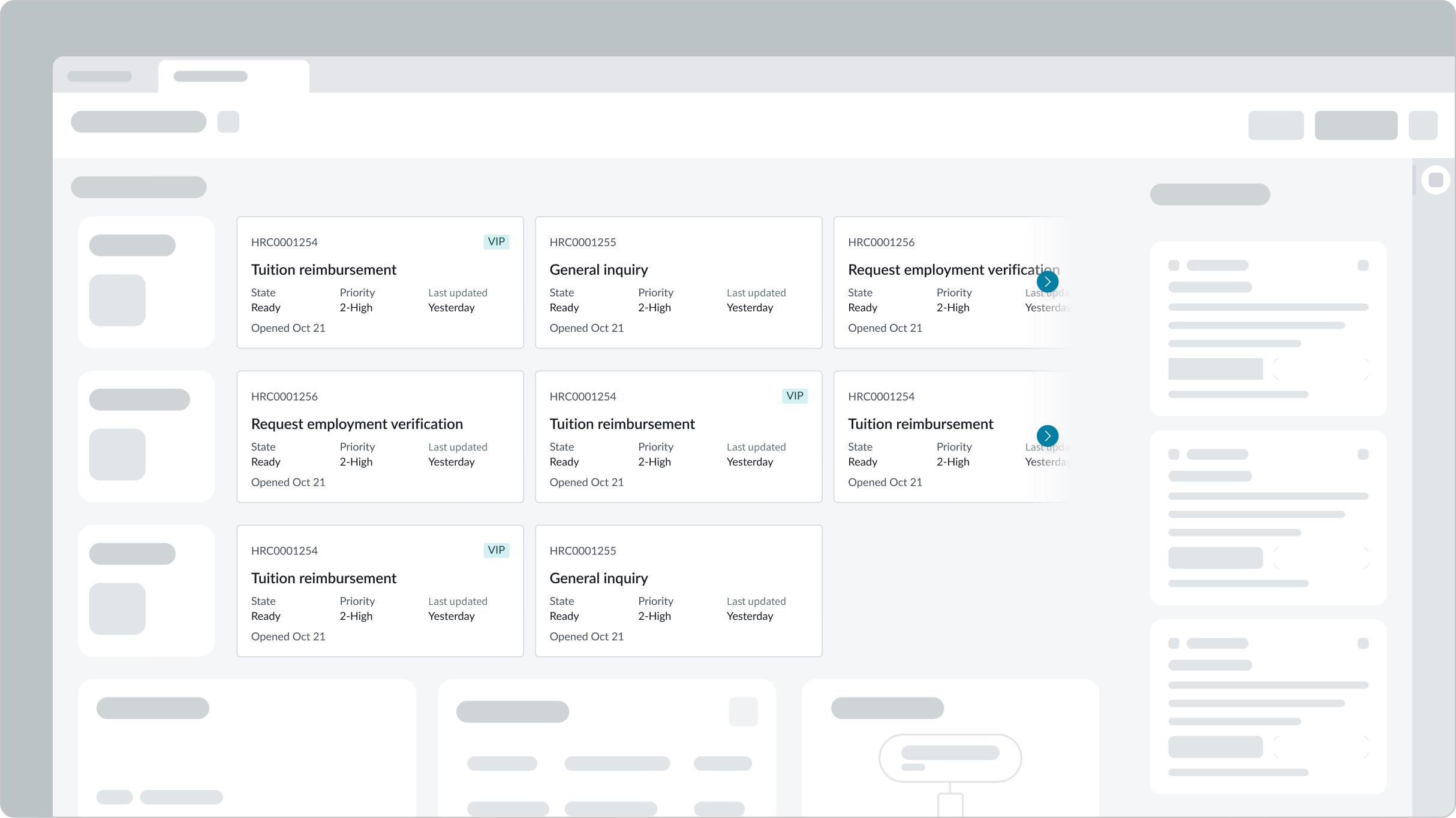
In the image above, carousel is used to display three rows of record cards and a rotation of announcements.
Performance analytics review (PAR)
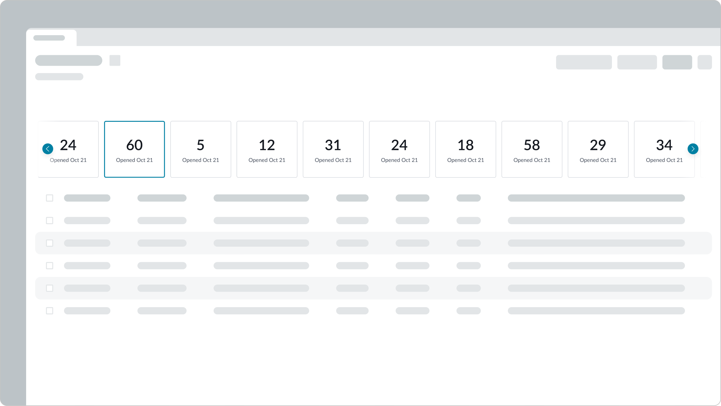
In the image above, carousel is used to display single score components.
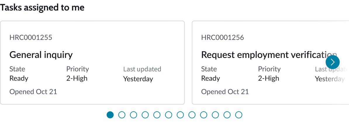
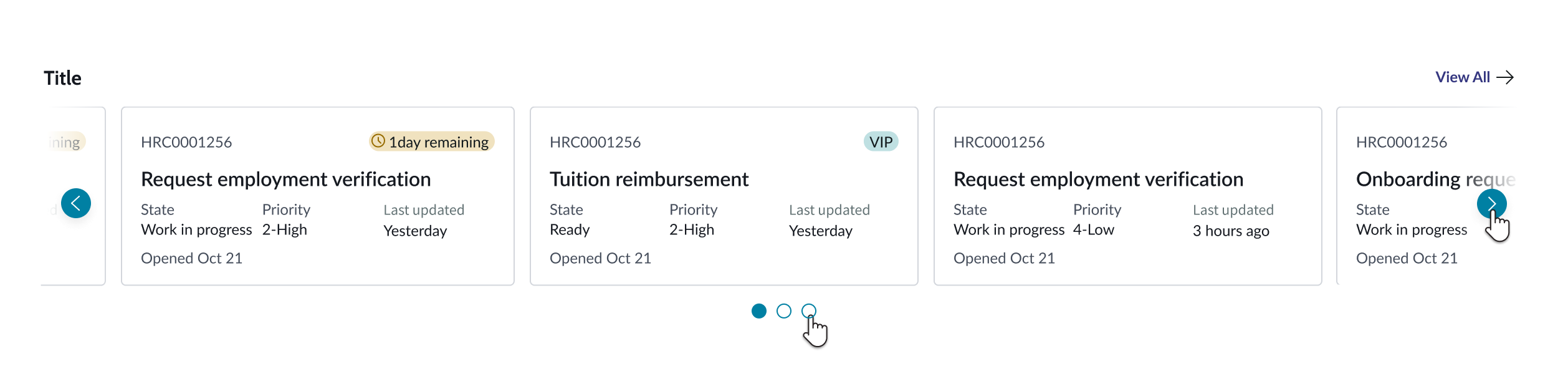
Next Experience landing page
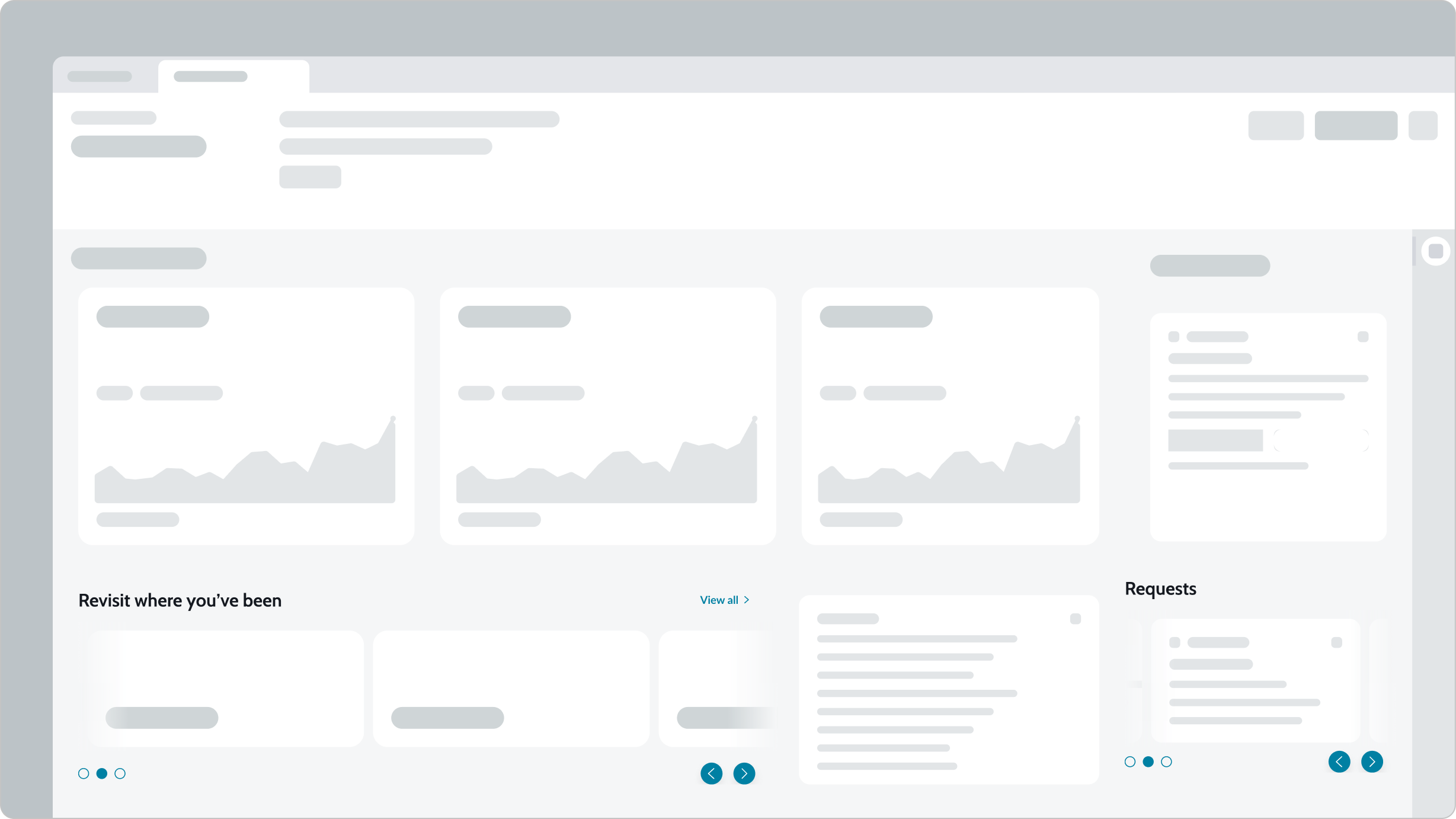
In the image above, carousel is used twice to display recently viewed pages and relevant requests.
Repeaters
While you can statically define your content for carousel banners, for example, you can use repeaters to loop content from a data source. This is useful when you want your carousel to adapt its content to the data source instead of predefining the amount of items in your carousel.
Configurations
Learn how to customize carousel by configuring the available properties.
Carousel title
You can configure the carousel title to be left or right aligned, or you can hide it. By default, the title is left aligned and visible.
Long titles wrap, but you can disable wrapping and have the long text truncate.
Customizable badge
By default, an empty badge is hidden to the right of the carousel title. You can expose the badge by adding optional text and any one of a variety of colors to it. For example, you can choose the “critical” option and insert the text “Critical” for the badge. This produces a bright red badge, with the word “Critical,” to the right of the carousel title.
Additionally, you can set up a dynamic counter to display the number of items in the carousel.
Carousel link
Links can be configured to display and take the user to a particular page in the experience such as an activity center or a List Page. They can include a combination of text and an icon. For example, a "View all" link with an arrow icon can be used to direct the user to view rest of the data-set.
Content area
You must configure the type of content that will be included in the carousel. Any type of data can be used, including, but not limited to: the card, single score, and announcement banner components. The height of the carousel adapts to the height of the content it contains unless the admin sets the height of the carousel.
Content width
A good practice is to define a fixed width for the content slots or the content inside the slots, expressed as a percentage of the entire viewport (<100%) or in pixels. This ensures that the navigation controls remain visible if the content of the container exceeds the width of the viewport. If you don’t restrain the width of the intended content, the Previous and Next buttons can be forced out of sight as the carousel expands, requiring the user to resize the browser to access these controls. For more information on this issue, see KB1183914.
Note: The width of a component or container can be set in the Styles pane of the UI Builder.
Display options
A user can configure the carousel to display a single content item or multiple content items, depending on the product needs and layout.
Navigation controls
You can configure the style and alignment of your carousel navigation controls. You can also choose to hide the dot indicators or enable looping. You can configure carousel content to automatically scroll on a loop using the Auto scroll settings. Toggle on the Enable auto scroll button to activate automatic scrolling behavior: Content auto scrolls on loop, at the default rate. You can change the auto scroll speed interval using the Auto scroll speed option.
Style
You can configure the fill and background gradient of the navigation controls.

In the image above, the navigation controls are configured to be filled and use a tertiary background gradient.

In the image above, the navigation controls are configured to be outlined and use a tertiary background gradient.
Alignment
You can also configure the navigation controls to align to the left, right, or center of the carousel.
Center
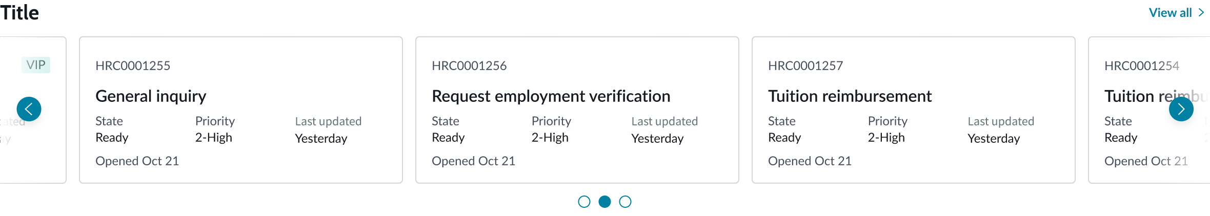
In the image above, the navigation controls are aligned to center, so that both left and right sides of the carousel each have an arrow and the pagination control (the 3 dots) is centered.
Left
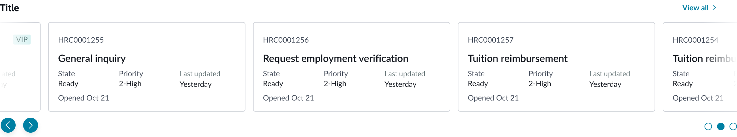
In the image above, the navigation controls are aligned to the left, so that the arrows are on the left side of the carousel and the pagination controls are pushed to the right.
Right
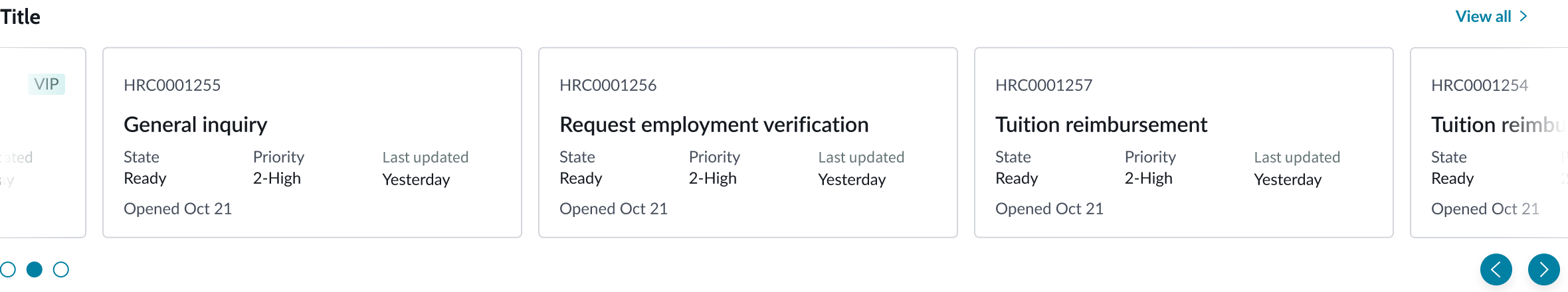
In the image above, the navigation controls are aligned to the right, so that the arrows are on the ride side of the carousel and the pagination controls are pushed to the left.
Design recommendations
Learn how to apply carousel in your design.
Do use carousel to display a smaller list of content items.
Avoid putting too much content in a carousel. We recommend no more than 15 content items. Consider using the list component to display large amounts of content.
Behavior
Learn how carousel behaves when the display changes or a user interacts with the component.
States
Learn about carousel's states.
Content area
The carousel content area has the following states: default, focus, pressed, and selected. The table below shows what the states look like for a carousel card.
| State | Example |
|---|---|
| Default | 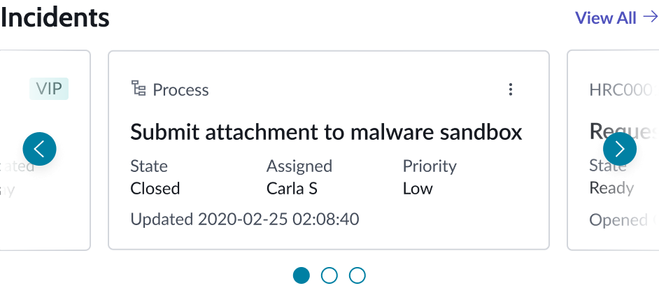 |
| Focus | 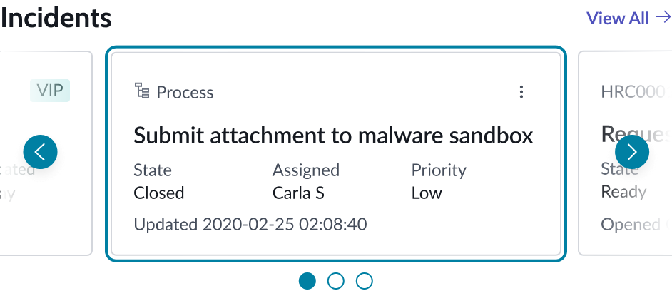 |
| Pressed | 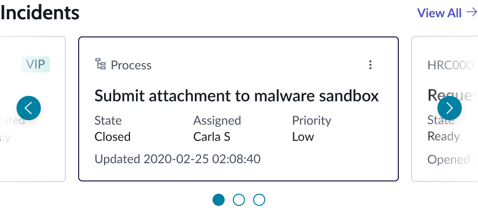 |
| Selected | 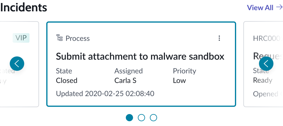 |
Indicator dots
The carousel indicator dots have the following states: default, focus, hover, disabled, and pressed.
| State | Example |
|---|---|
| Default |  |
| Focus |  |
| Hover |  |
| Disabled |  |
| Pressed |  |
Note: The color fill for the indicator dot hover state is lighter than the color fill for the pressed state.
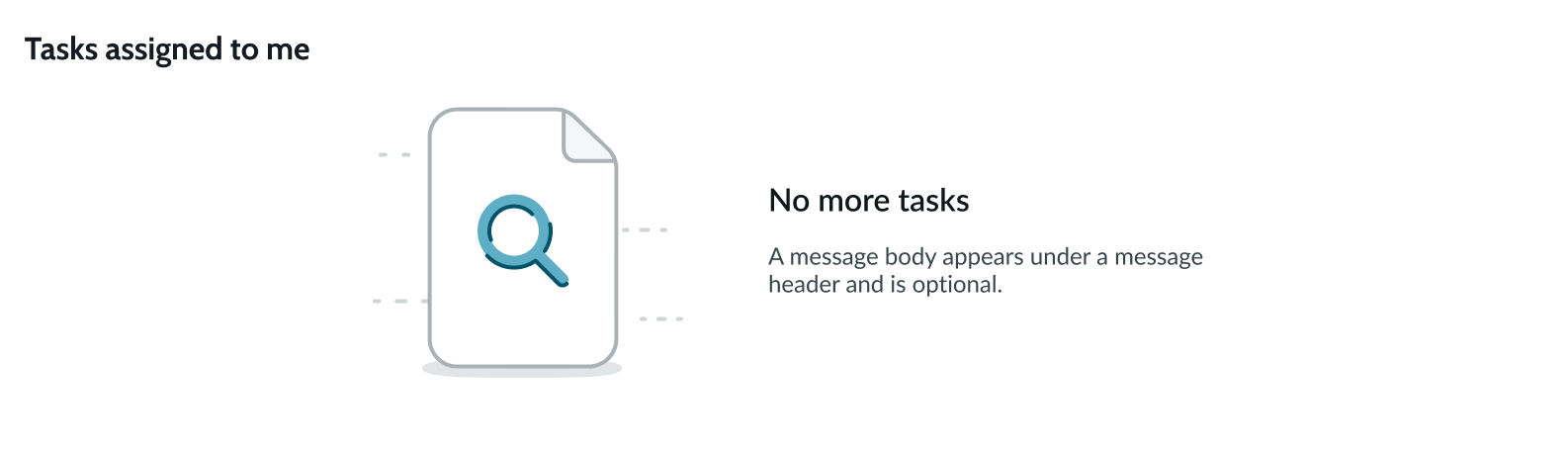
Loading state
If carousel is configured to pull its content from records, for example, and there are no applicable records, an empty state message will display. You can configure the data row to hide the component container when there are no applicable records to display. This helps prevent usability or page layout issues. You can also create an empty state message that displays when no data is available.

Empty state
If carousel is configured to pull its content from records, for example, and there are no applicable records, an empty state message will display. You can configure the data row to hide the component container when there are no applicable records to display. This helps prevent usability or page layout issues. You can also create an empty state message that displays when no data is available.
See usage guidelines for empty state
Interactions
Learn about the ways a user can interact with carousel.
Navigation controls
Users can navigate to the next content set in the carousel by selecting another indicator dot. Depending on how carousel is configured, users can also navigate to the next content set or next content item by selecting one of the navigation controls (left or right arrow).
Page level interactions
If carousel is receiving its content from a data set, you can configure the component to interact with other content on your page. Users can then select content within the carousel and see the page adjust to the selected content.
Auto scroll and looping
When auto scroll is enabled, content automatically scrolls on loop. Users can pause the movement by selecting the pause button. When auto scroll is disabled, the left arrow on the first slide and the right arrow on the last slide don’t appear.
Truncation
By default, long titles wrap, but you can disable this text wrapping. Then, long titles truncate and on hover an ellipsis and a tooltip display the full title.
Usability
Carousel complies with all internationalization and accessibility requirements.
Internationalization
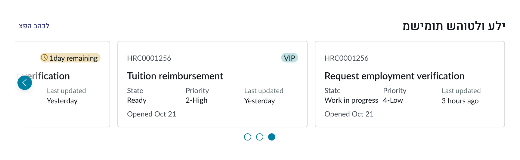
When carousel is used with a right-to-left (RTL) language, the link and title flip their positioning. The navigation direction will also flip so that carousel will rotate to the left.
Accessibility
Learn how to access the actionable elements of carousel through keyboard interactions and screen readers.
Carousel tab order
This is the high level tab order for carousel.
Keyboard interactions
You can access the actionable elements of carousel with these keyboard keys:
With focus on "view all" link:
- Tab: Moves focus to the next interactive element
- Enter: Launches the link and moves focus to the link target
With focus on content item:
- Tab: Moves focus to the next interactive element
- Enter: When selected state is disabled, it launches the link and moves focus to the link target; when selected state is enabled, the content becomes selected
With focus on navigation control:
- Tab: Moves focus to the next interactive element
- Enter: Skips to the next content set or item
With focus on dot indicator:
- Tab: Moves focus to the next interactive element
- Enter: Skips to the next content set or item
Screen readers
When you apply ARIA labels to a component, screen readers announce the controls and content of carousel in the prescribed tab order.