

Anatomy
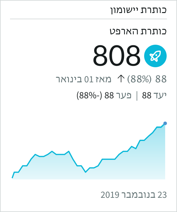
The single score visualization is used with Performance Analytics indicators. These data sources provide additional data that enable you to compare a score to a target value and display the data trend. Indicators also let you add the sparkline subcomponent, which displays values over time, relative to a target value, in a simple graph.
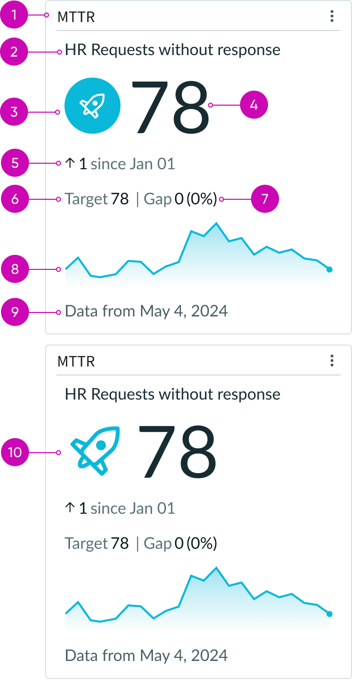
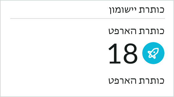
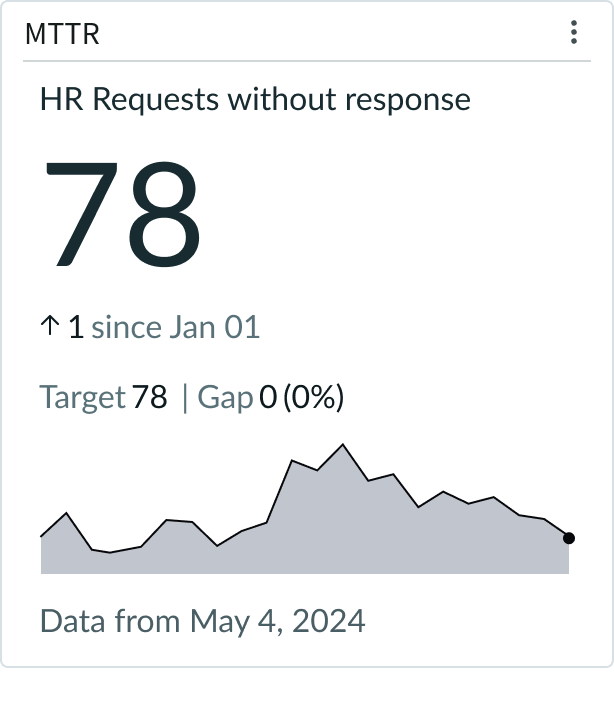
- Score header (optional): Can show title and separator line
- Metric label (optional): Identifies the specific data from the data source being displayed; only displays in the top of the score for PA widgets or indicators; displays in the top or bottom of the score for non-PA widgets
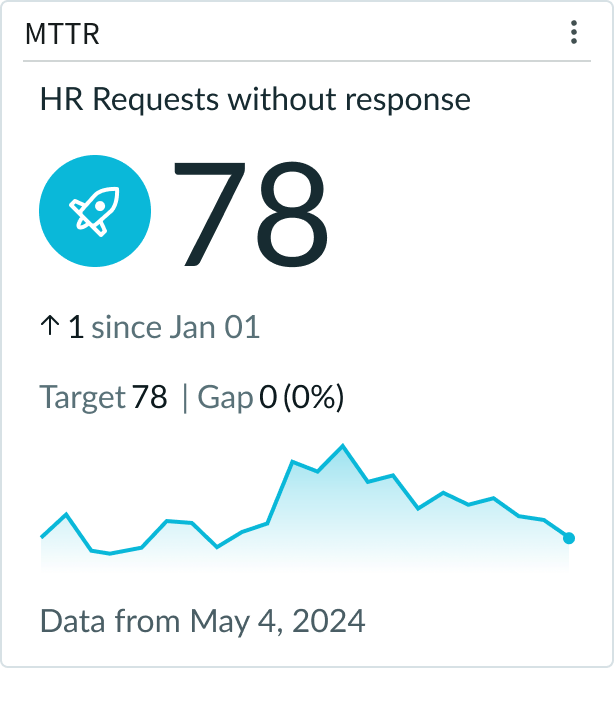
- Score icon (with background): Visual representation that shows the score performances
- Score: The current value of the data; updated at the last refresh
- Trend indicator: Shows the change in the data at the last snapshot; the arrow icon indicates whether the data is trending up or down
- Target: Desired value for the data
- Gap and Gap percentage: Difference between the target value and the actual value of the data in value count and percentage
- Sparkline graph (optional): Graph of the data over time, compared against the score and target values
- Last updated score date: When the score data was last updated; can be exact time or relative time - such as “just now”
- Score icon (without background): Visual representation that shows the score performances
Usage
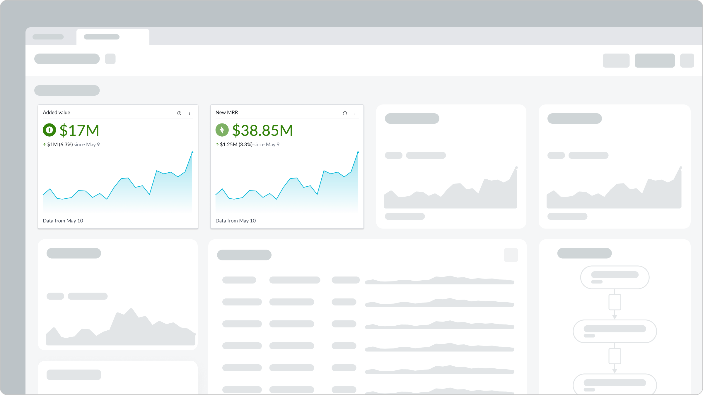
Use a single score report in a dashboard so that users can quickly view developing data. Users can open record lists from a single score chart by selecting the score.
Configurations
Learn how to customize single score charts by configuring the available properties. Configuration has two categories: data and presentation.
Data Sources
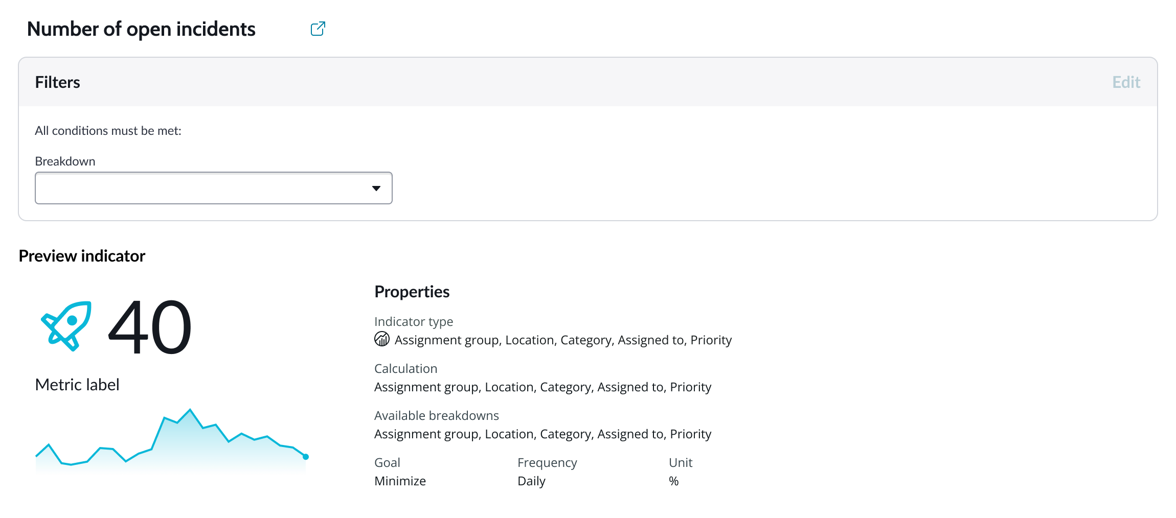
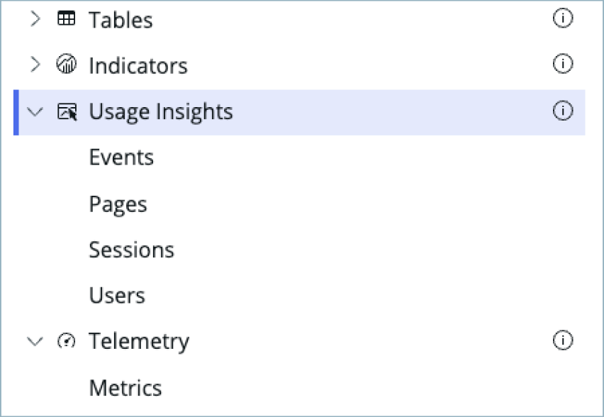
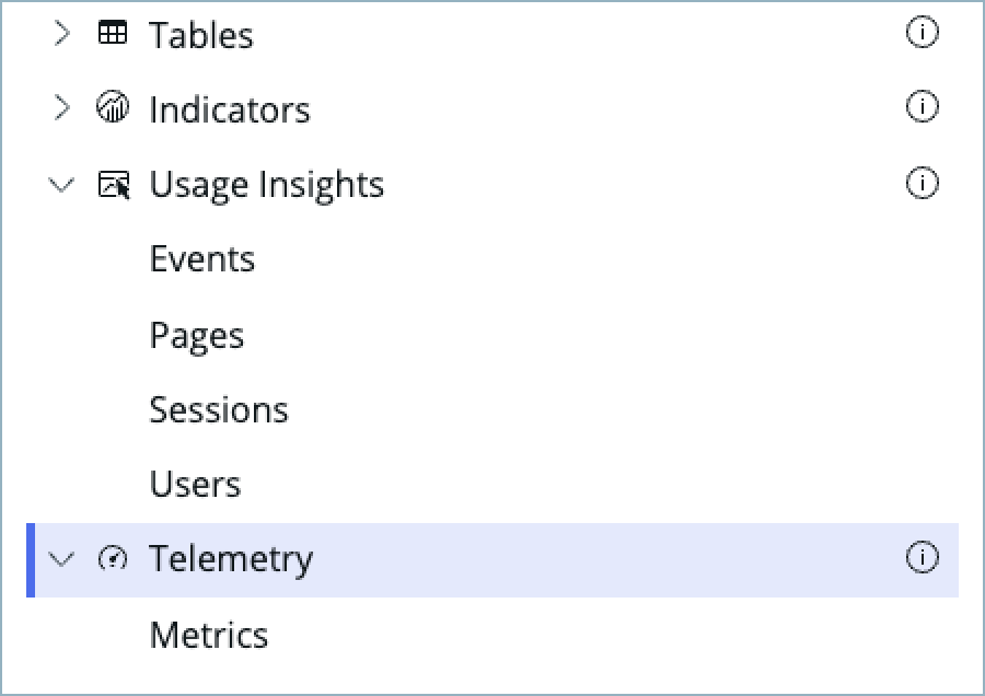
You can select between 4 different data sources for your visualization: system data tables, preconfigured Performance Analytics indicators, Usage Insights, and Telemetry to visualize telemetry KPIs and trends from the Telemetry Data Connector (traces/metrics/logs). If you are changing your data source, the option list provides suggestions based on previous selections and items that match your search.
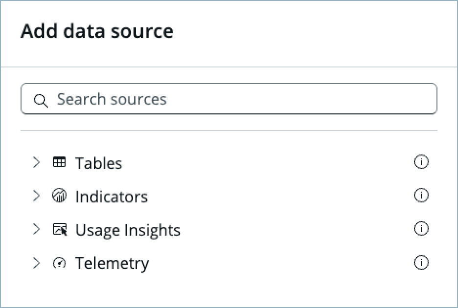
Tables
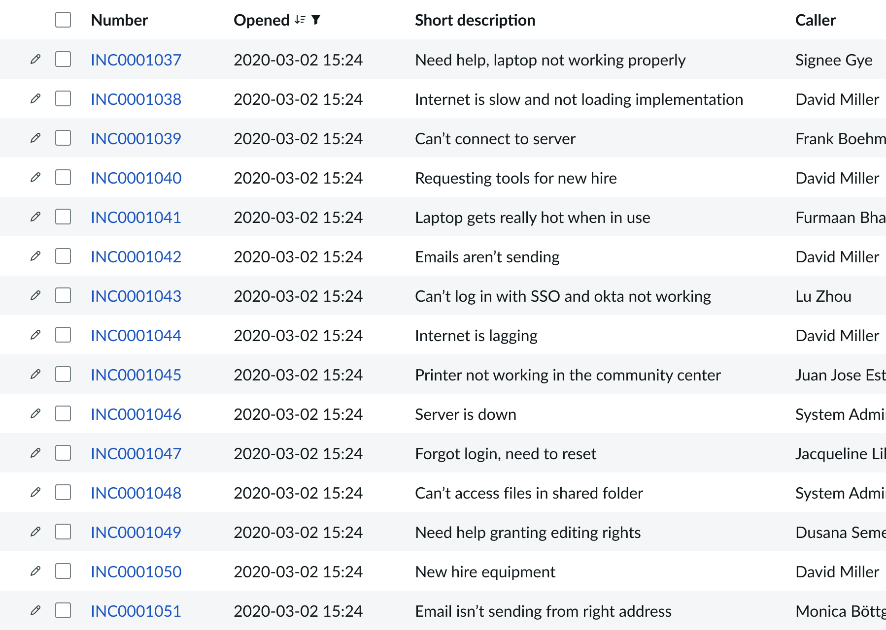
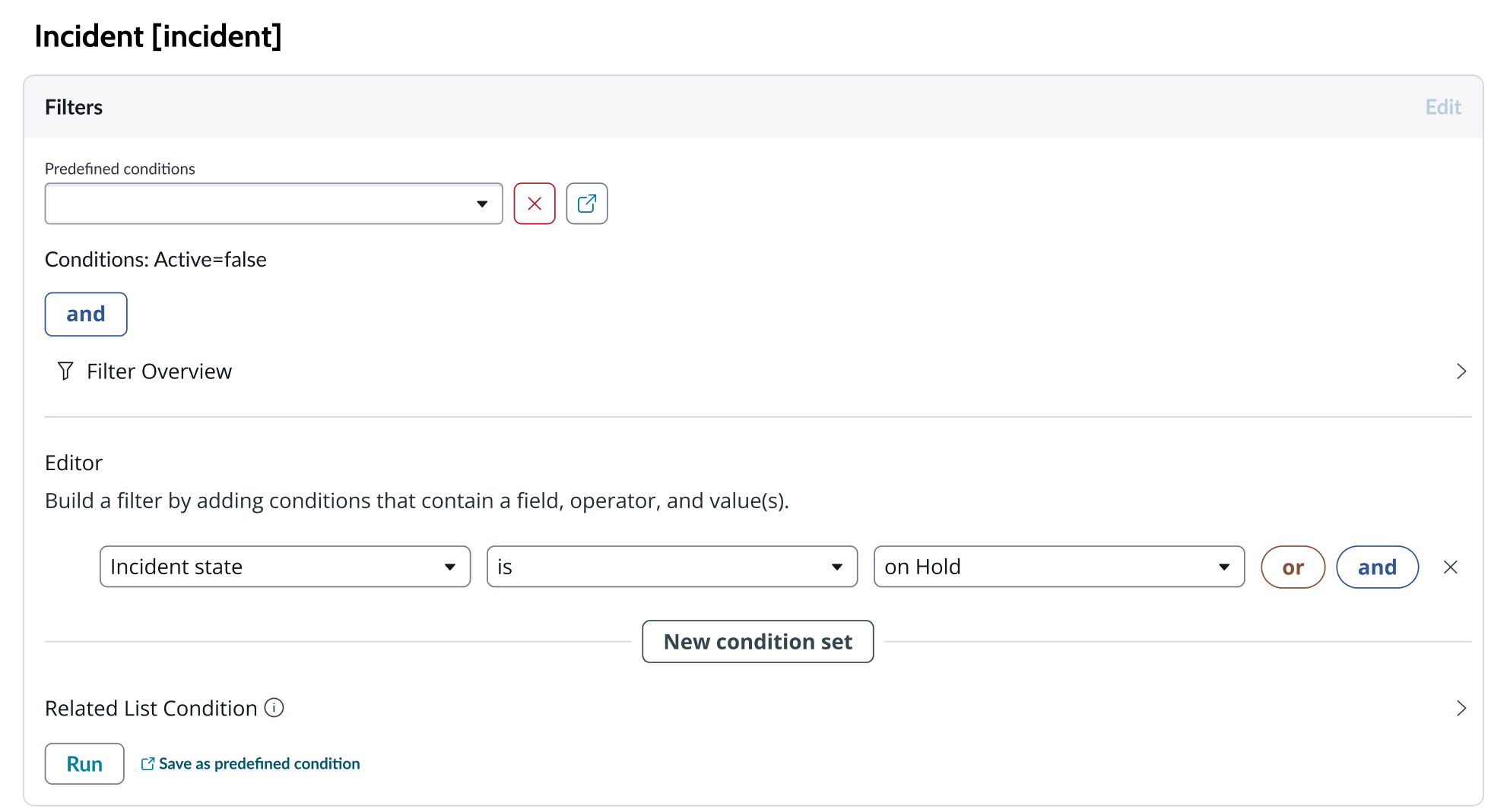
You can select any table from the system to use in your visualization and filter that data. When you apply a table as the data source, a preview list appears showing all available records in that table.
A condition builder above the list enables you to set filter conditions on the data before using it in your visualization. This is useful for limiting the data shown in the chart to only the data you need.
Indicators
Indicators are preconfigured business metrics that assess performance across attributes such as cost, quality, technical risk, investments, user satisfaction, and business value. Indicators are configured in the Performance Analytics application and reflect common measurements that users need. If breakdowns are defined for an indicator, you can apply filter conditions on those values.
Data snapshot indicators
Data snapshot type of indicators enable intraday collection and analysis, filtering by breakdown hierarchy, with the ability to report partial scores.
Key features:
- Move beyond daily snapshots: Collect and analyze data multiple times throughout the day (intraday) for granular insights.
- Breakdown hierarchy: Filter through hierarchical structures (department to team to individual) to pinpoint issues and identify trends at any level.
- Partial scores: Track progress toward goals mid-period in order to take corrective action early instead of waiting for periods to close.
- Deeper insights: Drill down through multiple dimensions to uncover hidden patterns.
- Simplified setup: Create fewer, more generalized indicators.
- Dynamic filtering: Apply breakdowns on-demand without preconfiguration.
- Reduced maintenance: Fewer indicators mean less ongoing work.
Usage Insights
Usage insights are the user experience analytics data points: events, page views, sessions, and users.
Telemetry
Use this data source to visualize telemetry KPIs and trends from the Telemetry Data Connector (traces/metrics/logs) in Platform Analytics.
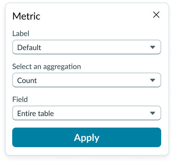
Metric selection
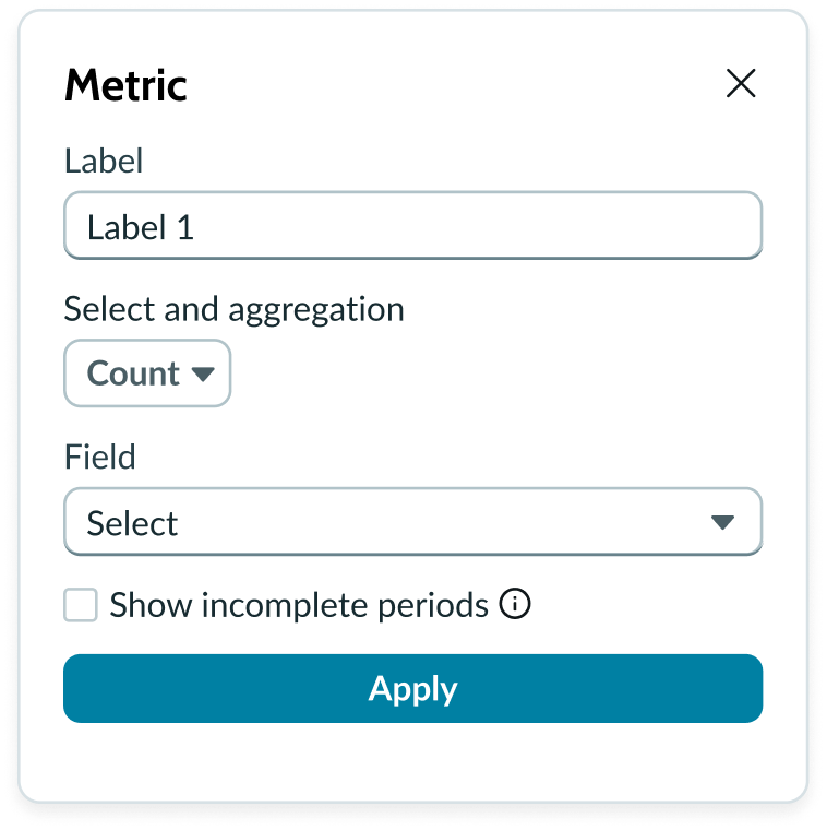
Select the specific data from the data source to display in the chart and the label that identifies it. Select an aggregation type from the dropdown list. You can select a specific field from the data source table to display in the chart. If you leave the field empty, all fields are used, depending on any filtering conditions you applied when you selected the data source.
Show incomplete periods
For Data Snapshot indicators only. To provide users real time progress tracking, for each “Metric” you can select the “Show incomplete periods” setting to display scores for the current, incomplete period to track progress.
Date range
For indicators source, you can use the “Apply date range” setting to apply a date range filter from filter component or manual configuration to the visualization.
Auto aggregation periods
For Data Snapshot Indicators, when you use a date filter the best aggregation period is selected. Affects only this visualization and does not change the indicator's default aggregation period. Clear the checkbox to always use the indicator's default period.
Header and border
The component header displays along the top and contains the title you give the visualization. By default, the header is configured to show, but the content is empty.
Visualization border
By default, a border around the chart. Unselect the “Show border” option to remove it.
Header separator
You can add a separator line between the header and the visualization. Disabled by default.
Chart title
By default, the chart title is blank, but you can add a title. When you add a title for your chart, you’re able to customize the color and make it wrap.
Header level
By default, text in the header is set to heading level 2 (H2). Heading levels H1 through H6 are also available.
Title alignment
By default, the title is aligned to the Start side. The start size can be the left or right depending on the language you use. Other options available from the dropdown are “Center” and “End”.
Title wrap
By default, long titles truncate with an ellipsis, and a tooltip showing the full title on hover, but you can set the title to wrap instead.
Title truncation
By default, the title text truncates at the end of the first line of text, but you can set the line of truncation to 2 or 3 lines instead. This option becomes available when the title truncates.
Refresh option
By default, refresh is available to the user in the “More options” menu, but you can hide it. This gives you more control over how refresh options are exposed on dashboards so you can align refresh behavior with your intended usage.
Header background color
By default, the color of the header background is neutral-0 (white). You can specify a different color (including a custom color) for the background.
Select a color for the visualization header background that aligns with your dashboard theme, branding, or design preferences. The color you choose applies only to the visualization header background.
For better accessibility, make sure a good color contrast exists between the header background and title text. The minimum contrast requirement for normal text is 4.5:1, and for large text is 3:1. To verify, check the contrast ratio in the color picker.
Note: Theming is not supported when you select a custom color.
Title color
By default, the title text is neutral-21 (black). You can select a different color (including a custom color) for the title text.
You should select a color for the chart title that aligns with your dashboard theme, branding, or design preferences. The color you choose applies only to the chart title.
For better accessibility, make sure a good color contrast exists between the header background and title text. The minimum contrast requirement for normal text is 4.5:1, and for large text is 3:1. To verify, check the contrast ratio in the color picker.
Note: Theming is not supported when you select a custom color.
Additional settings
Available settings can change based on the type of indicator(s) you select.
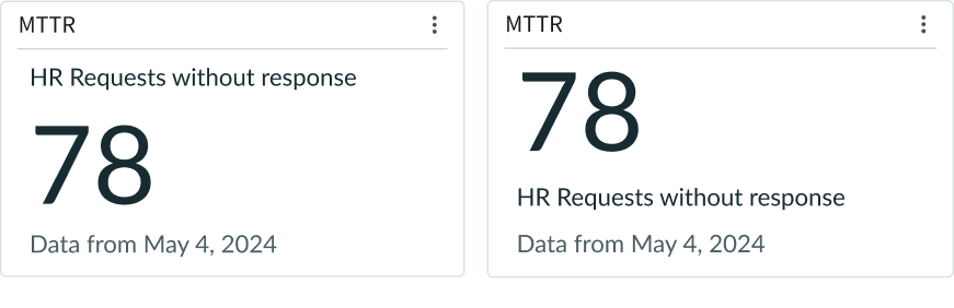
Metric label
You can show or hide the metric label for basic and advanced simple charts. The label for advanced charts can only appear at the top of the chart. However, you can place the label at the top or the bottom of basic simple charts.
Score update time
Use to display the time of the last update of the chart.
Show zero
For basic single score visualizations, when you use the table data source type you can choose to display zero “0” instead of "no data" for an empty state. This is typically used for metric "count" of records when no data and zero “0” have the same meaning.
Wrap elements
By default, when a single score chart element exceeds the width of the container or content area, the text truncates with an ellipsis, and a tooltip shows the full content on hover. If you prefer, you can have the single score element wrap instead.
Trend indicator
By default, a single score chart that uses an indicator data source displays the change in the value over time and the percentage of that change. An arrow icon indicates the direction of the trend. You can configure the chart to show or hide the change value and the percentage.
Show change
For Performance Analytics Indicators you can hide or show the change compared to the previous score or period. Shown by default.
Change %
For Performance Analytics Indicators you can hide or show the change percentage compared to the previous score or period. Shown by default.
Show change from
For Performance Analytics Indicators, use to choose whether the single score change is calculated comparing to the previous score or the period start. Default is “Previous value.”
Target
For Performance Analytics Indicators, shows the global target value. Must be defined for the Indicator to show. Shown by default.
Gap %
For Performance Analytics Indicators, shows the percentage between the current value and the target value. Shown by default.
Sparkline
For Performance Analytics Indicators, a sparkline is a small data visualization subcomponent that measures values over time in the form of a simple area chart. A sparkline doesn’t have an x or y axis or grid lines. By default, the sparkline shows and the target is represented by a line on the sparkline graph.
Note: A sparkline chart is only available for Performance Analytics indicators and appears by default below the score.

Score date
For Performance Analytics Indicators, the date of the score is shown by default.
Data update
Use these settings to configure how and when the chart data is updated.
Filters
You can configure data visualization to allow the use of individual chart filters and have a chart use the filters set on that workspace page. Filters set on the data source always run on the component. The “Follow filters” property, which is enabled by default, applies any filters set on the workspace page in addition to those set on the data source. Unselecting the “Follow filters” option prevents any filter input from the workspace page.
Filter icon
The filter icon and the number of filters impacting the visualization display by default. To hide them, unselect the “Show filter icon.”
Data drilldown
You can configure the chart to enable users to drill down into data directly by selecting the score. This enables users to view data such as records and record lists from data tables or KPI data from indicators.
Refresh after being away
You can configure your chart to update automatically.
Refresh requested
When the new value of this property is different from the previous one, you can trigger refresh by setting up a string that can be passed down.
Use data cache
You can cache user queries to shorten the load time for the data visualization. Unselected by default.
Info messages
By default, generic error messages display.
Extended error messages
You can choose to show extended error messages which contain more details that can be helpful to admins. Unselected by default.
Custom no data message
By default, when a data source doesn’t return any info, the “no data available” message displays with generic content. However, you can set a custom message by changing the title, illustration, and message content.
Presentation properties
The presentation properties control the physical appearance of the chart. Use these properties to control how your users consume the data.
Display settings
You can use the following to modify the display of the data visualization.
Score alignment
Aligns all single score visualization content to the starting edge, center, or ending edge of the visualization. Default is “Start.”
Sparklines occupy the entire width and don't change with the alignment.
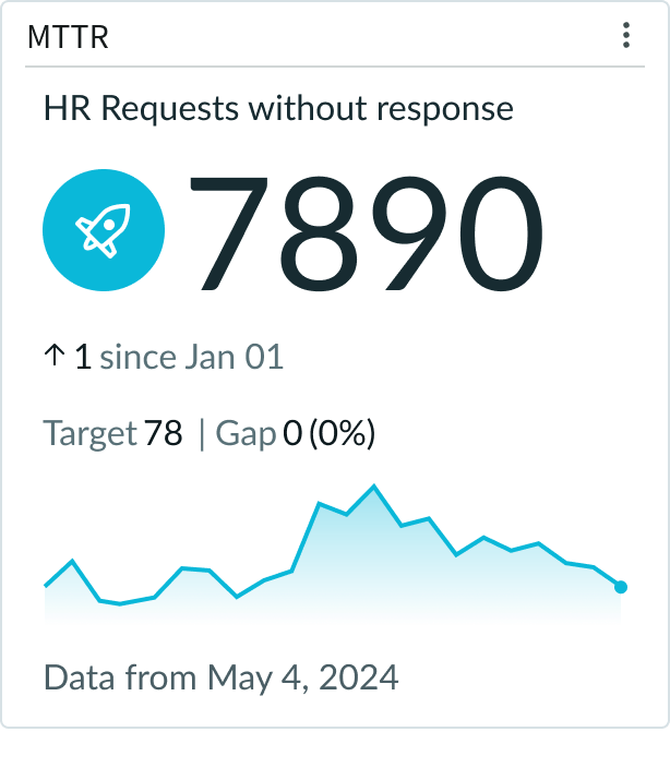
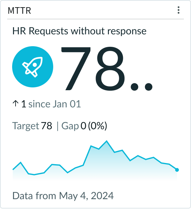
Score size
Configure the display size of the score in your single score chart. The size you use depends on the type of single score, the surrounding content, and how prominent you want the score to appear. Avoid using large score values that expand beyond the container width and truncate. Instead, adjust the font size so the score fits in the space available. The choices are Auto, XS, S, M, L, XL, and XXL. The default size is medium (M). Auto is a responsive size based upon the size of the widget and other single score properties enabled.
In this example, the score in a single score chart is displayed in the large (lg) size.
Sparkline style
When you choose to dispay the sparkline chart, by default, it is displayed as a line with the area between its points and the horizontal axis colored in. If you prefer, you can display the sparkline a line without the colored in part.
Note: A sparkline chart is only available for Performance Analytics indicators and appears by default below the score.
Score icon
You can select an icon that displays on the left of the score value.
Icon style
When the score icon you choose has a background, you can have the color applied to either the background or to the icon itself. Otherwise, the color is applied to the icon.
Colors
You can customize the colors used for your single score visualization. For the single color selection, a color picker provides a list of predefined colors in a dropdown list for the chart color and the icon color. Color selection options differ slightly, depending on the visualization selected.
Score color
You can configure the score color for all charts or define a color rule that changes the color based on conditions you define. For charts that use Performance Analytics indicators as the data source, the "Default" color of the score is determined by the value of the score compared to the target.
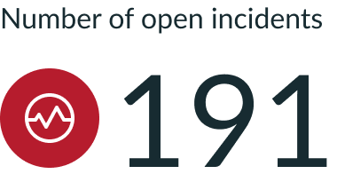
Color rules
Charts using a table as a data source enable you to create color rules for different values. You can add multiple rules to apply different colors to different value ranges.
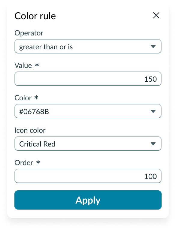
In this example, the rule displays the icon in red when open incidents reach a certain threshold.
Design recommendations
Learn how to apply single score in your design.
Proper sizing of score and score icon with respect to widget size
Incompatible sizes of score and icon with respect to the widget size
UI text guidelines
These are some recommendations for using text within single score:
- Avoid using long labels that expand beyond the container width. Labels don’t wrap and will truncate.
- Adjust the font size of the score so it fits in the space available. Large numbers don’t wrap and will truncate.
Behavior
Learn how single score behaves when the display changes or a user interacts with the component.
Truncation
Scores or labels that extend beyond the content slots or container don’t wrap and will truncate with an ellipsis. If any of the chart values in a content slot truncates, a tooltip shows the complete value on hover.
User interaction
When you configure data drilldown, users can open records directly from single score by selecting the score.
Usability
Single score complies with all internationalization and accessibility requirements.
Internationalization
When a basic single score chart is internationalized to a right-to-left (RTL) language, the chart contents align on the right of the container.
If there is a sparkline in the chart, the trendline retains its left-to-right direction.
Accessibility
Learn how to access the actionable elements of single score through keyboard interactions and screen readers.
Visual
Consider applying a sharp contrast (like a neutral gray fill) to the sparkline to make the chart accessible to all users.
Keyboard interactions
Users can access the chart navigator with these keyboard keys:
- Tab: Moves focus through each handle in the chart navigator
- Arrow up, down, right, left: Moves the handles that control the zoom feature in the chart navigator
Screen readers
When you apply ARIA labels to a component, screen readers announce the controls and content of single score in the prescribed tab order.
Screen readers read the data in the following order:
- Timestamp
- Score
- Trend Change
- Snapshot
- Target
- Gap