

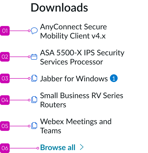
Anatomy
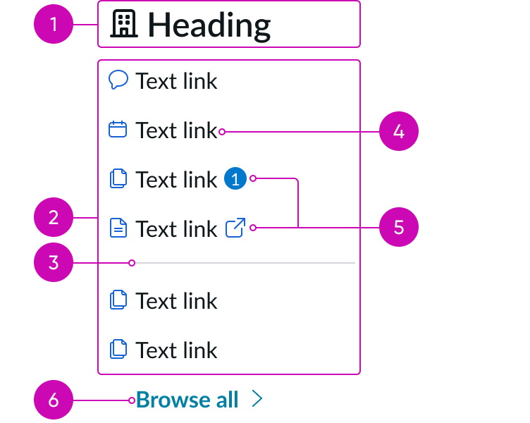
- Header: Provides a short description of the grouping of links; you can also configure the header as a link
- Links: A set of text links that share a common grouping but are linked to individual resources
- Divider (optional): Visual element that helps to visually separate and distinguish link groupings
- Text link: A styled link displayed as a text label; the label represents the title of the page the link is referring to and can include an icon, as desired
- Content slot: Space for a badge or icon after the text link label (but never both)
- “Browse all” element (optional): A visually distinguished element that takes users to a new page or opens an expanded view of the link set; can be either a link or a control
Subcomponents
See usage guidance for text link
Usage
Learn about link set and find out how to use it in your design.
Link set allows you to create sets of links that refer to multiple record types, including catalog items, knowledge base articles, and links to content outside the experience. You can use link sets in multiple contexts and within other components, such as canvas menu and canvas footer.
See usage guidance for canvas menu
See usage guidance for canvas footer
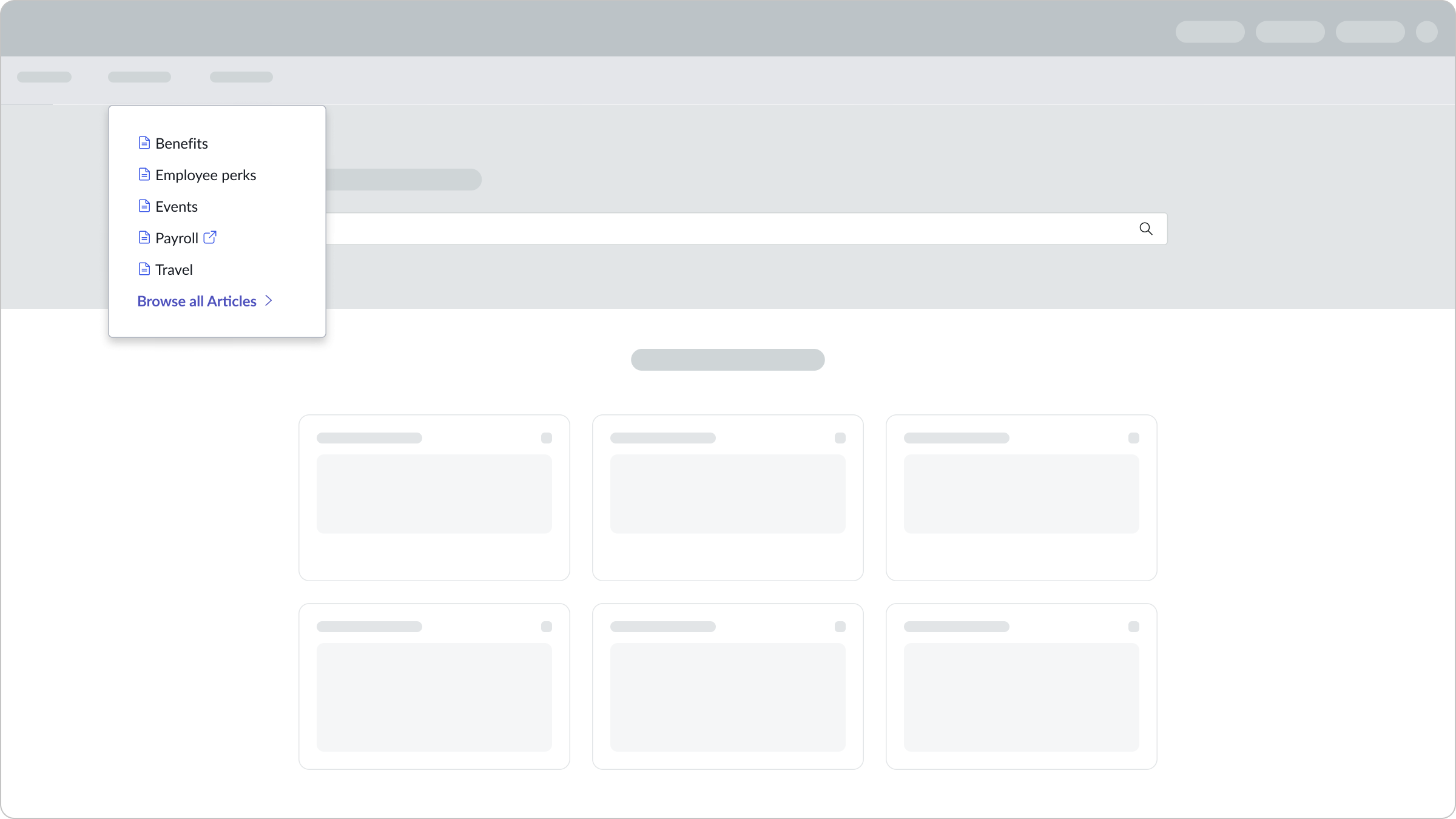
In this example, the link set component appears within the canvas menu.
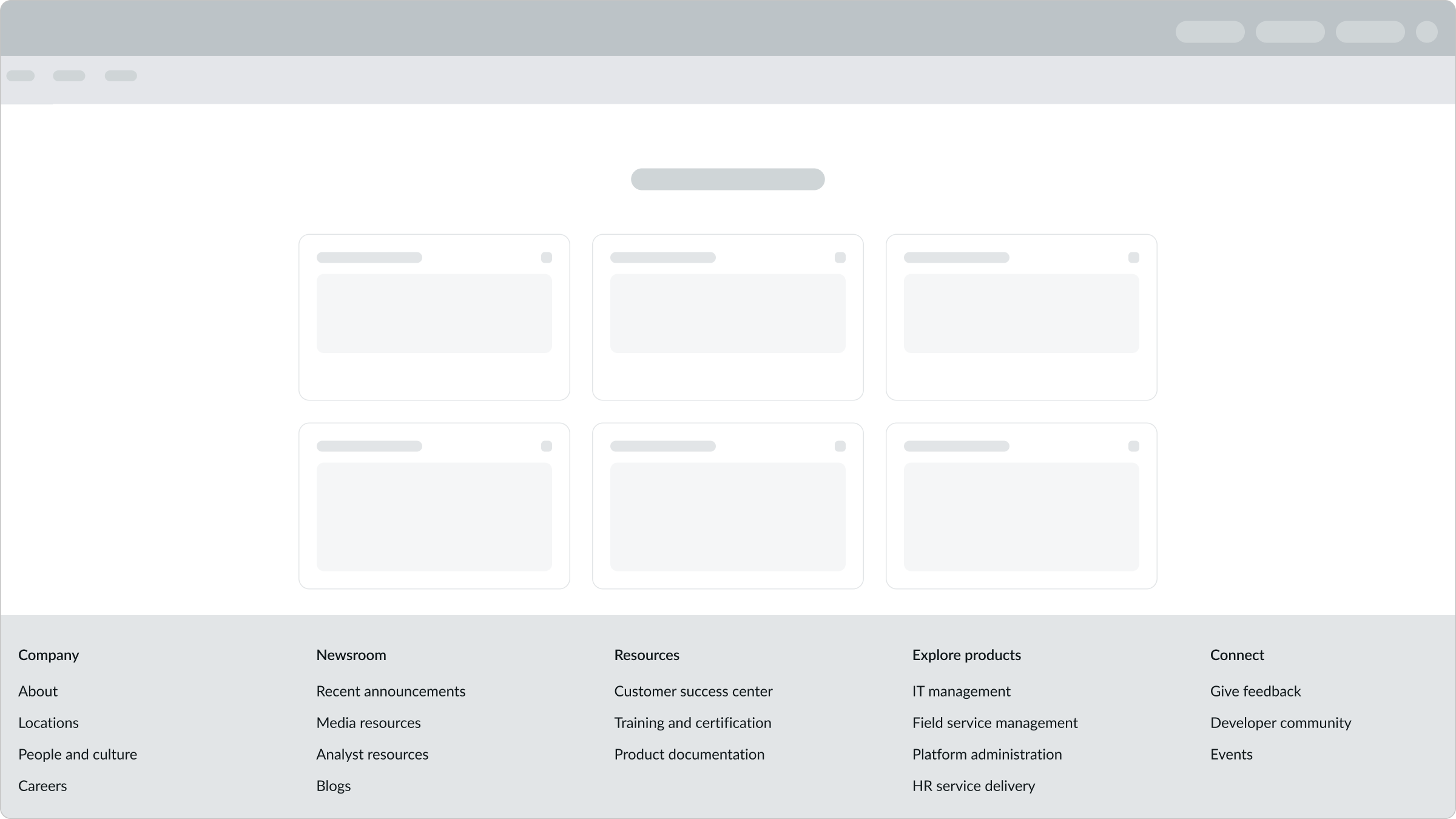
In this example, the link set component appears within the canvas footer.
Variant
Learn about the variants of link set.
Sizes
Link set doesn’t have any specific sizes. The height of the link set can grow to accommodate however many text links you choose to include in the link set. The header and icon combination can have two sizes: medium and large.
Configurations
Learn how to customize link set by configuring the available properties.
Header icons
You can configure the size of the header and its icon.
| Size | Example |
|---|---|
| Large |  |
| Medium |  |
You can also use an illustration instead of choosing the large or medium icon size.
See usage guidance for illustration
You can show these icons in 1 of 2 positions: as a larger icon above the link set title or as a smaller icon to the left of the title.
Header linking
You can also configure the header as a link. The link target should take the user to the same page as the “Browse all” element at the bottom of the link set.
Note: The header won’t change styling if you configure it as a link.
Leading icons
You can include optional icons before the link to help visually differentiate links in a link set. These icons should provide additional context for what a link is referencing.
| Icons | Example |
|---|---|
| With |  |
| Without |  |
Trailing icons
You can configure whether an icon or badge (but never both) appears in the slot after the text link. Use a badge to indicate if something within a specific section needs the user’s attention. For example, you might include a badge next to the link if there is an update or notification that requires the user’s attention. Use an icon to indicate if a link opens in a new tab or window.
Design recommendations
Learn how to apply link set in your design.
Alignment and positioning
By default, all links and the “Browse all” element within link set are left-aligned. An optional indentation is available with a fixed-width container, ensuring that overall alignment with iconography is maintained.
| Icons | Example |
|---|---|
| With | 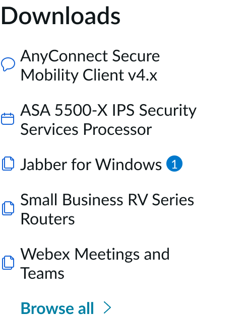 |
| Without | 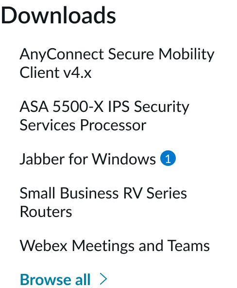 |
UI text guidelines
These are some recommendations for using text within link set:
- Keep all text labels informative and short to increase readability and scanning
- Avoid using unnecessarily verbose titles or titles that don’t accurately reflect the intent or purpose of the content
Behavior
Learn how link set behaves when the display changes or a user interacts with the component.
States
Link set doesn’t have any states. However, the subcomponents within link set have their own states.
Responsive behaviors
Learn how link set responds to changes in a container or display.
Canvas header and footer
In the canvas header and canvas footer components, multiple link sets appear next to one another. As the display gets smaller, the link sets appear on top of one another. You can determine the stacking order within these components by either configuring the link sets to stack or wrap.
Interactions
Learn how link set responds when a user interacts with it.
Selecting a link
The user can select any of the links from the link set. If a link opens in a new window or tab, tell the user by including the “open link” icon in the slot. If the user selects a “Browse all” link, it takes them to a new page with all available links. If the “Browse all” element is a disclosure control, it shows more links in the same view.
Viewing more links
The “Browse all” element within the link set can either take users to a new page with all links available or expand and show additional links. The interaction depends on how you configure this element.
Truncation
The subhead within link set truncates with an ellipsis after 2 lines, and the full text is visible in a tooltip on hover. Avoid truncating a text link because it creates a disjointed experience for the user. However, if you must truncate the text link due to constraints, truncation behavior exists. The text link truncates with an ellipsis, and a tooltip appears on hover to show the full label. If the text label has an underline, it extends with the ellipsis. And if a badge or icon appears in the slot, it shows after the ellipsis.
Usability
Link set complies with all internationalization and accessibility requirements.
Internationalization
When the component is used in a system configured for a right-to-left (RTL) language, the content and subcomponents flip and align on the right. Any names or proper nouns, however, display left-to-right (LTR). Non-directional icons don’t flip during translation. However, directional icons (such as the ‘external link’ icon) flip during translation.

In this example, the link set appears in a right-to-left (RTL) language.

In this example, the link set includes icons and appears in a right-to-left (RTL) language. The directional icon has flipped during translation.
Accessibility
Learn how to access the actionable elements of link set through keyboard interactions and screen readers.
Link set tab order
The tab order moves from the top to the bottom of the link set. This is the order for link set if you configure the subhead as a link:
In this example, the user has the first link under the subhead in the focus state.
Keyboard interactions
You can access the actionable elements of link set with these keyboard keys:
- Tab: Navigates through the links, starting with the topmost link in the tab order
- Shift + Tab: Navigates back to the previous element in the tab order
- Enter: When a link is in focus, it initiates that link
Screen readers
An additional ARIA role is not necessary if all text links are in the standard tab order and have the functions of a text link.
Badges
If you include a badge with a text link in link set, all information must be accessible in a non-visual way. Use the “description” property on the badge component to provide an ARIA label that gives more information about the contents of the badge.
In this example, a badge appears next to the text link to show that there is an update.
Icons with text links
Accompanying icons that are purely decorative (as seen in the heading) don’t need to be announced to screen reader users. Remember to apply aria-hidden="true" to all decorative icons. Determine if icons are decorative, informative, or functional. If it has an action associated with it, then it is functional. If it has information associated with it, then it is informative. If neither, then it is decorative.