

Anatomy
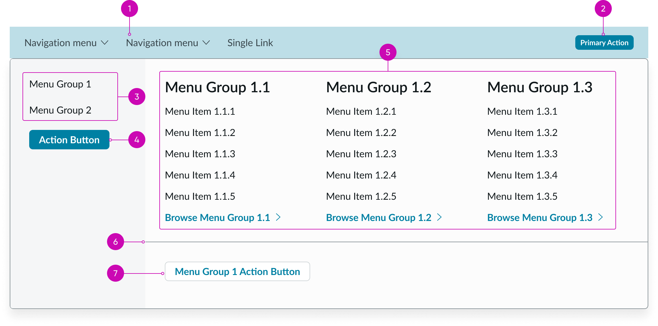
- Navigation items (optional): Enables navigation to relevant pages; each item can link directly to another page or display a panel with additional navigation options
- Primary button (optional): Main action for users as they navigate through the experience
- Topic link set: Options for moving between topics and see different link groups
- Page button (optional): Opens the page for the navigation item
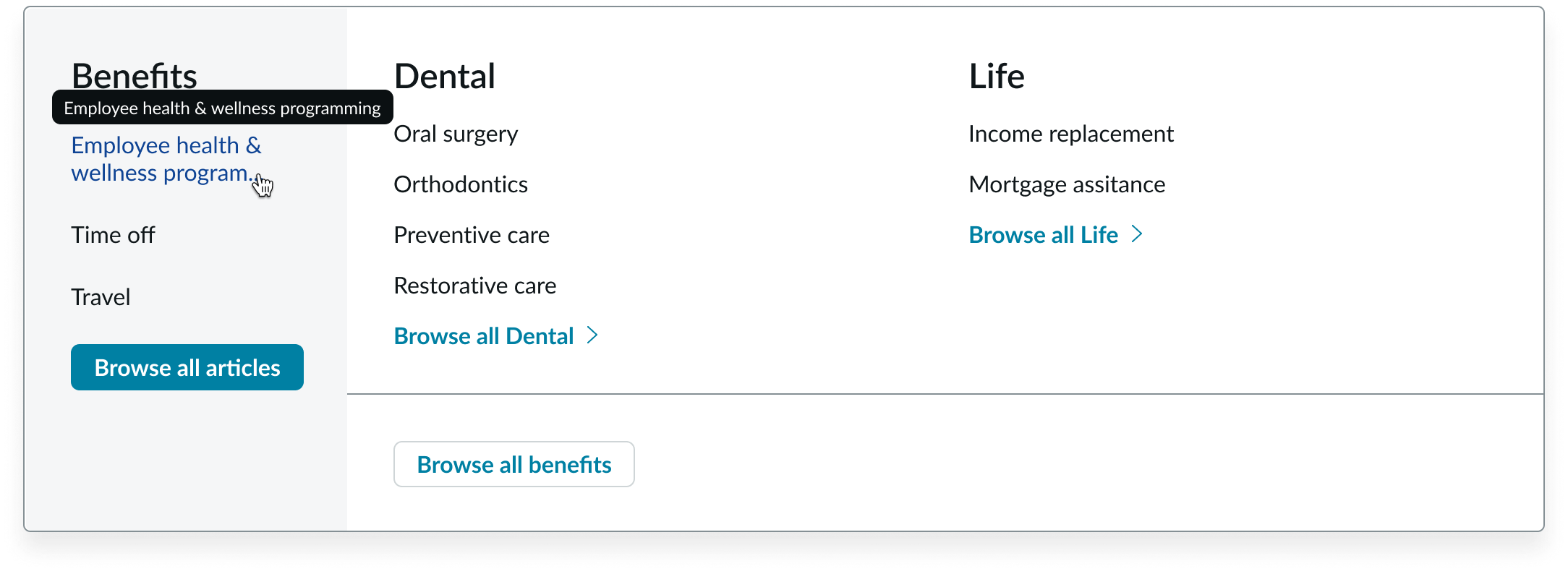
- Category link sets: Groups of links that take the user to pages within and outside of the experience; the link with the chevron takes the user to the category page
- Divider: Visual separator between the link sets and button
- Page topic button (optional): Opens the page topic
Subcomponents
See usage guidance for canvas header
Usage
Use the canvas menu to organize links in an experience. For example, you can use the canvas menu on an employee portal page to help the user navigate to other relevant pages, like benefits or equipment options.
The navigation items help users access other pages, while the primary button can help users take an action or go to another page (like a catalog item). Use the button to draw the user's attention to an important action throughout the experience.

In this example, the 'Create ticket' primary button is the most important action throughout the experience.
Variants
Learn about canvas menu and find out how to use it in your design.
Types
The canvas menu has 3 types: single level, double level, and triple level. The navigation items within the canvas menu are dropdowns, which contain 2 subcomponents: dropdown panel and link set.
You can configure what links appear in each type of canvas menu.
Single level
The single level type only includes a single list of links.
In this example, there is only a single list of links in the canvas menu.
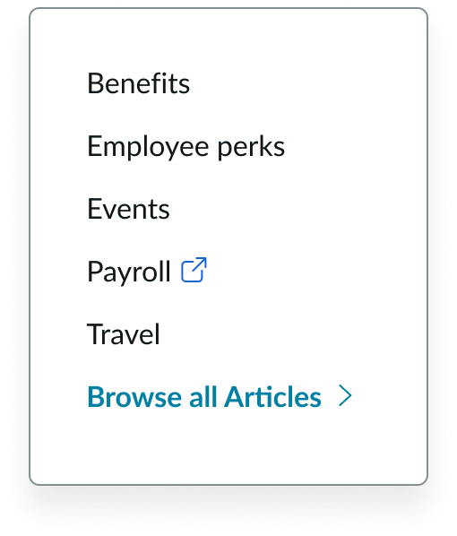
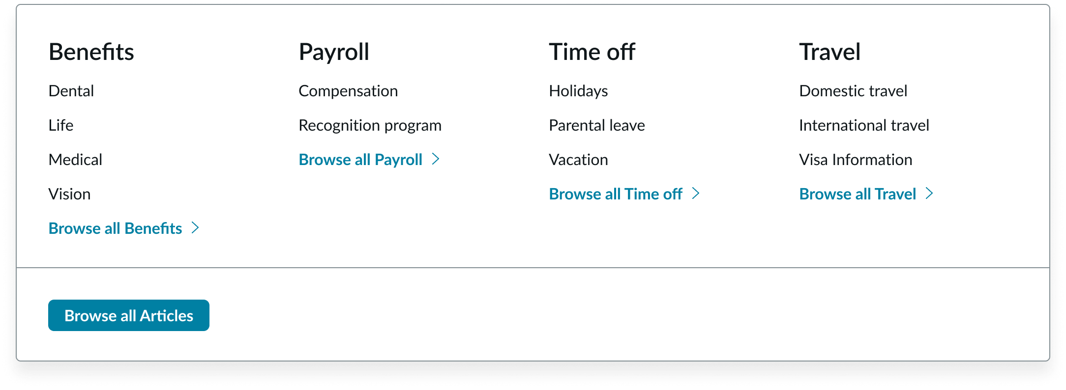
Double level
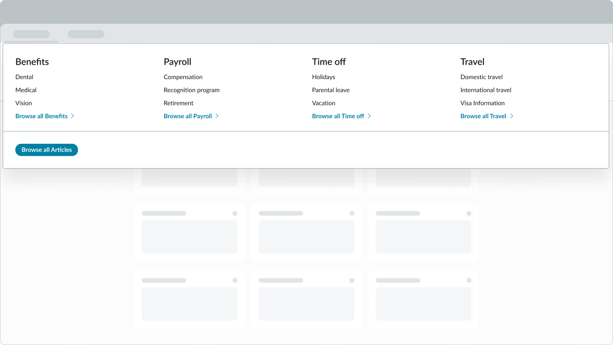
The double level type includes 2 groups of links that go 1 level deep, with an optional button.
In this example, there are 2 groups links in the canvas menu.
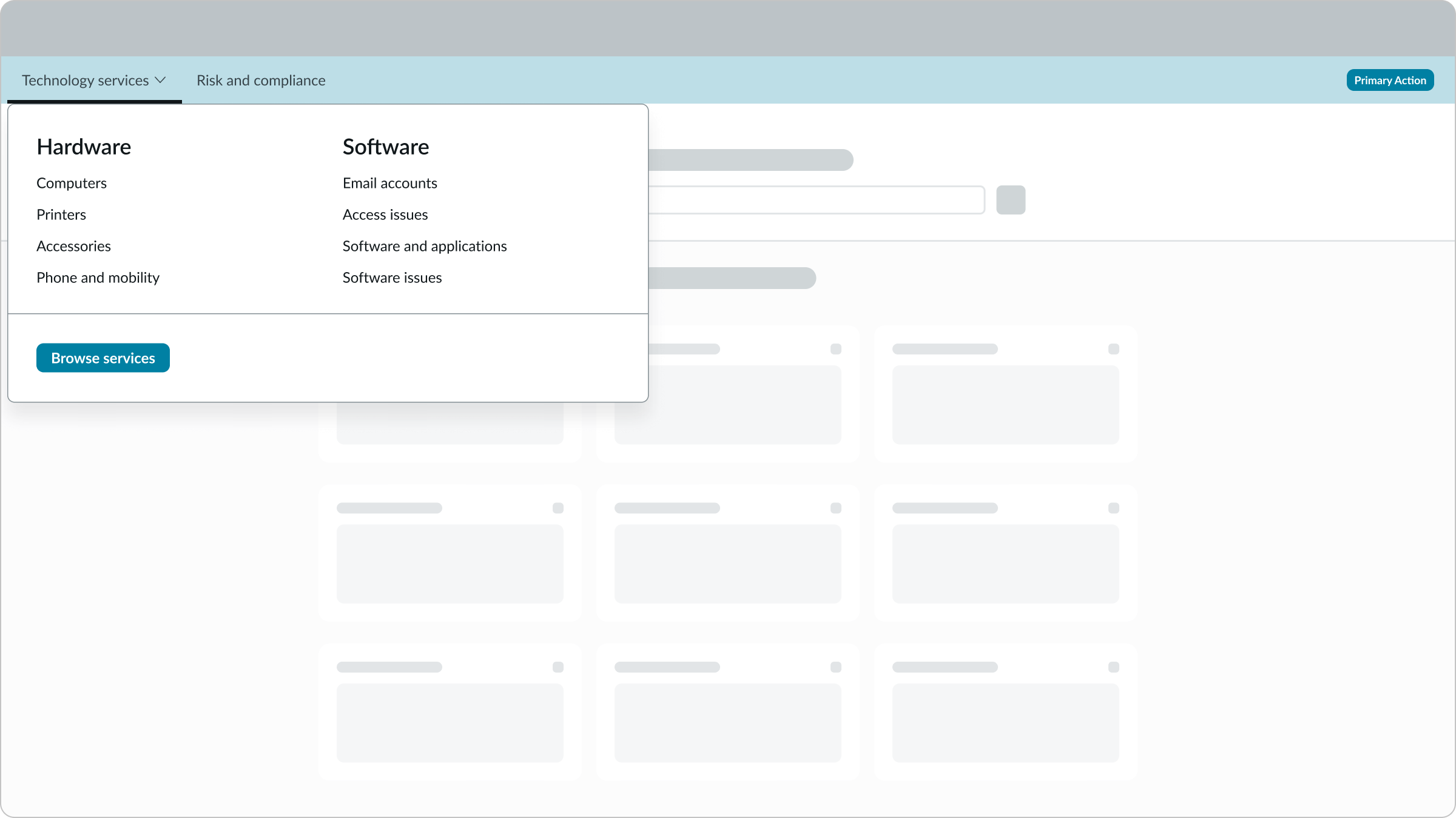
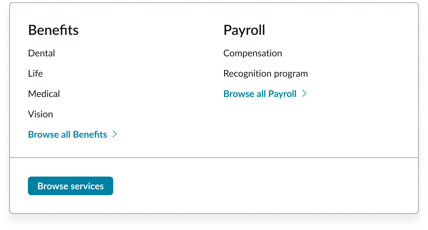
Triple level
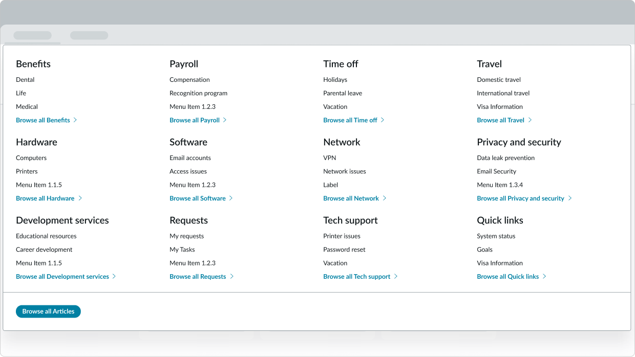
The triple level type includes 3 groups of links that go 2 levels deep, with 2 optional buttons.
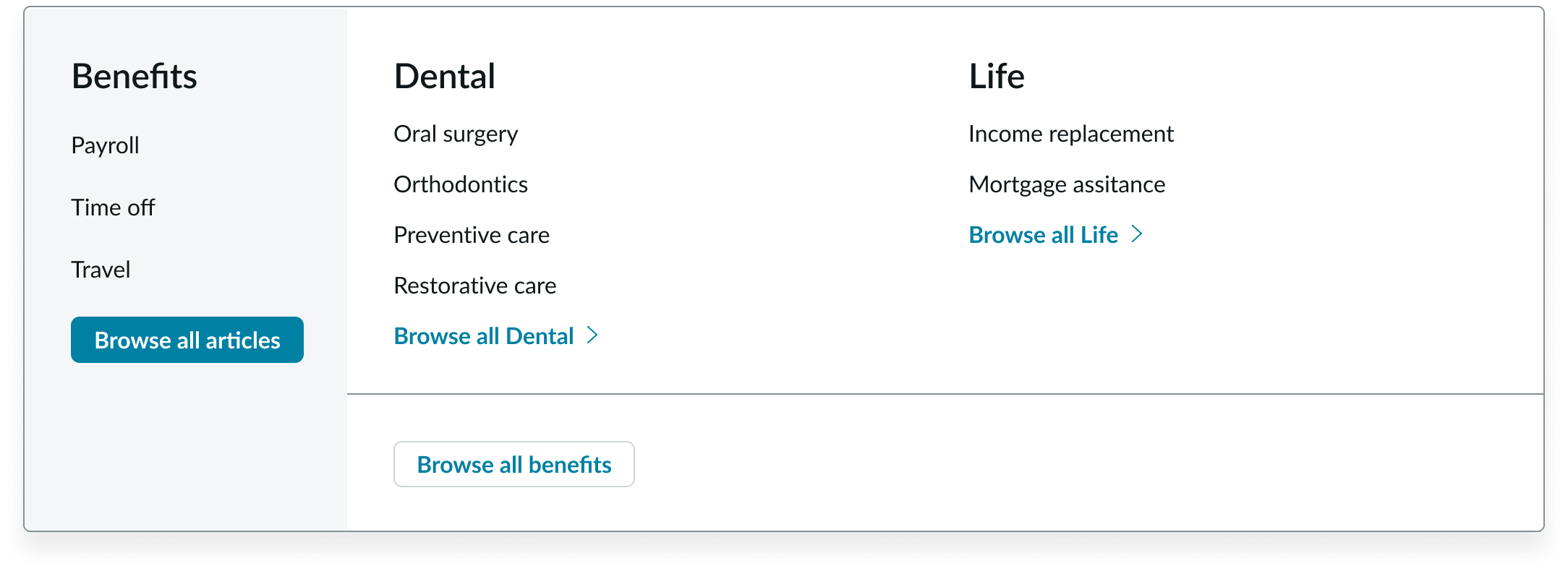
In this example, there are 3 groups of links in the canvas menu.
Configurations
Learn how to customize canvas menu by configuring the available properties.
Primary button
You can configure when the primary button appears in the canvas menu and how to label the button. Remember to choose a label that accurately reflects the action of the button. For example, if the button helps the user submit an issue, you could label the button with "Report issue."
You can show multiple buttons in the canvas header but remember to show only one primary button. Including multiple primary buttons can confuse the user as to which action is the most important.
Browse links and buttons
You can configure when the browse links and buttons appear and customize their labels. Consider only showing the browse links and buttons when the user can go to a topic or category page.
Column wrapping and stacking
You can configure how the link set columns show when they exceed the max width of the menu container.
Wrapping
Another option is for the columns to wrap to a second line when they exceed the width of the container.
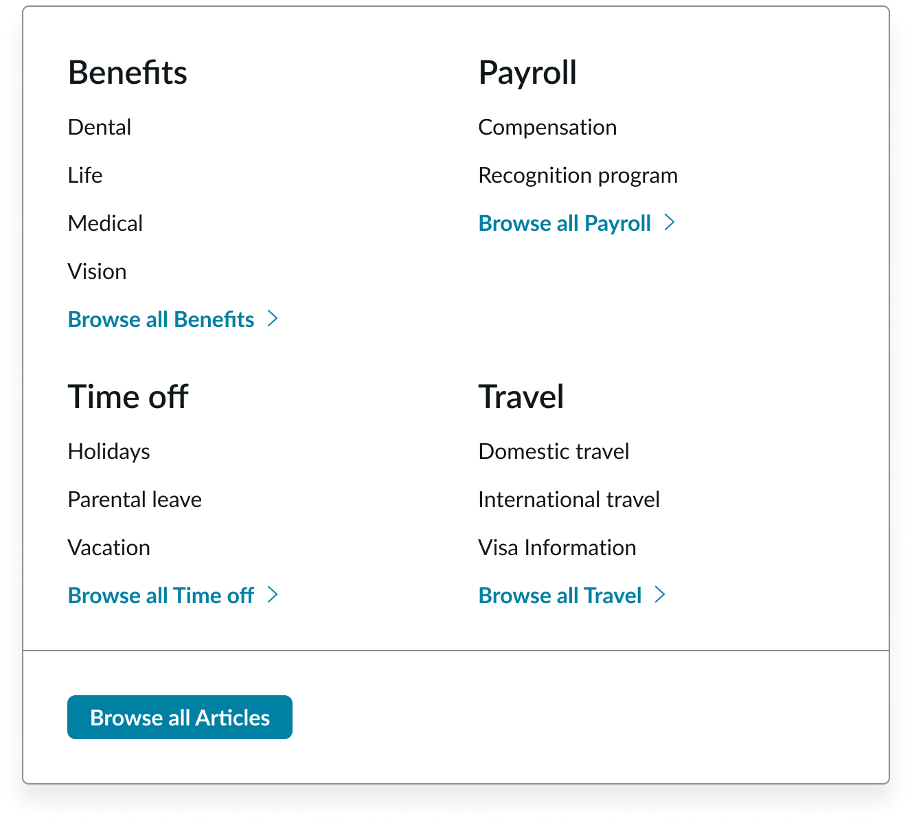
In this example, the categories wrap to the second line.
Stacking
In this option, the columns stack vertically instead of wrapping.
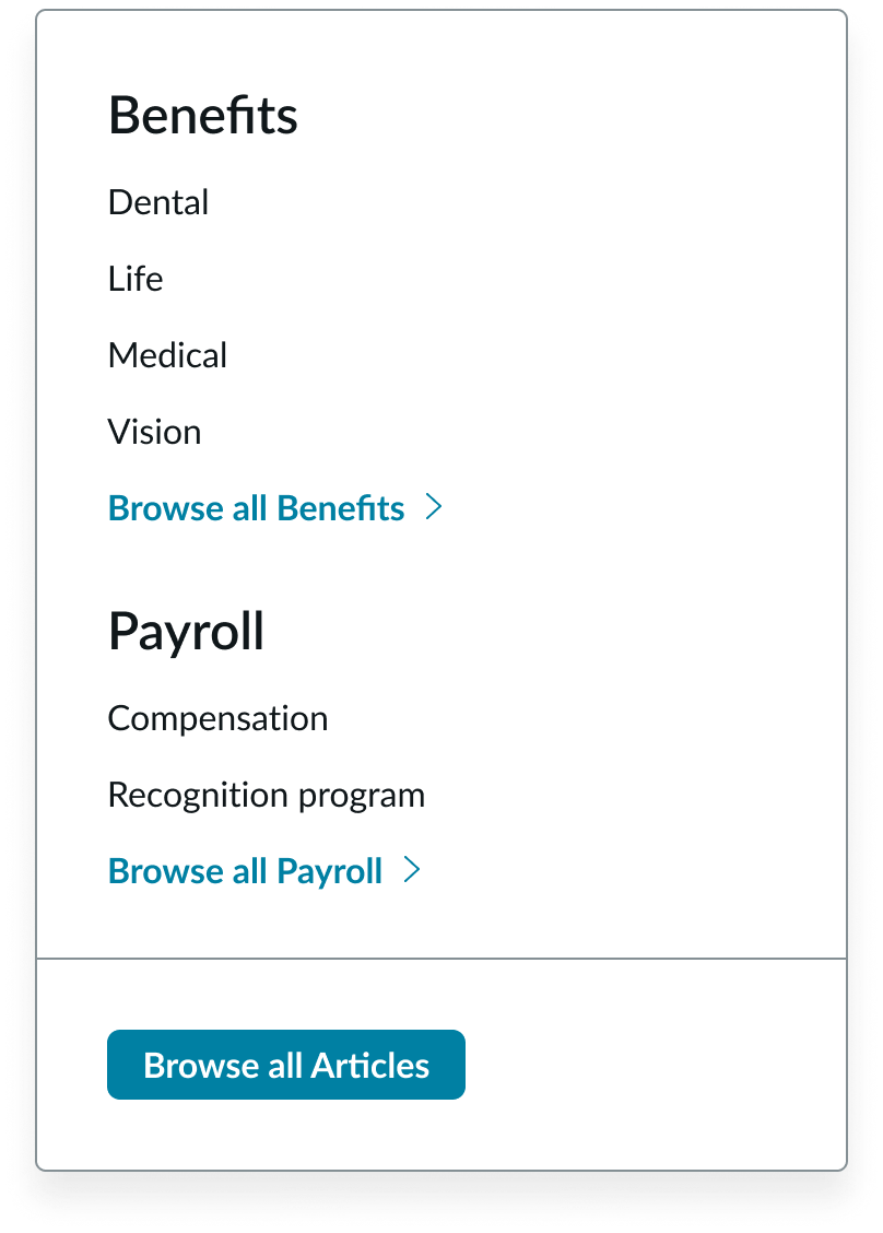
In this example, the categories stack.
Design recommendations
Learn how to use the canvas menu correctly in your design.
Add only the most relevant page categories in the menu so that users can quickly scan all available categories and links
Avoid adding too many page categories in the menu. This can make it difficult for users to find the right category or link.
Alignment and positioning
Always position the canvas menu directly beneath the canvas header.
UI text guidelines
These are some recommendations for using text within canvas menu:
- Use sentence case for all titles, labels, and column headers
- Keep all text labels informative and short to increase
- readability and scanning
Behavior
Learn how the canvas menu behaves when the display changes or a user interacts with the component.
Interactions
Learn how canvas menu responds when a user interacts with it.
Scrolling
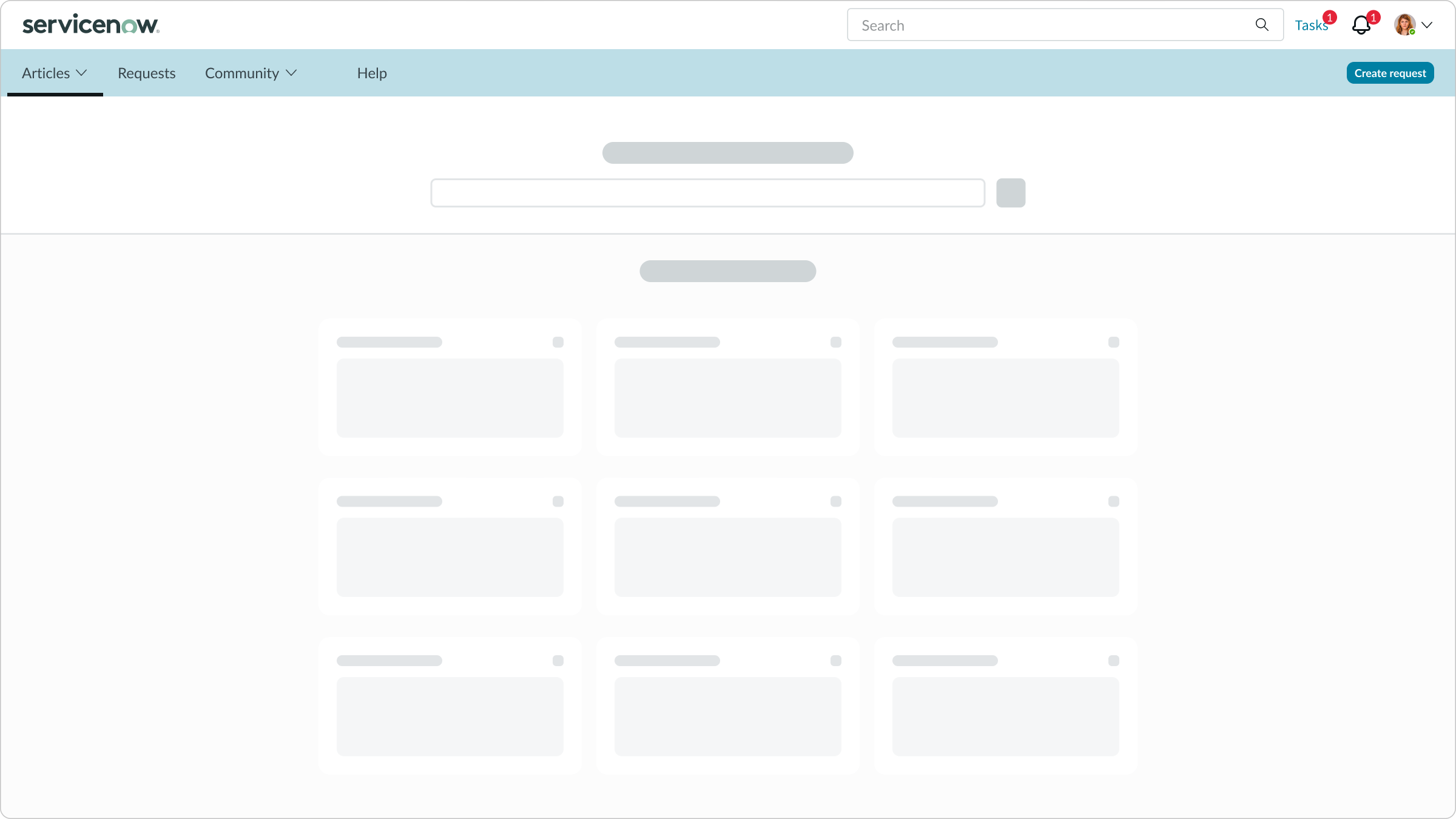
As the user scrolls up or down, the canvas menu stays fixed at the top of the page beneath the canvas header.
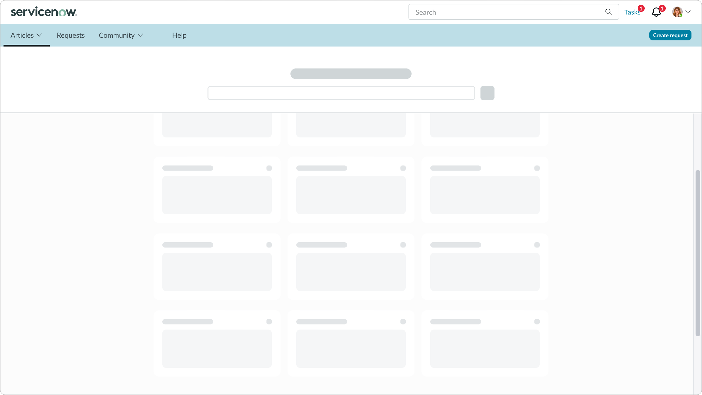
In this example, the canvas menu is fixed at the top of the display beneath the canvas header.
Navigating link groups
When the navigation goes three levels deep, the user can select a page topic to change the page categories and associated groups of links.
Truncation
The labels for the navigation items truncate only if the labels exceed the max width of the container. If a label truncates, the user can view the full text in a tooltip on hover.
For any truncation behaviors for the subcomponents, see their individual usage guidance.
Triple level menus
For this type of canvas menu, the panel and each group of links has a fixed width. If the labels exceed the fixed width, they wrap to a second line before truncating. If a label truncates, the full text is available in a tooltip on hover.
Usability
The canvas menu complies with all internationalization and accessibility requirements.
Internationalization
When the display translates to a right-to-left (RTL) language, the link sets and buttons align on the right of the column in the panel.
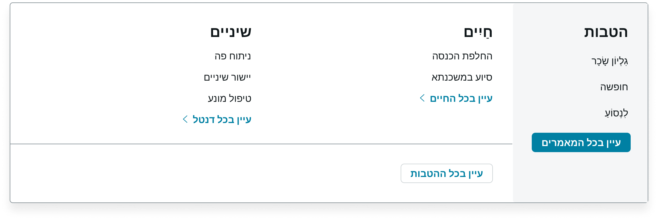
RTL translation for the canvas menu
Accessibility
Learn how to access the actionable elements of the canvas menu through keyboard interactions and screen readers.
Canvas menu tab order
This is the high level tab order for canvas menu.
This annotated image shows the tab order for canvas menu.
Keyboard interactions
You can access the actionable elements of the canvas header with these keyboard keys:
When focus is on a navigation item:
- Enter or Space: Initiates the action or opens the menu and keeps the focus on the element that opens the menu
- Home: Moves focus to the first navigation item
- End: Moves focus to the last navigation item
- Tab: Navigates to the next actionable item in the navigation
- Shift + Tab: Moves focus to the previous actionable item in the navigation
When the focus is on the link or button: - Enter or Space: Initiates the action
When the focus is on an item in the menu: - Enter or Space: Initiates the action
- Arrow up, Arrow down, Arrow right, and Arrow left: Moves focus among the items within the menu; if focus is on the last item, then it moves focus to the first item (if enabled)
- Home: If arrow-key wrapping is not enabled, it moves focus to the first item in the open menu
- End: If arrow-key wrapping is not enabled, it moves focus to the last item in the open menu
- Escape: Closes the menu in focus and returns focus to the element that opens the menu
- Tab: Closes the menu and navigates to the next actionable item outside of the menu
- Shift + Tab: Closes the menu and navigates to the previous actionable item outside of the menu
This is the tab order for moving focus between in canvas menus:
If focus is on the last item, then it moves focus to the first item (if enabled).