

Anatomy
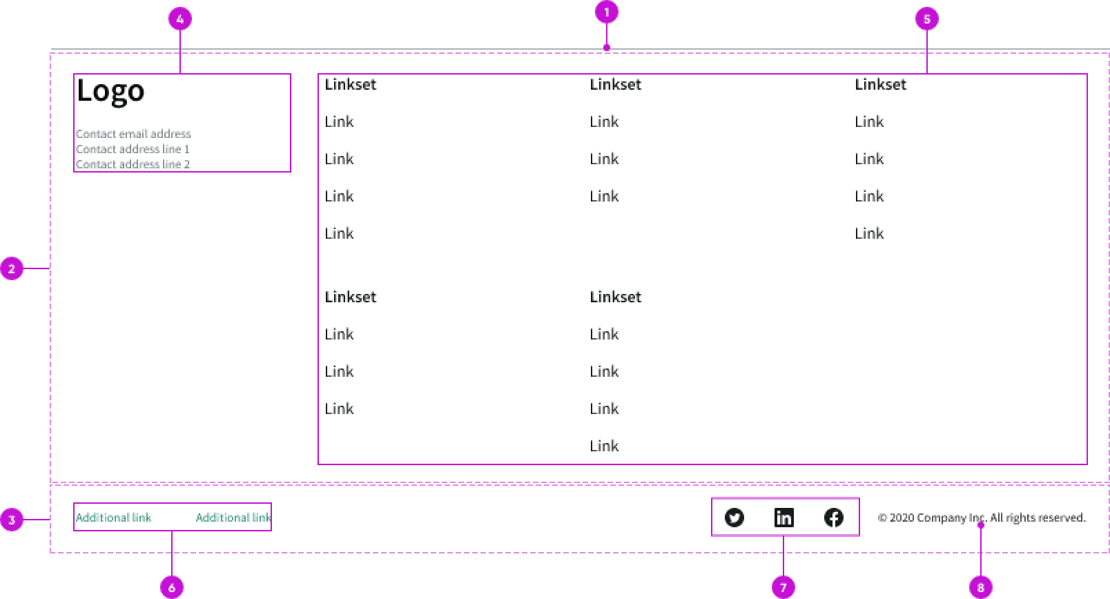
- Divider: Visual separator to distinguish the footer from the rest of the page content
- Footer (optional): Section that contains a content area and link set groups for navigation
- Base footer: Persistent section that contains the links, social media icons, and copyright information
- Content area (optional): Brand logo and contact information
- Link set groups (optional): Links that provide navigation options
- Text links (optional): Links to internal or external pages
- Social media icons (optional): Iconic buttons that take the user to social media sites
- Copyright information (optional): Configurable static text
Subcomponents
See usage guidance for link set
See usage guidance for text link
Usage
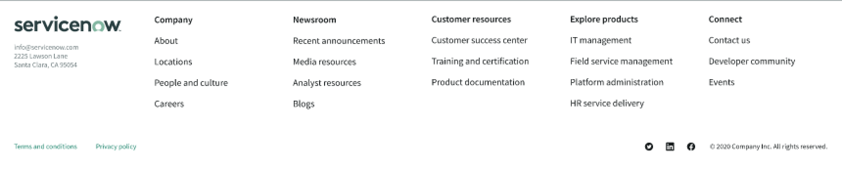
Use the canvas footer to provide information or links that the user may be looking for. This can include contact information, an abbreviated sitemap, secondary links to company details, or social media profiles.
Remember that the canvas footer appears on all pages, so include content and links that are applicable regardless of the page a user is viewing. However, don't use the canvas footer as a catch-all area for miscellaneous content or links.
Configurations
You can configure what appears in the canvas footer.
You can include contact information and navigational links, which offers users additional site navigation at the bottom of the page.
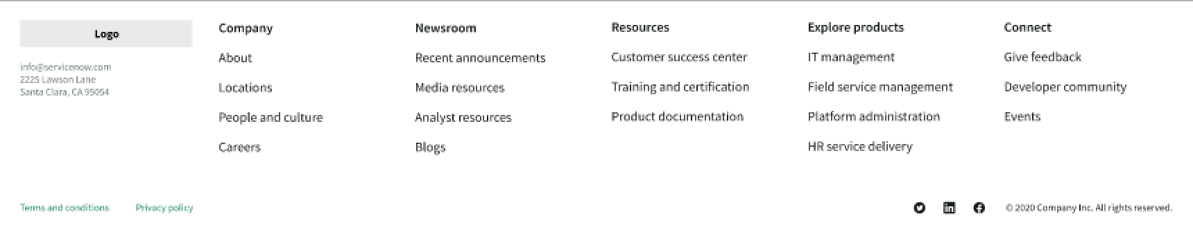
If you decide to not include the content area, the link set group spans the entire top container.
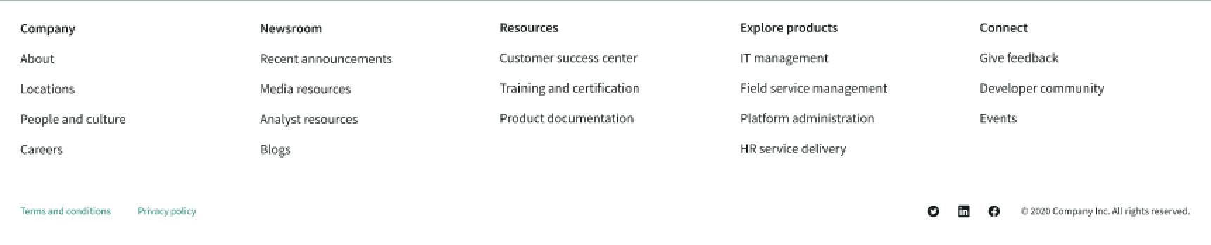
You can also choose to show only the base footer with a few links.

Link sets
You can configure which groups of links appear in the footer. You can determine what links to include based on the type of experience you are creating.
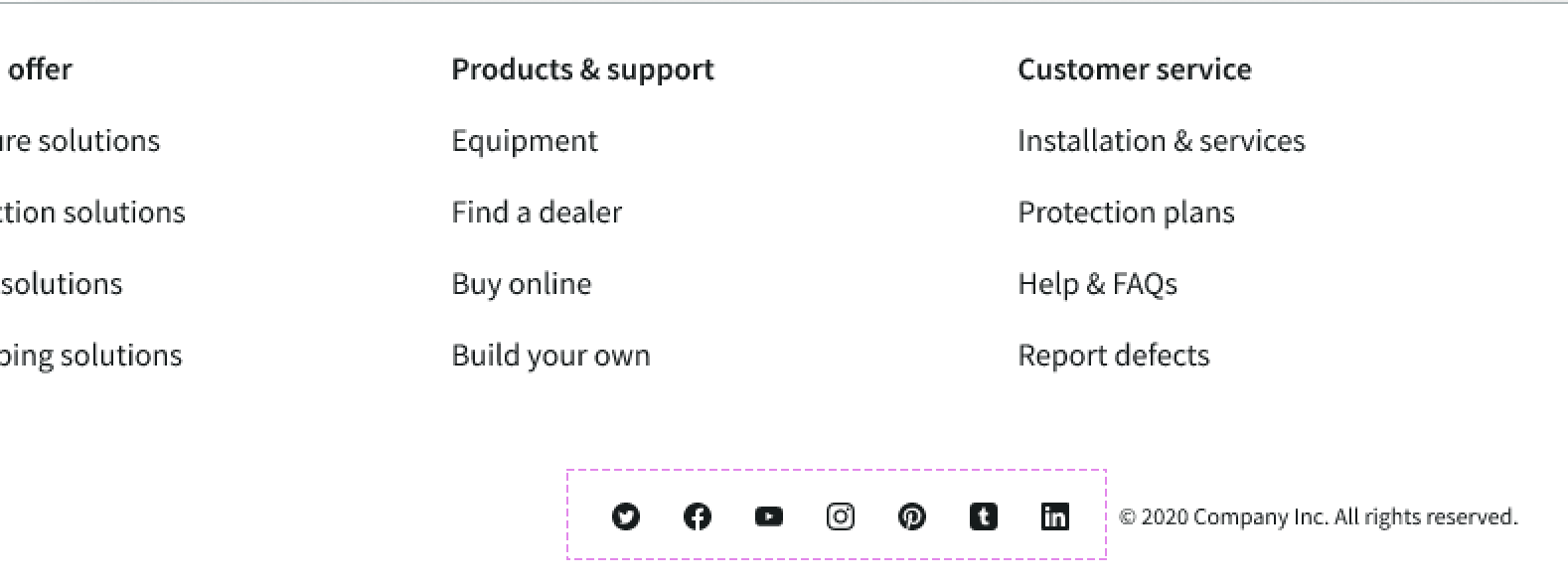
Social media icons
You can configure what social media icons appear in the canvas footer. You can add up to 7 social media links to the bottom container. The canvas footer component currently supports the following social media: Twitter, Facebook, YouTube, Instagram, Pinterest, Tumblr, and LinkedIn.
Design recommendations
Learn how to apply canvas footer in your design.
Keep footer navigation clean and concise with links to important or frequently used content that might be useful on every page.
Avoid adding unnecessary links and information in the canvas footer. Too many links or too much information may overpower the main content on the page.
Alignment and positioning
You can't configure the alignment or position of the canvas footer. It always appears at the bottom of the page.
UI text guidelines
These are some recommendations for using text within canvas footer:
- Use sentence case for all link labels and column headers
- Keep all link text labels informative and short to increase readability and scanning
Behavior
Learn how canvas footer behaves when the display changes or a user interacts with the component.
States
Canvas footer doesn't have any states. However, the link sets within canvas footer have their own states.
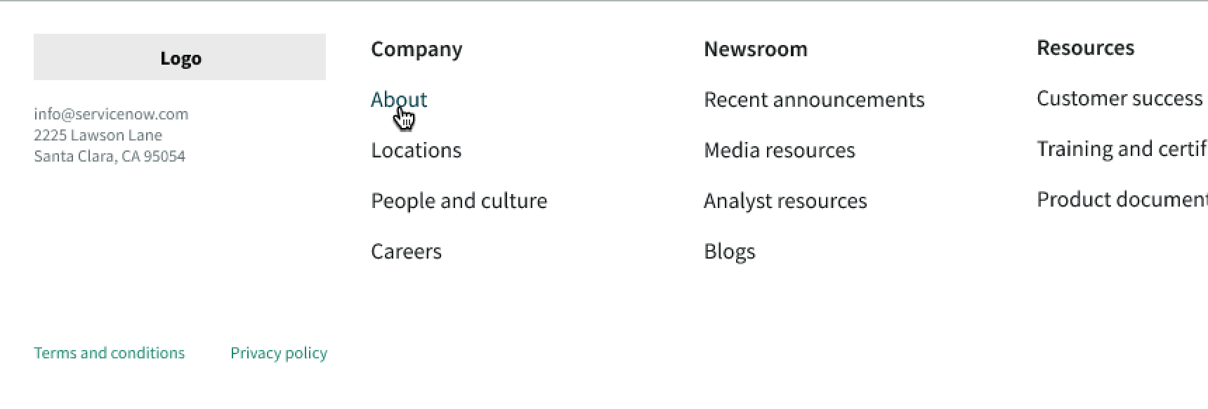
In this example, the link has changed color and shows an underline because the user is hovering over the "About" link.
Responsive behaviors
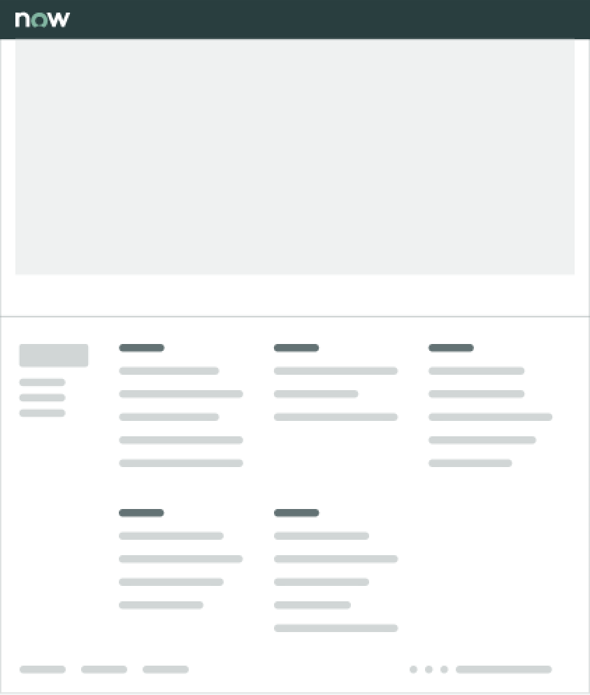
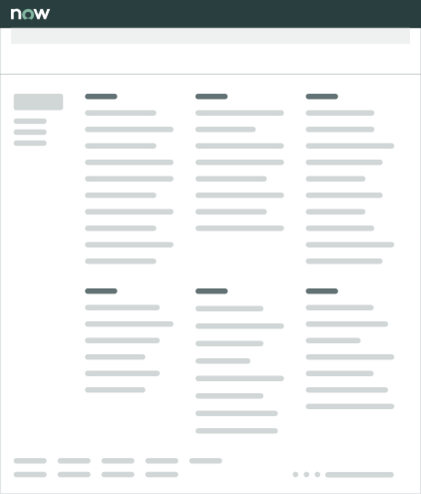
The canvas footer either center aligns with the page content or goes edge-to-edge depending on the display size.
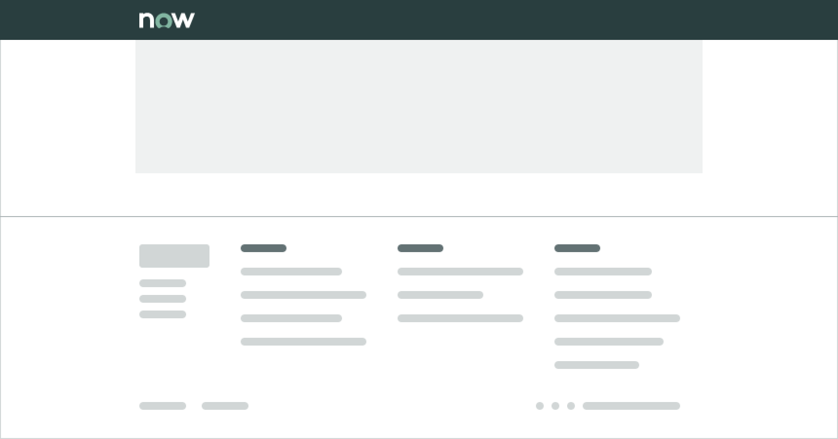
In this example, the canvas footer center aligns with the content because of the display size.
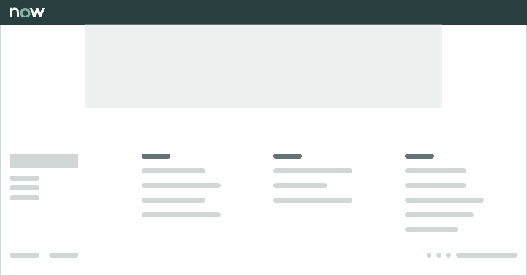
In this example, the canvas footer goes edge-to-edge because of the display size.
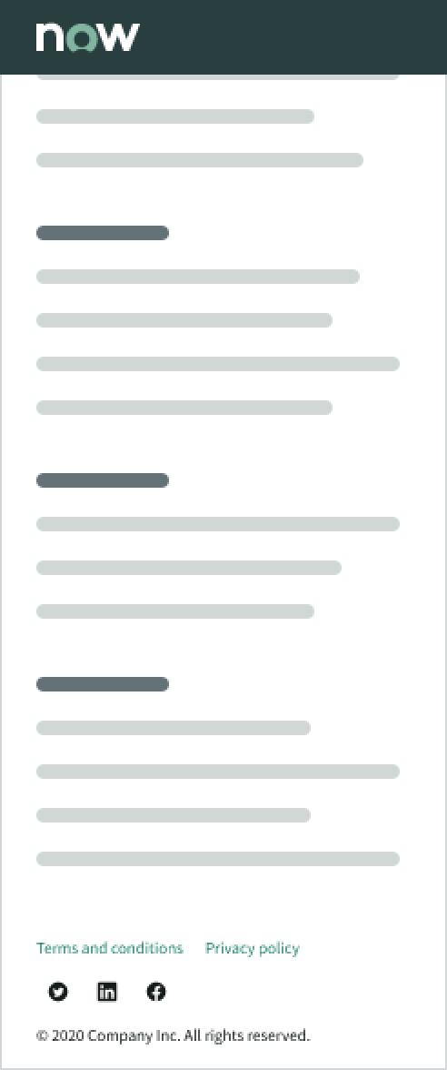
Additionally, the link sets wrap to a second line for narrow displays.
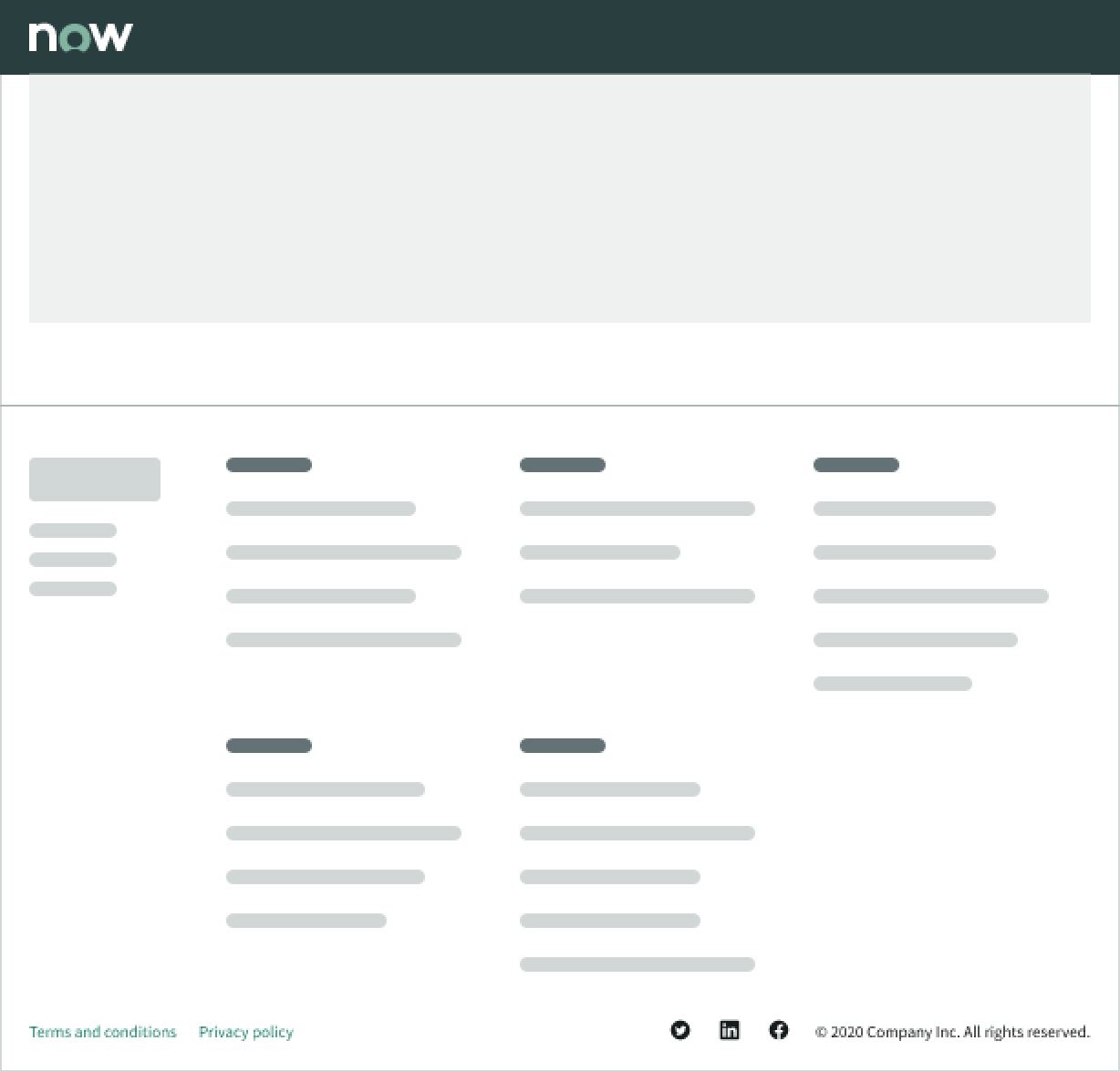
The social media icons and copyright information stack under the bottom footer container for narrow displays, too.
Interactions
The user can select any of the links or social media icons in the footer.
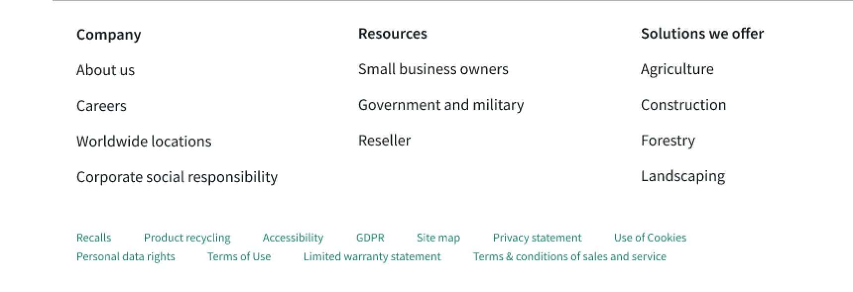
If link labels are too long or there are too many links in the bottom container, they wrap to the next line and align with bottom of the component.
Truncation
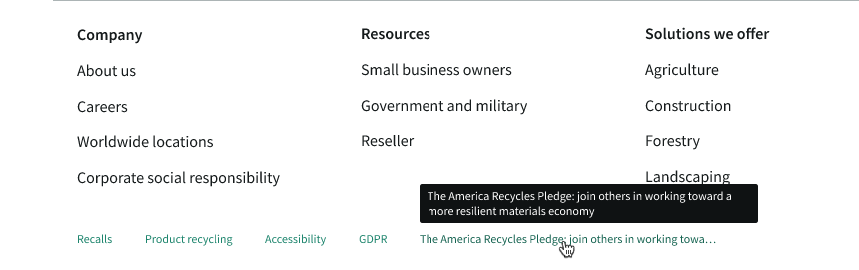
Links in a link set group truncate automatically if the label is too long.
Additionally, any links in the base footer truncate if the label is longer than the width.
Usability
Canvas footer complies with all internationalization and accessibility requirements.
Internationalization
When the display translates to a right-to-left (RTL) language, the content area aligns on the right and the copyright information and social media icons align on the left.
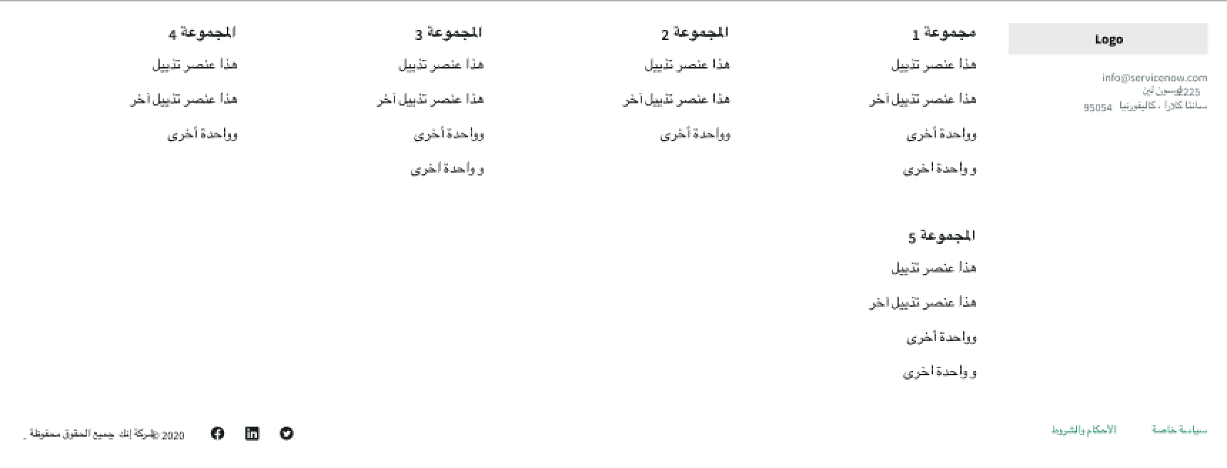
In this example, the canvas footer displays in a right-to-left language. The logo and the links align on the right, and the order of the link sets flips.
Accessibility
Learn how to access the actionable elements of canvas footer through keyboard interactions and screen readers.
Canvas footer tab order
This is the high level tab order for canvas footer.
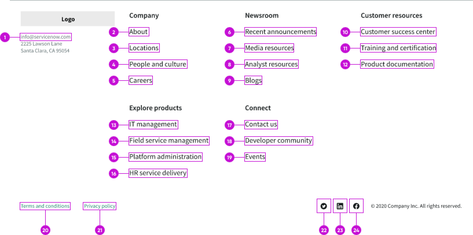
This is the tab order for canvas footer.
Keyboard interactions
When focus is in the canvas footer:
- Tab: Moves focus to the next focusable element
- Shift + Tab: Moves focus to the previous focusable element
- Enter: Activates the selected element
This is the tab order for moving focus within the canvas footer: