

Anatomy
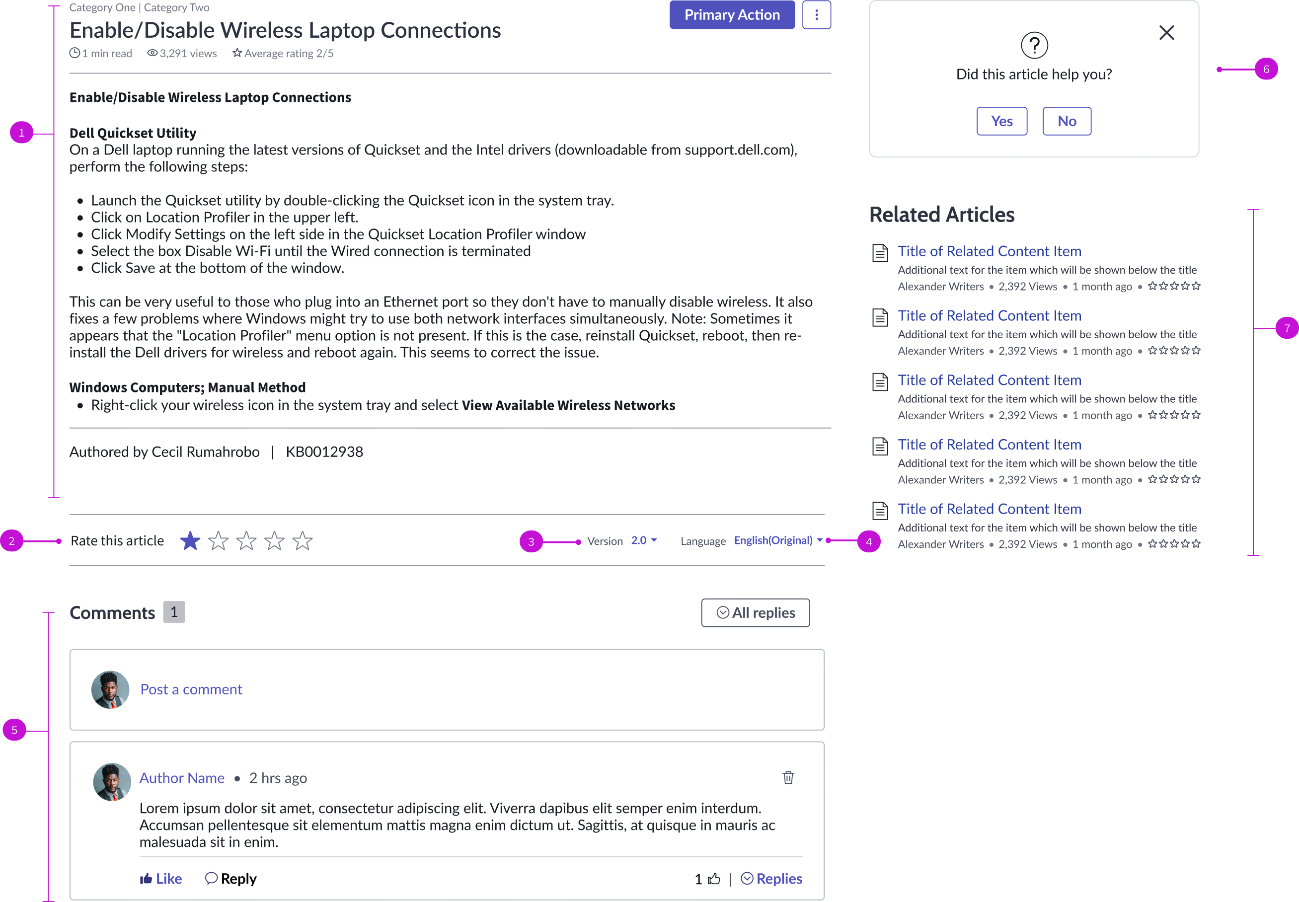
- Knowledge content: Content of the knowledge article and any metadata associated with it
- Star rating: User evaluation of the content, based on a 5 star rating system
- Version picker: Shows available versions or the article for the user to select; only available when there are multiple versions of the article
- Language picker: Shows available translations of the article; only visible when the article is available in multiple languages
- Nested comment: Interface for users to leave feedback, questions, or concerns about any content in the portal; comments left by other viewers appear here
- Feedback modal: Modal for users to submit positive or negative feedback about the article.
- Related content: Links to articles related to the current article
Usage
The knowledge view page template enables users to see all information involving an article, rate an article, and submit comments. Users can select earlier versions of an article to view or see the article in a translated version. You can use the knowledge view page in these applications:
- List and form views
- Activity stream component
- Agent Assist component
- Workspace global search tab component
Components
The knowledge view page template is built with Horizon Design System components that have their own attributes and interactions.
Knowledge content
The knowledge content component displays the content of a knowledge article and metadata about the article, including the author, article number, and current rating. Users with the proper permissions can take an action on the article and give it their own rating. For more information, see the usage guidelines for knowledge content.
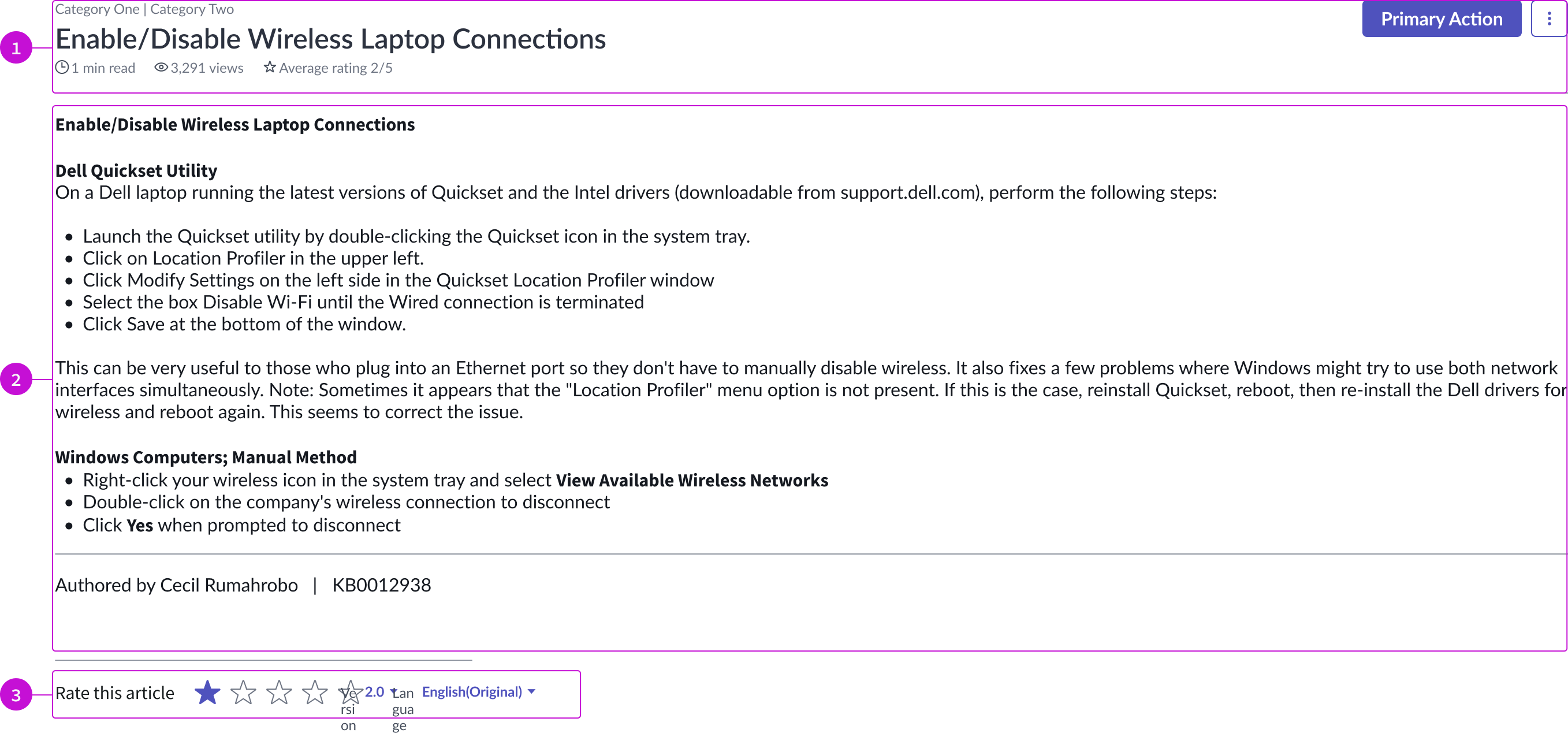
- Content header: Area for text and details that describe the content in view; the header also contains a primary action button and an overflow menu
- Body: Main content area that displays the authored content
- Content footer: Area for rating an article, the version number, and language selection
Interactions and behaviors
- The knowledge content component automatically adjusts its size to the size of the container.
- The “Edit” action is only available to users with the correct permissions.
- Only users with the correct permissions can see the “Delete” option in the overflow menu.
- If only authenticated users can view the article, a login screen appears when the user attempts to open it.
- If all users can view the article, the primary action is hidden to the unauthenticated users. Links are still actionable, but take the user to a login screen.
- The user selects the dropdown triggers in the footer to choose a version or a language.
- The user selects a star from 1 to 5 to rate the article; 5 being the highest rating.
- When a user selects the delete option in an article, a modal appears, asking them to confirm the action
- When a user flags an article, they submit a comment in a modal that a moderation team evaluates. The team can make a decision whether to edit or delete the article.
- The “Delete” option opens a modal that requires the user to confirm the delete action.
Defaults
By default the card displays these attributes:
- The primary action on the content is “Edit.” This puts the article into edit mode.
- The overflow menu provides these options:
- Flag: Submit a comment or a reply to be be reviewed by a content moderator
- Copy link: Enables user to copy a permalink to the comment or to a reply
- Edit: Enables author to edit their own comment or their reply
- Delete: Enables authors and administrators to delete a comment or a reply
- Article displays by default in its original language.
Nested comments
The nested comments component enables a user to view and submit comments on knowledge articles and reply to other user's comments. Users can indicate if the content was helpful, or if they liked the article. For more information, see the usage guidelines for nested comments.
Nested comment container
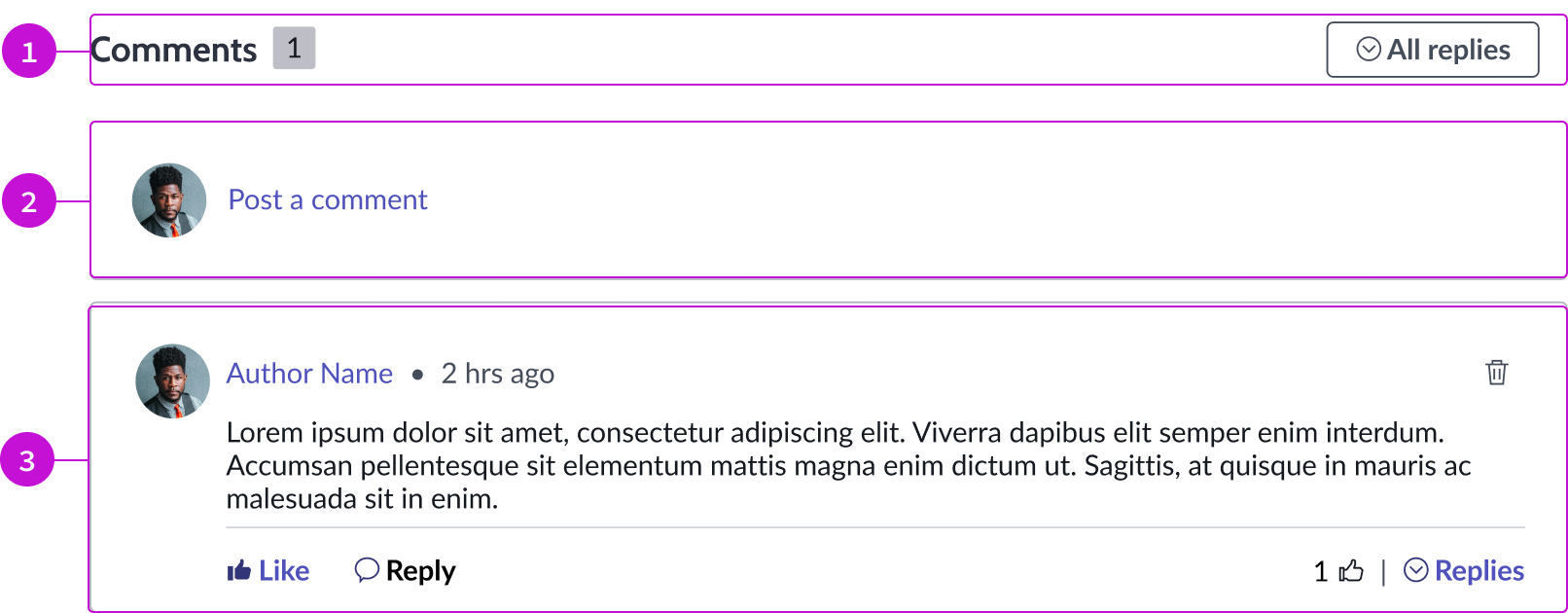
- Comment section header: Title and secondary button for showing or hiding comments
- Create comment: Link that opens the comment composer, enabling the user to post a comment about the current article; the composer opens inline
- Comment container: Displays collected comments from users, sorted by most recent; a link in each comment opens the author’s profile
Comment composer
The composer contains a text editor, a link for attaching files to the comment, and primary and secondary button actions. The composer appears inline with the comment container.
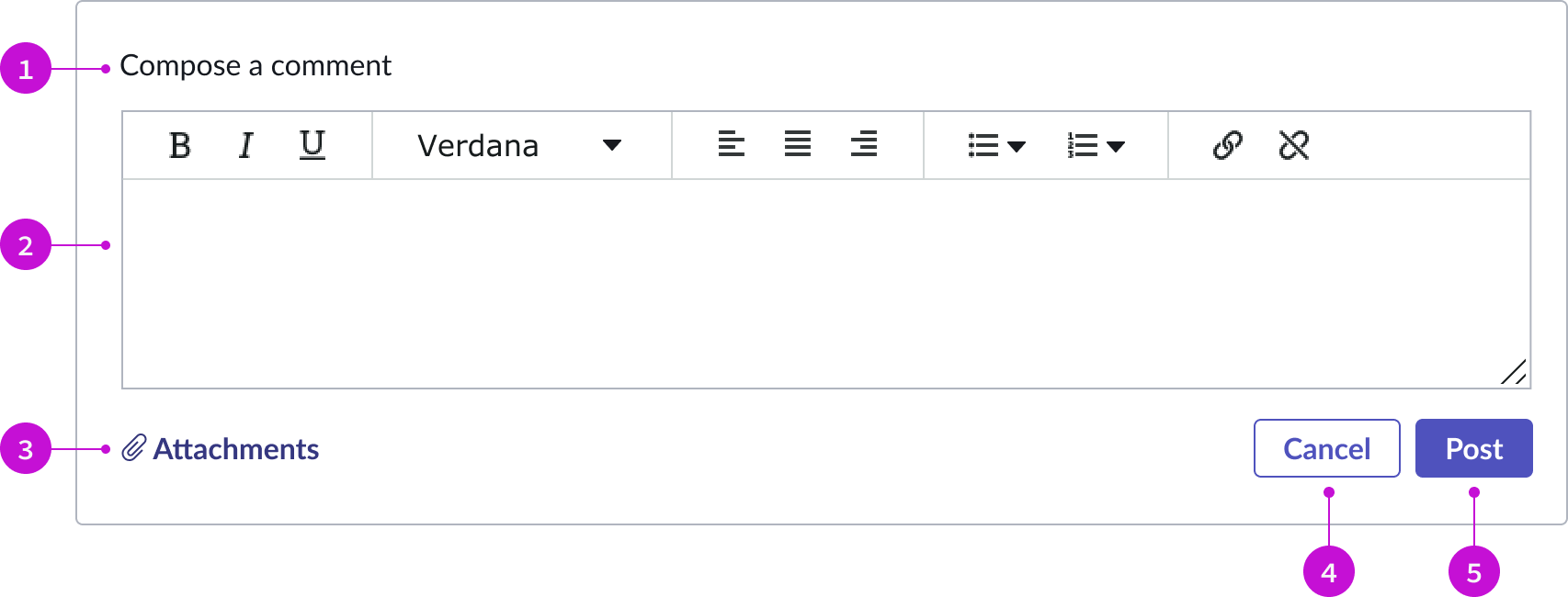
- Title: Identifies the area for creating a comment
- Rich text editor: Text area where the user can create and format their comment
- Attachment link: Link that enables users to attach files to their comment
- Secondary button: Action that cancels the comment and closes the composer
- Primary button: Action that posts the comment to the comment thread
Interactions and behaviors
- The comment composer opens when a user selects the “Post a comment” link in the nested comment container.
- The sizing handle in the lower right corner of the editor allows the user to resize the input field within the container.
- An action button allows users to view all comments or limit the number that display.
- The logged in user selects “Reply” to respond to a comment directly.
- The logged in user selects “Replies” to view all the responses to a comment. The user can then select to “like” a comment or submit a reply.
Defaults
By default the card displays these attributes:
- Comment component displays the author’s name, avatar, and a timestamp.
- An iconic button (trash icon) is displayed in the comment container for the delete action.
Related content
The related content component enables a user to view articles related to the current knowledge article. For more information, see the usage guidelines for related content.
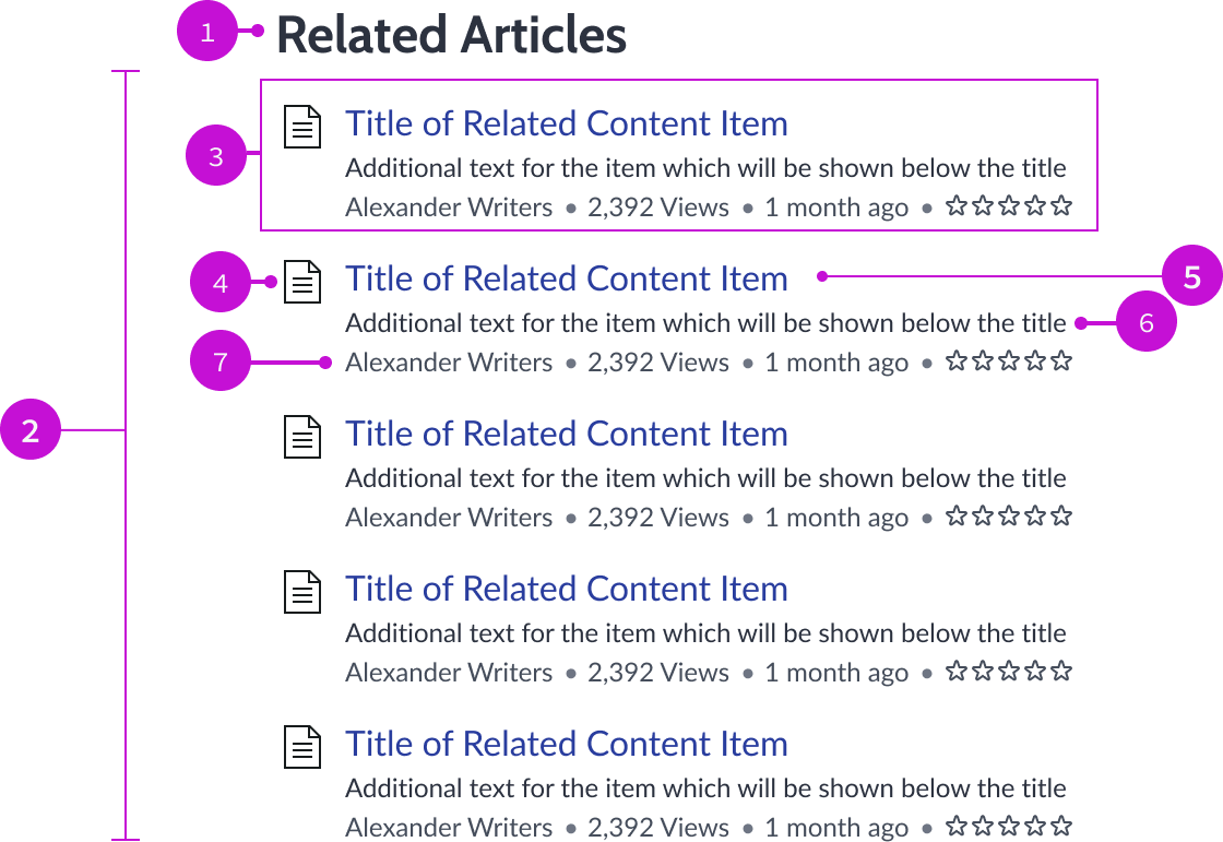
- Component header: Title of the related content list
- Related content container: Container that holds the set number of items
- Related content item: Single content item related to the configured criteria
- Content icon: Identifying icon associated with the content type of the item being displayed
- Content title: Title associated with the content type of the item being displayed
- Article description: Brief description of the content being displayed
- Content metadata: Configured information about the content being displayed, including the number of times they’ve been viewed and their star rating
Interactions and behaviors
- Text within related content wraps to the next line instead of truncating.
- The component resizes automatically to fit when the container shrinks.
- Users can open content items by selecting their titles.
- Users can go to the author’s page by selecting the author’s name in the item.
Defaults
By default the related content component displays these attributes:
- The header is “Related Articles.”
- The icon associated with the entries is the knowledge icon.
Configurations
The knowledge view page template is intended to be used as-is in your experience and provides default functionality that fits most use cases. The page is created from a template that is updated automatically. If you copy the template in UI Builder and customize the page, you won’t receive template updates, and your page might not function properly after an upgrade.
Usability
The knowledge view page template complies with all internationalization and accessibility requirements.
Internationalization
When this page template is used in an instance configured for a right-to-left (RTL) language, the individual components have their own behaviors. See the usage guidelines for the components used in the page for details.
Accessibility
For accessibility behaviors of specific components, see the usage guidelines for those components.
Keyboard interactions
Each component used in the knowledge view page template has its own tab order and keyboard interactions. See the usage guidelines for details.
Screen readers
When you apply ARIA labels to a component, screen readers announce the controls and content of each component in the prescribed tab order. See the usage guidelines for details.