

Anatomy
Learn about the individual parts of knowledge content.
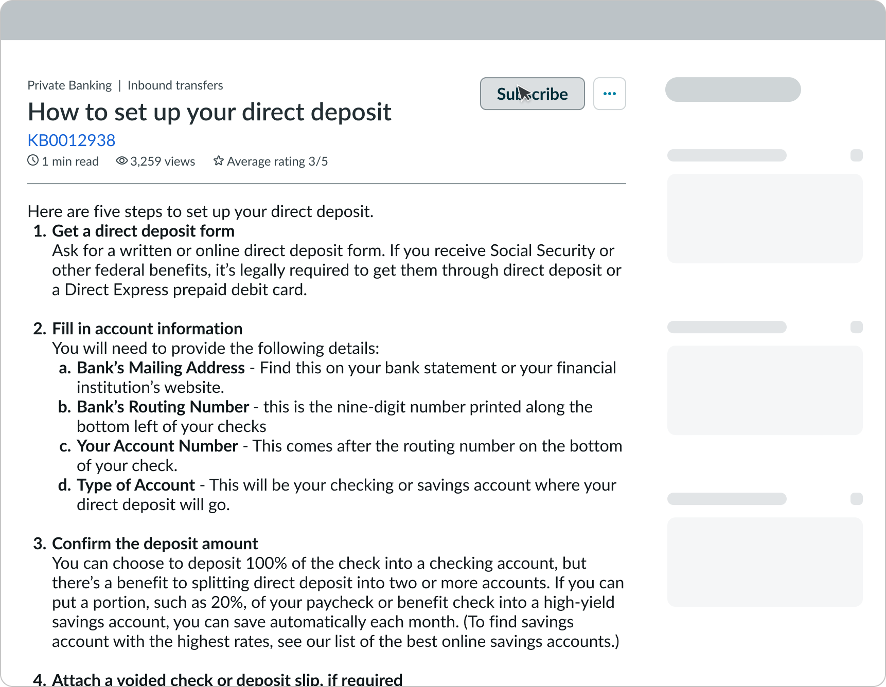
Knowledge content
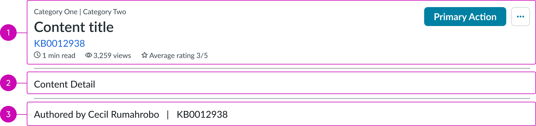
- Content header: Area for text and details that describe the content in view
- Body: Main content area that displays the authored content
- Content footer: Area for additional actions related to the content
Content header
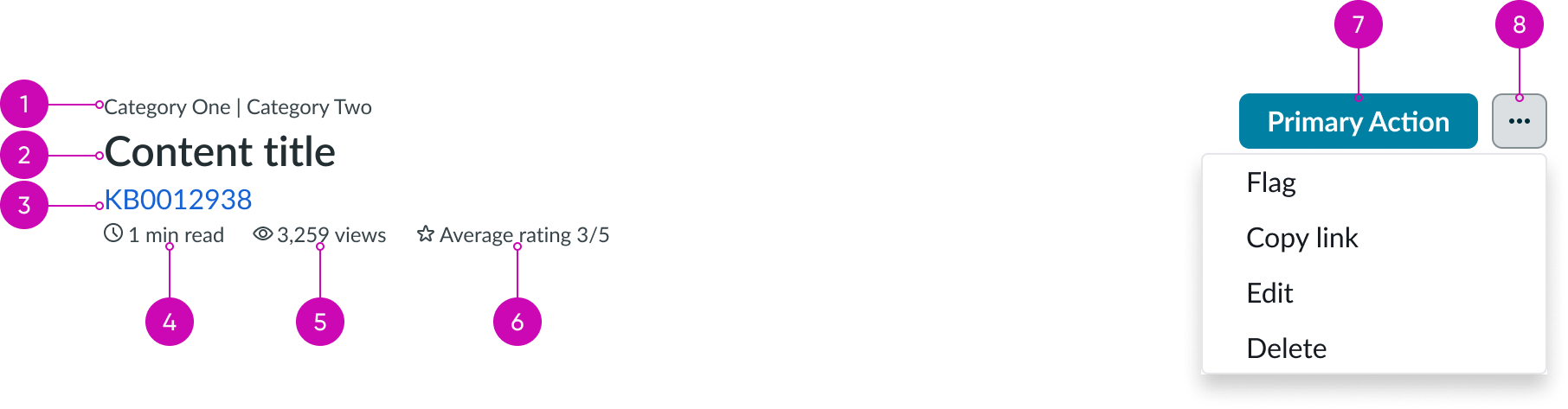
- Content title: Text that summarizes the content currently in view
- Read length (optional): The calculated time it would take to read the article
- Date updated (optional): The date when the content was last updated
- Average rating (optional): The average rating of the content in view; ratings are based input from users
- Primary action (optional): The most important action related to the piece of content in view
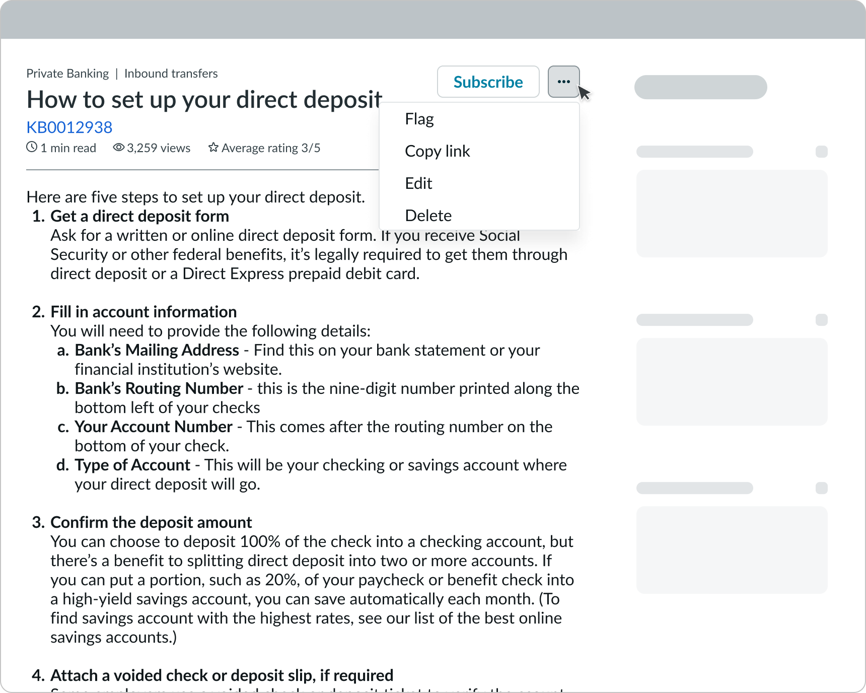
- Action menu (optional): Additional, non-primary actions related to the content; the available actions (Flag, Copy link, Edit, and Delete) depend on how you configure the menu and the user's permissions
Subcomponents in content header
See usage guidance for iconic button
Body
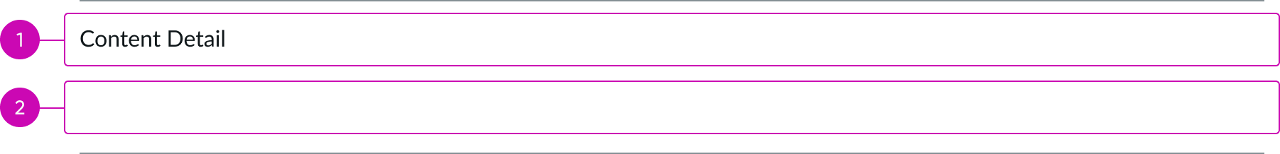
- Content area: Space for content details provided by the content author; content displays based on the content template the author uses
- Content slot: Space for knowledge article subcomponents, other subcomponents, and custom content
Subcomponents in body
See usage guidance for text link
Content footer

- Content area: Name of the user who published the article
- Article number: Number that identifies the article
Subcomponents in content footer
See usage guidance for star rating
Usage
Learn about knowledge content and find out how to use it in your design.
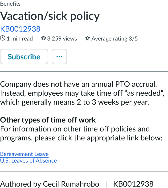
Use knowledge content's flexible layout to display a wide variety of content to the user. Articles can show content for support, general information, or even sensitive information to their users.
The knowledge content component also provides article authors with a rich text editor so that they can edit and format their content based on the specific topic.
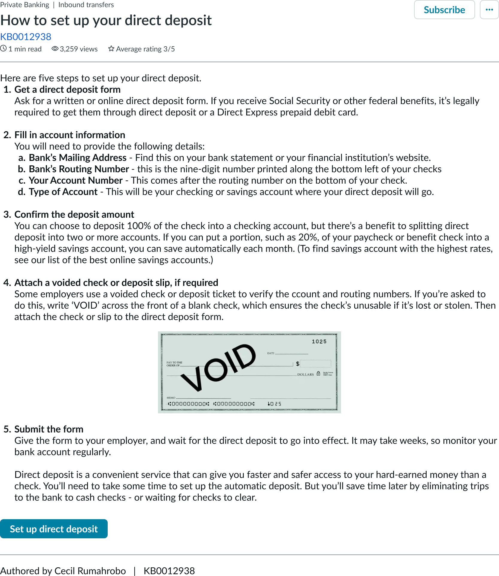
In this example, the content shows the vacation and sick leave policy for the company.
Configurations
Learn how to customize knowledge content by configuring the available properties.
Metadata
You can configure what metadata appears on the content in the content header and the body content. Header metadata can include read time, date updated, and average rating, while the body content metadata can include the author, view count, and article number.
The types of metadata that you should depend on the type of article and experience you are creating. Additionally, there is no limit on the number of metadata items you can include.
Primary action
You can configure whether the content body contains a primary action. Whether you include one depends on the intent of the published content. For example, if the content is informing the user (like describing the company vacation policy), then you don't need to include an action. However, if the content has a user action associated with it (like signing up for employee benefits), then you can include an action. This allows the user to immediately act on the content without having to go somewhere else.
Overflow actions
You can configure whether the overflow menu appears, or you can choose to show only certain actions within the menu depending on a user's permissions. For example, you could show the "Flag" and "Copy" actions to authenticate users, but not the "Edit" or "Delete" actions.
You can also configure the actions to be visible only to users with certain permissions.
Article visibility
You can set an article to be visible by anyone (non-authenticated users) or by users in a specific group (like authenticated users). If the content in the article is generic, consider allowing anyone to view it. However, if the content in the article is sensitive or company-specific, only allow authenticated users to view it.
The article visibility also affects what actions (like the "Subscribe" button) are available to the user.
Design recommendations
Learn how to apply knowledge content in your design.
Use knowledge content to show the full article content, then offer the user related links to other helpful content.
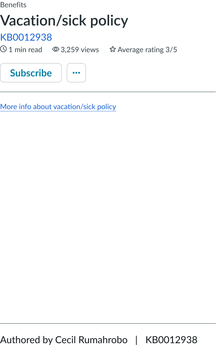
Avoid using knowledge content as a redirect to other content. This lowers the quality of search results and frustrates the user because they must go elsewhere to view the content.
Alignment and positioning
Knowledge content should always align on the left directly under the header or tabs. It should be the main focus on whichever page it's placed.
UI text guidelines
These are some recommendations for using text within knowledge content:
- Use sentence case for all titles, labels, and column headers
- Keep all text labels informative and short to increase readability and scanning
- Keep content concise and purposeful to help a user understand options and actions, and move successfully through tasks to achieve their goals
- Capitalize only the first letter and any proper nouns in a string of text
- Ensure content is contextual and specific to offer guidance and support to the user
- If a component performs or supports an action, label it with a verb (like "Submit")
- Use plain language and avoid slang, vague, or complex descriptions a user might misinterpret
- Button text should be concise, actionable, and clearly state what happens when a user makes the selection
- Use a neutral tone, not pushy, over-praising, or passive, and always express support for the user task at hand
Behavior
Learn how knowledge content behaves when the display changes or a user interacts with the component.
States
Knowledge content doesn't have any states. However, the subcomponents within knowledge content have their own states.
Responsive behaviors
Knowledge content responds to the size of the container in the display.
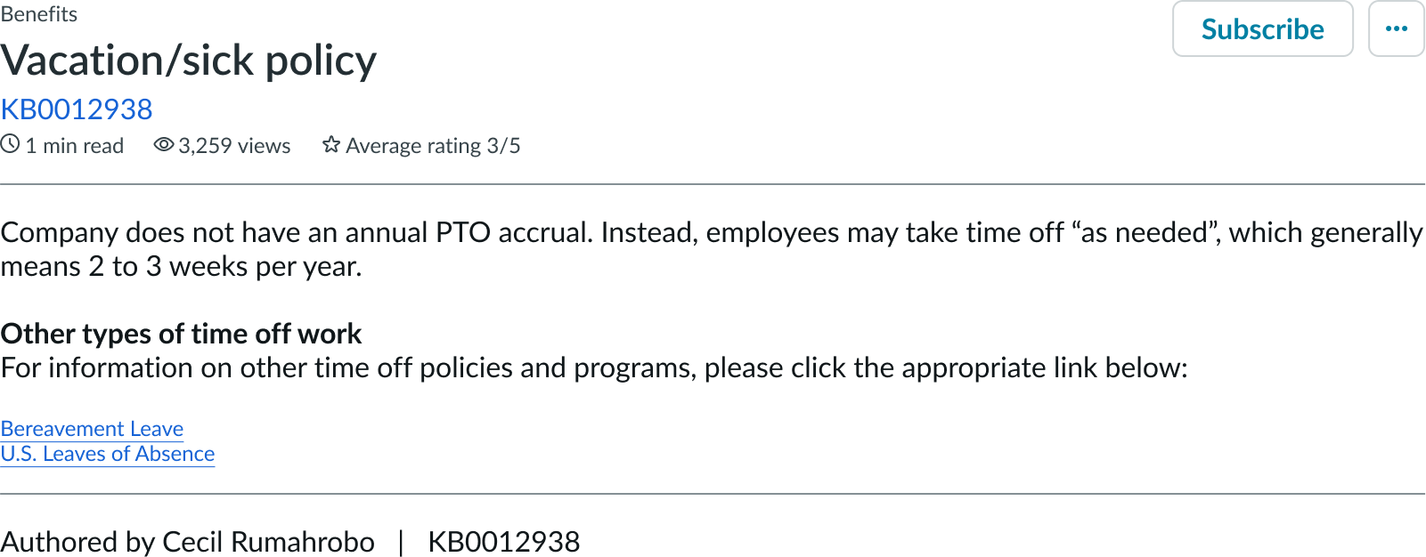
In this example, knowledge content shows in a standard display.
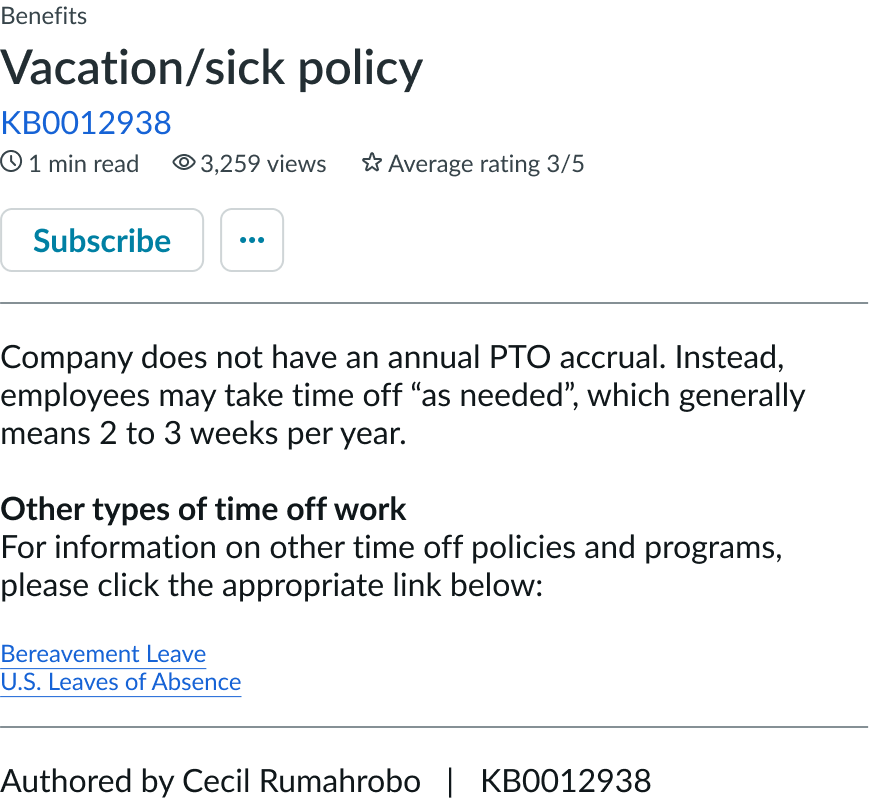
In this example, knowledge content shows in a smaller display. The content shrinks to accommodate the size of the display.
Content actions
On smaller displays, actions not contained within the overflow menu move below the header contents.

In this example, actions are shown in a wide display.

In this example, the actions for the knowledge content show in a narrow display.
Interactions
Learn how knowledge content responds when a user interacts with it.
Viewing content
If anyone can view the article, all actions (anything that requires a user to be logged in) don't appear. This includes all contextual actions, like subscribing or rating content. However, the links within the content are still actionable, but take the user to a log in page if selected.
If only authenticated users can view the article, then users can only view content if they have the correct permissions to access it. If the user tries to access the article but isn't logged in yet, a log in modal appears before they can view the article and access any contextual actions. The actions available to authenticated users depend on their permissions.
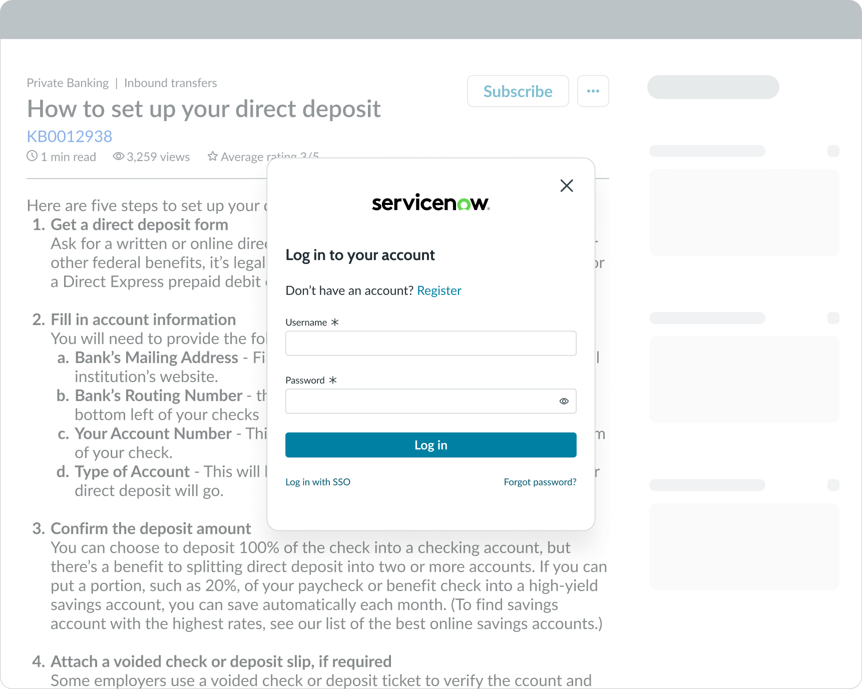
In this example, the article content is only visible to logged in employees. The user must log in before they can view the full article.
Taking an action on the content
A primary action appears within the content header next to the overflow menu (if available). This action is the most important action the user can take on the content, and all other actions should appear within the overflow menu. The overflow menu can contain any relevant actions that are not the primary action. This can include an action for flagging content for moderation by an administrator**,** an action for copying the URL of the content to the user's clipboard, an action that takes the user to the edit experience; only available for users with certain permissions, and an action for deleting the content.
If the content is viewable by anyone, the primary action doesn't appear.
If the content is only viewable by logged in users, the user can interact with the primary action if they are logged in.
Taking an action from within the content
The user can also take an action directly related to the content if a primary action button is available. This can help the user take an action directly from the content without having to go somewhere else to complete their task. For example, if the content describes the benefits of the company 401k plan, the primary action could be "Enroll." Then, it could take the user to a form to fill out all required info to process their request.
You can configure this action to be dynamic, where it pulls certain data to help complete a form. For example, if the user selects the primary action button to "Enroll" in the company 401k plan, the new form can have the user's name and location prepopulated.
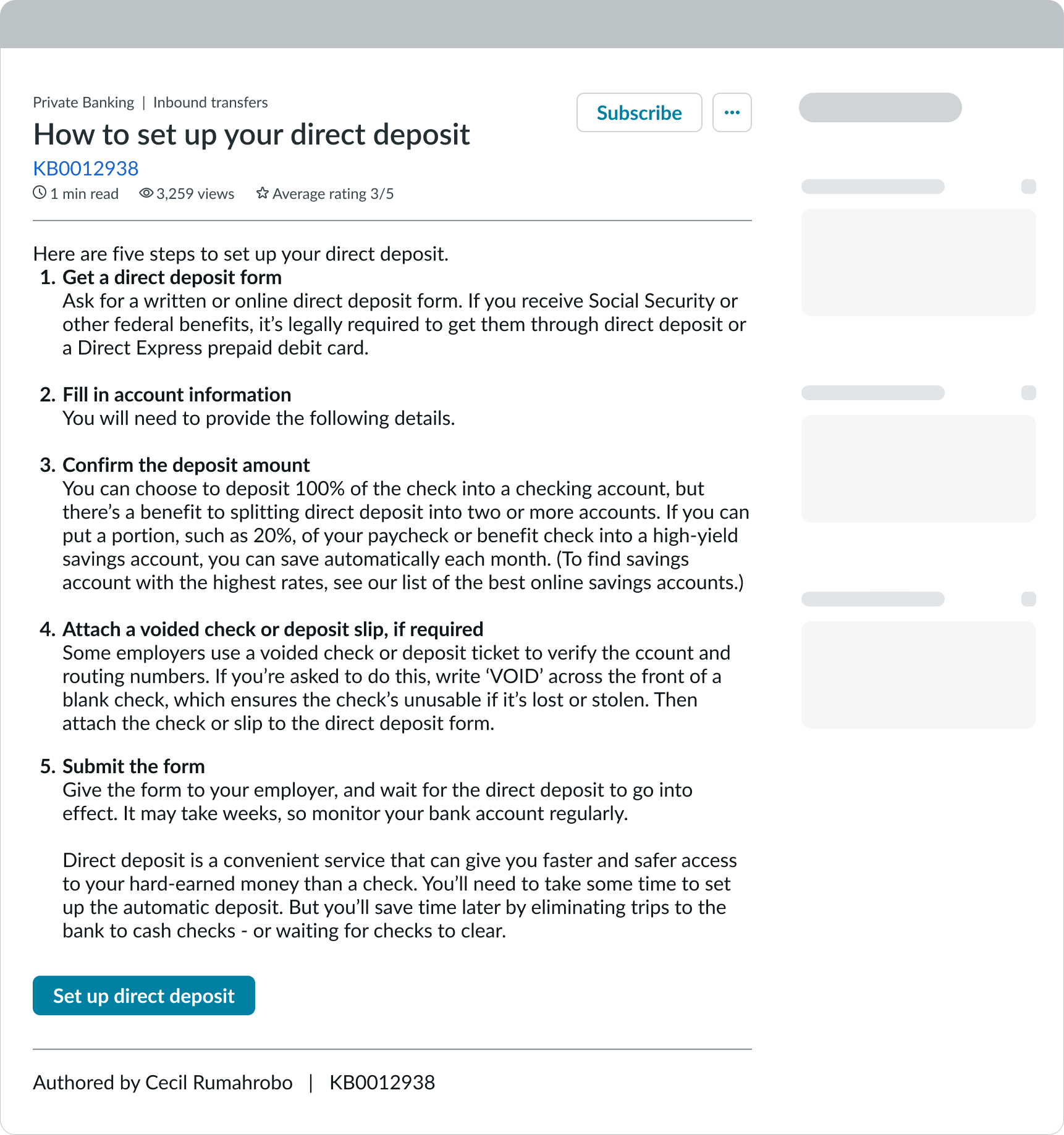
In this example, a CTA to "Enroll" appears within the content.
Accessing other actions
If more than 1 action is available, an overflow menu appears. If only 1 action is available, the overflow menu is hidden.
The available actions in the overflow menu depend on the user's permissions and may contain actions available to admins only.
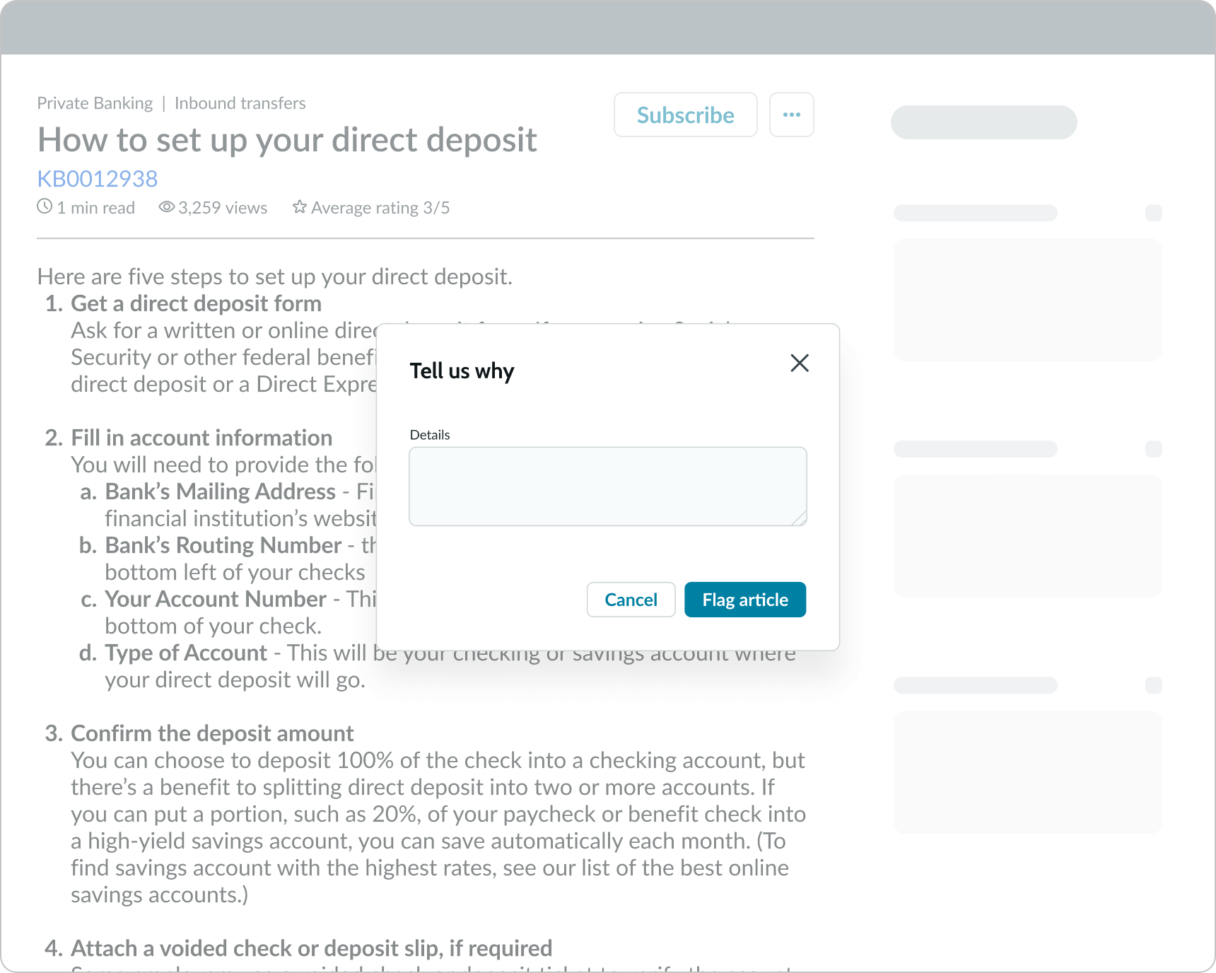
Flagging content
The "flag" action is only available to authenticated users if moderation is available. When the user selects this option, a modal appears to let the user provide details regarding why they are flagging the content. When the content is flagged, the moderation team can review the content and decide whether they need to edit it or delete it.
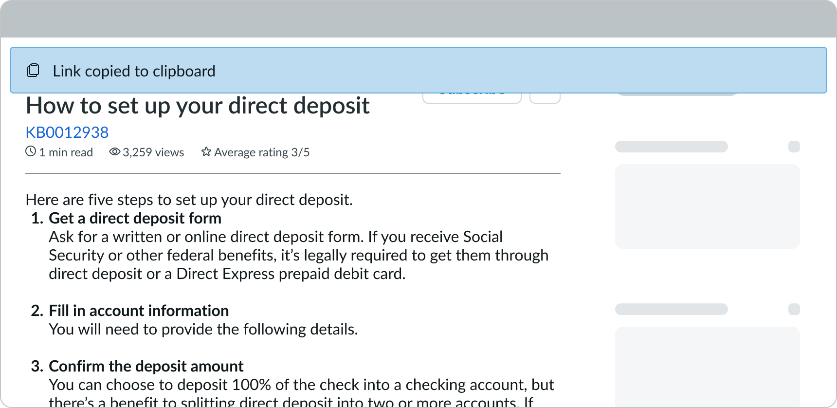
Copying a link to the content
The "copy" action is available to all users. When the user selects this option, a deep link to the content is added to the user's device clipboard. A confirmation message displays in an alert to show that the link was copied successfully.
Editing content
The "editing" action is only available to users with the correct permissions. When a user selects this action, it takes the user to the experience for editing the article content in a rich text editor.
Deleting content
This action is only available for users with the correct permissions. When a user selects this action, it displays a confirmation modal that asks them to confirm deletion of the content.
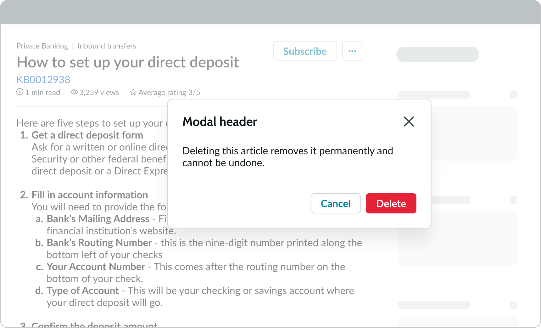
In this example, the confirmation modal appears to let the user confirm that they want to delete the article.
Truncation
Knowledge content text doesn't truncate.
Usability
Knowledge content complies with all internationalization and accessibility requirements.
Internationalization
When the display translates to a right-to-left (RTL) language, the content changes only if there is a matching article available in the RTL language. When translated, the content header, body and the content footer align on the right. Any proper nouns that can't be translated appear left-to-right (LTR).

In this example, knowledge content and the content appear in a right-to-left (RTL) language.
Accessibility
Learn how to access the actionable elements of knowledge content through keyboard interactions and screen readers.
Keyboard interactions
You can access the actionable elements of knowledge content with these keyboard keys:
- Tab: Navigates through the links in the specified tab order (top to bottom, left to right)
- Shift + Tab: Navigates to the previous actionable element in the specified tab order
- Space or Enter: Initiates the link action
When the action menu is open:
- Arrow up and down: Navigates through actions in the action menu
- Space or Enter: Initiates the action in focus
Screen readers
Screen readers follow the standard tab order. For left-to-right (LTR) and right-to-left (RTL) languages, tab order begins with the primary action button.