

Anatomy
Learn about the individual parts of nested comments.
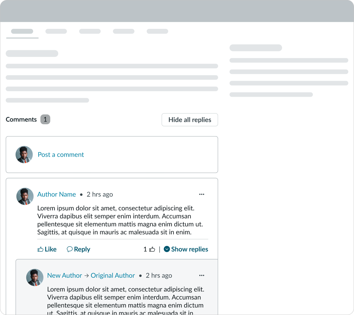
Nested comments
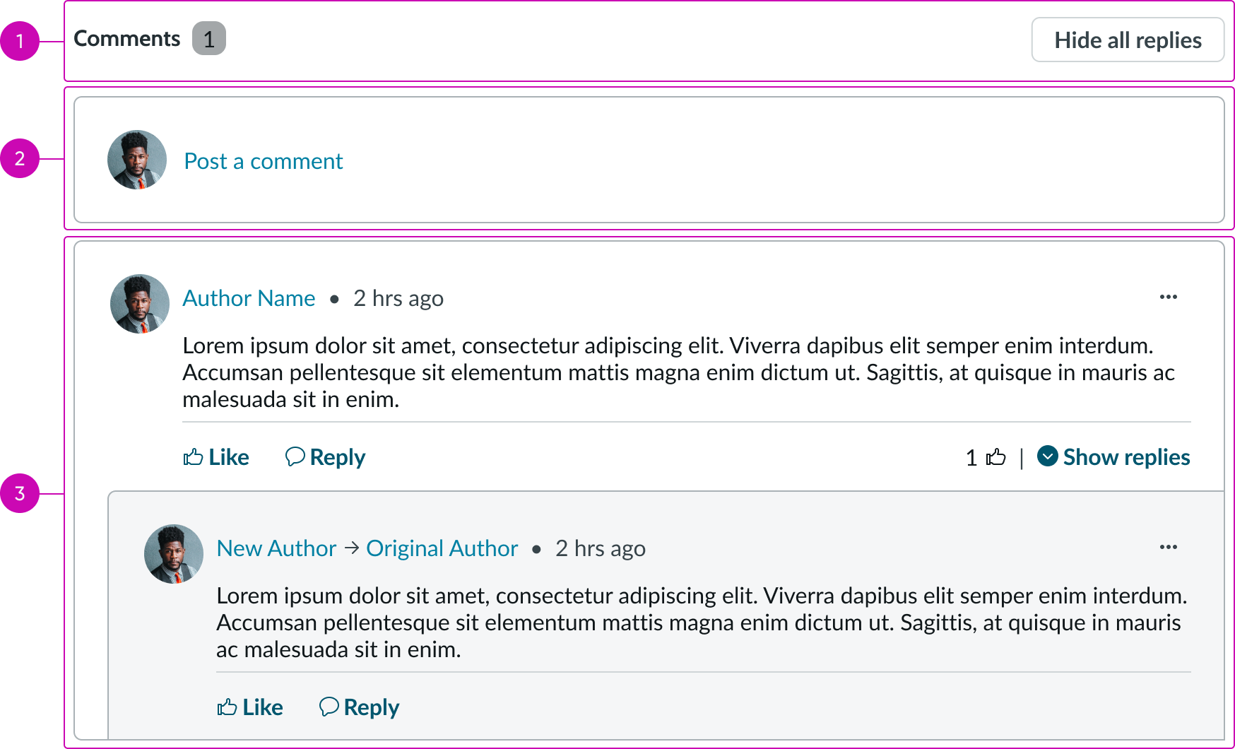
- Comment section header (optional): Title and a button for showing or hiding comments
- Create comment: Field for writing and publishing a comment on the content
- Comment container: Displays collected comments from users, sorted by most recent
Comment section header
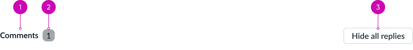
- Heading: Text describing the section
- Badge (optional): Number of comments on the content in view; can accommodate up to triple digits before it uses an abbreviation
- Button (optional): Hides all visible replies to comments in the comment section when the user selects it; only appears if there are replies to comments
Create comment
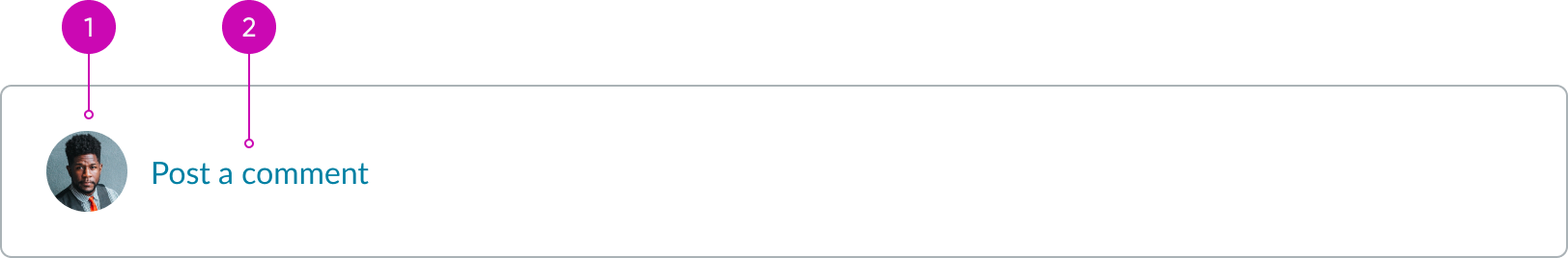
- Author avatar (optional): Image, initials, or icon for the user leaving the comment
- Bare button: When selected, it opens the rich text editor within the comment composer and places focus in the comment composer text area
Comment composer
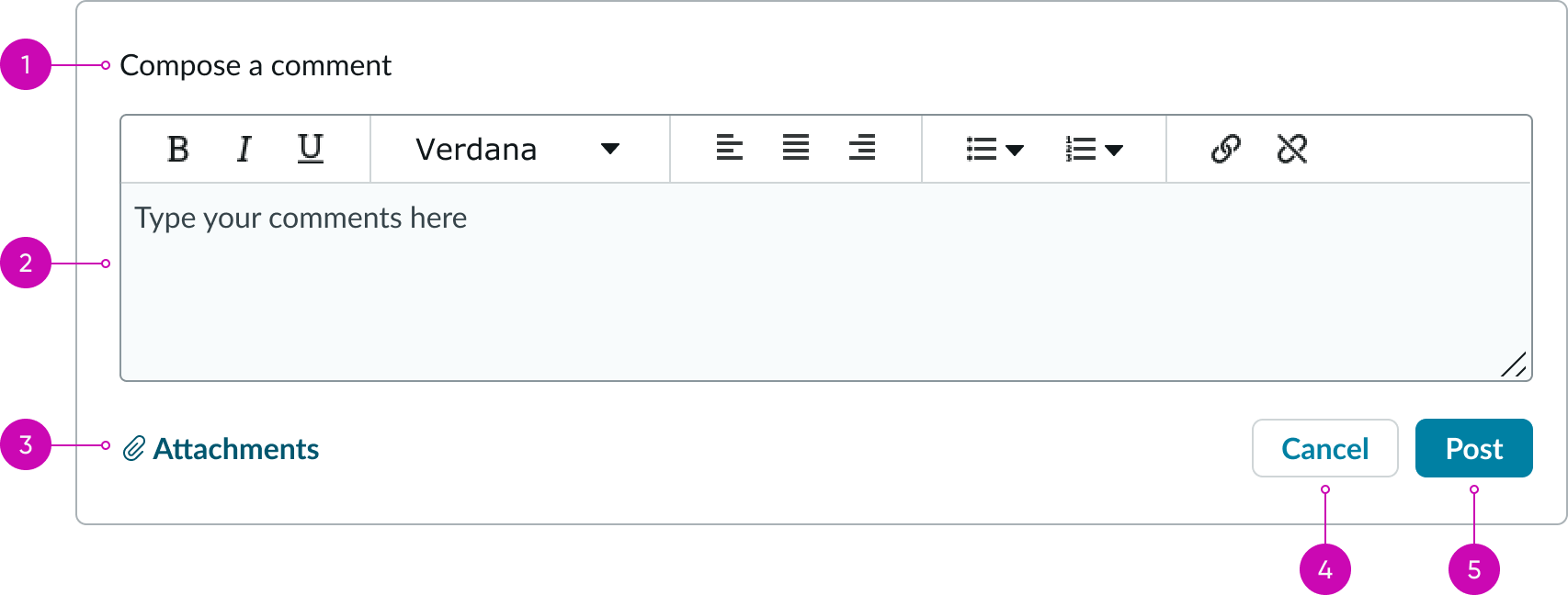
- Title: Text describing the area for creating and publishing a comment
- Rich text editor: Text area where the user can create and format their comment
- Attachment: Helps the user attach files to their comment
- Secondary button: Action that cancels the comment and reverts to the"create comment" state
- Primary button: Action that posts the comment to the comment thread
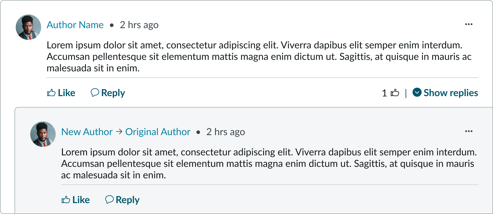
Comment container
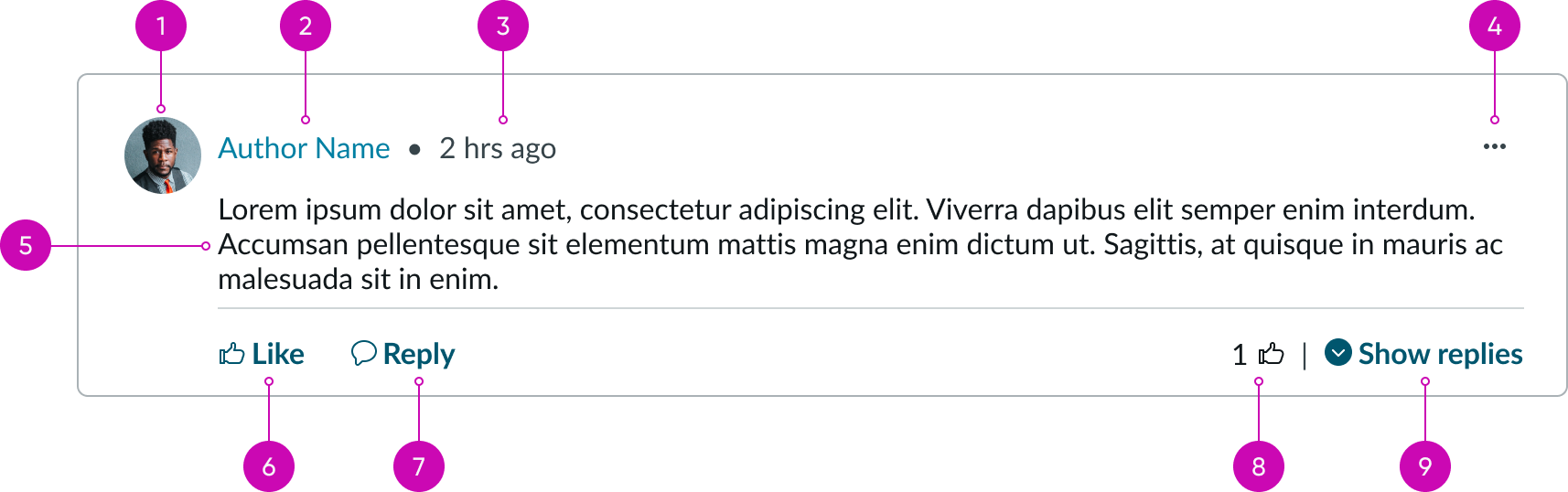
- Author avatar: The comment author's avatar
- Author's name: The user's display name; can be a link directly to the user's profile
- Timestamp: Amount of time since the comment was posted
- Action menu: Iconic button that displays secondary actions in a panel; can contain actions like "flag," "edit," "copy link," and "delete."
- Comment: User-submitted text
- "Like" bare button: Action a user can select to show approval of a comment; "likes" allows others to see which comments are popular in the comment section
- "Reply" bare button: Action a user can select to create a reply to the existing comment
- Actionable metadata: Displays the total number of likes on comment; when the user selects, it shows a modal with a list of users who liked that comment
- Disclosure control: When there are replies to the comment, the user can select this to show or hide the nested replies; if there are no replies, this control doesn't show
Subcomponents
See usage guidance for heading
See usage guidance for text link
See usage guidance for bare button
See usage guidance for dropdown
See usage guidance for stateful button
See usage guidance for iconic button
Usage
Use nested comments so that users can provide feedback on content that is user-centric. This can include community posts, blog posts, and other pieces of content that would benefit from user feedback and discussion. For example, you can use it on knowledge articles so that users can provide feedback (like asking questions about the content).
Collecting feedback is important because it provides users with a way to interact with the content or comments from other uses. Comments can also help create a community within an experience. These comments also give the article author ideas improving the content.
Avoid using nested comments on content that is private or 2-sided (like a support agent and a user).
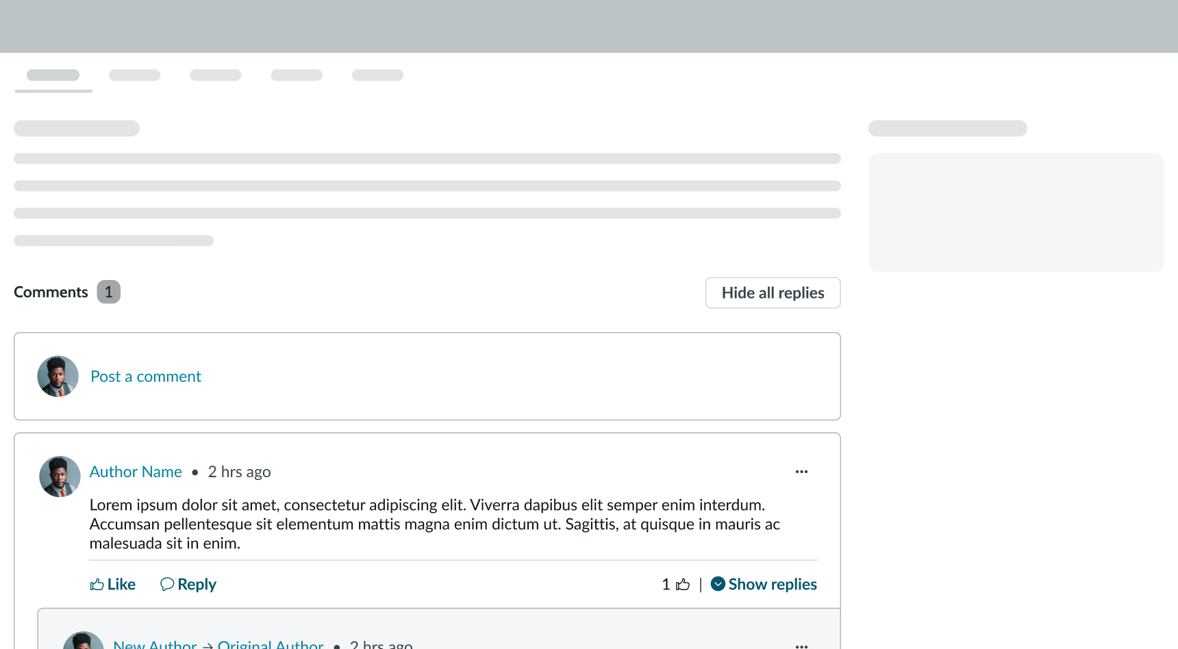
In this example, the nested comments appear under the main page content.
Configurations
Learn how to customize nested comments by configuring the available properties.
Comment section header
You can configure whether to show or hide the entire header. When the header is hidden, the other parts of the component move up to occupy the space. Alternatively, you can only hide the comment count and leave the other elements.
In this example, the comment header section doesn't show for the component.
Create comment
You can configure whether to show or hide the create comment panel. By turning off the comments option, you lock the content. This can be important for types of content that you don't want or need feedback on (such as an announcement or product documentation).
Comment container
You can configure whether to show or hide the overflow actions and bare buttons within the comment container. You can also configure what actions appear in the overflow menu. Turning off the "like" and "reply" buttons can keep users from liking or replying to existing comments.
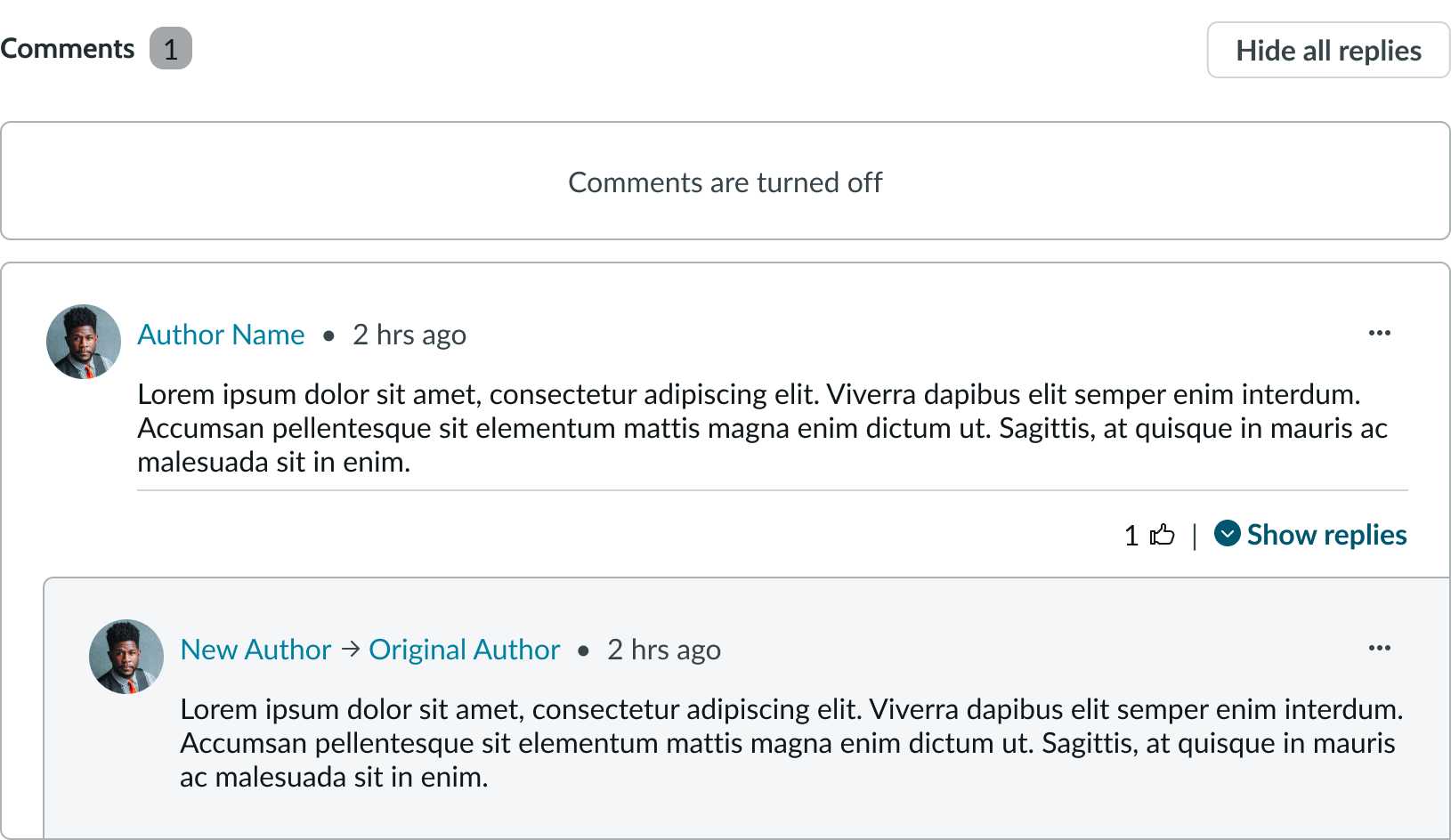
In this example, both the "like" and "reply" buttons have been turned off after users left comment replies and liked comments.
Design recommendations
Learn how to apply nested comments in your design.
Only use one nested comments component per page.
Avoid placing multiple nested comment components on a single page. Too many comments can distract from the main content in view.
Alignment and positioning
Position the nested comments component under the content in view. It should be clear to the user that they can provide comment on the content or interact with comments that have already been posted.
UI text guidelines
Use sentence case for all titles and button names
Behavior
Learn how nested comments behave when the display changes or a user interacts with the component.
States
Nested comments has 3 states: loading, disabled, and unauthenticated. Nested comments component doesn't have a unique empty state because it prompts the user to create a comment when none exist.
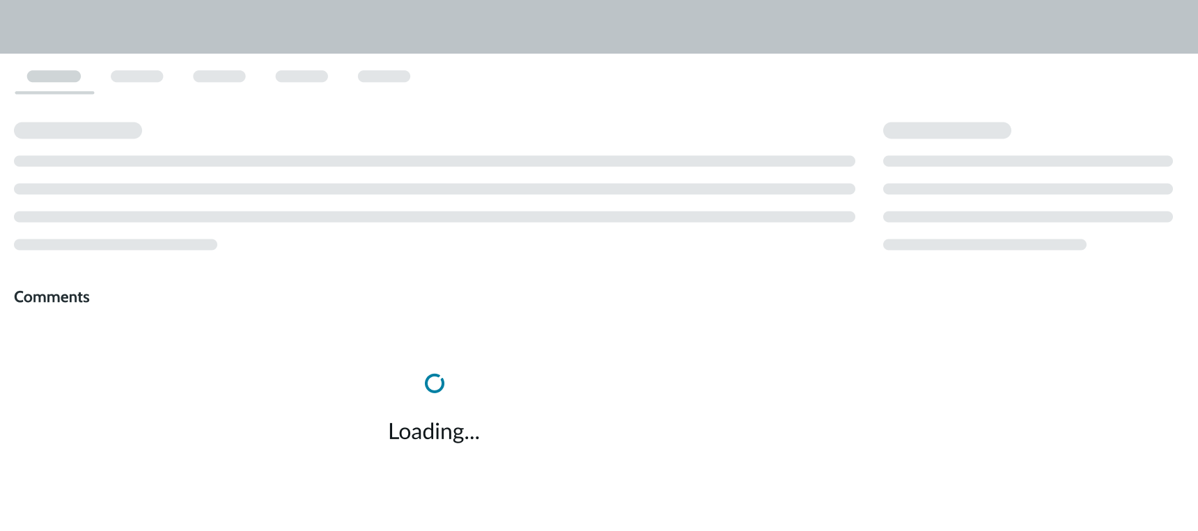
Loading state
There may be multiple comments and comment threads within a nested comments component. To help resolve long load times, nested comments supports lazy loading. This gives other components on the page time to load before loading the comments and replies. Lazy loading also helps notify the user that content is loading.
When the loading state appears for comment replies, the disclosure control becomes inactive.
Disabled state
You can disable the comment functionality of the component after it has been enabled. This restricts new comments from being posted; however, users can still "like" existing comments. You can also choose to disable new comments and likes entirely. For example, the disabled state is useful when a piece of content is outdated or is generating too many low-quality comments.

Unauthenticated state
When a guest user views content that has a nested comments component, they see a prompt to either log in or create an account in order to compose a comment. Only after logging in or creating an account can they create a comment or interact with posted comments.
For guest users, the options to "like" a comment or "reply" to one are also hidden. This keeps them from also liking or replying to an existing comment. However, they can view the number of likes and show replies to a comment.
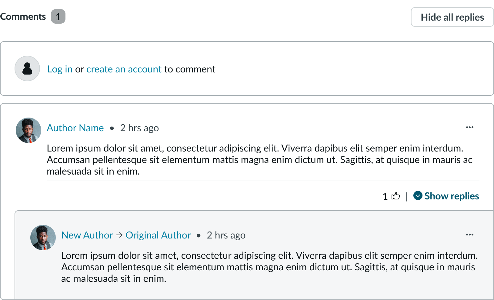
In this example, the user needs to log in or create an account before they can create a comment or interact with posted comments.
Responsive behaviors
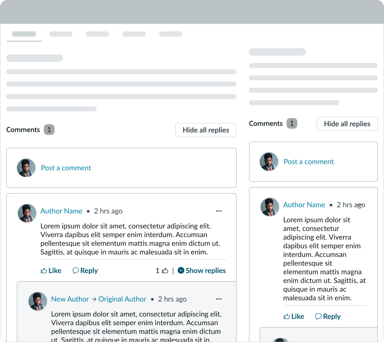
Nested comments respond to the size of the container in the display.
Interactions
The user can select the comment author’s name to go to the author's profile (if enabled).
When a user selects the 'like' option, it automatically increases the number of likes on that specific comment within the actionable metadata. A user can remove their "like" by selection the option again.

In this example, the user is hovering over the "liked" comment. A tooltip appears to notify them that they can "unlike" the comment if they select the button.
Reply action
When a user selects the "reply" option, it opens the text editor so that the user can compose their feedback. Any comment can support up to 7 levels of comments before they stop indenting to show hierarchy.
Action menu options
The user has the option to edit or delete their comment by accessing the options within the action menu. Editing a comment reopens the text editor, and deleting a comment removes it and any of its nested replies.
The "flag" option only appears for comments that a user didn't create. When a user flags a comment, it notifies the content moderator that the comment needs review.
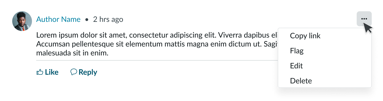
In this example, the user has opened the action menu on a comment.
Truncation
All labels, titles, and content within comments wrap to a new line so that the full text can be displayed to the user.
Usability
Nested comments comply with all internationalization and accessibility requirements.
Internationalization
When the display translates to a right-to-left (RTL) language, the header and the comments align on the right. Any comment replies appear indented from the right side. The "hide all replies" button, actionable metadata, and disclosure control align on the left.
Any proper nouns that can't be translated appear left-to-right (LTR).

In this example, the nested comments appear in a right-to-left (RTL) language.
Accessibility
Learn how to access the actionable elements of nested comments through keyboard interactions and screen readers.
Keyboard interactions
You can access the actionable elements of nested comments with these keyboard keys:
- Tab: Navigates through the links in the specified tab order (top to bottom, left to right)
- Space or Enter: Initiates the link action
When the action menu is open: - Arrow up and Arrow down: Navigates through actions in the action menu
- Space or Enter: Initiates the action in focus
Screen readers
Screen readers follow the standard tab order. For left-to-right (LTR) and right-to-left (RTL) languages, tab order begins with the first link in the first comment.