

Anatomy
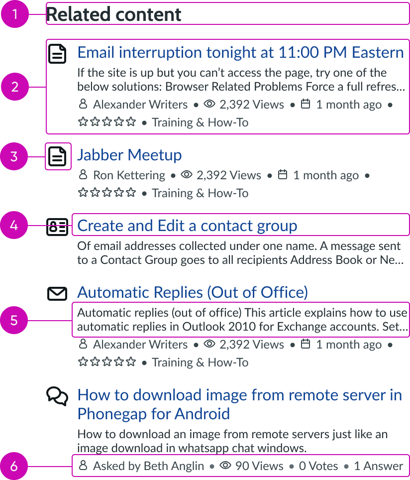
- Header: Title for the list of related content
- Related content item: Single content item that meets the related content criteria
- Icon (optional): Visual element that helps users understand the type of content
- Content title: Unique text that summarizes the specific content type
- Description (optional): Additional detailed text from the related content
- Content metadata (optional): Supplemental information (like author, views, or star rating) related to the content displayed
Subcomponents
See usage guidance for text link
See usage guidance for empty state
Usage
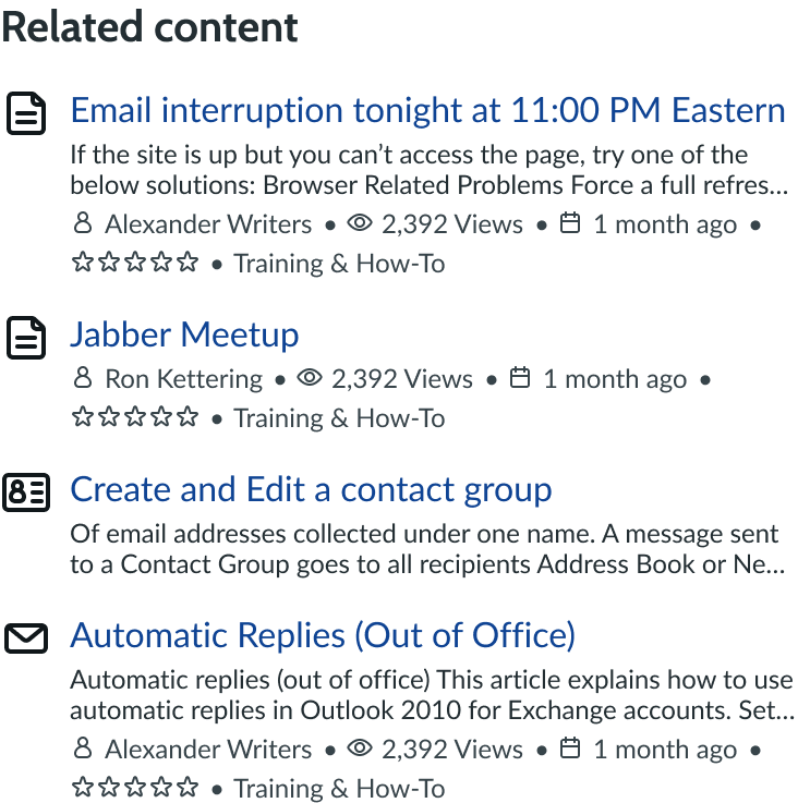
Use related content to help the user navigate to content that may be helpful or relevant to their current task or issue. Consider using a related content list with multiple content types when the user is viewing generic content. For example, a user could be looking at content that describes methods for connecting to the company internet.

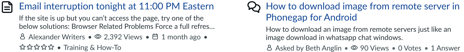
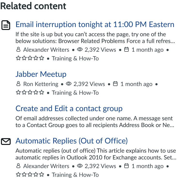
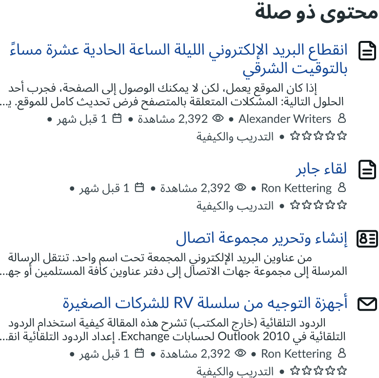
In this example, the related content list shows content items with multiple content types.
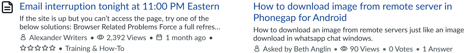
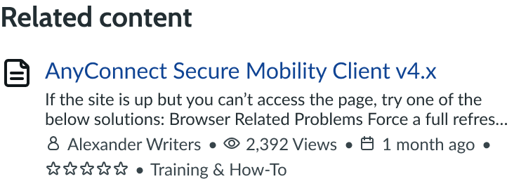
You can also use a related content list with only 1 content type when the user is viewing a specific type of content (like articles). For example, a user could be looking at an article for how to troubleshoot their router model.
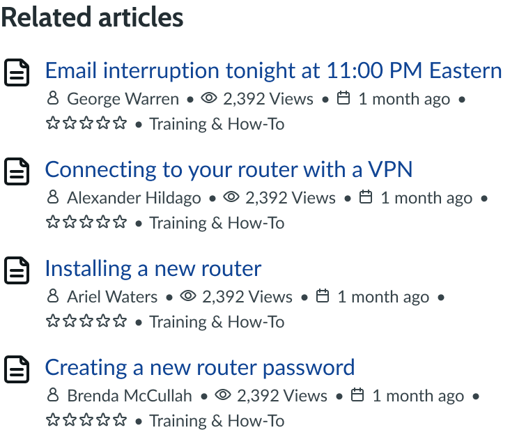
In this example, the related content list shows only the article content type.
Configurations
Learn how to customize related content by configuring the available properties.
Order
All subcomponents and elements within the component are in fixed positions that can't be changed.
The items within the related content are ordered according to how closely they meet the related content criteria. The order of the items changes depending on the content the user is currently viewing.
Component header
You can customize the header text to add more context to the content items. For example, you can use "Related articles " as the header text if you are only showing content categorized as an article. This is dependent on your individual use case.
The header doesn't truncate, and instead wraps to a new line if the text is longer than the container width.
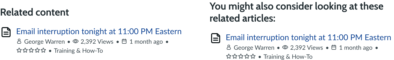
These examples show that the content header can be on a single line or wrap to multiple lines.
Related content
You can configure what the component shows as related content. This can be based on content type, data, rating, or other content classifications. For example, you can set the filter criteria to show only the highest-rated articles that are related to the current article the user is viewing.
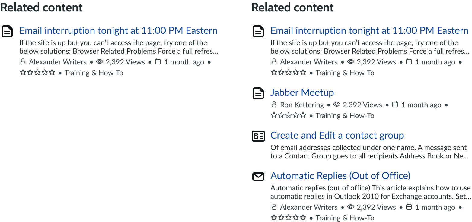
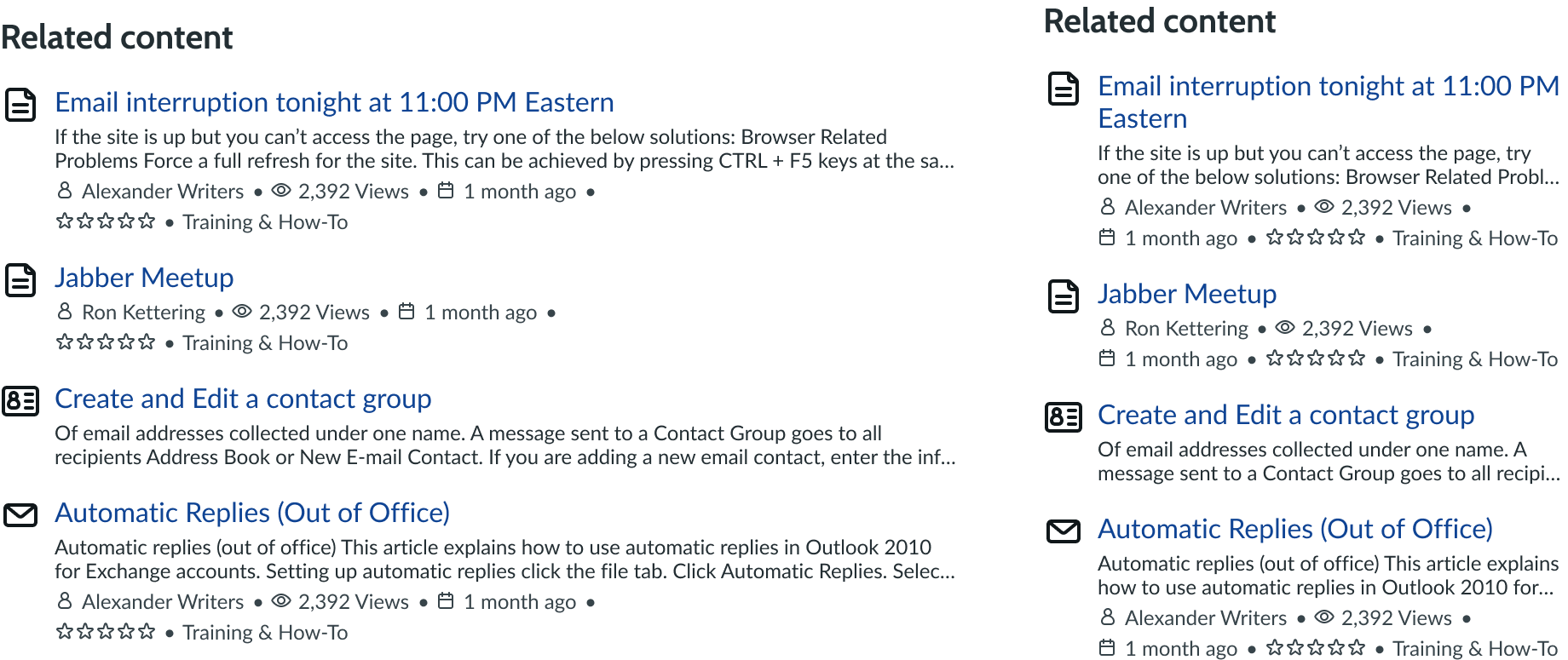
These examples show different numbers of related content items in the container.
Each content item within related content is independent of the others, but they all show together based on their relation to the content in view.
You can also configure the number of related content items shown. The total number of related results you show also determines the height of the component, which adjusts according to the number of items.
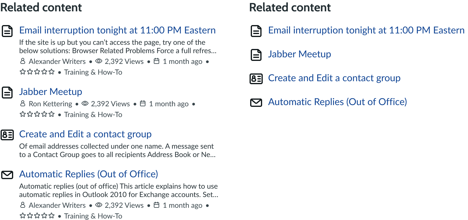
Content icon
Each type of content has an icon associated with it, but you can choose whether to display it. These icons help to visually distinguish content items from one another in a list of content. You can show or hide the content icon depending on your use case. However, remember that you can only show or hide icons for all related content and not individual items. It is recommended that you show the icon when you are showing different types of content but hide the icon if all content items are the same type. If you hide the icon, the other content item information moves left to occupy the space.
In this example, the content item appears with and without an icon.
Content title
Each content item must have a unique title. Titles can either be one line or wrap to a second line if they exceed the container width. A user can select the content title to go to that specific content item.
By default, the content title uses the tertiary text link variant. However, you can configure it to use the secondary variant instead. Avoid using the primary variant because a content item shouldn't be the primary action on the page.
Content metadata
You can configure what unique information shows for each of the content items. However, the type of information you can display is based on the information available for the content type.
Metadata can include author, view count, upload date, and star rating, in addition to other variables. You can also configure these to have a text link. If you include multiple types of metadata, a bullet appears between each item of to visually separate the information.
Additionally, if the string of metadata exceeds the width of the container, it wraps to a new line.
You can also hide the metadata in a related content item. When it is hidden, the space it takes up is collapsed.
Image
You can configure whether an image displays for the related content item. The image displays to the right of the content item and adds visual context to the content header. The image is hidden by default.
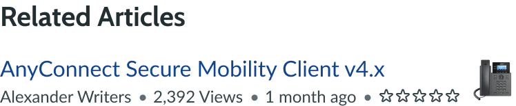
In this example, the phone icon provides a visual to add context to the related item.
Design recommendations
Learn how to apply related content in your design.
Keep the content titles short and concise for better readability and scannability.

Avoid using very long content titles.
If you show icons, enable them for all content items in the list.
Avoid inconsistencies in turning icons on or off within the same list.
Alignment and positioning
Position the related content component alongside the content in view. It should provide supplementary links but not be the focus of the page.
The content items within related list always align to the left of the container.
UI text guidelines
These are some recommendations for using text within related content:
- Use sentence case for all titles and column headers
- Capitalize only the first letter and any proper nouns in a string of text
- For empty state messages, tell the user what would appear in that section and why nothing is appearing
Behavior
Learn how related content behaves when the display changes or a user interacts with the component.
States
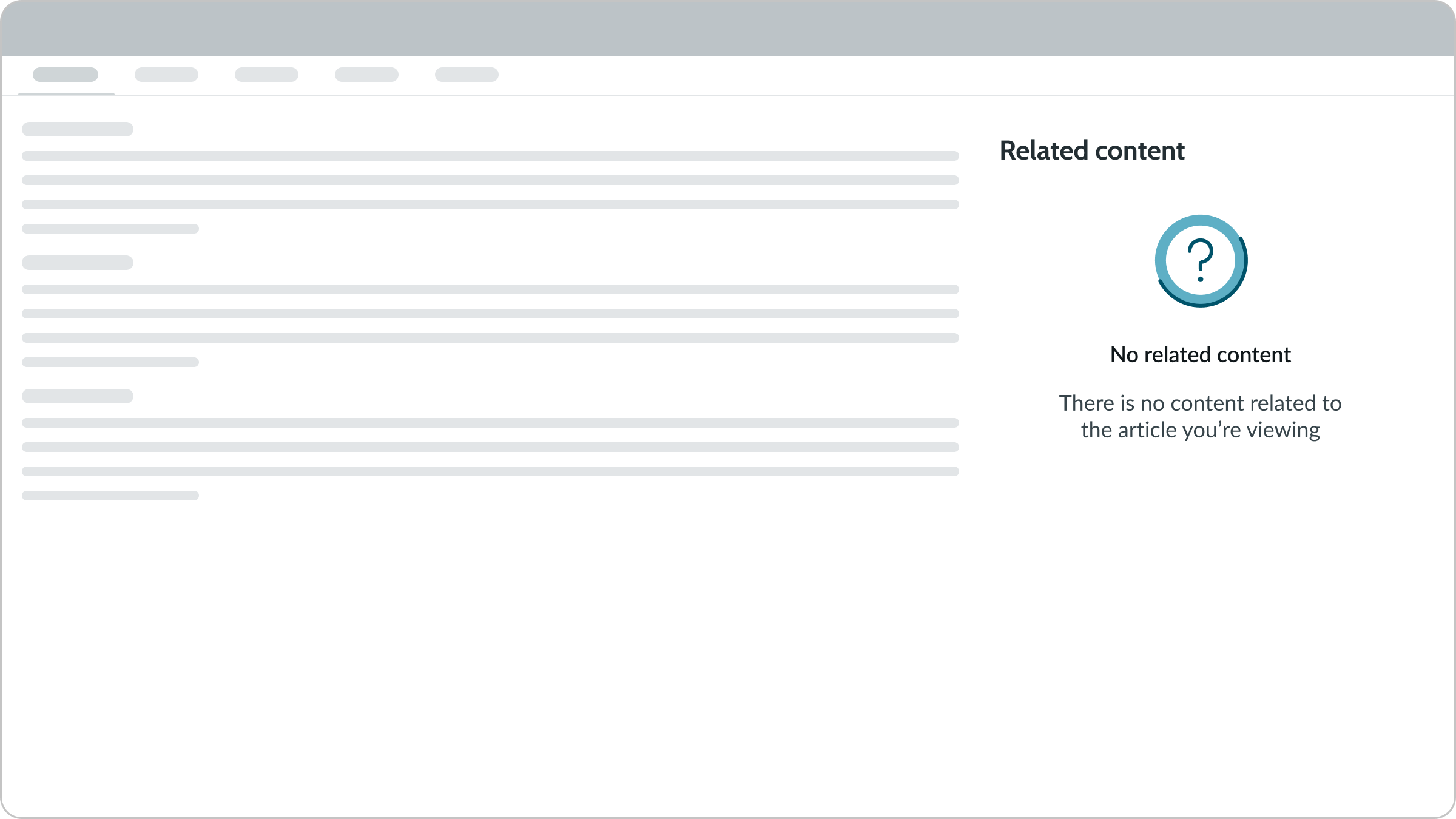
Related content can have an empty state. An illustration and a customizable message appear to notify the user that there is no content related to the content they're currently viewing.
Responsive behaviors
Related content responds to the component's container and size of the display. If the text exceeds the width of the subcomponent, it wraps to the next line.
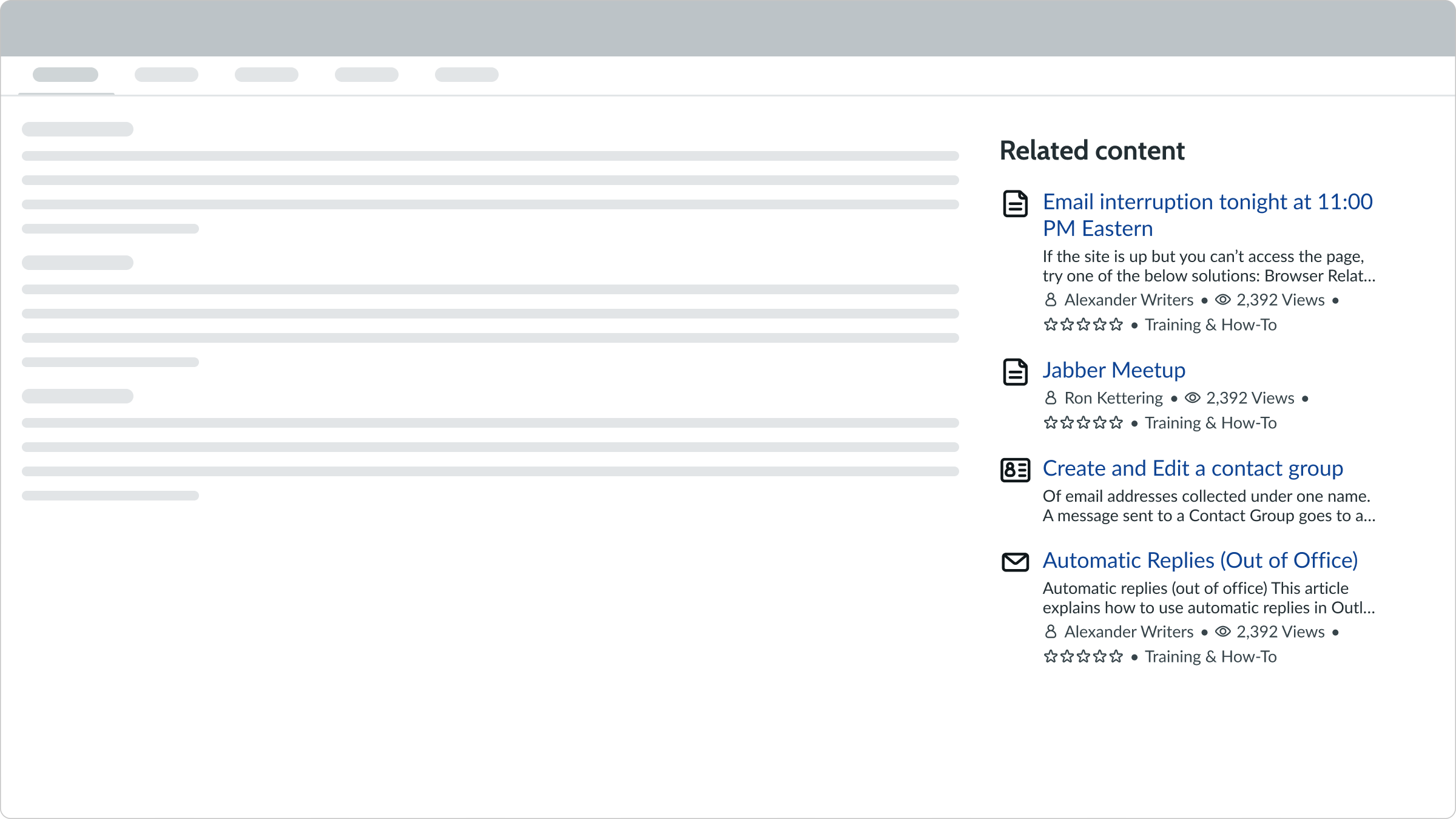
In this example, the subcomponents rearrange based on the width of the display
Interactions
The user can select the title or author of each content item. If they select the title, they go to that piece of content. However, if they select the author name, they go to the author's page.
Truncation
The text subcomponents within related content wrap to the next line instead of truncating. However, consider keeping the content headers short for better readability and scannability.
Usability
Related content complies with all internationalization and accessibility requirements.
Internationalization
When the display translates to a right-to-left (RTL) language, the header aligns to the right in addition to the related content items. Any proper nouns that can't be translated appear left-to-right (LTR).
Accessibility
Learn how to access the actionable elements of related content through keyboard interactions and screen readers.
Keyboard interactions
You can access the actionable elements of related content with these keyboard keys:
- Tab: Navigates through the links in the specified tab order (top to bottom, left to right)
- Space or Enter: Initiates the link action
Screen readers
Screen readers follow the standard tab order. For left-to-right (LTR) and right-to-left (RTL) languages, tab order begins with the first link in the first related content item.