

Anatomy
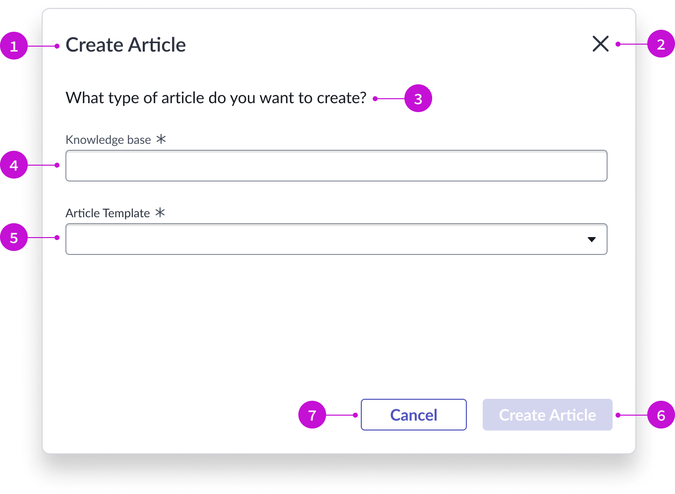
- Modal header: Title of the modal
- Close icon: Iconic button control to close the modal
- Modal body content: Descriptive text that tells the user what to do in the modal
- Typeahead component: Typeahead field that displays a reference list of all enabled knowledge bases
- Dropdown component: Dropdown list of available article templates associated with the selected knowledge base
- Primary button: “Create Article” button that creates a blank article for the author, using the selected template in the knowledge base specified
- Secondary button: Cancel button that cancels the selection and closes the modal
Usage
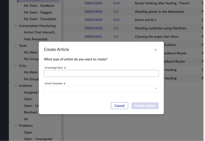
The knowledge article template selector modal enables the author of a new article to select the most appropriate knowledge base and template for their article.
Components
The knowledge article template selector modal is built with Horizon Design System components that have their own attributes and interactions.
Modal
The modal overlays the page from which it was launched and contains input fields and action buttons an author uses to create a knowledge article. For more information, see the usage guidelines for modal.
Interactions and behaviors
- The modal can display all available templates for the knowledge base selected by the author.
- The author selects the close icon to close the modal without creating an article.
- The primary button is disabled until the user selects a knowledge base and template.
- The author selects the “Create Article” button to open the template and begin writing.
Defaults
By default the modal displays these attributes:
- The primary button label is “Create Article.”
- The title, body text, and field labels are not configurable.
Typeahead
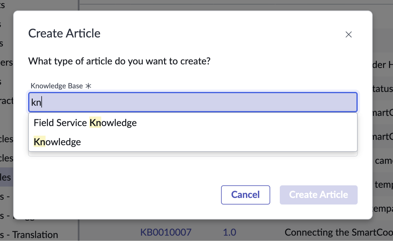
The typeahead component enables a user to quickly complete the input field for the knowledge base by narrowing down many results of a similar type. A dropdown panel offers suggestions dynamically as the user types. For more information, see typeahead.
Interactions and behaviors
- When the user places the cursor in the typeahead field, before typing, the dropdown list shows all available knowledge bases.
- When the user begins to type, the dropdown list displays selections that match the typed content. The characters the user enters are highlighted in the suggested results.
- If there are no matches for the text the user enters, the dropdown displays the message, “No results found.”
- If the user removes any text from the field, the field displays an error state; the field label and border appear in red.
Defaults
By default, typeahead displays these attributes:
- Field label is “Knowledge Base.”
- The input field is mandatory and is marked with the required asterisk icon.
Dropdown
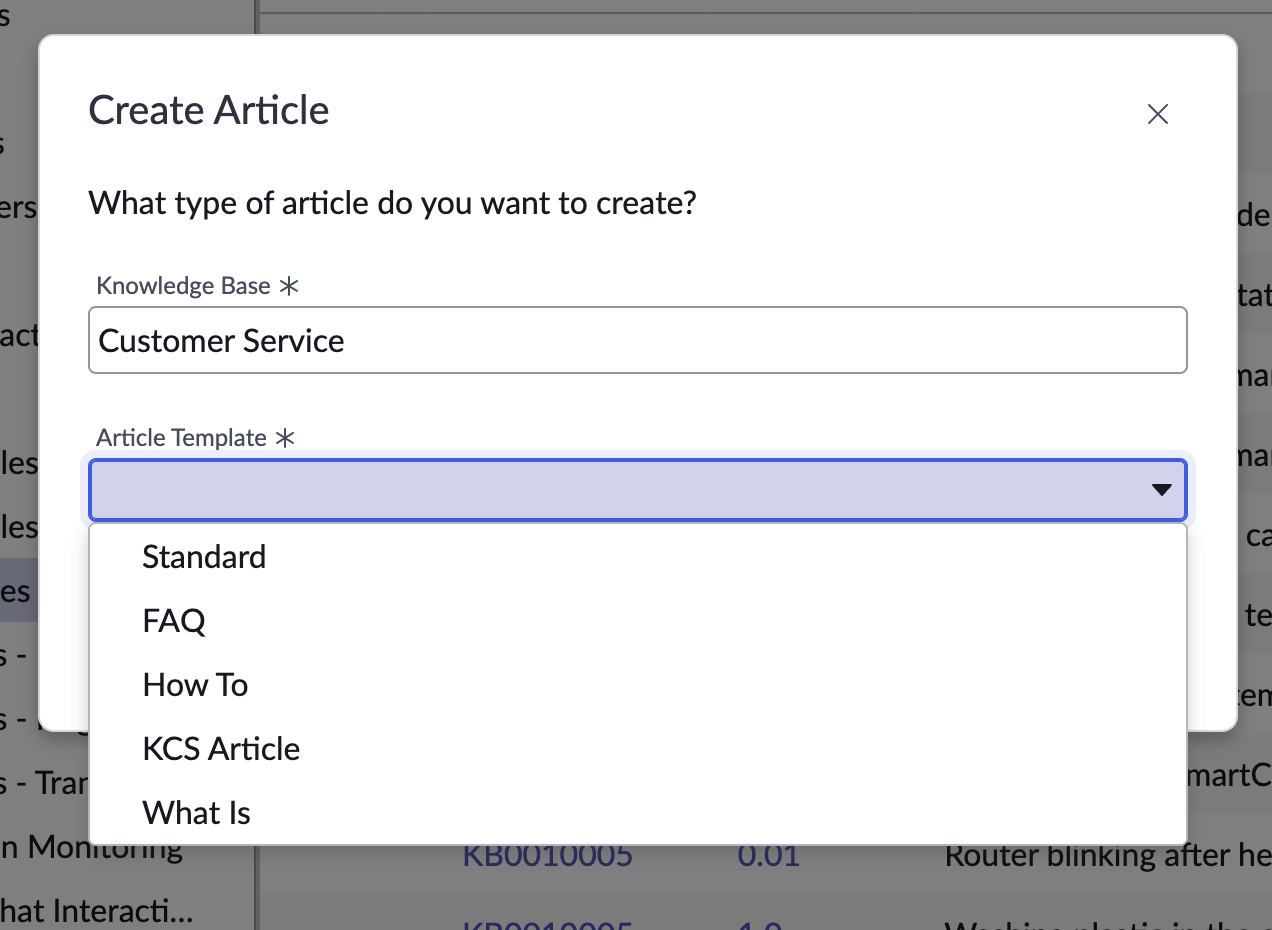
The dropdown panel helps the user select an available template for the knowledge base they specified. For more information, see the usage guidelines for dropdown.
Interactions and behaviors
- When the user selects the dropdown trigger, the list displays all the available templates for the knowledge base the user selected.
- If the list exceeds the height of the dropdown, a vertical scroll bar appears.
- If the user removes any text from the field, the field displays an error state; the field label and border appear in red.
Defaults
By default the knowledge article template selector modal displays these attributes:
- Field label is “Article Template.”
- The input field is mandatory and is marked with the required asterisk icon.
- The dropdown trigger is the caret icon.
Configurations
The knowledge article template selector page is intended to be used as-is in your experience and provides default functionality that fits most use cases. The page is created from a template that is updated automatically. If you copy the template in UI Builder and customize the page, you won’t receive template updates, and your page might not function properly after an upgrade.
Usability
The knowledge article template selector modal page template complies with all internationalization and accessibility requirements.
Internationalization
When this page template is used in an instance configured for a right-to-left (RTL) language, the individual components have their own behaviors. See the usage guidelines for the components used in the page for details.
Accessibility
For accessibility behaviors of specific components, see the usage guidelines for those components.
Keyboard interactions
Each component used in the knowledge article template selector page has its own tab order and keyboard interactions. See the usage guidelines for details.
Screen readers
When you apply ARIA labels to a component, screen readers announce the controls and content of each component in the prescribed tab order. See the usage guidelines for details.