

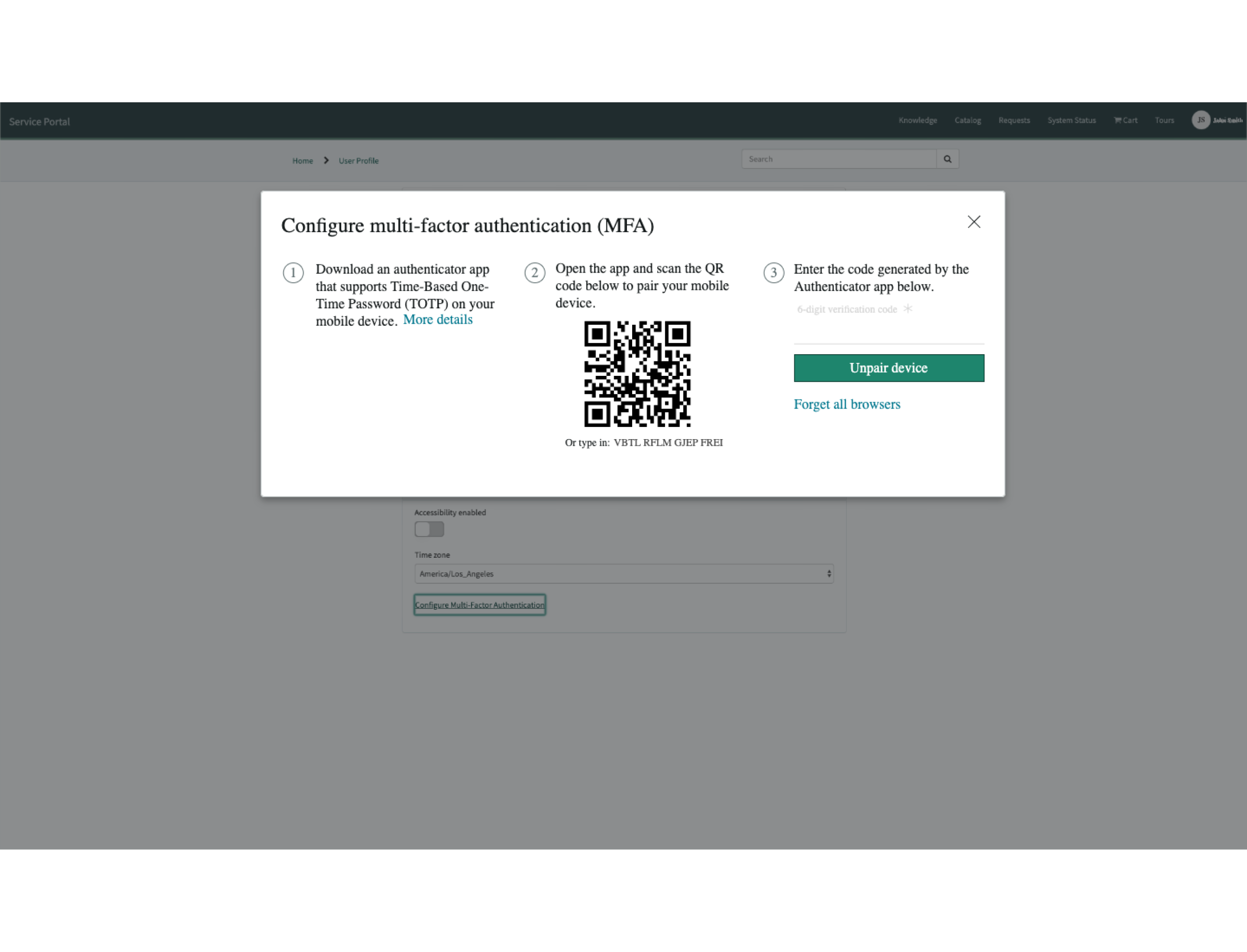
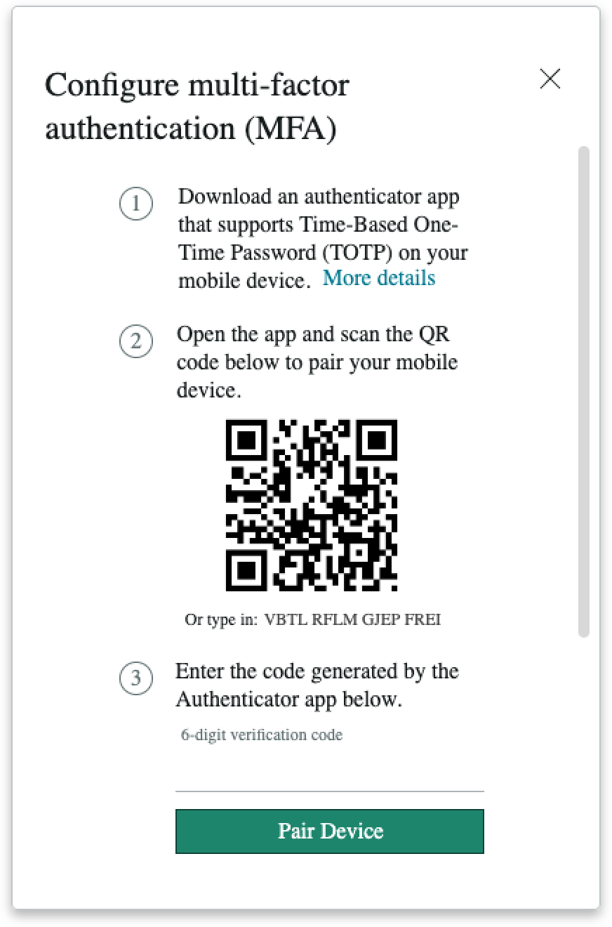
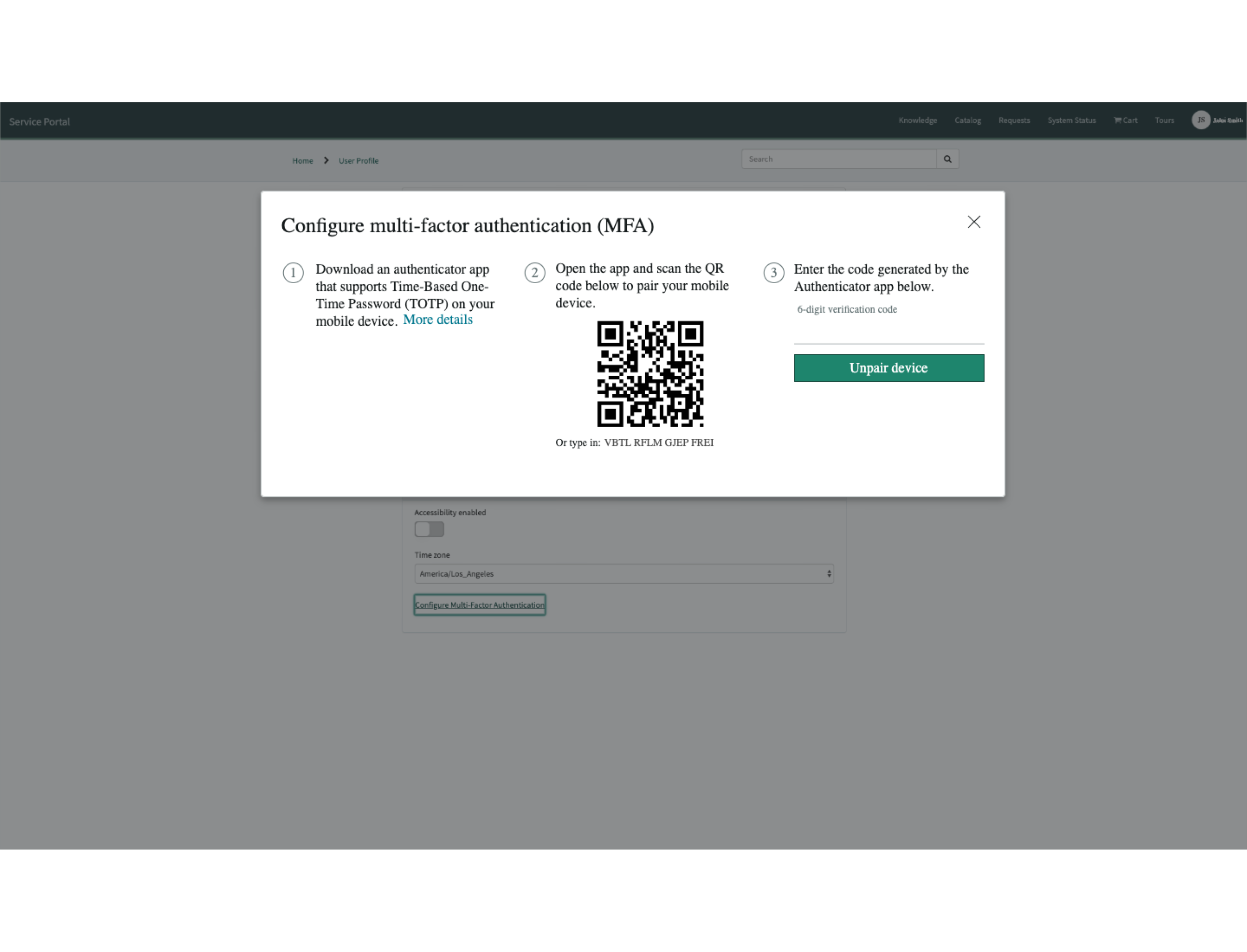
Anatomy
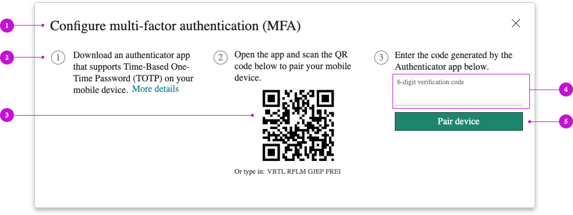
- Heading: Text that describes the MFA activity
- Setup steps: Numbered steps for the user to follow through the setup process
- QR code: Matrix barcode to scan and pair with the user's mobile device; a type-in code version of the barcode is included as backup
- Form field: Input field that allows the user to enter the 6-digit verification code
- Configure action: Button to pair or unpair the current device
Subcomponents
See the usage guidance for modal
See the usage guidance for stepper
See the usage guidance for input field
See the usage guidance for button
Usage
Use MFA setup to require a user to provide a verification code in addition to a password at login. This code is generated by the user's mobile device and ensures an elevated level of security.
Configurations
Learn how to customize MFA setup by configuring the available properties.
Heading
Create a heading for the setup modal that describes its function.
Custom content
You can configure custom content for step 1 of the procedure and add any links you need. If you don't create custom content, the default content appears, directing the user to download the authenticator app and providing a link to a download source.
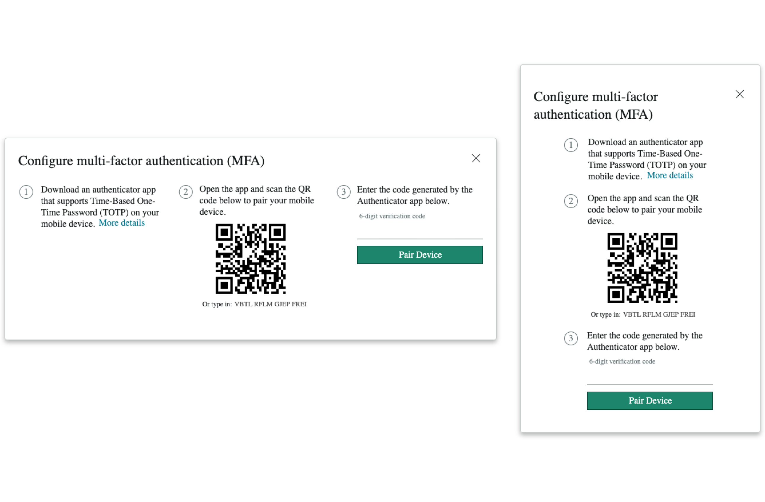
Layout
You can configure the MFA setup component for a vertical or horizontal layout, depending on the application. Use the vertical layout for mobile devices.
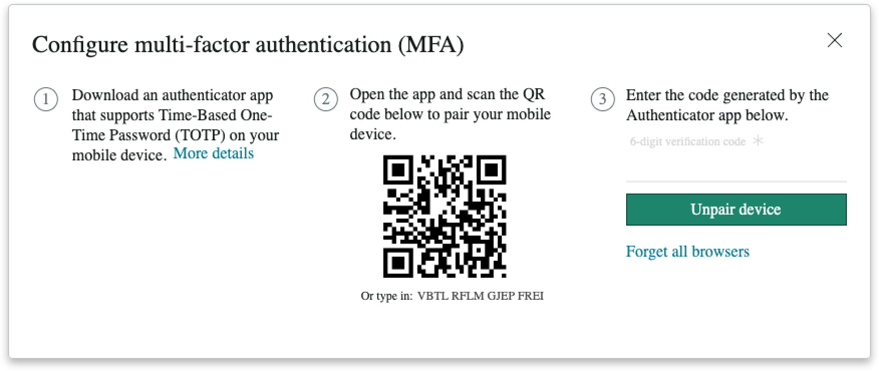
Unpair device
End users can unpair a current device using the MFA setup screen.
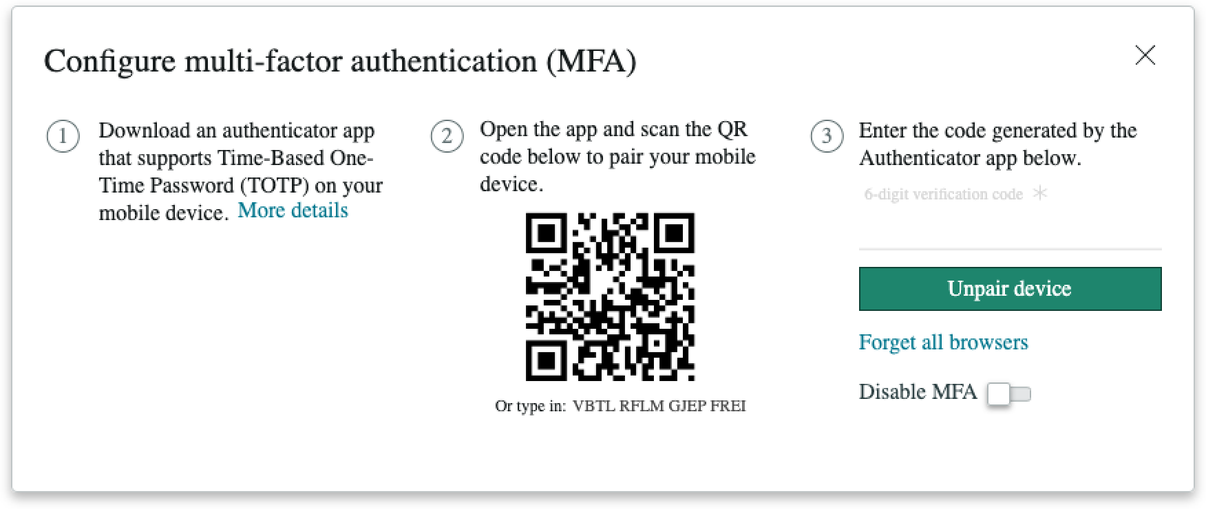
Disable MFA
Admin users can select the Disable MFA toggle to disable the use of MFA.
Design recommendations
Learn how to apply MFA setup in your design.
Alignment and positioning
MFA setup doesn't have any guidance on alignment or positioning. The MFA modal opens from the user profile page in the upper center portion of the page.
UI text guidelines
These are some recommendations for using text within MFA set up component:
- The title and body text should be brief, clearly describing the purpose and intent of the feature.
- The button text should be concise, actionable, and clearly state what happens when a user selects the button
- Body text in steps should be simple and to the point. Don't repeat the heading text.
Behavior
Learn how MFA setup behaves when the display changes or a user interacts with the component.
Responsive behaviors
Learn how MFA set up responds to changes in a container or display.
Overflow
If the setup modal content extends beyond the maximum height, a vertical scrollbar appears so that the user can scroll to see all the content.
Interactions
When the MFA setup modal opens, a semi-transparent shade appears over the existing content, showing that it's no longer interactive or accessible.
Usability
MFA setup complies with all internationalization and accessibility requirements.
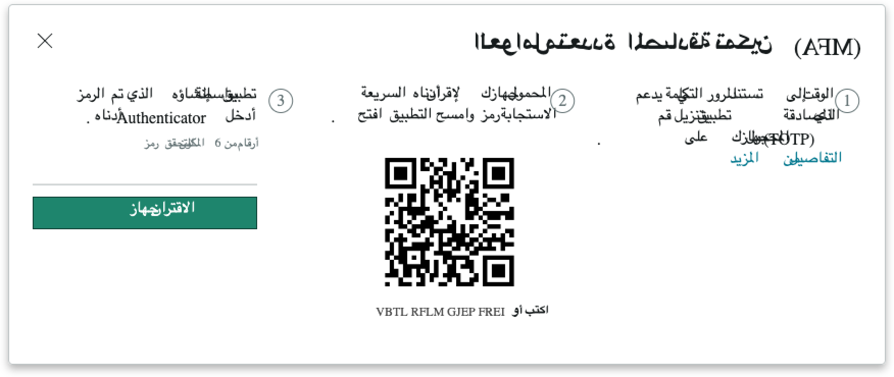
Internationalization
When the display translates into a right-to-left (RTL) language, the modal content flips. The close icon appears on the left, and the modal title and content aligns on the right.
Accessibility
Learn how to access the actionable elements of MFA setup through keyboard interactions and screen readers.
Keyboard interactions
You can access the actionable elements of modal with these keyboard keys:
- Shift + Tab: Moves focus to the element that was previously in focus
- Arrow right/left: Moves the text entry caret across available text
- Escape: Closes the modal
Screen readers
When you apply ARIA labels to a component, screen readers announce the controls and content of MFA setup in the prescribed tab order.
- Text link: "More details"
- Input field: "6-digit verification code"
- Button: "Pair device"
- Icon: "Close"
All dialogs should include a visible element with a role button that closes the dialog. This ensures that a close icon always remains, whether the header is required or optional.