

Anatomy
Learn about the individual parts of the search results component.
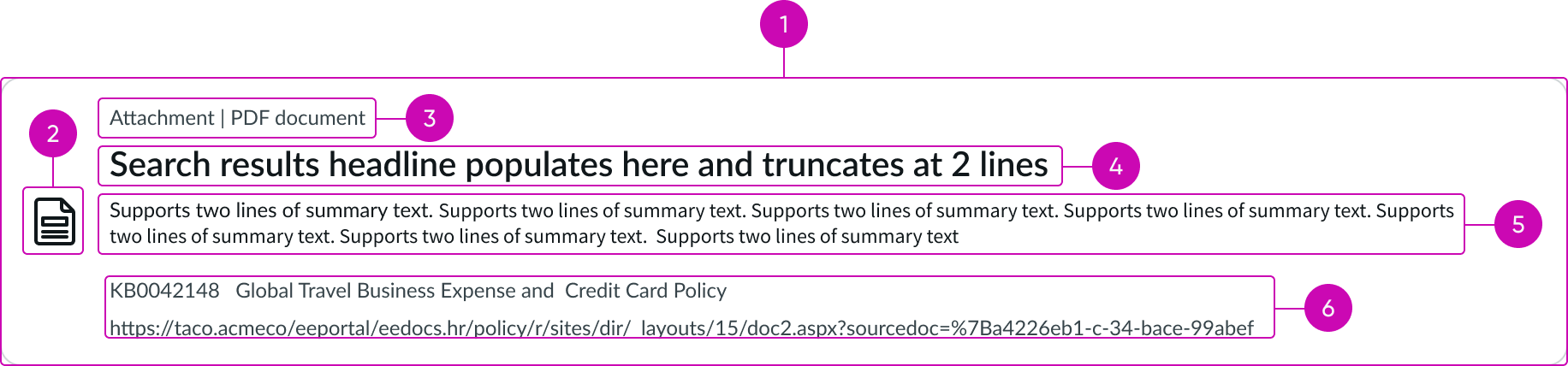
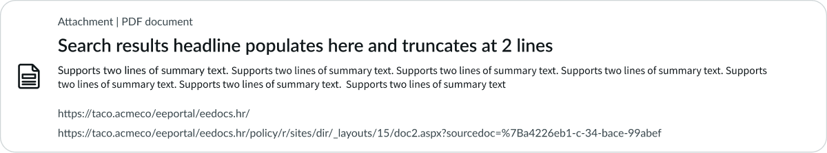
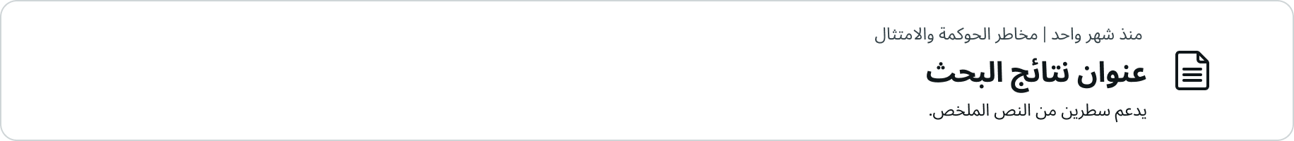
- Results card: The container for each search result
- Marker: Icon, image, or avatar representing the search result type
- Identifier: Each result type has a 1-line identifier (such as the category for an article or the department for a person), with up to 3 identifiers
- Title: Each result type has a title of up to 2 lines before truncation (such as the title for a knowledge base article or the name for a person)
- Summary: Each result type has a description of up to 2 lines before truncation (such as the body for an article or the job title for a person)
- Footer details: Usage examples include article title, article link, item price, or person job title, and may appear in 2 rows
Usage
The search result component shows a list of results in the context of a run search query within the search results page. For other list types and usage, see usage guidance for data set.
Variants
Learn about the variants of search results.
Types
There are 4 defined use cases for search results: article, article attachment, service catalog item, and person.
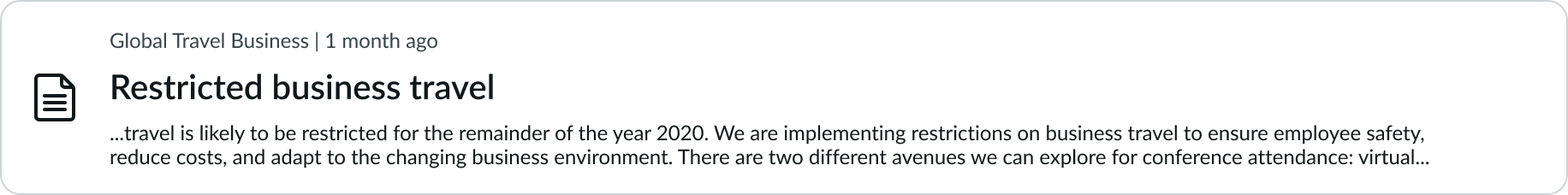
Article
The search result provides a highly relevant portion of information, pulled from a knowledge base article on the topic.
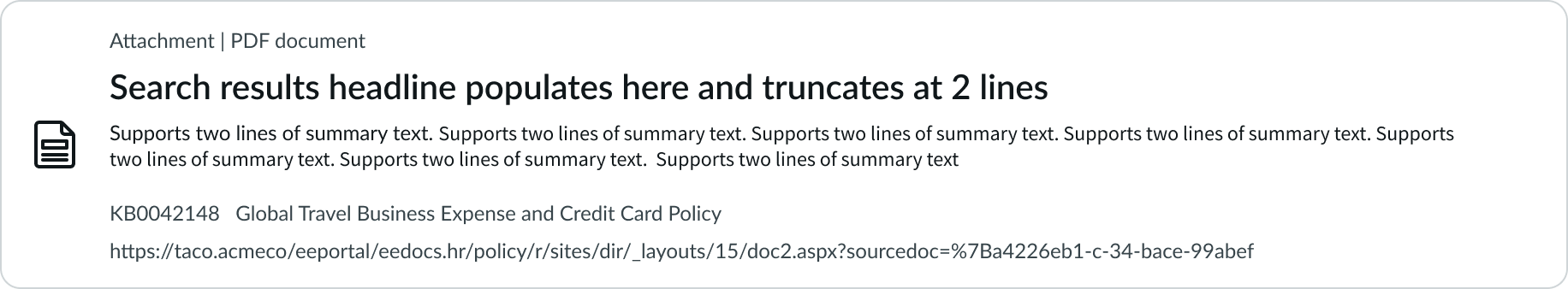
Article attachment
The search result provides a highly relevant portion of information, pulled from an attachment of a knowledge base article on the topic.
Service catalog item
The search result provides a highly relevant portion of information, referencing an item from the service catalog, with associated information like attributes and price.

Person
The search result provides a highly relevant portion of information about a single person from the employee directory, including their corporate identity and contact.

Configurations
Learn how to customize search results by configuring the available properties.
Number of results
You can configure a specific number of results to appear by default.
Actions
For each type of search result, you must provision at least one specific action. For example, for a service catalog-Item type, the action might be "Request this item" to take the user to the service catalog form used to fulfill the request. Secondary actions are limited to displaying a URL as a link, as shown in the article attachment result type.
Result markers
For each type of search result, you may decide to override the default marker. For an article, article attachment, and service catalog item, the default marker is a default icon. You may decide to change and differentiate between article type and catalog item. You may also choose to use an image rather than an icon to represent a specific catalog item. For people search results, the default marker is an avatar shown as the first and last name initials, and similarly, you may choose to allow a photo to appear instead of an avatar.
Design recommendations
Learn how to apply the search results component in your design.
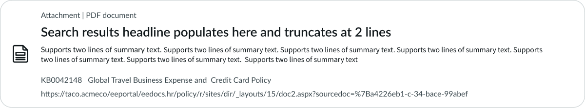
Ideally, each result provides a single click target. In some cases, there may be 2 targets, such as an article attachment, where the card links to the attachment and the second link goes to the source article. There should be a maximum of only 2 linked objects per result.
Don't configure multiple links per result, as several targets may cause user confusion.
Alignment and positioning
Search results can't be placed manually, but must be positioned within the search results list and container.
UI text guidelines
These are some recommendations for using text within the search results component.
- Use sentence case for all titles, labels, and column headers
- Keep all text labels informative and short to increase readability and scanning
- Keep content concise and purposeful to help a user understand options and actions
- Capitalize only the first letter and any proper nouns in a string of text
- Ensure content is contextual and specific to offer guidance and support to the user
Behavior
Learn how the search results component behaves when the display changes or a user interacts with the component.
Interactions
Learn how the search results component responds when a user interacts with it.
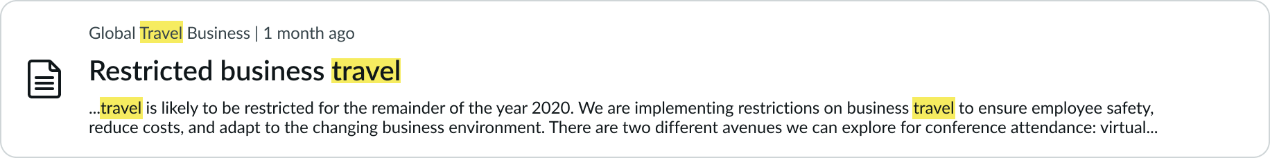
Hit highlight results
The hit highlight is the visual indicator that marks relevant keyword matches. The highlight appears on all character matches displayed in the result card (except for the identifier). A hit highlight can display as both a color wash and an increase in font weight. If the font weight is at maximum, then the color wash is the sole indicator of a hit. For accessibility reasons, use a non-transparent color wash.
For search results without a keyword, hit highlighting won't appear.
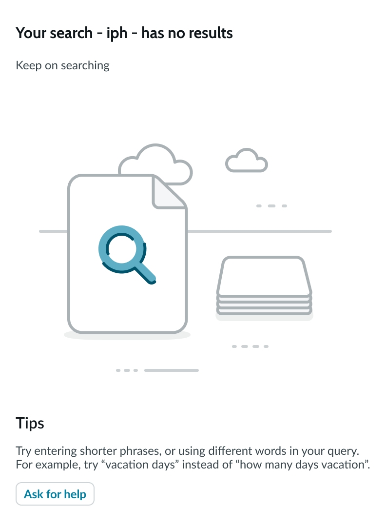
No results
When there are no results to show, an empty state appears, with messaging such as "Tips" and actions such as "Ask for help."
Auto-corrected results
If a keyword is entered with a typo ("ipone") but has a strong match ("iphone"), then search results for the matched keyword are shown. If the user chooses to override the original typed keyword ("ipone"), the new search results will show an exact match for the query.

Truncation
When text in the search results component exceeds the width of the container or content area, the text truncates with an ellipsis, and a tooltip shows the full content on hover. The identifier, header, and summary subcomponents each wrap text and display up to 2 lines before truncation.
A result summary may be presented as an extract of the target content.
Front truncation
A summary (any result type) may be extracted from within the source, and therefore presented as front truncation with an ellipsis (…).
Segments truncation
A summary (any result type) may also be presented as multiple extracted segments, with each segment separated by an ellipsis (…).

Usability
The search results component complies with all internationalization and accessibility requirements.
Internationalization
When the display translates to a right-to-left (RTL) language, the search results component follows the same behavior as LTR, except with a reversed right-justified orientation.
Accessibility
Learn how to access the actionable elements of search results through keyboard interactions and screen readers.
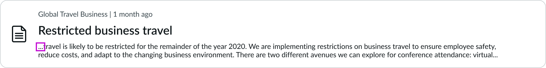
Search results tab order
- Primary search result target: Links to the main result
- Secondary result target: if configured, this links to a secondary source such as the referring KB article
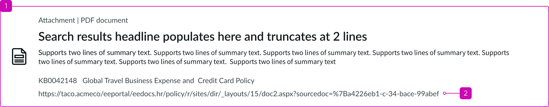
In this example, the accessible label names (highlighted) are shown in tab order along with the search results link for the referenced doc.
Keyboard interactions
You can access the actionable elements of search result with these keyboard keys:
When focus is on the primary search result:
- Tab or SHIFT + Tab: Moves forward or backward through elements in the tab order
- Enter or Space: Activates actionable elements
Screen readers
When you apply ARIA labels to a component, screen readers announce the controls and content of search results in the prescribed tab order.