

Anatomy
Learn about the individual parts of data set.
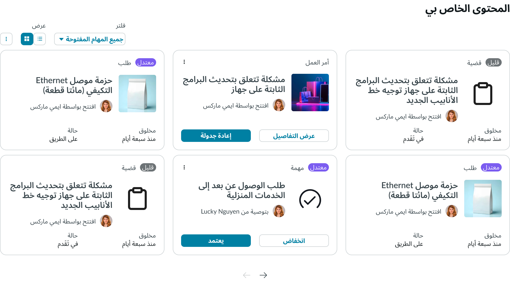
Data set content
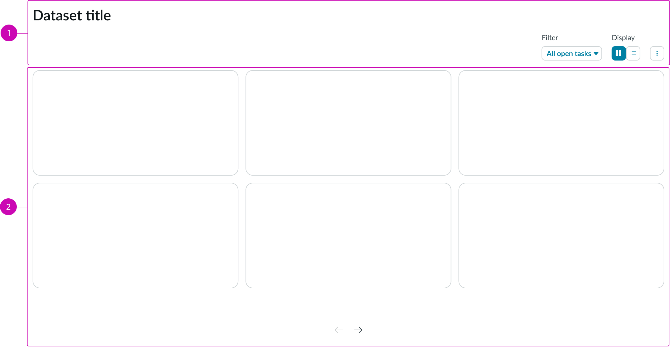
- Toolbar: Area that contains subcomponents for filtering the records within the content area
- Content area: Area for displaying filtered records; can show records in a card or list view
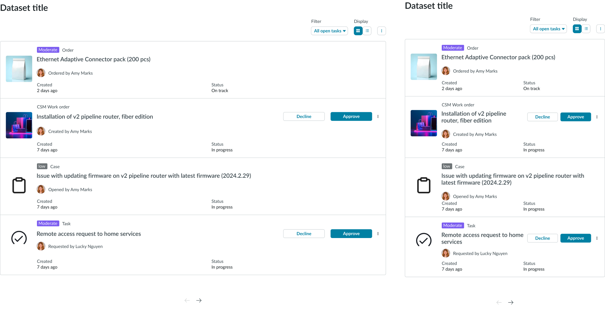
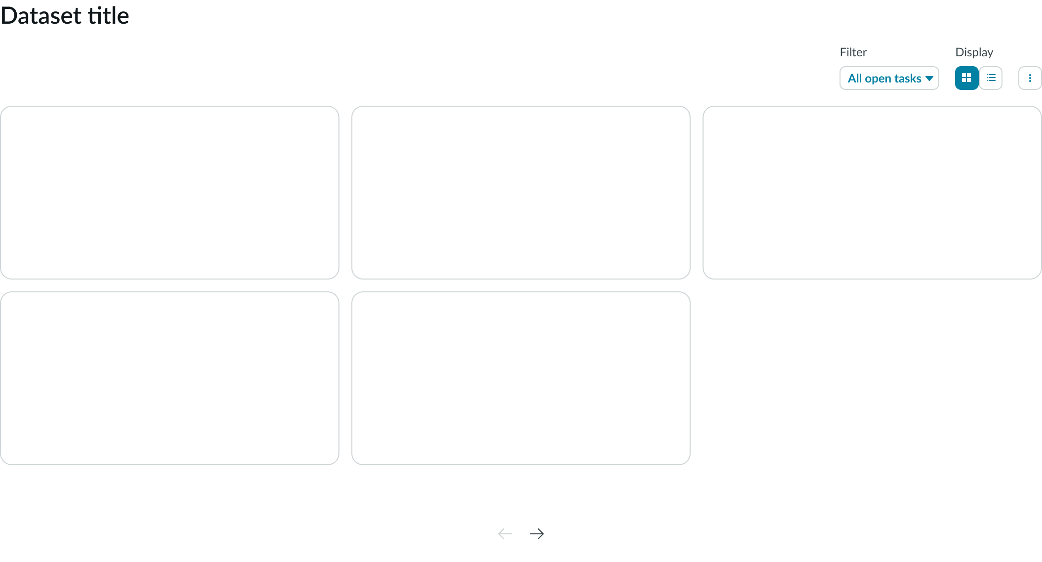
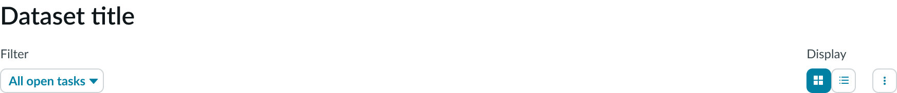
Data set toolbar
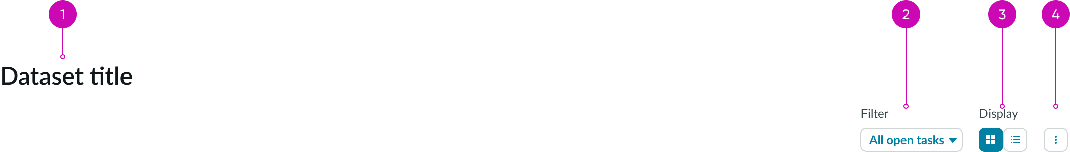
- Title (optional): Name of the data set; if disabled, the title area collapses to eliminate white space
- "Filter" dropdown (optional): Configurable subcomponent with filtering options; the user can only select a single option from the dropdown panel
- Display type (optional): Iconic buttons that change the layout of the data set between a list or card view; you can display both options or display only one view to the user
- Overflow menu (optional): Iconic button that displays a list of additional actions related to the data being represented in the content area
Subcomponents
See usage guidance for dropdown
See usage guidance for pagination control
See usage guidance for iconic button
Usage
Use the data set component to provide user access to records. Use only the card view for displaying records where users need to take immediate actions. Alternatively, use only the list view for displaying information that the user needs to scan quickly.
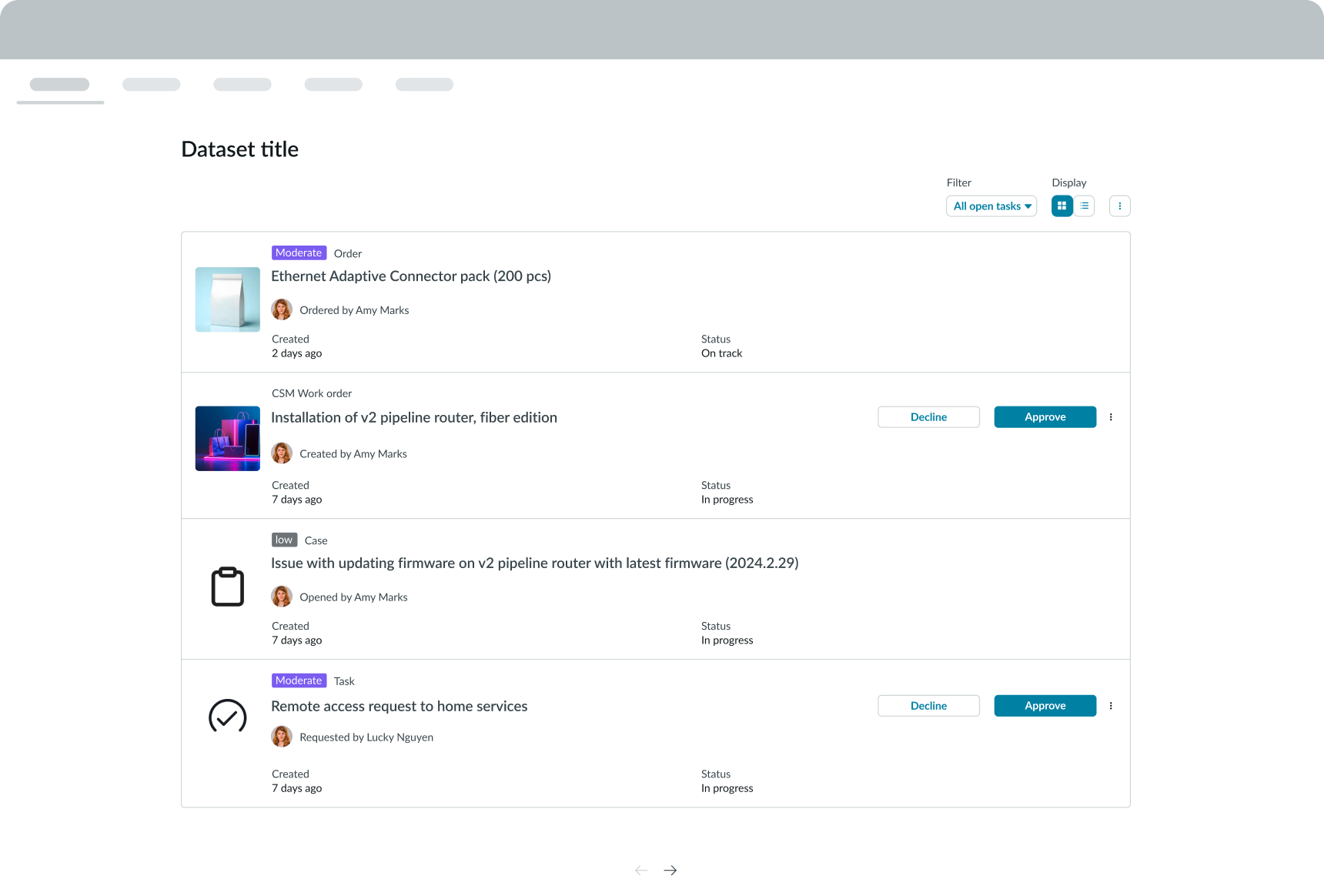
In this example, a data set component appears in a user portal page.
Variants
The data set component is composed of a toolbar and a content field. Both areas contain different subcomponents to help users interact with the records.
Types
There is only one type of the data set component. However, the content area can display as either a card or a list view, depending on the default view you choose. You can also choose to hide the display type control and only show the user one view type.
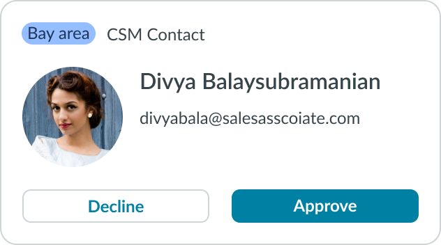
Card view
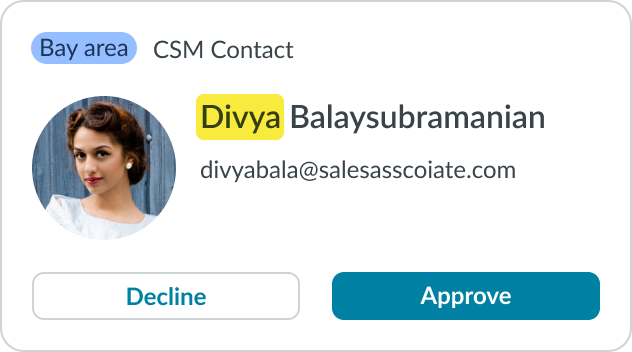
In the card view, each record displays as a single card. You can configure from 1 to 6 columns, depending on the card size you select. See the Sizes section for details. Users can then sort these cards based on their filter selections.
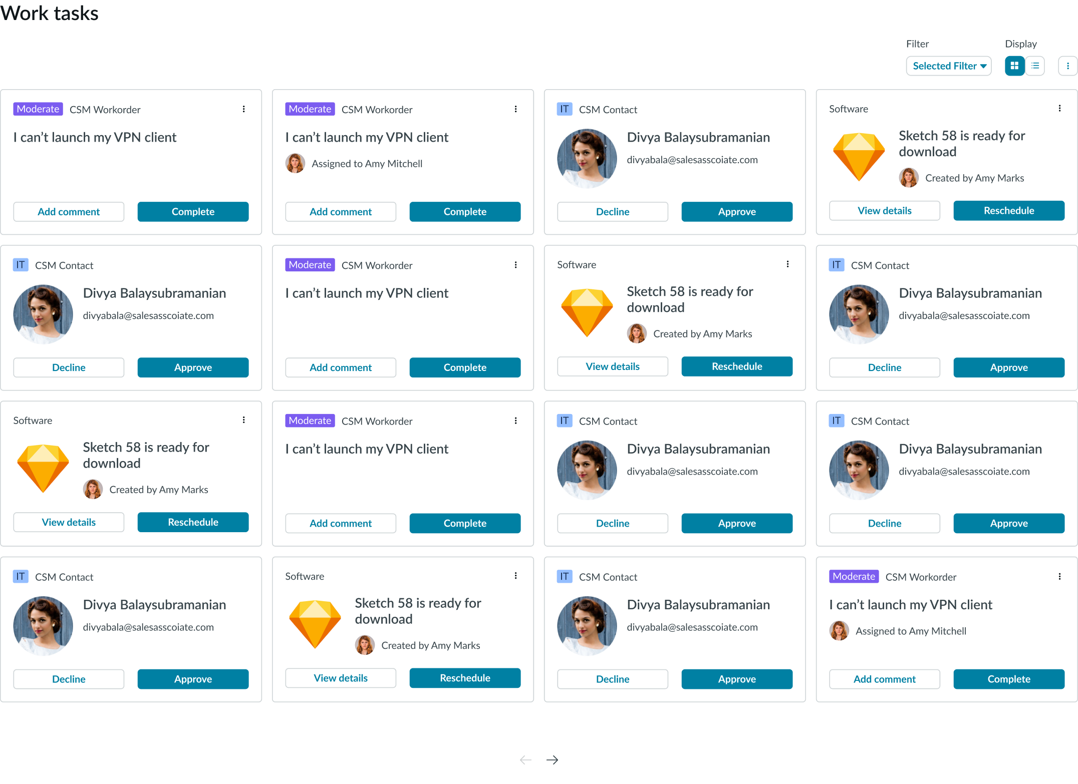
Whether a card has actions is dependent on the record. When actions appear on the card, users can take an immediate action without having to open the record.
List view
In the list view, each record displays as a single list item. You can configure which data in the record you want to display in the list item. Images or icons are allowed on the left side of the list item only.
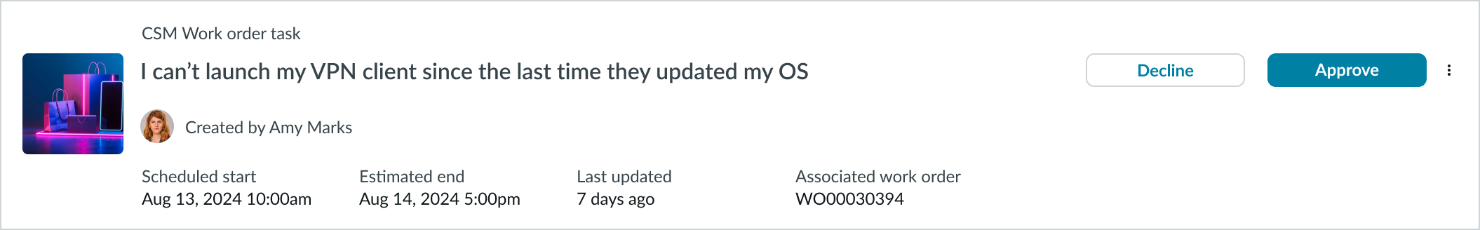
The list view is responsive and shows data based on the space you give it.
Sizes
You can select height and width sizes for cards in the card (grid) view. The list view is not affected by the card size selected for the grid view. Row heights in the list view are dynamic, based on the amount of data in the cards.
Card height
Data set has 3 sizes for card height: small (sm), medium (md), and large (lg). The size you choose depends on how many cards you want to display in each page of your grid view.
Configurations
Learn how to customize data set by configuring the available properties.
Toolbar
You can configure the toolbar to either show or hide. When the toolbar is hidden, the space it occupied collapses. You might consider hiding the toolbar when you want to display a set of pre-filtered records without the ability to customize that filter.
Cards
You can add buttons to a card so that users can take additional actions from within the card. For example, the user could approve a request directly from a card. The card templates use the core card component internally and Entity View Action Mapping (EVAM) to determine how card data is displayed. For more information, see EVAM documentation.
Loading records
You can configure the number of results a user sees in the display by setting the maximum number of items to display per page. The list view (or grid) then adjusts accordingly. The page size can automatically adjust to ensure consistency between the card and list views
The loading option can be a pagination control that includes "Next" and "Previous" iconic buttons. You can also load more content in line with a button. The pagination control is always aligned in the center below the content area.
An example of pagination arrows at the bottom of a card view.
Card width
Configure any card width you want, greater than 130 pixels.
Design recommendations
Learn how to apply data set in your design.
Alignment and positioning
Within the data set toolbar, the search field and data set title always appear on the left side, while the action menu appears on the right side. You can position the remaining subcomponents and elements on the left or right sides.
UI text guidelines
It's possible for the user to get to an empty state in the data set component. When this happens, you can provide them with a custom empty state message.
Empty state messages should be succinct and informative and should provide the user with guidance on what to do next. These messages are limited to a single line, which truncates without a tooltip if it exceeds the given space.
In this example, the text provides guidance for how the user could improve their search
Behavior
Learn how data set behaves when the display changes or a user interacts with the component.
Responsive behaviors
Learn how data set responds to changes in a container or display.
Toolbar
When the content area shrinks, the toolbar resizes to match the content area width. The filtering and sorting controls condense as the toolbar resizes, and the Filter option moves underneath the Search bar. Instead of a dropdown, the user can access the Filter and Sort by options from the Filter button.
Display types
In the card view, the cards automatically adjust their size based on the number of available columns. The card height is set with a property, regardless of the amount of data returned by the query.
In the list view, the list items automatically adjust based on the container width and the amount of data in the entry.
Interactions
Learn how data set responds when a user interacts with it.
Data set title
The user can select the title of a card or list item to open that specific record.
Search
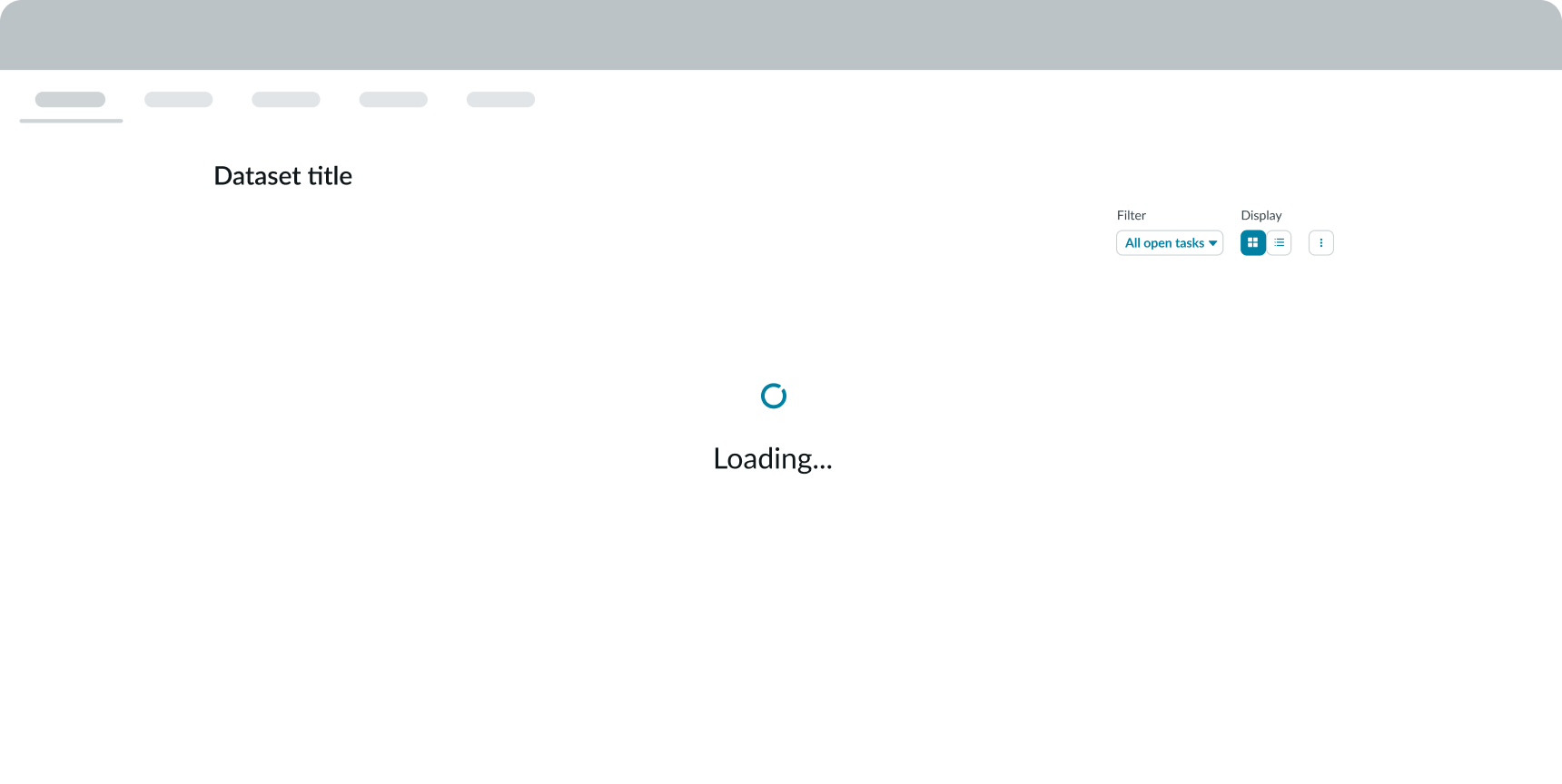
When the user performs a search using the input field, a loading state appears while the system collects the results. The loading state uses the loader component.
When the records display, any matches highlight in the card or list views.
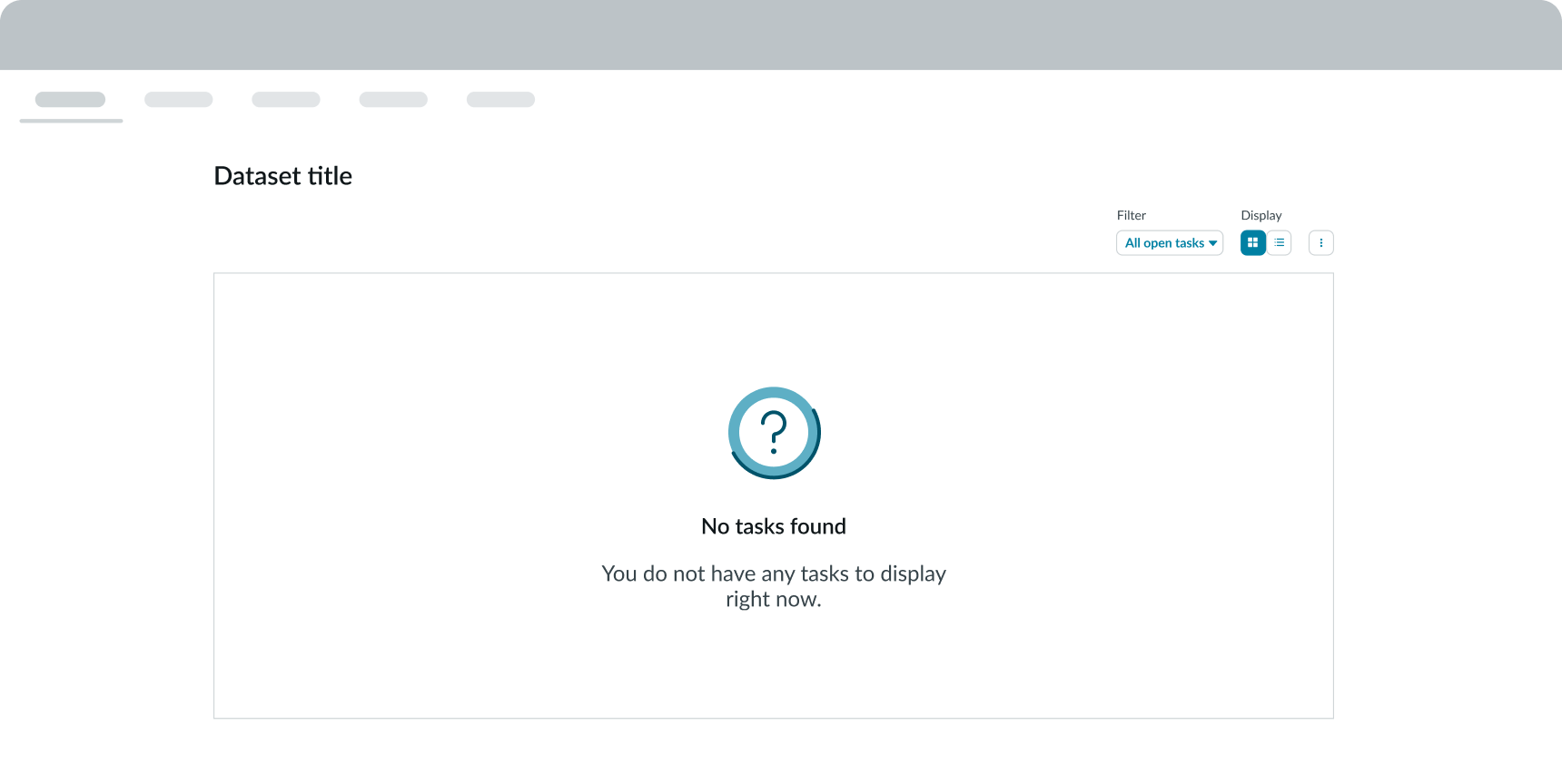
Empty state
If there are no results based on the user's search criteria, an empty state appears. The empty state includes an image and custom message.

In this example, there are no tasks to display based on the search criteria.
Usability
Data set complies with all internationalization and accessibility requirements.
Internationalization
When the display translates to a right-to-left (RTL) language, the controls, Search field, and title reverse positions.
Accessibility
Learn how to access the actionable elements of data set through keyboard interactions and screen readers.
Data set tab order
This is the tab order for data set.

Keyboard interactions
- Tab: Navigates through actionable items in the toolbar, following the specified tab order
- Space or Enter: Launches an action or switches a stateful button ON and OFF.
Focus on a dropdown panel
- Space or Enter: Opens the dropdown panel
- Arrow up and Arrow down: Shifts focus between options in the dropdown without opening the dropdown panel
Focus within a menu
The user can place focus on all items in a menu.
- Spacebar: Changes the selection in the menu without closing it; if an option isn't checked, it checks the focused option and unchecks the previously checked option
- Arrow keys: Shifts focus to the next item; if focus is on the last item, it shifts to the first item, if enabled
- Home: If arrow-key wrapping is not enabled, it shifts focus to the first item in the open menu
- End: If arrow-key wrapping is not supported, it shifts focus to the last item in the open menu
- Keys A -- Z: Shifts focus to the next menu option in the open menu that starts with the selected letter
- Escape: Closes the menu in focus and returns focus to the element that opens the menu
- Tab: Shifts focus to the next element in the tab sequence; if the item in focus is in a menu, it closes that menu
- Shift + Tab: Shifts focus to the previous subcomponent or element in the tab order; if the item that had focus is not in a menu, it closes its menu and opens all parent menu containers
Screen readers
Screen readers follow the tab order of the data set component. For left-to-right (LTR) and right-to-left (RTL) languages, tab order begins with the Search field.
These are the ARIA accessible names for each subcomponent or element within the data set toolbar, in the indicated tab order.
- Filter
- Display type
- Overflow menu