

Anatomy
Learn about the individual parts of recommended actions.
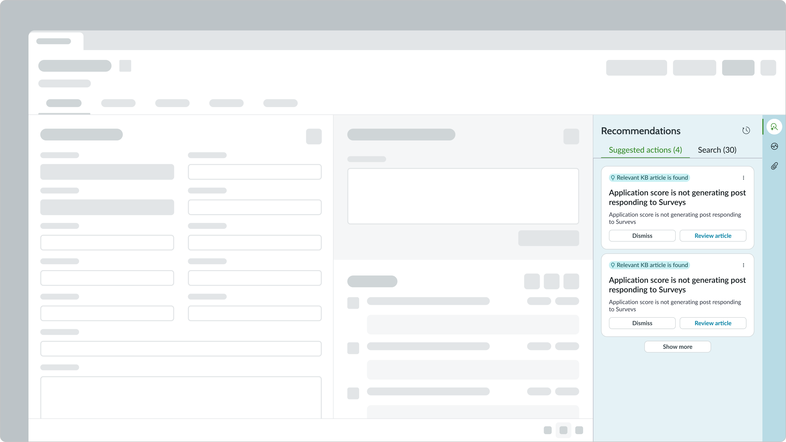
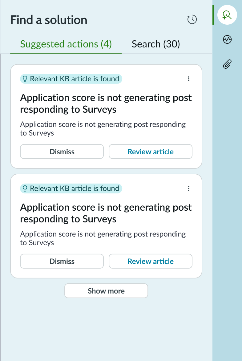
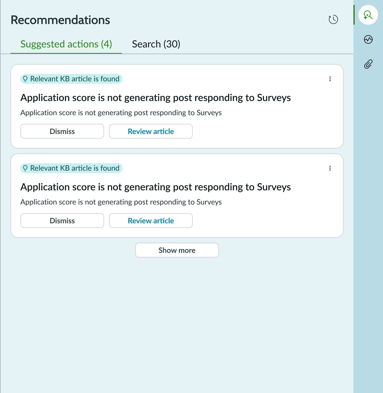
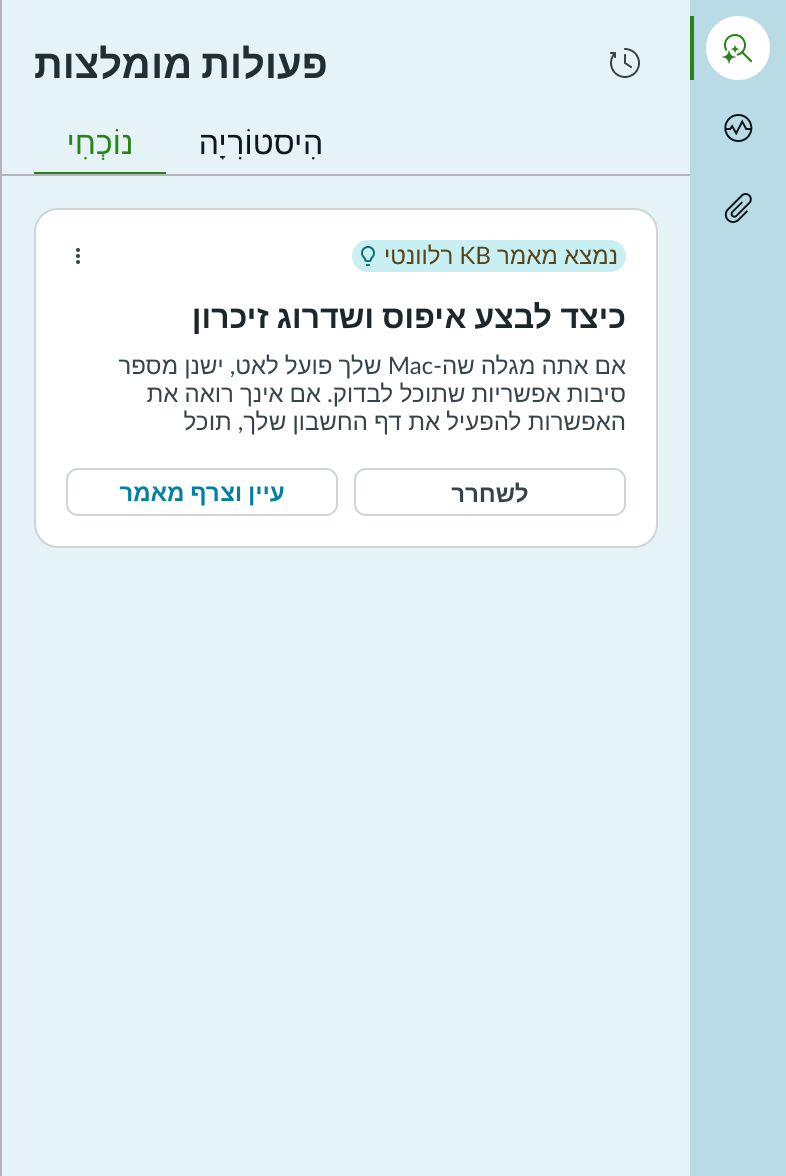
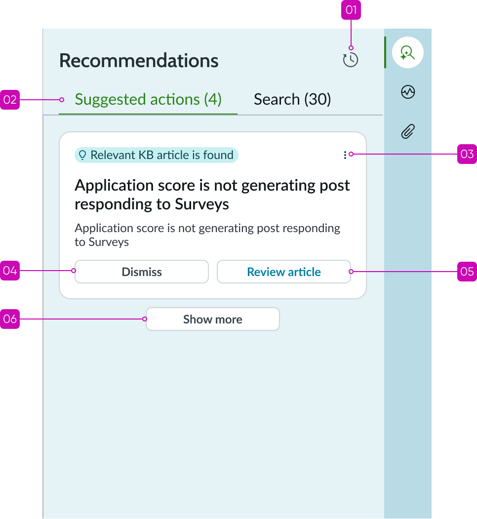
Recommended actions tab
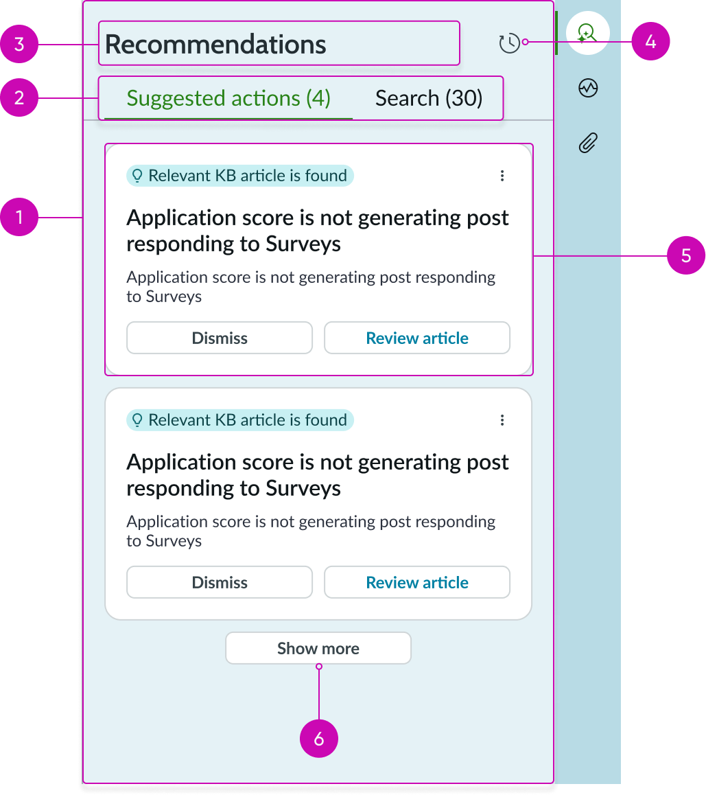
- Container: Panel containing the recommendation action tabs and cards
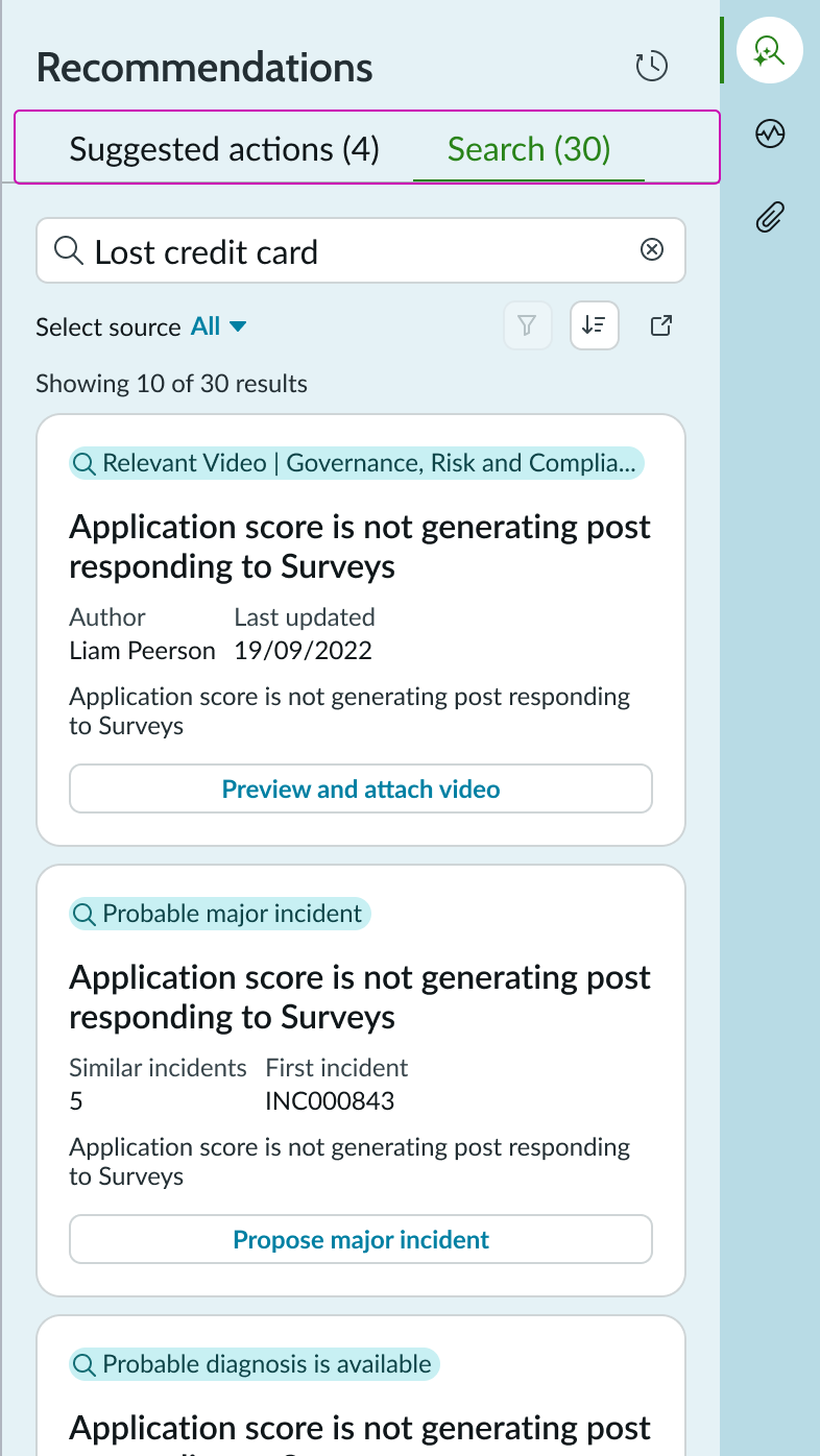
- Tabs: Tabs for switching between active recommendations and the search function: tab; tab titles are configurable
- Panel title: Configurable title that describes the content of the recommended actions panel
- History: Iconic button that displays cards for successful actions taken in the past for similar cases
- Card: Contains the content of each recommended action, including action buttons, metadata, and links to relevant records: recommended actions display an information message highlighted in green
- Show more actions: Button tertiary appears when additional cards with recommended actions are available but not displayed due to the height of the container
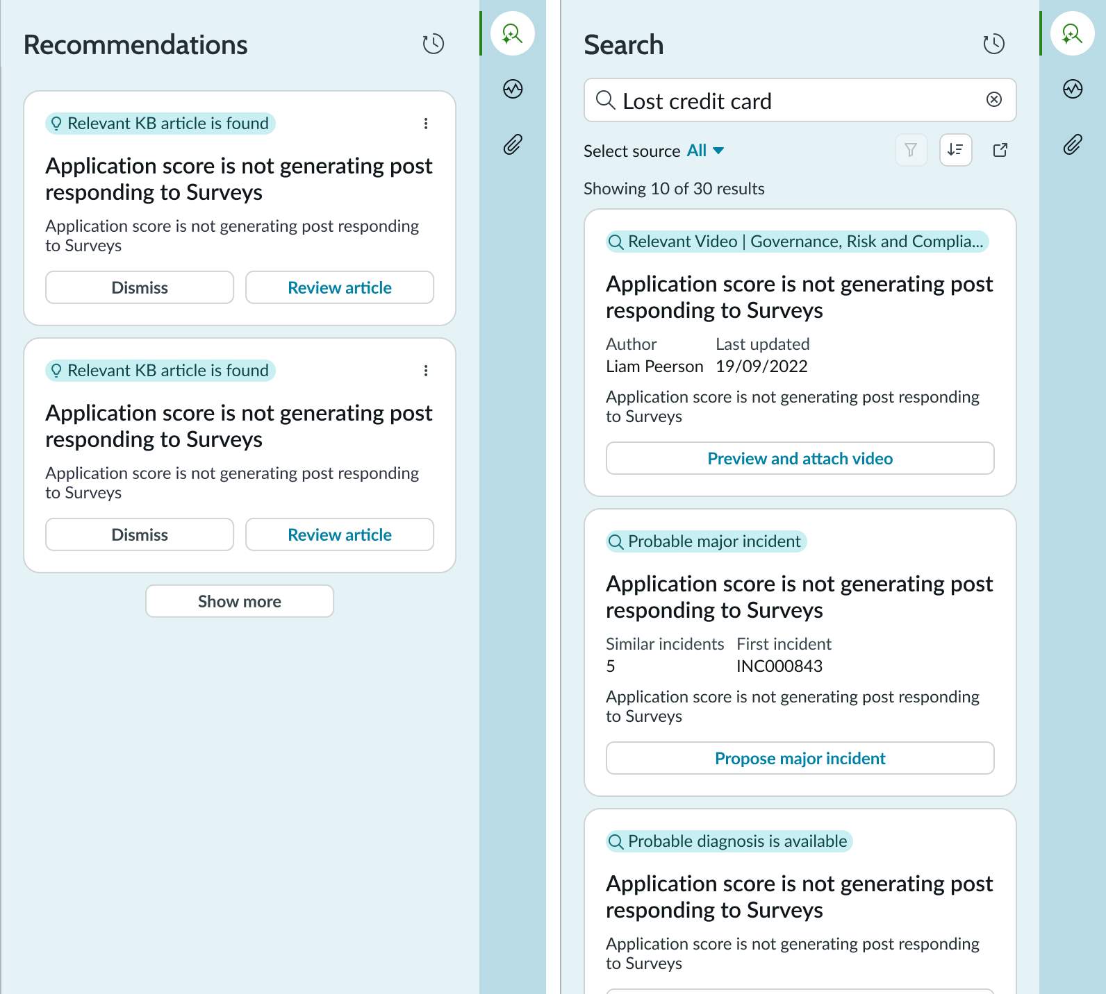
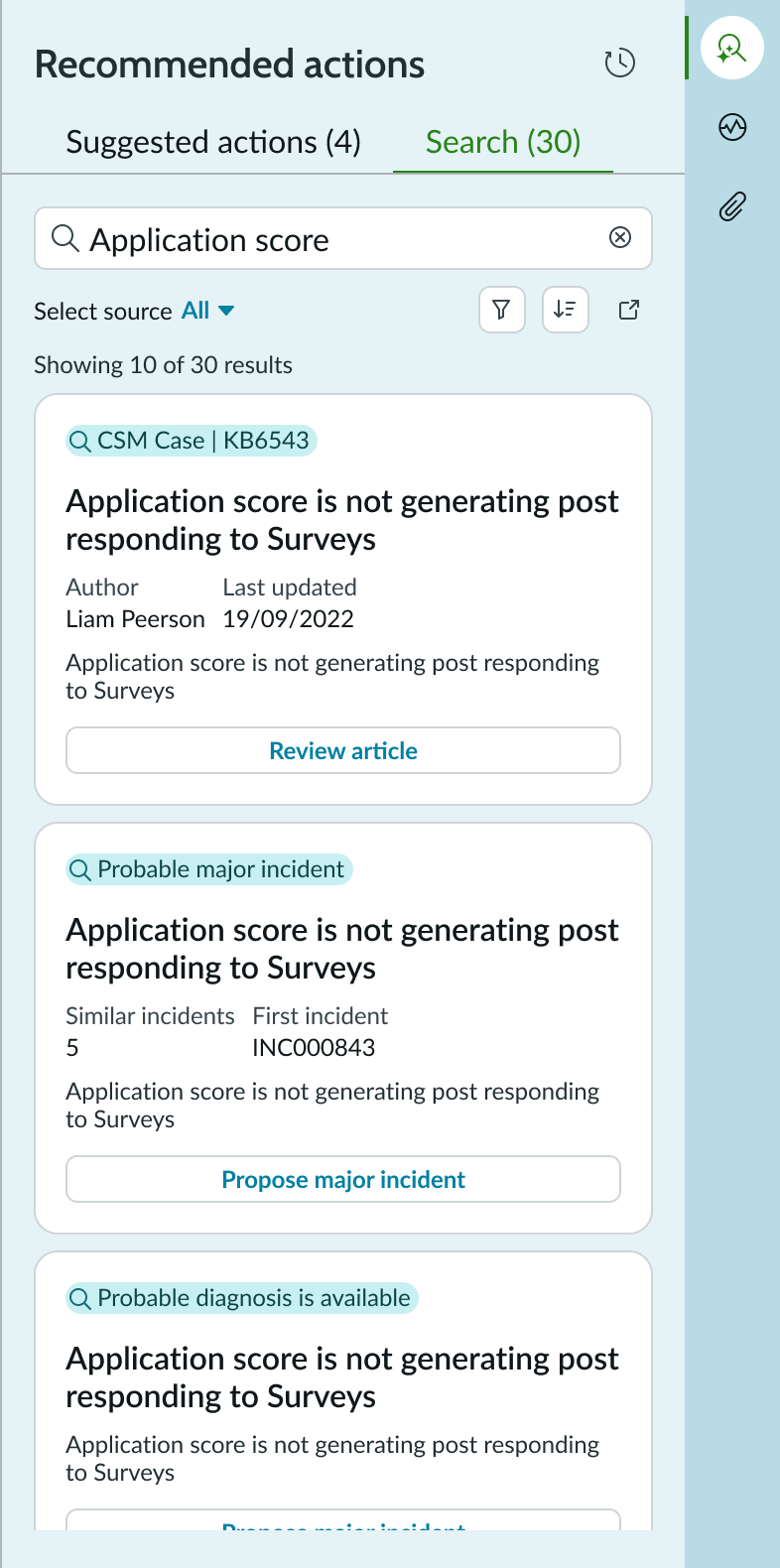
Search tab
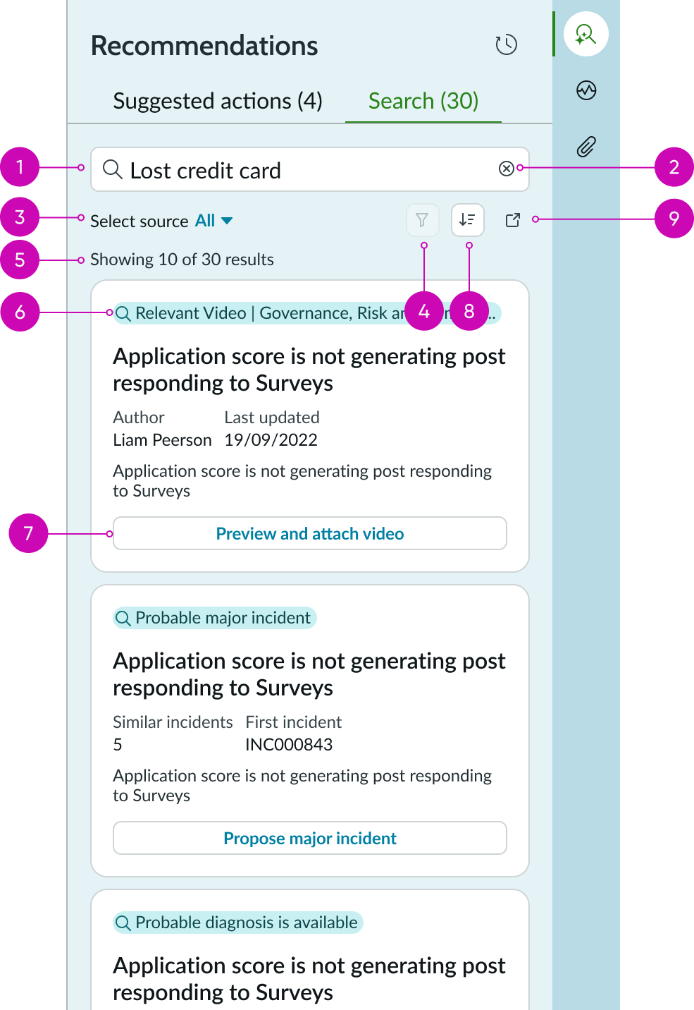
- Search field: Input field for entering search terms
- Clear field: Iconic button for clearing the search term from the input field
- Filter: Dropdown to select the filter source type, default it’ll be mapped to All
- Advanced Filters: Iconic button for selecting a advanced search filter; a badge on the icon indicates that the filter returned results
- Result counter: Displays the count of search results that match the current search filter
- Result type: Message that identifies the type of recommended action that matches the search filter, such as a video or knowledge article; recommended actions are highlighted in green
- Action: Button for taking an action to resolve the issue based on the recommendation
- Sort: Button iconic to sort the result by latest updates or A-Z/Z-A
- Search full view: Button iconic to open the search in the full tab view
Filters
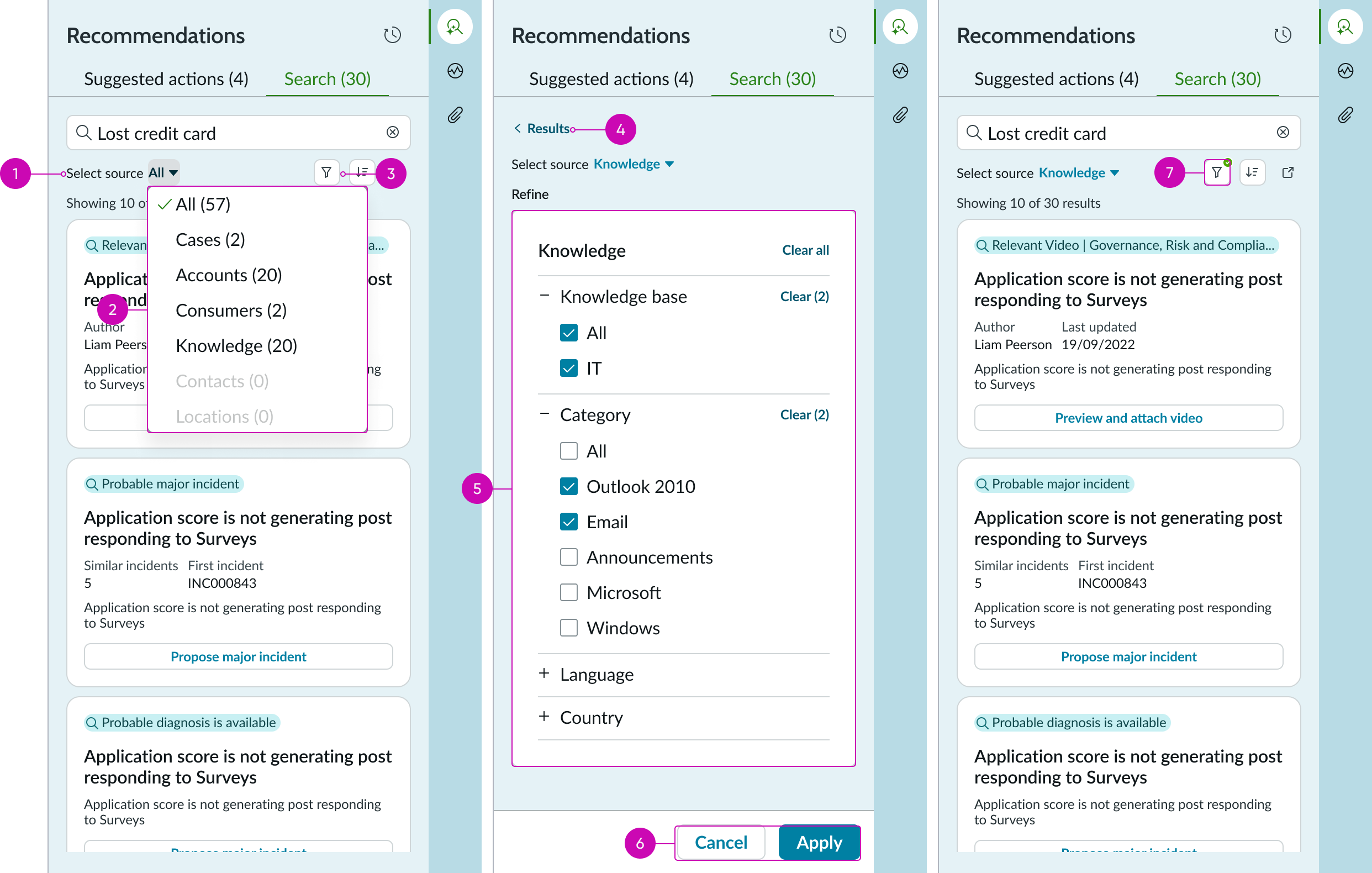
- Filter: Dropdown to filter content by the source type
- Source list: Dropdown list shows the list of sources available for filter
- Filter action: Button icon to be enabled post selecting a source. Action on button will navigate to the detail panel (advanced search)
- Back to results: Bare button to navigate back to search results
- Advanced filters panel: Contains list of advanced filter option for the selected category
- Action buttons: Action buttons to apply or cancel the filters
- Filter button indicator: Iconic button with indicator to highlight advanced filters are applied
Sort
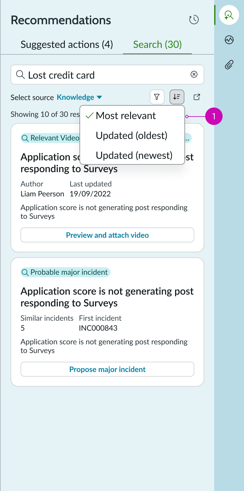
- Sort panel: Contains list of sorting options
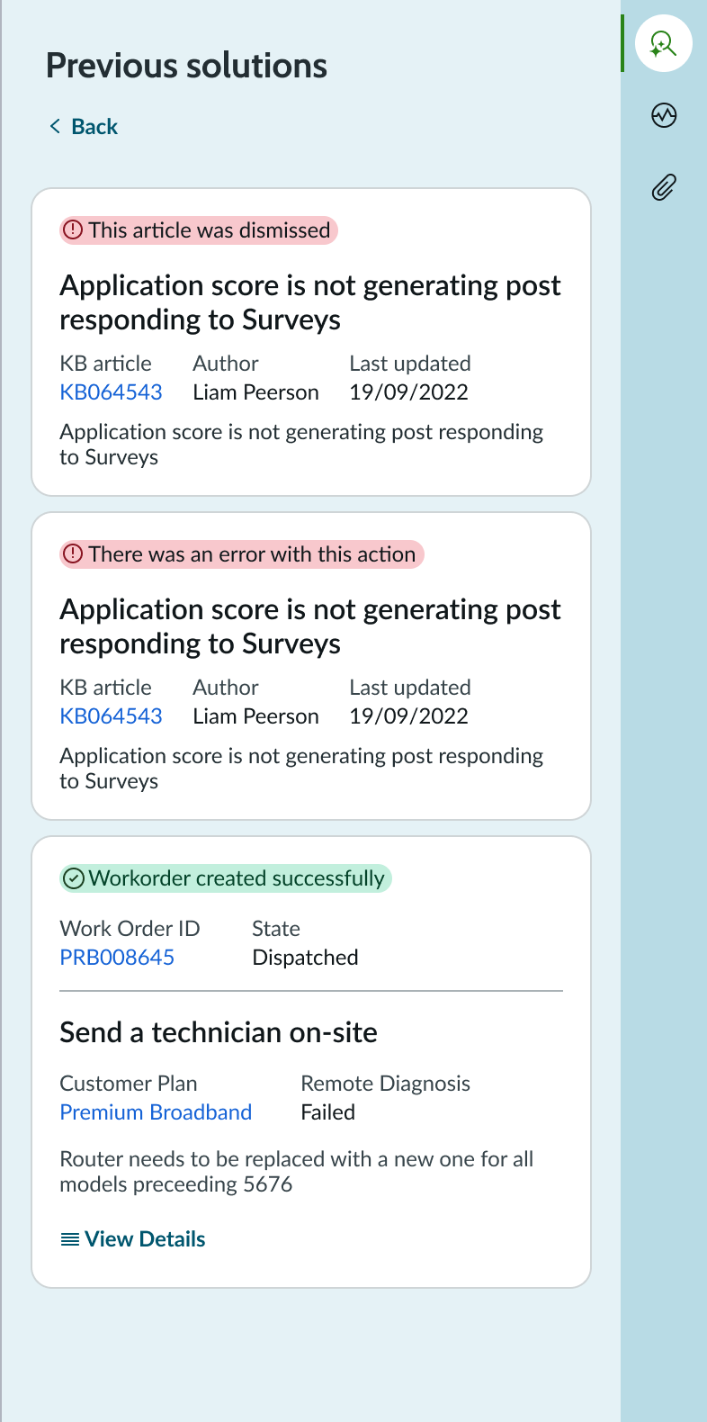
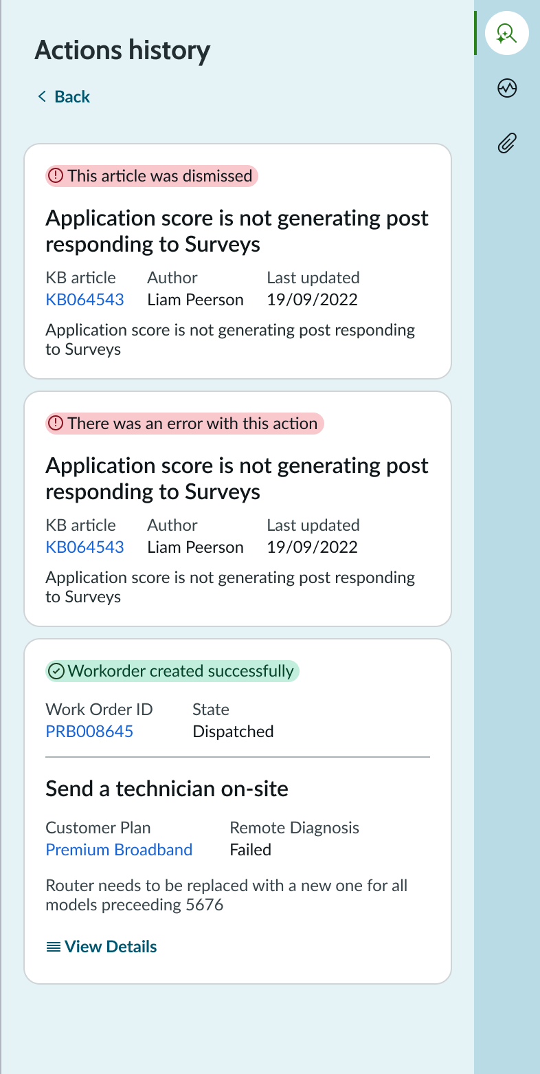
History panel
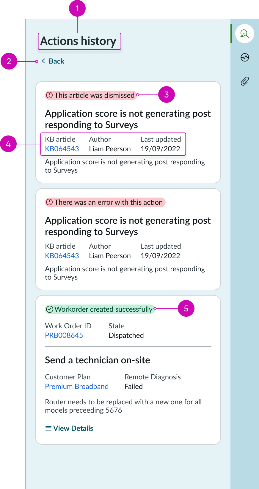
- Title: Configurable title for the history panel
- Back button: Bare button action for returning to the previous tab the user was viewing in the recommended actions panel
- Unsuccessful action: Message showing that an action was unsuccessful in resolving a similar issue in the past; unsuccessful actions are highlighted in red and display an appropriate icon
- Record metadata: Details about a previously recommended action, including a link to the record
- Successful action: Message showing that an action was successful in resolving a similar issue in the past; successful actions are highlighted in green and display an appropriate icon
Subcomponents
See the usage guidelines for card base header.
See the usage guidelines for tabs.
See the usage guidelines for card base actions.
See the usage guidelines for label value stacked.
See the usage guidelines for carousel.
Usage
The recommended actions component can be used in an agent workspace to provide an agent with possible actions to take based on the context of the current record. This helps agents quickly take an appropriate action to assist customers and resolve issues. When configured, the component returns a list of articles, similar cases, decision trees, and other form of guidance based on simple rules or by using predictive models. These actions are presented on cards in a carousel and contain important information on the action to assist the agent in making a decision. Cards can contain links for accessing related records and action buttons to accept or dismiss a recommended action. When configured, users can view a history panel that displays actions used to resolve similar issues in the past.
The recommended actions panel displays from the contextual sidebar of a case record and offers potential solutions to the current case.
Design recommendations
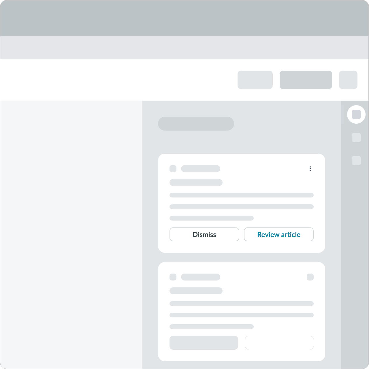
All the actions should be secondary action and Dismiss should be tertiary action.
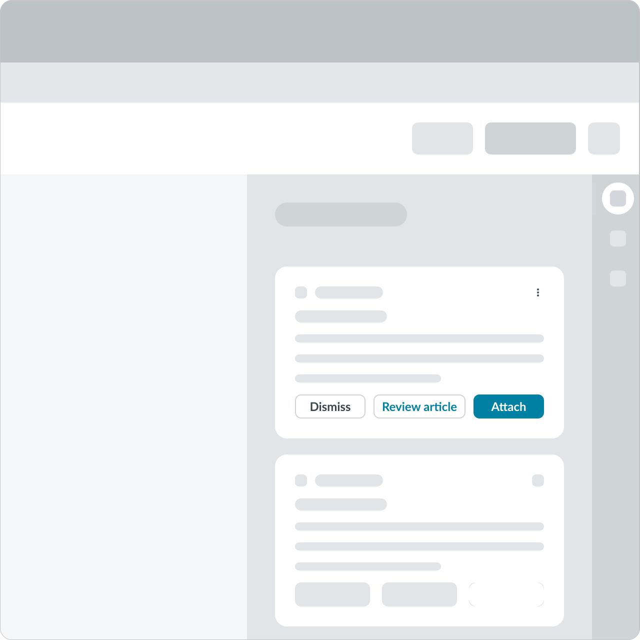
Don’t add primary action on the preview card.
Configurations
Learn how to customize recommended actions by configuring the available properties.
Titles
You can override the default heading of “Recommended actions” with your own, custom heading or hide the heading altogether. You can also rename the tabs in the component to suit your use case.
The title of the history panel is also configurable. You can change the default title of “Actions history” to match the title you chose for the component.
Tab visibility
You can configure the component to hide either the “Recommended actions” tab or the “Search” tab
Changing tab order
You can configure the order in which the tabs display in the component. By default, the Recommended actions tab is displayed in position 1 (on the left) and the Search tab is displayed in position 2 (on the right).
History
The history panel is accessed via the iconic button in the upper right corner of the recommended actions panel. By default, the history button is visible, but you can elect to hide to prevent users from accessing previous actions.
Cards
You can configure the display options of cards in recommended actions as follows:
- Define the maximum height and width of each card in the carousel.
- Select between grouping relevant recommendation cards or displaying them individually in a list.
Carousel display options
You can configure the display options of the carousel in recommended actions as follows:
- Display a single content item or multiple content items depending on the product needs and layout.
- Enable the option to move a single item or a set of items in a grouping experience.
- Configure the number of items that the carousel shows - either single items or multiple items.
- Display the carousel with or without borders.
Behavior
Learn how recommended actions behaves when the display changes or a user interacts with the component.
Two column display
By default, the component displays the recommended action cards in a scrollable list. When the content area is large enough, cards are displayed in two columns.
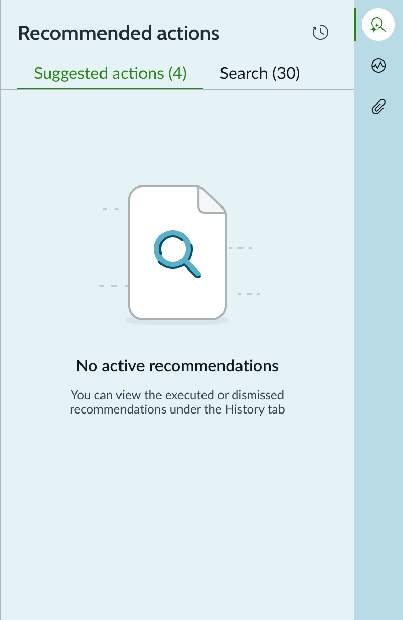
Empty state
When there aren’t any recommendations, the component displays an empty state message.
Interactions
Learn how recommended actions responds when a user interacts with it.
Tabs
By default, the component shows the Recommended actions and the Search tabs. The user views current, recommended actions or searches for possible additional solutions. Users can view related articles here and select to attach the article to their case record.
If there are more cards than can fit in the panel, the user clicks the “Show more” button to display the additional cards.
Actions history
The user can select the History button to see successful actions taken in the past for similar cases. The cards are marked with a success message highlighted in green. Unsuccessful actions are highlighted in red. Links in the card enable an agent to view previous successful actions that might work for the current case. Users click the “Back” button to return to the tabs view of the component.
Usability
Recommended actions complies with all internationalization and accessibility requirements.
Internationalization
When this component is used in a platform configured for a right-to-left (RTL) language, the tabs, heading, and card contents align on the right.
Accessibility
Learn how to access the actionable elements of recommended actions through keyboard interactions and screen readers.
Recommended actions tab order
Tab order for the Recommended Actions panel
Keyboard interactions
You can access the actionable elements of recommended actions with these keyboard keys:
When the focus is in the tab set
- Right arrow or Left arrow: Navigates between tabs in the component. With focus on a tab, the tooltip associated with that tab appears.
- Enter: Opens the tab.
When the focus is within a tab - Arrow up or Arrow down: Navigates up and down through the card list to locate a specific recommended action. With focus on a card, the tooltip associated with that card appears.
- Enter: Selects a card for the recommended action.
When the focus is within a card - Tab: Navigates to the next card element according to the tab order within the card. With focus on a button, the tooltip associated with that button appears.
- Enter: Selects a link or action in the card.
Screen readers
When you apply ARIA labels to recommended actions, screen readers announce the controls and content in the prescribed tab order.
The following ARIA attributes are defined for the elements at each tab stop.
When the focus is in the tab set (1)
- role = tablist
- aria-labelledby=[the id for 'recommended actions']
- aria-description = Filter list of recommended actions
When the focus is on a tab (1a - 1b) - aria-labeledby isn’t necessary for HTML buttons
When the focus is on a card in the list (2a - 2b) - aria-labelledby = [id for the heading of the card]
When the focus is on a knowledge article link (3) - aria-description = “KB Article” [if the link is always a KB article link]