

Anatomy
Learn about the individual parts of document display.
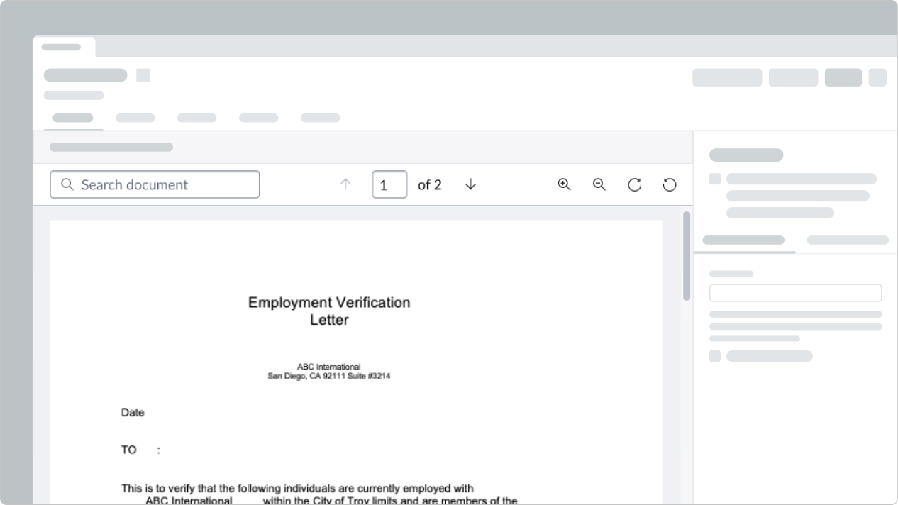
Document display with an attachment
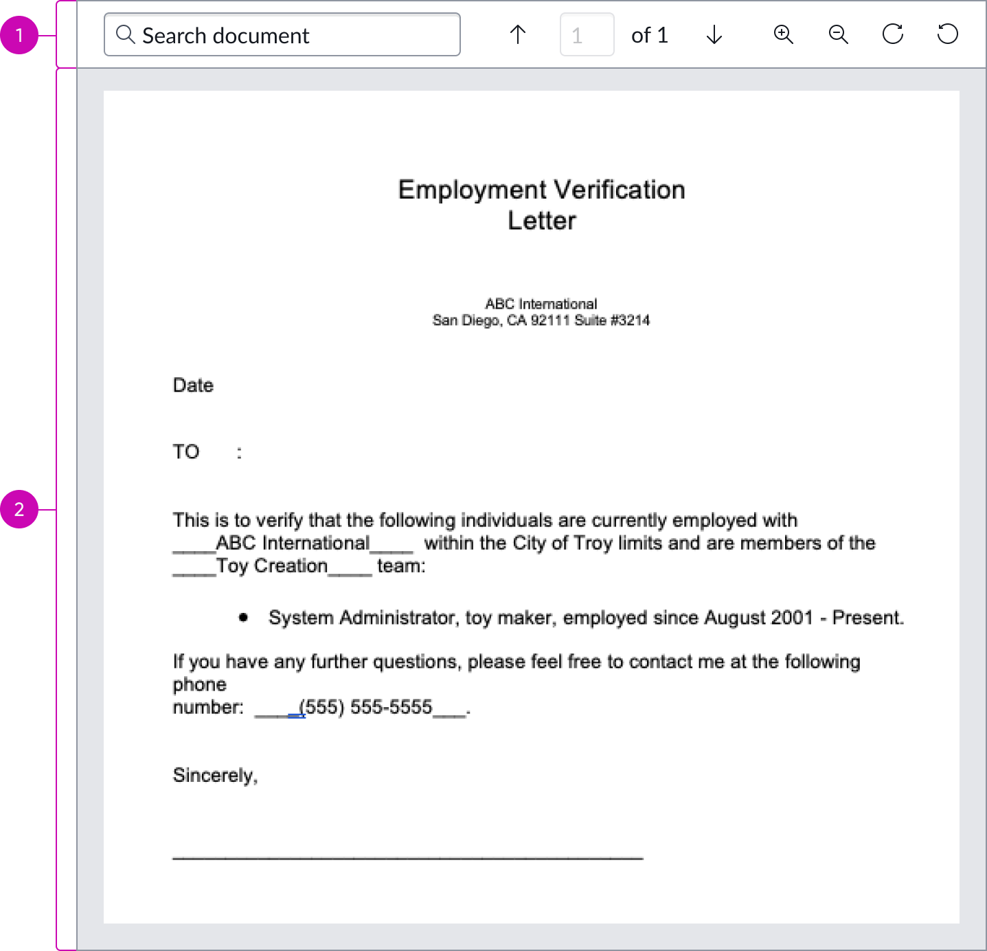
- Action bar: Enables controls such as search, pagination, zoom, and rotate
- Attachment content area: Display area for viewing an attachment
Document display with an HTML document
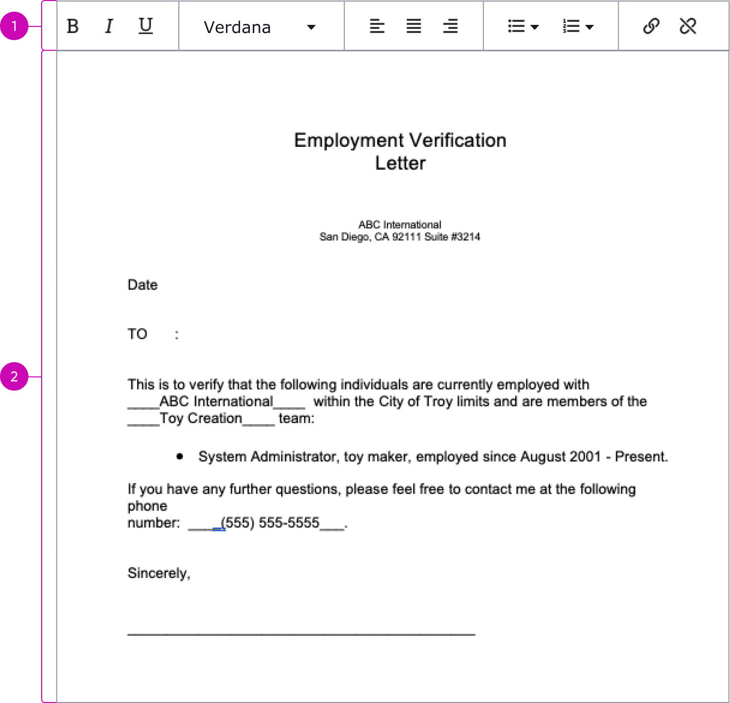
- Rich-text editor bar: Enables document editing controls such as font styles, orientations, bullet lists, and external linking
- HTML document content area: Display area for viewing an HTML document
Usage
Document display should be used to show a document. It can be used with the digital signature component to enable users to view and sign a document.
See usage guidelines for digital signature
Variants
Learn about the attributes of document display.
Types
Learn about the different types for document display.
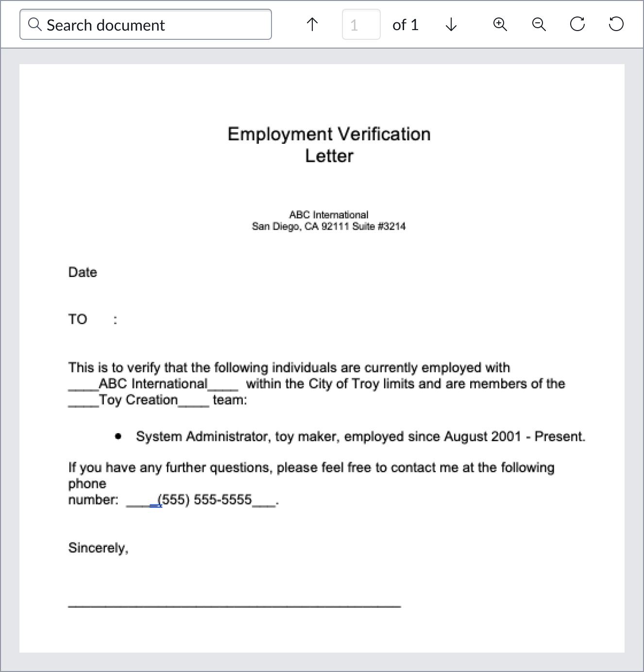
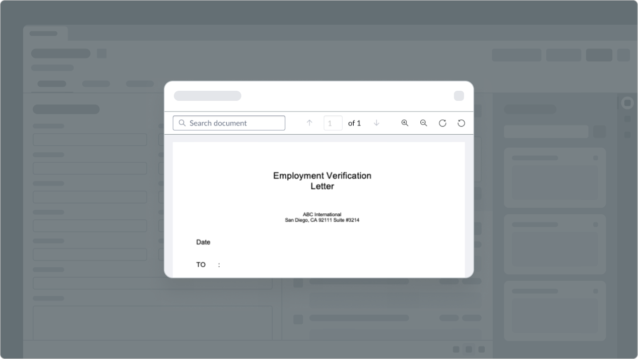
Attachment view
The attachment view can be used to display a PDF document or an image. If this view is selected, the user will have access to search, download, and rotate controls in the action bar.
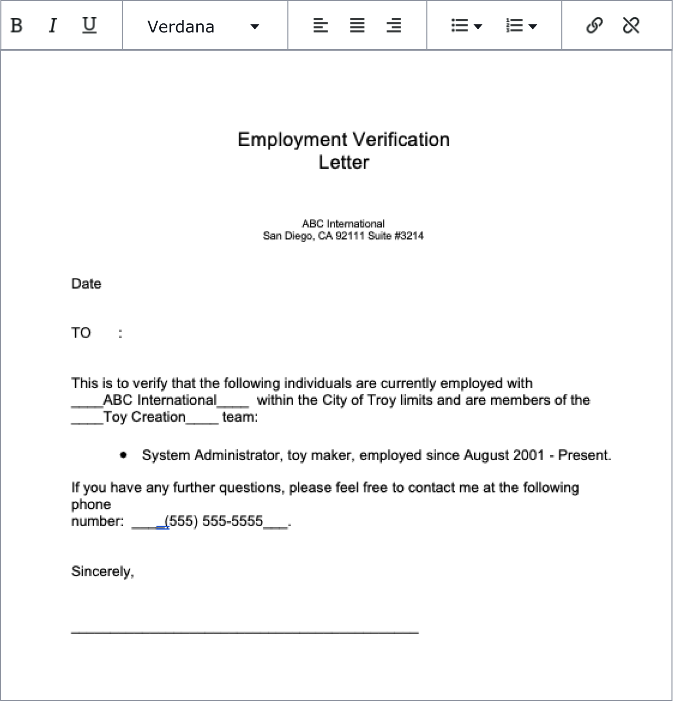
HTML view
The HTML view is used to display an HTML document. If this view is selected, the user will have access to editing controls in the action bar.
Configurations
Learn how to customize document display by configuring the available properties.
Display type
You can configure the document display type to be the attachment or HTML view.
Attachment view action bar
By default, the action bar in attachment view displays all available controls. However, you can configure the action bar to hide certain features or hide the action bar entirely.

Enable editing in HTML view
Configure document display to enable editing in HTML view so that the action bar controls are available to the user.
Design recommendations
Learn how to apply document display in your design.
Do use a larger space for document display, so the component fills a large panel or the entire screen.
Avoid placing document display within a modal where there isn’t enough space to show the document.
Alignment and positioning
Document display should be placed in a large panel or be shown in fullscreen. Avoid putting document display in a small space, such as a modal.
Behavior
Learn how document display behaves when the display changes or a user interacts with the component.
Responsive behaviors
Learn how Document display responds to changes in a container or display.
Interactions
In both the attachment and HTML views, users can interact with the respective controls in the action bar.
Usability
Document display complies with all internationalization and accessibility requirements.
Internationalization
Document display is a container that doesn't change for right-to-left (RTL) languages. However, any elements within document display may have their own internationalization behaviors.
Accessibility
Learn how to access the actionable elements of document display through keyboard interactions and screen readers.
Keyboard interactions
You can access the actionable elements of document display with these keyboard keys:
| Key | Value |
|---|---|
| Space or enter | Moves focus to the first interactive element and initiates an associated action |
| Tab | Moves focus to the next interactive element |
Screen readers
When you apply ARIA labels to a component, screen readers announce the controls and content of document display in the prescribed tab order.