Anatomy
Learn about the individual parts of digital signature.
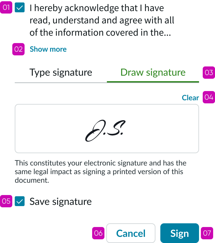
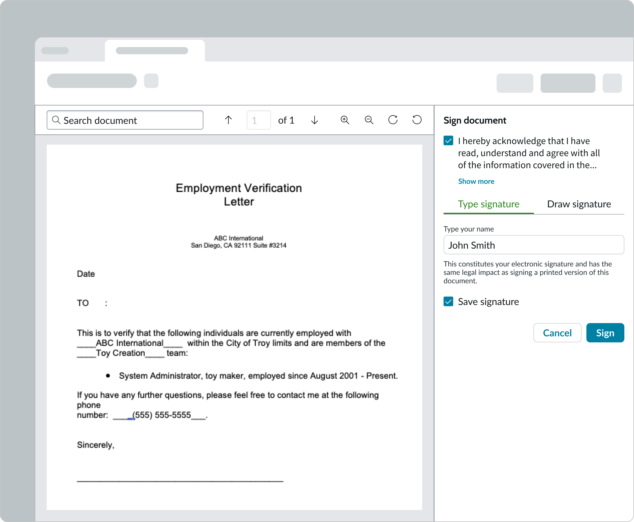
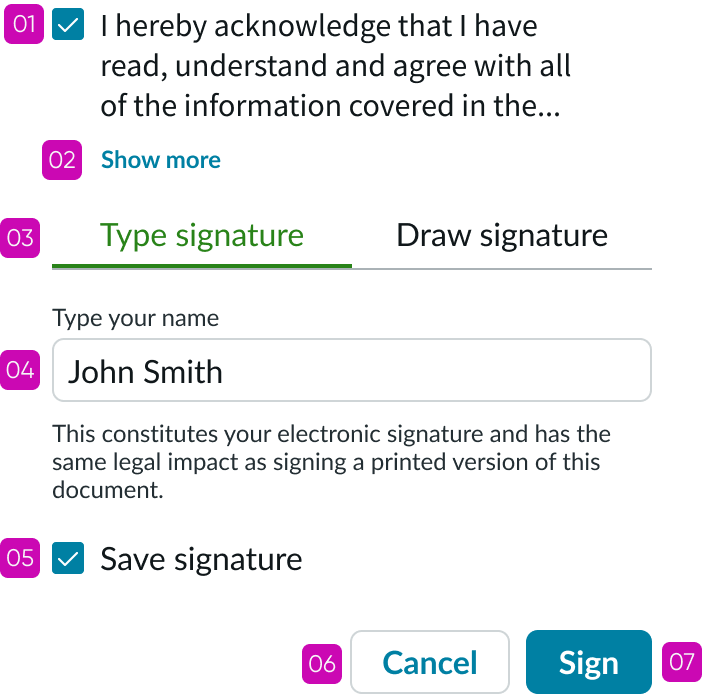
Type signature tab
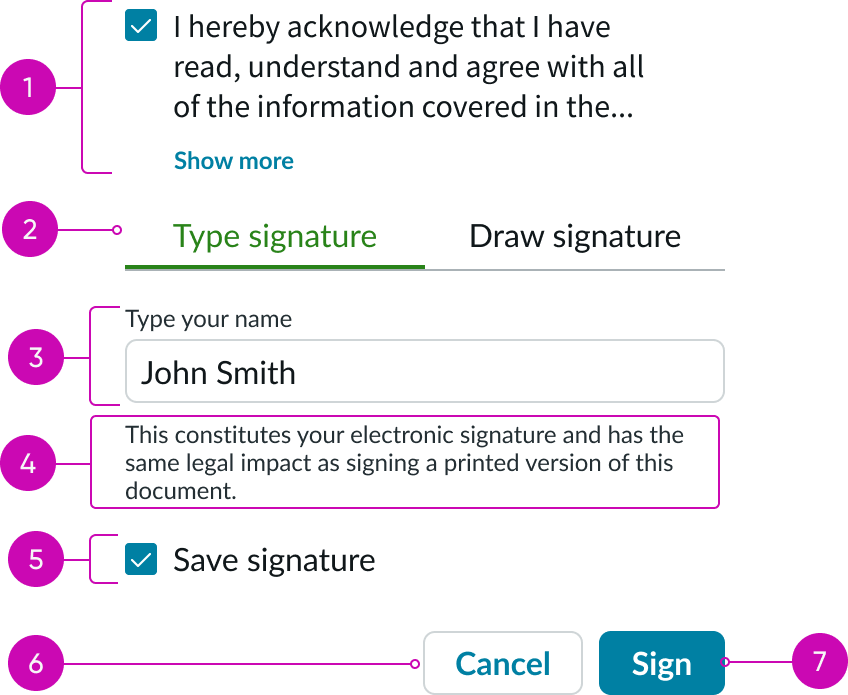
- Acknowledge terms content area: Checklist item that the user can select to acknowledge the document terms
- Type signature tab: Selectable tab for typing a signature
- Name input area: Input field for the user to enter their name
- Legal text content area: Area to include legal copy that confirms the use of the electronic signature
- Save signature checkbox (optional): Checkbox that the user can select to save the signature for future documents
- Cancel button: Button to cancel the signature
- Sign button: Button to apply the user’s signature to the given document
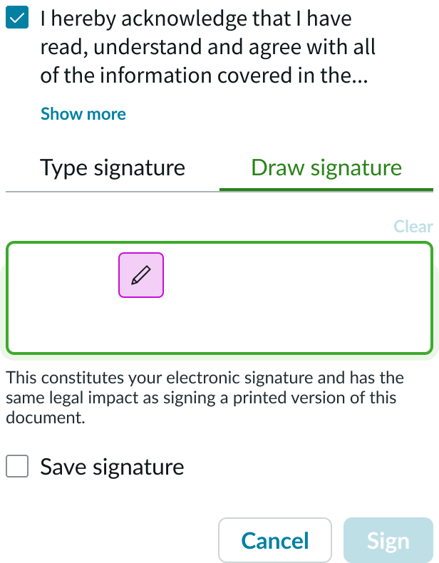
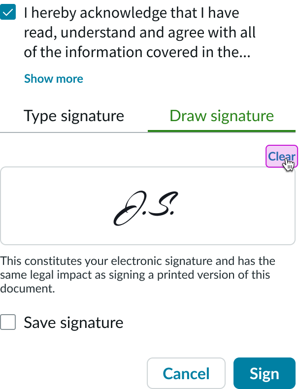
Draw signature tab
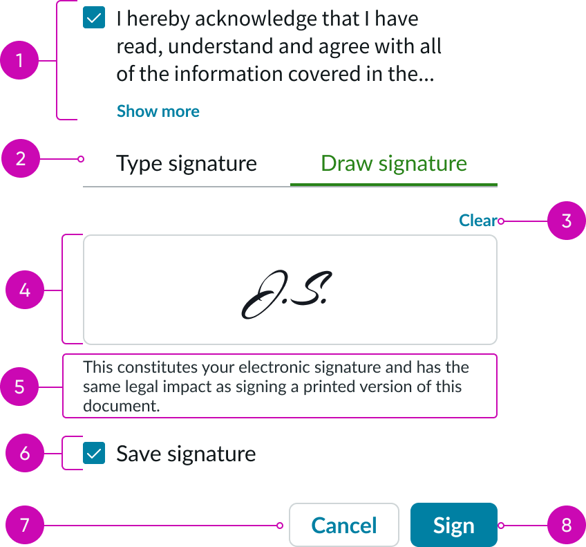
- Acknowledge terms content area: Checklist item that the user can select to acknowledge the document terms
- Type signature tab: Selectable tab to draw a signature
- Clear signature button: Bare button to clear content in the draw area
- Draw area input: Area for the user to draw their signature
- Legal text content area: Area to include legal copy that confirms the use of the electronic signature
- Save signature checkbox (optional): Checkbox that the user can select to save the signature for future documents
- Cancel button: Button to cancel the signature
- Sign button: Button to apply the user’s signature to the given document
Subcomponents
See the usage guidelines for checkbox
See the usage guidelines for input field
See the usage guidelines for text link
See the usage guidelines for tabs
See the usage guidelines for button
See the usage guidelines for bare button
Usage
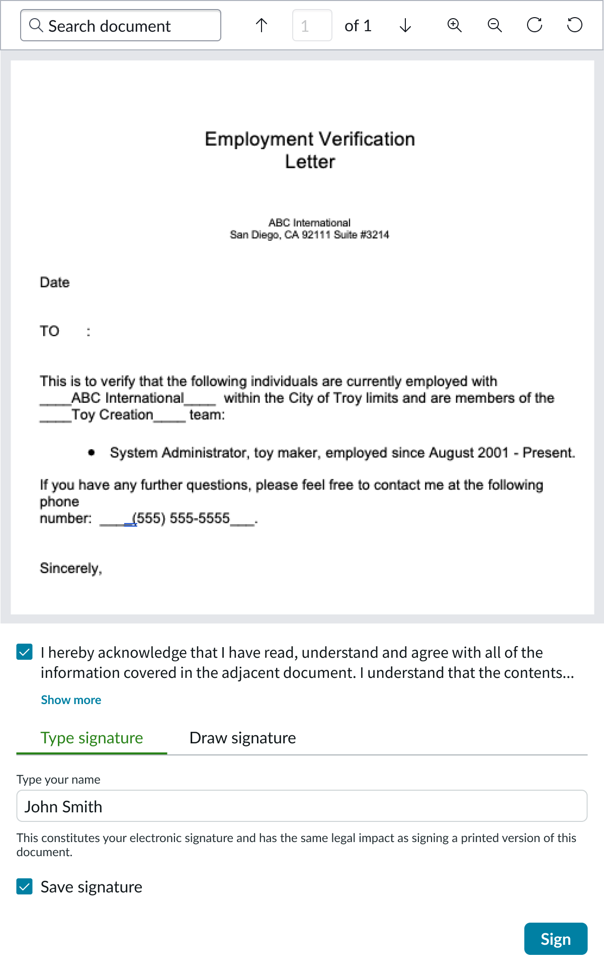
Digital signature can be used to digitally sign a document, access a record, or approve a decision. It can be used in conjunction with the document display component for instances where a user is required to sign a document.
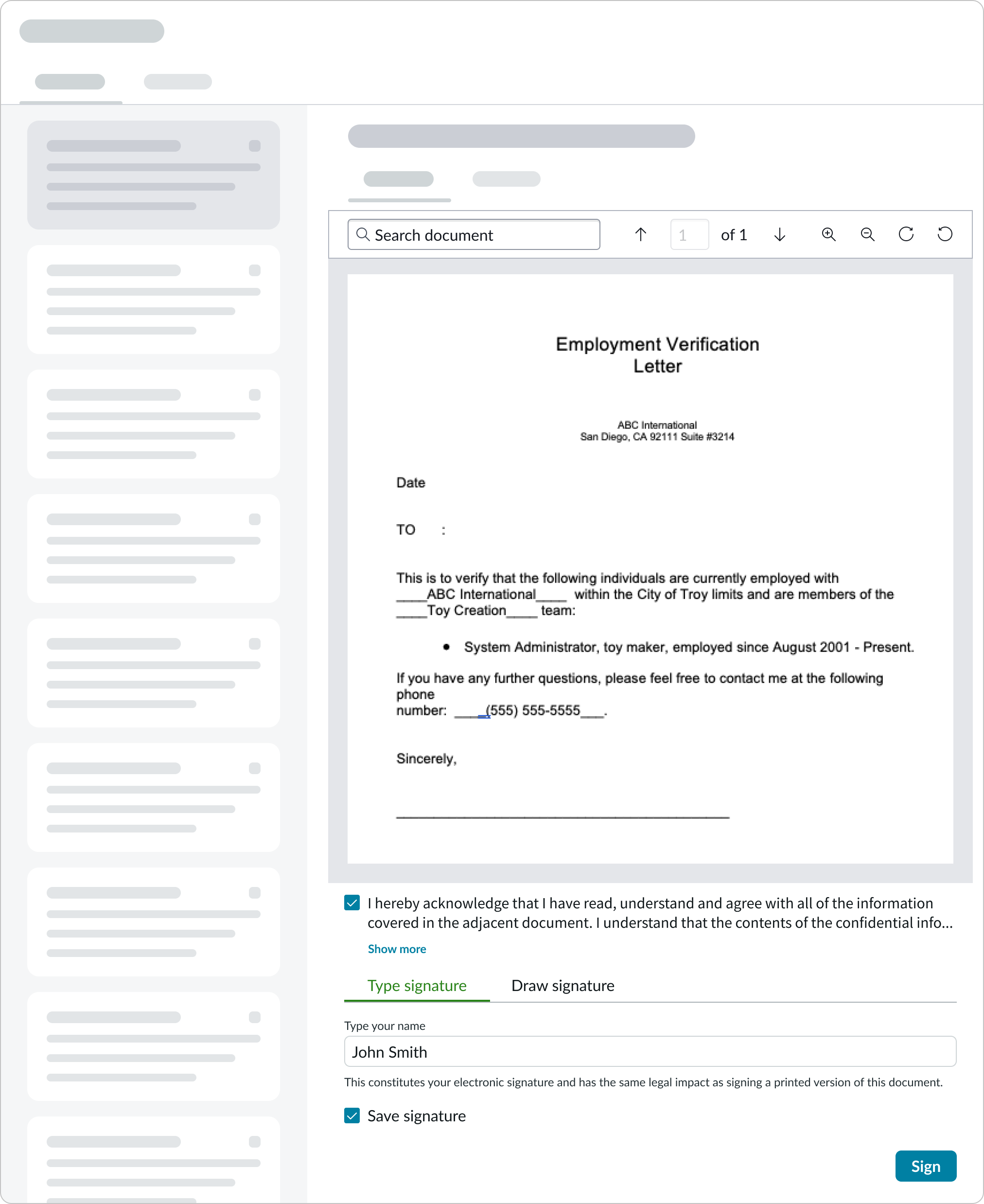
Employee use case
Below is an example of what digital signature can look like for an employee signing a document.
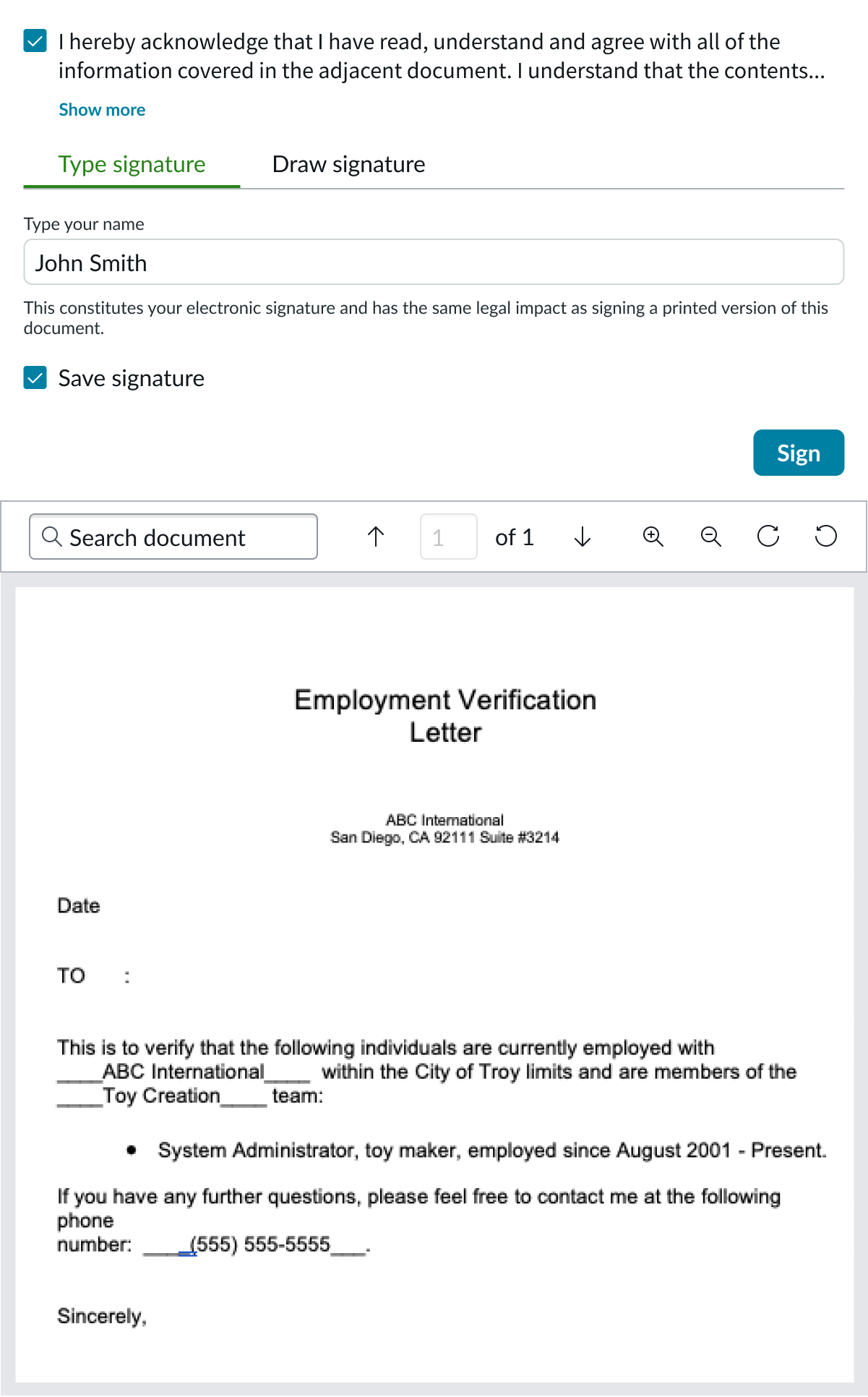
Agent use case
Below is an example of what digital signature can look like for an agent signing a document.
Variants
Digital signature has 2 different variants: type and draw.
Type
The type tab is available for users that prefer to type their signature.
Draw
The draw tab is available for users that prefer to draw their signature.
Configurations
Learn how to customize digital signature by configuring the available properties.
Type and draw tabs
By default, digital signature will include the type and draw tabs. However, you can configure this to not be displayed.
Agreement checkbox
By default, digital signature will include the “Acknowledge terms” content area. However, you can configure this to not be displayed.
Legal text
You can configure digital signature to display legal text below the signature area.
Save signature checkbox
You can configure the “Save signature” checkbox to display.
Submit button
You can configure digital signature to display the submit button.
Secondary button
You can configure this property to display the secondary button and provide a label for it. For example, you can use this button to display a “Cancel” option.
Design recommendations
Learn how to apply digital signature in your design.
Do place the digital signature component after a document (below or on the right) so that the user can review the content before signing off on it.
Don’t place the digital signature component before a document.
Alignment and positioning
Learn how to place digital signature and any elements in your design.
Bottom alignment
For pages that contain more vertical than horizontal space, it’s recommended that you position the digital signature component below a displayed document.
Right alignment
For pages that contain another column or contextual sidebar, you can place the digital signture component in the column, to the right of a displayed document.
In a modal
You can use the digital signature component for quick approvals, such as confirming an important decision made in a modal. For these use cases, it is recommended that you configure the digital signature component to display within the modal after an action button (such as “approve” or “reject”) is selected.
Behavior
Learn how digital signature behaves when the display changes or a user interacts with the component.
Interactions
Learn how digital signature responds when a user interacts with it.
Checkboxes
Users can select or unselect the “Acknowledge terms” checkbox and the “Save signature” checkbox.
“Show more” button
Users can select the “Show more” bare button to expand truncated text in the “Acknowledge terms” content area.
Type and draw tabs
Users can toggle between the “Type signature” and “Draw signature” tabs. Selecting the other tab will clear out any input content.
Type signature
When the “Type signature” tab is selected, users can select and type in the “Name” input field to enter their signature.
Draw signature
When a user hovers over the “Draw signature” input area, the cursor changes to a pencil icon. The signature is rendered when the user selects and drags wtihin the input area.
Users can clear their signature by selecting the “Clear” bare button.
Truncation
If the “Acknowlegement” content exceeds 3 lines of text, the content truncates with an ellipsis and a tooltip shows the full content on hover.
Usability
Digital signature complies with all internationalization and accessibility requirements.
Internationalization
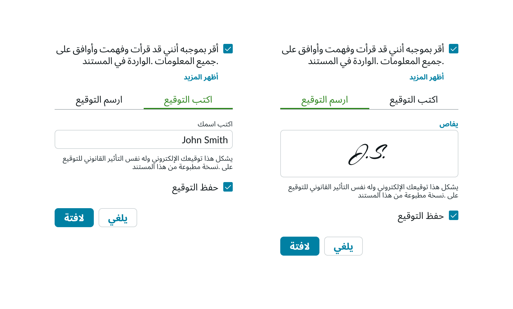
When digital signature is used with a right-to-left (RTL) language, all content (including the title) flips positioning. The type and draw signature tabs will also flip positions.
Accessibility
Learn how to access the actionable elements of digital signature through keyboard interactions and screen readers.
Keyboard interactions
You can access the actionable elements of digital signature with these keyboard keys:
| With focus on checkbox | |
|---|---|
| Tab | Moves focus to the next interactive element |
| Space | Select or deselects a checkbox |
| With focus on button | |
|---|---|
| Tab | Moves focus to the next interactive element |
| Space or enter | Activates the button and places focus on the first interactive element; if activating the button does not dismiss the current context, then focus remains on the button after activation |
| With focus on tab | |
|---|---|
| Tab | Moves focus to the next interactive element |
| Right or left | Activates next tab and displays the relevant tab content |
| With focus on input field | |
|---|---|
| Tab | Moves focus to the next interactive element |
Screen readers
When you apply ARIA labels to a component, screen readers announce the controls and content of digital signature in the prescribed tab order.
Type signature tab
Draw signature tab