

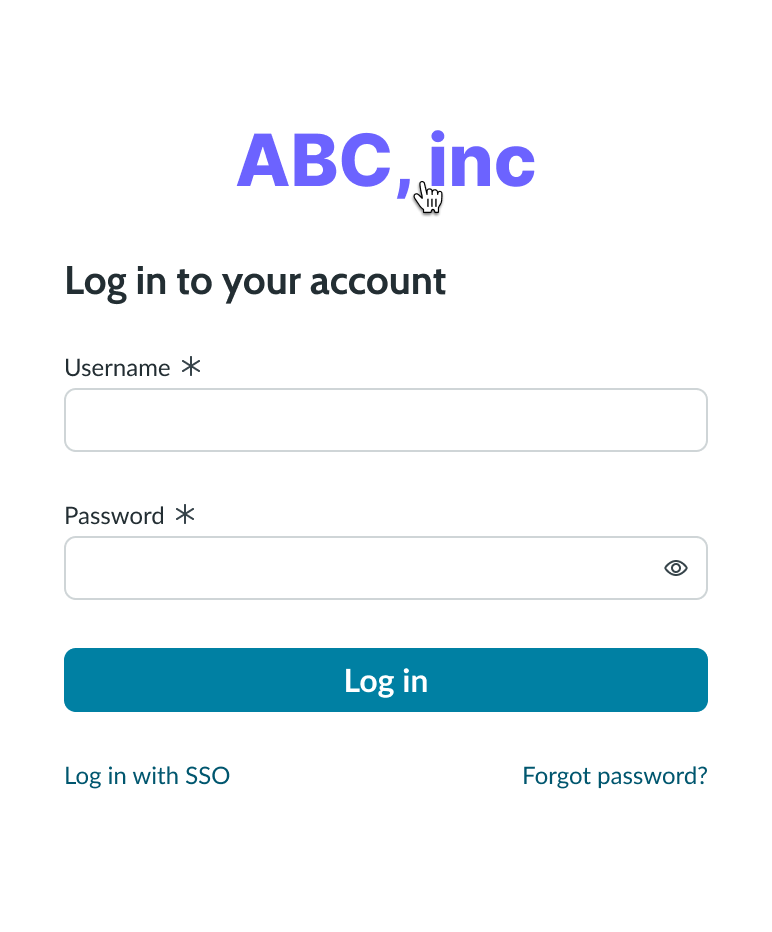
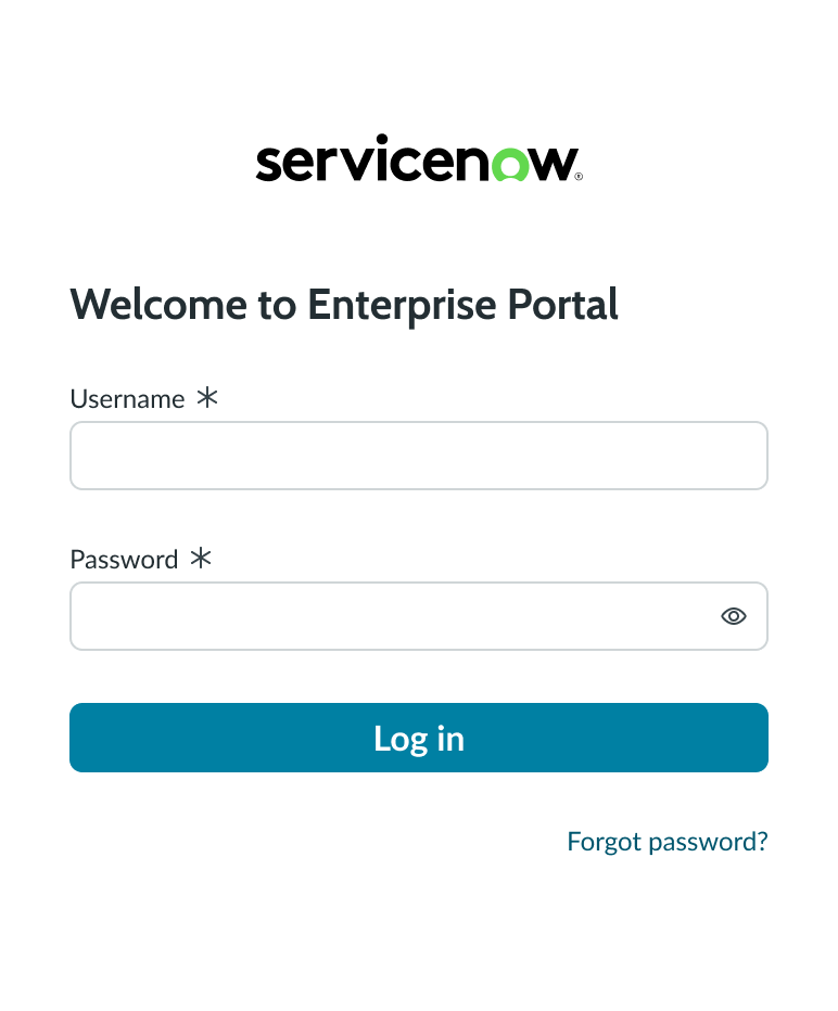
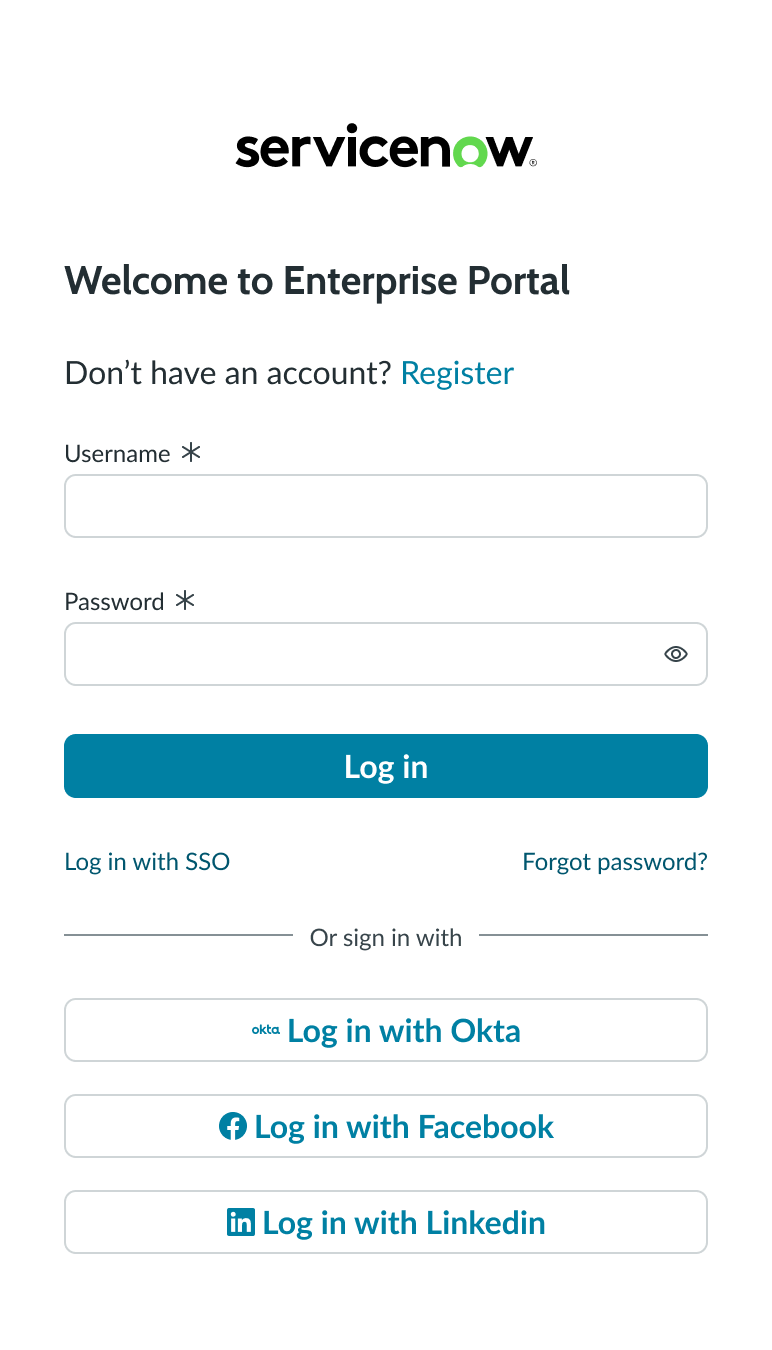
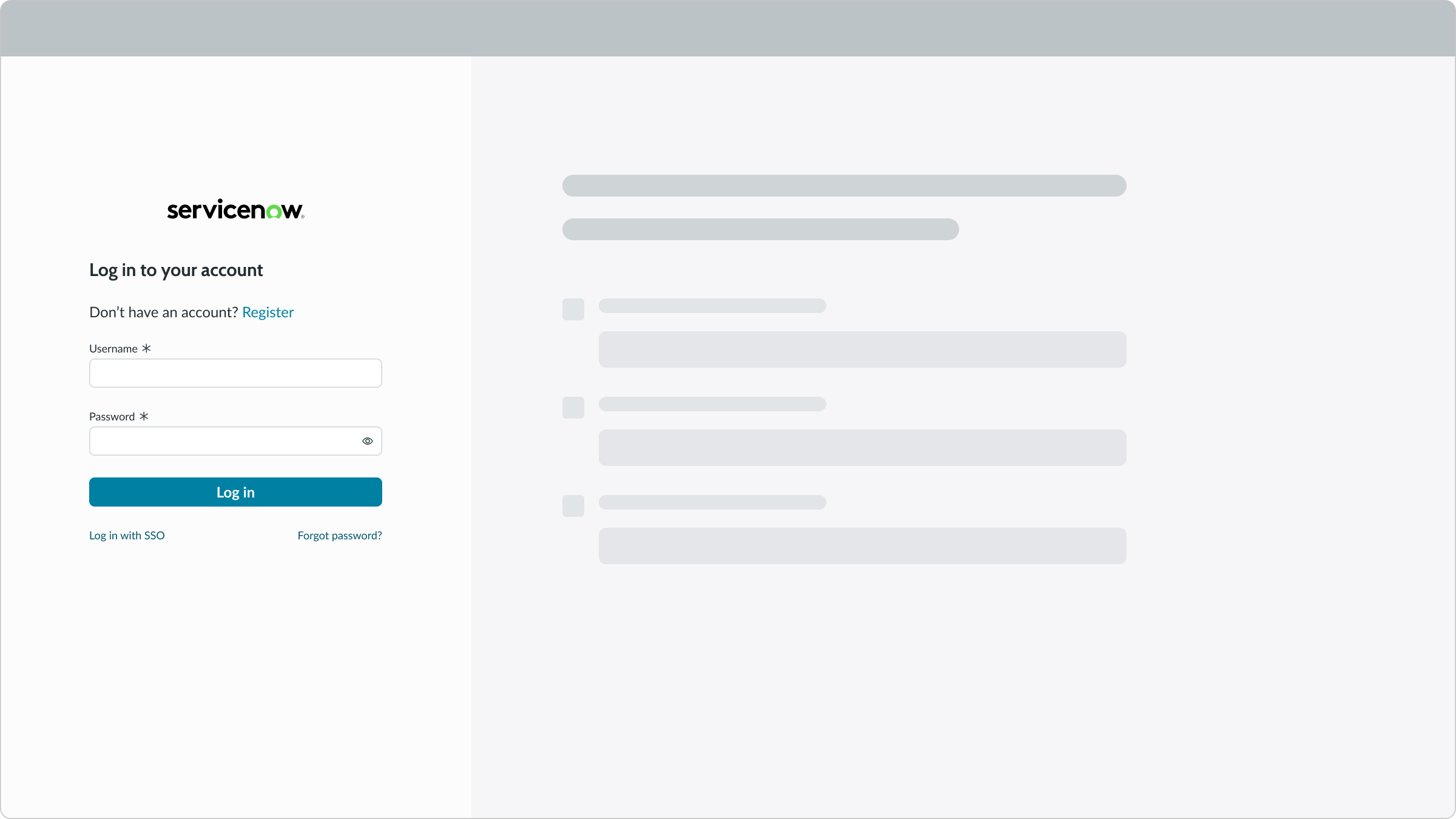
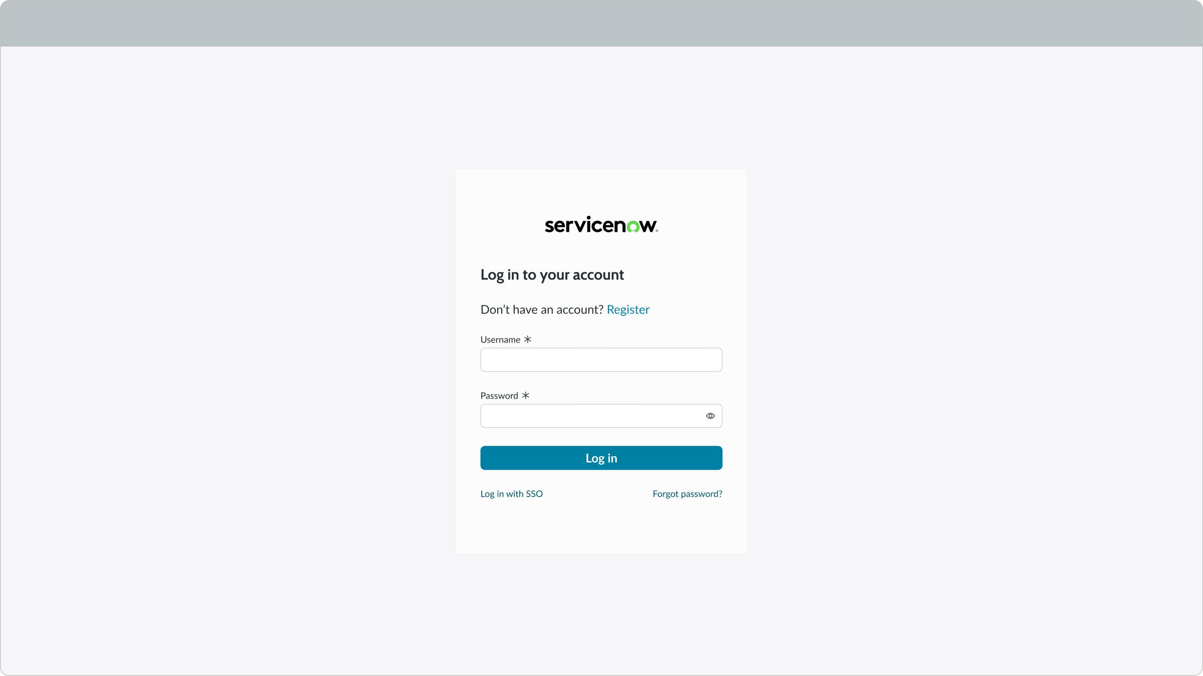
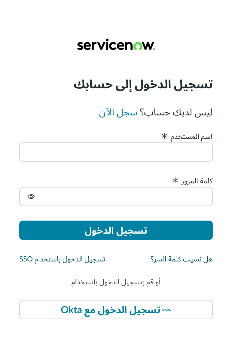
Anatomy
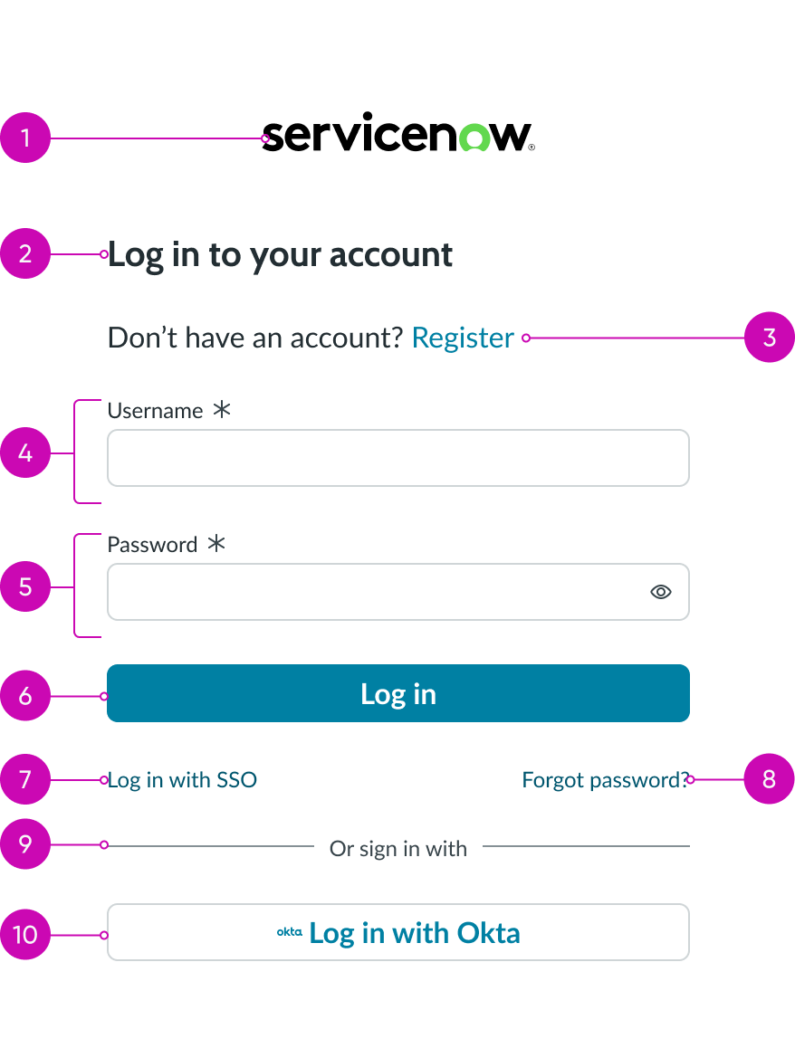
- Logo: Company's logo
- Header: Text that describes the login activity
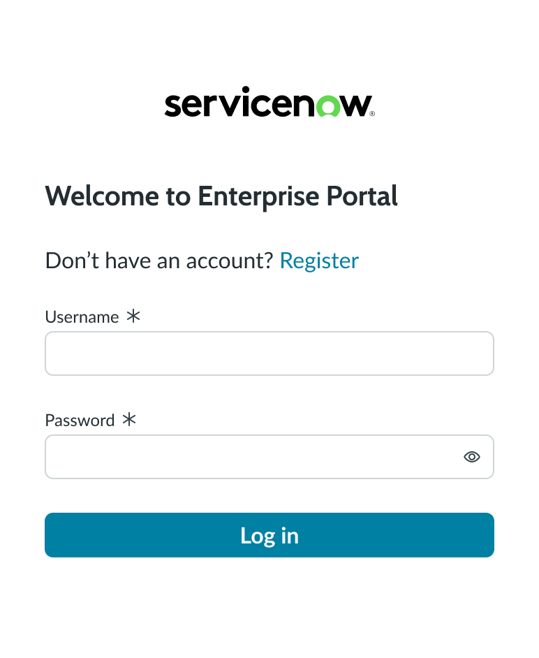
- Register link (optional): Link allowing the user to register a new account
- Username input field: Input field for the user's name
- Password input field: Input field for the user's password
- Login action: Opens a landing page or homepage when the user's login is successful
- External login link (optional): Link to a single sign-on (SSO) login feature
- **Reset password link: ** Link to allow users to reset their password
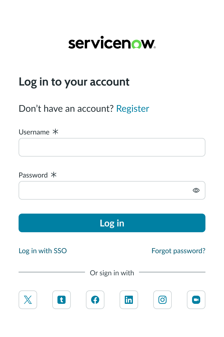
- Divider (optional): Divider line that separates the default login method from the social login
- Social login (optional): Allows user to log in using a third-party, social media provider
Subcomponents used within login
See usage guidance for text link
See usage guidance for input field
See usage guidance for input password
See usage guidance for button bare
Usage
Learn about the login component and find out how to use it in your design.
The login component provides self-service access to resources within a network. You can grant employees access to a portal using either single sign-on (SSO) or their social provider credentials. Provide agents with a workspace login and allow external users or contractors to self-register for access to a portal. Users who forget their password can request a reset without any intervention.
Variants
Learn about the attributes of login.
Types
The login component has 3 different types: local database login, social providers login, and login within a modal.
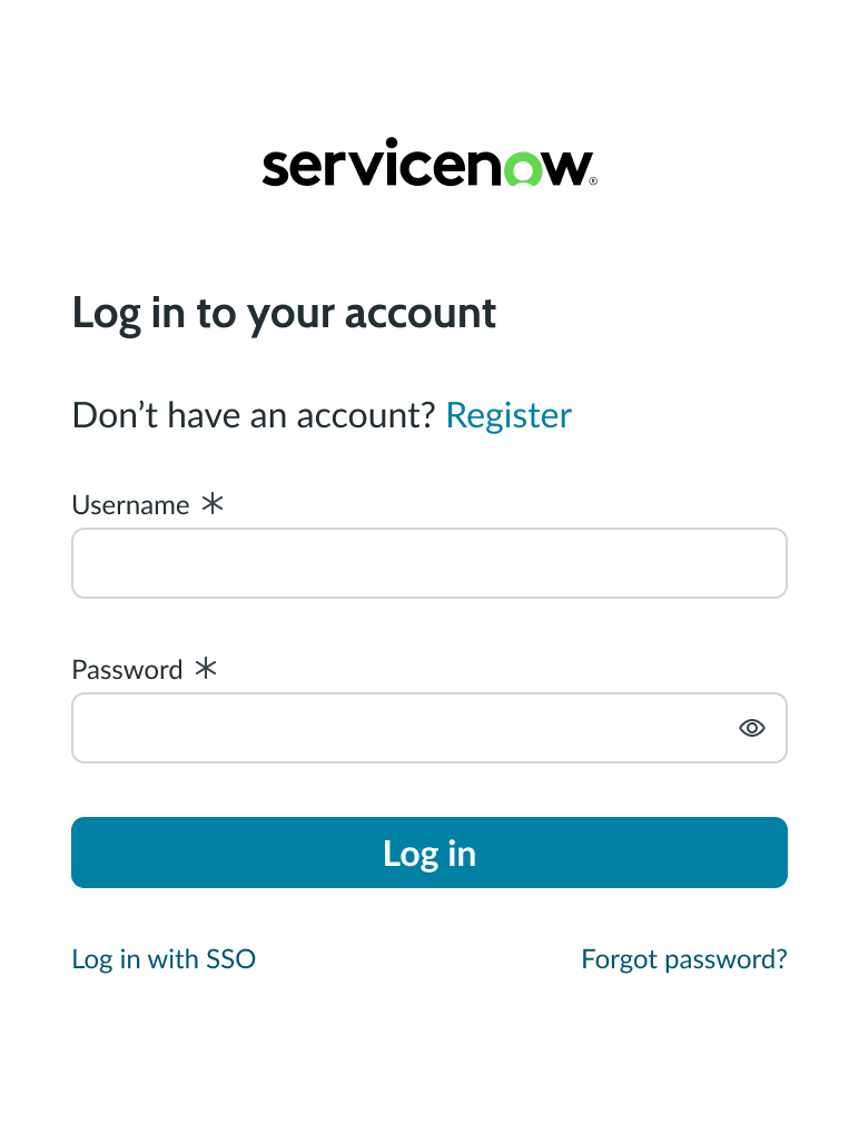
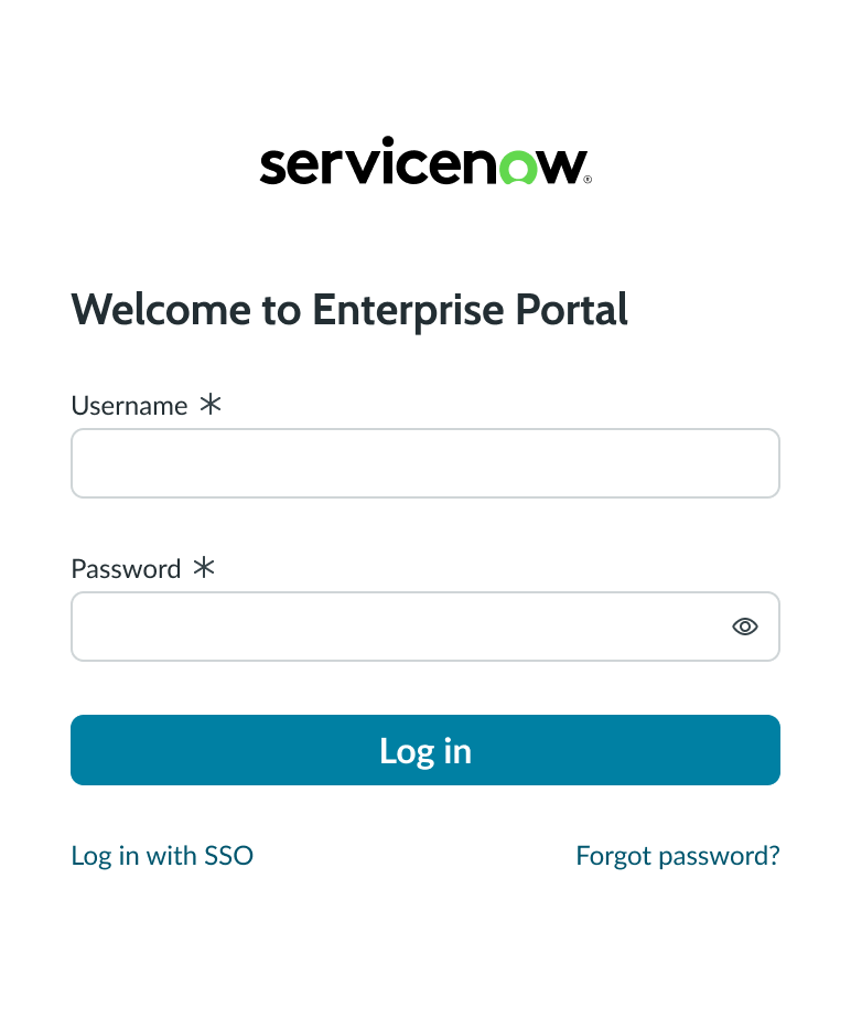
Local database login
The local database login screen has all the elements needed to log into a local instance, but no social login links. Users can register new accounts, log in with an organization's single sign-on (SSO) system, and recover forgotten passwords.
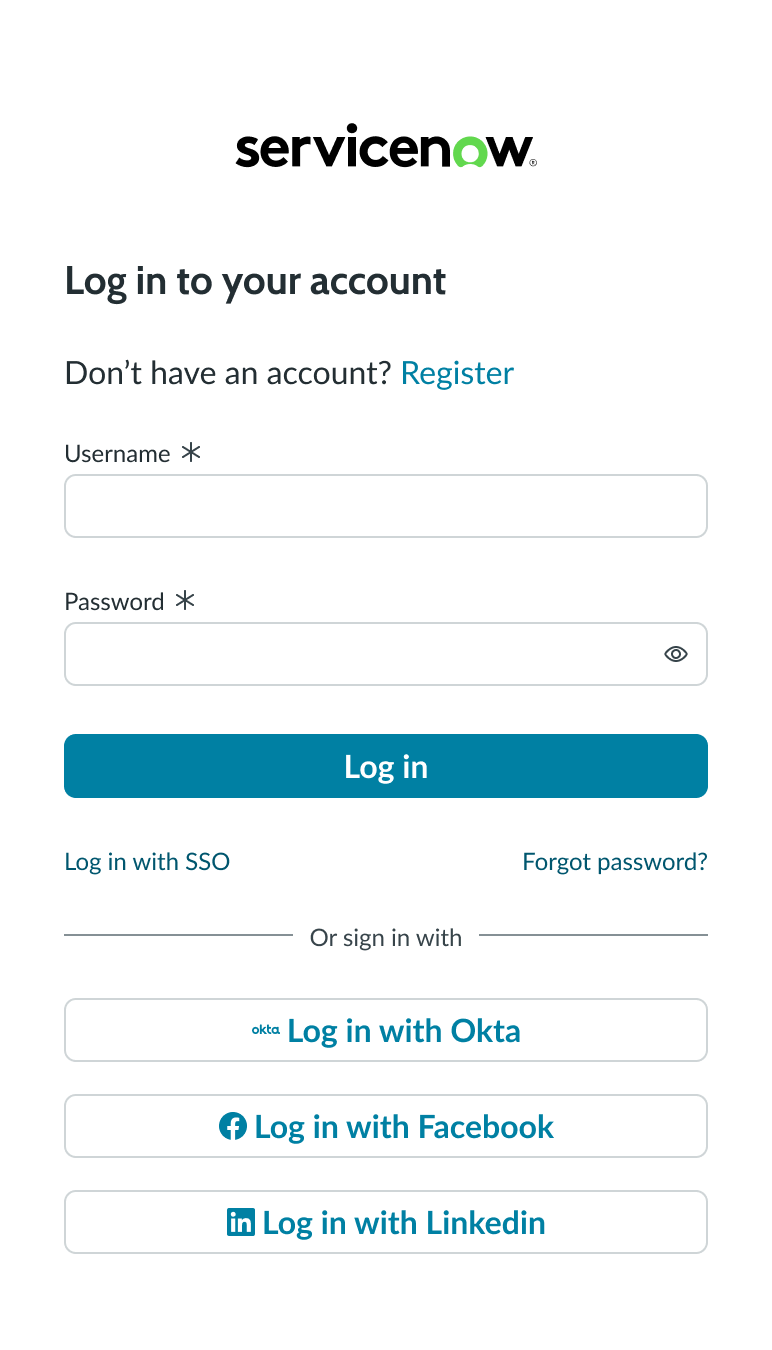
Social login
The social login screen displays buttons that allow the user to log into their account or home page with their social provider credentials. Buttons for social logins can appear with labels and icons or just icons.
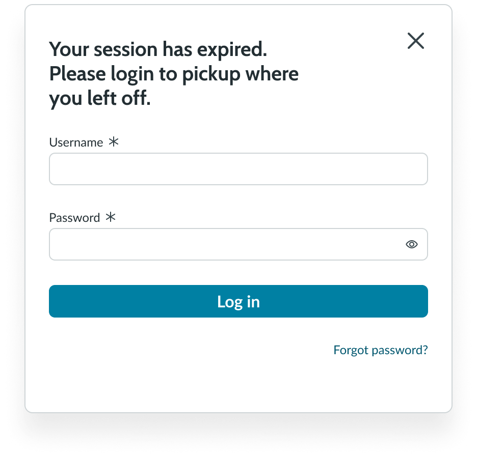
Modal pop-out
When a session has expired, a modal appears asking the user if they want to cancel or continue the session. If the user chooses to continue, the login screen appears in a modal, allowing them to re-enter their credentials.
Configurations
Learn how to customize login by configuring the available properties.
Logo
You can add the logo of your company to the top of the login screen and make it a link.
Header
Add a header to the login screen that describes the purpose of the login.
Account registration
You can add an optional link to the login screen allowing users to create an account if they don’t have one.
Single sign-on link
If your users can log in with single sign-on (SSO), add an external link to that system and create a custom label.
Password recovery
Add a link that allows users to reset their password if they've forgotten it.
Divider
A divider line is an optional element that separates the input fields from the social login links. The divider has a default appearance and label.
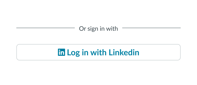
Social provider login
This login option provides a link the user can use to login through their social media account connection page. The text label, icon, and link are configurable.
Design recommendations
Login doesn’t have any specific applications.
Alignment and positioning
Learn how to place login and any elements in your design.
Component on the Left
Position the login component on the left side of the landing page.
Component on the center
Position the login component in the center of the landing page.
Component on the right
Position the login component on the landing page right.
UI text guidelines
These are some recommendations for using text within the login component:
- The header text should be brief, clearly describing the purpose and intent of the feature
- The button text should be concise, actionable, and clearly state what happens when a user selects the button
- The primary action button label should be simple and use proper grammar, such as Log in or Sign in.
Behavior
Learn how login behaves when the display changes or a user interacts with the component.
States
Login doesn’t have any states. However, the subcomponents within login have their own states.
Responsive behaviors
Learn how login component responds to changes in a container or display.
Overflow
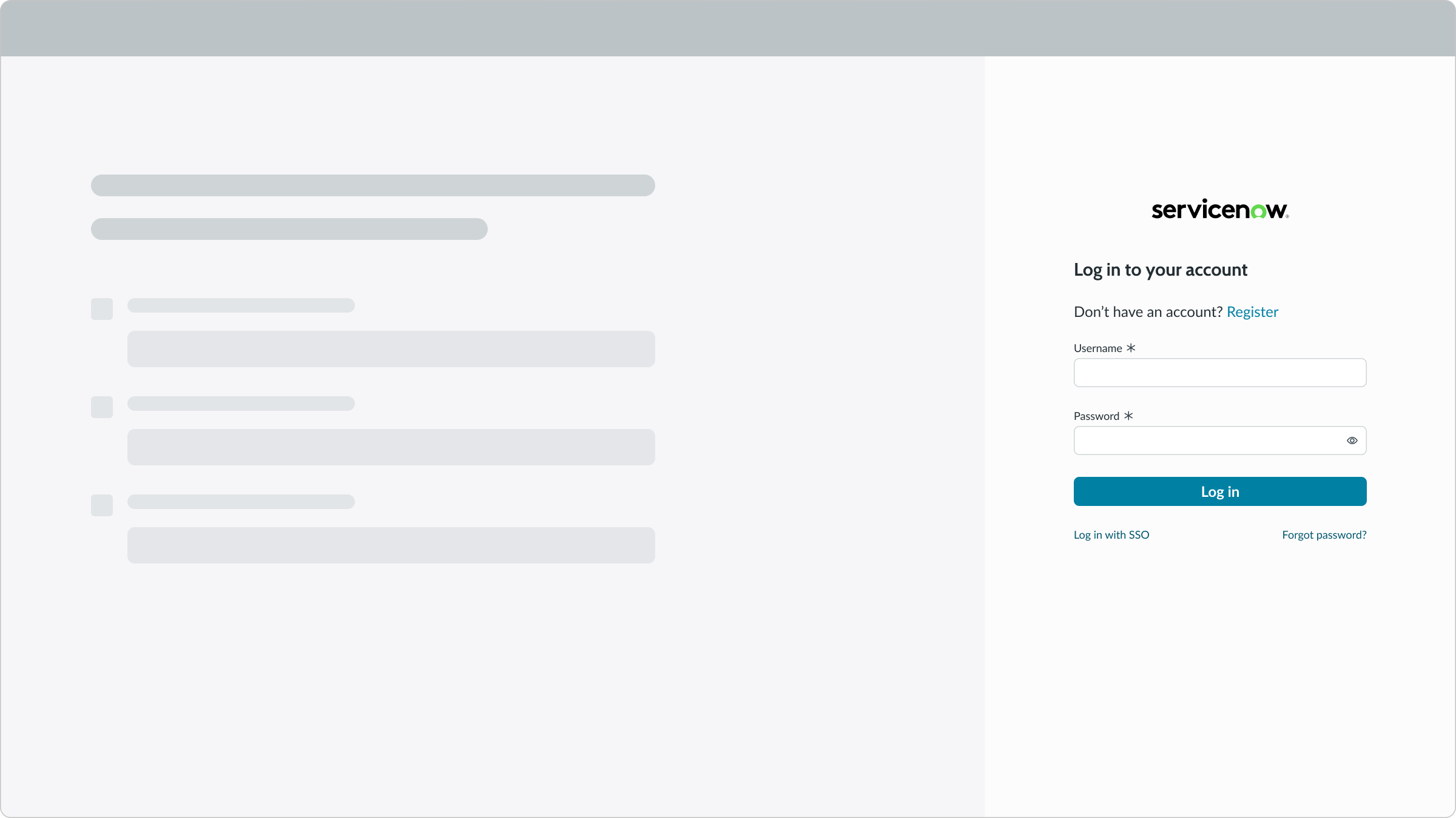
When login content overflows, a small display, a vertical scrollbar appears, so that the user can scroll to see hidden content.
Social login buttons
If you define more than 4 social login buttons for your login screen, the text buttons automatically change to iconic buttons to fit in the space allowed.
Interactions
By default, password input is masked, but can be manually displayed in plain text by the user for verification.
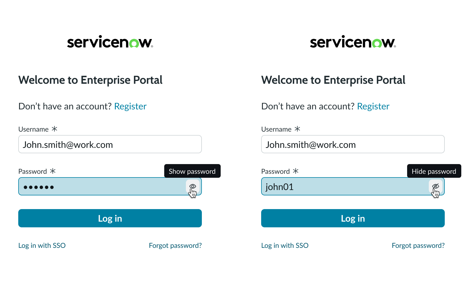
In these examples, the user selects the masking control to reveal a masked password in plain text or to conceal it again.
Usability
The login component complies with all internationalization and accessibility requirements.
Internationalization
When the display translates to a right-to-left (RTL) language, the content flips. The header and sub-components align on the right.
Accessibility
Learn how to access the actionable elements of login through keyboard interactions and screen readers.
Keyboard interactions
You can access the actionable elements of login with these keyboard keys:
- Tab: Moves focus to the next actionable element within the component
- Shift + Tab: Moves focus to the previous element
- Arrow right/left: Moves the text entry caret across available text
- Enter: Triggers the action associated with with an element
Screen readers
When you apply ARIA labels to a component, screen readers can access all controls and content. States and status messages are also announced..