

Anatomy
Learn about the individual parts of date-time-interval.
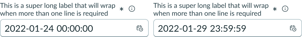
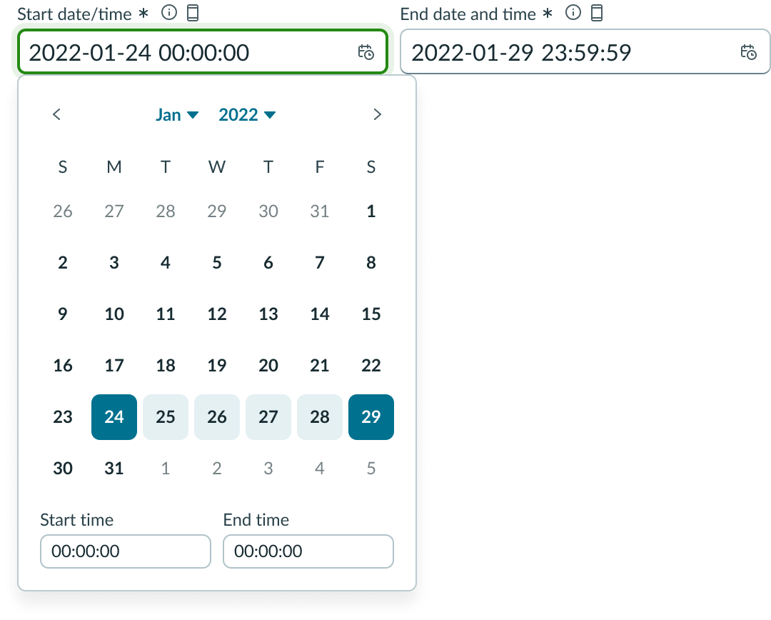
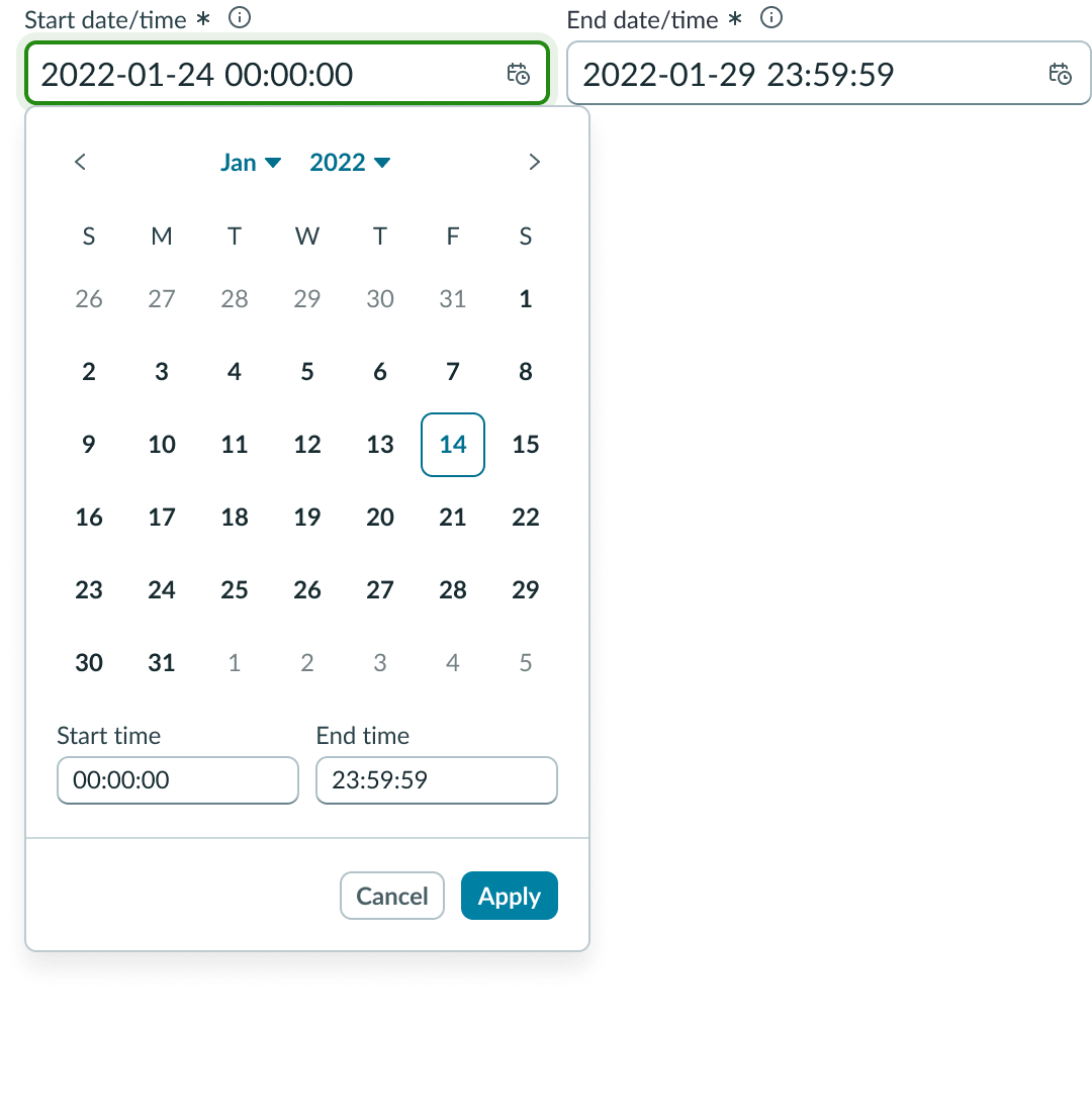
Date-time-interval input fields
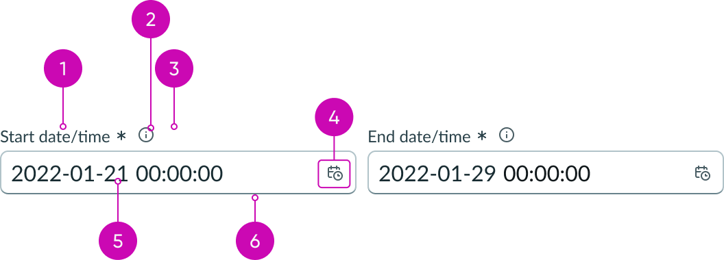
- Label: Text that identifies the expected user input; a label must be present for accessibility, either as the component's label element or external to the component
- Required indicator: Field decorator that indicates if a field is required
- Information button (optional): Opens a popover and shows the field helper text
- Date-time icon: Icon that indicates the field contains a picker
- Value: Date and time entered by a user
- Input field: Space for user input or placeholder date and time format
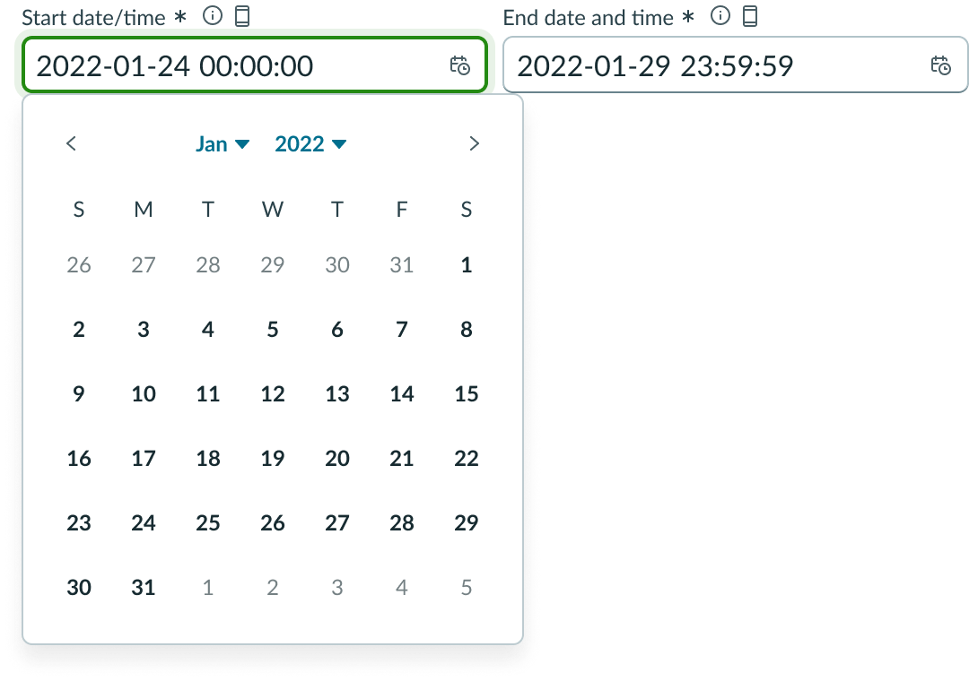
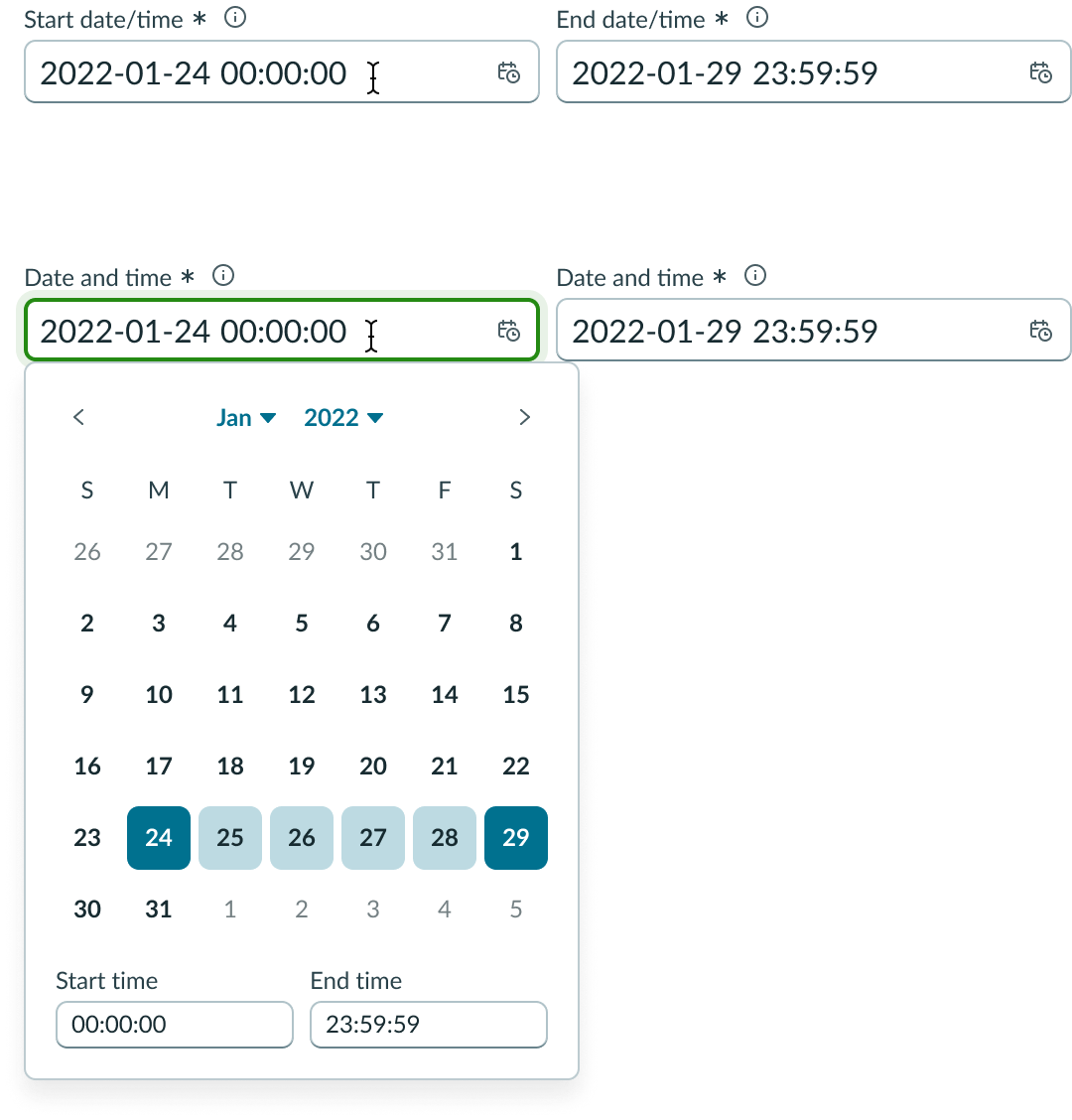
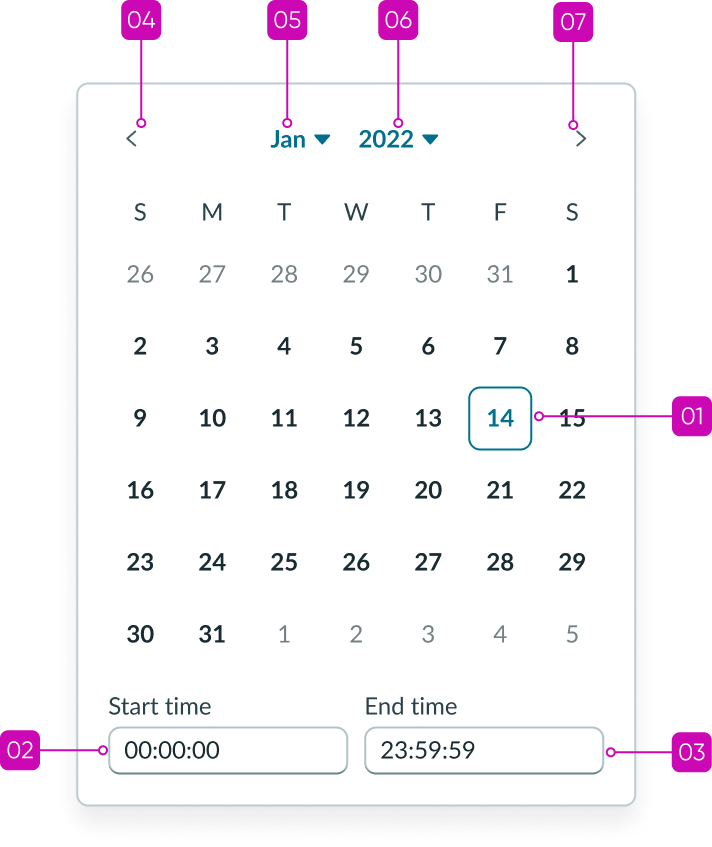
Date-time-interval picker
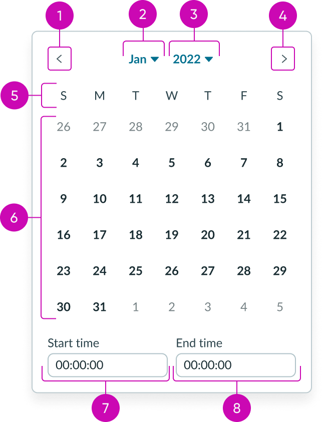
- Previous month button: Navigates to previous month
- Month selector: Displays a month view
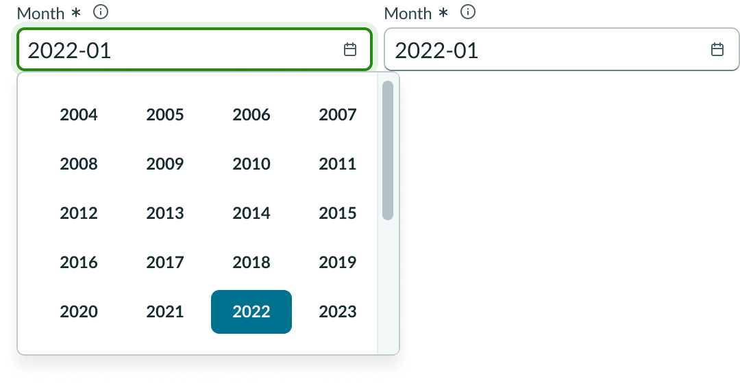
- Year selector: Displays a year view
- Next month button: Navigates to next month
- Days of the week: Displays the days of the week
- Dates: Displays current dates within the current month and adjacent months
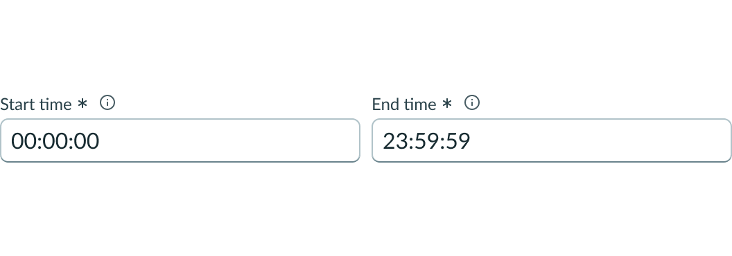
- Start time input: Displays and accepts a valid start time value
- End time input: Displays and accepts a valid end time value
Usage
Date-time-interval picker can be used to enable users to select a range of dates and times from a calendar picker to fill an input field. For use cases requiring a single date time selection, see usage guidelines for the date-time component. For a full interactive calendar see usage guidelines for the calendar component.
See usage guidelines for Date-Time
See usage guidelines for Calendar
Variants
Learn about the variants of date-time-interval.
Sizes
Date-time-interval picker has the following sizes: small and medium. The size you choose depends on your use case.
Small
Use the small size for areas that have limited space. The small size reduces the font size of the text. The field indicators, padding, and picker remain the same size as the default “Medium”.
If icons are included in the input field slot, the padding is reduced between multiple icons.

Medium
Use the medium size alongside similarly sized components and content.
Note: Medium is the default size.

Configurations
Learn how to customize date-time-interval inputs by configuring the available properties.
Presets and controllers
This component has a preset configuration that sets properties and event handlers, making it ready for use. You can override preset values with a custom configuration if needed. Preset values won’t upgrade with updates. To avoid using presets, configure manually. One preset can apply to a single component instance. See presets for more info.
A preset is linked to a controller, which serves as a data resource. Controllers provide configuration data and event bindings for the component. Selecting a preset adds the required controller to the page, allowing new components to use its preset. For more on controllers, see controllers. For default presets, see view properties and events in the controller API.
The following presets are available by default:
- Last 7 days
- Last month
- Last 3 months
- Last 6 months
- Last year
- Year to date
Orientation
You can set the input fields for your date-time-interval picker to display vertically or horizontally.
Horizontal
The horizontal orientation displays your two input fields side by side.

Vertical
The vertical orientation stacks your input fields.
Size
You can configure date-time-interval inputs to be small or medium sized.
Small
Use the small size for areas that have limited space. The small size reduces the font size of the text.

Medium
Use the medium size alongside similarly sized components and content.
Note: Medium is the default size.

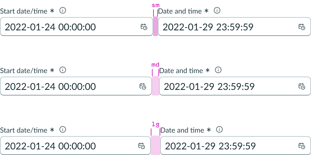
Spacing
The spacing between the date-time-interval inputs can also be set to small (8px), medium (12px), or large (16px).
Slots
The label has an end and in-line slot for additional information. The label-end slot is available at the end of the label line. The label-inline slot is available immediately after the field helper icon. You can add anything to the label-inline slot, but icons are the most appropriate use for this slot.

This example shows a color label with optional icon to indicate status or category.

This example shows a device type indicator in the label-inline slot.
Unsaved field indicator
You can use the label-start slot to add an unsaved field indicator. The indicator appears as a small dot next to the field when the field contains unsaved changes and disappears when the changes are saved.
Note: If you want to add the unsaved indicator to all the input fields in a form, see Form usage guidelines.

Read only
You can configure the date-time-interval inputs to be read-only. Users can select and copy the value, but are unable to edit the value or trigger the picker.

Disabled
You can configure the date-time-interval inputs to be disabled. Users are unable to edit the value or trigger the picker.

Label wrapping
By default, field labels truncate with an ellipsis when they exceed the container width. To wrap labels, enable this property.
Required indicator
You can configure an input field as required with an asterisk indicator after the form label. This indicates that the user must enter a value in this field.
Note: This indicator shouldn't be used with the optional field indicator.

Optional indicator
You can configure an input field as optional. When used, optional fields display "(Optional)" text next to the label. Add this indicator to an optional field when all other fields are required by default. However, you can show the user that a field is optional without displaying the indicator at all.
Note: This indicator shouldn't be used with the required field indicator.

Field helper text
Use the field helper text to display guidance information to help users complete the field. The helper text displays in a popover when the information icon is activated.
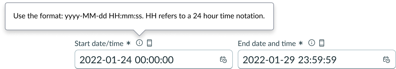
The popover text can contain additional information such as the date and time format.
Alert messages
Provides a list of messages customizable by status aka color (for example, info, suggestion, alert), icon, and text content. The list displays in order from top to bottom.

Picker configurations
You can configure how the calendar displays, including the type of calendar, the footer actions, the first day of the week, adjacent months, days of the week headings, weekend days, and specific dates.
Type
You can select the type of calendar to display. Types include date, date-time, week, month, quarter, and year.
Date
You can set the calendar to display dates. In this view, the month and year selectors remain visible.
Time
You can set the input to accept a time value. The time input doesn’t include a time picker.
Date-time
You can set the calendar to display date and time inputs. In this view, the month and year selectors remain visible.
Week
You can set the calendar to display weeks. In this view, the month and year selectors remain visible.
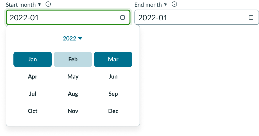
Month
You can set the calendar to display months. In this view, the year selector still remains visible.
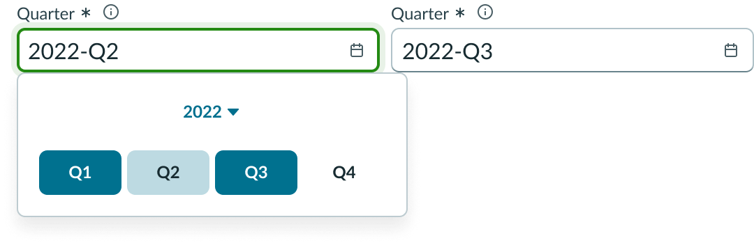
Quarter
You can set the calendar to display quarters. In this view, the year selector still remains visible.
Year
You can set the calendar to display years.
Footer actions
The cancel and apply buttons can be configured to be displayed or hidden. They are hidden by default.
First day of the week
You can enable users to set the first day of the week to start on any day. In the left image below, the week starts on Sunday and in the right image, it starts on Monday.
Hide adjacent months
Adjacent months can be configured to be displayed or hidden. In the left image below, adjacent months are shown and in the right image, they are hidden.

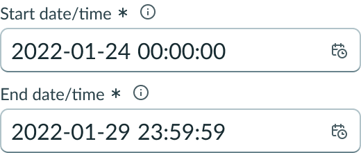
Default start time
Configure a default start time for the picker when it loads. If you don’t configure a start time, the time defaults to midnight. Below, the image to the right has the start and end time configured.

Weekend days
You can specify which days are weekend days so you have the option to disable weekends on the calendar. Below, the image to the right has weekends disabled.
Disable specific dates
In addition to disabling weekend days, you can disable specific dates. This includes disabling individual dates, date ranges, and all dates before or after a certain date.

Design recommendations
Learn how to apply date-time-interval picker in your design.

Configure the date time picker to the type “time” for entering time specific intervals.

Don’t use the default date-time-interval picker for time specific intervals.
Enable the default footer actions to display confirmation controls, allowing users to verify their selection prior to the picker closing.
Don’t use the default date picker if your use case requires a user to verify their selection.
Configure the first day of the week to start on Monday to mimic an ISO calendar.

Don’t use the default date picker if your use case requires an ISO date picker
UI text guidelines
These are some recommendations for using text within date-time-interval:
- Your date-time-interval labels should be concise, for example, “Start date and time” and “End date and time.”
- The label for this field should instruct the user to take an action (“Select a date and time for your appointment”) or can just be nouns if the context is already apparent (“Date and time”)
- For example, you could use “Select a date and time for your appointment” or “Date and time”
- Don’t use a slash or symbol in the label because slashes, ampersands, and other symbols don’t translate
- If you use an Information icon, the popover text should describe any additional information the user needs to know regarding the date and time.
- For the primary button in the footer, use a label that clearly conveys what happens with the date and time selection they made
- For the Current button, use a label that tells the user selecting this chooses the present time
- Start with a verb to describe a specific verb to set the expectation of what happens next
- Use short labels. Two words is ideal. Three is OK. If needed for clarity, four is acceptable.
- Avoid commas, periods, and other punctuation
- Add an object to the verb if additional context or clarity is needed
- For example, “View today’s date”
- Add an article (like “a” or “an”) to add a more human, conversational tone
- For example, “Choose this date”
- Use the same verb tense if multiple buttons are present
Behavior
Learn how date-time-interval picker behaves when the display changes or a user interacts with the component.
States
Date-time-interval inputs has the following states: default, hover, focus, read-only, disabled, and invalid.
Users cannot edit the value when the input field is in a read-only state. However, users can select and copy the value.
| State | Example |
|---|---|
| Default |  |
| Hover |  |
| Focus |  |
| Read-only |  |
| Disabled |  |
| Invalid |  |
Responsive behaviors
Learn how date-time-interval picker responds to changes in a container or display.
Interactions
Learn how date-time-interval inputs responds when a user interacts with it.
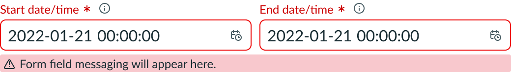
Invalid state
In an invalid state, the labels and indicators of the required input fields appear in red. If the labels include either a required indicator or an optional indicator, it also appears in red. If you include an invalid message, it appears under the fields to describe the error to the user. You can customize the words in the invalid message based on your experience and audience. Although invalid messages are optional, it is recommended that you include one to help the user understand what caused the error.
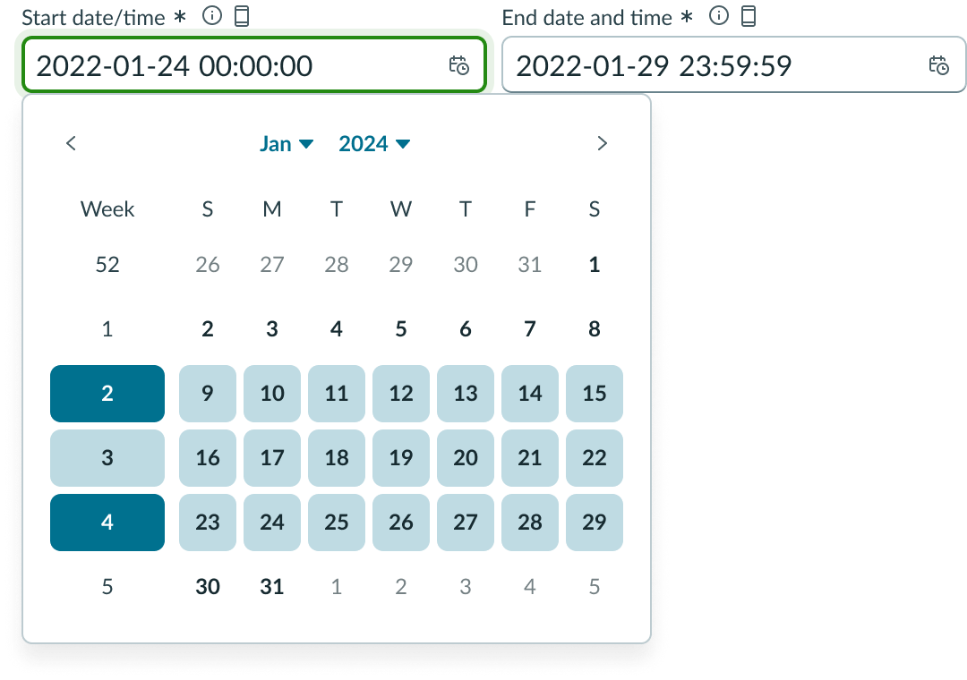
Scrolling
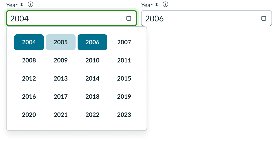
If the year exceeds the container height, the year selection displays a vertical scroll bar.
Interactions
Learn how date-time-interval picker responds when a user interacts with it.
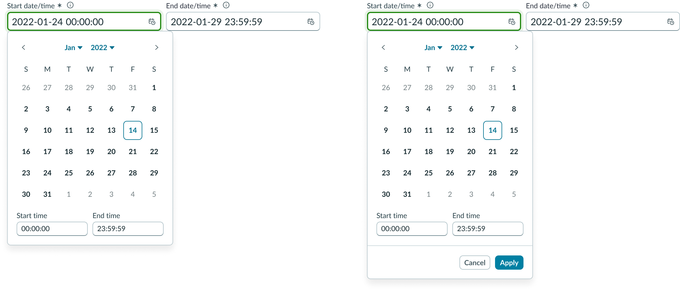
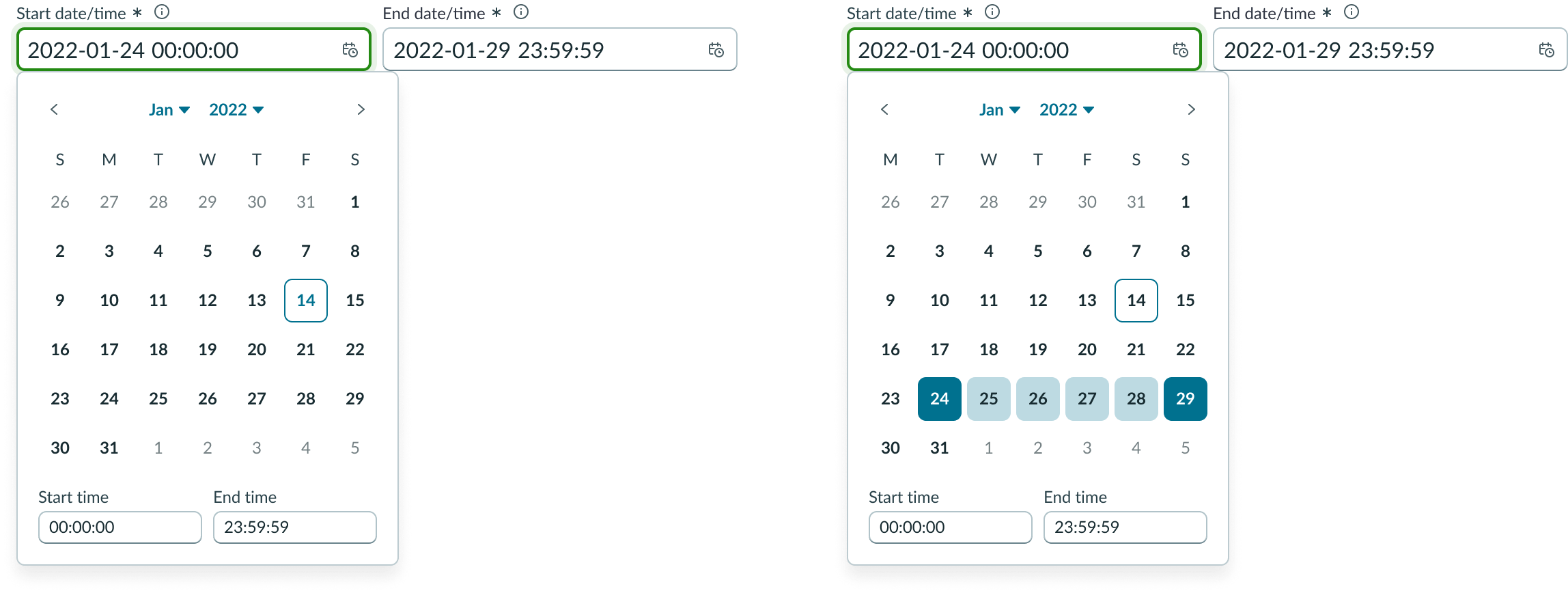
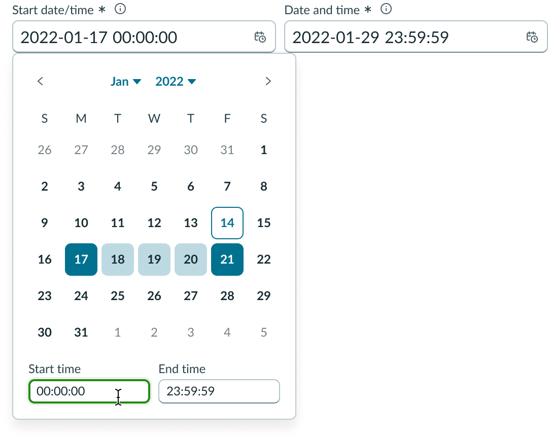
Select dates
Users can select an input field to display the picker. Users can then type their value into the input field, or select a value from the picker.
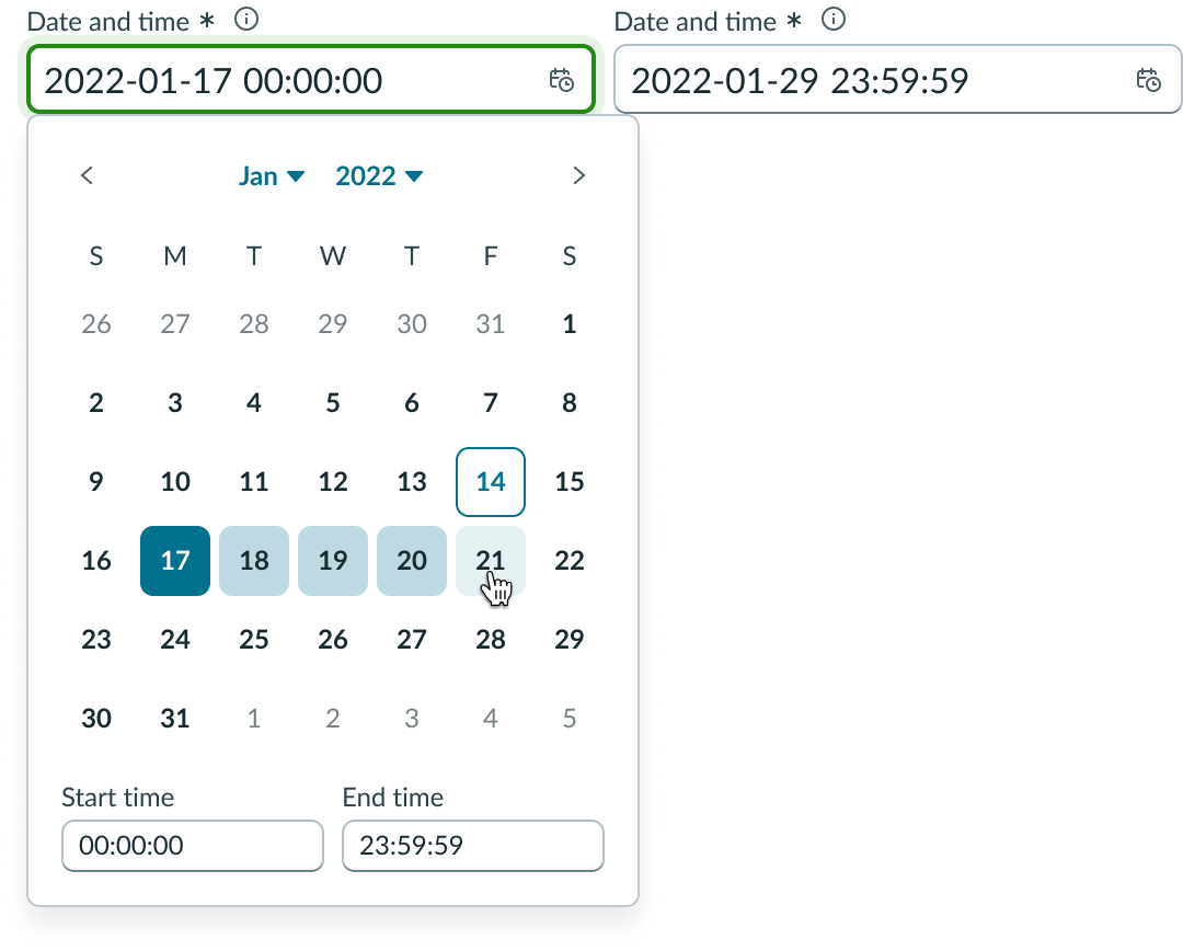
With the picker open, users can make an initial selection (for example, the 17th). The date value and default time is then updated to the start input.
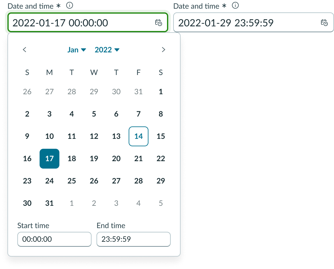
Once the start date has been selected, hovering over an end date highlights the dates in between. Users can select a date-time-interval within one picker.
After a start and end date have been selected, the user can enter a start and end time. Pressing the Enter key within either time input submits the time values and dismisses the picker.
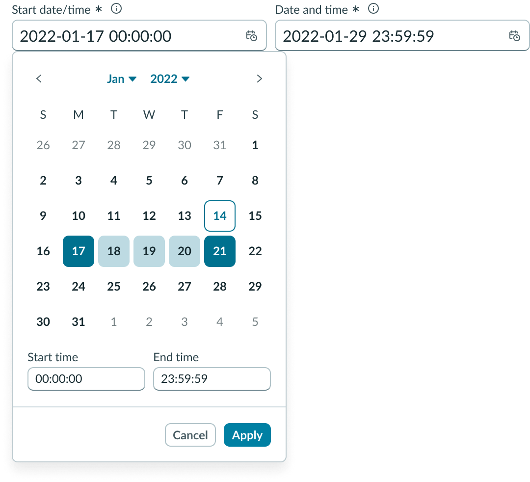
Footer actions
If configured, users can select actions “Cancel” and “Apply” from the footer. This configuration is important for use cases that involve preserving or validating selected date and time values.
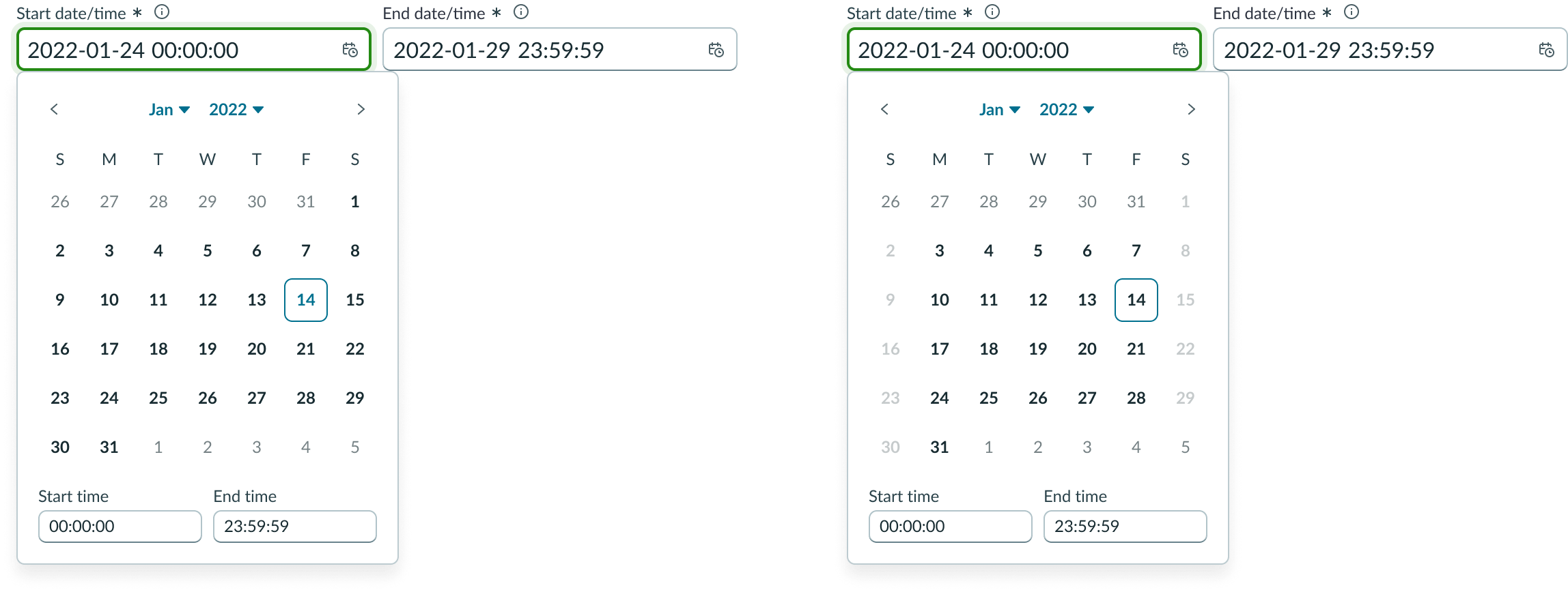
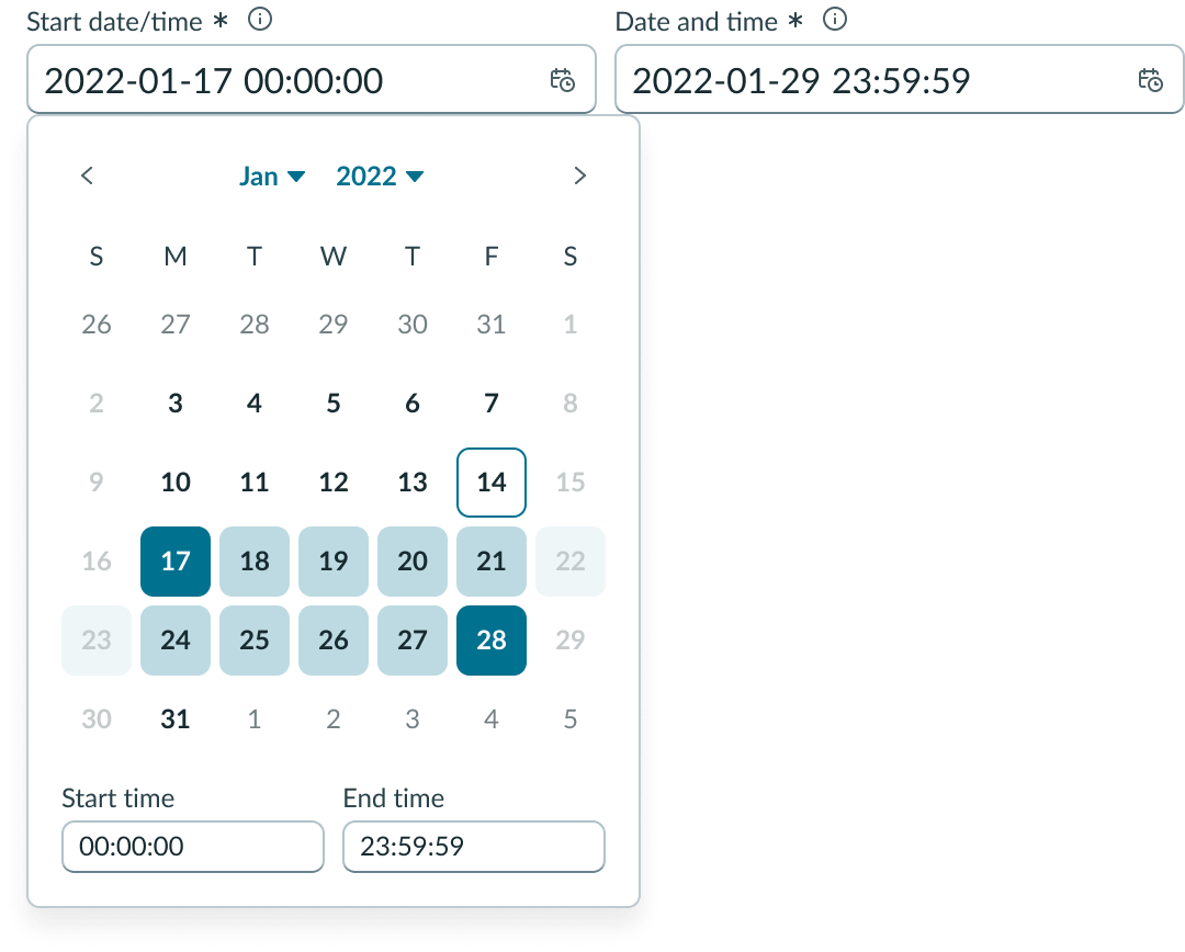
View disabled dates
Disabled dates cannot be selected as a start or end date. However, a disabled date may fall within a selected date range.
Usability
Date-time-interval complies with all internationalization and accessibility requirements.
Internationalization
When date-time-interval picker is used in a platform configured for a right-to-left (RTL) language, content in the component flips its orientation.
Accessibility
Learn how to access the actionable elements of date-time-interval picker through keyboard interactions and screen readers.
Date-time-interval picker tab order
This is the tab order for date-time-interval picker
If no value is selected, focus moves to the current date.
Keyboard interactions
You can access the actionable elements of date-time-interval picker with these keyboard keys:
With focus on date input:
- Down arrow: Expands picker
With focus on previous month button:
- Enter or space: Displays previous month button
- Tab: Moves focus to month button
- Shift + tab: Moves focus to “End time” input
With focus on month:
- Enter or space: Displays month selection
- Tab: Moves focus to year button
- Shift + tab: Moves focus to previous month button
With focus on year:
- Enter or space: Displays year selection
- Tab: Moves focus to next month button
With focus on next month button”
- Enter or space: Displays next month and focus remains on button
- Tab: Focus moves to date picker
- Shift + tab: Focus moves to year button
With focus on current date”
- Enter: Selects date
- Esc: Dismisses picker and focus returns to date time input (when footer actions are present, the Esc key dismisses the picker and reverts to previous value)
- Up/down and left/right arrows: Moves focus within the calendar
- Tab: Moves focus to “Today” button
- Shift + tab: Moves focus to next month button
With focus on “Start time” input:
- Enter: Submits time value and collapses picker
- Tab: Focus moves to “End time” input
- Shift + tab: Moves focus to last selected date if date selection is present
With focus on “End time” input
- Enter: Submits time value and collapses picker
- Tab: Focus moves to previous month button
- Shift + tab: Moves focus to “Start time” input
Screen readers
When you apply ARIA labels to a component, screen readers announce the controls and content of date-time-interval picker in the prescribed tab order.