

Anatomy
Learn about the individual parts of calendar.
Calendar header
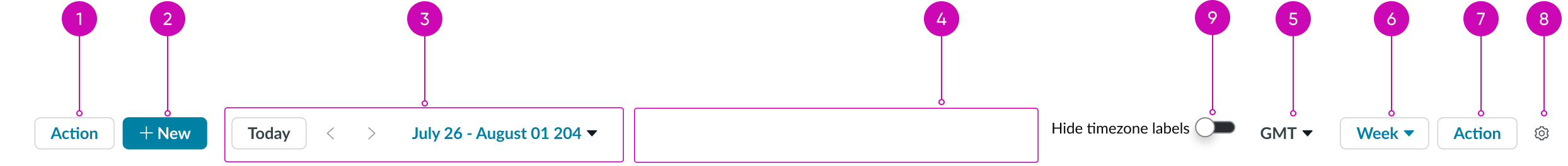
- Content slot (optional): Slot for placing optional actions or content
- New Button (optional): Creates a new event on the Calendar
- Date selector: Provides navigation to the previous or next time period; enables users to quickly select a specific date or to navigate to the current date.
- Middle content slot (optional): Additional slot for placing optional actions or content
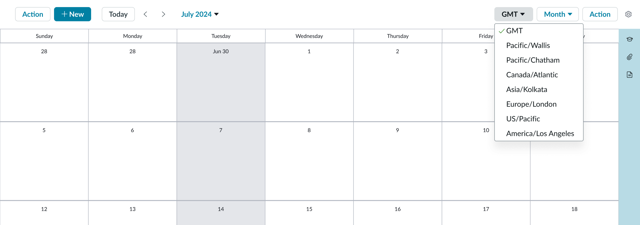
- Time zone selector: Available when the user selects a time zone other than the default in the preferences menu; lets the user select a time zone from a configured list
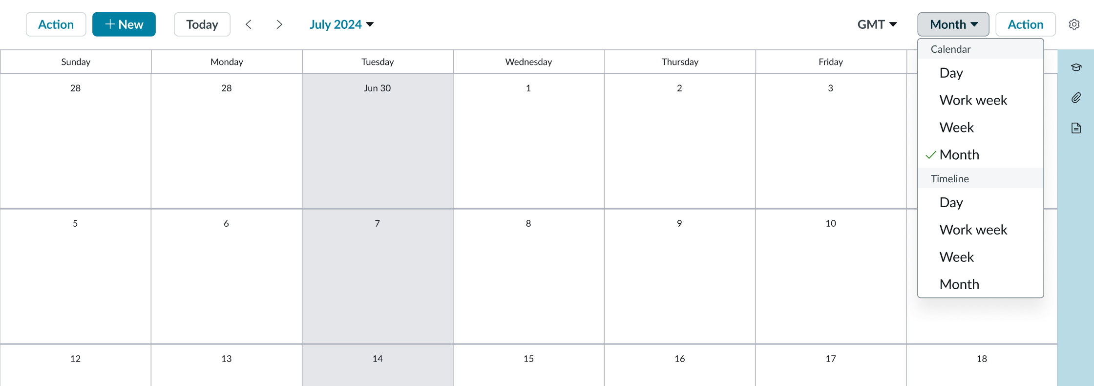
- View selector (optional): Allows selection of views from a configured list
- Content slot (optional): Slot for placing optional actions or content
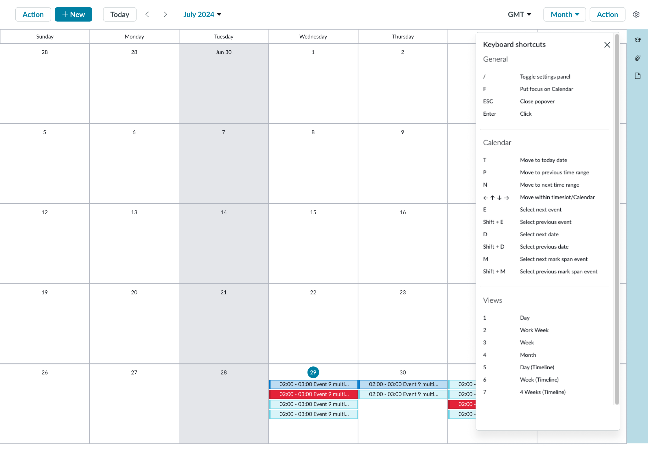
- Settings menu: Provides access to the keyboard shortcuts and other settings
- Time zone label toggle: Toggle to hide section-based time zone label
Calendar grid
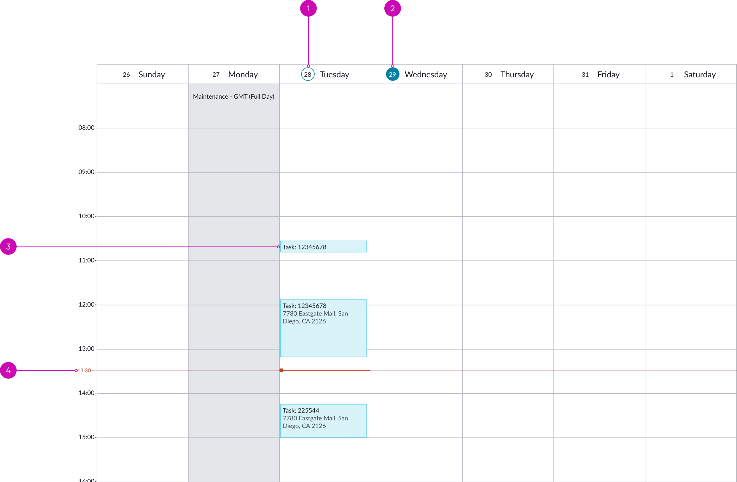
- Current day indicator: Indicates the current date
- Selected day indicator: Indicates the selected date
- Event: An event with a start and end date/time
- Current time indicator: Indicates the current time
Timeline grid
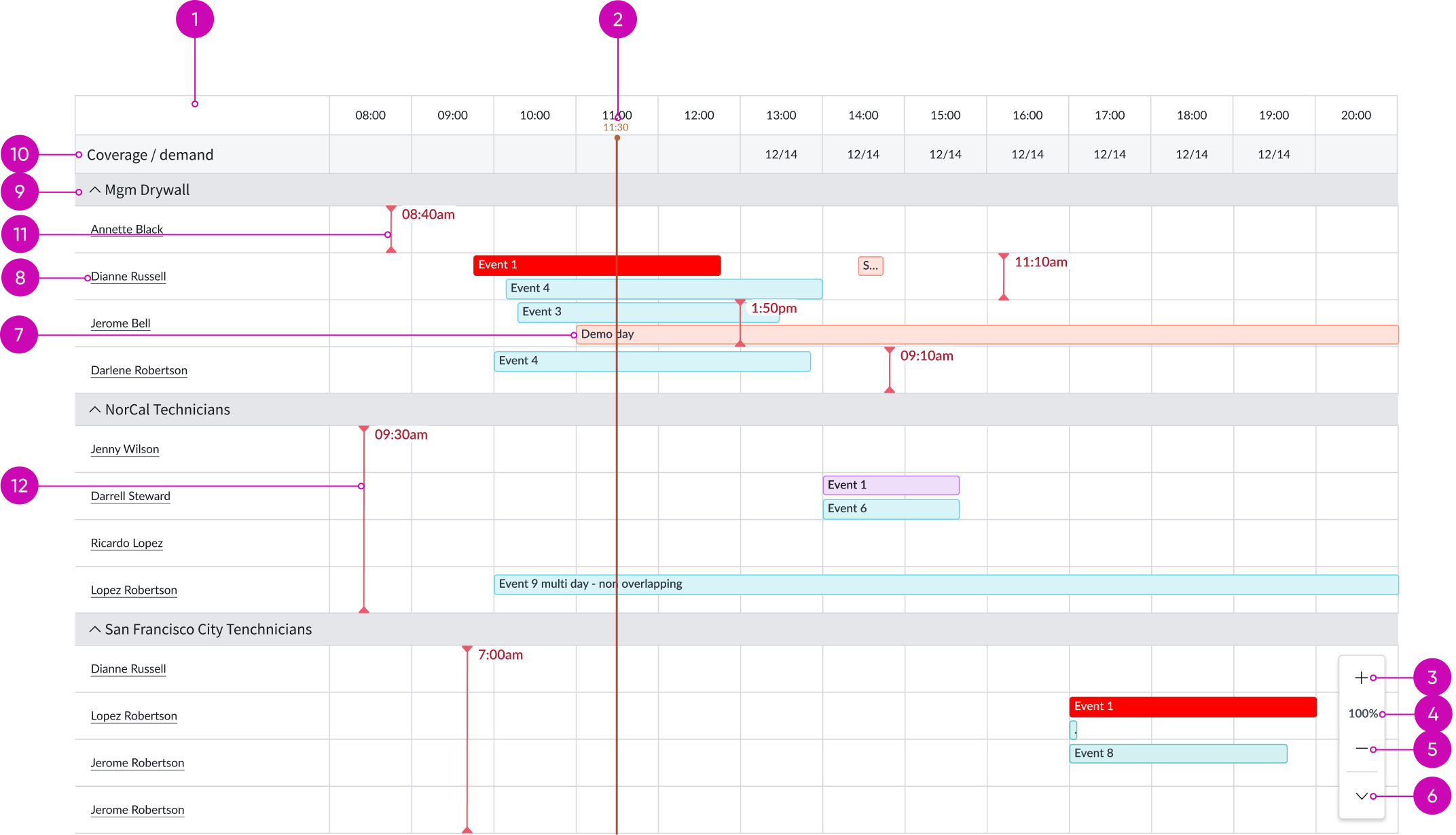
- Content slot (optional): Contains optional actions or content
- Current time indicator: Indicates the current time
- Increase column width: Increases the width of the column
- Reset column width: Displays the current level of the column width; reverts to the default width when clicked
- Decrease column width: Decreases the width of the column
- Collapse column width control: Collapses the column width control
- Event: An event with a start and end date/time
- Row context: Displays the context and assigned user for the scheduled events shown
- Grouped row (optional): Can expand/collapse rows below and display rollup/summary data
- Summary row (optional): Can display rollup/summary data for the rows below
- Row level time zone indicator: Time zone indicator with label at row level
- Section level time zone indicator: Time zone indicator with label at section level
Contextual side panel
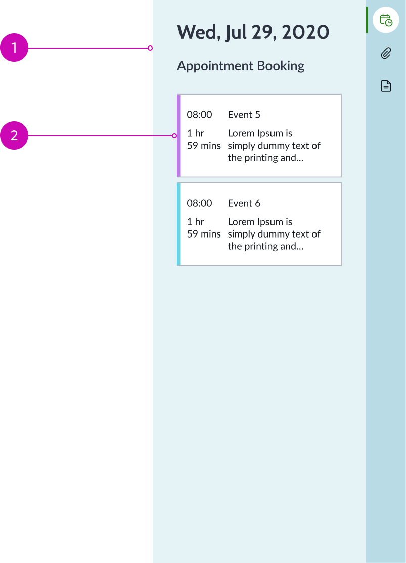
- Contextual side panel (optional): Displays cards for all the agenda items in the selected view and additional configured widgets
- Event card: Displays details about an event within the agenda side panel display
Subcomponents
See usage guidance for button bare
See usage guidance for dropdown
See usage guidance for button iconic
See usage guidance for popover
See usage guidance for heading
See usage guidance for date-time
Usage
Use a calendar on a page where a user needs to see events with a scheduled start and end time. Some examples could be on-call schedules, agent shifts, recurring meetings, or scheduled changes.
Configurations
Learn how to customize calendar by configuring the available properties.
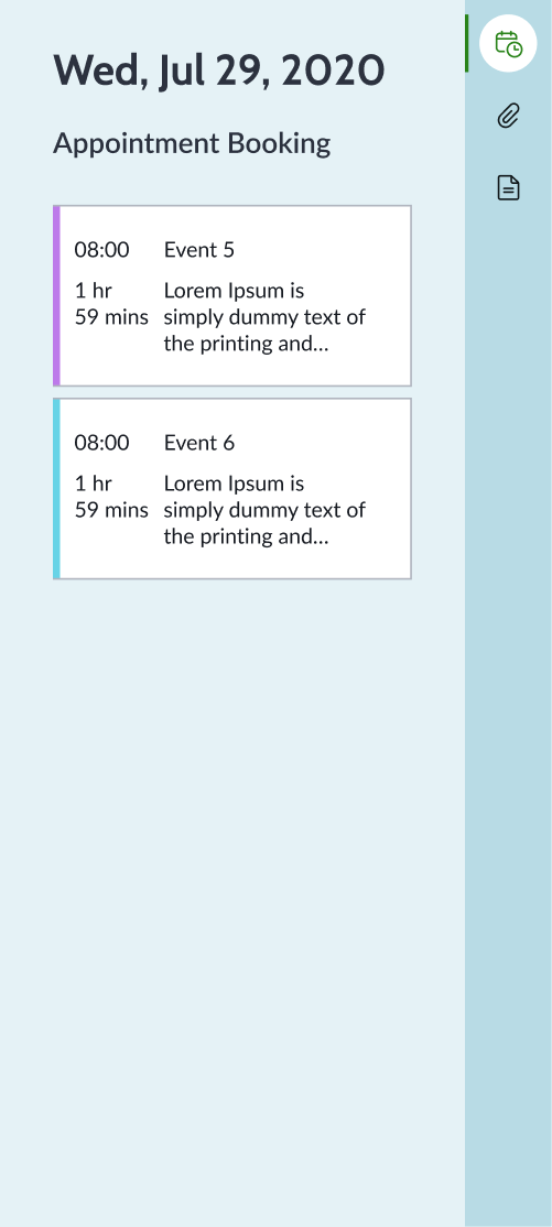
Views
You can configure different calendar views. The traditional calendar views of Day, Week, and Month are available. You can also select Timeline – Day and Timeline – Week to display scheduled events for a collection of contexts like agents or records.
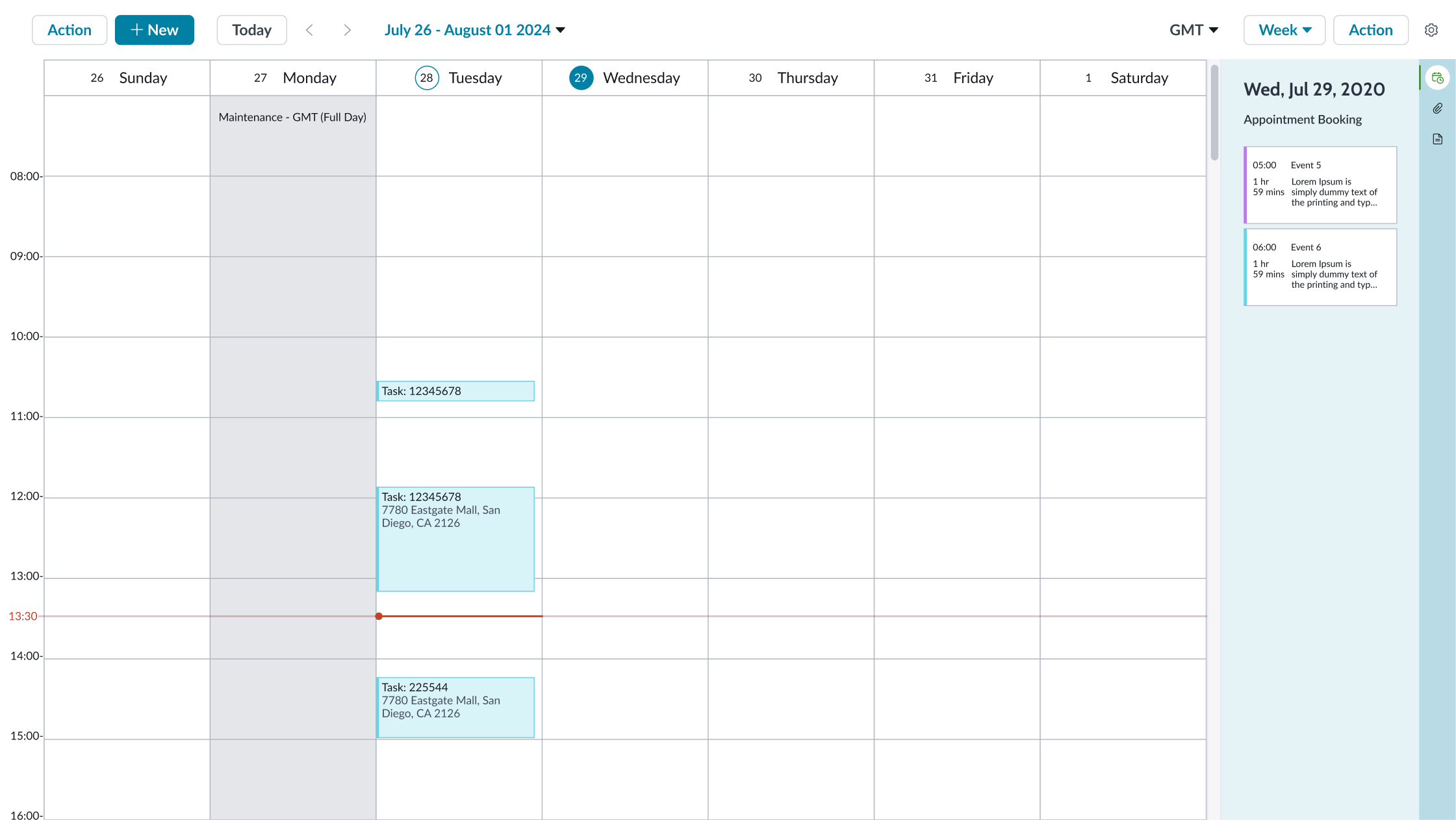
Week view
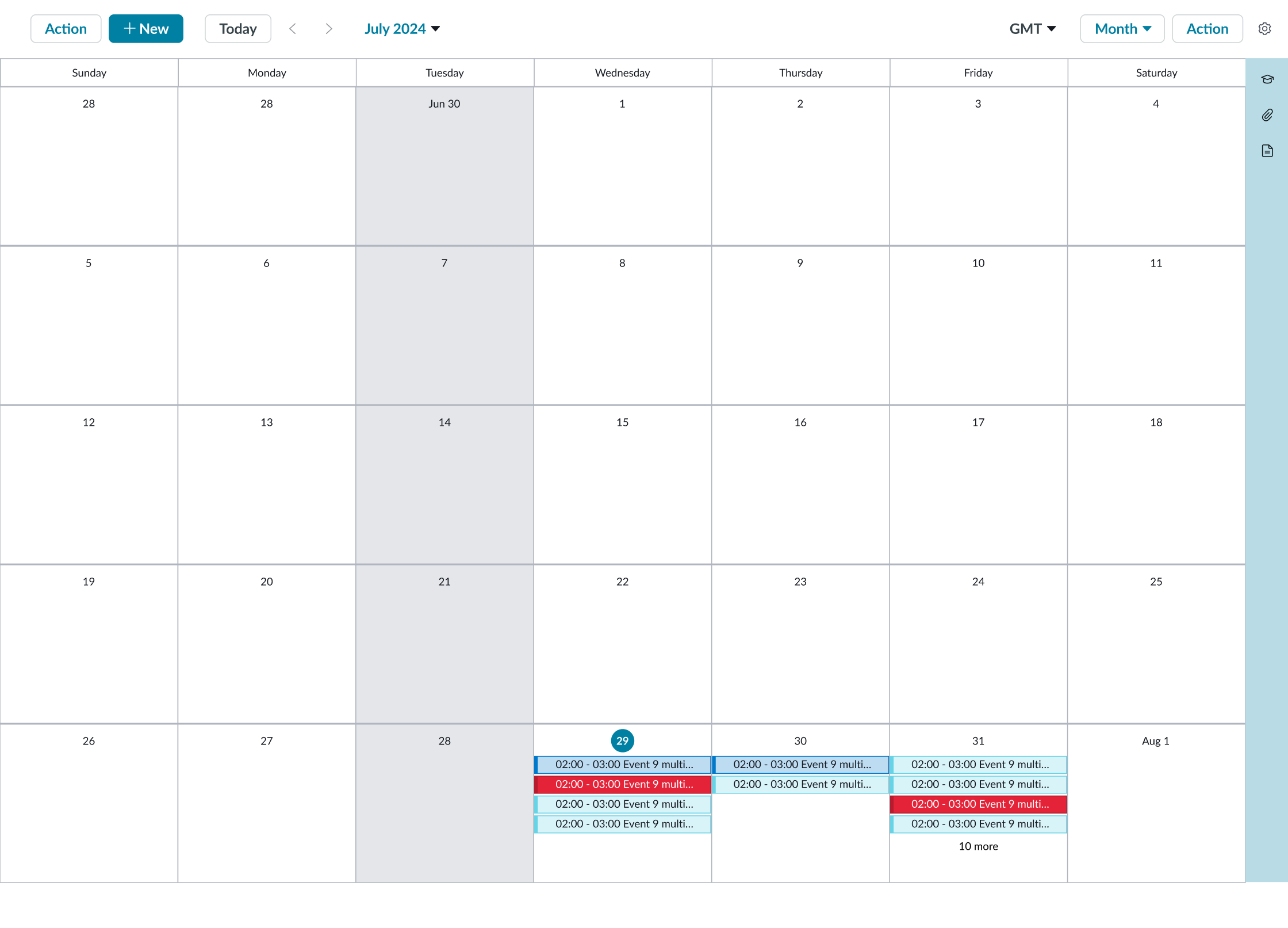
Month view

Day view
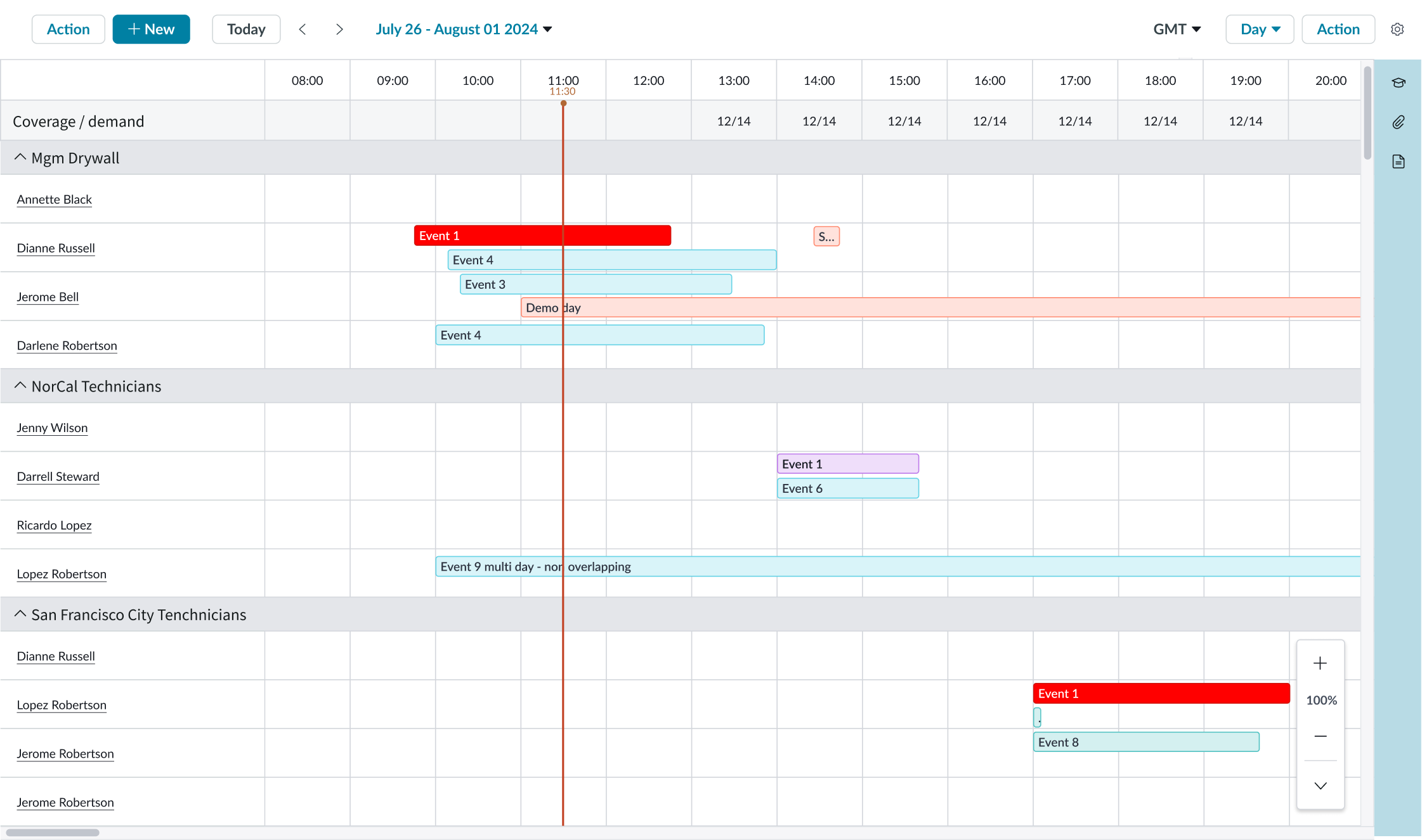
Timeline day view

Timeline week view
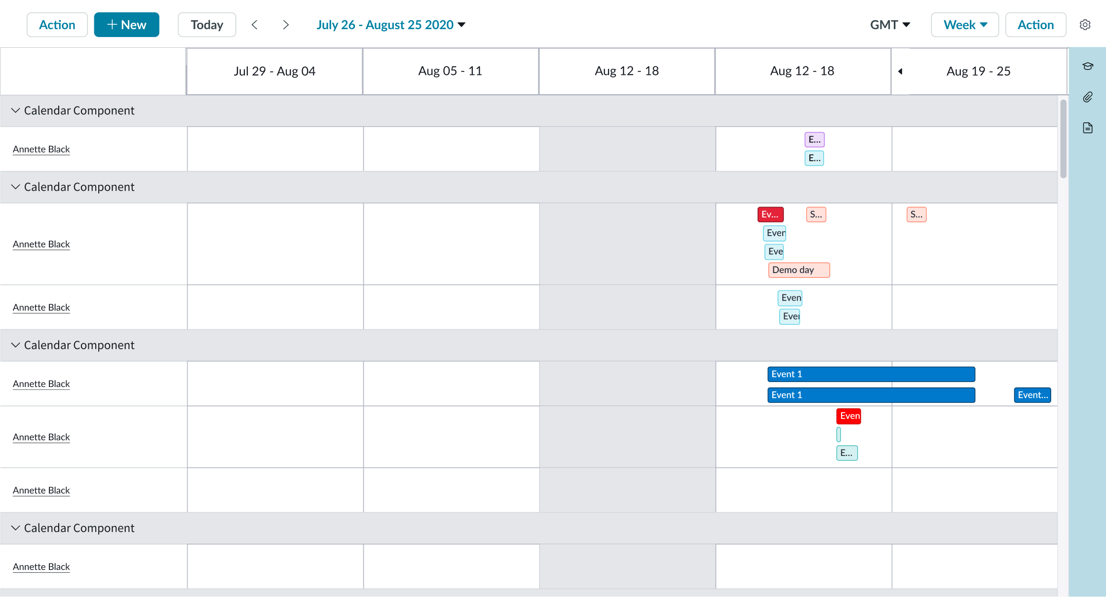
Timeline extended week / month view
Contextual side panel
You can hide or display the contextual side panel for each selected calendar view. Add content to your side panel that includes information appropriate to the calendar, such as work schedules or time off requests. By default, there is an agenda list available that lists events chronologically as cards for the selected date and by context, if applicable. For days with numerous scheduled events, the agenda list is the only way to access all the events for the month view. For this reason, you shouldn't disable the agenda list for the month view.
Right click action
You can configure events to have right click action that opens a menu and enables users to take actions in less steps.
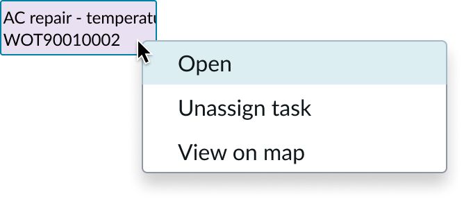
Right click action
New event actions
You can configure the New button to appear that enables users to create a new calendar event. If you need to create more detailed events for your application, you can disable the New button and insert a custom button in the content slot to the left side.

Event selection popover
You can configure a popover to display when the user selects an event. The popover contains a single slot, so the content, layout, and actions available in the event popover are all configurable.

For smaller screens, you can configure the event popover to appear in the side bar.
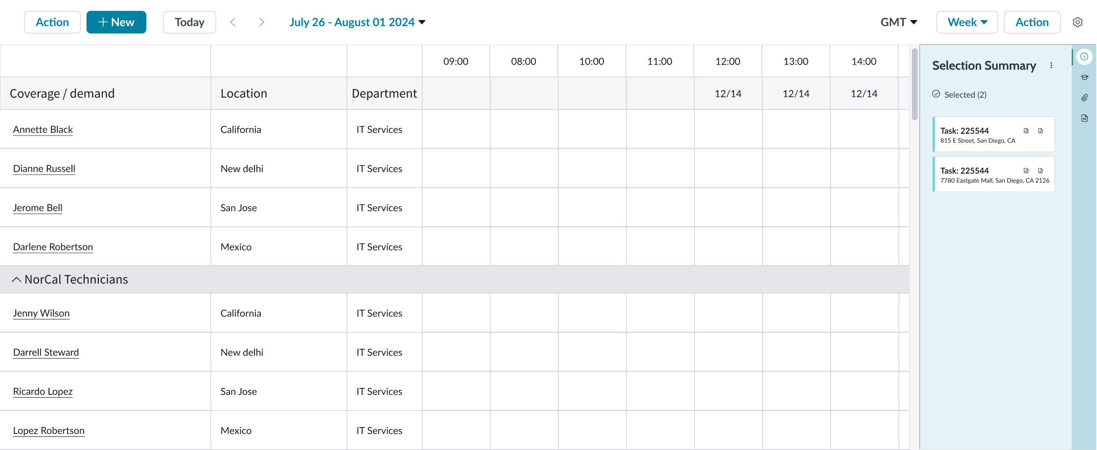
Multiple event selection
The user can select multiple events by holding the Shift or CMD button and selecting the events. The selection summary in the contextual side panel displays the selected events.

Multiple left columns
You can configure calendar to show multiple left columns. Enabling multiple left columns adds extra slots in the component configuration in UIB. These slots can be configured with the data to show in the extra columns.
Event height
By default, the height of calendar events is 20 pixels. You can configure the initial height or dynamically change the height of all the events. The event height can be between 20 pixels and 100 pixels unless you change using the minimum and maximum height values.
Minimum
By default, the height of events is 50 pixels; the minimum possible height is 24.
Maximum
By default, the maximum height of events is 100 pixels, and the maximum height is configurable to any limit.
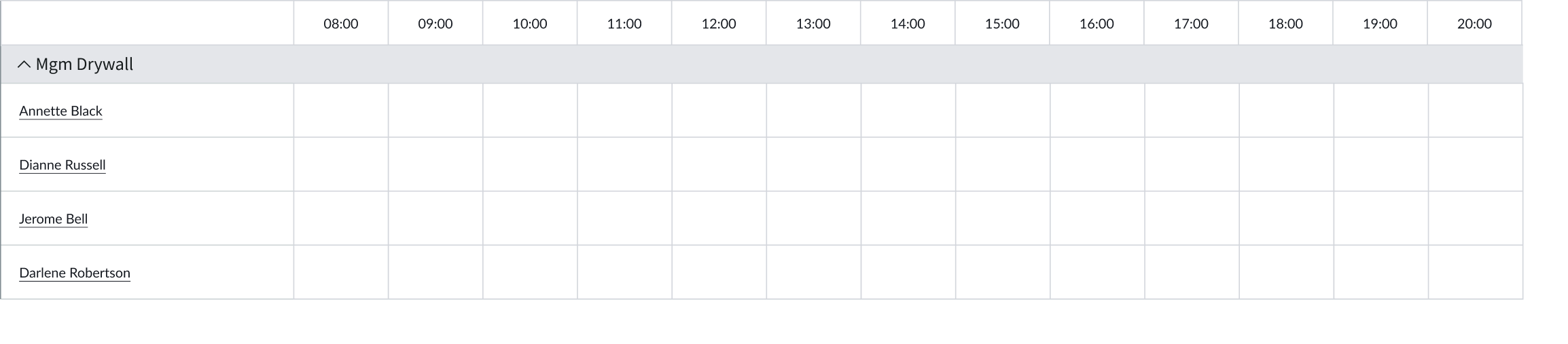
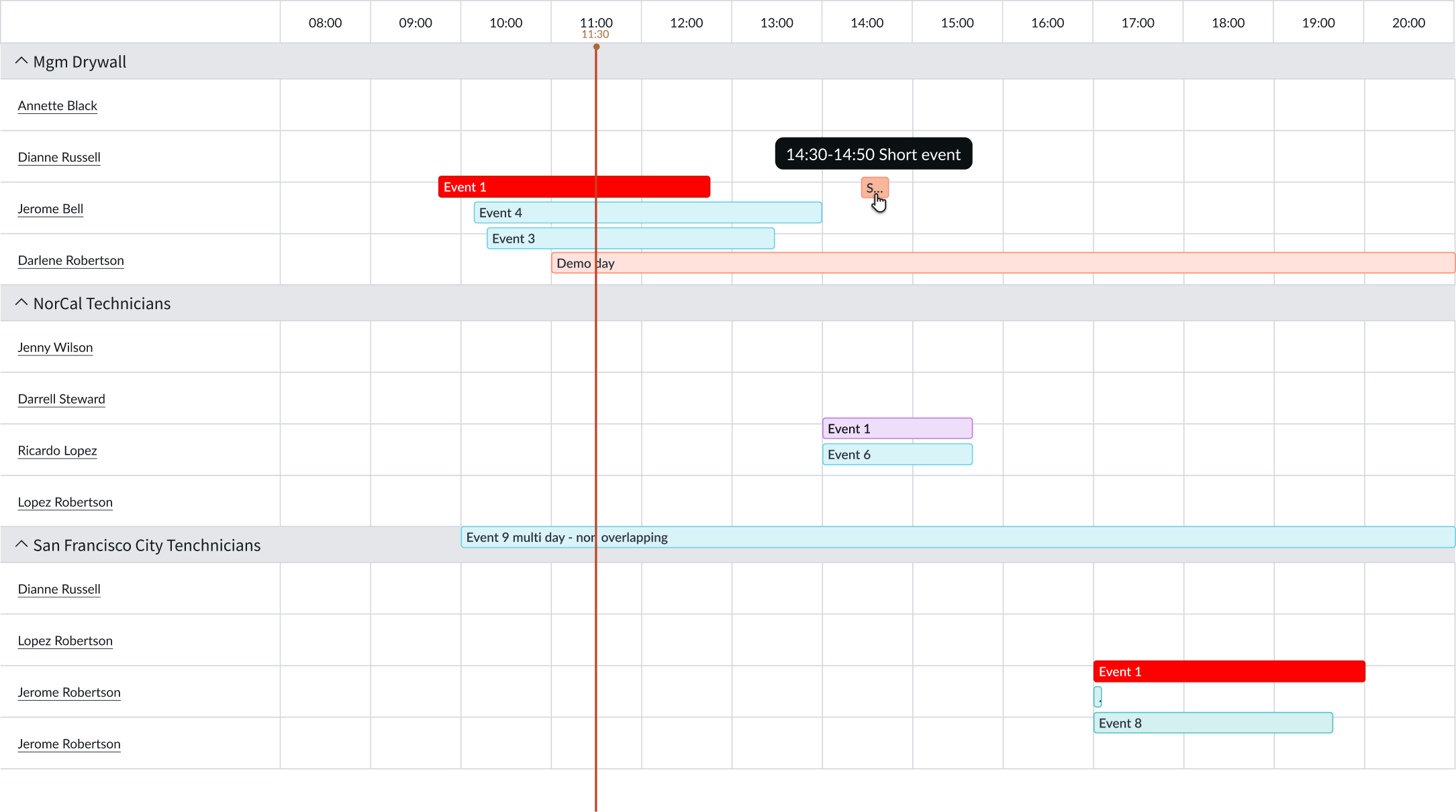
Timeline grouped rows
You can group the context list in a Timeline view by different values. Depending on your use case, you might group agents by their assignment groups.

Timeline summary row
You can use a template to insert content into a Summary row in Timeline views. An example of this might be the count of current agents scheduled vs. the forecasted demand for a particular time slot. Timeline summary row isn’t available out of the box and must be configured through templates.
Note: Timeline summary row isn’t available out of the box and must be configured through templates.

Timeline month representation
You can see a month-wise representation of events in the timeline view.

Timeline day/week grid width
You can disable horizontal scrolling when the content overflows the container width. This causes the grid columns to shrink to fit the available width.
Timeline column width control
Timeline column width control is enabled by default and is displayed at the bottom-right corner in the view. To increase or decrease the column width, the user selects the width control buttons. To reset the column width to its default (100%), the user selects the area displaying the current width level.
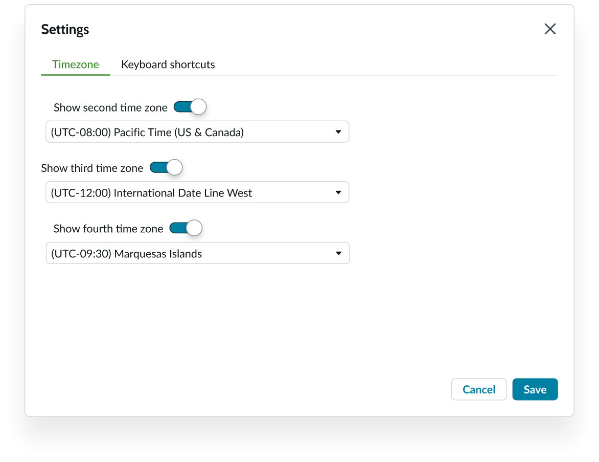
Show multiple time zones
Users can choose up to 3 additional time zones to show in the timeline view from the settings in the calendar header.

To add multiple time zones, the user selects Settings > Timezone tab.
Hide header
By default, the calendar header displays, but you can configure the calendar to hide it and provide more space in the workspace UI toolbar. If you hide the calendar header, you must configure the calendar component to show the header’s features like action, dates, and settings.
Hide settings
By default, the settings button displays in the calendar header, but you can configure the calendar to hide it.
Hide keyboard shortcuts
By default, the settings button displays the keyboard shortcuts tab, but you can configure the calendar to hide it. Hiding this tab doesn’t affect the shortcuts usability or behavior.

Section-based timezone indicator
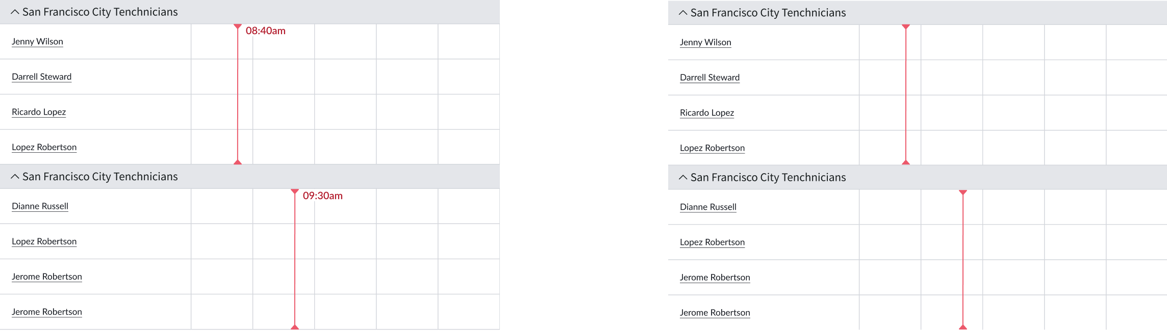
You can configure to show section-based timezones. Each timezone is indicated by a vertical timezone line along with a timezone label. You can also configure to show the Hide timezone indicator toggle in the calendar header. Users can switch this toggle to hide the section-based timezone indicator, label, or both. The following image shows the timezone indicator with label (left) and without label (right)
Design recommendations
Learn how to apply calendar in your design.

Display calendar on a full screen so that the user can see all information and controls easily.

Avoid using calendar in a small space; it can make it challenging for the user to access all events and controls.
Use only a single calendar per page to avoid confusion.

Avoid using more than 1 calendar on a page because it makes it difficult for users to view the data and understand how the calendars are related.

Add custom functionality to the embedded side panel to support the needs and context of the calendar users.
Avoid adding additional components on the page for functions that can exist in the side panel. This makes it difficult for the user to access all events and controls.
UI text guidelines
These are some recommendations for using text within calendar:
- Keep all text labels short and concise
- Slot content should be descriptive and concise.
Behavior
Learn how calendar behaves when the display changes or a user interacts with the component.
Left column cell states
Cells in the left most column behave as buttons with different states.
States included are default, focus, hover, pressed, selected, selected (hover), selected (focus), selected (disabled), and selected (pressed).
Default
Focus

Hover
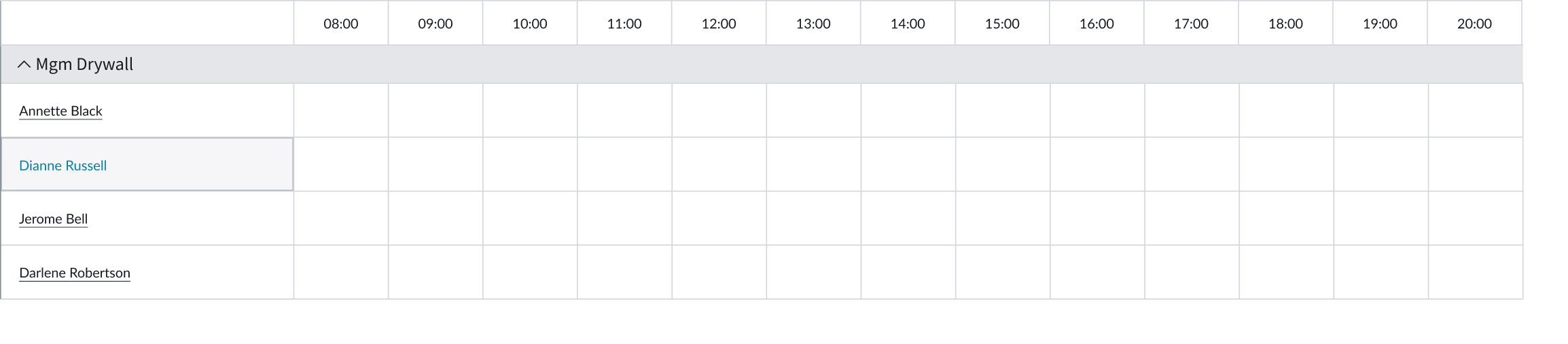
Pressed

Selected

Selected (hovered)
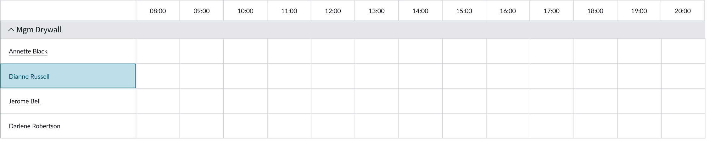
Selected (focused)

Selected (disabled)
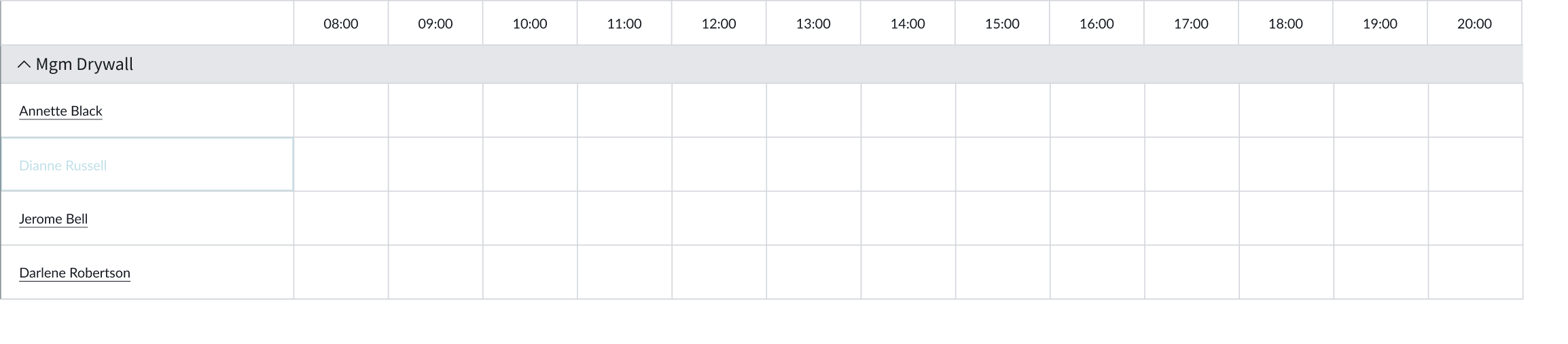
Selected (pressed)

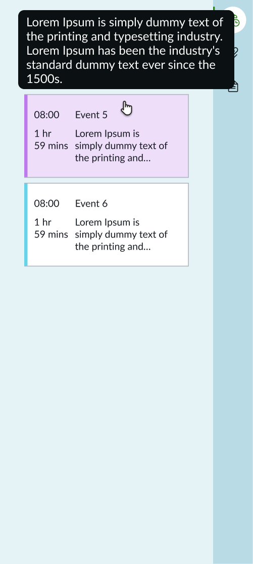
Agenda event hover
Hovering over an agenda event highlights the card and displays a tooltip.
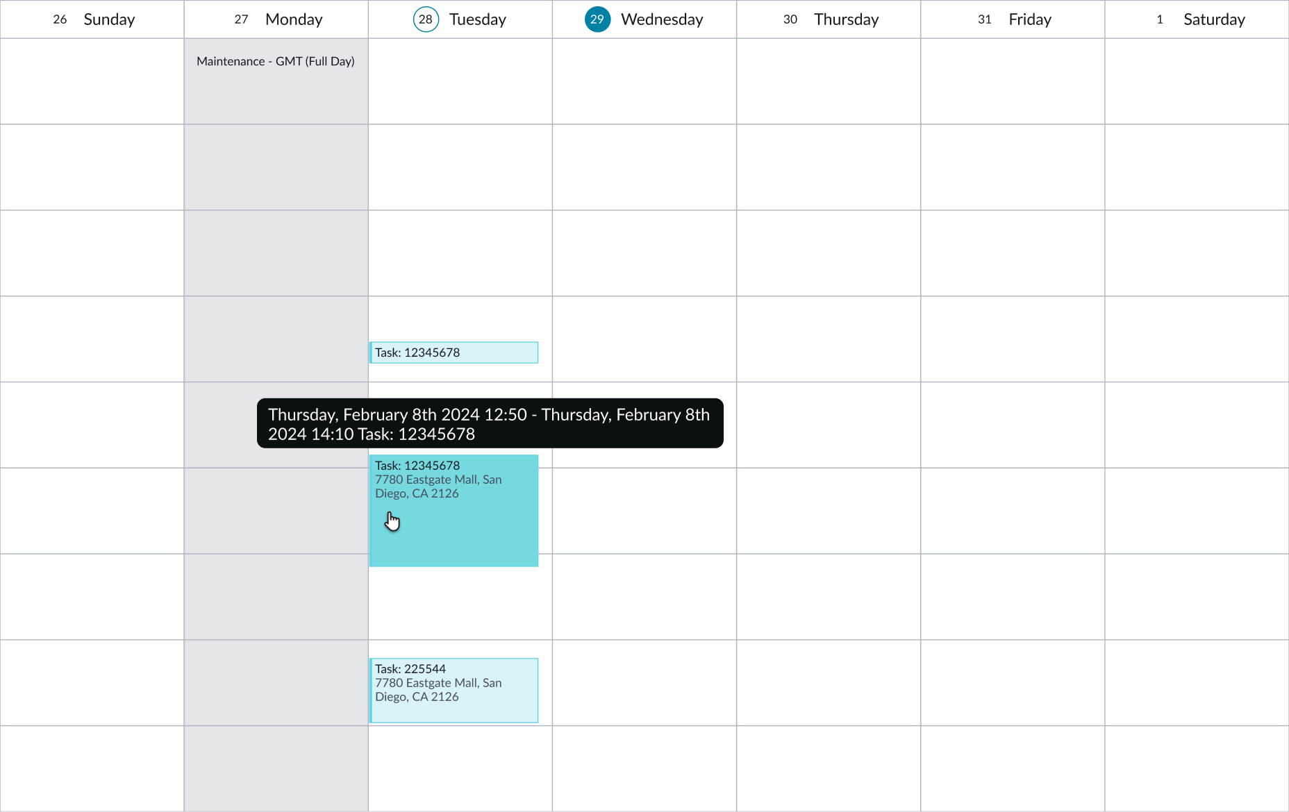
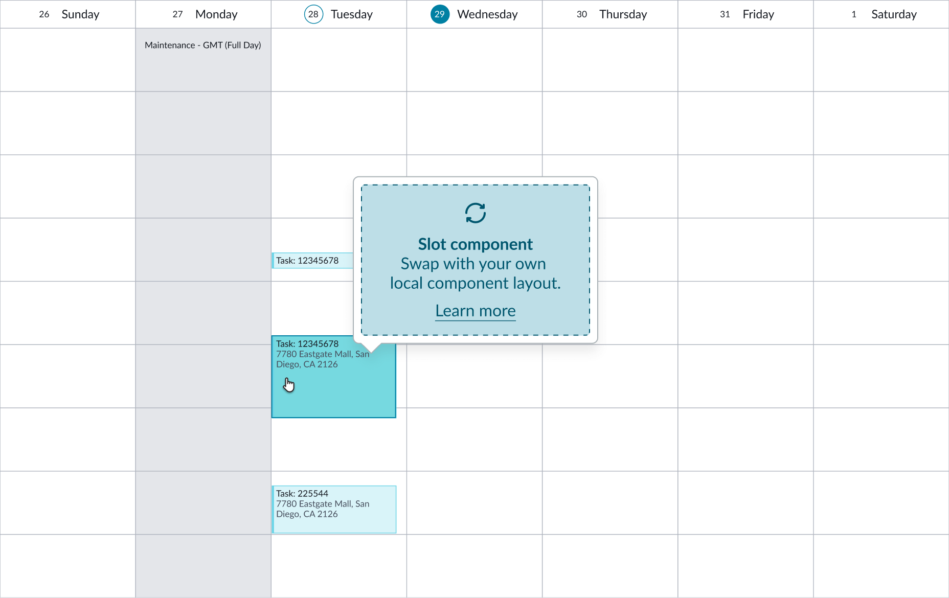
Calendar grid event hover
Hovering over a calendar grid event highlights the event and displays a tooltip. The user can resize the event container vertically to display hidden content by dragging the handle (three dots) at the bottom of the container.
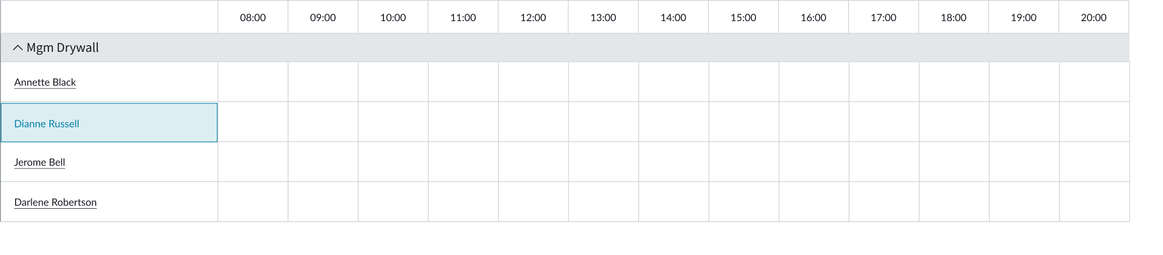
Timeline grid event hover
Hovering over a timeline grid event highlights the event and displays a tooltip. The user can resize the event container horizontally to display hidden content with the drag handle at the right side of the container.

Timeline context selected
Selecting a context row highlights the selection.
In this example, collapse is used within a content tree. When the user selects 'Show More,' the remaining nodes appear.
Day selected
When the user selects a day, the date appears inside a solid circle.

Week states for extended timelines
Extended multi-week, month, and year timelines’ column headers have different states. States included are default, focus, hover, pressed, selected, selected (hover), selected (focus), selected (pressed), and selected (disabled).
| State | Normal |
|---|---|
| Default |  |
| Focus |  |
| Hover |  |
| Pressed |  |
| Selected |  |
| Selected (hover) |  |
| Selected (focus) |  |
| Selected (pressed) |  |
| Selected (disabled) |  |
Responsive behaviors
Learn how calendar responds to changes in a container or display.
Calendar Day/Week/Work Week grid
These grids resize as the container shrinks. All grids have a vertical scrollbar.
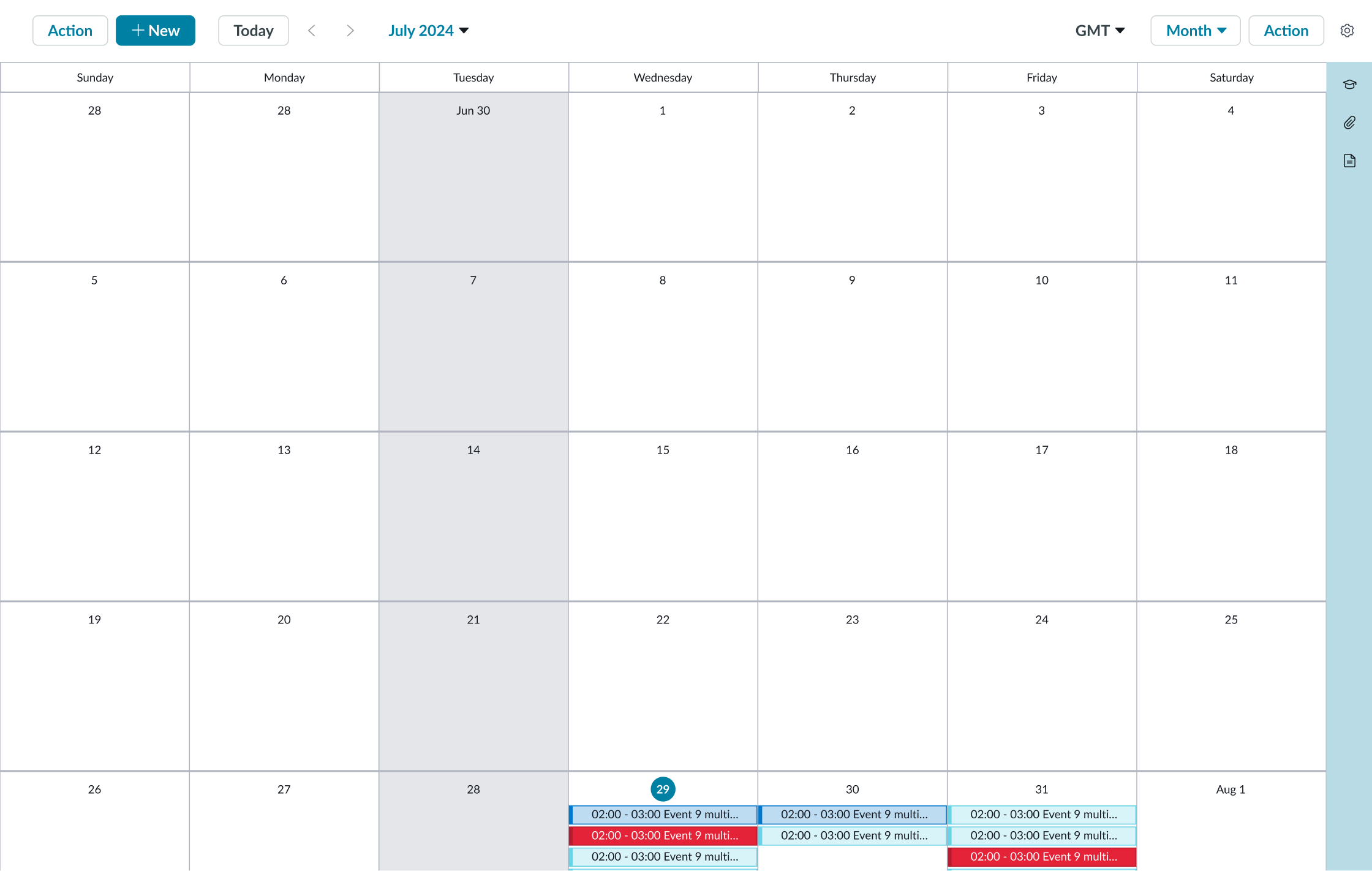
Month grid
This grid resizes proportionally as the container shrinks, so that the entire month is visible without scrolling.
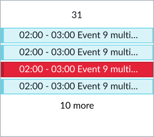
Month view event overflow
If more events are present than can be displayed, the X more disclosure control appears at the bottom of the cell, indicating how many events are hidden. The user selects this control to show the hidden events. All events become visible with a vertical scrollbar in the agenda side panel display. If the side panel is closed, clicking the X more control opens the side panel.

Timeline Day/Week grid
By default, the timeline day and week view grids display horizontal and vertical scrollbars when the content overflows the container. If horizontal scrolling is disabled, the grid columns shrink to fit the available width.

Interactions
Learn how calendar responds when a user interacts with it.
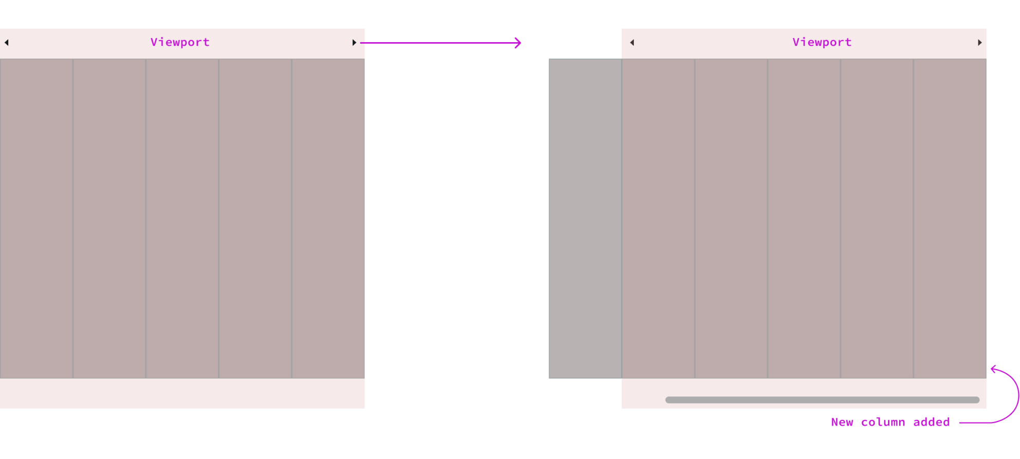
Shifting Columns
Users can view the previous or next date range (week, month, and year) by clicking the left and right arrow buttons on the each side of the column header row.

- Left arrow: When clicked, shifts the calendar left to show the previous week, month, or year
- Right arrow: When clicked, shifts the calendar right to show the next week, month, or year
If there are no additional columns to show, new columns are added.
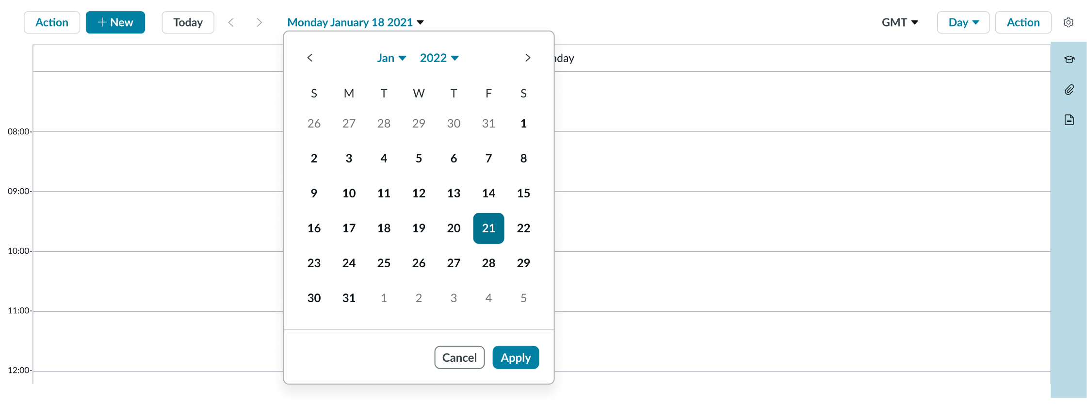
Mini calendar
When the user selects the current date range, the mini calendar opens. Selecting a date closes the mini calendar and sets the appropriate date range in the current view.
Time zone picker
The time zone selector opens the time zone menu, allowing the user to select a time zone for their calendar view. Changing time zone resets the view of the calendar grid and events to reflect the new time zone.
View selector
The view selector opens the view menu, allowing the user to select a new view from the configured options. Selecting a new view resets the view to the date range containing the currently selected date.
Settings
The gear icon opens the settings menu, allowing the user to access the keyboard shortcuts. An alternative method is to press the forward slash ( / ) key.
Selected event popover
Selecting an event on either the calendar grid or in the agenda side panel displays the event popover. The content and interactions available in this popover are configured separately for each calendar by the consuming application and may differ.
Day selection
Selecting a specific day on the calendar sets the selected date for the agenda list and opens the side panel, if it's closed.

Month view cell
Selecting X more on the calendar sets the selected date for the agenda list and opens the side panel, if it's closed.
Side panel
Selecting an icon in the side bar displays the side panel and sets the content of the panel to that of the selected icon. If the currently selected icon is selected again, the panel collapses. If the panel is collapsed when the icon is clicked, it expands.

Controls in the side panel enable the user to collapse the panel to provide more room for the calendar grid.
Truncation
When text in some calendar elements exceeds the width of the container or content area, the text truncates with an ellipsis, and a tooltip shows the full content on hover.
Agenda event

Timeline event
In this example, a timeline event truncates with a tooltip when the cell is too small to display all the content.
Usability
Calendar complies with all internationalization and accessibility requirements.
Internationalization
When the display translates to a right-to-left (RTL) language, the orientation of all elements within the calendar flips, including the side panel and its contents.

Accessibility
Learn how to access the actionable elements of calendar through keyboard interactions and screen readers.
Calendar tab order

Keyboard interactions
You can access the actionable elements of calendar with these keyboard keys: In the Day and Week views, when a user increases the browser zoom level, the component resizes and reflows automatically to fit the screen without losing information. The component supports zoom levels up to 400%.
- Tab: Navigates through actionable items in the calendar in the specified order
- Shift + Tab: Navigates through actionable items in reverse order
- Enter: Interacts with subcomponents, such as the date selector
- Arrows: If events are focused, arrow keys shifts the focus to the timeslots underneath those events and user can further move the focus within calendar grid using the arrow keys
When the calendar grid is focused, users can access the actionable elements with these keyboard keys:
- /: Toggle keyboard shortcuts legend
- F: Set focus on calendar grid
- ESC: Close popover
- Enter: Select focused item
- T: Move to today's date
- P: Move to previous time range
- N: Move to next time range
- Arrow keys: Move in any direction within the selected timeslot/calendar
- E: Select next event
- Shift + E: Select previous event
- D: Select next date
- Shift + D: Select previous date
- M: Select next marked span
- Shift + M: Select previous marked span
- S: Select next section/row
- Shift + S: Select previous section/row
- 1: Day view
- 2: Work Week view
- 3: Week view
- 4: Month view
- 5: Day view (Timeline)
- 6: Week view (Timeline)
To access keyboard shortcuts, select Settings > Keyboard shortcuts.

Reflow
In the Day and Week views, when a user increases the browser zoom level, the component resizes and reflows automatically to fit the screen without losing information. The component supports zoom levels up to 400%.