

Anatomy
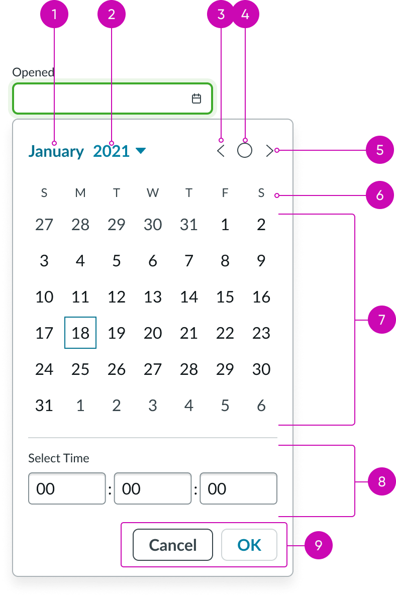
Mini calendar
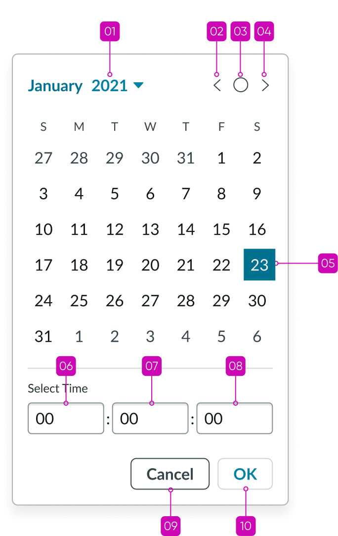
- Month: Month displayed
- Year: Year for display and button when selected displays a list of years for the user to choose from
- Previous month button: Users can select to go to previous month
- Today button: Users can select to go to the current month
- Next month button: Users can select to go to next month
- Week row: Shows all the days of a week
- Month view: Shows 6 rows of weeks for month displayed; days of other months are disabled; states for each day can be default, hover, selected, and disabled.
- Time input: Users can enter hours, minutes, and seconds
- Footer actions: Users can save or cancel changes
Usage
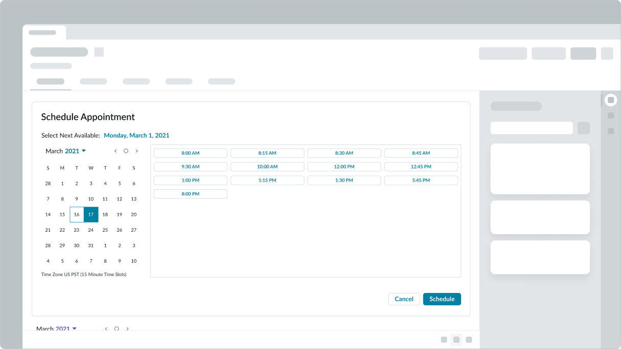
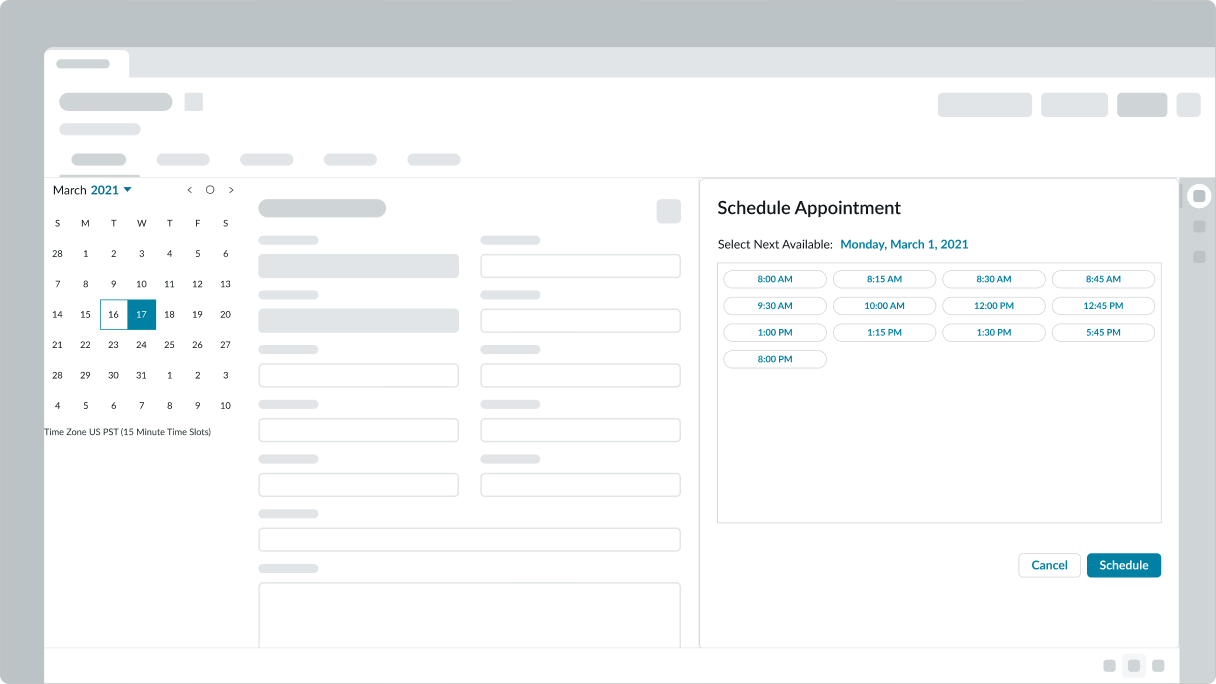
Use mini calendar on a page where a user needs to pick a date from a calendar. For example, picking a date range, selecting a calendar month or day view, and selecting date for an appointment.
Configurations
Learn how to customize mini calendar by configuring the available properties.
Autofocus
You can have the mini calendar component be in focus when the mini calendar is loaded by the user
Description
You can provide information to the user that appears at the bottom of the mini calendar.
Date and time
You can select the first day of the week, the date (and time) formats, and specify a value for the default date (YYYY-MM-DD or YYYY-MM-DD hh:mm:ss am|pm if you are showing a time picker). The formats you choose depend on the experience you are creating and the intended user.
Label
You can add text that appears at the top of the mini calendar.
Language
You can configure the language by entering the code. The default is en (English). Language codes for platform-supported languages - and any ‘custom language’ added to the user’s instance - are valid. In general, the mini calendar display honors the current user preferences, and if not present, then the instance preferences. If you set this value to a language other than English, the user's preferred language will be used. However, if not available, the mini calendar will display in the language you specify.
Name
The name value doesn’t appear to the user . You can use name to reference the mini calendar within a larger component such as a workspace. It may be necessary to use name if the component ID value is unknown.
Global options
You can make the mini calendar read-only so the user cannot modify it, require the user to select a value when the mini calendar is opened, add OK and Cancel buttons, and also add a time picker to the bottom. Use reversed to make the mini calendar appear right to left for an application for a single language that reads RTL.
Design recommendations
Learn how to apply mini calendar in your design.
Place mini-calendar close to connected components. If space is a constaint use popover to show mini-calendar.
Avoid separated placement between mini-calendar and components connected to it.
Behavior
Learn how mini calendar behaves when the display changes or a user interacts with the component.
States
Mini calendar has 4 states: default, hover, selected, and disabled.
Default
Dates that are part of the month.
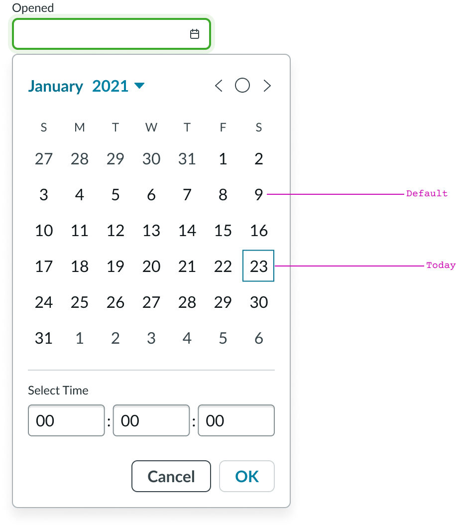
Default and today
Hover
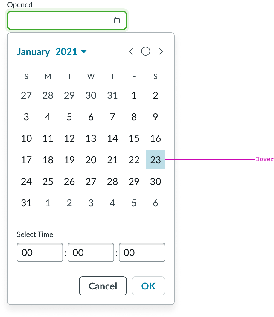
Hover
Selected
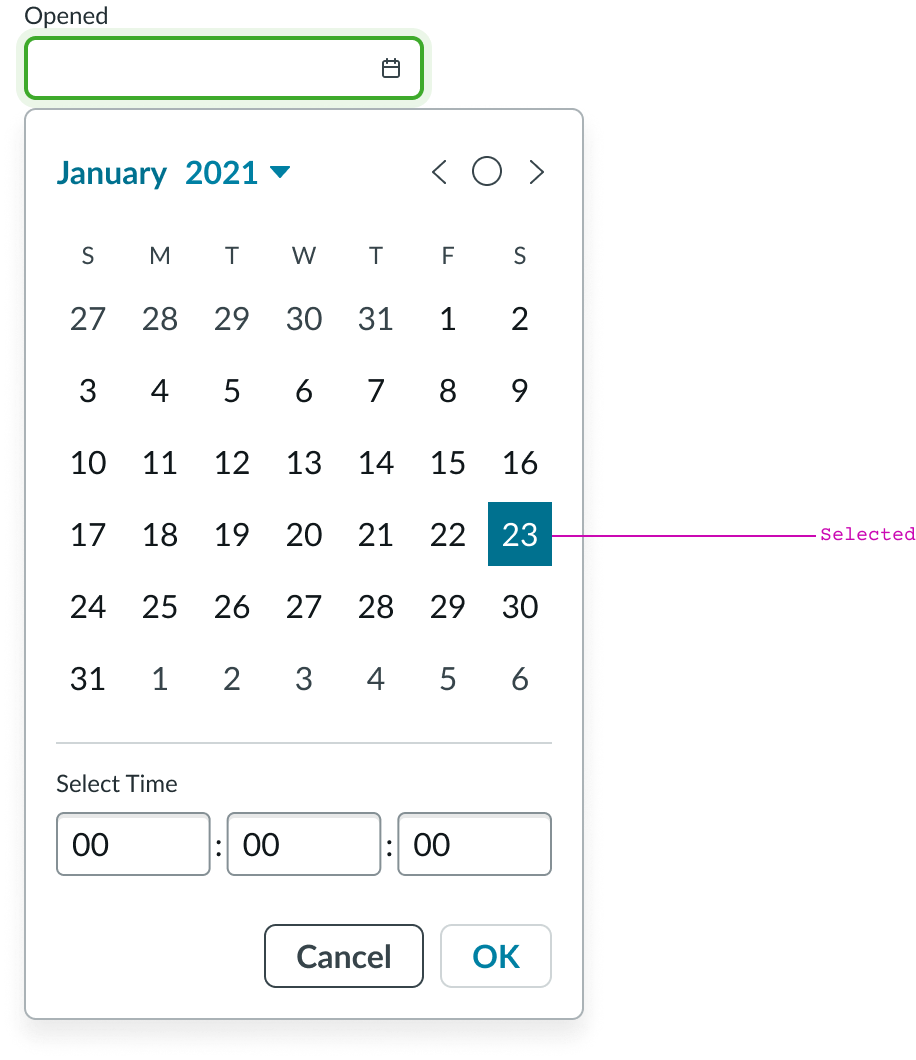
Selected
Disabled
Dates that are not part of the month.
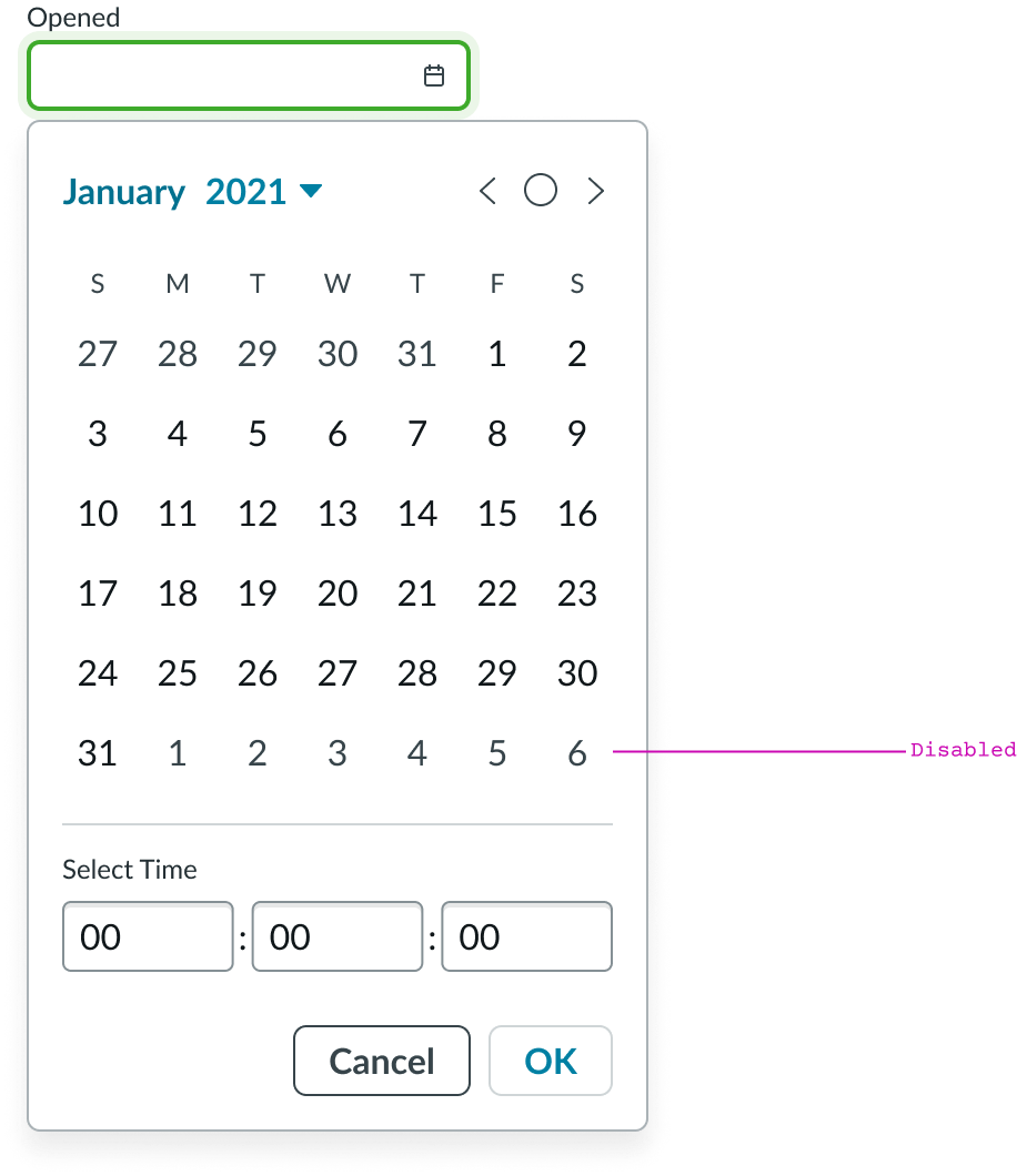
Disabled
Responsive behaviors
Learn how mini calendar responds to changes in a container or display.
Interactions
Learn how mini calendar responds when a user interacts with it.
Year selector
The year selector opens the year menu, letting the user choose a year for their mini calendar view.
Previous/next month buttons
When the user selects the previous button, the mini calendar displays the previous month; selecting the next button, displays the next month.
Today button
When the users selects this button, the mini calendar displays the current month.
Usability
Mini calendar complies with all internationalization and accessibility requirements.
Internationalization
When the display translates to a right-to-left (RTL) language, the orientation of all elements within the component flips.
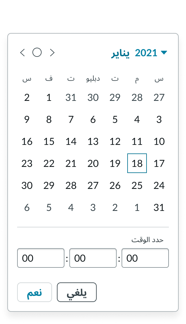
RTL
Accessibility
Learn how to access the actionable elements of mini calendar through keyboard interactions and screen readers.
Mini calendar tab order
Tab order
Keyboard interactions
Users can interact with mini calendar using the keyboard.
- Tab: Activates the keyboard interaction with focus on the year; use to move focus forward through mini calendar elements
- Shift + Tab: Moves focus backwards through elements
- Enter/return/space bar: Triggers an action associated with an interactive element when in focus, such as opening the year menu list
With focus on the year menu
- Enter/return/space bar: Opens year menu; selects a year in the menu
- Arrow up, down: Moves focus up and down through list of years
With focus on the month controls
- Enter/return/space bar: Triggers the action associated with the element in focus; moves to previous month; shows current month; and moves to next month
With focus on a date
- Enter/return/space bar: Selects the date
- Arrow left, right: Moves focus left and right through days in a month; if the focus moves to a day in another month then the month changes
Screen readers
When you apply ARIA labels to a component, screen readers announce the controls and content of mini calendar in the prescribed tab order.