

Anatomy
Learn about the individual parts of collaborate side panel.
Panel layout
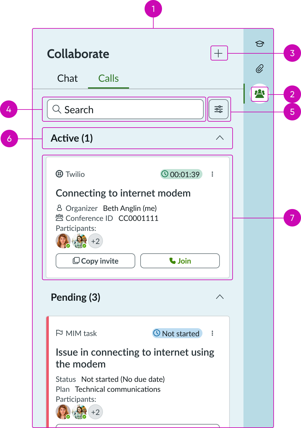
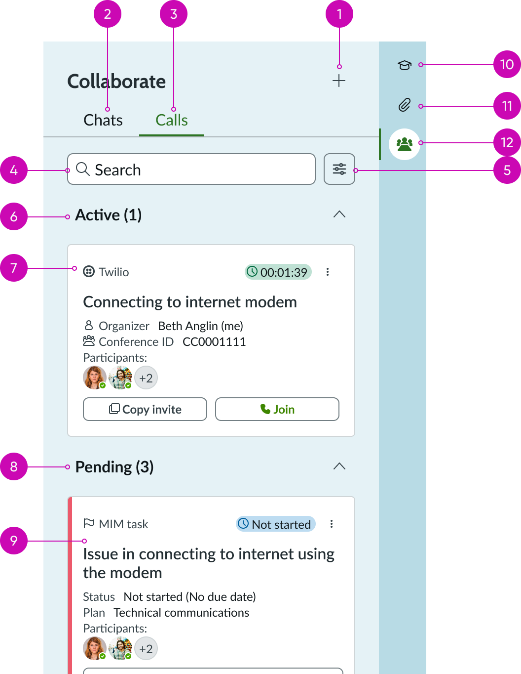
- Contextual sidebar tabs: Tabs that determine the active view; uses the contextual sidebar component to switch between the Chats and Calls tabs
- Tab icon: Icon representing the communication type (conference-room icon); displays with a fill style when the tab is selected
- New interaction: Opens a menu with options to start a new chat or call interaction through a selected provider
- Search: Input field that enables users to filter the list of interactions within the active tab by keyword
- Filter: Opens filter options for narrowing the displayed results by criteria such as creator, organizer, or provider
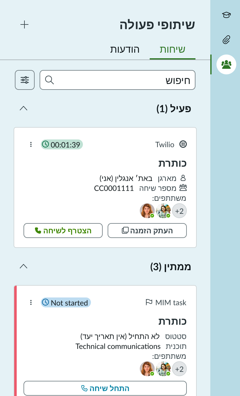
- Accordion: Collapsible sections that organize interaction cards by status; sections include Active, Pending, and Recommendation; sections with no cards are hidden
- Card container: Area within each accordion section where interaction cards are displayed; cards hold information about the communication method that was activated or will be activated and are aligned to a template
Card
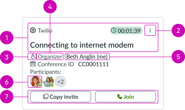
- Header: Provides metadata, actions, or menu options for the card; includes a highlighted value indicator (such as a timer or status label) and an ellipsis overflow menu button
- Ellipsis: Overflow menu button that opens a list of contextual actions for the card; available options vary by card type, provider, and current state
- Icon: An icon inside the card identifying the provider or interaction type; displays in outline style
- Text (title): The primary label describing the interaction, such as a subject or record description
- Text (metadata): Supporting details displayed beneath the title, such as organizer name, conference ID, status, plan, or due date; displayed with a label
- Avatar: Avatar with presence indicator showing participants associated with the interaction; uses form record presence
- Card actions: Action buttons at the bottom of the card, such as "Copy invite", "Join", "Start call", or "Start discussion"; the number and type of actions change by card type
Subcomponents
See usage guidance for accordion
See usage guidance for button iconic
See usage guidance for card actions
See usage guidance for card header
See usage guidance for dropdown
See usage guidance for highlighted value
See usage guidance for label value
See usage guidance for record presence
Usage
Collaboration side panel provides a centralized place for users to manage chats and calls related to a workspace record. It consolidates multiple communication tools, including sidebar discussions, Microsoft Teams chats, and conference calls through providers like Microsoft Teams, Zoom, and Twilio, into a single panel. The options are available to the user based on the configuration of the source table. Collaborate side panel itself doesn't control which options, functions, and tabs are displayed to the user.
Use the collaboration side panel on record pages where users need to coordinate with others to resolve or act on the record. For example, IT agents can use the panel on an incident record to start a conference call, open a discussion thread, or view the status of pending tasks that require collaboration.
The panel organizes interactions into two tabs: Chats and Calls, and groups items within each tab into collapsible accordion sections based on their status: Active (in-progress interactions), Pending (upcoming tasks awaiting action), and Recommendation (suggested contacts or actions).
Configurations
Learn how to customize collaborate side panel by configuring the available properties.
Source table name and record ID
You can configure the component with the source table name and record ID to associate the panel with a specific record. Once placed, the contextual sidebar tabs are automatically updated to display the collaboration side panel icon. The Chat and Call tabs display if they're available in the specified record.
Behavior
Learn how collaborate side panel behaves when the display changes or a user interacts with the component.
States
Collaborate side panel has the following states: Loading and Empty.
| State | Example |
|---|---|
| Default | 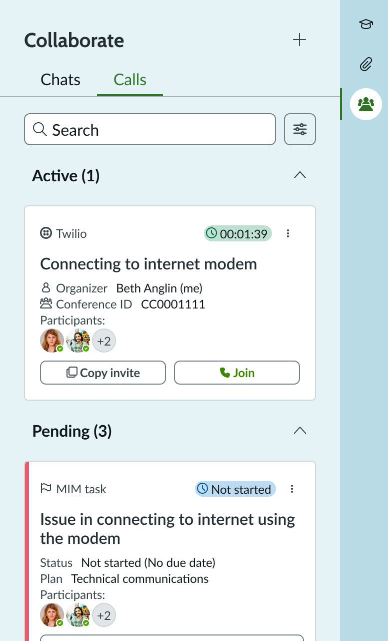 |
| Loading | 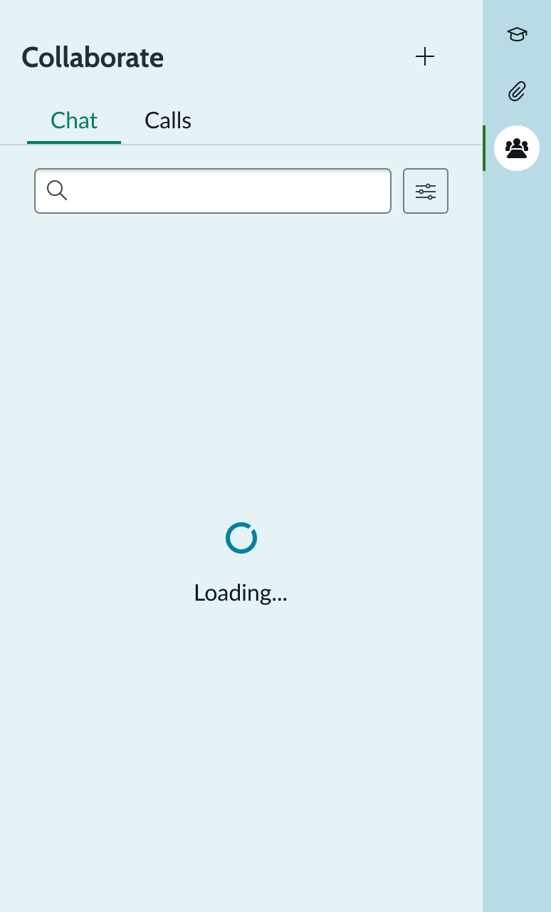 |
| Empty | 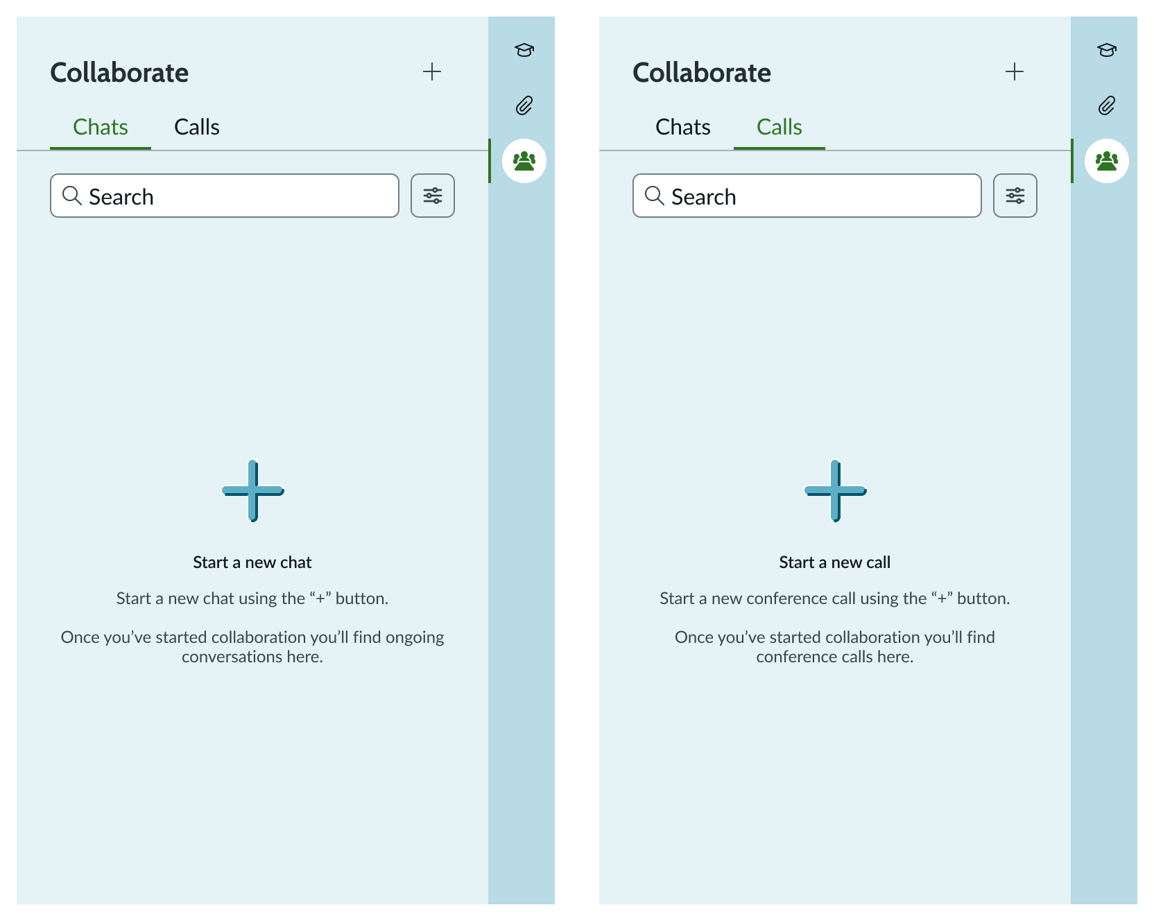 |
Responsive behaviors
Learn how collaborate side panel responds to changes in a container or display.
Resizing
The panel has a default width of 388 pixels and a fixed height of 640 pixels. The width can be resized; when the panel expands (for example, to 730 pixels), the card containers and search field stretch to fill the available horizontal space.
Scrolling
When the panel content exceeds the available vertical space, the panel displays a vertical scrollbar. The header, tabs, and search area remain fixed at the top while the card list scrolls beneath them.
Truncation
Truncation can occur in three areas of the card: the provider name, the heading, and the data fields within the card. The heading can be configured to display one or two lines of text depending on the use case and layout. The heading has a maximum of two lines to avoid overwhelming the card when horizontal space is limited. Truncation with an ellipsis applies when the heading reaches the two-line maximum, and a tooltip shows the full content on hover.
Interactions
Learn how collaborate side panel responds when a user interacts with it. The available tabs, menu options, and supported providers displayed in the panel are determined by the source table's configuration. The collaboration side panel component itself does not provide any functionality to enable, customize, or disable these options.
Panel interactions
- Tabs: The panel includes two tabs: Chat and Calls. The user can switch between them by selecting the appropriate tab. Each tab displays a list of interactions relevant to the tab.
- Search: The search bar enables users to quickly locate specific interactions (calls or chats) within the active tab. As the user types, the list below filters in real time to show only results that match the entered keywords. When no results match, an empty state with a "No results found" message is displayed.
- Filter: Users can filter data by selecting the Filter icon. Filters support multi-selection and dynamically update the displayed results based on the selected criteria. Filters are context-aware and adapt to the selected tab (for example, Calls or Chats). Available filter options vary by tab and may include values such as "All", "Created by me", "Created by others", "Organized by me", "Organized by others", and provider-specific options. The provider filter appears only when there is an active chat or call using a specific provider and at least one additional provider is also in use in the same context. If only one provider is in use, the panel does not display the filter, as filtering by provider is unnecessary.
- New interaction: The plus (+) button opens a menu with options to start a new interaction, either a chat or a call, with the ability to select a specific provider. The providers configured for the source table determine the available chat and call options.
- Accordion: Selecting the accordion component enables users to expand or collapse sections of content. Existing sections for Chat are Active, Pending, and Recommendation. Existing sections for Calls are Active, Pending, and Recommendation.
Card interactions: Calls tab
- Join/Leave call/Completed: The call card dynamically updates its appearance based on the call's current state. In the initial "Join Call" state, which appears when a call is already in progress, selecting Join connects the user to the ongoing call. In the active "Leave Call" state, which appears when the user is in the call, selecting Leave Call disconnects the user from the call without ending it for other participants. In the post-call "Completed" state, which appears when the call ends, the card displays a summary with the option to start another call.
- Copy invite: Selecting the "Copy Invite" button copies the call invitation text (call bridge link) to the clipboard. A confirmation message appears at the top of the screen indicating the invite has been copied.
- Selecting the completed call card: When the user selects a completed call card in the list, the system navigates to the post-call actions view. In this view, the user can set up another call using the same details as the previous one, generate a summary using Now LLM or an external provider, view the recording and transcript of the ended call, and see the full list of participants.
- Selecting the active call card: Selecting an active call card navigates the user to the Call Detail View, where the user can see current call status, participants, duration, and any in-progress actions.
- Popover through form record presence: Selecting the participant count icon on a call card opens a popover that displays the list of active viewers, including each participant's name, avatar, and action icons.
- Start another call: Selecting "Start Another Call" opens a modal pre-filled with the details from the previous call, including the subject, call bridge, and participants. The agenda field is empty. The user can confirm or edit the information. Selecting "Start" activates a new call through the selected provider, and the card transitions to the "Leave call" state.
- Open discussion: Applicable when there is an active chat tab. If the chat is closed, selecting "Open discussion" opens the chat modal. If the chat is minimized, selecting "Open discussion" extends the chat view. If the chat is already open, the button has no effect.
Card interactions: Chats tab
- Active chat cards: Active chat cards show the provider, the discussion title, participant avatars, and a timestamp indicating when the chat was last updated.
- Pending task cards: Pending task cards display the task type, status, plan, and participant information along with an action button to start a discussion or call.
Card interactions: Ellipsis
The ellipsis (overflow menu) button on each card provides contextual actions that vary depending on the card type, provider, and current state.
- Active call card (user is not in the call): The ellipsis menu displays contextual options based on the provider. Options may include opening the call in the provider's external interface, adding participants, or ending the call. The provider determines whether users can end a call from within the workspace; some providers require users to end the call through their external interface.
- Active call card (user is in the call): The ellipsis menu displays contextual options based on the provider, which may include opening the call in the provider's external interface, adding participants, or ending the call.
- Pending task card: The ellipsis menu on pending task cards provides options including "View record", "Manage participants", and "Close task". For tasks with a recurrence or overdue status, a "Snooze" option is also available.
- Open in external provider: Selecting this option retrieves the associated meeting link (predefined as the call bridge) and redirects the user to that link via their default browser. If the user has the provider's application installed and properly configured on their machine, the call opens in the native desktop application. Otherwise, the link opens in the provider's web interface.
- Add participants: Selecting "Add participants" opens a modal where the user can define the participants of the chat or call associated with the task card. Editing participants here enables the user to control who is included in the call or chat for that particular task.
- End call: The provider determines whether users can end a call from within the workspace. Some providers support ending a call directly from the ellipsis menu; others require users to end the call through the provider's external interface. When ending a call through a supported provider, the user selects "End call" from the ellipsis menu, confirms the action, and the card transitions to the completed state.
- View record: Selecting "View record" on a task card's ellipsis menu opens the record for the specific task from the MIM playbook.
- Manage participants: Selecting "Manage participants" opens a modal where the user can define the participants of the chat or call associated with the task card.
- Close task: When the user selects "Close Task", a confirmation modal appears. Upon confirming the action, the task is marked as closed and removed from the sidebar list.
- Snooze task: Selecting "Snooze" on a task opens a confirmation modal asking if the user wants to snooze the task. Once confirmed, the timer restarts or adds additional minutes to the countdown. If the task is overdue (displayed in red), it transitions back to an upcoming state (displayed in green). There is no fixed default snooze duration across the platform; the duration depends on how the snooze action is configured in your instance.
- Import chat (read only): Selecting "Import Chat" retrieves and displays the chat transcript from the external provider in a read-only format within the task. Users can view the conversation for reference but cannot edit or interact with it. Only chats conducted via supported external providers support this feature.
New interaction
- Start a chat: Selecting a chat option from the dropdown opens a modal. Once the user fills out the details of the discussion and confirms, the chat opens either within the sidebar or through the selected external provider, depending on the option chosen.
- Start/schedule a call: Selecting a call option from the dropdown opens the "Start a conference call" modal. The modal layout remains consistent across all providers. The only variation is the pre-filled Call Bridge field, which the system automatically populates based on the selected provider. For telephony providers, the system populates the field with the phone number of the user that is set in the system.
- Now Assist scheduling: Selecting the option to schedule with Now Assist opens the Now Assist panel with an open conversation for the user to start the scheduling process.
Usability
Collaborate side panel complies with all internationalization and accessibility requirements.
Internationalization
When this component is used in a platform configured for a right-to-left (RTL) language, all elements within the panel flip their orientation and align on the right. Tab labels, search fields, card content, and action buttons are mirrored to support RTL reading order.
Accessibility
Learn how to access the actionable elements of collaborate side panel through keyboard interactions and screen readers.
Collaborate side panel tab order
This is the high-level tab order for collaborate side panel.
Note: For tab stop information about sub components of collaborate side panel, see the individual component usage guidelines.
Keyboard interactions
Users can interact with collaborate side panel using the keyboard. You can access the actionable elements of collaborate side panel with these keyboard keys:
- Tab: Moves focus to the next element in collaborate side panel
- Shift + Tab: Moves focus to the previous element
- Enter/return: Triggers element action