Anatomy
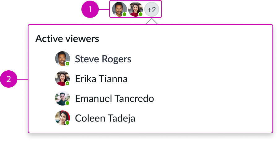
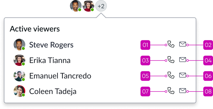
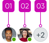
- User presence status bar: Displays up to 2 user avatars; also displays a third overflow trigger avatar when more than 2 users are present
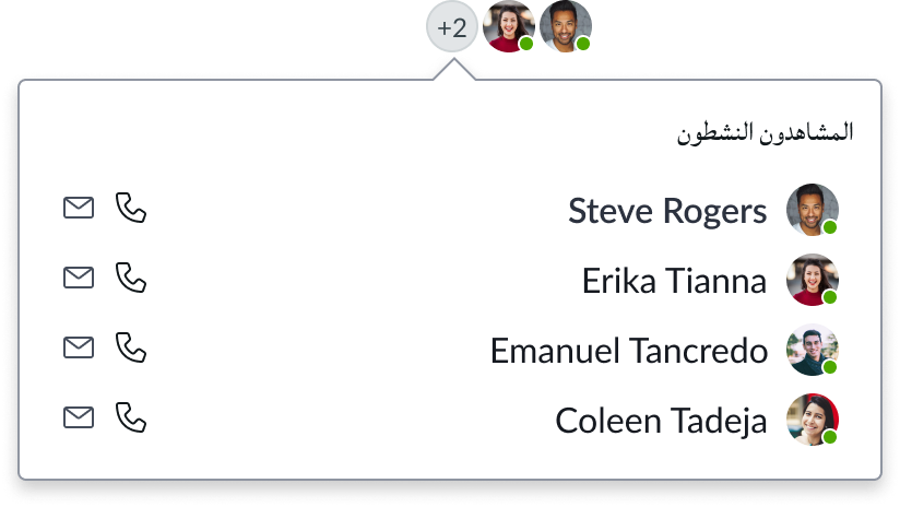
- User presence overflow: Popup that displays when the overflow trigger avatar is clicked: displays all other users viewing the record

Subcomponents
See the usage guidelines for avatar
See the usage guidelines for popover
See the usage guidelines for tooltip
See the usage guidelines for contact card
Usage
Add form record presence to a record page in a configurable workspace and use it to indicate when 1 or more other users are viewing the same record and to initiate communication with those users.
Configurations
Learn how to customize form record presence by configuring the available properties.
Presets and controllers
This component has a preset configuration that sets properties and event handlers, making it ready for use. You can override preset values with a custom configuration if needed. Preset values won’t upgrade with updates. To avoid using presets, configure manually. One preset can apply to a single component instance. See presets for more info.
A preset is linked to a controller, which serves as a data resource. Controllers provide configuration data and event bindings for the component. Selecting a preset adds the required controller to the page, allowing new components to use its preset. For more on controllers, see controllers. For default presets, see view properties and events in the controller API.
Design recommendations
Learn how to apply form record presence in your design.
Alignment and positioning
Position this component on the record in the upper right in the view in the left of the quick actions area.
Behavior
Learn how form record presence behaves when the display changes or a user interacts with the component.
Responsive behaviors
Form record presence displays the avatars of the first 2 concurrent users. When more than 2 users are viewing the record, the component displays an overflow avatar with a counter, showing the number of additional users.

Interactions
Learn how form record presence responds when a user interacts with it.
Viewing concurrent users
The user selects the overflow trigger avatar to view all concurrent users of the record. A popover appears containing the user list and conact icons. When the user list exceeds 11 users, a horizontal scroll bar appears in the popover.
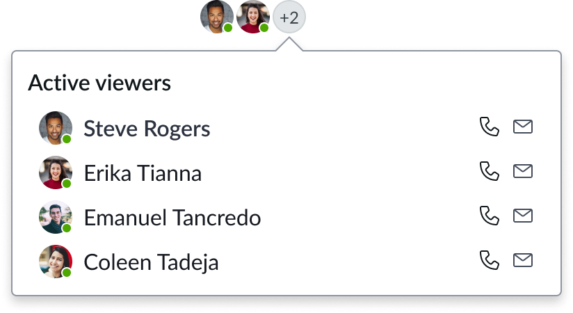
Contacting a user
If the user has the Openframe plugin installed, they can initiate an outbound call to another user's business phone number by selecting the phone icon on the popover list. To send an email, the user selects a letter icon in the popover list.
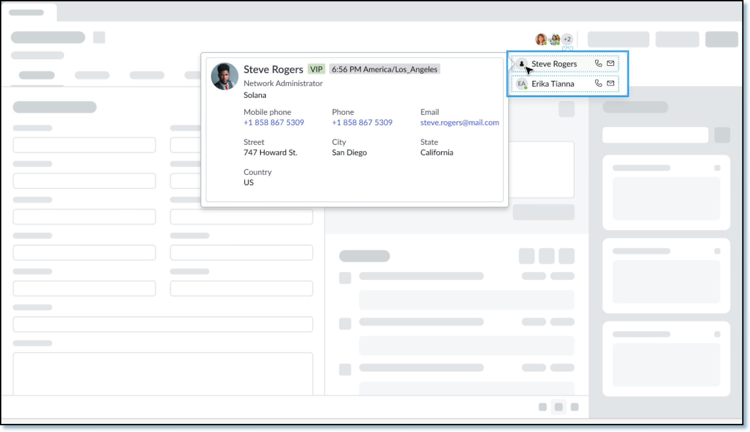
Viewing user contact info
The user can access a contact card popup for each active viewer by selecting their avatar. The contact card can contain a user’s name and avatar, and optional information such as their job title,
and contact information, or a subset based on what is available.
Usability
Form record presence complies with all internationalization and accessibility requirements.
Internationalization
When this component is used in a platform configured for a right-to-left (RTL) language, form record presence flips in its orientation. The order of importance changes to right-to-left in the form record presence status bar but remains top to bottom in the popover list.
Accessibility
Learn how to access the elements of form record presence through keyboard interactions.
Form record presence tab order
Overflow tab order