

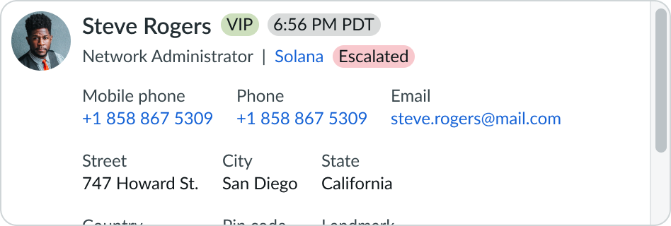
Anatomy
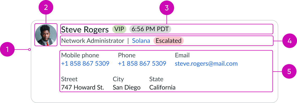
- Card container: Wrapper for the content slot
- Avatar: The contact image or initials
- Header: The contact name and a unique attribute
- Subheader (optional): The contact role, account name, and status (such as a highlighted value)
- Body (optional): The primary contact information with label value pairs only
Subcomponents
See usage guidance for highlighted value
See usage guidance for text link
Usage
Contact card is often applied within the header of a case record page for resource information and context about the person who opened the case.
Variants
Learn about contact card and find out how to use it in your design.
Types
The contact card can be configured to show and hide content and adapted for 3 main use cases, including presenting account, consumer, and contact information.
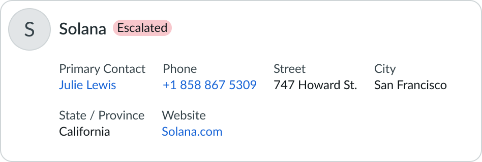
Account
This use case is especially for business-to-consumer content. The card displays the contact account name, status information (highlighted value), such as an issue escalation, and primary contact information (label value pairs), such as a phone number and website address.
Consumer
This use case is especially for business-to-consumer content. The card displays the contact name and default minimum contact information (label value pairs), such as a phone number and email address.

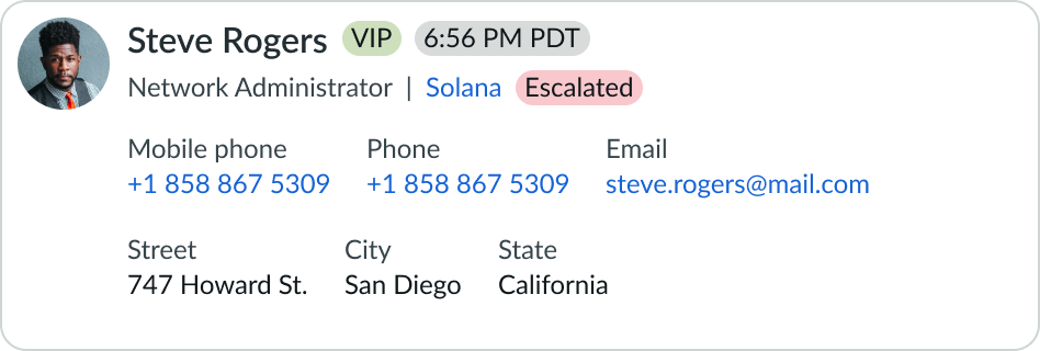
Contact
This use case is especially for business to-business content. The card displays the contact name, a unique attribute, such as a class, role, account name, or status information (highlighted value), such as an issue escalation. and primary contact information (label value pairs), such as a phone number and email address.

Configurations
Learn how to customize the contact card by configuring the available properties.
Avatar
The avatar can be configured within the contact card to display the contact profile image or initials.
Header
The header incudes the contact name and can show an optional highlighted value with a specific attribute, such as a VIP label.

Subheader
The subheader includes the contact role and account name. An optional highlighted value can cite account status, such as an issue escalation. Subheader titles can be made clickable using an API attribute. When this occurs, the value is transformed into a text link.

Body
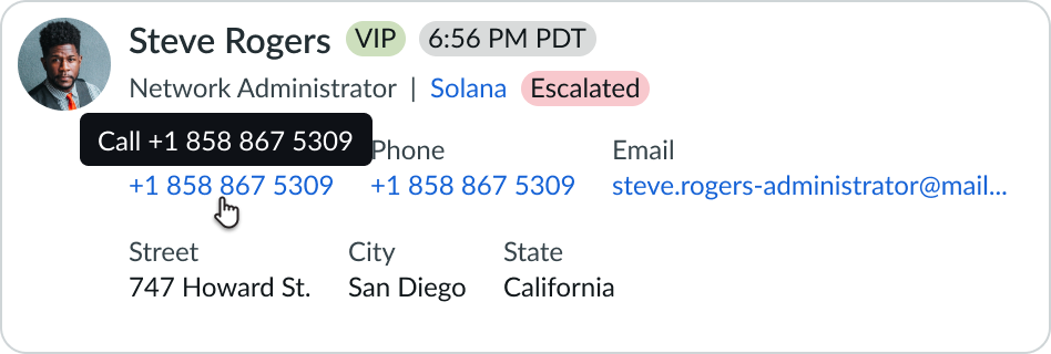
The body displays additional contact information, including label value pairs, like a phone number and an email address that can link to other actions.

Design recommendations
Learn how to apply contact card in your design.
Display only label value pairs with important, actionable information, like a phone number, website, and email address, and not simply descriptive text.
Avoid placing more than 6 label value pairs in containers with restricted heights, so you can avert creating a scrollable area.
Alignment and positioning
Position the contact card in a prominent location, like within a header, so it can be easily referenced, and not lost under a tab or visible only when clicking a button.
UI text guidelines
These are some recommendations for using text within contact card component:
- Use sentence case for all titles, labels, and column headers
- Keep all text labels informative and short to increase readability and scanning
- Keep content concise and purposeful to help a user understand options and actions, and move successfully through tasks to achieve their goals
- Use plain language and avoid slang, vague, or complex descriptions a user might misinterpret
- Limit using abbreviations and acronyms and always include full spelling with an acronym's first appearance on a page
- Capitalize only the first letter and any proper nouns in a string of text
- Ensure content is contextual and specific to offer guidance and support to the user
Behavior
Learn how contact card behaves when the display changes or a user interacts with the component.
States
Contact card has 2 states: loading and empty.
Loading state
Because there might be multiple components within a page gathering extensive data to display, contact card supports "lazy loading " to help limit load times. Lazy loading also helps notify the user that an action is underway, instead of showing an empty container.

Empty state
If a page has been configured to show contact details and no contact has been assigned, the contact card defaults to an empty state. The empty state alerts the user to add the appropriate information in the contact card form.

Responsive behaviors
Contact card resizes to suit to the size of the container.
Interactions
The user can select interactive elements to trigger their associated action. For example, selecting the phone number to initiate a call.
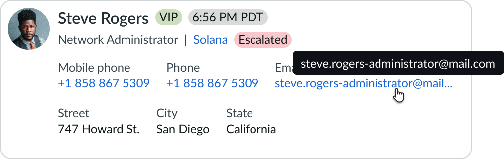
Truncation
The text truncates when it exceeds the width of the container (or content area). Truncated text is denoted with an ellipsis, and a tooltip shows the full content on hover.
Usability
Contact card complies with all internationalization and accessibility requirements.
Internationalization
When the display translates to a right-to-left (RTL) language, the nested components align on the right. Any proper nouns that can't be translated, including rich information such as email addresses, appear left-to-right (LTR).

Accessibility
Learn how to access the actionable elements of the contact card through keyboard interactions and screen readers.
Keyboard interactions
You can access the actionable elements of contact card with these keyboard keys:
- Tab: The order flows left to right and top to bottom to accommodate sighted keyboard users. If a component can be navigated sequentially and the navigation sequences affect meaning or operation, focusable components receive focus in an order that preserves meaning and operability.
- Shift + Tab: Moves focus to the element that was previously in focus
- Space or Enter: Initiates the link action
When the action menu is open:
- Arrow up and Arrow down: Navigates through actions in the action menu
- Space or Enter: Initiates the action in focus
Screen readers
Screen readers follow the standard tab order. For left-to-right (LTR) and right-to-left (RTL) languages, tab order begins with the first configured link in the contact card.