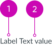
Anatomy

- Label: Identifier of the displayed value
- Value: Plain text that displays secondary metadata
Subcomponents
See usage guidance for tooltip
Usage
The type of label-value pair you use depends on the metadata you want to display, the design layout, and the amount of space you have available. Use label value (inline) for displaying secondary and tertiary information horizontally.
In cases where space is limited, you can use the label value stacked component to display values in a vertical alignment. See the usage guidelines for details.

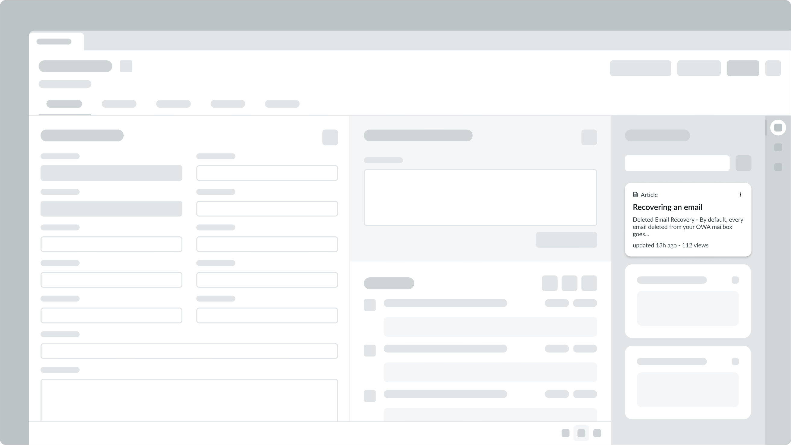
In this example, a card uses the label-value pair (inline) component to display secondary information like last updated and views.
Variants
Learn about the attributes of label value (inline).
Types
There are multiple label-value pair types: tabbed, stacked, and inline. This guidance covers how to use the inline type, referred to here as label value (inline).
See usage guidance for label-value pair (tabbed)
See usage guidance for label-value pair (stacked)
Size
Label value (inline) has only one size. This size succinctly displays secondary or tertiary information in areas where space is limited.

Configurations
Label value (inline) has the following different configurations: default and reversed.
Default order
Default ordering places the label before the value.

In this example of the default order, the label, “Last updated”, appears before the value , “3 days ago.”
Reversed order
Reversed ordering places the label after the value. Choose a configuration based on the metadata you want to display.

In this example, the values of the pairs, “100” and “9”, appear before the labels.
Truncation
You can configure the label to be truncated. This truncates the content to a single line within the width configured for the component.
Design recommendations
Learn how to apply label value (inline) in your design.

If you have more than one label-value pair, place each pair on its own line.

Placing multiple label-value (inline) pairs side-by-side affects readability. It becomes difficult to determine which values relate to which labels.
UI text guidelines
These are some recommendations for using text within label value (inline):
- Use short labels to avoid text wrapping to the next line
- If you’re using the default order, use past tense verbs in the label to say what happened
- For example, “Authored by Abel Tuter”
- If you’re using the reversed order, use the plural version of the objects you’re showing
Behavior
Learn how label value (inline) behaves when the display changes or a user interacts with the component.
Truncation
Avoid truncating label value (inline), because this will impact readability. However, if you can't avoid truncating the label or value, you can configure the text to truncate. An ellipsis replaces the overflow text and a tooltip displays the full text string on hover.

Usability
Label value (inline) complies with all internationalization and accessibility requirements.
Internationalization
When the content translates to a right-to-left (RTL) language, the labels and values flip. The label moves to the right and the value moves to the left.
Accessibility
Learn how to access the actionable elements of label value (inline) through keyboard interactions and screen readers.
Keyboard interactions
The label value (inline) component doesn't have keyboard interactivity because the value is always a plain text string.
Note: An option in the user Preferences menu on the operating system sets a tab stop on non-interactive text that truncates in this component, such as a title or label, and makes that text a tooltip trigger. The user presses Enter or the spacebar to open the tooltip and view the entire content. To enable this feature, set the Enable keyboard focus on truncated text option to true in the Accessibility panel of the Preferences menu.

