

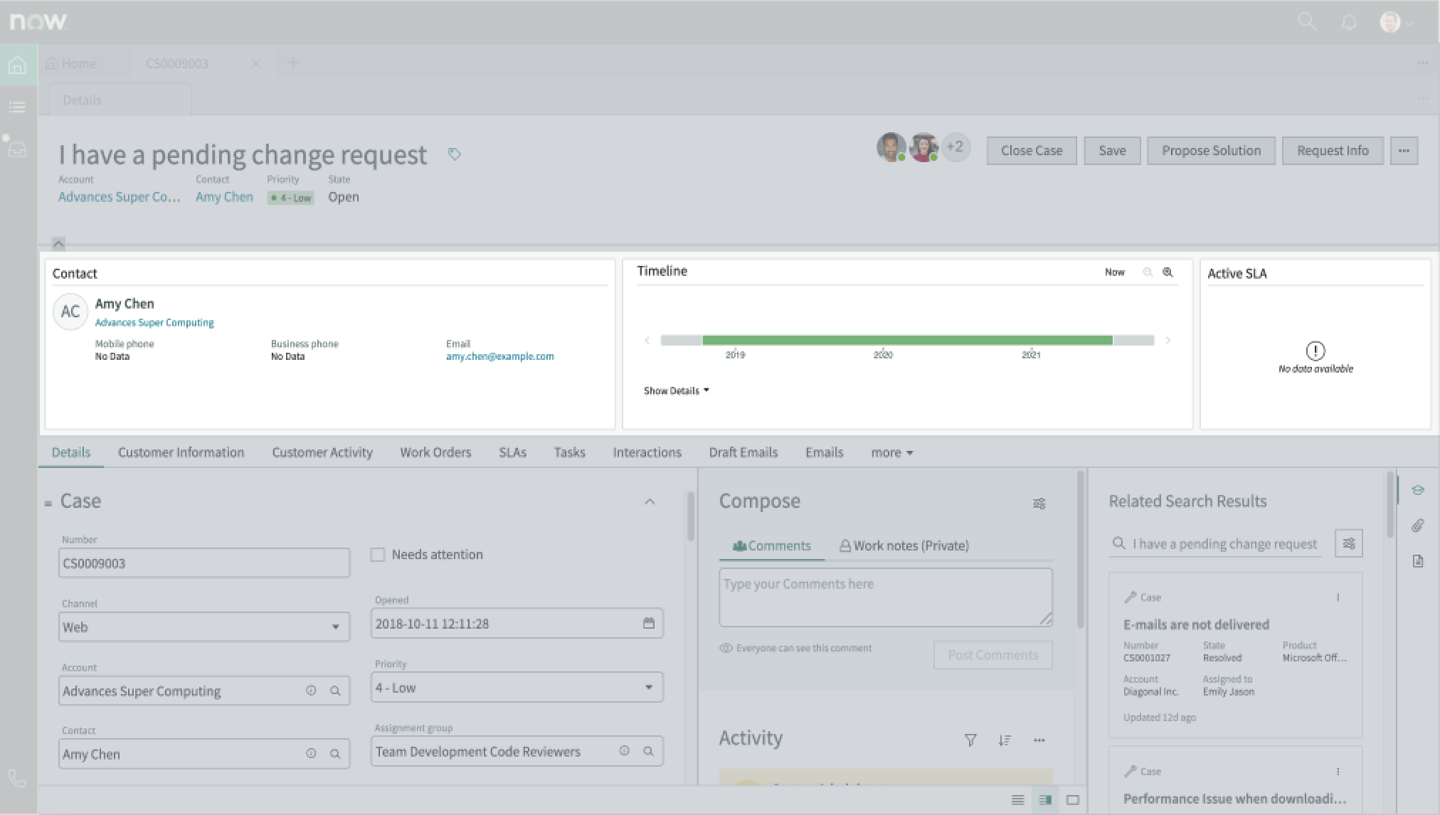
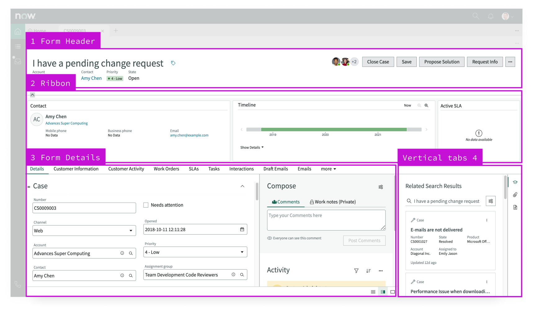
Anatomy
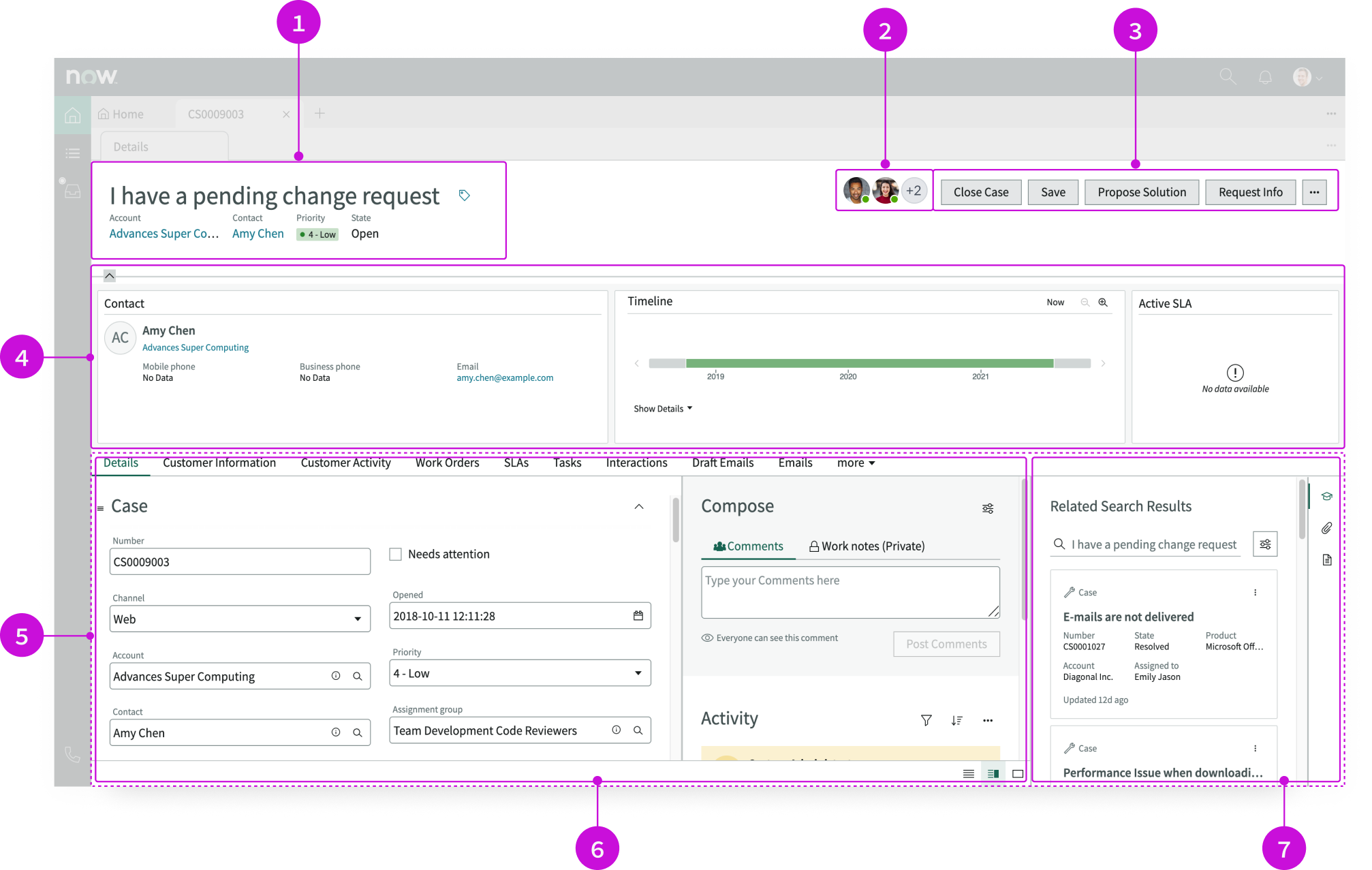
- Header: Contains the record name and description, followed by related information displayed with label-value pairs; the header can also display a subheading and image
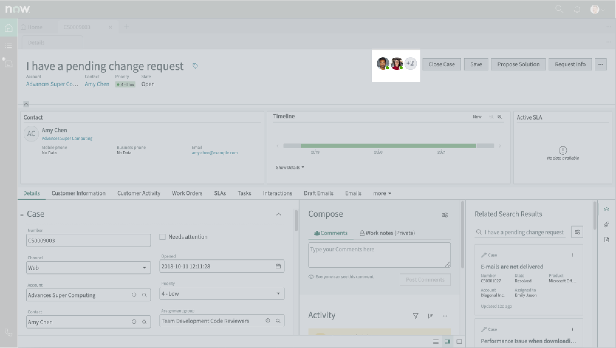
- Form record presence icons: Displays avatars for users currently viewing the record: selecting an avatar displays that user’s contact information in a popover
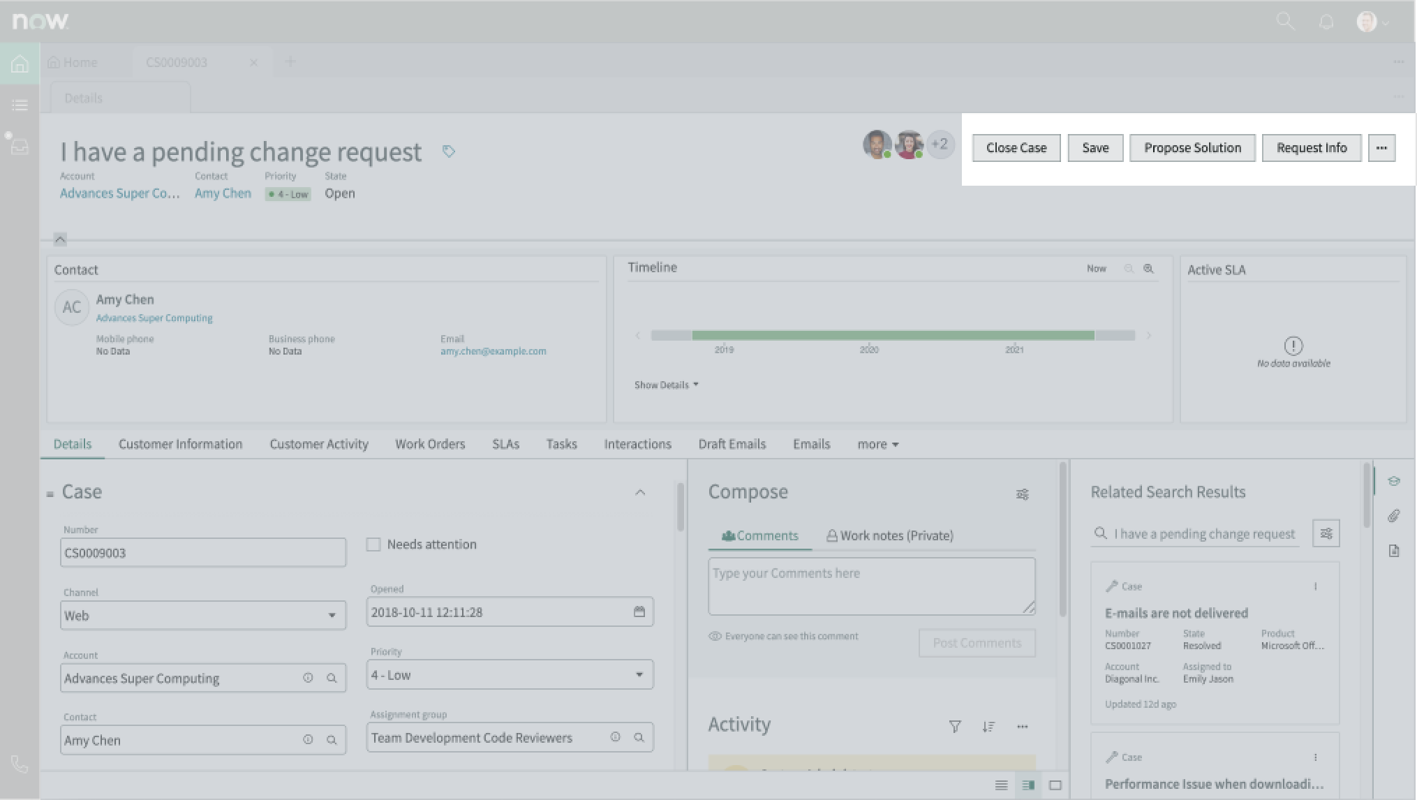
- UI action bar: Contains a row of buttons mapped to UI actions that a user can take when working on a record; an overflow menu contains additional actions
- Ribbon: Contains widgets that display customer and record information
- Resizable pane: Container with two component slots for tabs and the contextual sidebar that allows for resizing between the two
- Tabs: Displays tabs for lists and items related to the current record: replaces the Record Tabs component in the Tokyo release
- Contextual sidebar: Vertical tabs (new in the Tabs component) that display important tools in a separate panel: a user can expand and collapse this panel as needed
Presets and controllers
This component has a preset configuration that sets properties and event handlers, making it ready for use. You can override preset values with a custom configuration if needed. Preset values won’t upgrade with updates. To avoid using presets, configure manually. One preset can apply to a single component instance. See presets for more info.
A preset is linked to a controller, which serves as a data resource. Controllers provide configuration data and event bindings for the component. Selecting a preset adds the required controller to the page, allowing new components to use its preset. For more on controllers, see controllers. For default presets, see view properties and events in the controller API.
Usage
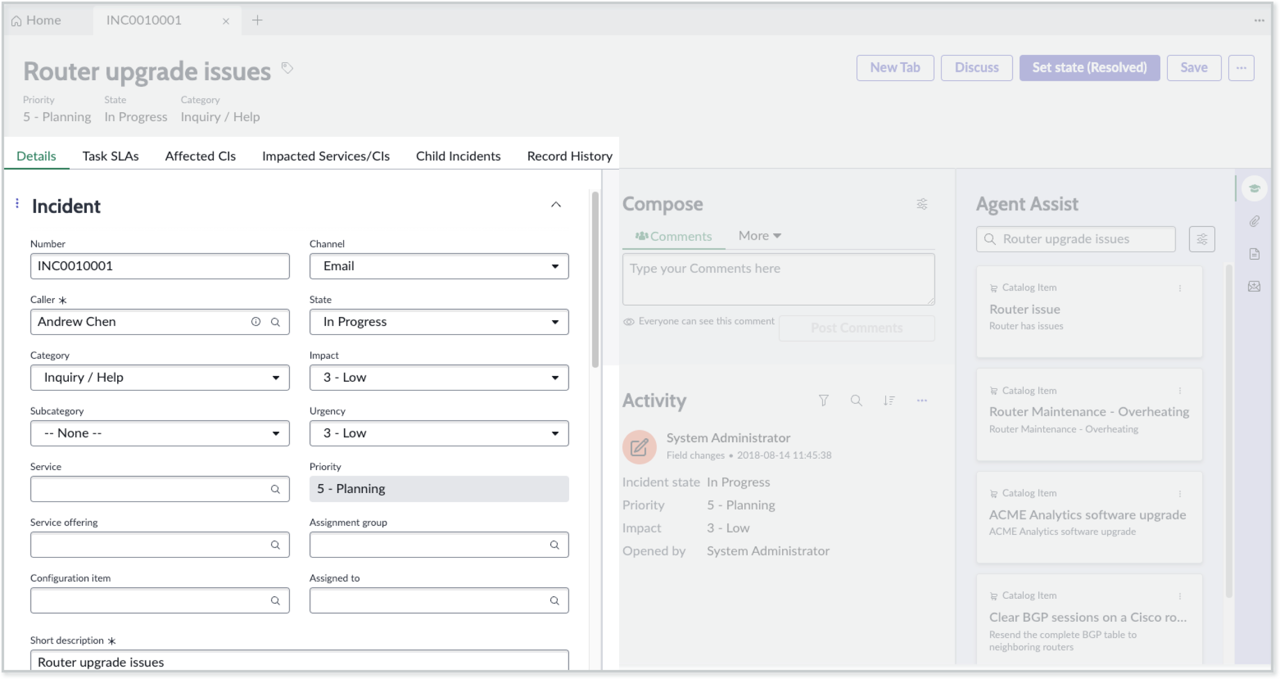
The record page template provides a complete view of a task or case. This view includes an overview of record information, such as contacts, a timeline, and SLA status. The page offers recommendations for resolving issues and provides links to similar issues and related knowledge articles.
Users can accomplish these tasks using the record page template:
- Get a quick overview of a record, including priority, and manage record tags
- Get detailed record information, view record activity, and post comments
- Communicate directly with requestors using the contact information provided
- Search different sources for similar issues and review recommended solutions
- Perform actions on each record using the controls provided; actions can include saving records, requesting additional information, or creating additional records
Components
The record page template is built with Horizon Design System components that have their own attributes and interactions. Many of these components have preset values that simplify configuration.
Record header
The record header component displays the name of the record, tags, and record details expressed as label-value pairs. This component offers presets. For more information, see the usage guidelines for record header.
Interactions and behaviors
This is how the record header component reacts to user interaction and changes to the container size when used in the record page template .
- Buttons in the header enable users to take action on the current record.
- Selecting the tag icon opens the Edit Tag modal, showing the tags currently associated with the record. In this modal, users can:
- Add and remove tags
- Rename existing tags
- Change tag visibility
Presets
The record header subcomponents have these presets:
- Record header image: Defines the title of a record dynamically from the header image field for the table configured in the form header record.
- Record tags: Enables creating and maintaining additional attributes and information related to a record.
- Record subheading: Defines the title of a record dynamically from the subheading field for the table configured in the form header record.
- Record secondary values: Defines the title of a record dynamically from the secondary values related list for the table configured in the form header record.
Form record presence
The form record presence component displays the avatars of other users who are viewing the record. Only two avatars are displayed at a time, with an overflow avatar indicating the presence of additional users. For more information, see the usage guidelines for form record presence.
Interactions and behaviors
This is how the form record presence component reacts to user interaction and changes to the container size when used in the record page template .
- When more than 2 users are viewing the record, the component displays an overflow trigger avatar showing the number of additional users.
- When a users selects the overflow trigger, a popover appears, showing all users viewing the record.
- If the record has more than 11 viewers, a vertical scroll bar appears in the popover.
- Users can select individual avatars from the record or from the popover to contact that user.
Presets
The Record presence preset displays other users that are viewing the record concurently and provides a method for contacting those users.
Action bar
The action bar component contains buttons and menu items that allow users to interact with and take actions on a page. This component offers presets. For more information, see the usage guidelines for action bar.
Interactions and behaviors
Selecting a button or menu option executes the associated UI action for the record.
Presets
The Record actions preset provides actions for a user to manage the record, for example Save. The buttons that appear are defined by the default UI actions for the selected table.
Defaults
By default, the action bar component displays these elements:
- UI actions: Assign to me, Resolve, and Save actions
- Overflow menu: Copy Task and Delete actions
Ribbon
The ribbon component contains sub-components, or widgets, that display customer and record information. This component offers presets. For more information, see the usage guidelines for ribbon.
Interactions and behaviors
This is how the ribbon component reacts to user interaction and changes to the container size when used in the record page template.
- An option in the user preferences menu enables the user to show or hide the ribbon by default.
- Users can collapse or expand the ribbon by selecting the chevron control icon.
- Up to 12 widgets display in a single row. Additional widgets wrap to a new row.
Presets
The Record ribbon preset helps users quickly scan important information about the record, including the record overview and timeline. Configuration properties can be used to optimize the view.
Defaults
By default, the ribbon component has these behaviors:
- The Details tab displays when the user first opens the page.
- The tabs appear in the following left-to-right order: Details, Related Items, and then Related Lists.
Resizable pane
The resizable pane component contains two horizontal panes, with a movable divider in between, and the contents of the contextual sidebar. Each pane contains a slot that can accept other components, including containers. This component offers presets. For more information, see the usage guidelines for resizable panes.
Interactions and behaviors
This is how the resizable pane component reacts to user interaction and changes to the container size when used in the record page template.
- The components inside the pane resize automatically when the user resizes the two slots by moving the divider. The width value of either slot can’t go below a pre-configured minimum.
- To resize the pane, the user selects the divider and drags it right or left. Resizable pane can also be adjusted vertically by dragging the top of the container.
- When the user resizes the pane, the application saves the resized view as a user preference while the user works on other records.
Presets
The Record resizable panes preset enables a user to control spacing and pane visibility.
Defaults
By default the resizable panes component displays these components:
- Tabs
- Contextual sidebar
Tabs
The tabs component is a navigational element attached to a record that helps a user view different sets of information, including related lists. Tabs allow the user to access information without having to display long lists on a single record page.
The Record History tab is included by default and displays a list of past record changes. For more information, see the usage guidelines for tabs.
Interactions and behaviors
This is how the tabs component reacts to user interaction and to changes in the container size when used in the record page template.
- When the number of tabs exceeds the width of the container, excess tabs are moved to an overflow menu marked “more.”
- Selected tabs are marked with an active indicator.
- Users select a tab to display the information from that tab in the content area.
- Users can add comments and worknotes to records they are viewing.
Defaults
By default, the tabs component displays these attributes:
- Default hover, active, and selected states
- Comment and work notes fields
- Filtering and sorting options for viewing record activity
Tabs sidebar
The tabs sidebar contains vertical tabs that open sub-components related to the current record in a larger panel. For more information, see the usage guidelines for Tabs.
Interactions and behaviors
This is how the tabs sidebar component reacts to user interaction and changes to the container size when used in the record page template.
- Users can set the tabs sidebar to be open or closed by default from Settings in the user preferences menu.
- Selecting a tab in the sidebar when the content pane is expanded changes focus to that tab and opens the content for that tab. Selecting a tab when the panel is collapsed expands the panel and changes focus to that tab.
- When the panel is open, a user can select and drag the outer left edge to resize the width of the panel.
- The tabs component exhibits an overflow control (…) when the display height shrinks to cover up the components inside. Selecting the overflow control displays a popover containing the hidden components. When the user selects a component from the overflow menu, the overflow control remains selected.
Default
By default, the tabs sidebar component has these behaviors:
- The tabs sidebar is open by default.
- Related search results (agent assist), attachments, and templates can also appear as tabs in the sidebar.
Configurations
The record page template provides presets for the major components with property and event mapping that fit most use cases. You can connect the presets provided to the Record controller, and the page will function perfectly without any further configuration. For details about preset values and event mapping see the UIB Setup documentation for each component on the developer portal.
You can override any preset property value with a custom configuration. However, the properties you override don’t receive automatic updates when you upgrade your system. For information about overriding and resetting preset values, see Override a preset for a component.
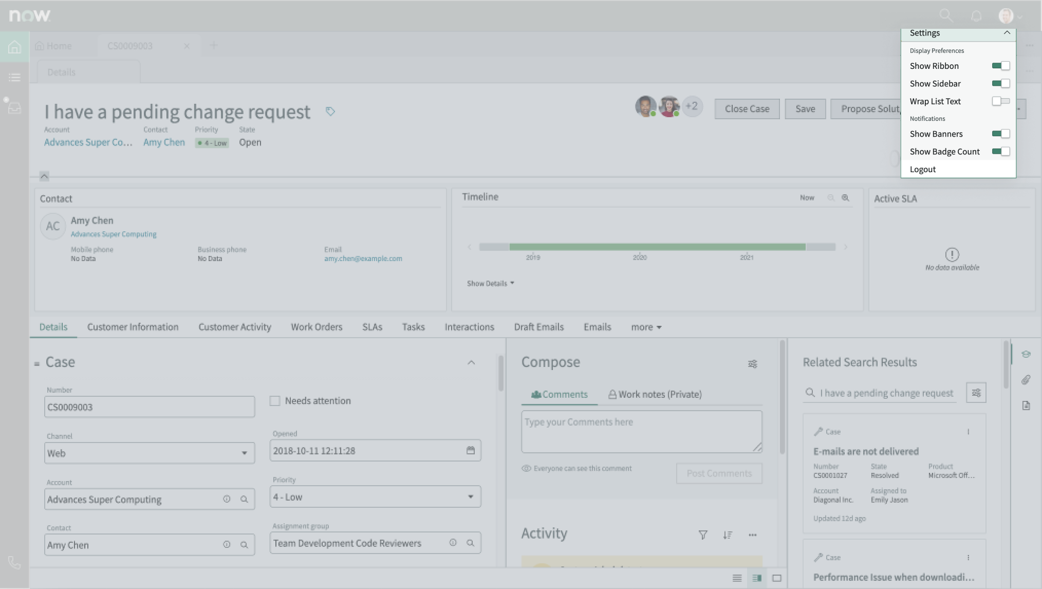
User preferences
Users can personalize specific behaviors and features of the page at runtime through the user settings menu options. The selections that users make in this menu persist until the user’s next session. Examples of user preferences options offered in workspaces are:
- Wrapping text in lists
- Showing banners
- Showing a counter on badges
- Show ribbon
- Show sidebar
Usability
The record page template complies with all internationalization and accessibility requirements.
Internationalization
When this page template is used in an instance configured for a right-to-left (RTL) language, the individual components have their own behaviors. See the usage guidelines for the components used in the page for details.
Accessibility
For accessibility behaviors of specific components, see the usage guidelines for those components.
Record page template tab order
This is the high-level tab order for record page.
Each component used in a landmark has its own tab order and keyboard interactions. See the usage guidelines for each component for internal keyboard interactions.
Screen readers
When you apply ARIA labels to a component, screen readers announce the controls and content of each component in the prescribed tab order. See the usage guidelines for details.