

Anatomy
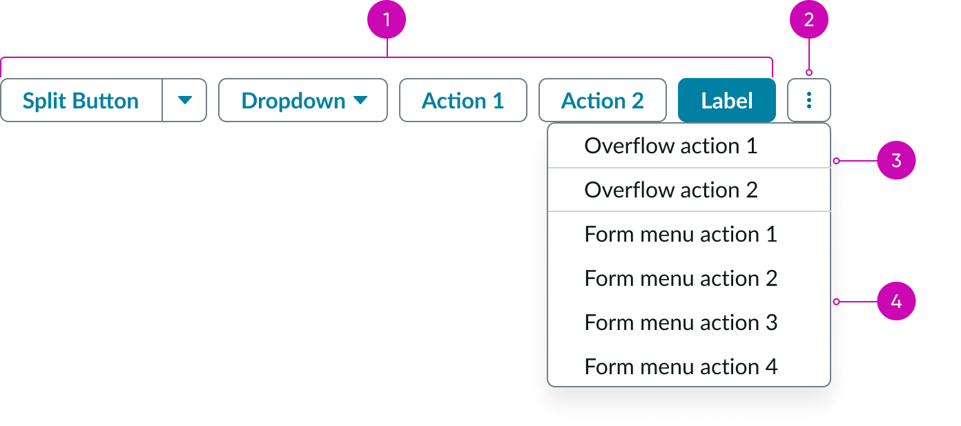
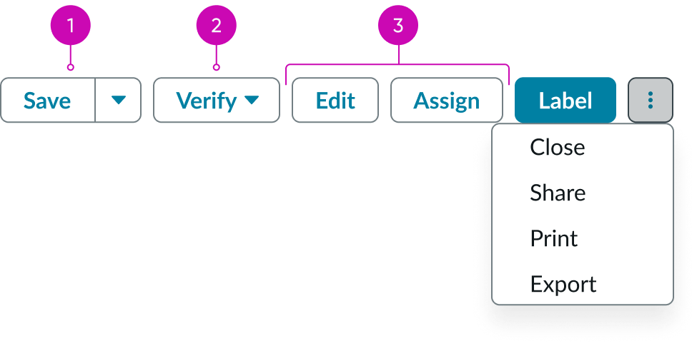
- Action buttons: Buttons supported by the component, used to trigger actions by the user
- Actions menu: Dropdown panel containing less frequently used actions; used as an overflow for actions when the container is resized
- Overflow actions: Actions that flow into the form menu when the container is too small to render all action buttons
- Form menu actions: Actions that are configured as form menu actions
Subcomponents
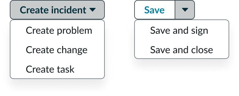
See usage guidance for simple button
See usage guidance for split button
See usage guidance for no selection dropdown
Usage
Use action bar to enable users to perform actions related to the current page.
Reduce clutter in the interface by logically organizing actions using a split button or a menu button based on the user flow and context. By putting less frequently used actions in the form menu, you make the frequently used action buttons easily accessible on the page.
Place an action bar at the top of the page, since it provides page-level actions.
Variants
Learn about the attributes of action bar.
Colors
Action bar has the following button color variants: primary, secondary, and negative. Use the primary variant for the most important action on the page. Use the secondary variant for other actions of lesser importance. Use the negative (destructive) variant for the delete action.
Note: Place the primary action button in the right-most position, before the overflow button ellipsis, for the best visibility.
| Variant | Example | Button type |
|---|---|---|
| Primary |  |
Standard, split, grouped |
| Secondary |  |
Standard, split, grouped |
| Negative |  |
Standard |
Sizes
Action bar doesn't have any specific sizes. However, action bar supports medium-size button subcomponents only. See the usage guidelines for details.
Configurations
Learn how to customize action bar by configuring the available properties.
Presets and controllers
This component has a preset configuration that sets properties and event handlers, making it ready for use. You can override preset values with a custom configuration if needed. Preset values won’t upgrade with updates. To avoid using presets, configure manually. One preset can apply to a single component instance. See presets for more info.
A preset is linked to a controller, which serves as a data resource. Controllers provide configuration data and event bindings for the component. Selecting a preset adds the required controller to the page, allowing new components to use its preset. For more on controllers, see controllers. For default presets, see view properties and events in the controller API.
Sort order
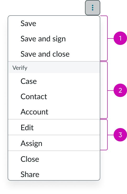
The sort order is used to define the relative importance of an action compared to other actions in the component. Configure the most important button action to the farthest right, and the least important action to the left. In the form menu, the most important action is on the top, and the least important action is on the bottom.
Form menu
Configure actions you use less frequently to appear in the form menu.
Action grouping
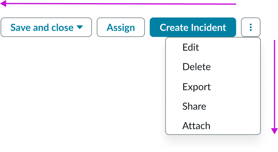
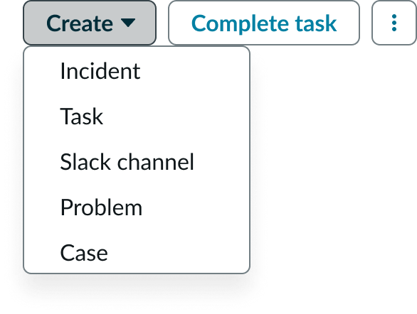
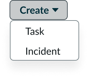
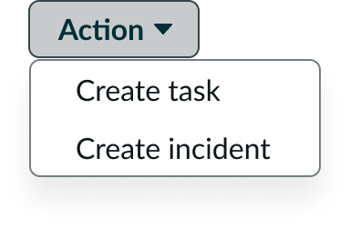
You can group similar actions into a dropdown menu or a split button. A menu button with a designated, primary action is a split button.
The example on the left shows the actions in a menu button (no selection dropdown panel). The example on the right shows a split button with a primary action and a menu.
Design recommendations
Learn how to apply action bar in your design.

Use primary styled actions that are appropriate to the context of the page. An action might be primary in one context but not in another.

Avoid using multiple primary actions on the page.

Use the split button as the primary styling in a dropdown to call out the primary action in that group.

Avoid using primary styling on menu buttons, since the dropdowns refer to multiple actions.

The primary action should be the most accessible button within the component so that it is the last button to overflow into the dropdown when resized.

Avoid assigning the primary action to a lower order of importance. The most important action should always be to the right in left-to-right interfaces.

Consider which button is the primary action on that page and assign it to a single button.

Avoid using the destructive action together with a primary action.

Display only one destructive button when possible.

Avoid using multiple destructive buttons in a action bar.

Use primary or secondary variants for non-destructive actions.

Don't use a negative variant for a non-destructive action.

The primary action should be the most accessible button within the component. This makes it the closest to overflow into the dropdown when resized.

Don't assign a lower order of importance to the primary-negative action.

Split unrelated actions into separate buttons or reconsider the grouping.
Avoid grouping unrelated actions.
Limit the group of actions to 7 or less. Remember to place the less frequently used actions in the form menu.
Avoid grouping too many actions.
Define a clear and concise name to the group that makes sense to the user.
Avoid grouping actions under an unclear group name.
Behavior
Learn how action bar behaves when the display changes or a user interacts with the component.
Responsive behaviors
Depending on your use case, you might have multiple button types in the action bar. The button actions can occupy the entire bar in larger containers. When the action bar shrinks to fit a smaller container, the actions overflow into the actions menu and are organized according to their button type.
Button and menu actions that overflow when the container shrinks.
- Split buttons: Actions overflow into the menu as a separate section with all the actions expanded
- Dropdown menu: Actions overflow into the menu as a separate section with all the actions expanded
- Standard buttons: Actions overflow into the menu in the same order they were configured
If you haven't configured an actions menu, one automatically appears when the button actions overflow. If you already have a form menu as part of the component, any overflow buttons appear above the form menu actions. This is because the button actions have more importance than the form menu actions. All actions are displayed in their order of importance, from top to bottom.
In some cases, the container size might prevent any action buttons from appearing in the bar. When this happens all the actions appear in their own sections in the form menu, ordered by importance from top to bottom.
Interactions
User interaction with the action bar depends on the capabilities of the button subcomponents. See the usage guidelines for details.
Usability
Action bar complies with all internationalization and accessibility requirements.
Internationalization
When the display translates to a right-to-left (RTL) language, the action bar flips in its orientation. The order of importance changes to left-to-right in the bar, but remains top to bottom in the form menu. The sort order configuration for LTR and RTL versions remains the same.

Accessibility
Learn how to access the actionable elements of action bar through keyboard interactions.
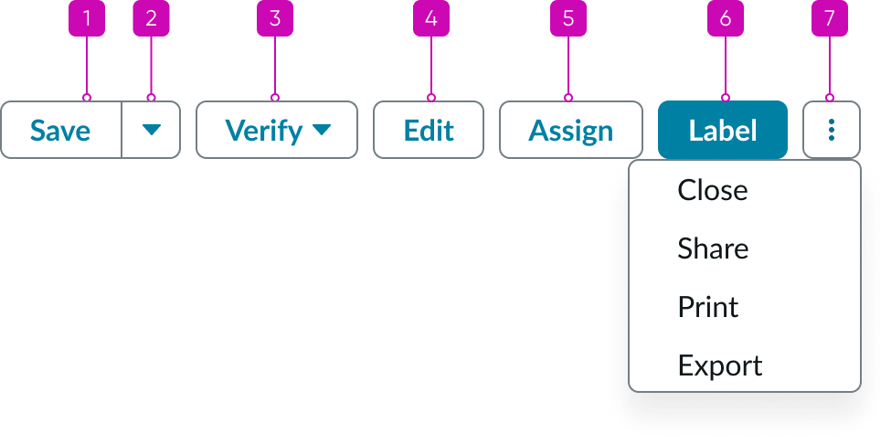
Action bar tab order
This is the tab order for Action bar.
Keyboard interactions
You can access the actionable elements of action bar with these keyboard keys:
- Tab: Shifts focus to the button
- Space or Enter: Launches the button action
Note: For instructions on the keyboard interactions for the subcomponents, see the usage guidance for those components.