Anatomy

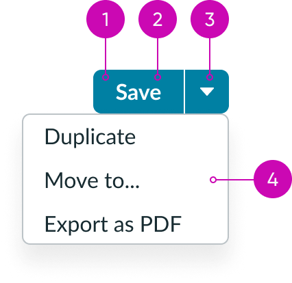
- Action: Button that triggers an event when the user selects it; it behaves independently from the dropdown trigger
- Label: Text, icon, or text with icon to describe the primary action
- Dropdown trigger: User-initiated action that opens the dropdown menu
- Dropdown panel: A list of secondary actions related to the primary action
Subcomponents
See Icon Gallery for approved icons
Usage
Use a split button to display an action with related actions. The main action should be the primary action the user takes, while the related actions are similar but less popular or prominent actions. Actions within the dropdown should be closely related to the primary action.
Variants
Learn about the variants of split button.
Colors
Split button has the following different color variants:
- Primary
- Primary positive
- Primary negative
- Secondary
- Secondary positive
- Secondary negative
- Tertiary
- Primary AI
- Secondary AI
- Tertiary AI
Primary
Use the primary variant to provide a strong visual presence for an action when it's placed next to other button types.

Primary positive
Use the primary (positive) variant for confirming an object or action.

Primary negative
Use the secondary variant when the action is supplemental to completing a workflow. The secondary variant is the default for button.

Secondary
Use the secondary variant for actions that supplement the primary button.
The secondary split button has the same style as the secondary variant of button.

Secondary positive
Use the secondary (negative) variant when there are multiple instances of a negative and positive action within a single view.

Secondary negative
Use the secondary (positive) variant when there are multiple instances of a negative and positive action within a single view.

Tertiary
Use the tertiary variant for complementary actions.

The tertiary variant allows other content and elements to stand out while still providing an action.
Primary AI
Use the primary AI variant to provide a strong visual presence for an AI action.

Secondary AI
Use the secondary AI variant for AI actions that supplement the primary button.

Tertiary AI
Use the tertiary variant for the lowest priority of AI actions.

All variants are available for each configuration:
| Variant | Text | Iconic | Text with icon |
|---|---|---|---|
| Primary | |||
| Primary positive | |||
| Primary negative | |||
| Secondary | |||
| Secondary positive | |||
| Secondary negative | |||
| Tertiary | |||
| AI Primary | |||
| AI Secondary | |||
| AI Tertiary |
Sizes
A split button is available in the following sizes: small (sm), medium (md), and large (lg).
Small

Medium
Medium is the default size for split button.

Large

Configurations
The split button component supports the button component but doesn't include additional button types (like bare button). The split button can contain text, an icon, or text with an icon.
Label
You can configure the label for your button. The default is “Button.”
Variant
Configure the variant for your button to assign your button’s level of priority. Options include primary, secondary, tertiary, as well as positive/negative primary and secondary.
Size
Configure the appropriate size for your button.
Additional visibility properties
- Disable the button to mute color and prevent click interactions.
- Check “opened” to receive automatic updates or check “managed open” to override automatic updates to the opened property.
Identifier
You can assign a static or animated icon for your identifier.
Accessibility
Assign tooltip labels and ARIA properties. You can enable the Landmark Focus keyboard shortcut to focus on the split button.
Text

Icon

Text with an icon

Design recommendations
Learn how to apply split button in your design.

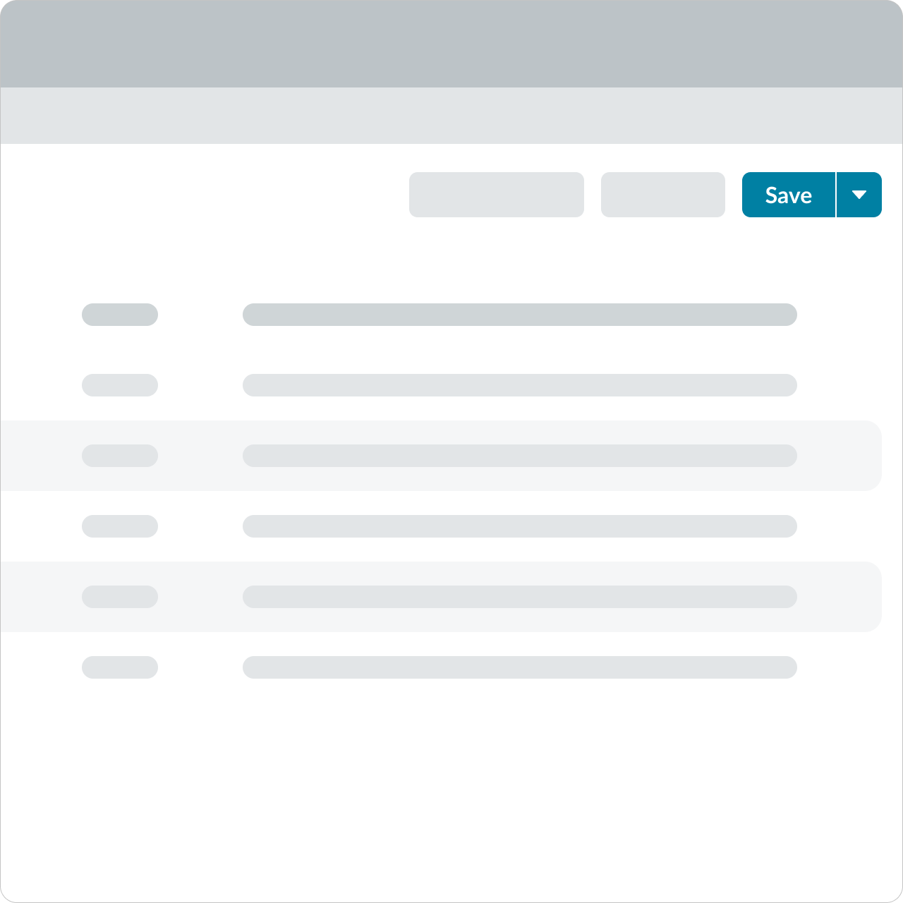
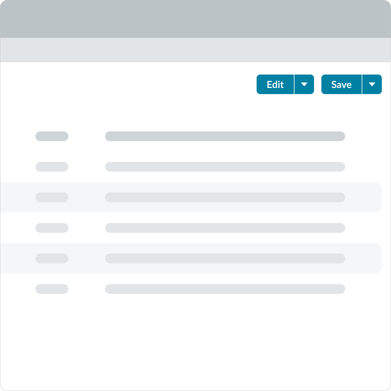
Use only one primary action.

Avoid using multiple primary split buttons within a single view. Primary buttons are not meant for repeated or supplementary actions.
Alignment and positioning
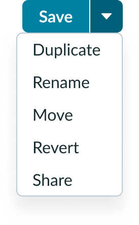
The dropdown menu element aligns based on available space in the viewport.
UI text guidelines
Consider these recommendations for labeling a split button:
- Start with a verb to describe a specific action. This sets an expectation of what happens next.
- Use short labels. Two words is ideal. Three is OK. If needed for clarity, four is acceptable.
- Avoid commas, periods, and other punctuation
- Add an object to the verb if additional context or clarity is needed
- Add an article (like “a” or “an”) to add a more human, conversational tone
- Use the same verb tense if multiple buttons are present
- For example, the split button could have options like “Save” “Edit” and “Update,” which are all present tense verbs
- All the options in a split button should be related to the same object. They are different actions that you can take on one thing.
Behavior
Learn how split button behaves when the display changes or the user interacts with the component.
Responsive behaviors
The split button automatically inherits the width of its parent container.
Interactions
The split button has different interactions available to the user. If the user selects the primary action, it launches that action. But if the user selects the dropdown trigger instead, it opens the dropdown panel and offers a list of actions. The user must make a choice from the list to launch one of those actions and close the panel. If the user selects the trigger again, it closes the dropdown menu.

Usability
Split button complies with all internationalization and accessibility requirements.
Internationalization
When the display translates to a right-to-left (RTL) language, the split button flips. The caret appears on the left and the button label is on the right. If the split button includes an icon, it will appear to the right of the label for RTL languages.

Accessibility
Learn how to access the actionable elements of split button through keyboard interactions and screen readers.
Keyboard interactions
- Tab: Shifts focus to the split button component unless the button is disabled
- Right Arrow: Moves focus to the next control (dropdown trigger); the focus movement may wrap from the last element to the first element
- Left Arrow: Moves focus to the previous control (primary action button); optionally, focus may wrap from the first element to the last element
- Space or Enter: Launches the primary action when the button is in focus
- Down Arrow: Opens the menu and moves focus to the first menu item
- Up Arrow: Opens the menu and moves focus to the last menu item
Screen readers
When you apply ARIA labels to a component, screen readers announce the controls and content of split button in the prescribed tab order.
Primary action button
The primary action button has the role of button.
- The button has an accessible label; by default, the accessible name uses any text content inside the button element
- If a description of the button's function is present, the button element has aria-describedby set to the ID of the element containing the description
- When the action associated with a button is unavailable, the button has aria-disabled set to true
Dropdown trigger
The element that opens the menu has the role of button.
- The element with role button has “aria-haspopup” set to either menu or true
- When the menu is displayed, the element with role button has “aria-expanded” set to true
- When the menu is hidden, it is recommended that “aria-expanded” is not present; if “aria-expanded” is specified when the menu is hidden, it is set to false
- The element that contains the menu items displayed by activating the button has role menu

