

Anatomy
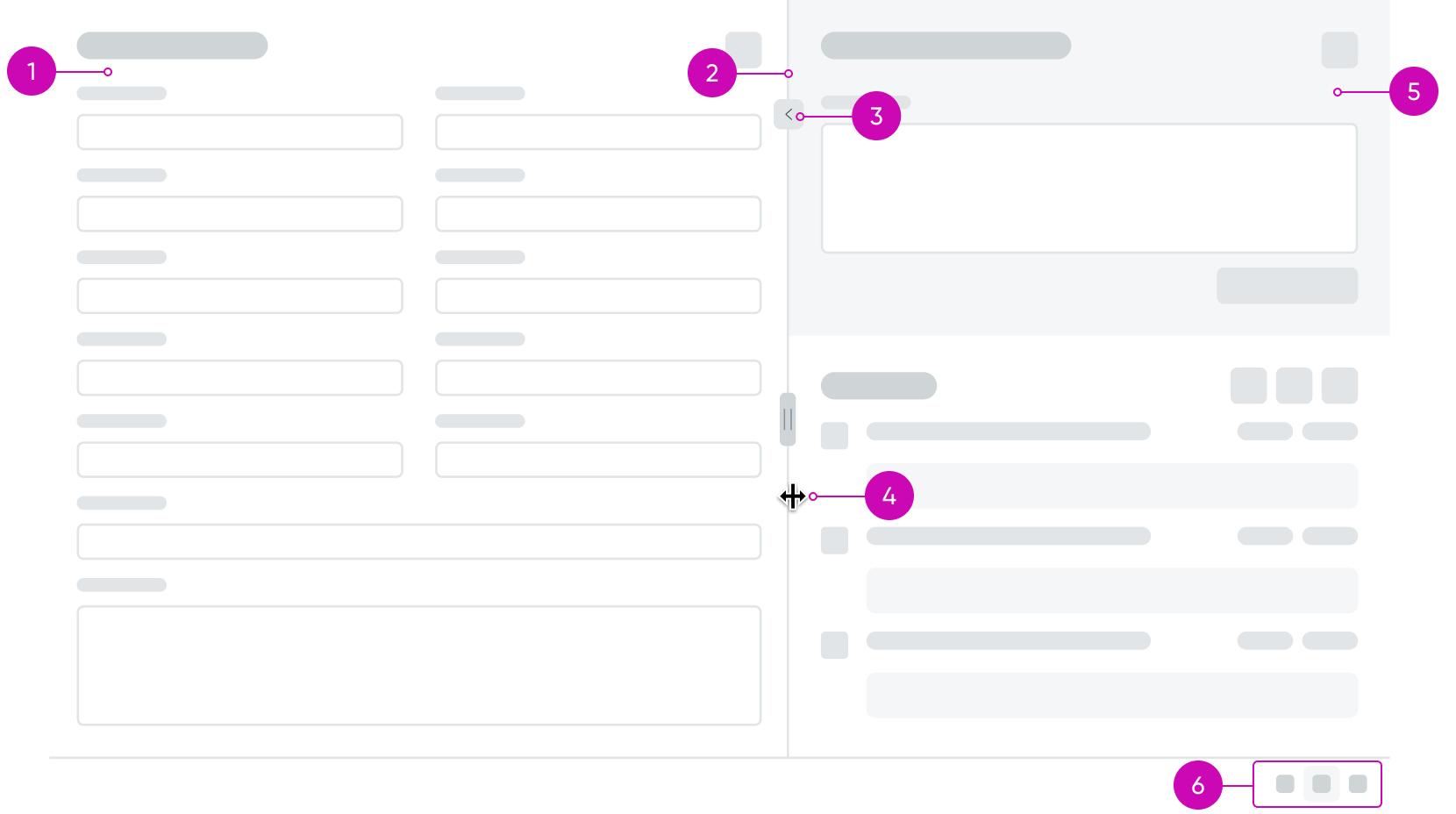
- Left pane: A named slot that can accept a component, including a container.
- Divider: The divider line allows a user to change the width of the two panes, increasing the amount of space for the right or left slot. A minimum width can be configured that prevents the user from sizing the slot lower than a ratio and/or pixel value.
- Divider button: Expands or collapses the panes to the customizable width.
- Divider handle: The divider handle is visible when the user hovers over the divider to indicate that the panes can be resized.
- Right pane: A named slot that can accept a component, including a container.
- Action bar (optional): Three icons that when clicked show only the left pane, both panes, or only the right pane; shows split or stack icons when panes position is Left & right with split-stack.
Usage
The resizable panes component organizes 2 pieces of content on a page while letting a user resize or hide one side or the other to fit their needs. For example, an incident form on the left and an activity stream on the right.
Configurations
Learn how to customize the resizable panes component by configuring the available properties.
Presets and controllers
This component has a preset configuration that sets properties and event handlers, making it ready for use. You can override preset values with a custom configuration if needed. Preset values won’t upgrade with updates. To avoid using presets, configure manually. One preset can apply to a single component instance. See presets for more info.
A preset is linked to a controller, which serves as a data resource. Controllers provide configuration data and event bindings for the component. Selecting a preset adds the required controller to the page, allowing new components to use its preset. For more on controllers, see controllers. For default presets, see view properties and events in the controller API.
Pane position
By default, resizable panes displays 2 panes side-by-side. You can change the panes to display stacked (top and bottom) or side-by-side with an additional stack or split option.
Left and right
This is the default pane position. Arranges the panes side-by-side. You can also show an action bar so that users can switch between showing one pane, or both.
Top and bottom
Stacks the panes vertically. You can also show an action bar but you must configure the icon’s behavior. The default configuration is for left and right panes.
Left & right with split-stack
Arranges the panes side-by-side (split) or vertically (stack). You can configure the default display. Displays a separate action bar that has icons representing split and stack position. Users can select these options to change the panes position from the configured version.
Default displayed pane
The resizable panes component can also be configured to show the left pane only, both panes, or the right pane only upon page load.
Disable divider drag
You can fix the divider and restrict the user from dragging the vertical divider to resize the panes.
Display action bar
You can display the action bar at the bottom of the component. This enables the user to define the icons and tooltips used by the action bar to switch between different view modes.
Display divider button
You can display a button on the divider that the user can click to expand and collapse the panes If you display the divider button, You can customize the divider button, for example, you can change its position on the divider and the icon it uses for the button.
Default divider position
A numeric value between 0 and 100 that sets the default position between the left and right side of the component on page load.
ARIA configuration
You can configure ARIA labels for the panes, divider button, and the divider button’s tooltip.
Left pane width
This involves fine-grained control over the sizing behavior and minimum size of the left pane represented as JSON.
Right pane width
This involves fine-grained control over the sizing behavior and minimum size of the right pane represented as JSON.
Divider styles
You can enter custom CSS styles for the divider, expressed in JSON format. For example, you can add padding and change the background color.
Bare
When enabled, the borders that surround the resizable panes component are removed and the component appears borderless.
Note: The border above the action bar is not removed nor is the divider line between the right and left pane when this property is set to true.
Behavior
Learn how the resizable panes component behaves when the display changes or a user interacts with the component.
States
The resizable panes component has 2 states: a single visible pane and both panes visible.
Single visible pane
A single pane (either right or left) takes up the entire area of the component. The other pane is not visible and can only be shown by using the action bar at the bottom of the component.
Note: If the action bar is hidden, a user would be unable to see the other pane.
Two visible panes
Both the right and left pane are visible to the user. The user can resize the available space for each pane by clicking on the divider handle and dragging right or left until they reach the minimum size values for a given pane, if set. The user can also use the action bar to switch to a single visible pane.
Responsive behaviors
The resizable panes component has the following responsive behaviors.
Reduced container
When the resizable panes container is reduced enough, the side-by-side configuration changes to the stacked (top and bottom) layout.
Interactions
Learn how the resizable panes component responds when a user interacts with it.
Changing the width of the panes
A user can click the divider and drag their mouse to the right or left and adjust the width of the resizable panes. The width value will not change if the user reaches the minimum size ratio or pixel value defined in the configuration, if applicable.
Selecting which panes are visible
When the action bar is visible, a user can select between 3 options and change between the left pane only, both the right and left pane, or only the right pane.
Note: This interaction is only available when the action bar is configured to be visible.
Usability
The resizable panes component doesn’t have any specific accessibility or internationalization requirements.
Internationalization
The resizable panes component doesn’t change when the display translates to a right-to-left (RTL) language.
Accessibility
Learn how to access the actionable elements of the resizable panes component through keyboard interactions and screen readers.
Keyboard interactions
You can access the actionable elements of the resizable panes component with these keyboard keys:
- Tab and Shift + Tab: Moves focus through the contents of the left pane if applicable, then the right pane if applicable, and finally to the Action Bar buttons if they are visible.
- Enter or Space: When the action bar is visible, a user focused on an action button can press enter or space to launch the button’s action.
- Left Arrow: Moves a vertical splitter to the left.
- Right Arrow: Moves a vertical splitter to the right.
- Up Arrow: Moves a horizontal splitter up.
- Down Arrow: Moves a horizontal splitter down.
- Enter: If the primary pane is not collapsed, collapses the pane. If the pane is collapsed, restores the splitter to its previous position.
- Home (optional): Moves splitter to the position that gives the primary pane its smallest allowed size. This may completely collapse the primary pane.
- End (optional): Moves splitter to the position that gives the primary pane its largest allowed size. This may completely collapse the secondary pane.
- F6 (optional): Cycle through window panes.
- Shift + Option + L: Changes layout to only left pane, both panes, and only right pane.
- Shift + Option + P: Moves focus to the divider button.
Screen readers
When you apply ARIA labels to a component, screen readers announce the controls and content of the component in the prescribed tab order. Any components that are added into the panes will present their ARIA content to the screen reader.
The screen reader announces in order:
- The contents of the left pane, respecting the content’s default order.
- The contents of the right pane, respecting the content’s default order.
- If present, the contents of the action bar from left to right.