

Anatomy
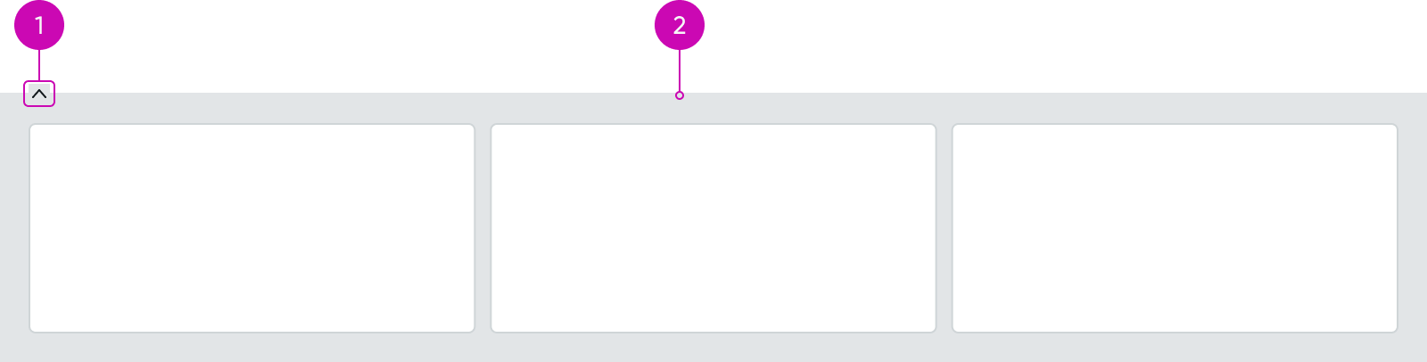
- Ribbon expand/collapse control: Opens and closes the ribbon container
- Ribbon container: Holds compatible ribbon widgets (such as SLA timeline data, profile information for a caller, and other audit trail information linked to a record)
Usage
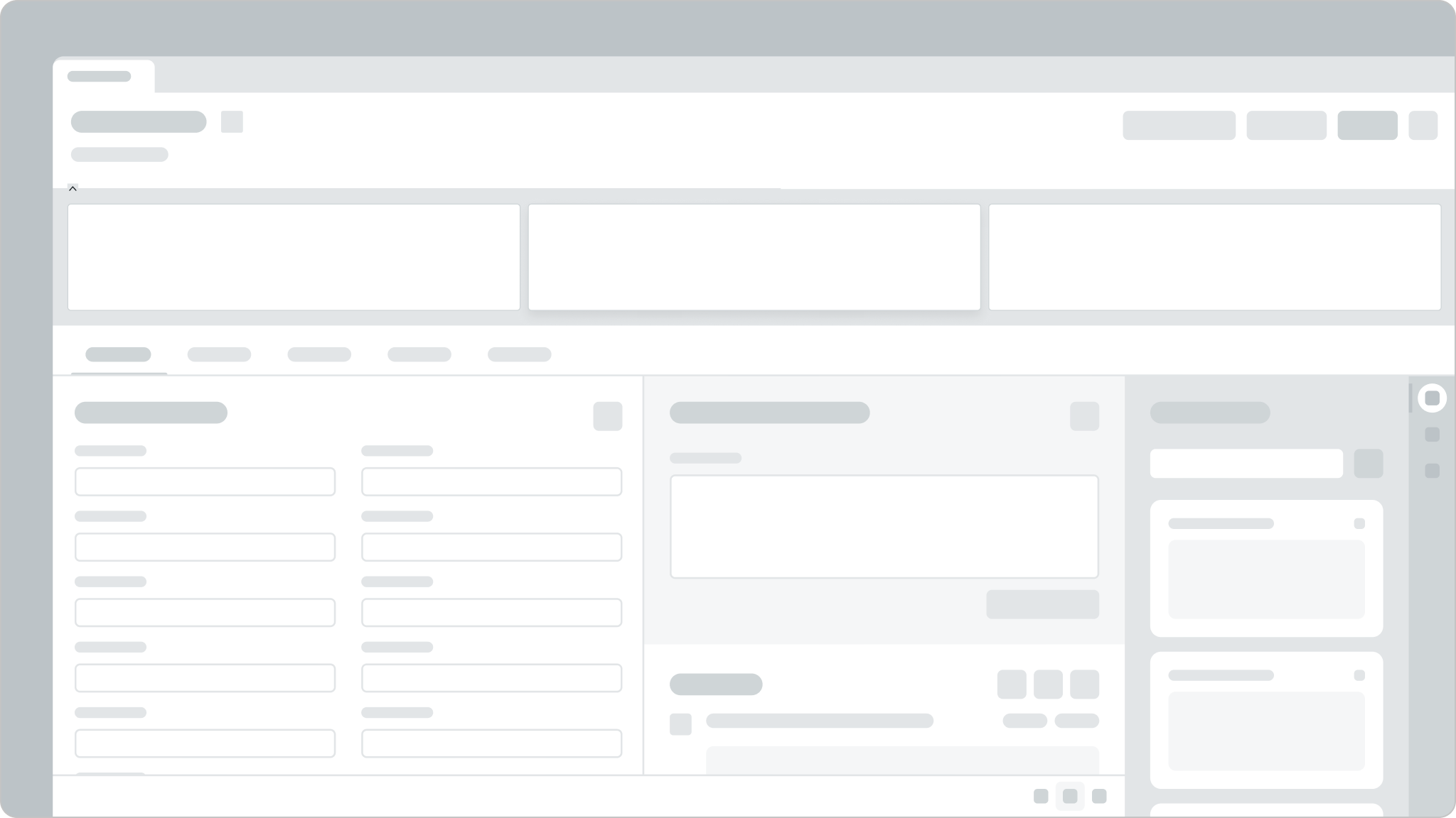
The ribbon component provides a location where one or more custom widgets can be displayed on a page.
Variants
Learn about the variants of ribbon.
Sizes
The ribbon component doesn't have any specific sizes. However, it has a fixed full-page width. The ribbon container can hold widgets up to a maximum of 12 columns within the container.
Configurations
Learn how to customize the ribbon component by configuring the available properties.
Presets and controllers
This component has a preset configuration that sets properties and event handlers, making it ready for use. You can override preset values with a custom configuration if needed. Preset values won’t upgrade with updates. To avoid using presets, configure manually. One preset can apply to a single component instance. See presets for more info.
A preset is linked to a controller, which serves as a data resource. Controllers provide configuration data and event bindings for the component. Selecting a preset adds the required controller to the page, allowing new components to use its preset. For more on controllers, see controllers. For default presets, see view properties and events in the controller API.
Show/hide component
The ribbon defaults to open at run time, unless the collapsed flag is set. The ribbon can also be configured not to show, as needed.
Any widgets shown in the ribbon must already be pre-configured.
In this example, the ribbon is expanded.
Design recommendations
Learn how to apply the ribbon component in your design.
Make sure you place the ribbon at the top of a record.
Don't place the ribbon in a location too small to hold its full width.
UI text guidelines
These are some recommendations for using text within the ribbon component.
- Use sentence case for all titles, labels, and column headers
- Keep all text labels informative and short to increase readability and scanning
- Keep content concise and purposeful to help a user understand options and actions
- Capitalize only the first letter and any proper nouns in a string of text
- Ensure content is contextual and specific to offer guidance and support to the user
Behavior
Learn how ribbon behaves when the display changes or a user interacts with the component
Responsive behaviors
The ribbon component uses the full width of a record and does not resize.
Interactions
The ribbon component has an expand/collapse interaction that opens and closes the widget to support maximizing the viewable content.
Usability
The ribbon component complies with all internationalization and accessibility requirements.
Internationalization
When the display translates to a right-to-left (RTL) language, the elements in the ribbon component maintain their hierarchy and are ordered from right-to-left.
Accessibility
Learn how to access the actionable elements of the ribbon component through keyboard interactions and screen readers.
Keyboard interactions
You can access the ribbon component with these keyboard keys:
- Tab
- Shift + Tab
You can open and close the ribbon component with these keyboard keys:
- Spacebar
- Enter
Screen readers
When you apply ARIA labels to a component, screen readers announce the controls and content of the ribbon component in the prescribed tab order.
The ribbon component has 2 states:
- Aria-expanded=true
- Aria-expanded=false