

Anatomy
Learn about the individual parts of Now Assist context menu (NAcm).
Draggable variant
Learn about the individual parts of NAcm draggable variant.
Trigger and contextual menu
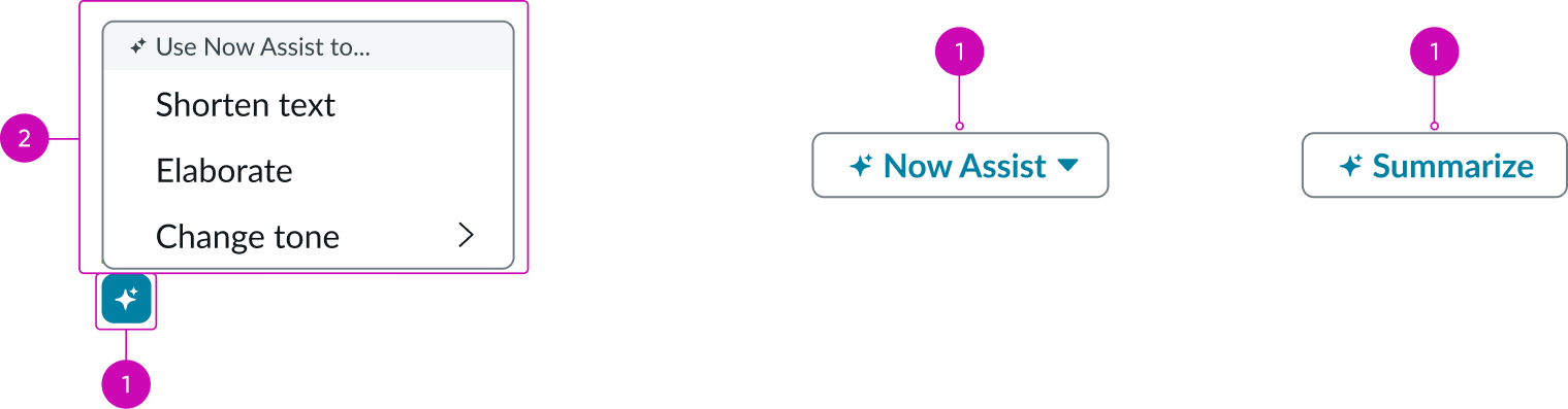
- Now Assist button: Opens the Now Assist context menu
- Now Assist actions menu: List of available Now Assist actions; the actions display based on the Now Assist configuration
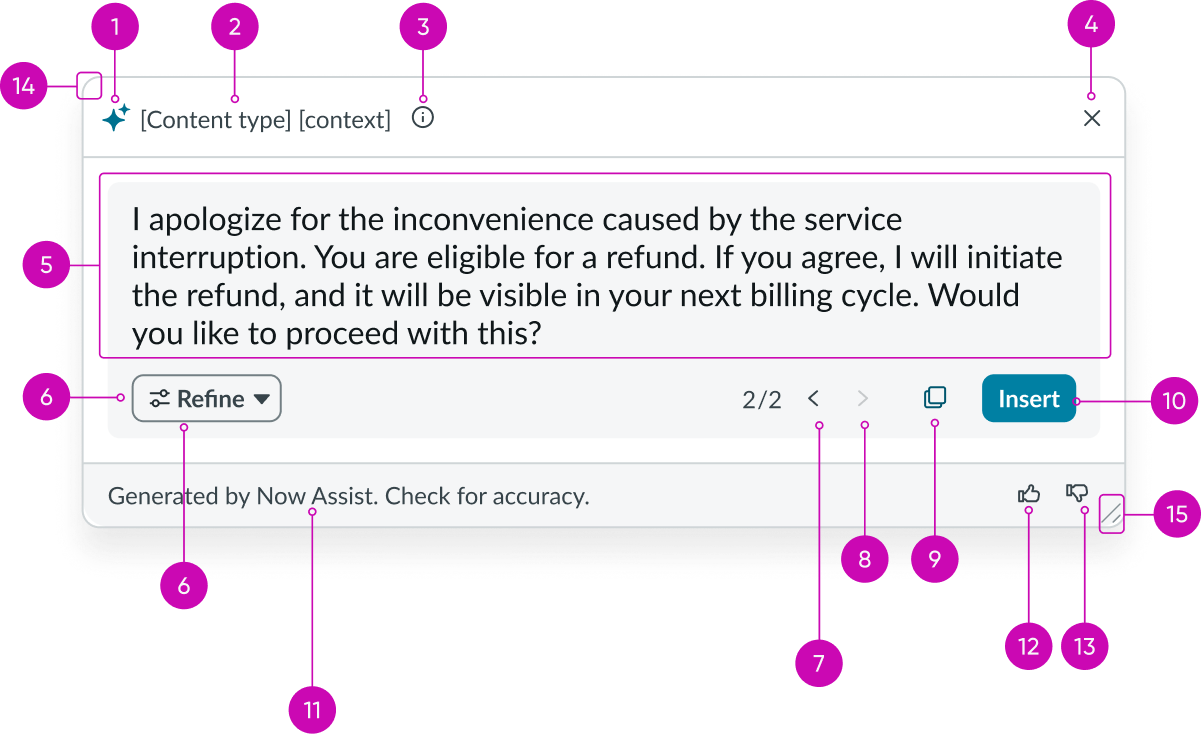
Recommendation dialog
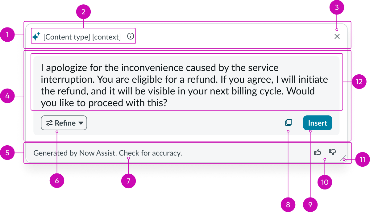
- Header: Header area of the NAcm recommendation dialog showing the title and close button
- Header label and info icon: Title label of the Now Assist recommendation dialog header and info tip that displays additional information; different labels at normal, loading, and loaded states display based on the NAcm configuration
- Close button: Closes the recommendation dialog
- Dialog body: Location where the Now Assist actions, the generated content, and call-to-action (CTA) buttons are placed
- Footer: Area of recommendation dialog’s footer for the footer title, feedback buttons, and dialog drag-resize button
- NAcm action button: Accesses the Now Assist actions; actions are displayed based on the NAcm configuration
- Footer label: Contains additional content and can be declarative or guiding text based on the context
- Copy button: Copies the generated content
- Insert button: Inserts the generated content
- Feedback buttons: Capture user feedback
- Drag-resize indicator: Resizes dialog when dragged
- Content space: Area to display the generated content
Recommendation dialog with open prompt
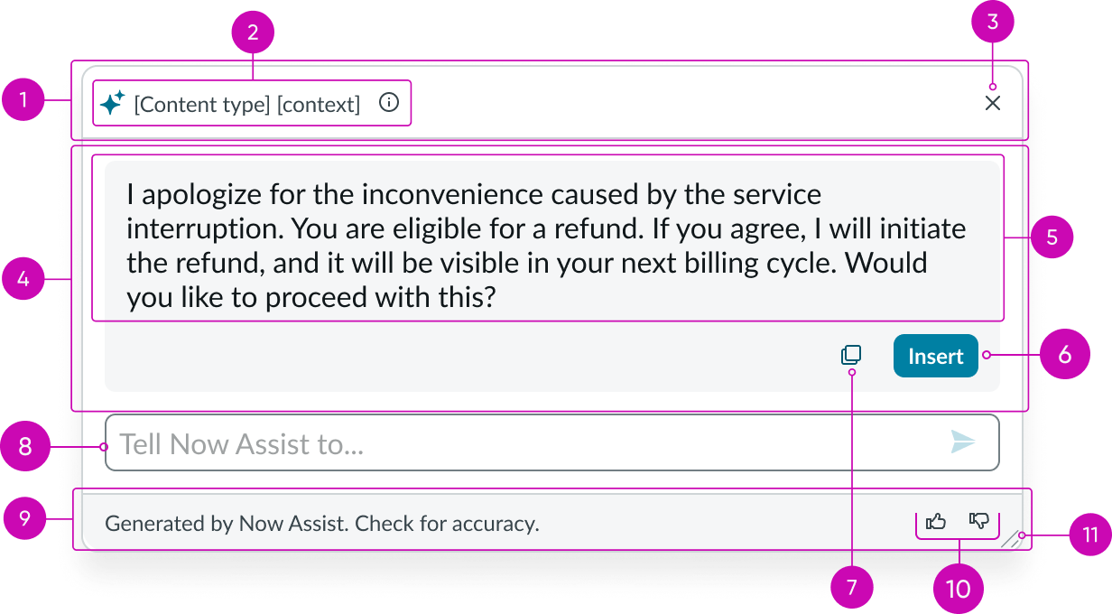
- Header: Header area of the NAcm recommendation dialog showing the title and close button
- Header label and info icon: Title label of the Now Assist recommendation dialog header and info tip that displays additional information; different labels at normal, loading, and loaded states display based on the NAcm configuration
- Close button: Closes the recommendation dialog
- Dialog body: Location where the Now Assist actions, the generated content, and call-to-action (CTA) buttons are placed
- Content space: Area to display the generated content
- Insert button: Inserts the generated content
- Copy button: Copies the generated content
- NAcm open prompt: Now Assist field for refining suggestions
- Footer: Area of recommendation dialog’s footer for the footer title, feedback buttons, and dialog drag-resize button
- Feedback buttons: Capture user feedback
- Drag-resize indicator: Resizes dialog when dragged
Fixed variant
Learn about the individual parts of NAcm fixed or embedded variant.
Trigger card
- Card label: Title label of the Now Assist trigger card
- Info icon: Tooltip with additional information for the user
- Trigger button: Triggers the button’s action
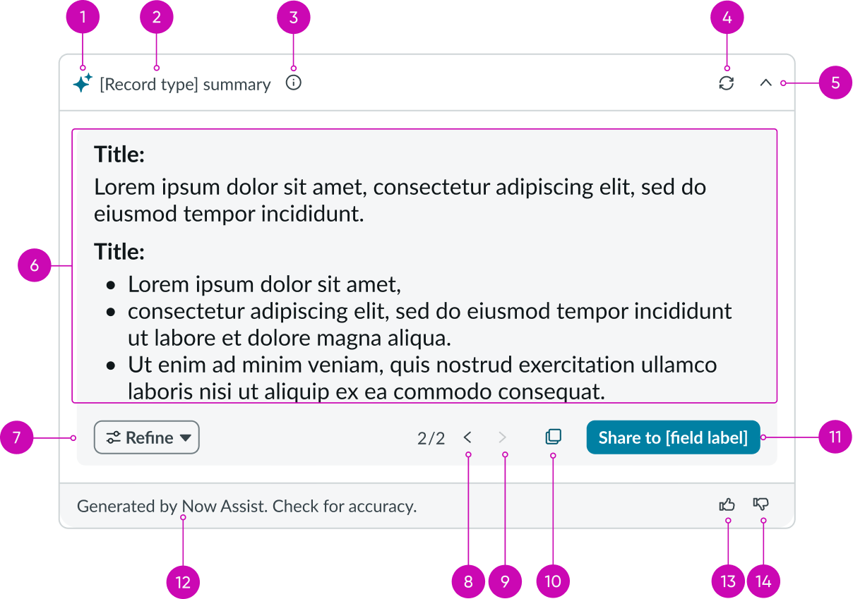
Recommendation dialog
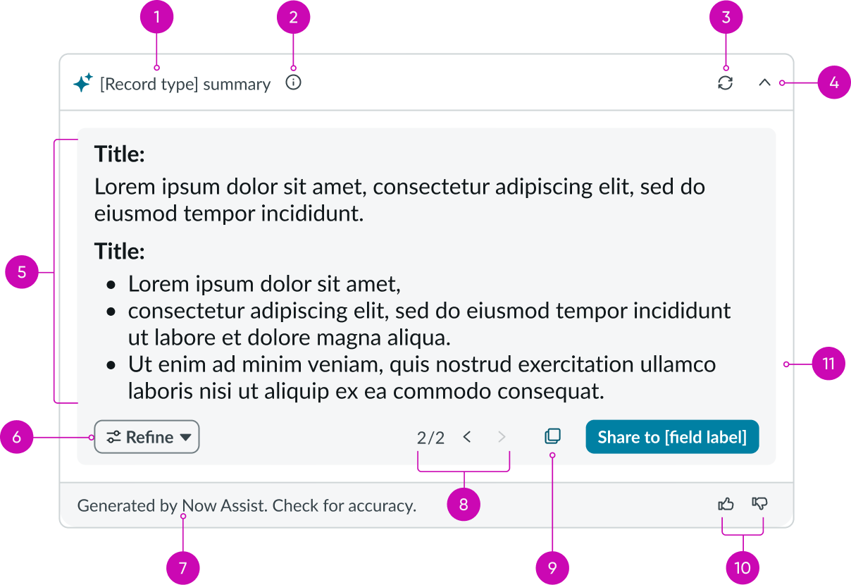
- Header label: Title label of the Now Assist recommendation dialog header; different labels at normal, loading, and loaded states display based on the NAcm configuration
- Info icon: Displays the information tooltip
- Refresh button: Refreshes the generated content based on the latest contextual information
- Collapse button: Minimises the recommendation dialog
- Content space: Area where the Now Assist-generated content displays
- NAcm action button: Lists the Now Assist actions; actions are displayed based on the NAcm configuration
- Footer label: Area of recommendation dialog’s footer; this is additional content and can be declarative or guiding text based on the context
- Version pagination buttons: Navigate between different versions of the generated content; appears when the user refines the generated content
- Copy button: Copies the generated content
- Feedback buttons: Capture user feedback
- Share button: Shares the generated content to the activity stream, work notes, or other elements based on configuration
Usage
Now Assist is a part of ServiceNow’s AI offering that lets users leverage generative AI on specific objects for quick, contextual tasks like summarizing content or generating responses. Now Assist Context Menu presents the Now Assist actions in a configurable container. Whether it is for on-demand help or always-visible support, Now Assist Context Menu enables users to get AI assistance without navigating away from their current workflow. ITSM, CBDM, SLO, ITOM are among the several workflows that support Now Assist capabilities (actions). For more information, see Now Assist Context Menu.
The Now Assist Context Menu UIB component (NAcm) is to configure and enable Now Assist Context Menu in the workflow. It displays Now Assist actions based on how the NAcm configuration is setup. The actions shown in NAcm, correspond to the configuration of the Skill ID, Configuration ID, or NAcm configuration properties in UIB. Only one of these fields needs to be configured.
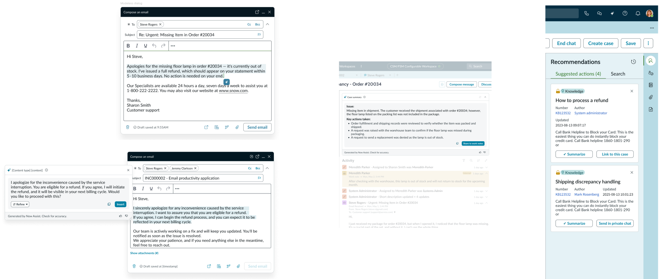
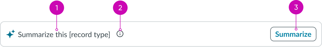
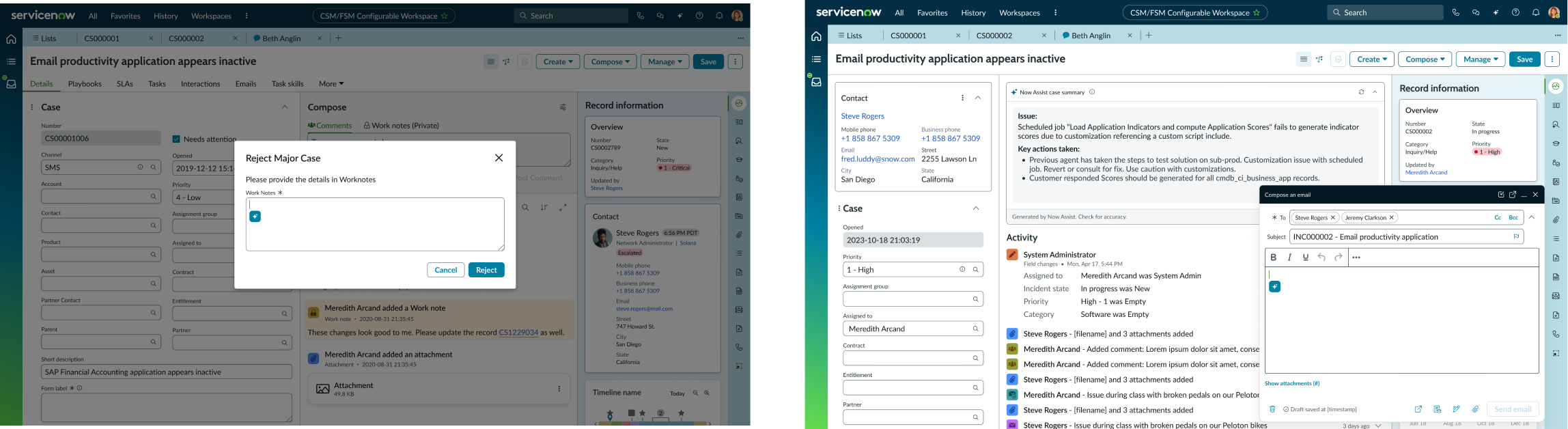
Example : Now Assist context menu for email refinement and Now Assist context menu for case summary
Example : Now Assist context menu for email refinement and Now Assist context menu for case summary
Variants
Learn about the variants of NAcm.
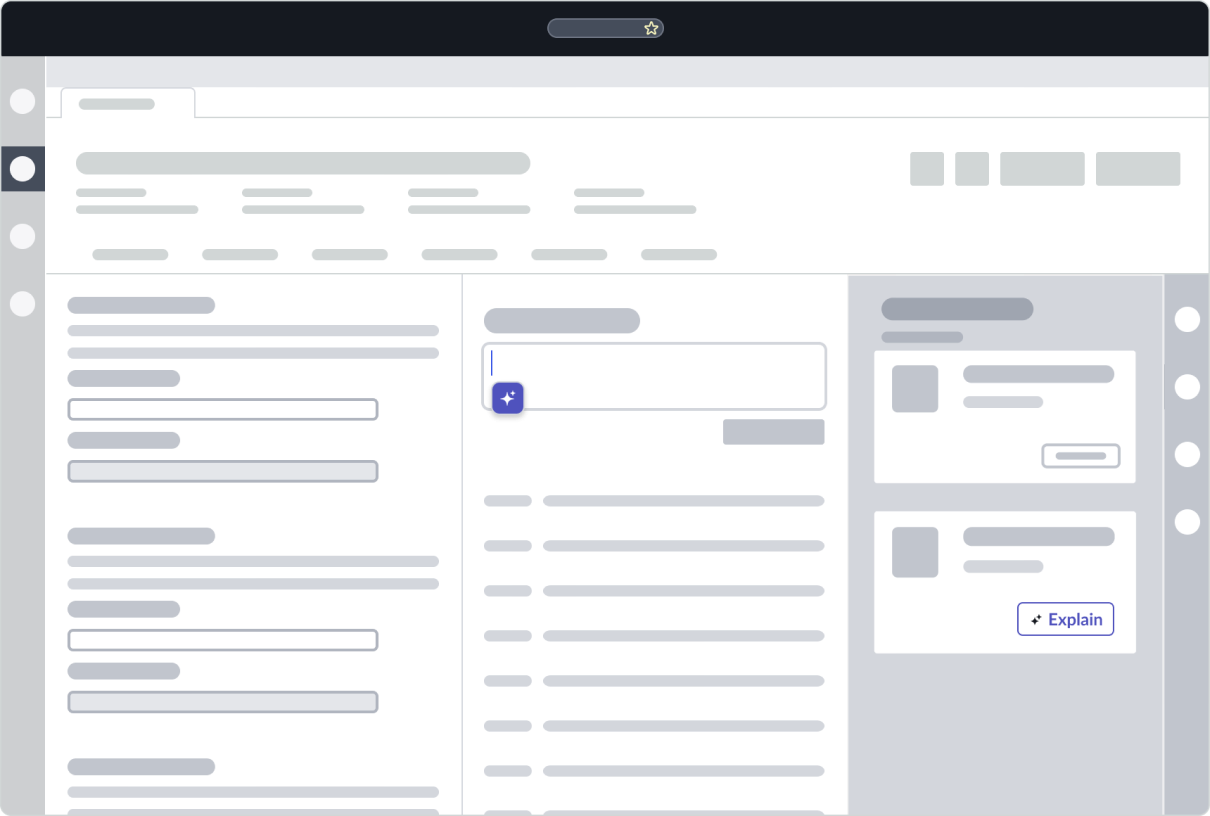
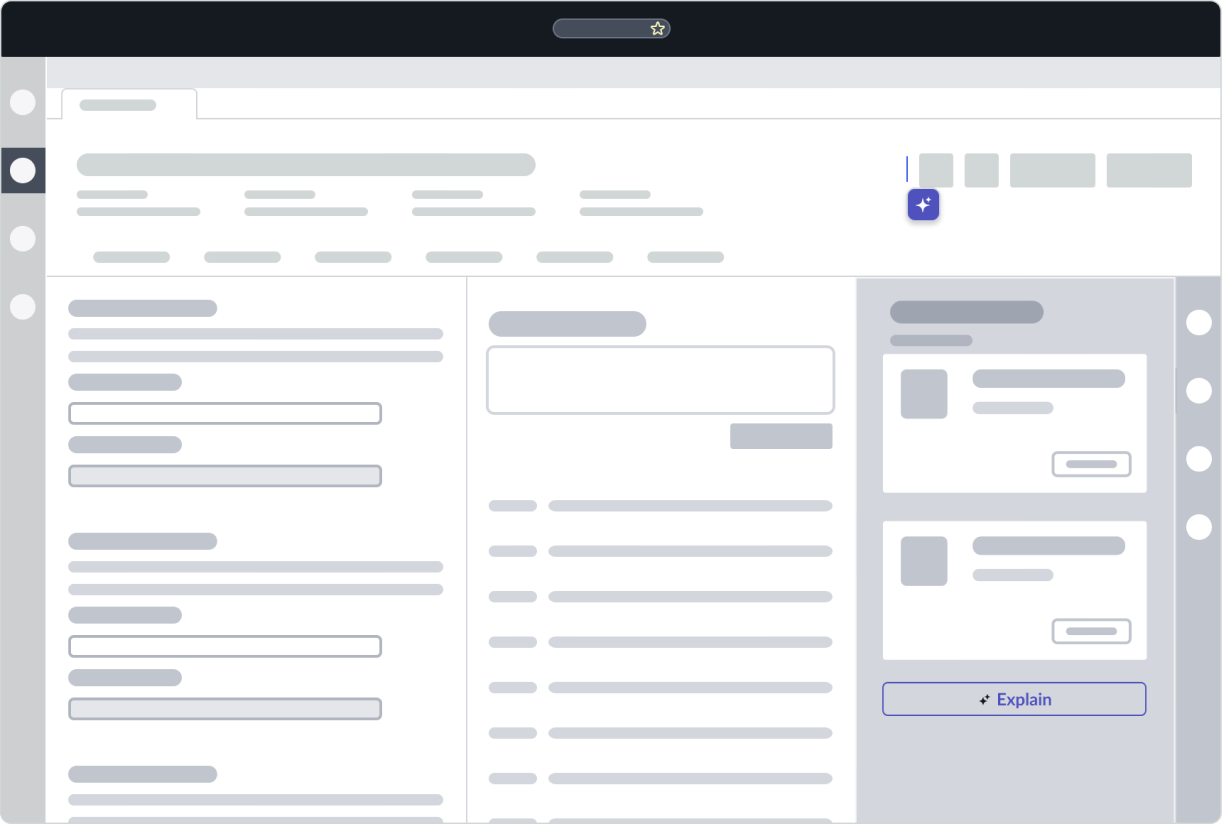
Draggable
You can use the draggable variant of NAcm to handle text generation use cases, such as elaborating or shortening text, where the context is focused on a single element on the page. such as email composition. The draggable variant’s recommendation dialog is a modal that can be resized by the user. The draggable variant lets the user perform the Now Assist actions on the entire text or a portion of the text. The Now Assist trigger moves with the user's cursor in the draggable variant.
Example of the draggable variant of NAcm in text field
Fixed
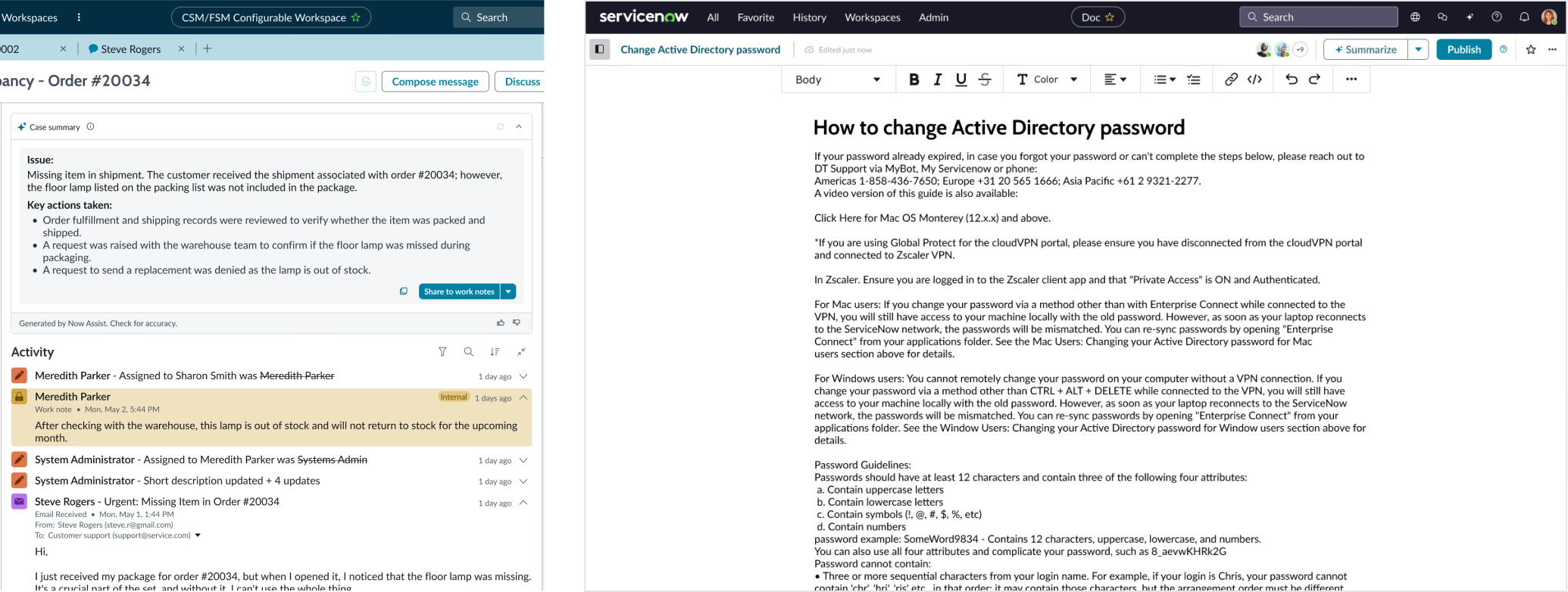
You can use the fixed or embedded variant of NAcm to handle summarization-based tasks where the context is information from multiple elements. For example, case summarization where the component generates content based on information from multiple elements like case type, dates, assignees, an so on. This variant includes refresh capability, which regenerates the content based on the latest available data.

Example of the fixed variant of NAcm
Configuration
Learn how to customize NAcm by configuring the available properties.
NAcm configuration
The context menu only supports the actions it’s configured to use. You can configure these actions by either selecting an activated available skill (Skill ID property), using out of the box available Now Assist configurations (Configuration ID), or a custom Now Assist configuration (NAcm configuration).
Trigger properties
You can configure and customize the trigger’s display properties like icon, size, tooltip, and so on.
Recommendation dialog properties
You can customize every aspect of the NAcm recommendation dialog, right from appearance (dialog size, labels, tooltips, and so on) to behavior (maximum refinements allowed).
Disable skeleton (Fixed variant only)
The fixed variant of NAcm appears as a part of the page, unlike the draggable variant that appears as an icon. You can select to load the NAcm component after the entire page has been loaded, but this can cause a layout shift throughout the page. To avoid a layout shift, you can load an inactive skeleton of NAcm along with the page by selecting the Disable skeleton property. In this state, users can see the component but not interact with it. It becomes active, or enabled, when the component is ready.
Design recommendations
Learn how to apply NAcm in your design.
In context with the component
Outside the component
Alignment and positioning
Learn how to place NAcm and any elements in your design.
Draggable variant
Place the NAcm trigger within the text area in your design. The NAcm recommendation dialog opens at the position of the NAcm trigger.
For creating worknotes and composing an email
Fixed variant
Place the NAcm card in an area where the user can spot it when the page loads. In elements such as forms or contextual panels, place NAcm at the top to enable users to view the summarized content easily. The following images show examples of the NAcm card in case forms, activity streams, and contextual side panels:
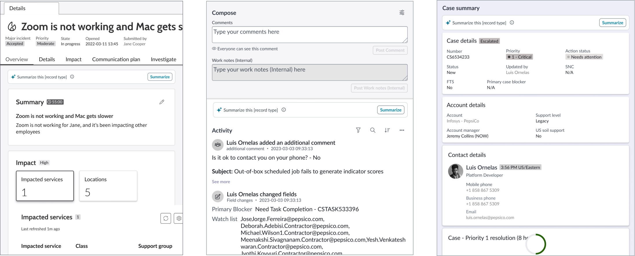
Above case form, Above activity stream, Inside contextual side panel
UI text guidelines
These are some recommendations for using text within NAcm:
- Use noun phrases in the present tense for titles (modal title in the draggable variant or NAcm titles in the fixed variant). For example: Case summary, Data analysis, and so on.
- Use verb phrases for call-to-action (CTA) button labels based on the action. For example: Refine, Rewrite, Generate summary, etc.
- Use noun phrases in the past tense for titles when showing the result of Now Assist actions. For example: Refined content, Generated summary, and so on.
Behavior
Learn how NAcm behaves when the display changes or a user interacts with the component.
States
NAcm has the following states: default, trigger, generating, results, error, hover, and click.Each variant handles states differently so the distinct states are listed based on the variant. Hover and click are handled the same by both variants so they are listed after the variant states.
Draggable variant
| State | Example |
|---|---|
| Default |  |
| Trigger | 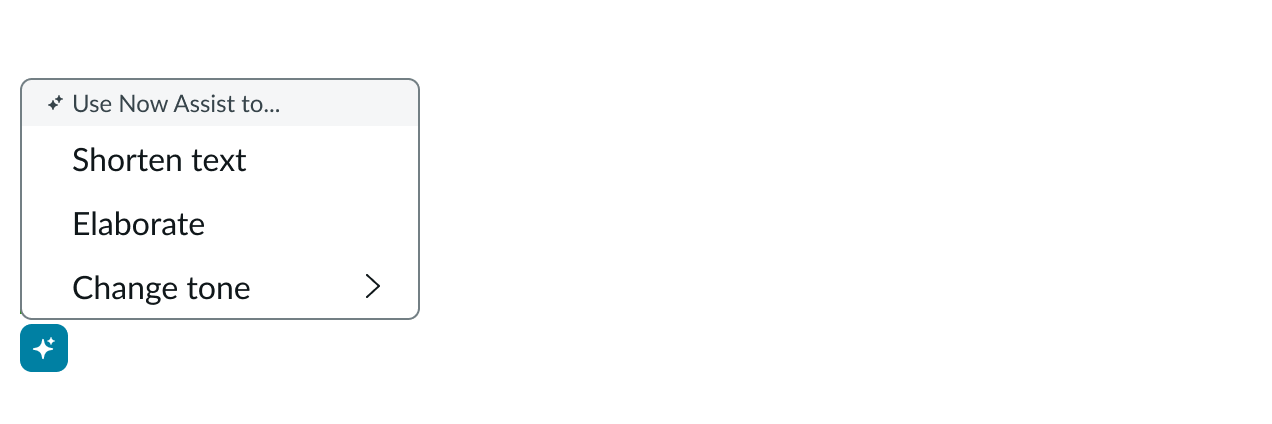 |
| Generating | 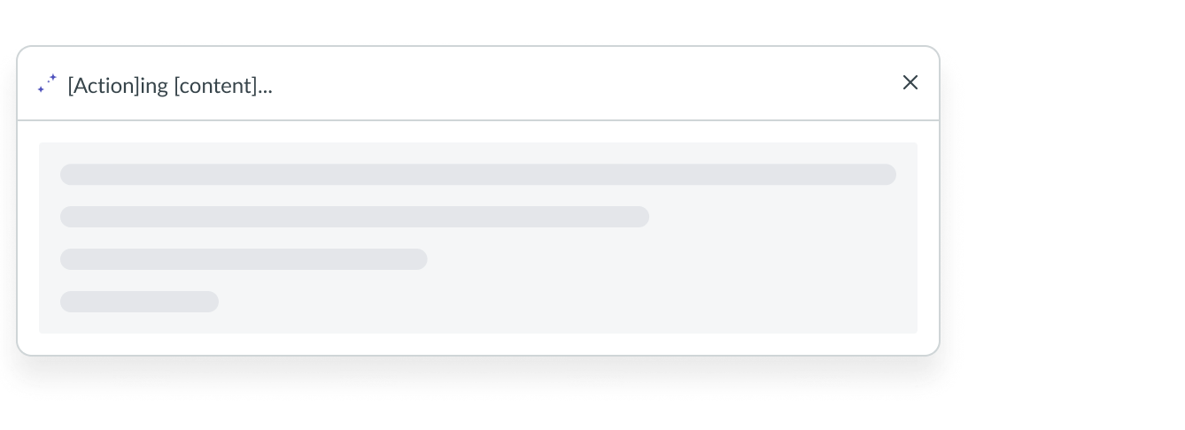 |
| Results | 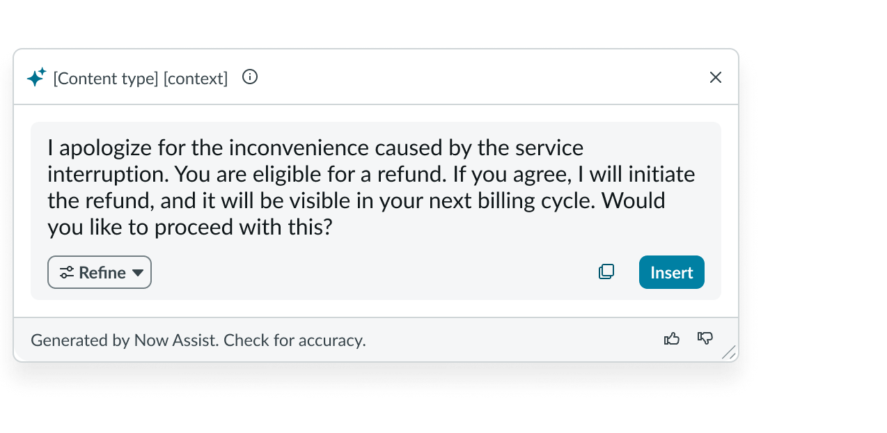 |
| Error | 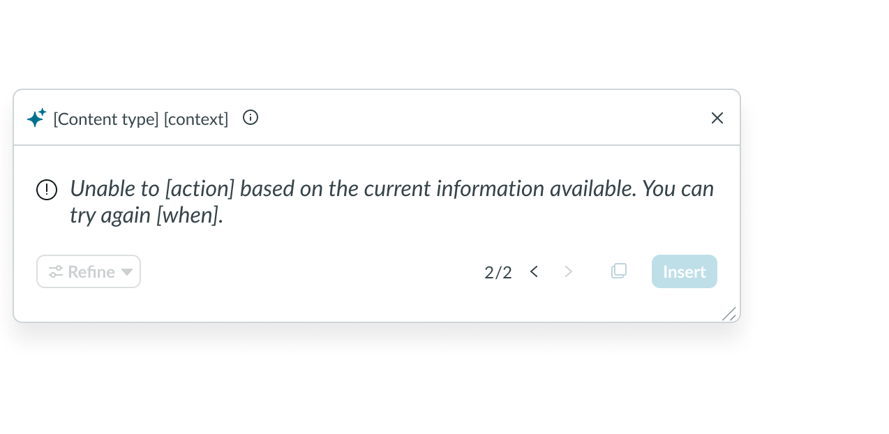 |
| Hover | 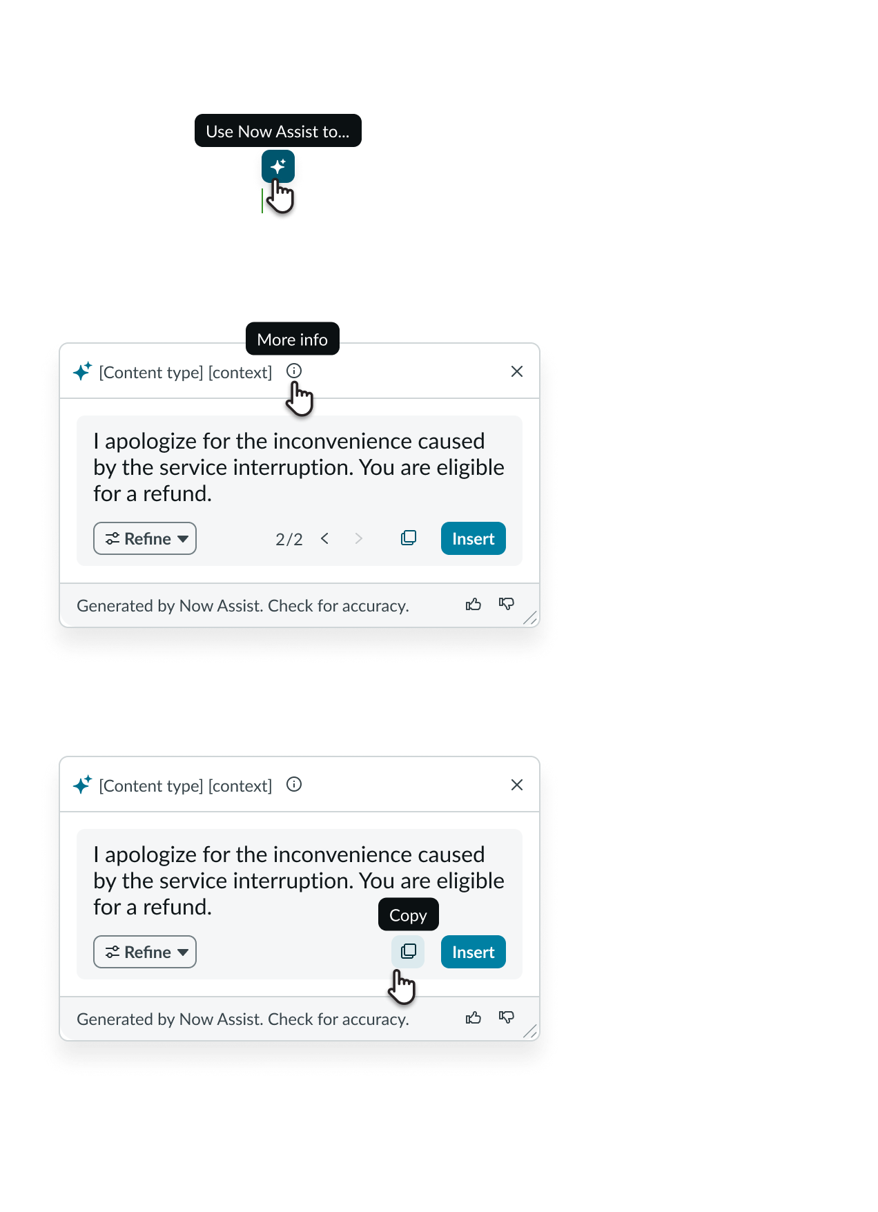 |
Fixed variant
| State | Example |
|---|---|
| Default |  |
| Generating | 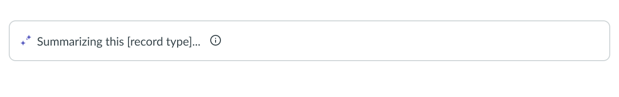 |
| Results | 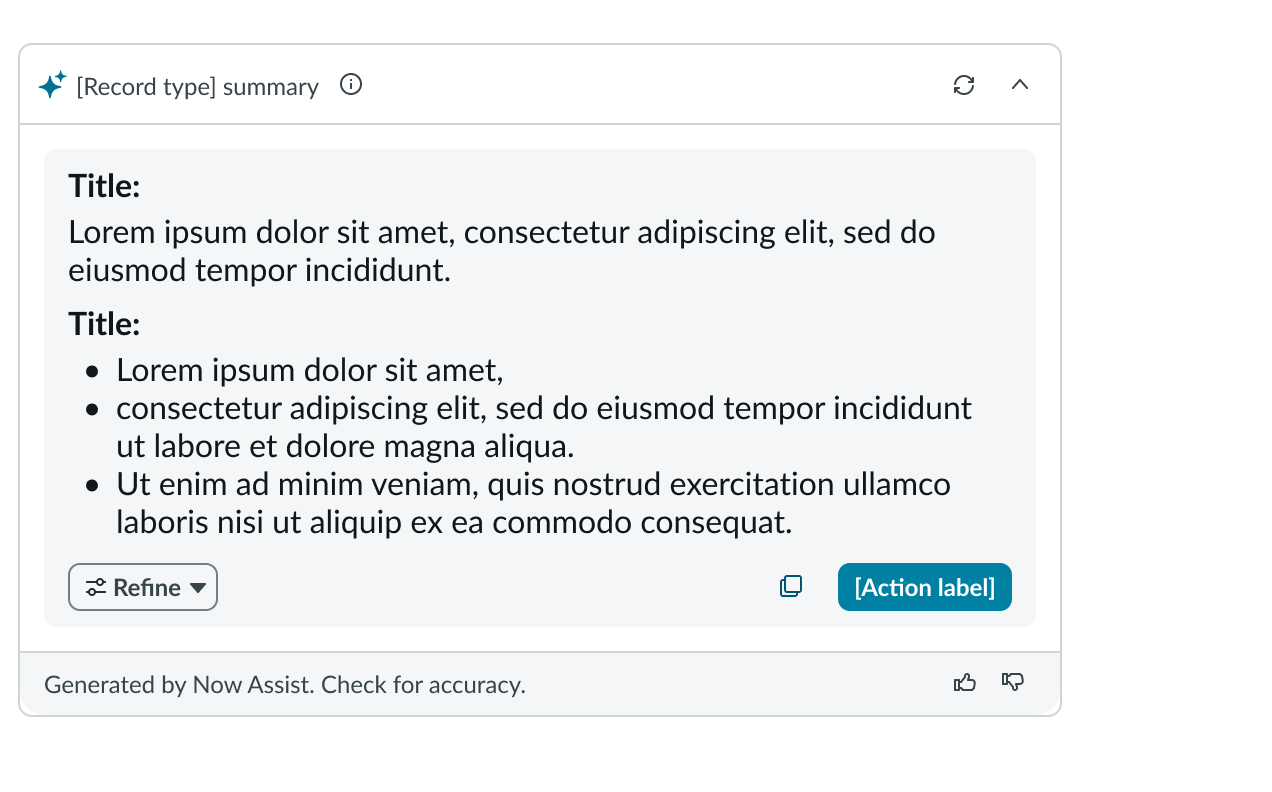 |
| Refining |  |
| Error | 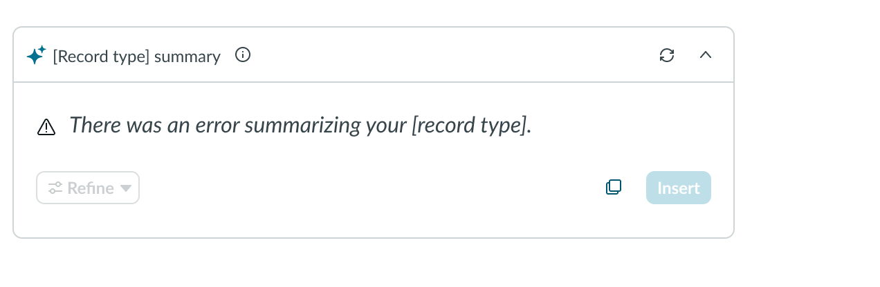 |
| Hover | 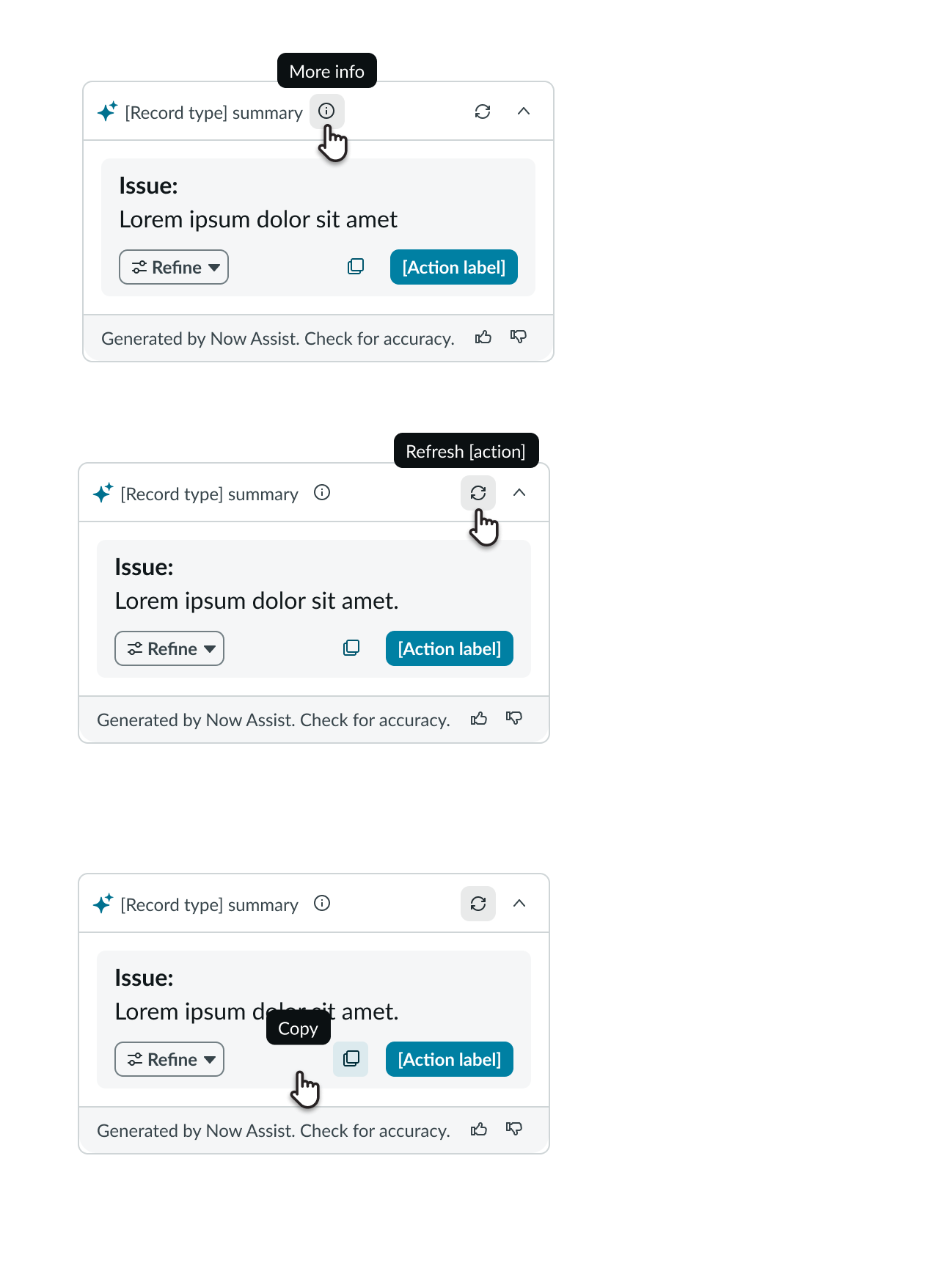 |
Interactions
Learn how NAcm responds when a user interacts with it.
Context menu actions
When the user selects the Refine button, a context menu showing the Now Assist actions displays. Upon selecting an action, NAcm generates content based on the selection action.
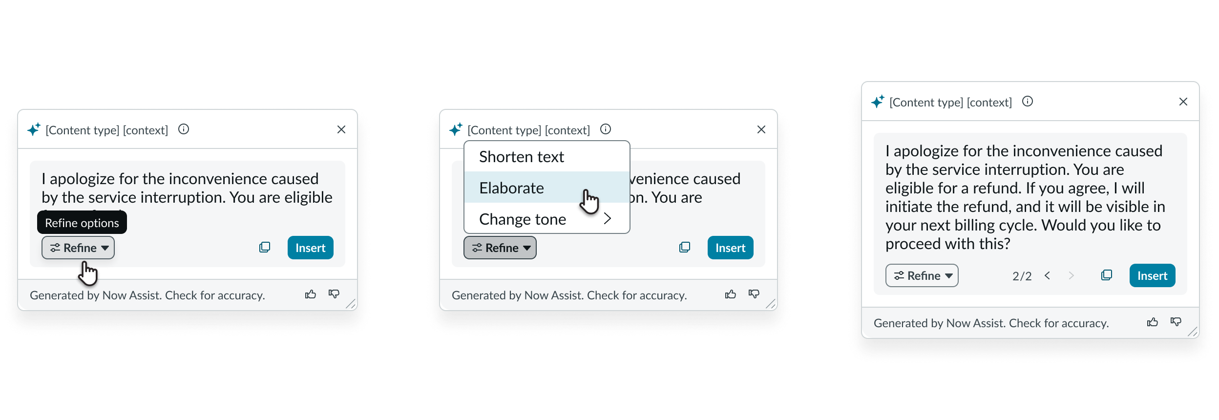
1. Hover on refine menu 2. Click on Menu and then click on action item 3.Content is updated and navigation appears
Dynamic versioning of generated content
The user can generate multiple multiple responses by selecting the Refine button. NAcm displays each version separately and the user can navigate between the versions using the arrows (< >).
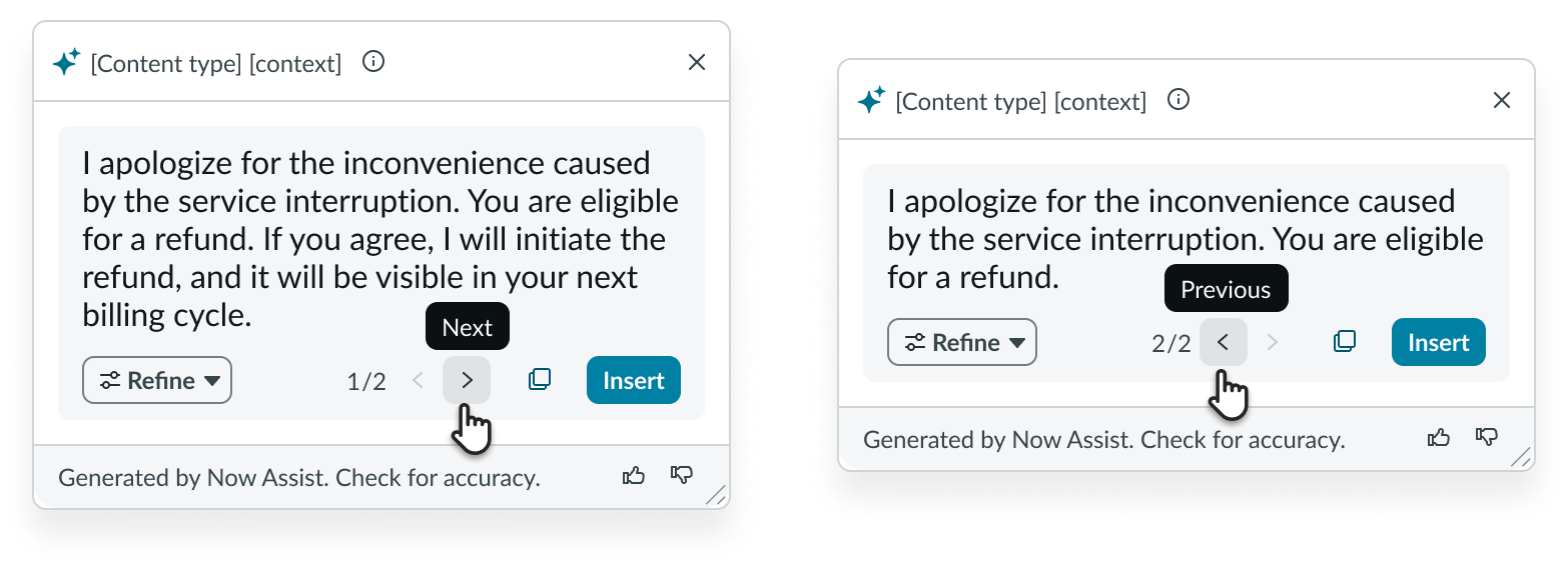
1. Select > to go to the next version * * 2. Select < to return to the previous version
Copy content
The user can copy the generated content by selecting the Copy button. This action copies the entire generated content. In cases where the user generates multiple versions, selecting the Copy button only copies content from the version currently on display.
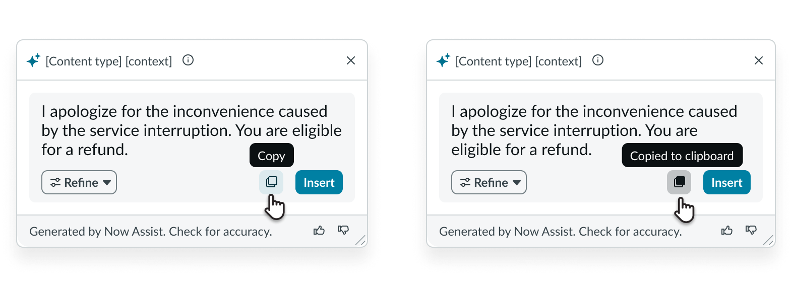
1. Hover on copy icon 2.Select the copy button
Refresh generated content (Fixed variant only)
The user can select the Refresh button to regenerate content based on an updated context when using the fixed variant of NAcm. In a summarization scenario, in which this variant is typically used, the user can generate an updated summary based on the changing context of the incident, task, or case which the component is configured to summarize. This shouldn’t be confused with the Refine feature, where only the component rewrites the existing generated content as a new version.
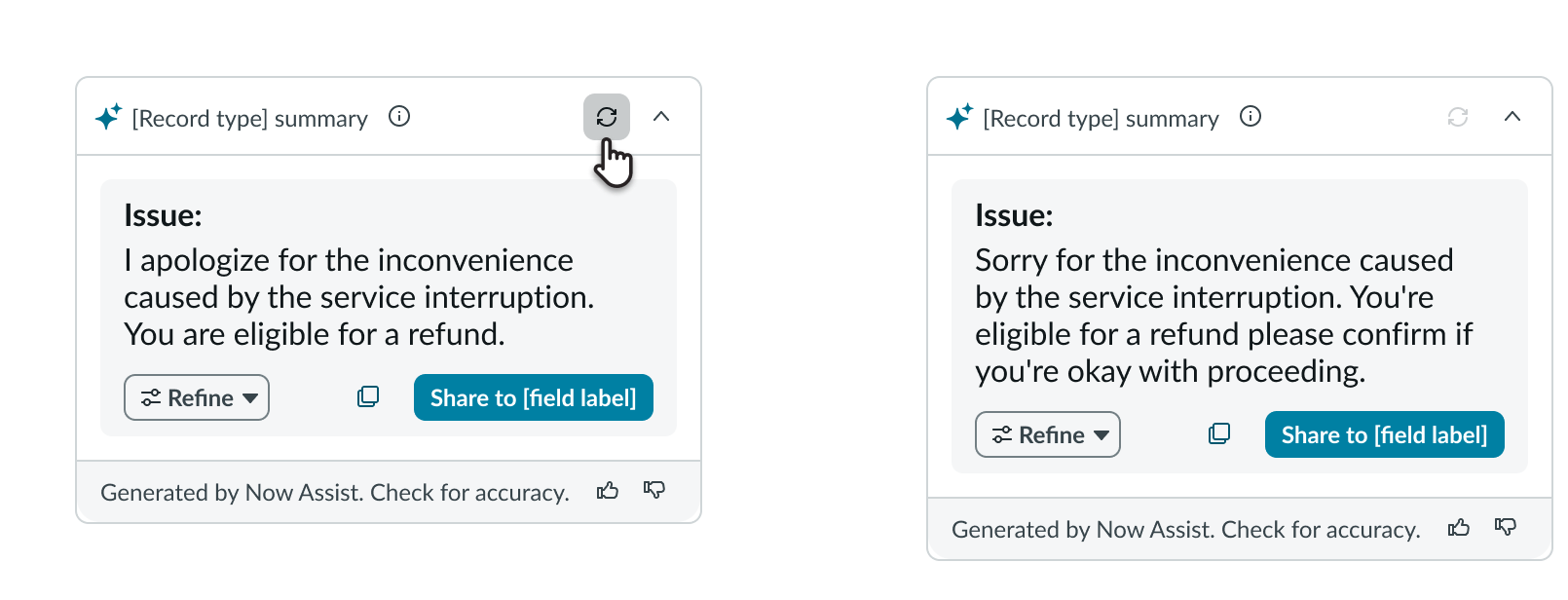
1. Select the Refresh button to regenerate summary 2. NAcm refreshes the content based on the latest data
Usability
NAcm complies with all internationalization and accessibility requirements.
Internationalization
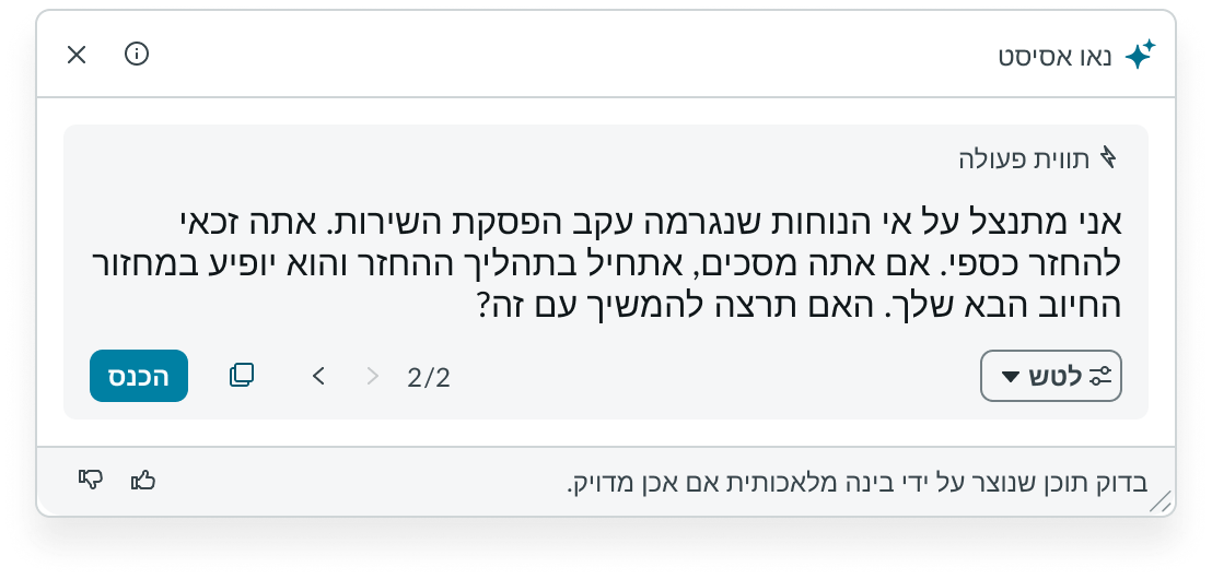
When this component is used in a platform configured for a right-to-left (RTL) language, all the elements in the recommendation dialog align from right to left.
Accessibility
Learn how to access the actionable elements of NAcm through keyboard interactions and screen readers.NAcm follows WCAG 2.0 guidelines.
NAcm tab order
Learn about the keyboard tab order of NAcm.
Draggable variant
Learn about the keyboard tab order of the draggable variant.
When focus is on the text area
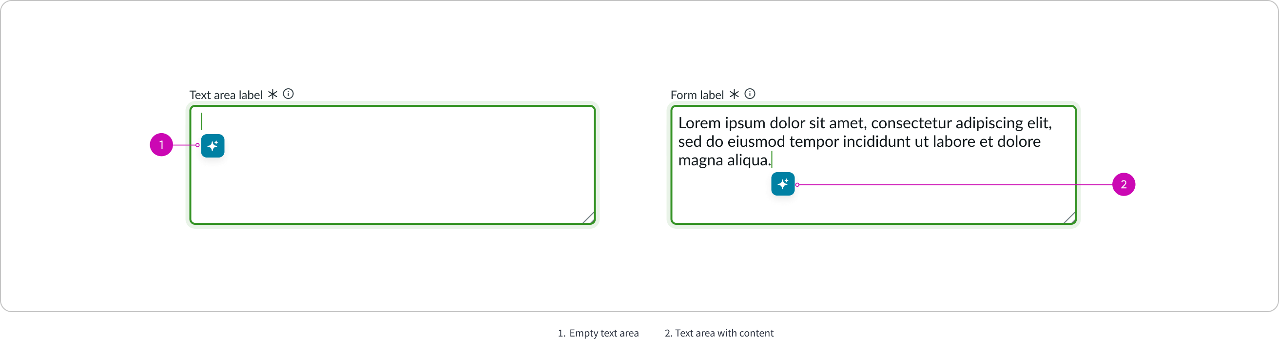
When the focus is on the context menu
1. Empty text area 2. Text area with content
When the recommendation dialog opens
Fixed variant
Learn about the keyboard tab order of the fixed variant.
When the focus is on the summary card
When the recommendation dialog opens
Keyboard interactions
Users can interact with NAcm using the keyboard. Keyboard interactions vary based on the NAcm variant.
Draggable variant
You can access the actionable elements of the draggable variant with these keyboard keys:
- Tab: Moves focus to the next element
- Shift + Tab: Moves focus to the previous element
- Enter/return: Triggers element action
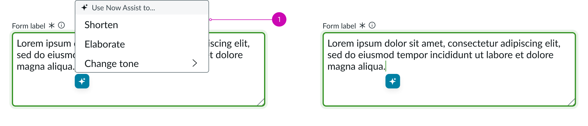
When the focus is on the actions context menu or the refine context menu
- Up or down arrow: Moves focus among the actions
- Enter/return/spacebar: Triggers the highlighted action
- Esc: Closes the context menu
Focus on the selectable elements like buttons, or version navigation arrows:
- Spacebar or Enter/return: Triggers the action for the element (opens context menu, copies content, closes the dialog, navigates between versions, etc.)
Focus on the recommendation dialog:
- Tab: Moves focus to the next element
- Esc: Closes the dialog
Focus on top-left corner of the recommendation dialog:
- Shift + any arrow: Drags the recommendation dialog in the direction of the arrow
Focus on drag-resize element of the recommendation dialog:
- Up or down arrow: Increases the height of the recommendation dialog
- Shift + Up or down arrow: Decreases the height of the recommendation dialog
- Left or right arrow: Increases the width of the recommendation dialog
- Shift + Left or right arrow: Decreases the width of the recommendation dialog
Fixed variant
You can access the actionable elements of the fixed variant with these keyboard keys:
- Tab: Moves focus to the next element
- Shift + Tab: Moves focus to the previous element
- Enter/return: Triggers element action
When the focus is on the refine context menu:
- Up or down arrow: Moves focus among the actions
- Enter/return/spacebar: Triggers the highlighted action
Focus on the selectable elements like buttons, or version navigation arrows:
- Spacebar or Enter/return: Triggers the action for the element (opens context menu, copies content, closes the dialog, navigates between versions, etc.)
Focus on the recommendation dialog:
- Tab: Moves focus to the next element
- Esc: Closes the dialog
Focus on top-left corner of the recommendation dialog:
- Shift + any arrow: Drags the recommendation dialog in the direction of the arrow
Focus on drag-resize element of the recommendation dialog:
- Up or down arrow: Increases the height of the recommendation dialog
- Shift + Up or down arrow: Decreases the height of the recommendation dialog
- Left or right arrow: Increases the width of the recommendation dialog
- Shift + Left or right arrow: Decreases the width of the recommendation dialog
Screen readers
Screen readers follow the standard tab order. For left-to-right (LTR) and right-to-left (RTL) languages, tab order begins with the first element.