

Anatomy
Learn about the individual parts of Schedule recurrence.
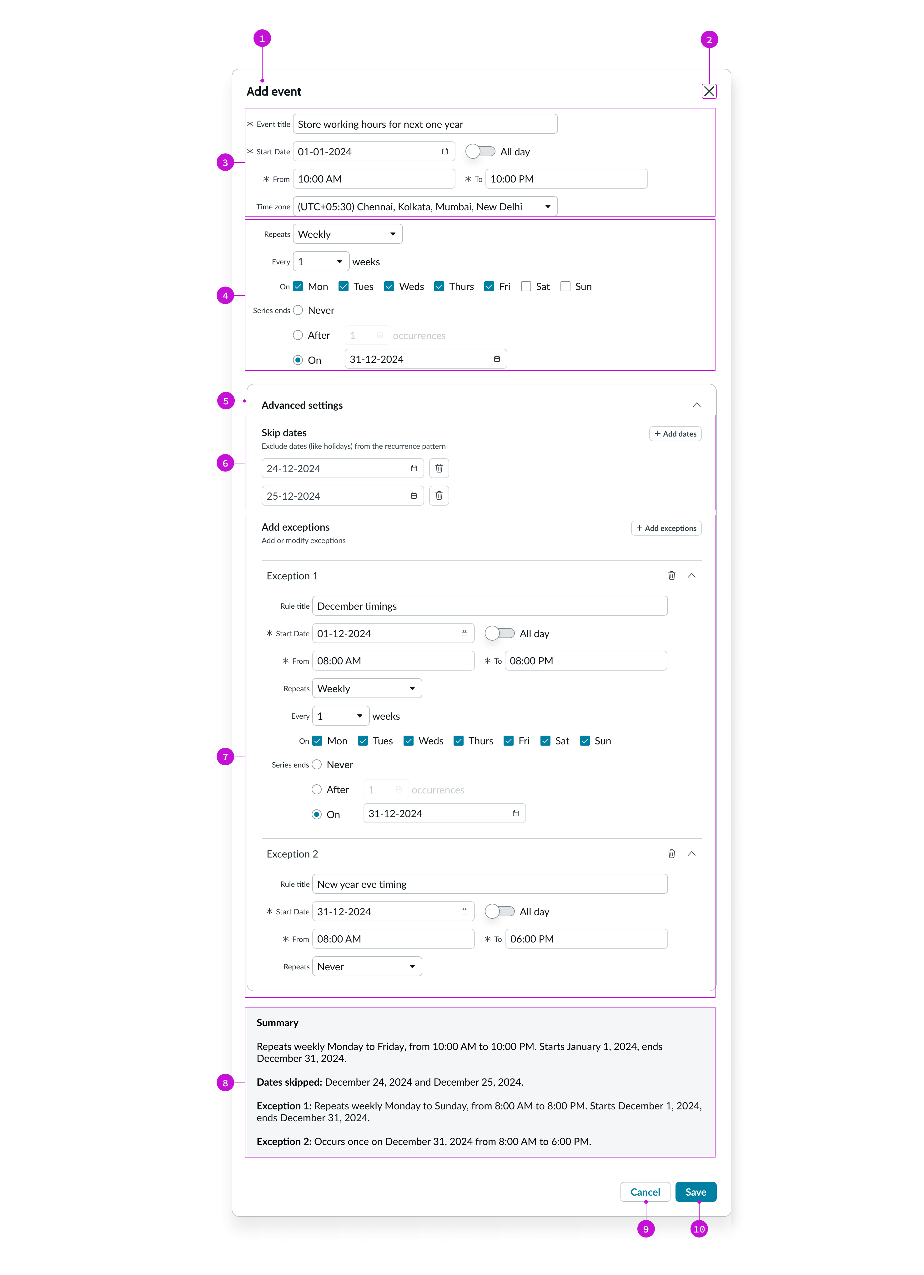
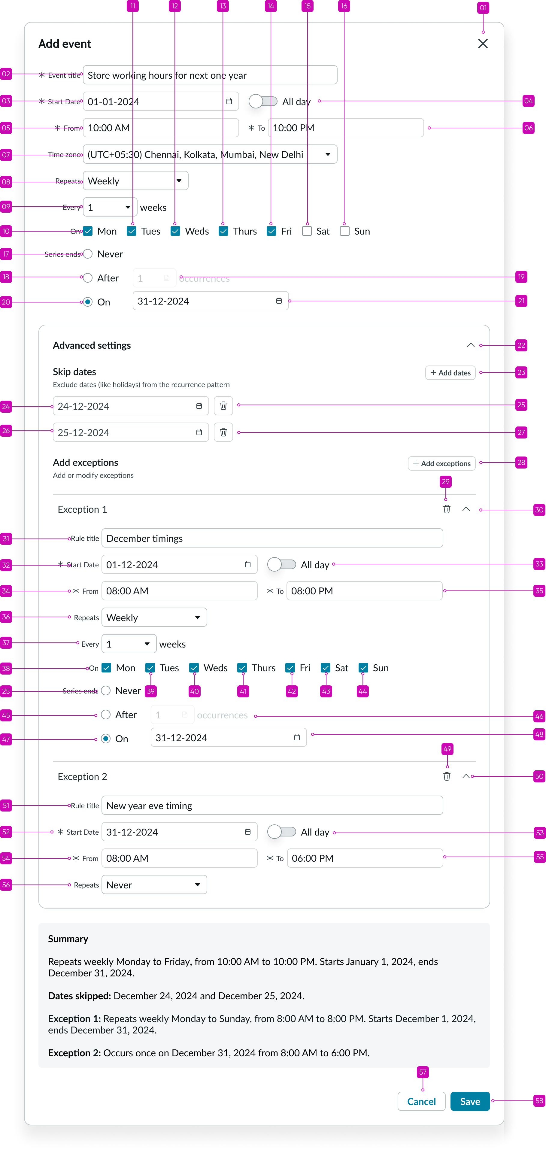
- Header: Title for the Schedule recurrence modal
- Close button: Closes the Schedule recurrence modal
- Event details section: Section to configure event details like event title, start date, time, and so on
- Recurrence pattern: Section to configure the recurrence settings like repeat frequency and series end date
- Advanced settings section: Section to add advanced settings like skip dates and exception rules
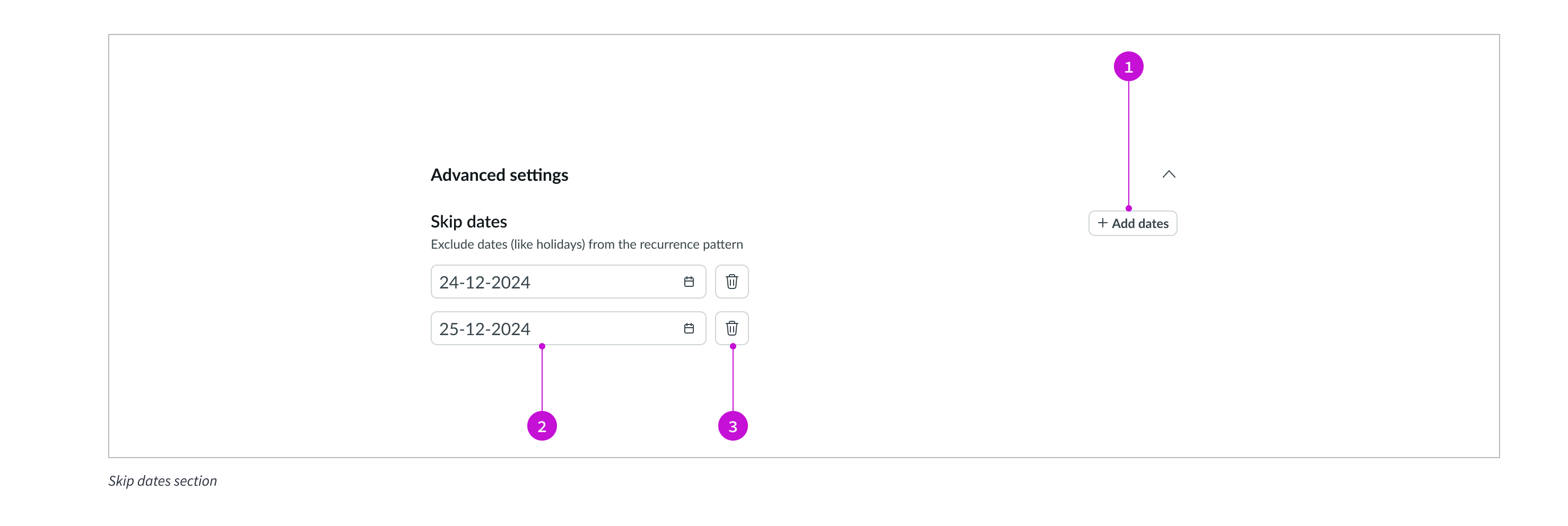
- Skip dates section: Section to configure skip dates for the recurring event
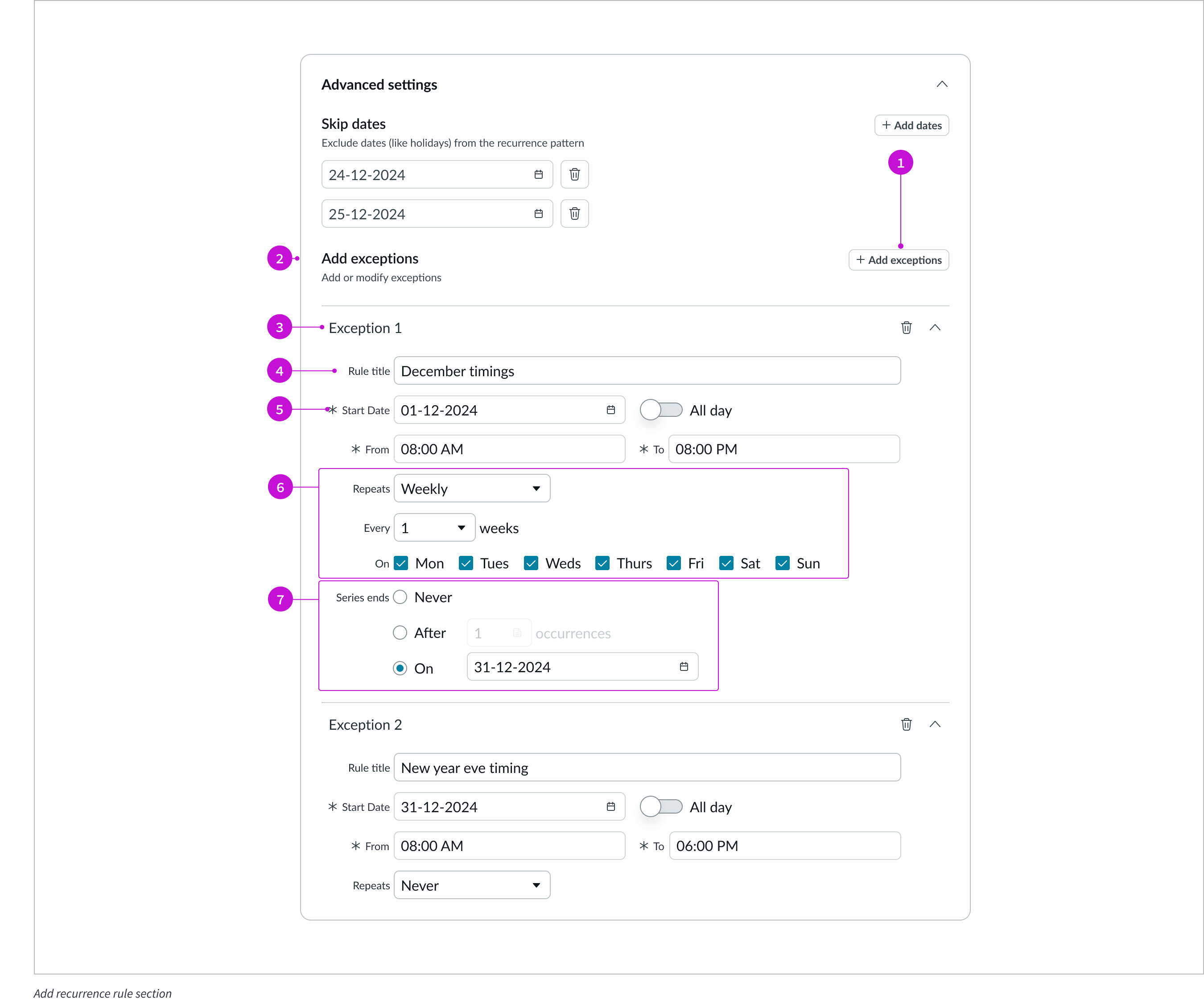
- Exception rules section: Section to add exception rules for the recurring event
- Summary section: Displays a summary of the event, including recurrence patterns, skip dates, and exception rules
- Cancel button: Closes the modal without saving changes
- Save button: Saves the event with the configured recurrence settings
Subcomponents
See the usage guidelines for Accordion.
See the usage guidelines for Button.
See the usage guidelines for Button iconic.
See the usage guidelines for Checkbox.
See the usage guidelines for Date-time.
See the usage guidelines for Input.
See the usage guidelines for Modal.
See the usage guidelines for Radio button.
See the usage guidelines for Select.
Usage
Use Schedule recurrence on a page where the user needs to configure events that repeat frequently (daily, weekly, monthly, or yearly).
Configurations
Learn how to customize Schedule recurrence by configuring the available properties.
Presets and controllers
This component contains a preset configuration that automatically configures properties and event handlers for a component, making the component ready to work when you add it to a page. A preset is designed to suit a specific use case. However, you can override preset property values with a custom configuration if you find it necessary for your design. Preset values that you override aren’t upgraded when updates are available. If you don’t want to use the preset values provided, select the option to configure the component manually. You can apply one preset to a single instance of a component on a page. For more information, see Presets.
A preset is always associated with a controller, which acts as a data resource for the component. Controllers provide the configuration data and event bindings the component needs to function in your experience. By selecting a preset, the required controller is added to the page. By adding a controller to the page, any new applicable components will have that controller's preset. For more information about how controllers work, see Controllers. For instructions on using the data inspector to view the default presets for a component, see View properties and events in the Controller API.
Basic configuration
Users can use the Schedule recurrence component to create events that recur daily, weekly, monthly, or annually using the Repeat type property. Users can also configure when the recurring event ends by specifying event count or the last date for the event to occur. Users can also configure one-off events by specifying the repeat type as Never. The user is required to specify the start and end times of the event; however, if the event is an all day event, the user can do so too. In that case, the user only specifies the start time and date.
Advanced configurations
Users can configure Schedule recurrence to add skip dates and exception rules for the recurring event. Skip dates specify the dates on which to skip the recurring event. For example, if an event is set to recur on the third every month, and the day in a particular month coincides with the weekend or a public holiday, the user can configure the component to skip this day.
Users can configure exceptions to override skip date rules. Users can add multiple exception rules, and delete or modify an exception rule.
Behavior
Learn how Schedule recurrence behaves when the display changes or a user interacts with the component.
Resizing
All the sub-components in Schedule recurrence resize based on the width of the container or modal. So, the user experience is uniform when the component is viewed on a mobile screen.
Reflow
Content reflows based on the responsive behavior of the component.
Interactions
Learn how Schedule recurrence responds when a user interacts with it.
Date selection
Users can select date input fields to display the date picker for selecting dates. Alternatively, users can input the dates directly in the date field following the configured date format.
Recurrence selection
Users select the Repeats drop-down to select a recurrence pattern. Additional fields appear based on the user’s selection in this drop-down.
All day event toggle
Users enable the All day toggle to configure events covering the whole day. Enabling the All day toggle makes the To field appear. Users specify the end of the all-day event by selecting a date from the To field. All day events are dependent only on dates, and not time, so the time-related fields disappear when the All day toggle is enabled.
Advanced settings accordion
The advanced settings section appears in the expanded or collapsed form on component load based on configuration. Users can select the corresponding accordion to expand or collapse the advanced settings section. This section contains settings for skip dates and exceptions.
Skip dates addition
The Skip dates section has one date field by default. The user selects the Add dates button to add more skip dates in the recurring event’s configuration.
Exception addition
Users select the Add exceptions button to add exception rules. When the user selects the Add exceptions button, the exceptions section appears. This section has an accordion that the user can select to expand or collapse an exception rule. There is also a delete button adjacent the accordion to enable users to delete an exception rule.
Usability
Standard introduction
Schedule recurrence complies with all internationalization and accessibility requirements.
Internationalization
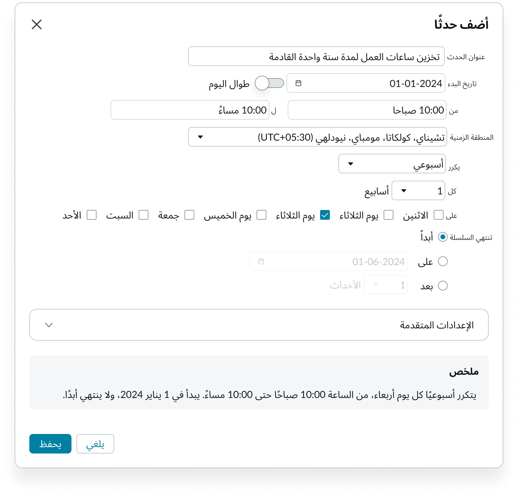
When this component is used in a platform configured for a right-to-left (RTL) language, the text, options, and buttons align right to left.
Accessibility
Learn how to access the actionable elements of Schedule recurrence through keyboard interactions and screen readers.
Schedule recurrence tab order
This is the high-level tab order for Schedule recurrence.
Note: For tab stop information about sub components of Schedule recurrence, see the individual component usage guidelines.
Keyboard interactions
Users can interact with Schedule recurrence using the keyboard.
You can access the actionable elements of Schedule recurrence with these keyboard keys:
- Tab: Moves focus to the next element in Schedule recurrence
- Shift + Tab: Moves focus to the previous element
- Enter/return: Triggers element action
When the focus is on a text input field:
- Left or right arrow: Moves the cursor across the available text
- Shift + control or shift + command: Selects text
- Shift + left or shift + right arrow: Selects one character at a time
When the focus is on date input:
- Down arrow: Expands the date picker
When the focus is on drop-down:
- Enter: Expands and collapses the drop-down
- Up or down arrow: Moves focus between the options in an open drop-down menu
- Shift + up or shift + down arrow:
- Shift + left or shift + right arrow:
When the focus is on drop-down menu options:
- Up or down arrow: Moves focus between the options
- Enter: Selects the option and closes the drop-down menu
- Escape: Closes the drop-down menu and moves focus to the next field
- Home: Selects the first option
- End: Selects the last option
When the focus is on checkbox:
- Space: Selects or deselects the checkbox
When the focus is on radio buttons:
- Arrow keys: Move focus to the next or previous radio button
- Space: Selects the radio button in focus
When the focus is on accordion:
- Space or Enter: Expand or collapse the accordion
When the focus is on icon or buttons:
- Space or Enter: Activates the button or icon action
Screen readers
When you apply ARIA labels to a component, screen readers announce the controls and content of Schedule recurrence in the prescribed tab order.