

Anatomy
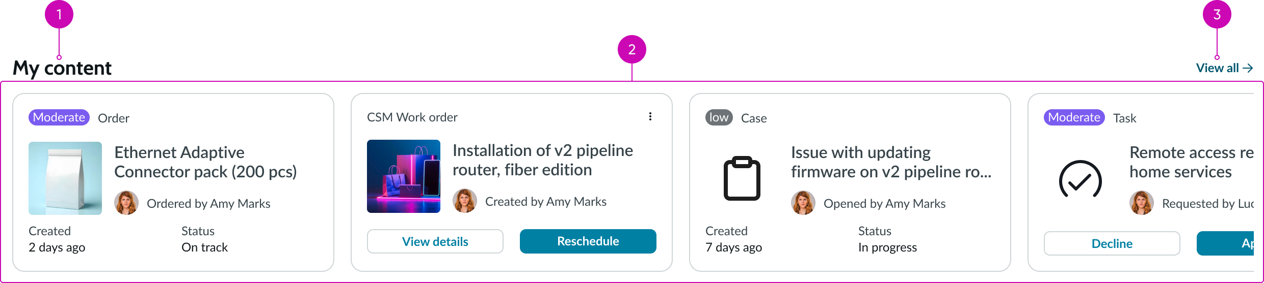
- Title: Short descriptive name for this set of records; this may describe either the type of records that this set represents (e.g., tasks, requests, etc.) or the content itself (e.g., taxonomy level, topic, etc.)
- Content area: Scrollable area for displaying a configured set of records; this content is always displayed using card components, and the number of cards is dependent on the quantity of data configured in the data source.
- View all button (optional): Configurable button that opens the full set of records, such as a topic landing page or a pre-configured list page with a data set component.
Subcomponents
See usage guidance for button bare
See usage guidance for contact card
Usage
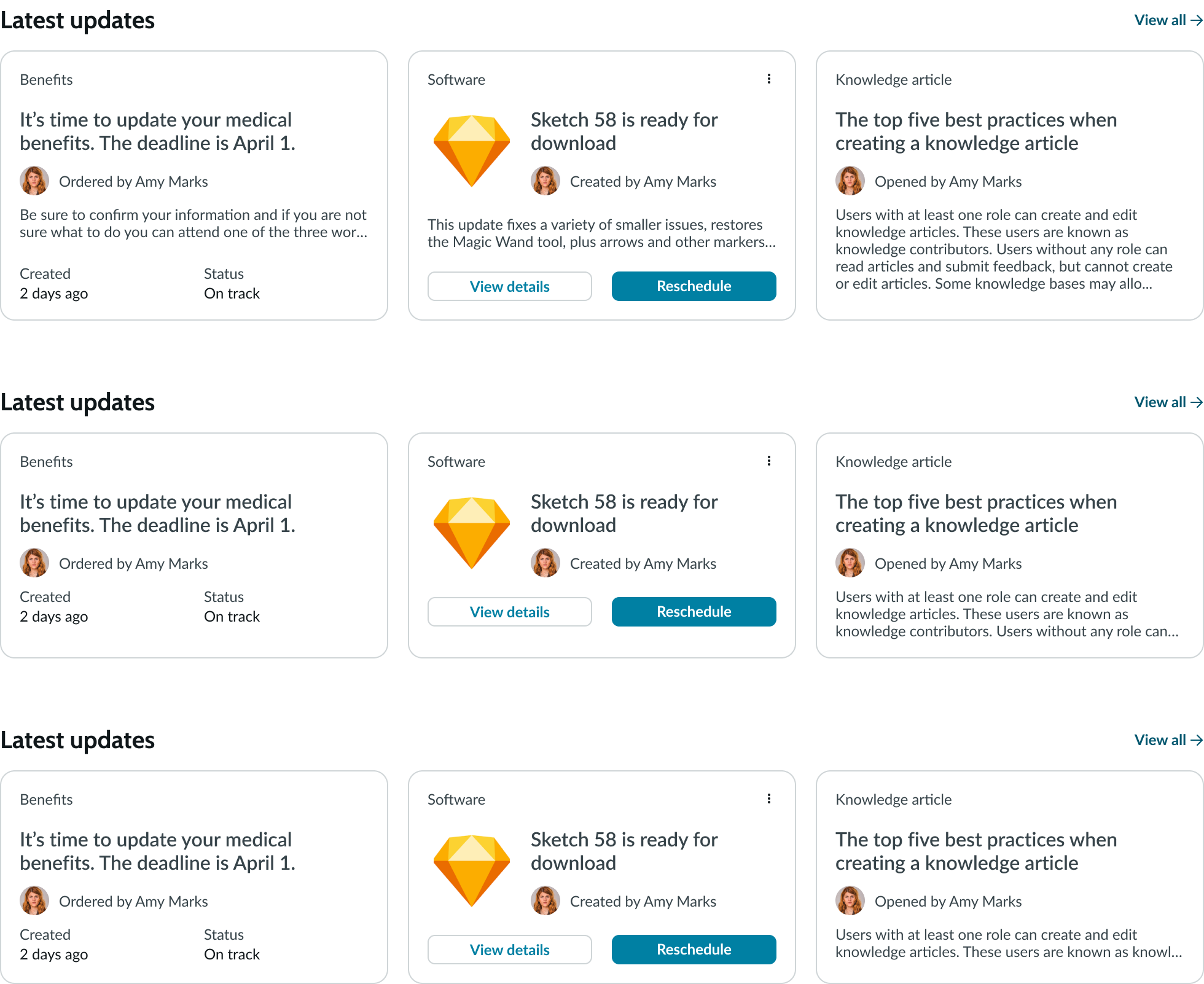
Use the data row component for custom landing pages or home page scenarios. You can use data row to display dynamic content, such as user-specific requests or tasks that require quick access. You can use data row to display a pre-defined subset of a larger set of records. This presents a curated view of the content without requiring the user to load the entire data set.
Other uses might be to promote popular articles or the most recent articles in a specific topic. Another typical use is to present commonly requested catalog items.
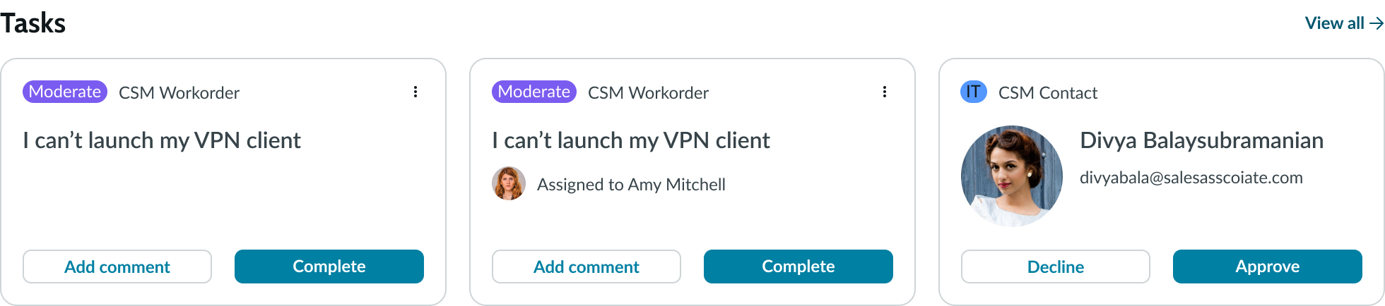
In this example, a data row displays user tasks.
Configurations
Learn how to customize data row by configuring the available properties.
Display options
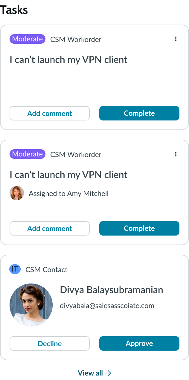
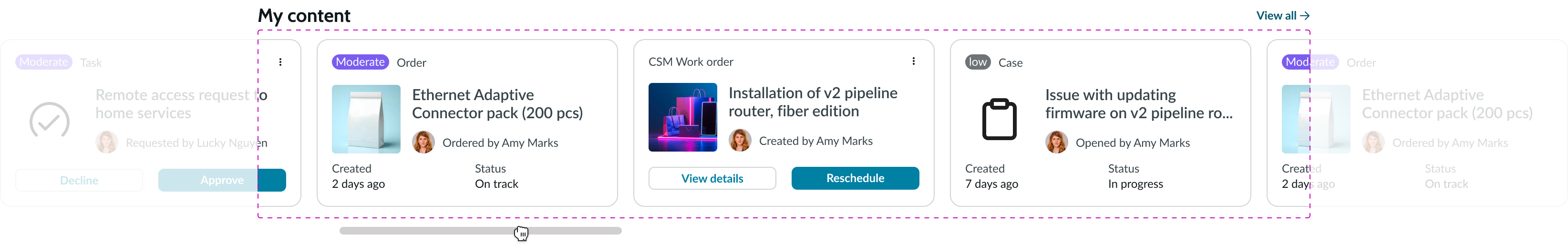
You can configure data row to display vertically or horizontally. By default, data row shows all the cards returned from the data source. You have an option to set a maximum number of cards to display at once in the horizontal configuration without scrolling. Depending on the usage, it may be more appropriate to display a single column of content instead of a horizontal row.
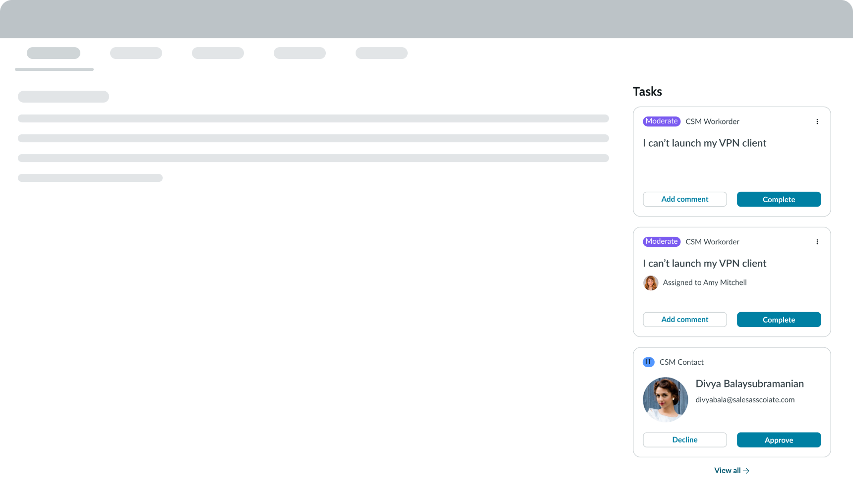
This is especially helpful in situations where supplemental or related content may be contextually relevant or useful. For example, if there are additional articles or catalog items associated with content, these can be displayed prominently, to the right of the article.
View all button
You can configure the button with an appropriate label for the action. This button is not displayed by default.
Empty state
You can configure data row to hide the entire component container when there are no applicable data records to display. This helps prevent usability or page layout issues. You can also create an empty state message that displays when no data is available.
Card height
Depending on your use case or design preference, you can configure small, medium, or large cards. Sizing applies to height only. The card width adjusts automatically, depending on the size of the container. However, this is affected by the properties controlling the number of cards to display in a single view and the minimum card width. By default, data row uses medium-sized cards for both content and record card types.
Examples of card sizes from large to small, starting from the top.
Behavior
Learn how data row behaves when the display changes or a user interacts with the component.
Responsive behaviors
For horizontal rows, if all the cards can't be displayed at once, a scroll bar provides access to the overflow cards. The content area defines what is currently visible, and any part of the cards that goes beyond the container edge is hidden.
Interactions
A user can select a card to view a single record, or they can select the View all button to navigate to a page containing a list of all the associated records that this group represents.
Single card selection
When the user selects a single card, the record opens within the same browser window. Typically, the entire card is a clickable area. However, there are times where cards may have actions associated with them. For example, a group of tasks may include cards with Approve or Reject actions, enabling the user to approve or reject a request without having to navigate to the record itself.
View all records
The View all button enables you to create a link to a custom list or data set page containing an expanded view of a content group. This is usually a page that already exists and has been defined by the administrator.
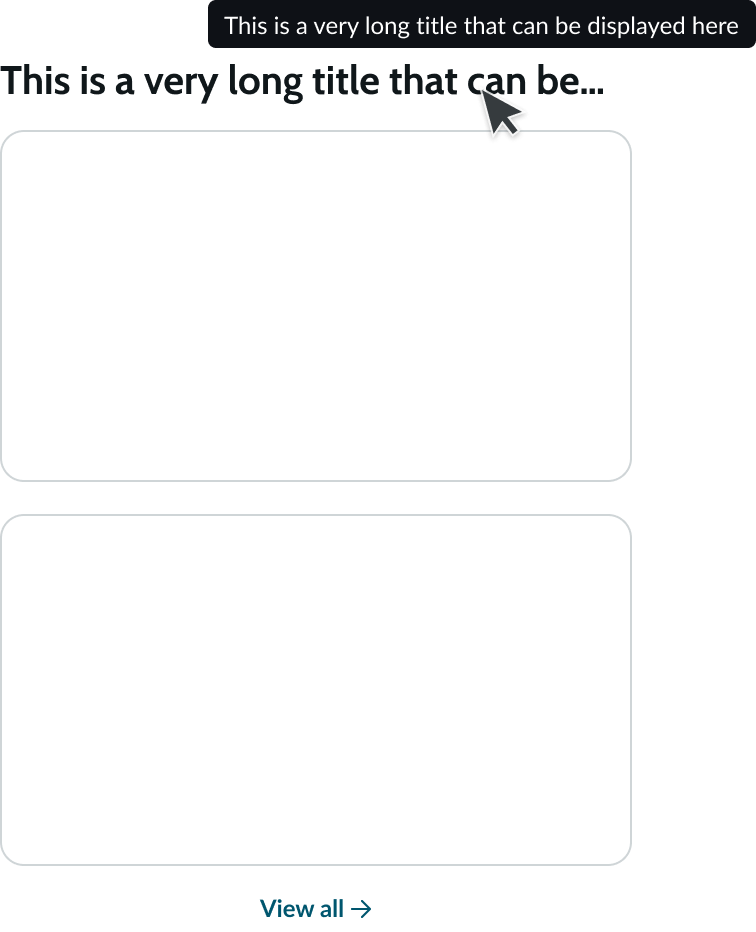
Truncation
Long titles truncate with an ellipsis. However, depending on the available width of the container, additional truncation may also occur in vertical implementations of the component. A tooltip displays the full title on hover.
Usability
Data row complies with all internationalization and accessibility requirements.
Internationalization
When data row translates to a right-to-left (RTL) language, the title and View all button switch positions. The behavior of the card contents for an RTL language is controlled by the card component. See the usage guidelines for details.

Accessibility
Learn how to access the actionable elements of data row through keyboard interactions and screen readers.
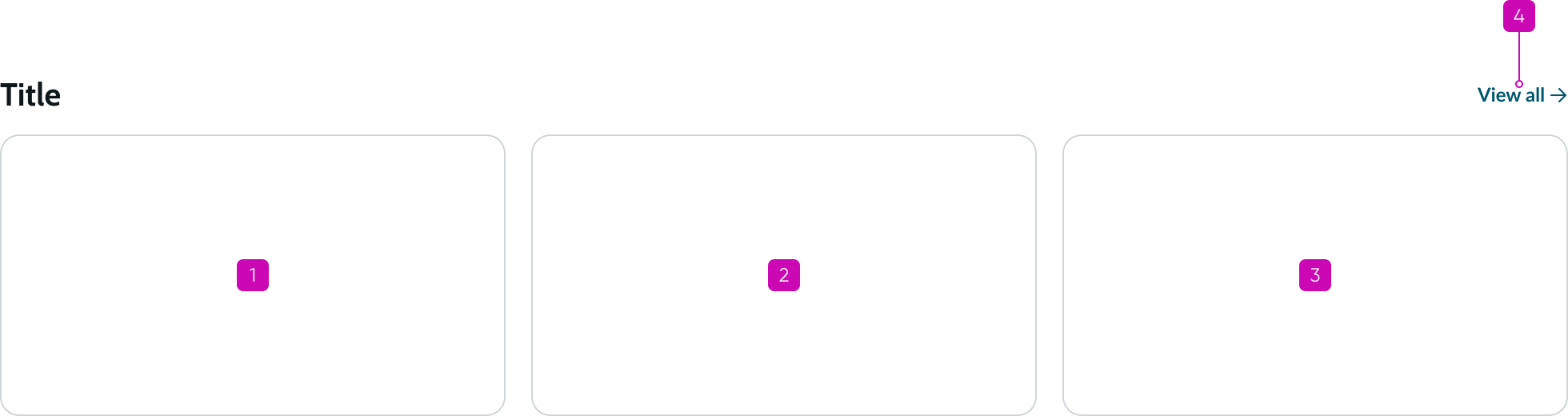
Data row tab order
This is the tab order for data row.
Keyboard interactions
You can access the actionable elements of data row with these keyboard keys:
- Tab: Follows the tab order of cards from left to right; when focus is in a card, tabs through focusable elements in that card
- Enter: Performs the action on a focused element; shifts focus into a card and executes any functionality in that card
Screen readers
Screen readers follow the tab order of the data row component, starting with the first card in the record set. For left-to-right languages, the first card is on the left. In RTL languages the first card is on the right. The ARIA accessible names for each card depend on the card's content. The ARIA accessible names for the View all button are: View All and Link.