

Anatomy

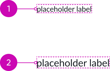
- Container: Encloses the label text; includes padding to mask the animation of item sets
- Label text: Contains the text
Subcomponents
See the usage guidelines for stylized text.
Usage
Carousel text displays rotating text messages with animated transitions during loading processes. Configure multiple messages to provide real-time status updates and reduce perceived wait time.
Configurations
Learn how to customize carousel text by configuring the available properties.
Items
The component cycles through the provided labels in each item set in order, displaying one label for 3 seconds at a time with animated transitions between them. The available labels in the set loop continuously until interrupted or the loading completes.

In this example, with one label in the item set, the text remains static with no further animation.

In this example, with multiple labels in the item set, each label displays one at a time.
Content updates interrupt the current rotation sequence and trigger an immediate transition from the label currently displayed to the first label of the next item set.
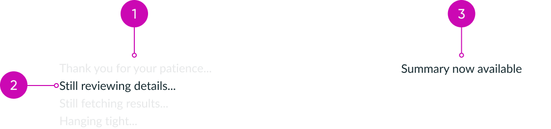
- Item set with multiple labels: cycles through rotation sequence
- Currently displayed label: upon content update, transitions to the next item set
- Item set with single label: remains static
CSS
You can apply custom CSS to the text inside the carousel text.
Height
The height of the component is determined by the line height of the font size.
- Carousel text with 12px font and 16px line height
- Carousel text with 16px font and 20px line height
Width
If there is no width set, the component expands only as wide as the content.

If the width is set larger than the content, the component expands.
Align text
Set the text alignment to left, center, or right.

In this example, the text-align property is set to: left, center, and right.
Design recommendations
Learn how to apply carousel text in your design.

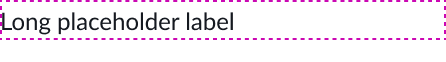
Keep labels short and adjust the width to avoid truncation.

Avoid longer labels and width adjustments that result in the label truncating.
Alignment and positioning
Learn how to place carousel text and any elements in your design.
Full-page loaders
Display carousel text below the loader custom animation when creating center-aligned experiences like full-page loaders.

Inline loaders
Use carousel text for inline loading patterns where the content is left-aligned.

UI text guidelines
These are some recommendations for using text within carousel text:
- The number of messages should be based on the estimated average load time
- Consider adding one new message for every 4 seconds of expected load time
- For load times under 4 seconds, use a single, concise message
- For load times under 12 seconds, avoid repeating messages
- To reduce user uncertainty, use context-specific updates instead of generic loading messages
- Use action verbs that reflect the current system activity (for example, "Analyzing data", "Preparing report")
- Consider surfacing AI's step-by-step reasoning for extended complex tasks within loading messages. For example:
- Looking into your request…
- Gathering insights…
- Reviewing details…
- Generating your results…
Behavior
Learn how carousel text behaves when the display changes or a user interacts with the component.
Responsive behaviors
Learn how carousel text responds to changes in a container or display.
Truncation
When text in carousel text exceeds the width of the container, the text truncates with an ellipsis, and a tooltip shows the full content on hover.

Usability
Carousel text complies with all internationalization and accessibility requirements.
Internationalization
When this component is used in a platform configured for a right-to-left (RTL) language, the component flips its orientation and the text becomes right-aligned.

Accessibility
Learn how to access the actionable elements of carousel text through keyboard interactions and screen readers.
Screen readers
You can configure how screen readers announce the labels: they can read the first label, all labels, or none. By default, screen readers announce the first label.