

Anatomy
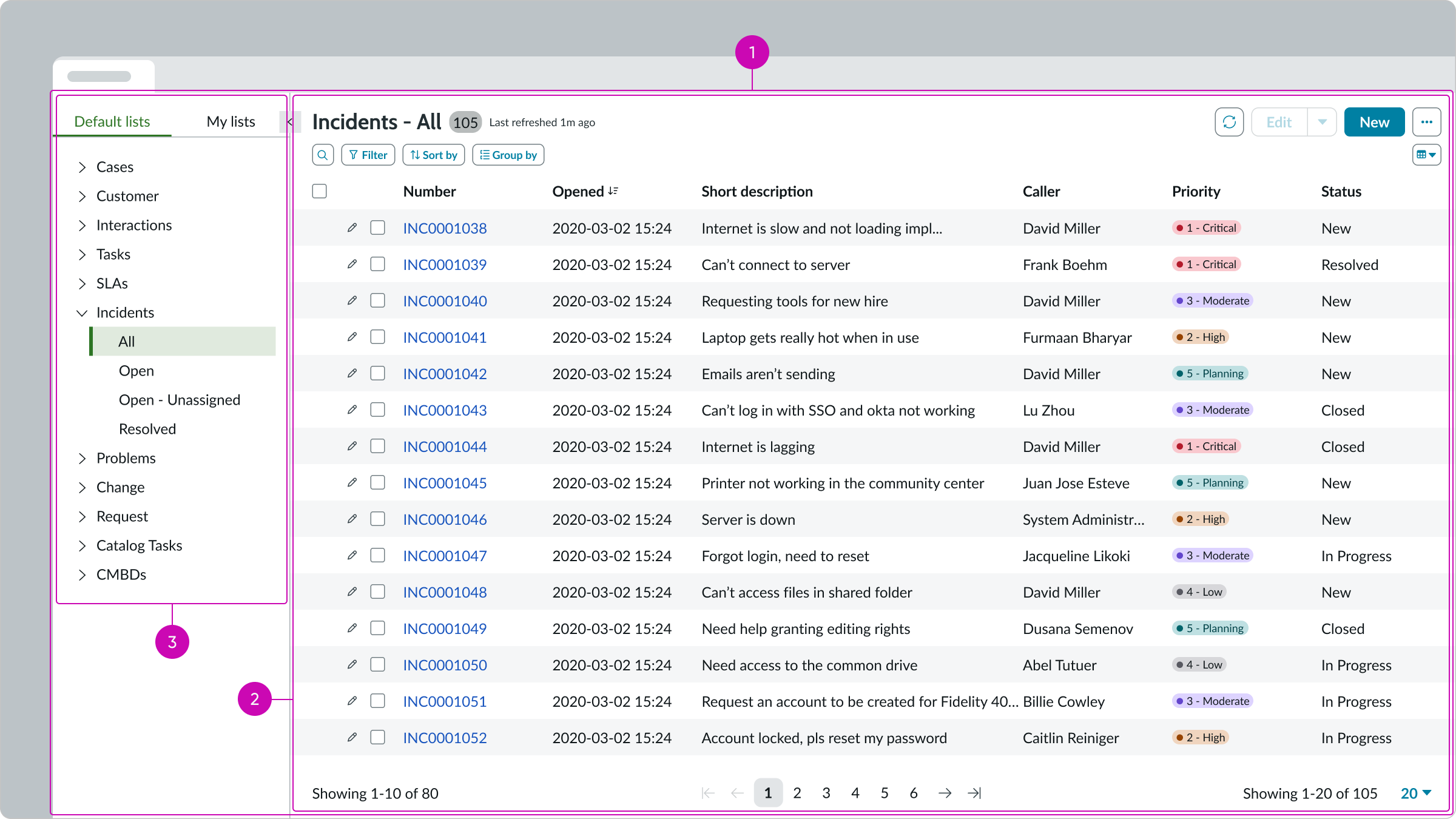
- Resizable panes: Container for the List menu and the Record List bundle
- Record list: Component bundle containing a record list header, presentational list, and pagination control
- List menu:Mmenu showing pre-configured lists defined by an administrator and custom lists created by or shared with the user
Usage
The standard list page template can display any record list and is intended for use in large displays as a full screen experience. The record list bundle provides controls to filter, sort, and group entries. Visual clues, such as highlighted values, make this list easy to scan. This page includes the list menu, which appears in the left pane to provide additional navigation capabilities for default lists provided by an administrator and lists created by the user or shared with the user. You can allow users to filter the list and select the columns to display.
The standard list page template enables users to:
- Locate and sort records easily
- Update single records or groups of records
- View record activity and add comments
- Export records in different formats
- Share custom lists with other users
Presets and controllers
This component has a preset configuration that sets properties and event handlers, making it ready for use. You can override preset values with a custom configuration if needed. Preset values won’t upgrade with updates. To avoid using presets, configure manually. One preset can apply to a single component instance. See presets for more info.
A preset is linked to a controller, which serves as a data resource. Controllers provide configuration data and event bindings for the component. Selecting a preset adds the required controller to the page, allowing new components to use its preset. For more on controllers, see controllers. For default presets, see view properties and events in the controller API.
Resizable panes
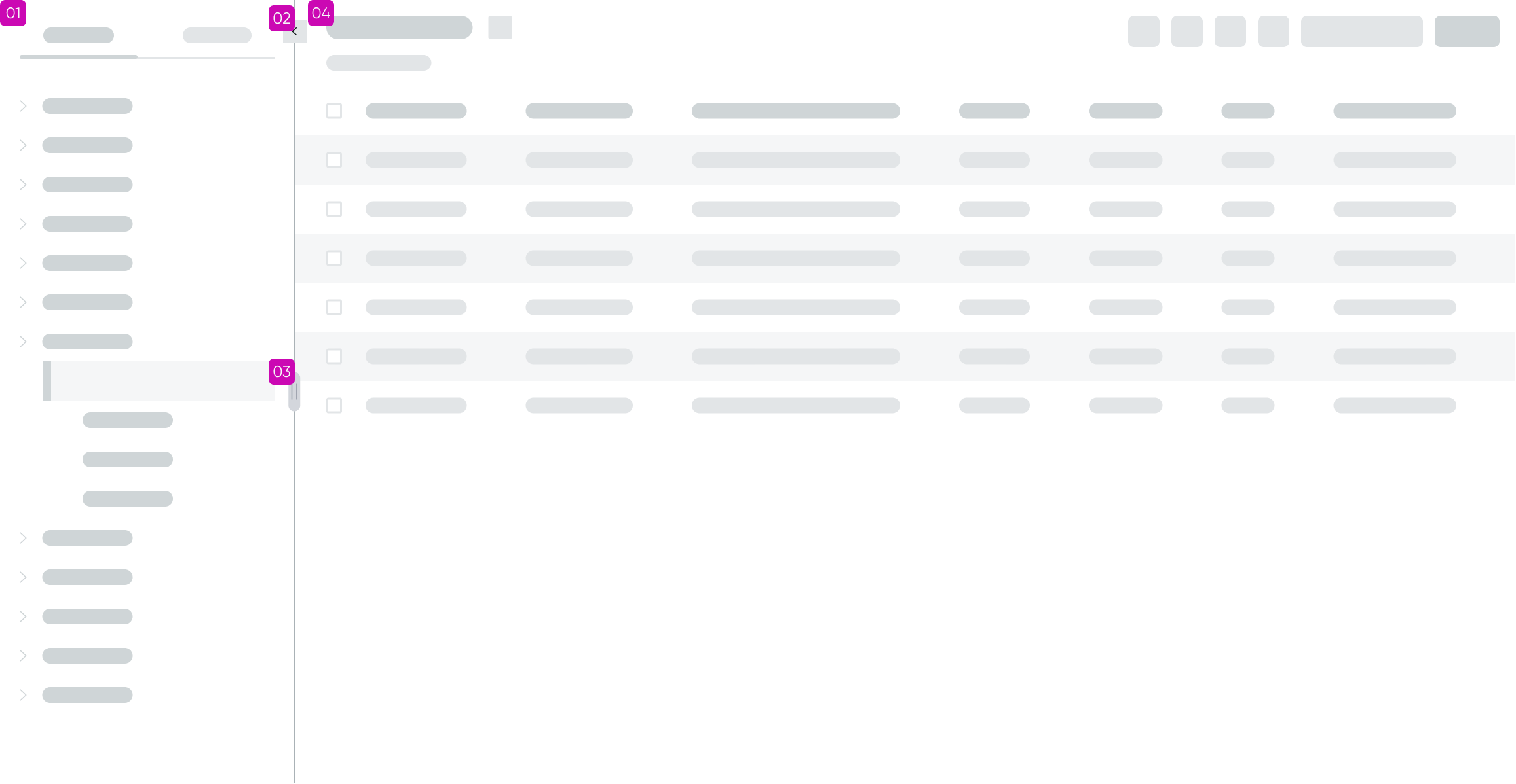
There are two resizable pane components in the standard list page template: one set within the record list bundle and another containing the bundle and the list menu component. The image below shows the anatomy of the resizable panes container in which the list menu is displayed beside the record list.
Anatomy
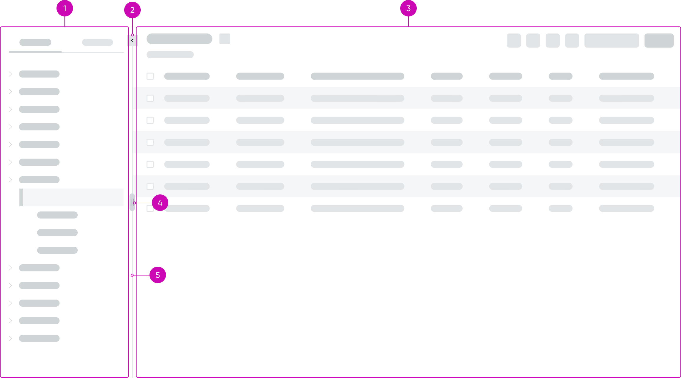
- Left pane: Resizable slot that contains the list menu component
- Trigger icon: Chevron icon that triggers the list menu headers to expand or collapse
- Collapse/expand button: Iconic button for expanding or collapsing the left pane containing the list menu
- Right pane: Resizable slot that contains the record list bundle
- Divider drag handle: Handle for dragging the divider to resize the panes; the handle is visible when the user hovers over the divider
- Divider: Divider line that separates the two panes; users can drag the divider to change the width of the panes
Responsive behaviors
Learn how resizable panes responds to changes in a container or display.
Divider
The divider has constraints on its position to prevent users from resizing the panes beyond a useful ratio. The drag handle on the divider appears when the user hovers over the divider.
Collapse control
When the user collapses the left pane, the arrow icon in the collapse control reverses direction to the right to indicate that it can be selected to reopen the pane.
Interactions
Resizable panes has the following interactions:
- Users can use the drag handle on the divider line to move the divider left or right to change the relative widths of the two panes.
- The user selects the arrow iconic button at the top of the divider line to collapse the left pane or to reopen it.
Usability
Resizable panes complies with all internationalization and accessibility requirements.
Internationalization
The resizable panes component doesn’t change when the display translates to a right-to-left (RTL) language.
Accessibility
Learn how to access the actionable elements of the resizable panes through keyboard interactions and screen readers.
Resizable panes tab order
Tabbing from the list menu in the left pane moves focus to the collapse/expand icon, then to the drag handle, before moving focus into the record list bundle in the right pane.
For the tab stops within the list menu and record list bundle, see the information later in this document.
Keyboard interactions
You can access the actionable elements of resizable panes with these keyboard keys:
When focus is in the collapse control iconic button:
- Enter: Collapses or expands the left pane containing the list menu
When focus is in the drag handle:
- Arrow left or Arrow right moves the divider to resize the panes
Screen readers
When you apply ARIA labels to a component, screen readers announce the controls and content of actionable element in the prescribed tab order.
- Use aria-label to identify the navigation region
- Assign role **“**navigation” to the pagination control
- Ensure the current page has aria-current set to “true”
- Use aria-disabled if a page link is disabled
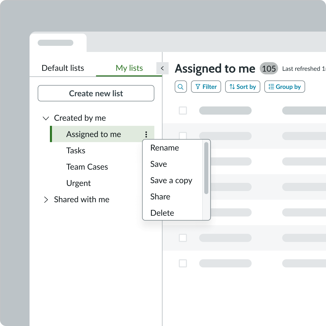
List menu
List menu is a menu containing two tabs with expandable accordions that enable users to navigate between admin-defined lists and lists created by the user. List menu enables users to share custom list, which appear on the My Lists tab.
Anatomy
Learn about the individual parts of list menu.
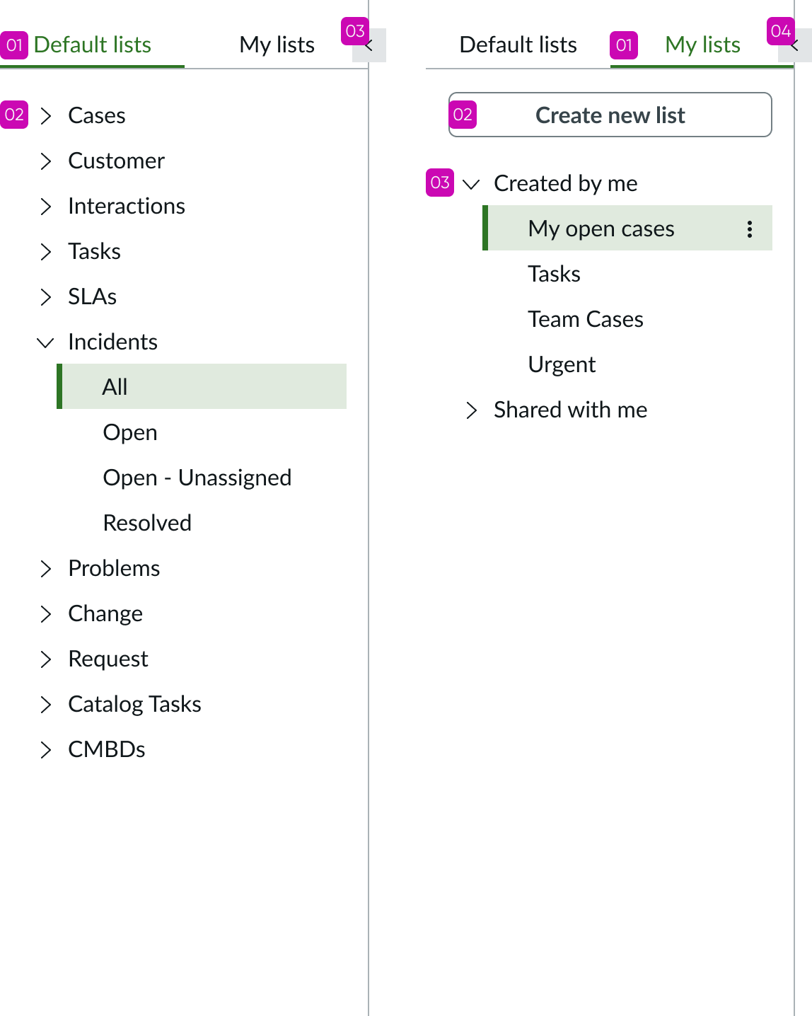
Default lists
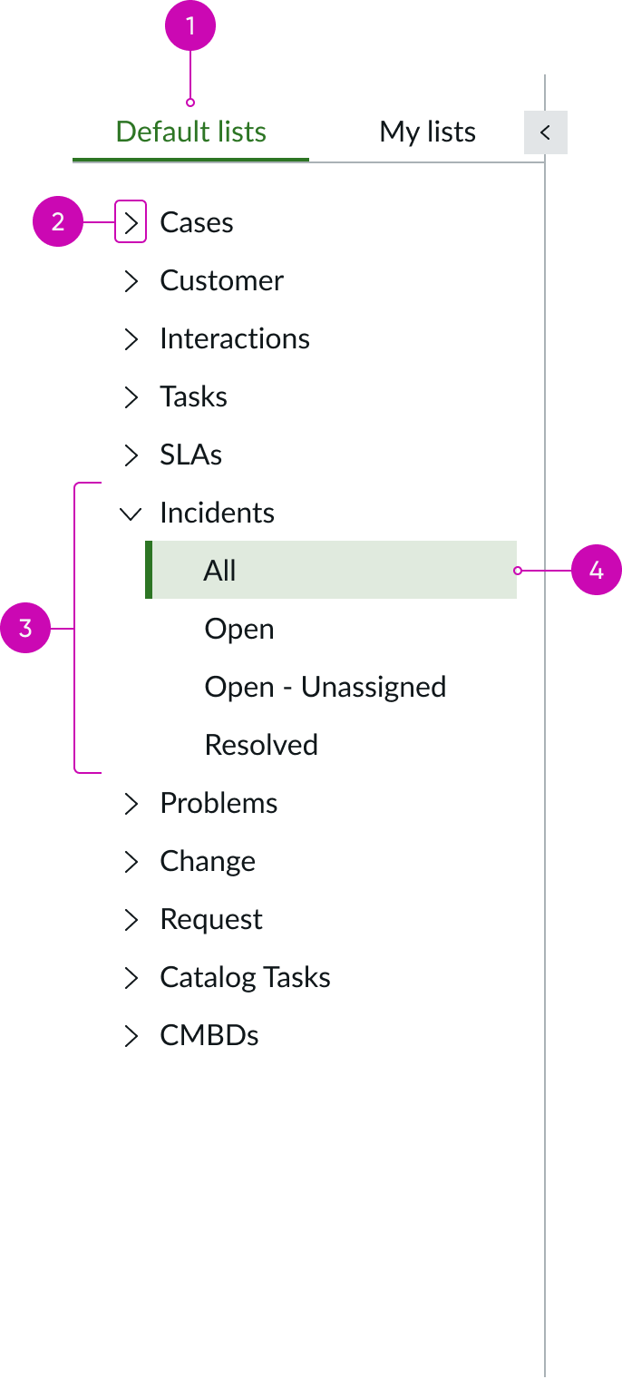
- Tab heading: Heading for the default list tab that shows lists created by an administrator that are available to all users
- Expand or collapse control: Chevron iconic button that expands or collapses list categories; arrow position indicates if the category is expanded or collapsed
- Predefined list category: List category containing predefined lists
- List name: Predefined list created by an administrator and available to all users
My lists
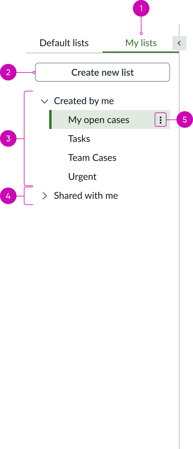
- Tab heading: Heading for the “My Lists” tab that shows lists created by the user or custom lists shared with the user
- Create new list button: Action button for creating a custom list
- Custom list category: Expandable category containing the user’s custom lists
- Shared list category: Expandable category containing custom lists created by other users and shared with the current user
- List actions: Iconic button that opens a menu of list actions for the currently selected list; available options are Rename, Save, Save a copy, Share, and Delete
Behavior
Learn how list menu behaves when the display changes or a user interacts with the component.
States
List menu has the same states as the content tree component.
See the usage guidelines for content tree for more information.
Responsive behaviors
Learn how list menu responds to changes in a container or display.
Scrolling
When the list is taller than the height of the pane a vertical scrollbar appears to let the user see the full list.
Truncation
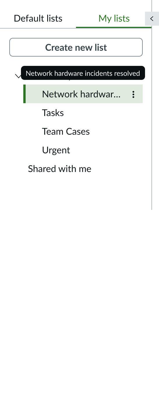
When a list name exceeds the width of the list menu, the text truncates with an ellipsis, and a tooltip shows the full content on hover.
Interactions
Learn how list menu responds when a user interacts with it.
Creating lists
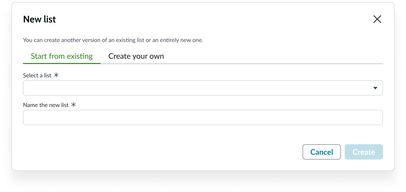
When users select the “Create new list” button in the My Lists tab, a modal appears, allowing the user to use an existing list as a starting point, or build one from scratch. The new list appears in the first position in the My Lists tab with the name the user gives it. For details on creating lists, see the usage guidelines for list menu.
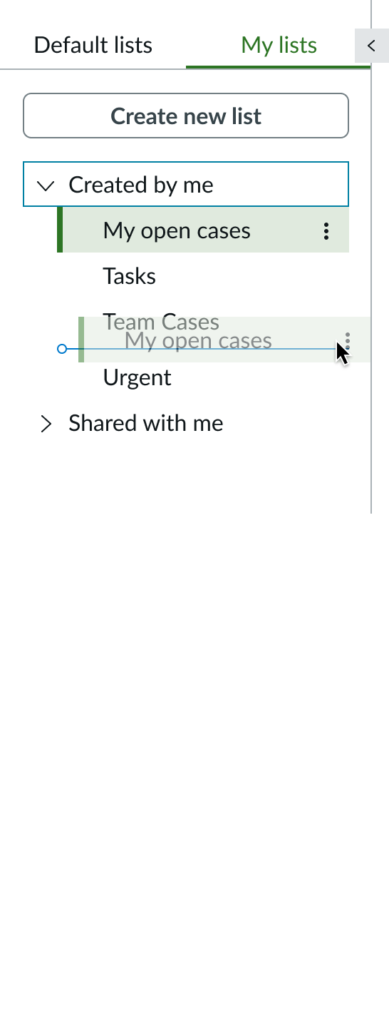
Reordering custom lists
Users can drag and drop a list to a different position in the My Lists tab but only within the same category. For example, the user can’t drag a list that was shared with them into the Created by me category.
As the user drags the list to a new position, an indicator line appears, showing the new location of the list in the menu. The user releases the list when the line indicates the list is in the correct position.
List menu options
Users can open the list actions menu from each list on the My lists tab to take actions on a custom list. The available actions are:
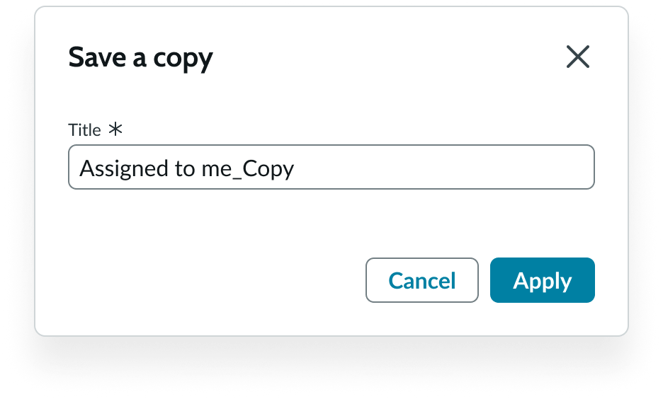
- Save a copy
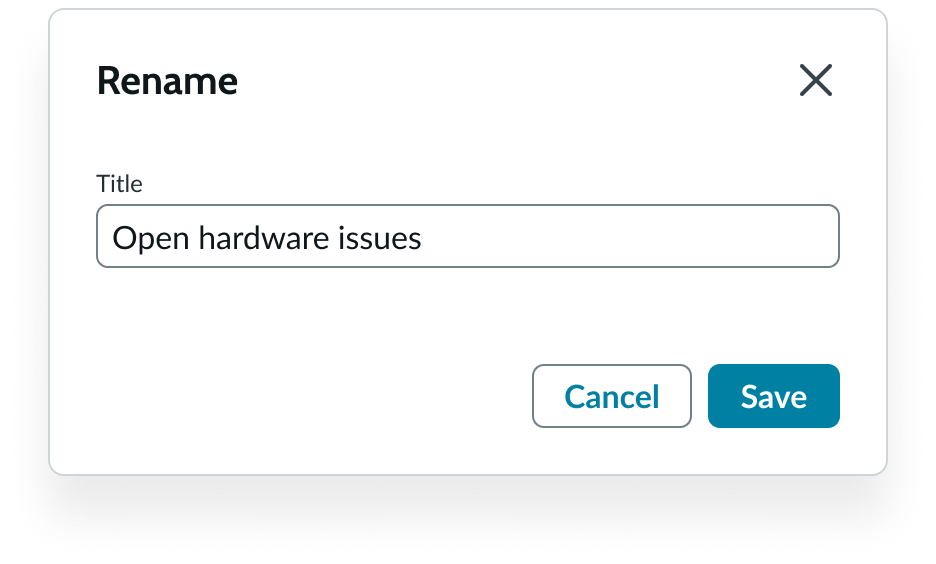
- Rename
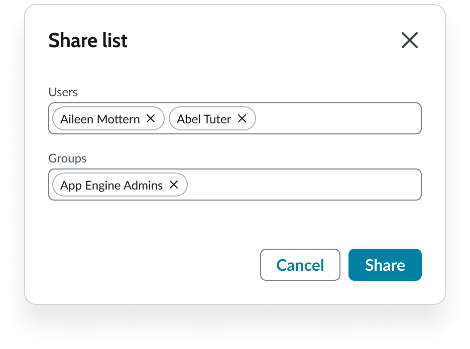
- Share
- Delete
When the user selects the “Save a copy” option, a modal appears enabling the user to select a name for the copy. The copied list appears with the new name in the Created By Me category.
When the user selects the “Rename” option, a modal appears enabling the user to change the list title.
When the user selects the “Share” option, a modal appears asking the user to name one or more individual recipients and groups.
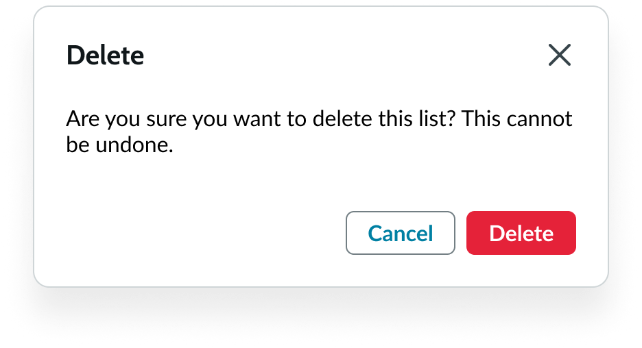
When the user selects the “Delete” option, a modal appears asking the user to confirm their action.
Usability
List menu complies with all internationalization and accessibility requirements.
Internationalization
When this component is used in a platform configured for a right-to-left (RTL) language, the tabs and the lists in each tab align on the right.
Accessibility
Learn how to access the actionable elements of the list menu through keyboard interactions and screen readers.
List menu tab order
Keyboard interactions
You can access the actionable elements of list menu with these keyboard keys:
When focus in in the Default Lists tab:
- Tab: Moves focus to a category in the tab. The tab order can vary, depending on which categories have been selected.
- Shift + Tab: Moves focus backward through in the reverse tab order.
- Arrow right and Arrow left:
- Moves focus back and forth between the Default Lists tab and the My Lists tab when focus in is the tabs.
- Opens and closes a category of lists when focus is in the category.
- Arrow up and Arrow down: Moves focus up and down through the categories and the lists
When focus is in a list category:
- Arrow right and Arrow left: Expands and collapses the category.
- Arrow up and Arrow down: Moves focus up and down through the lists in the category.
- Enter: Opens a list in focus.
When focus is in the My Lists tab:
- Tab: Moves focus to the “Create new button” and then to the first custom list.
- Shift + Tab: Moves focus backward through in the reverse tab order.
- Arrow up and Arrow down: Moves focus up and down through the custom lists.
- Enter: Opens a list in focus in the list pane.
When focus is in the collapse/expand icon:
- Enter: Collapses or expands the left pane containing the List Menu
When focus is in the drag handle:
- Arrow right and Arrow left: Moves the divider line right or left to resize the panes.
Screen readers
When you apply ARIA labels to a component, screen readers announce the controls and content of pagination control in the prescribed tab order.
- Use aria-label to identify the navigation region
- Assign role navigation to the pagination control
- Ensure the current page has aria-current set to “true”
- Use aria-disabled if a page link is disabled
Record list bundle
The record list bundle is a full-featured data list that provides all cell types and list actions, such as sorting, grouping and reordering row items using drag and drop functionality. In addition, the bundle allows you to display Glide record data in your list.
See the usage guidelines for record list bundle for more information.