

Anatomy
Learn about the individual parts of list menu. List menu presents either a list preconfigured by an administrator or a user's customized list.
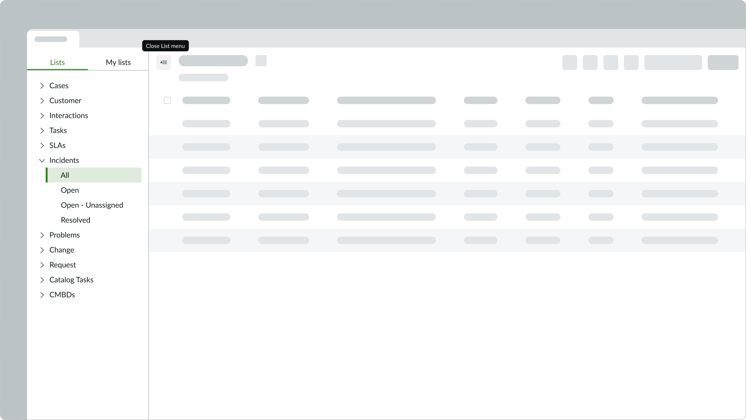
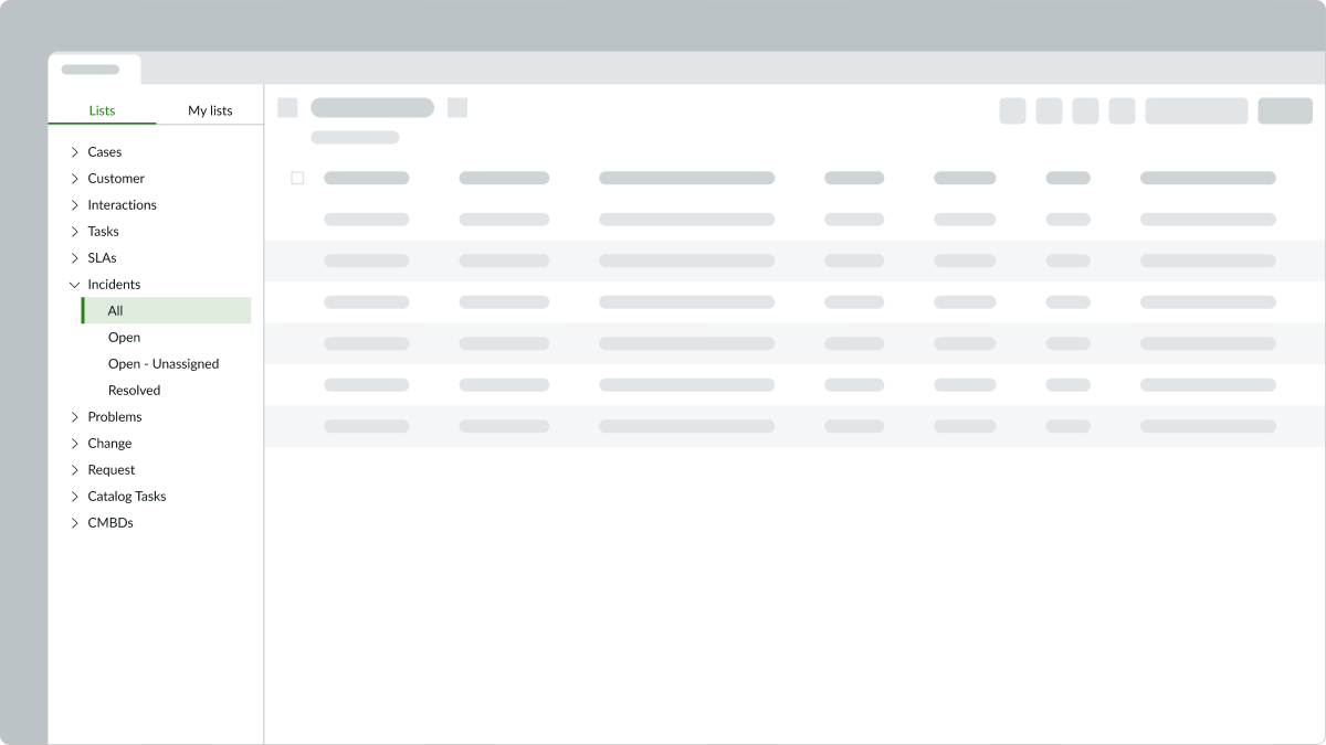
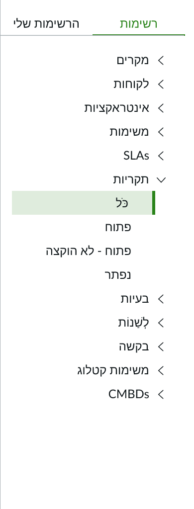
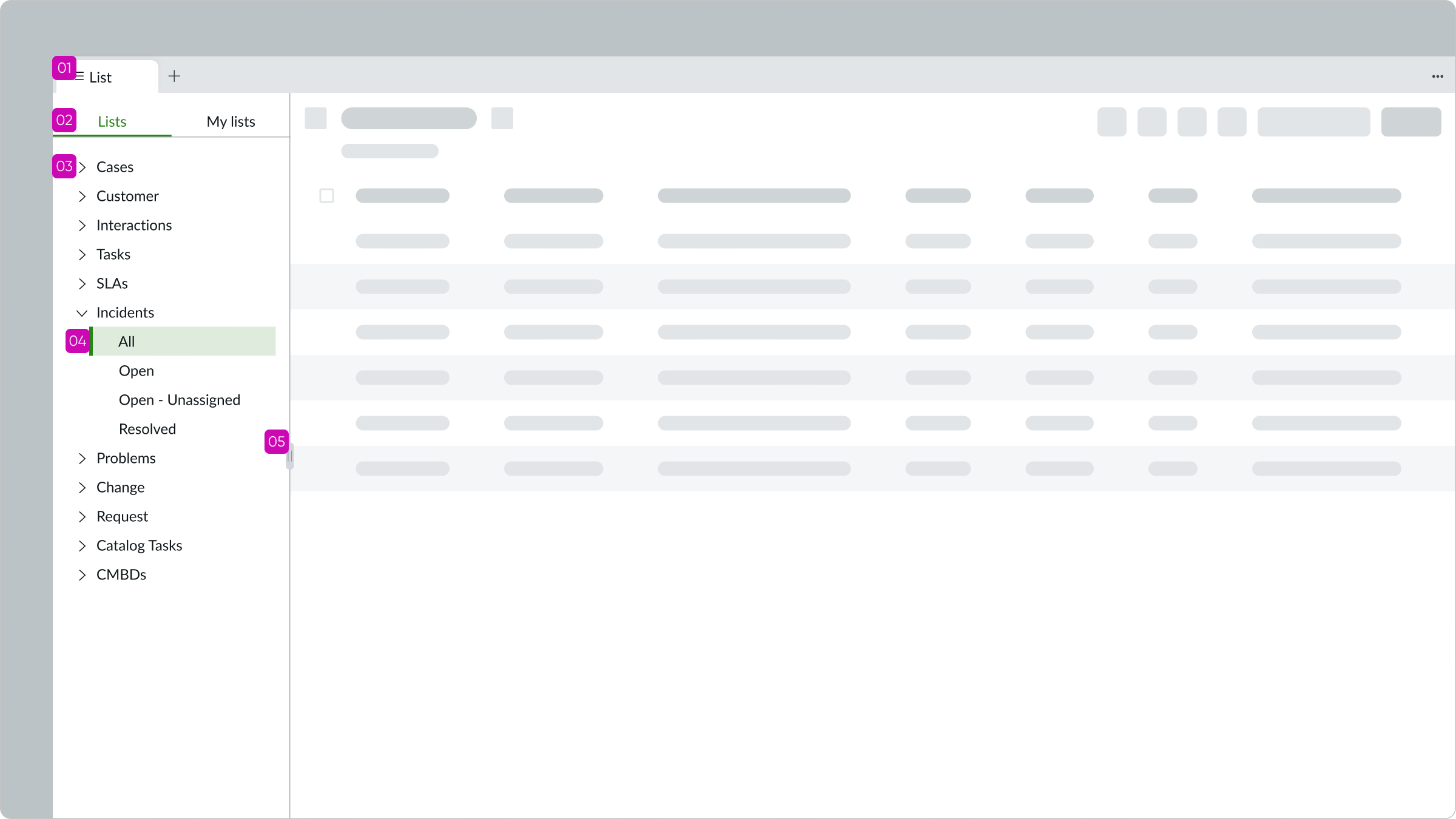
List menu
The default view shows the Lists tab that contains lists preconfigured by an administrator.
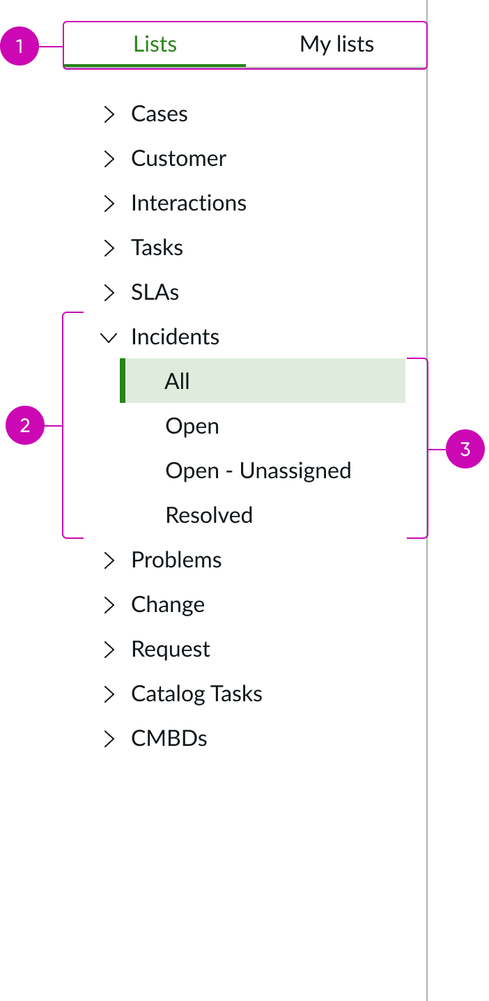
- List display tabs: Tabs for displaying preconfigured lists and customized lists saved by the user
- List category: Expandable group of records
- Filtered lists: Subset of all records in the category
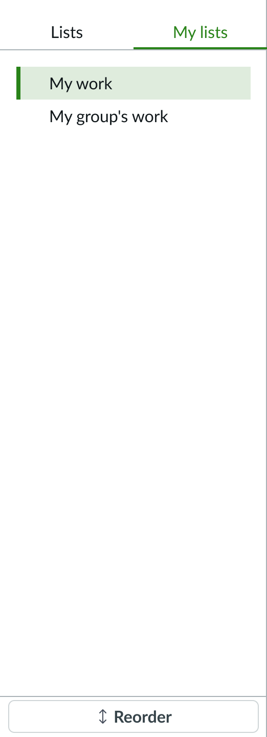
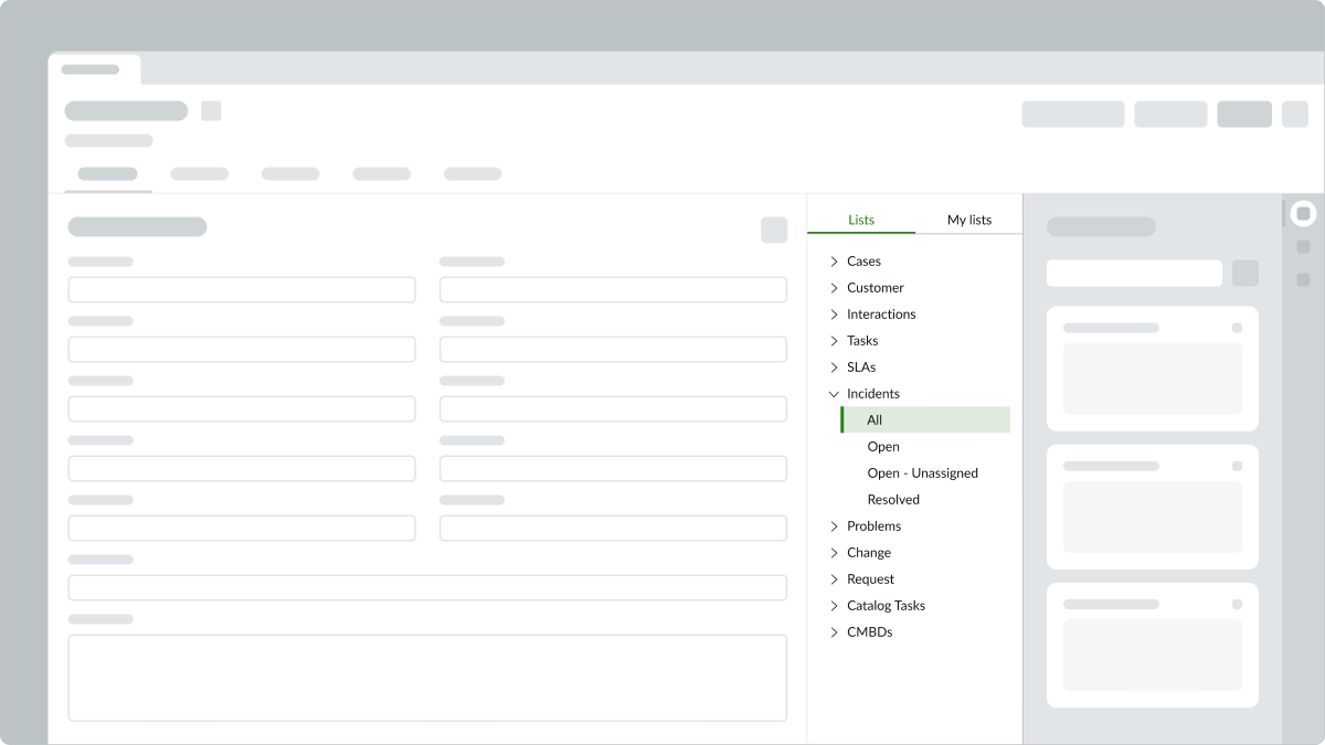
My Lists tab
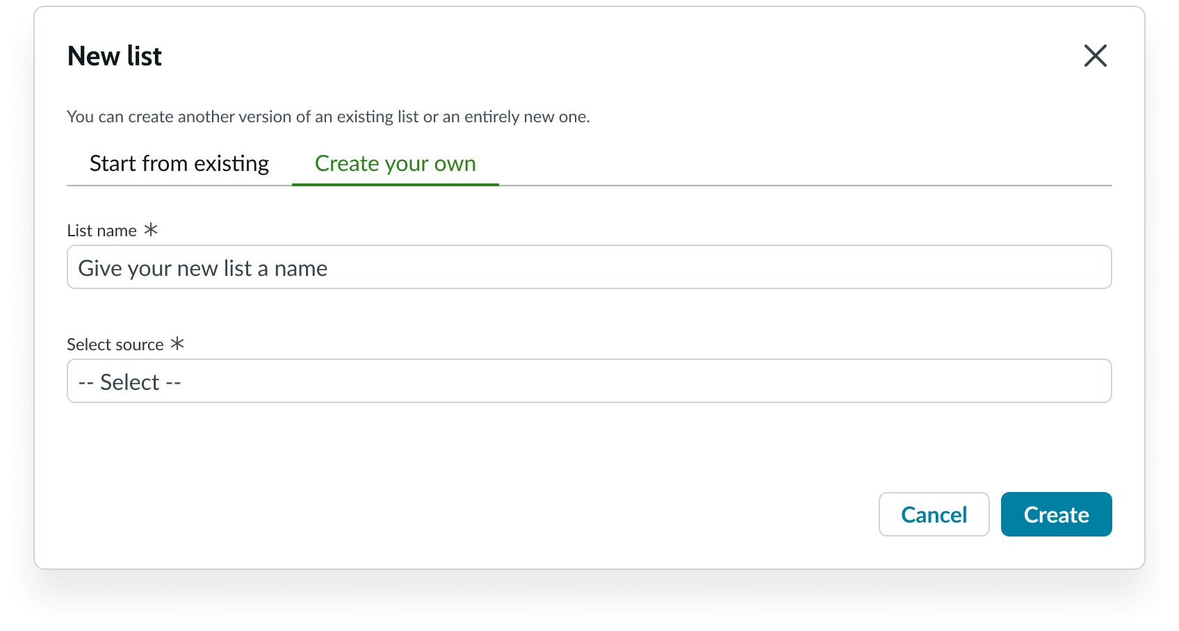
The My Lists tab displays the user's customized lists. It includes a button to allow the user to create additional lists.
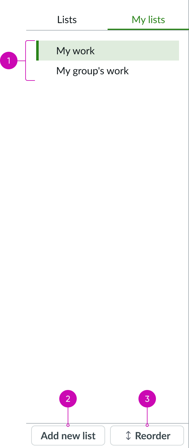
- Create new List button: Opens a modal where users can create a custom list
Subcomponents
See usage guidance for content tree
Usage
Learn about list menu and find out how to use it in your design. Use the list menu in a full-page experience beside a list. List menu allows users to navigate between admin-defined lists and lists customized by the user. Depending on the use case, you can prevent your users from creating new lists but allow them to modify existing lists. You can also prevent your users from creating new lists and modifying existing lists. This can reduce possible confusion from a proliferation of custom lists.
Configurations
Learn how to customize list menu by configuring the available properties.
Block new lists
By default, the Create new List button is available for users in the My Lists tab. You can hide that button to prevent your users from creating new lists from any table they can access.
Block access to My Lists
You can configure the list menu to appear without the Lists and My Lists tabs. This prevents users from modifying existing lists and creating new ones.
Note: To ensure that users can't create or modify lists, you must also hide the option to save custom lists in the list component.
Define list access privileges
Configure user permissions for the list menu. You can grant users the rights to create, read, update, or delete lists in the menu. When the component has appropriate permissions, users can modify existing lists for their own purpose, even if the New List button is hidden. See Interactions for details.
Show list open
You can configure the list menu to display in an open state by default or to display collapsed when the page opens.
Design recommendations
Learn how to apply list menu in your design.
Use list menu on a full page with an accompanying list.
Avoid placing list menu on a page without a connected list.
Alignment and positioning
List menu is typically placed on the left side of the accompanying list.
Behavior
Learn how list menu behaves when the display changes or a user interacts with the component.
Responsive behaviors
When the content tree is taller than the height of the parent container, a vertical scrollbar appears to let the user see the full content tree.
Interactions
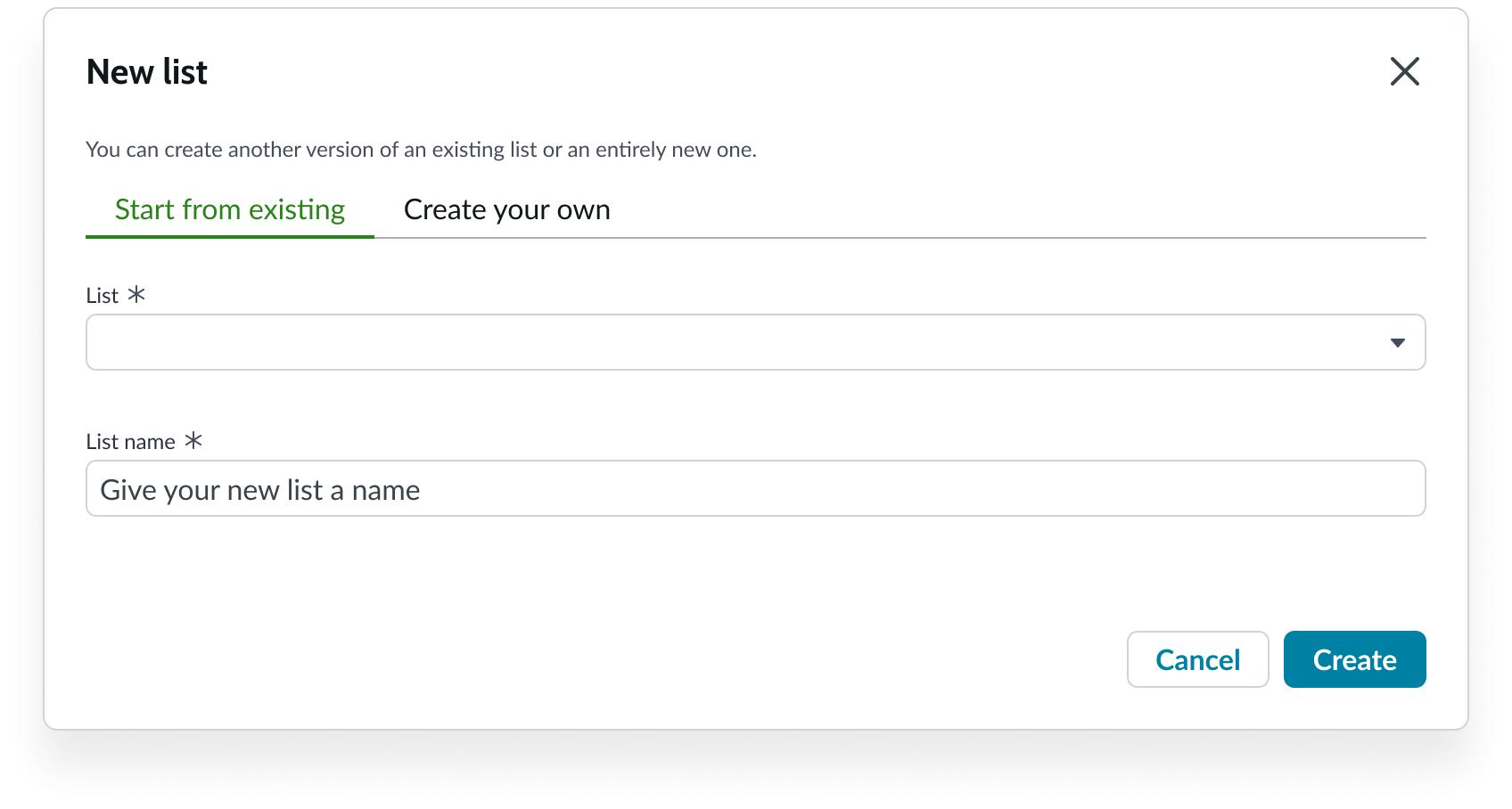
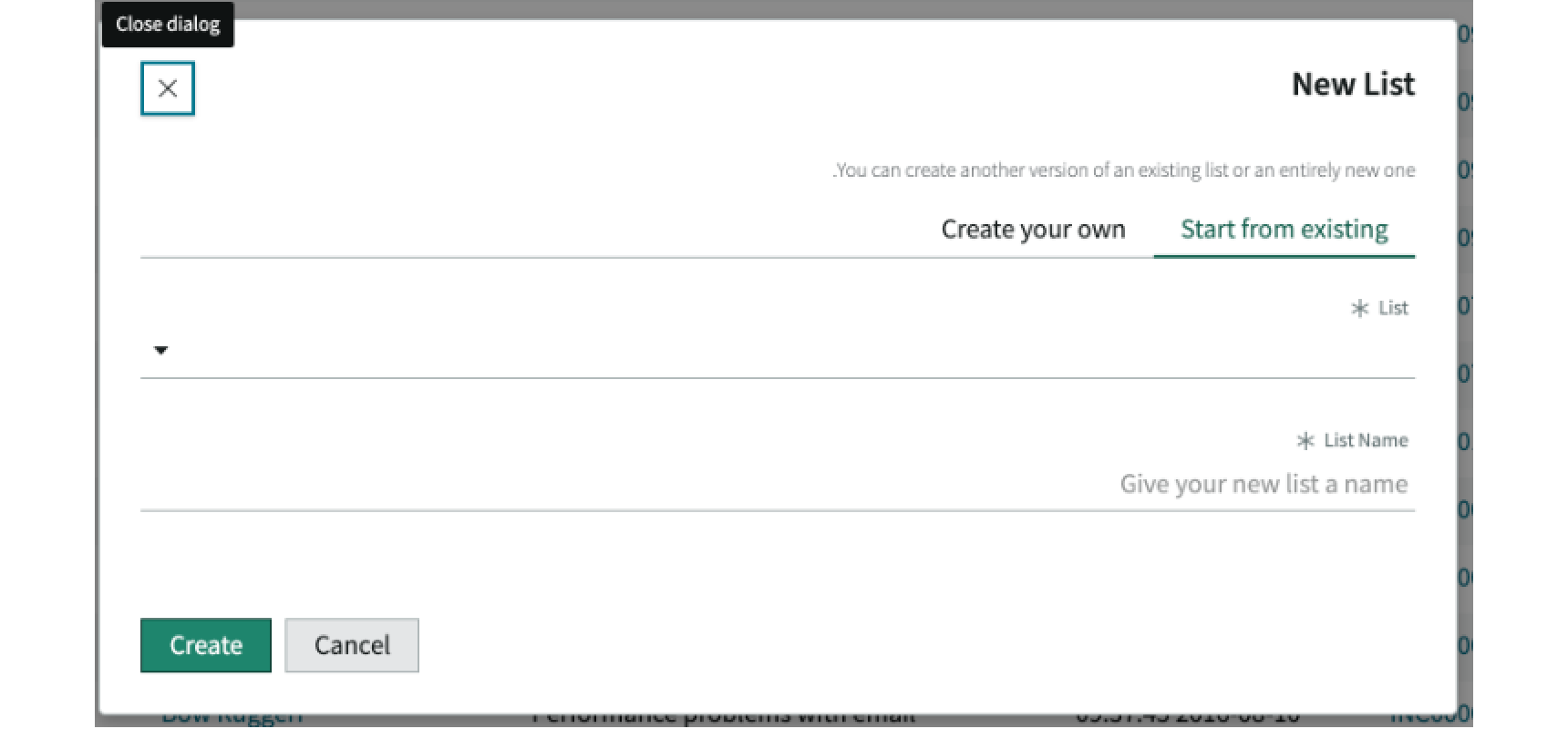
When list menu is configured to allow users to create their own custom lists, users can select the Create new List button in the My Lists tab to get started. This action opens the New List modal, allowing users to modify an existing list or create an all-new list. All lists created or modified by the user appear in the My Lists tab of list menu.
Create a new list by modifying an existing list
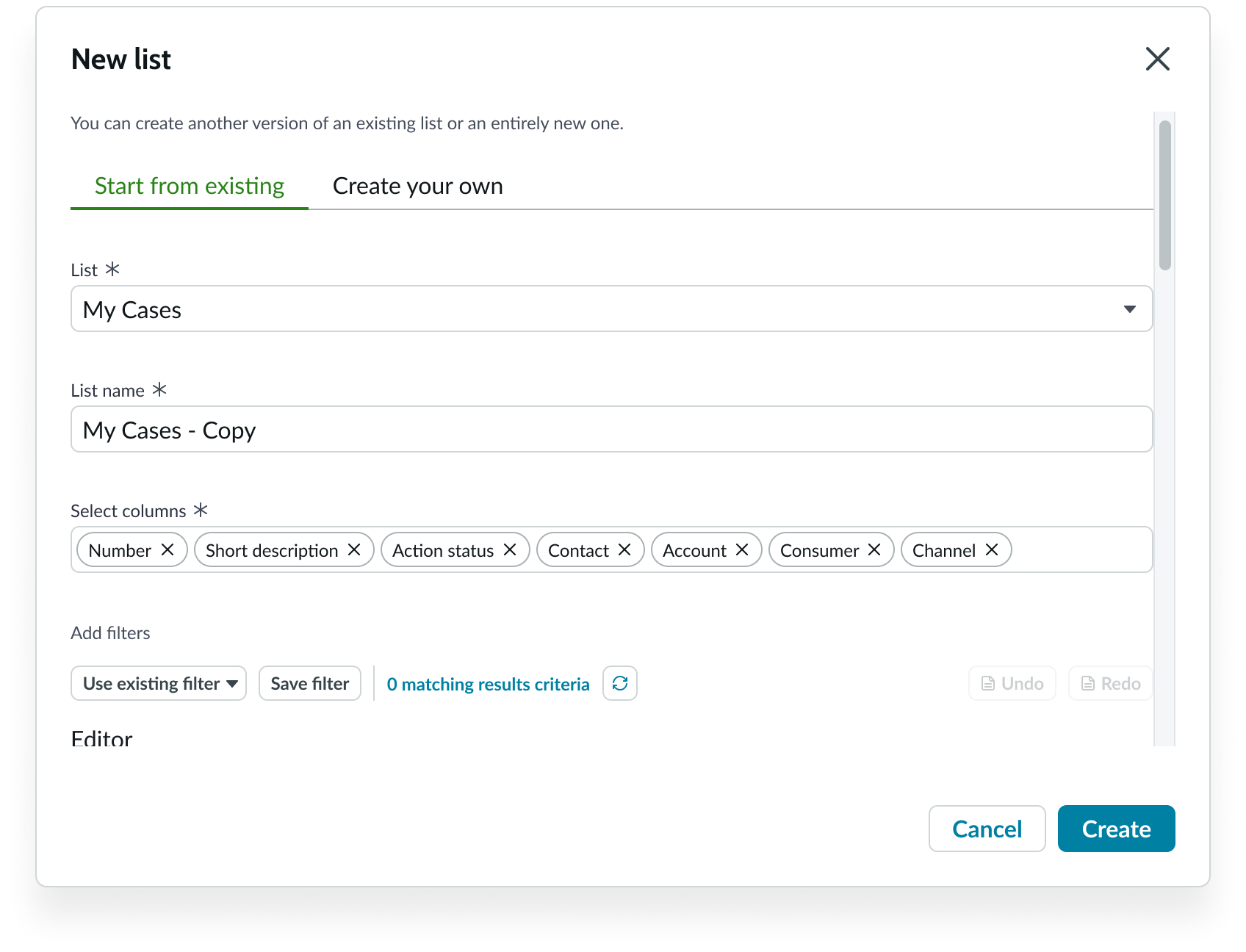
If list menu is configured to customize an existing list, users select the Start from existing tab and name the list they want to modify. The modified list uses the same data source (table) as the existing list. The user enters a unique name for their list and selects Create to open the configuration form.
The user can select different data columns to display and can modify the existing list's filter using the condition builder.
If the configuration blocks users from creating new lists, they can still modify existing lists for their own purpose by selecting the Save a copy option of a list on the Default lists tab. If the configuration blocks both the Default lists and My Lists tabs, the user can’t create new lists or modify existing lists.
Create a brand new list
If configured, the user can create a new list. The user selects the Create your own tab and provides the data source (table name), filtering conditions, and columns to display. The user selects Save to save the new list and return to the My Lists tab in the list menu.
Truncation
When text in the content tree subcomponent exceeds the width of the container or content area, the text truncates with an ellipsis, and a tooltip shows the full content on hover. See the content tree usage guidelines for details.
Usability
List menu complies with all internationalization and accessibility requirements.
Internationalization
When this component is used in a platform configured for a right-to-left (RTL) language, the nodes in the content tree align on the right. For details, see the usage guidelines for content tree.
When the New List modal is used in a platform configured for a right-to-left (RTL) language, the content aligns on the right.
Accessibility
Learn how to access the actionable elements of list menu through keyboard interactions and screen readers.
Keyboard interactions
You can access the actionable elements of list menu with these keyboard keys:
- Tab: Shifts from the list menu into content tree
- Arrow right/left: Selects between Lists and My Lists
To learn how to access the actionable elements of content tree with keyboard keys, see the usage guidelines for content tree.
To learn how to access the actionable elements of modal with keyboard keys, see the usage guidelines for modal.
Screen readers
When you apply ARIA labels, screen readers announce the controls and content of list menu in the prescribed tab order.