

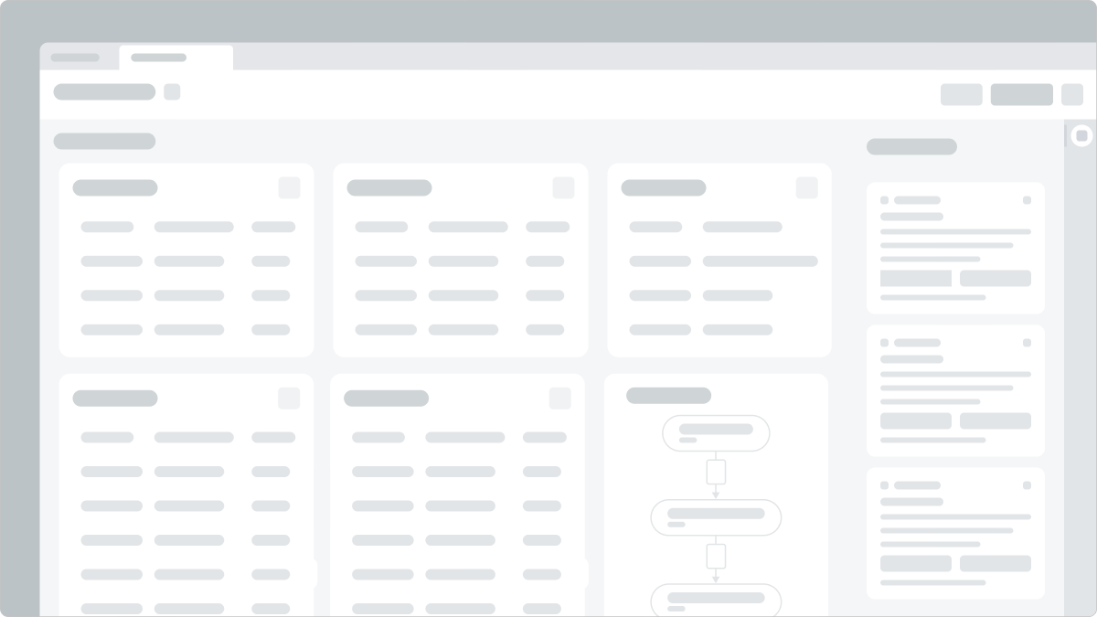
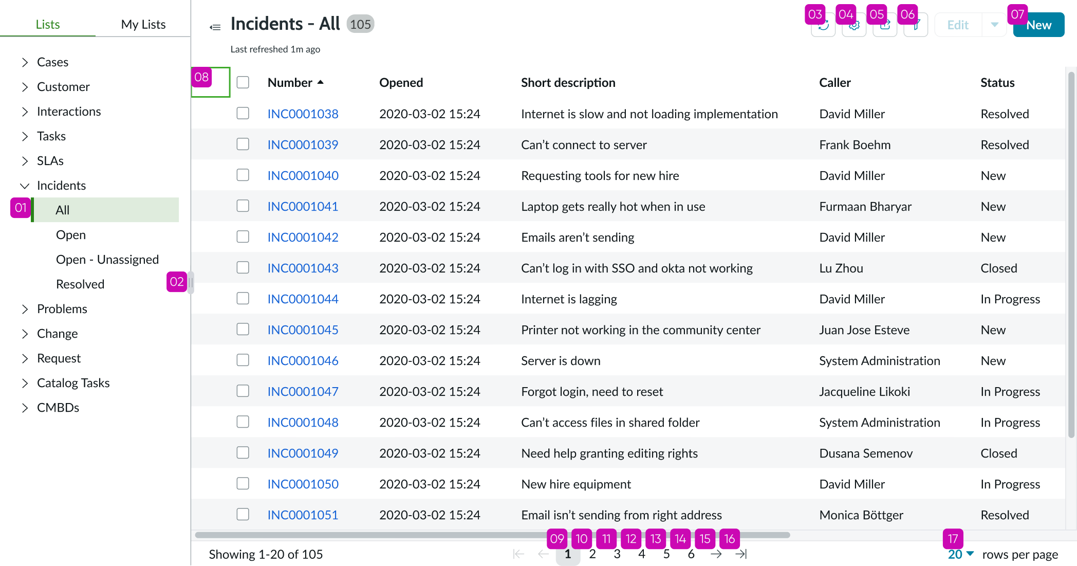
Anatomy
Learn about the individual parts of list.
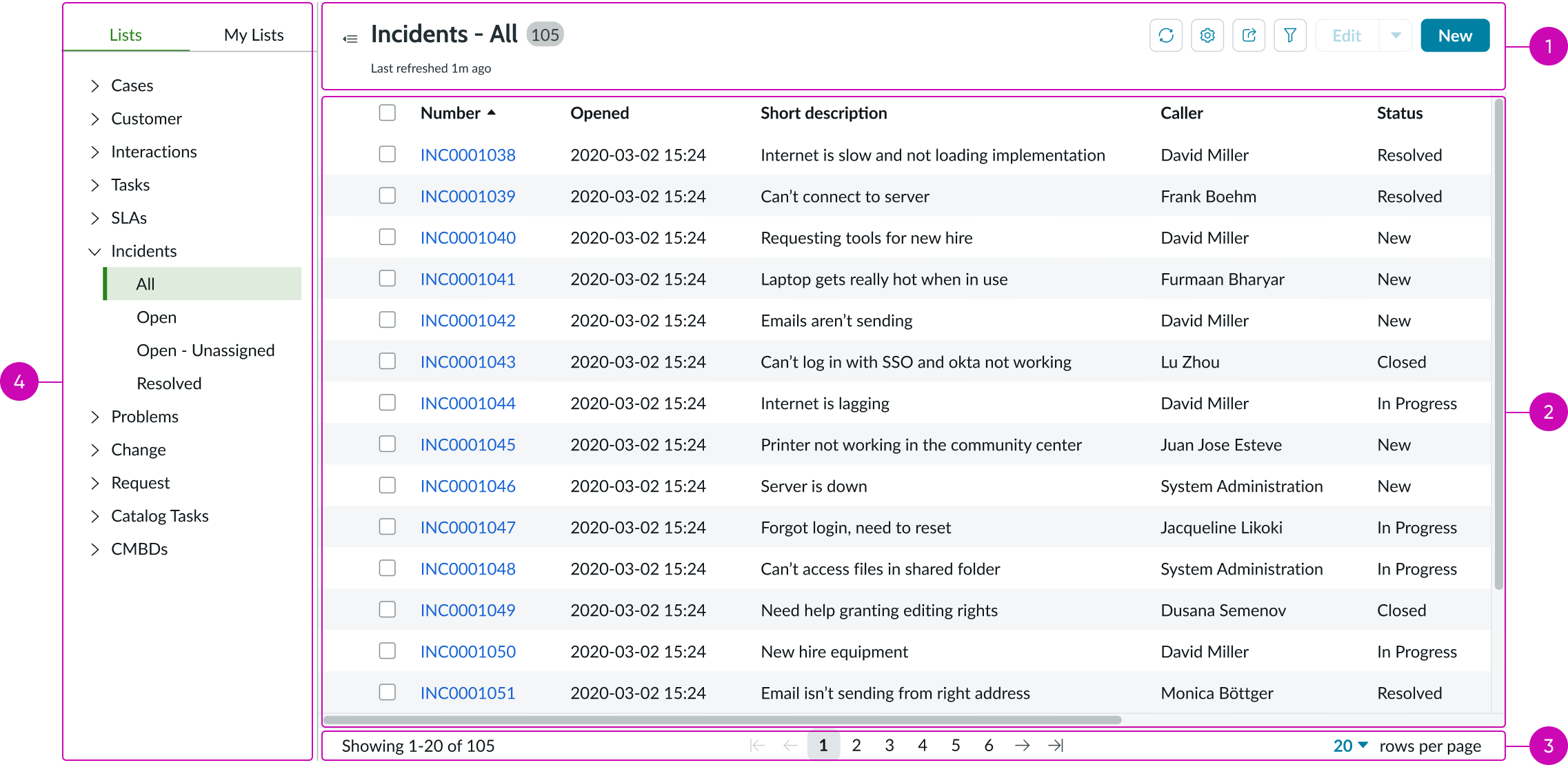
- Header: Area containing the list title and the action buttons that enable the user to interact with the list
- Record list: Column headers and rows that organize the records in the list
- Footer: Area beneath the list that contains pagination or view all elements
- List menu (component): Content tree that allows users to navigate between lists defined for them and lists they have personalized; see the list menu usage guidelines for details
List header
You can hide or show the entire list header or any of its elements selectively.
- Title: Title of the list
- Badge with record count: Displays the total number of records in the data result set
- Refresh time: Text indicating how long ago the list last refreshed
- Refresh button (optional): Refreshes the list on demand with the latest data from the data source
- Menu button: Contains options for saving the list as a "My List" and resetting the column width; see the usage guidelines for list menu for details about personalizing lists in the My List tab.
- List sharing: Displays or hides the list sharing options
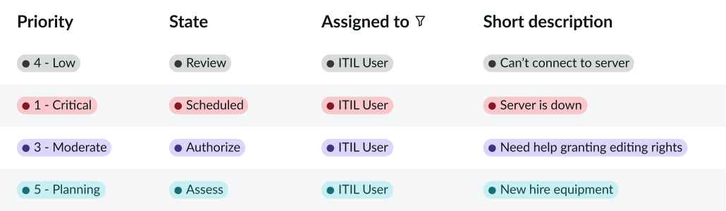
- Filter button: Control for adding filters; count is incremented as filters are added to the filter pane
- Declarative actions: Actions that can be applied to selected list items
List body
Column controls, filtering, sorting, and editing in the list body are optional features.
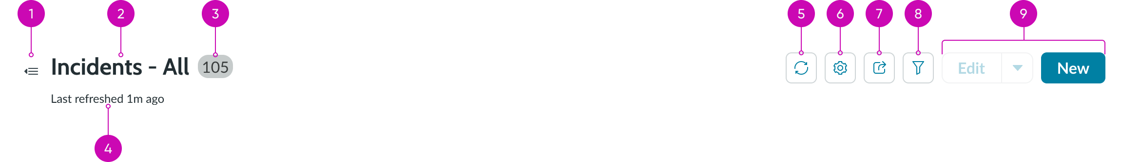
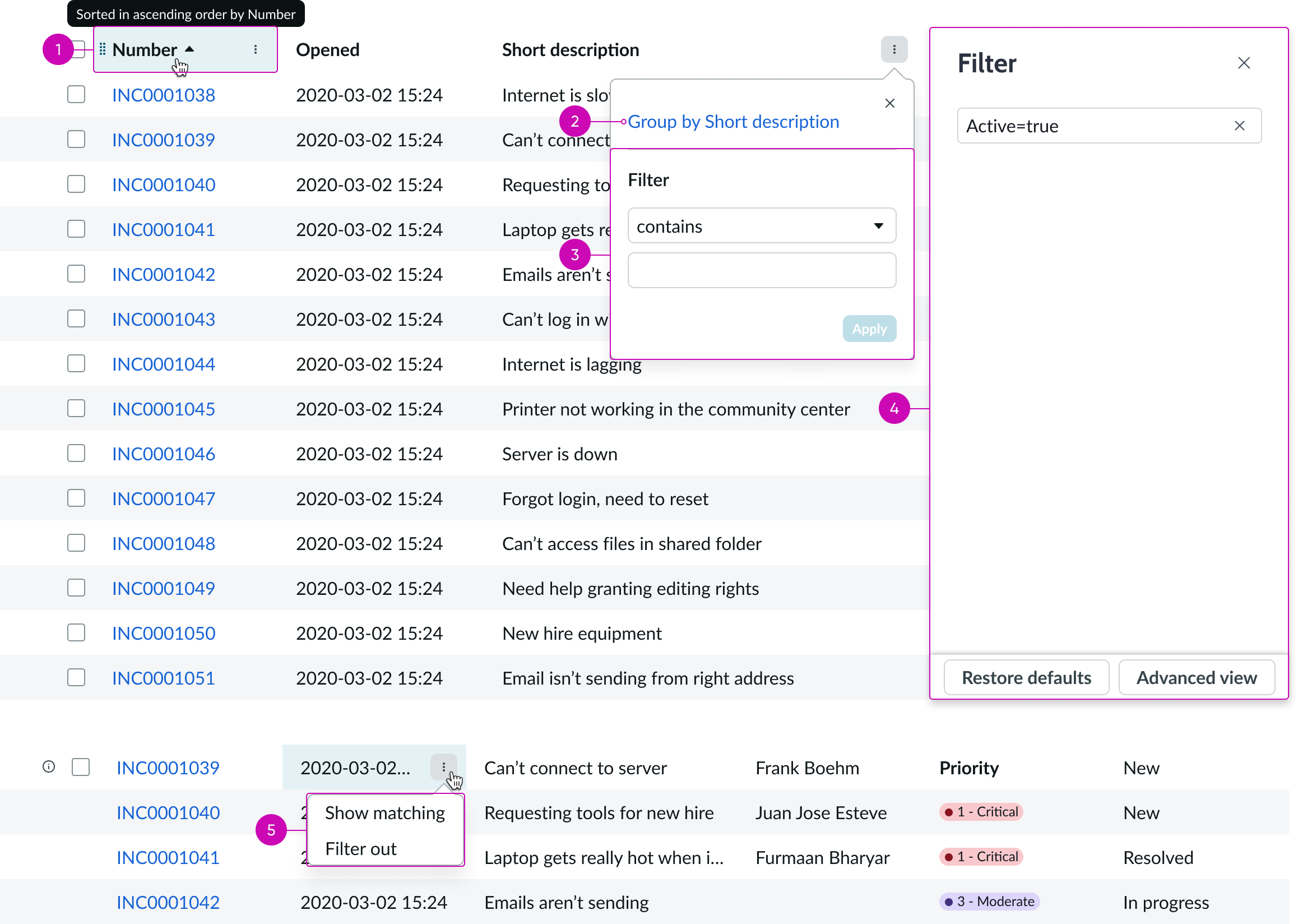
- 1. Column headers: Each column header contains a drag handle button, a label that describes the data in the column, icons to indicate sort, filter, and group, and a popover trigger** 2. List item:** Individual list item (row) within the list body that contains filterable data** 3. Sorting indicator:** Icon to indicate whether the list is sorted by a column in ascending or descending order** 4. Filter indicator:** Icon to indicator whether a column has a filter applied** 5. Popover trigger:** Iconic button in the column header that opens the popover for grouping and selecting filtering conditions** 6. Column header popover:** Popover containing button to group by the column and column filter condition builder** 7. Grouping button:** Option for grouping records in the list by column** 8. Quick edit:** Enables users to preview and edit single records within the list view** 9. Links:** Actionable links that enable users to open a record from the list; this is the default behavior ** 10. Highlighted values:** Color highlights content of a list item based on a predefined highlighted value configuration** 11. Empty state message:** Message that displays when there is no data in the list to display
Footer
You can hide or show the list footer elements selectively.
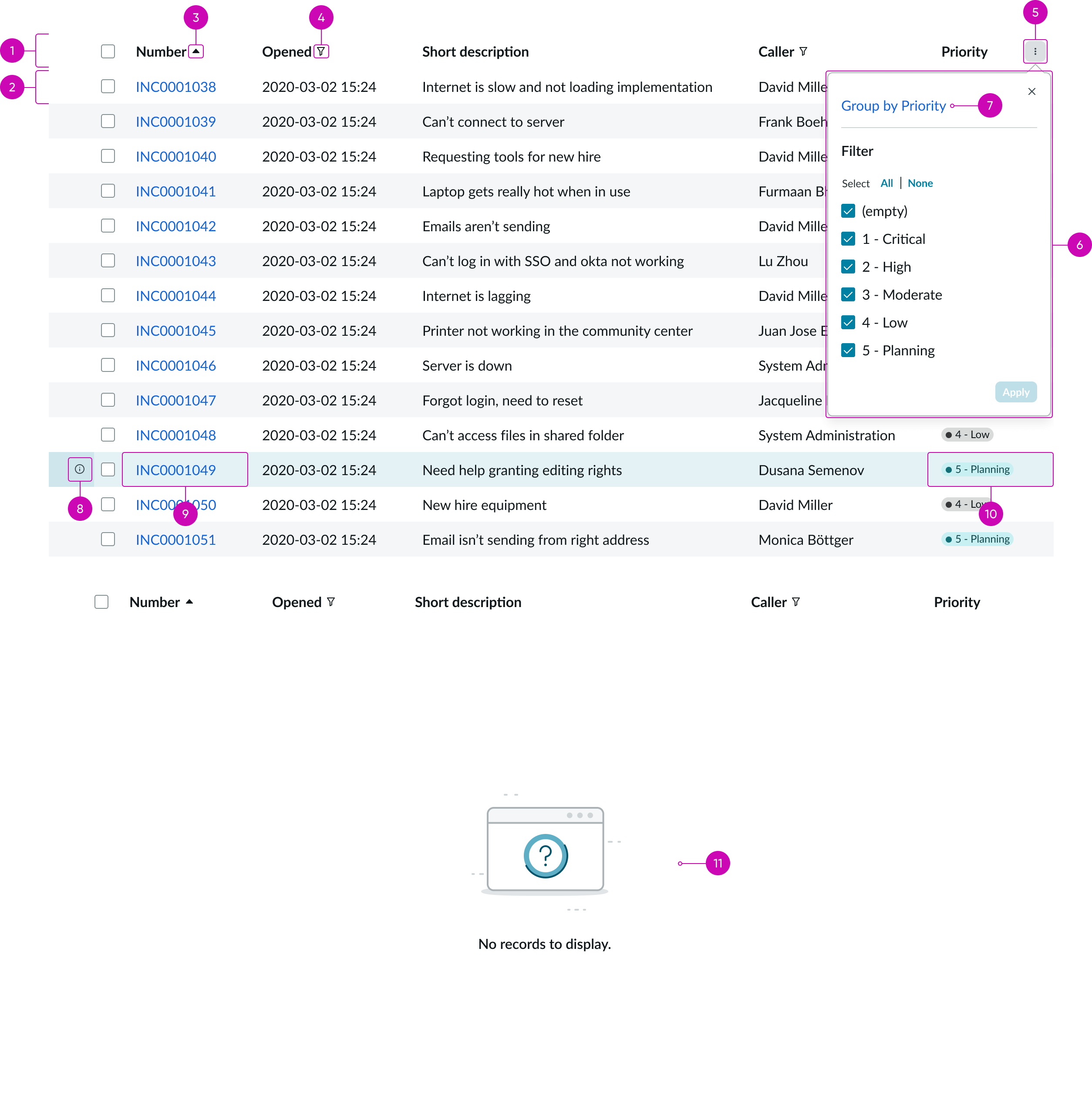
- Pagination control: Shows page range for all records and provides navigation for selecting hidden records; see the pagination control usage guidelines for details
- Disclosure control: Control that enables users to select the number of records to display per page.
Subcomponents
See usage guidance for button bare
See usage guidance for dropdown
See usage guidance for highlighted value
See usage guidance for pagination control
See usage guidance for popover
See usage guidance for record mini calendar
See usage guidance for split button
See usage guidance for text link
See the usage guidance for list menu
Usage
The list component has the most features of any list type. List enables users to sort, group, and filter data and to navigate easily through records. Visual clues such as highlighted values make these lists easy to scan. Use the list component in large displays as a full screen experience. This type includes the list menu, which appears next to the list body to provide additional navigation capabilities.
Configurations
Learn how to customize list by configuring the available properties.
Header and footer
You can show or hide individual subcomponents or elements within the header and footer, or you can hide the entire header or footer.
Badge
If the configured table has many records, the badge shows the total number of records in the system. A plus sign (+) indicates more records are available. You can hide the badge.
Table data
Select the table from which the records in the list are drawn, select the columns from that table to display, and create an initial filter for the data. You can configure the number of rows to display and the number of data columns.
Filters
Filters you create show up in the Filter panel. By default, the user can delete, edit, or create filters, unless you hide these capabilities. If you want to add a read-only filter to the list, create a “fixed filter.”
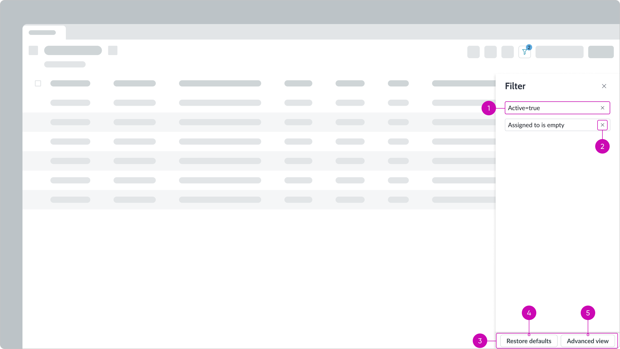
- Filter conditions: Conditions set for the filter in the advanced view
- Delete condition button: Deletes a filter condition
- Panel footer: Contains action buttons for managing filters
- Restore defaults button: Replaces user’s current list of filters with the filters you create
- Advanced view button: Accesses the condition builder, enabling users to create filters
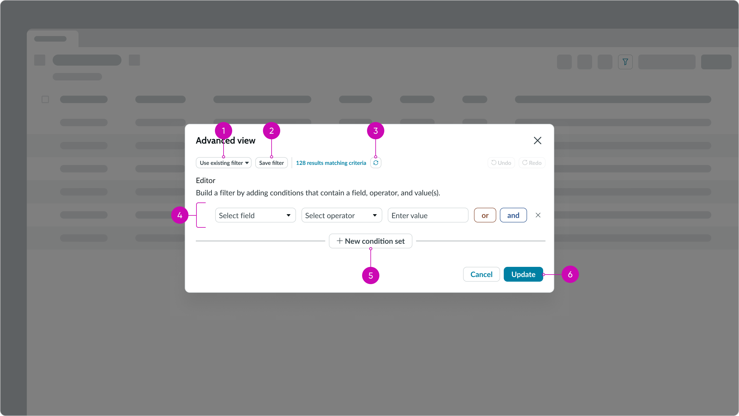
- Use existing filter dropdown: Displays a list of saved filters; users can save commonly used filters to reuse as is or as building blocks for new filters
- Save filter button: Saves a filter to the list of existing filters for reuse
- Refresh icon: Returns an accurate count of the number of records that match the filter conditions but doesn’t save a filter
- Condition set: Enables users to add or remove a filter condition from a set of conditions
- New condition set button: Adds an “or” condition group to the existing condition group
- Primary action button: Runs the filter with the current conditions
Creating filters
By default, users can filter a list by creating new filters and updating existing ones. You can limit what users can do with filters by removing the abilty to access the condition builder, delete a filter, and restore the default filters.
Note: Fixed filters take precedence over regular filters; all fixed filters are resolved first. Then, any regular filters are run against the results.
Fixed filters
Users can’t delete or modify fixed filters that you create. For example, you can create a fixed filter that only shows incidents that are related to a problem for a specific record. Then, your users can only see the incidents associated with that record.
List body
Configure how you want the list to appear to certain users and how you want those users to interact with the list. Filtering and column sorting are enabled by default, but can be disable as can many of the list controls, such as inline editing, drag-and-drop functionality, and grouping. Determine your use case and how much control the users should have over the data.
Word wrap
You can enable word wrap for column entries. If word wrap is set to true, it's enabled on the related list, regardless of the user preferred setting. The maximum character limit controls how many characters are shown in a cell before the content truncates with an ellipsis. The default character limit is 4,000.
Reordering list items
You can configure the list to enable users to drag and drop one or more rows into different positions in the list. To allow reordering to persist, you must create and configure an event handler in UI Builder. Sorting must be disabled to use the drag and drop feature.
Disabling custom lists
You can prevent users from creating custom lists or from modifying existing lists for their own use in the list menu component. A property in UI Builder hides the option in the gear menu of the list header that enables users to save lists to the My Lists tab in the list menu.
Note: To ensure that users can't create their own custom lists, you must also set the property that hides the My Lists tab in List Menu component.
Pagination
If you want to prevent users from moving list pages forward or backward, you can hide the previous or next page controls. For example, you may want to stop users from returning to previous pages in a wizard.
Design recommendations
Learn how to apply list in your design.
![Example of how fewer highlighted columns provides better readability\]\](https://static.horizon.servicenow.com/components/now_record_list_connected_zurich_4839_39359_f307367748.png)
Use only 1 or 2 highlighted columns for best scanability.
Avoid using more than 2 columns with highlighted values in them. Too many of these columns causes cognitive overload for users and makes it difficult for them to prioritize information.
![Example of proper use of default list type in full screen\]\](https://static.horizon.servicenow.com/components/now_record_list_connected_zurich_4839_39712_037200f20a.png)
Use the default list type in a full screen so the user can see all information and controls at-a-glance.
Avoid using the default list type in a small space. The small format makes it difficult for the user to access list controls.
![Example of proper use of single list on a page\]\](https://static.horizon.servicenow.com/components/now_record_list_connected_zurich_4839_40488_561f7b6779.png)
Use only a few lists on a page.
Avoid using too many lists on a page. This makes it difficult for users to view the data and understand how the lists are related.
Alignment and positioning
List doesn't have any guidance on alignment or positioning.
UI text guidelines
These are some recommendations for using text within list:
- Use sentence case for all titles, labels, and column headers
- Keep all text labels informative and short to increase readability and scanning
Behavior
Learn how list behaves when the display changes or a user interacts with the component.
States
List has 2 states: hover and selected
Hover
Hovering on a link highlights the link only.
Hovering over the checkbox in a list item highlights the row.
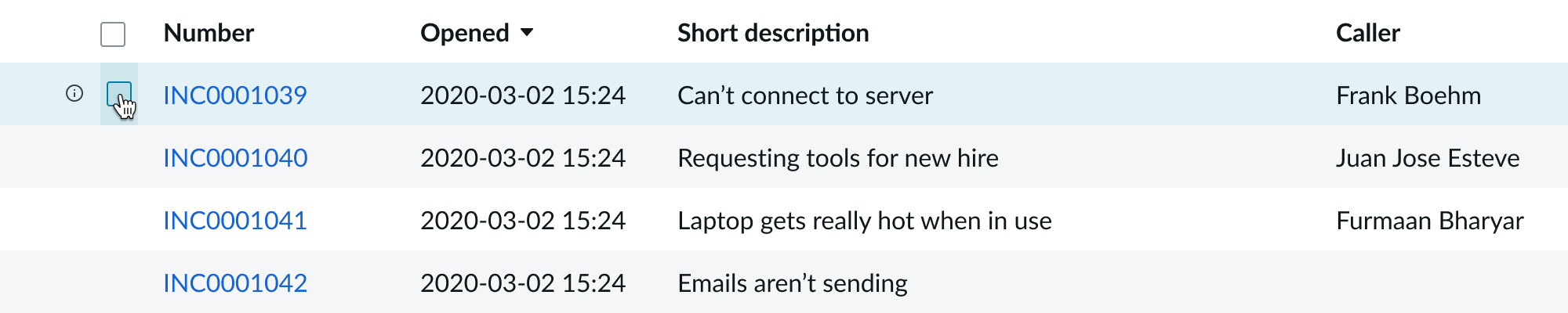
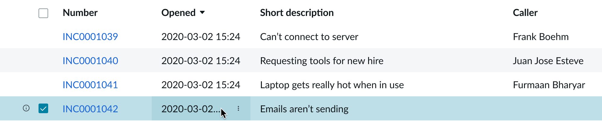
Selected
Selecting the checkbox in a list item highlights the row in a slightly darker shade.
Selecting a cell filter option highlights the option.
Responsive behaviors
Learn how list responds to changes in a container or display.
Scrolling
If the list has more vertical content than space, it displays a vertical scrollbar. If it has more horizontal content than space it displays a horizontal scroll bar. Both scroll bars can appear at the same time.
Interactions
Learn how list responds when a user interacts with it.
Filtering and sorting
The list body provides the user with multiple options for filtering and sorting content.
- Column filtering: Filter by selected criteria
- Column sorting: Sort by alphabetical or numerical order
- Cell filter: Filter results based on cell content
- Panel footer: Contains panel actions
- Restore defaults: Restores the filter to its default settings
- Advanced view: Displays advanced functionality
- Conditional delete: Deletes selected conditions from the filter
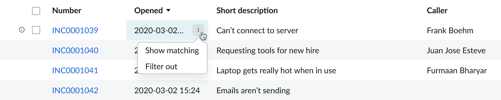
Grouping items by column filter options
Selecting the Overflow icon button in the column header displays a menu with a Group by option and an inline Filter form. Different content types display different filter types. When the user modifies the Filter form, the Apply button appears. Selecting Apply closes the menu and filters the form.
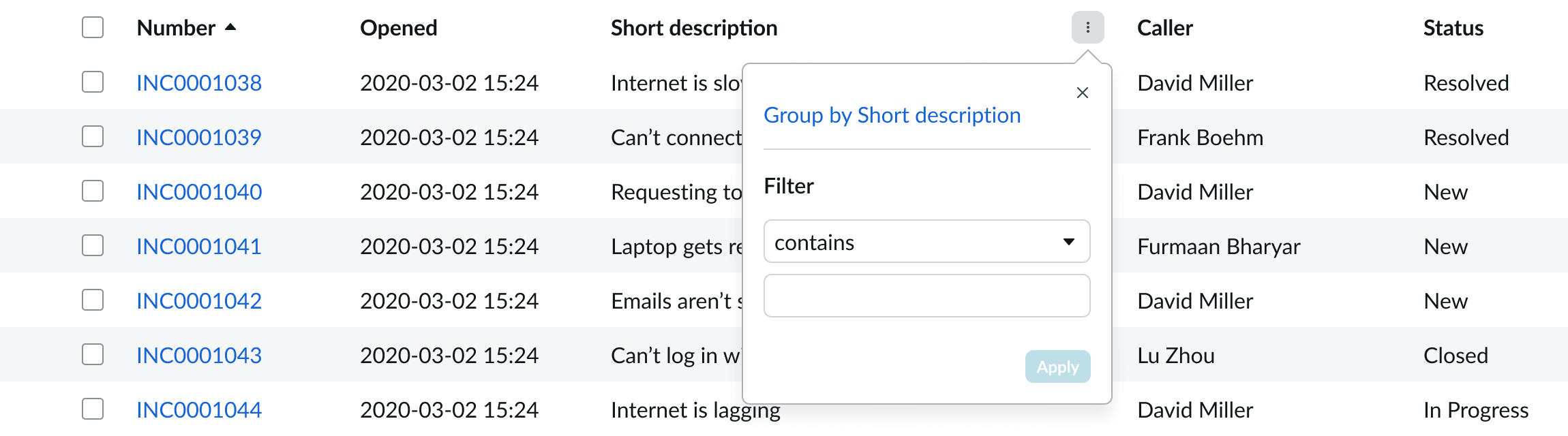
- Group by: Group list items by selected criteria
- Filter: Selected criteria by which to group list items
- Apply filters: Control for applying grouping criteria
Column sorting
Selecting the sorting icon at the top of a column arranges the records in ascending or descending order based on the entries in that column.
Quick edit
Selecting quick edit opens the report panel, providing details of the list item.
Truncation
If the short description within a list item doesn't fit within the column, it truncates with an ellipsis and shows the full text in a tooltip on hover.
Usability
List complies with all internationalization and accessibility requirements.
Internationalization
When this component is used in a platform configured for a right-to-left language (RTL), the list flips its orientation and aligns on the right.
Accessibility
Learn how to access the actionable elements of list through keyboard interactions and screen readers.
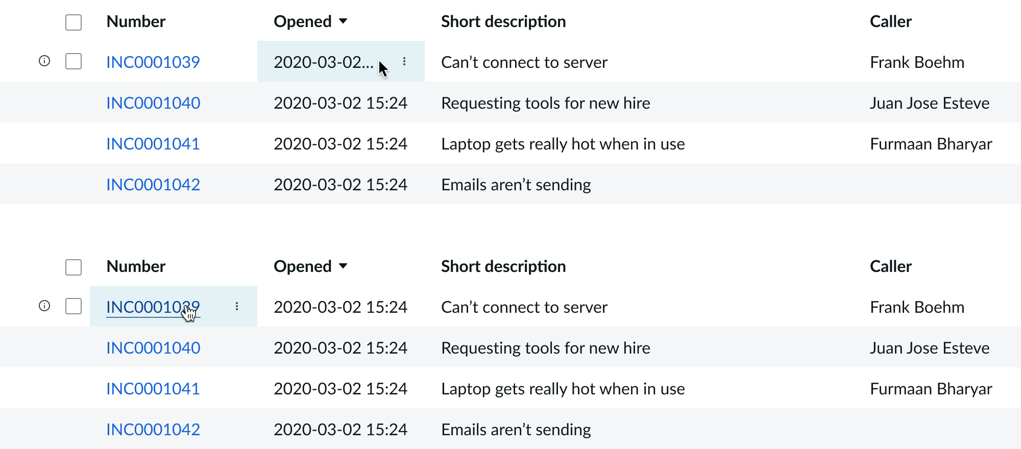
List tab order
In this example, the tabbing moves from the list menu component into position 1 in the list component. For details about the list menu tab order, see the usage guidelines for that component.
Keyboard interactions
You can access the actionable elements of list with these keyboard keys:
- Tab: Moves focus forward through list controls in the prescribed tab order
- Shift + Tab: Moves focus backward through list controls in the reverse tab order
- Arrow left or right: Moves left or right through the cells
- Arrow up: Moves to the previous visible row, whether you are focused on the list item itself or within the list item on one of its actions; if the focus is already on or within the first visible list item in the list, nothing happens
- Arrow down: Moves to the next visible row, whether you are focused on the list item itself or within the list item on one of its actions; if the focus is already on or within the last visible list item in the list, nothing happens
If on a cell containing interactive elements:
- Tab: Focuses on the first interactive element within the cell, trapping the focus within the cell; continued tabbing moves focus through each interactive element
- Enter: Selects the focused element
- Esc: Releases the tab function from the cell
If on a cell with no interactive elements:
- Tab: Does nothing
- Enter: Does nothing
If on a column resizer:
- Arrow left or right: Adjusts the width of the column
Screen readers
Screen readers use the built-in table functionality.