

Anatomy
Learn about the individual parts of related record.
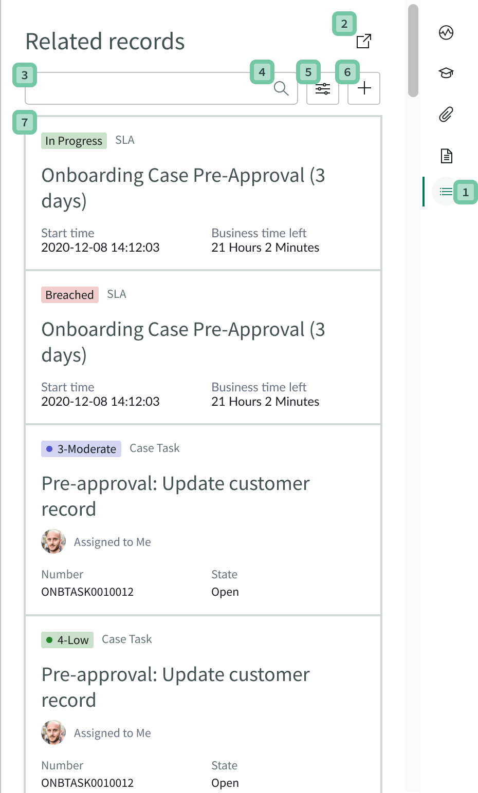
Side panel and controls
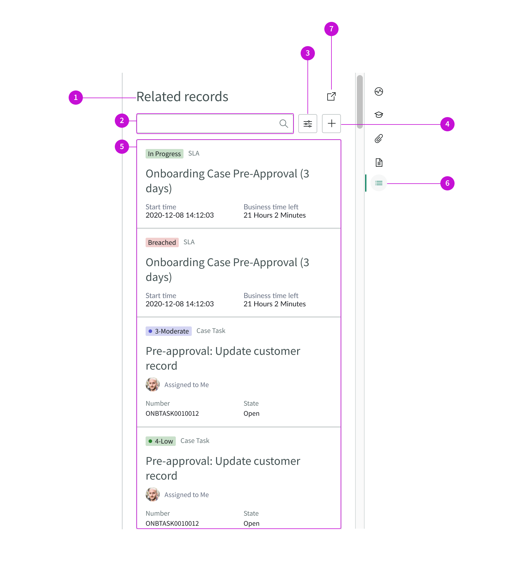
- Title: Name of the side panel
- Search input field: Enables agent to execute a text search to find specific records
- Filter control: Opens a menu that enables an agent to filter by record type
- Add button: Adds a new record
- Record card list: Container for the list of record cards
- Side panel control: Control for opening and closing the contextual side panel
- New tab button: Opens the records for a selected record type in a new, secondary tab displayed as a traditional list
Cards
This is the default view of the card component in related records. Data contained in the card can be configured with Entity View Action Mapper (EVAM) view templates associated with a configuration bundle called dynamic_related_records_bundle. For information about these templates and the view configurations that define what a card can show, see the EVAM product documentation.
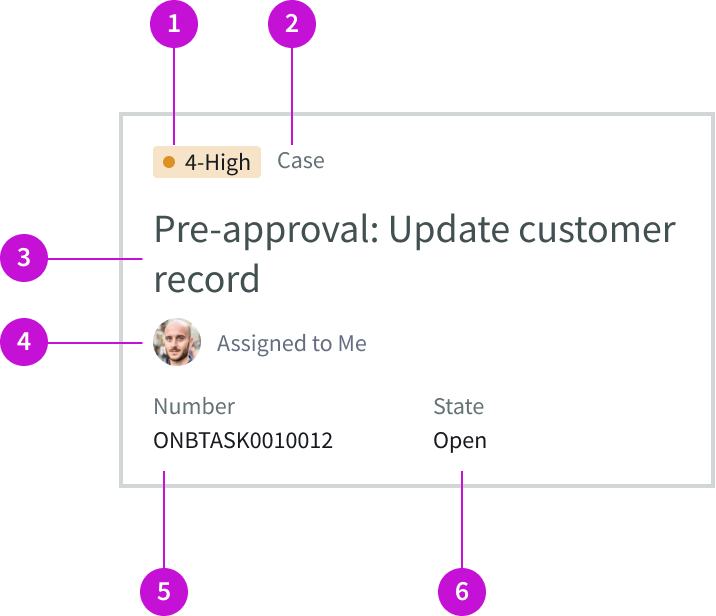
- Highlighted value: Shows priority of a task or stage of an SLA
- Category: Type of record, such as case, email, or SLA
- Description: Describes the record or displays the subject of an email
- Assignee: User to whom a task is assigned
- Metadata slot: Contains details about the record, such as a task number, email address, or an SLA start time
- Metadata slot: Contains details about the record type, such as state, elapsed time, email date, and blocking issues
Usage
The related records page template enables agents to access records that are related to content in their main working area, without having to navigate away. Components used in the page allow the agent to add records, search for records, and filter the list. The cards in the list provide at-a-glance information about each related record or email. Details include task priority, SLA status, and contact information.
Subcomponents
Dynamic related records is built with Next Experience components that have their own attributes, such as states, variants, and sizes. To learn more about the individual components used in the related records page, see the usage guidelines for those components.
See usage guidance for heading
See usage guidance for dropdown
See usage guidance for button iconic
See usage guidance for data set
See usage guidance for highlighted value
See usage guidance for SLA timer
See usage guidance for pagination control
Configurations
The related records page template is intended to be used as-is in UI Builder. The page was created with a template that is updated automatically. If you copy the template and customize the page, you won’t receive template updates, and your page might not function properly after an upgrade.
Card view
You can configure the information that a card displays and the actions that it offers by modifying the view template that the card uses in the instance. For details see Entity Vew Action Mapper (EVAM) in the product documentation.
Responsive behaviors
Learn how the related records page template responds to changes in a container or display.
Container size
The card width increases or decreases as the container width changes.
Empty state
You can configure the empty state message when there are no records to display. The empty state message appears above the heading, aligned on the left. The default message is: “No content to display. Try modifying your search text or filter to find what you’re looking for.“
Interactions
Learn how the related records page template responds when a user interacts with it.
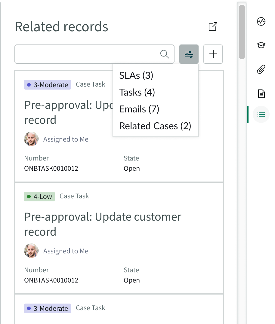
Filtering
When the user selects the filter control, a menu opens that allows the agent to filter by record type.
Creating records
A user can create a new record by selecting the add button. A blank record form opens in a sub tab.
Loading records
When the user selects a card, the record details appear in a new tab.
Opening a record list
Users can select the new tab button to view the records for the selected record type displayed in a list in a new tab.
Usability
The related records page template complies with all internationalization and accessibility requirements.
Internationalization
When this template is used in a platform configured for a right-to-left (RTL) language, The content of the cards flips to align on the right. The side panel controls don’t change their position.
Card and header content in the related records page aligns on the right for right-to-left languages.
Accessibility
Learn how to access the actionable elements of the related record page template through keyboard interactions and screen readers.
Keyboard interactions
You can access the actionable elements of the related records page template with these keyboard keys:
| Keys | Action |
|---|
These annotations show the tab order for keyboard access to the related records page and the order in which a screen reader announces each actionable element.
Keyboard interactions
You can access the actionable elements of related records page template with these keyboard keys:
You can access the actionable elements of related records page template with these keyboard keys:
- Tab: Moves focus to the next interactive element in the tab order
- Shift + Tab: Moves focus to the previous interactive element
- Enter/return or space bar: Triggers element action
When the focus is on the side panel control:
- Enter/return or space bar: Expands or collapses the contextual side panel
- Up or down arrow: Scrolls within the side panel area
Focus on the new tab button:
- Enter: Launches a new secondary tab and moves focus to the first interactive element in the new tab
Focus on the search field:
- Tab: Moves focus to the magnifying glass icon after search term is entered
- Shift + Tab: Moves focus to the previous interactive element
Focus on the search magnifying glass icon:
- Control + option + space bar: Executes a search when text is entered
- Tab: Moves focus to the next interactive element - the filter control
- Shift + Tab: Moves focus to the previous interactive element
Focus on the filter control:
- Enter: Activates the control and opens a drop down menu
- Arrow down: Moves focus to the next item in the drop down menu
- Arrow up: Moves focus to the previous item in the drop-down menu
- Tab: Moves focus to the next interactive element - the add record button
- Shift + Tab: Moves focus to the previous interactive element
Focus on the add record button:
- Enter: Activates the control and opens a new record form in a new tab, with focus on the first interactive element in that tab
- Tab: Moves focus to the next interactive element - the first record card in the panel
- Shift + Tab: Moves focus to the previous interactive element
Focus on a record card:
- Enter: Activates the control and opens the record in a new tab, with focus on the first interactive element in that tab
- Control + option + arrow right: Enters the group container and navigates the contents of the card in a voiceover of the elements inside
- Tab: Moves focus to the next interactive element - the next record card
- Shift + Tab: Moves focus to the previous interactive element
Screen readers
When you apply ARIA attributes to a component, screen readers announce the controls and content of that component in the prescribed tab order. Information about ARIA attributes is found on the WAI-ARIA Authoring Practices site. The accessible names are included in the components used in this page template.