

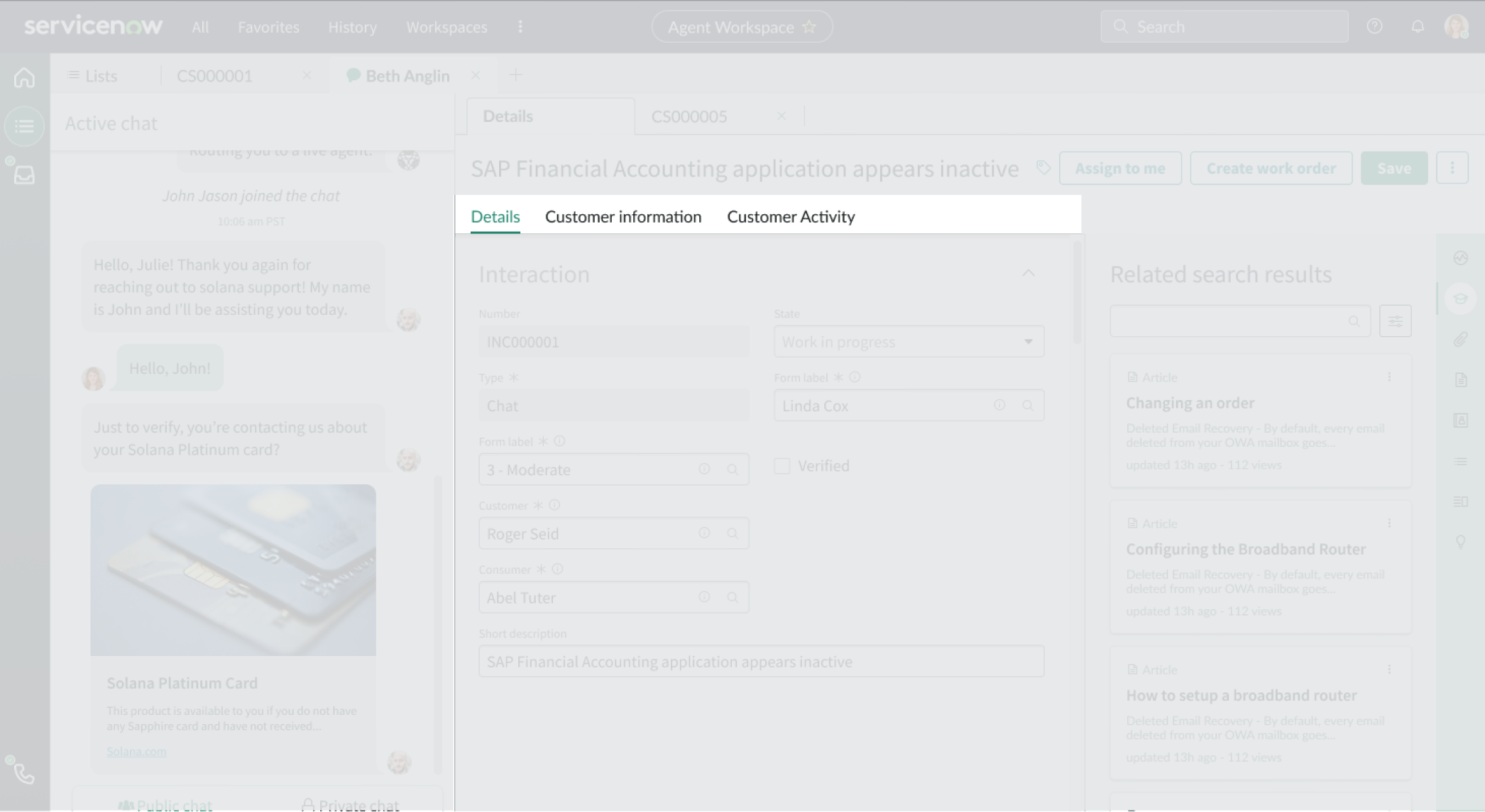
Anatomy
Learn about the individual parts of CSM Interaction Record.
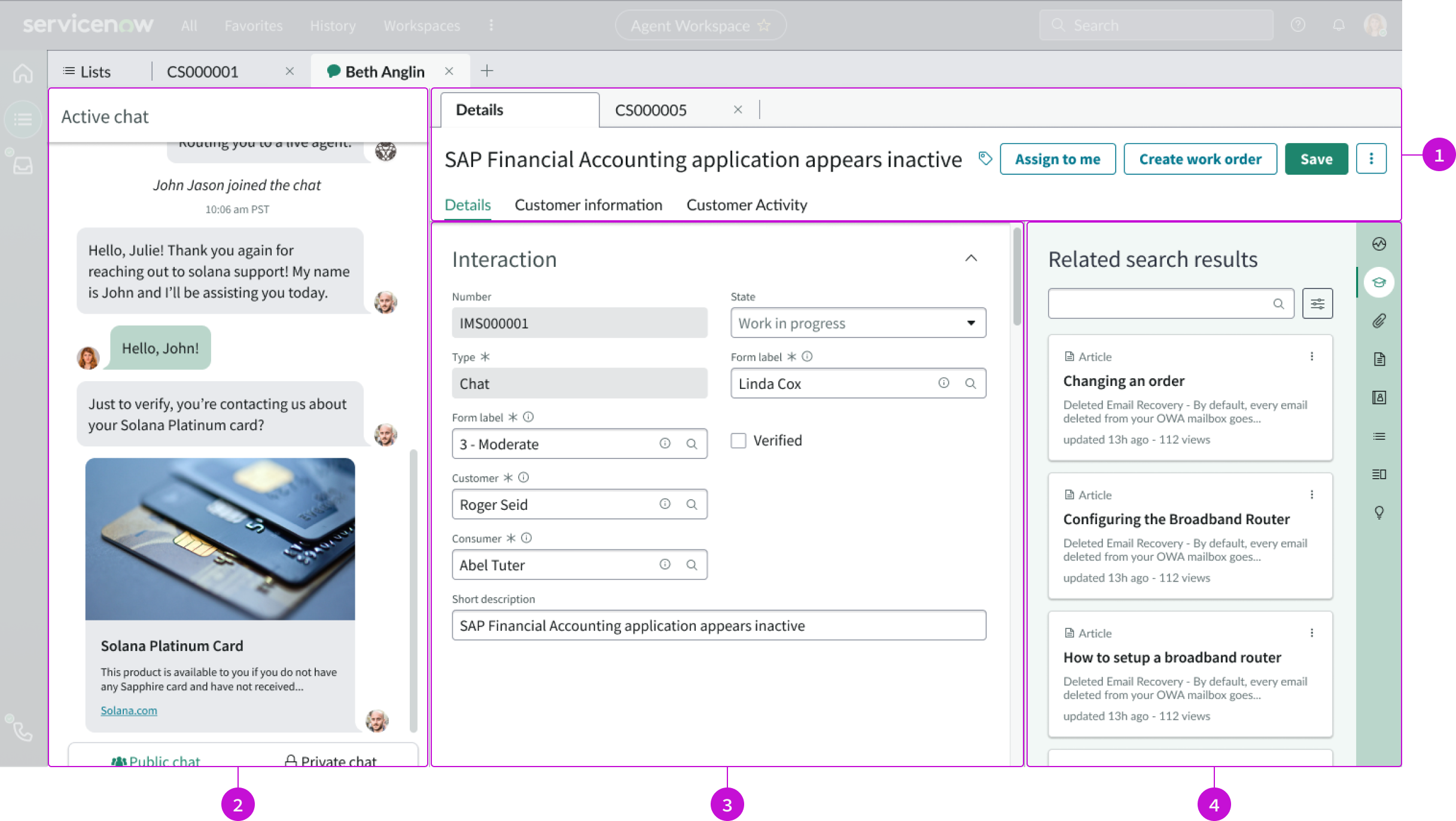
- Header: Contains record tabs, the title of the open record, and an action bar
- Chat panel: Viewport for displaying an active chat (if available); when the chat ends, the panel disappears
- Record: Interaction record displayed in the center of the page
- Contextual sidebar: Contains a search field and vertical tabs that open sub-components in a larger panel that are related to the current record
Usage
This page template provides the basic structure for an interaction record, including interaction information and related search results.
Components
The CSM Interaction Record is built with Horizon Design System components that have their own attributes and interactions.
Record header
The record header displays the name of the record, tags, and any buttons. This component offers presets. For more information, see the usage guidelines for record header.
Interactions and behaviors
- Buttons in the header enable users to take action on the current record.
- Selecting the tag icon opens the Edit Tag modal, showing the tags currently associated with the record. In this modal, users can:
- Add and remove tags
- Rename existing tags
- Change tag visibility
Defaults
By default the record header includes:
- Title
- Record tags
- Action bar
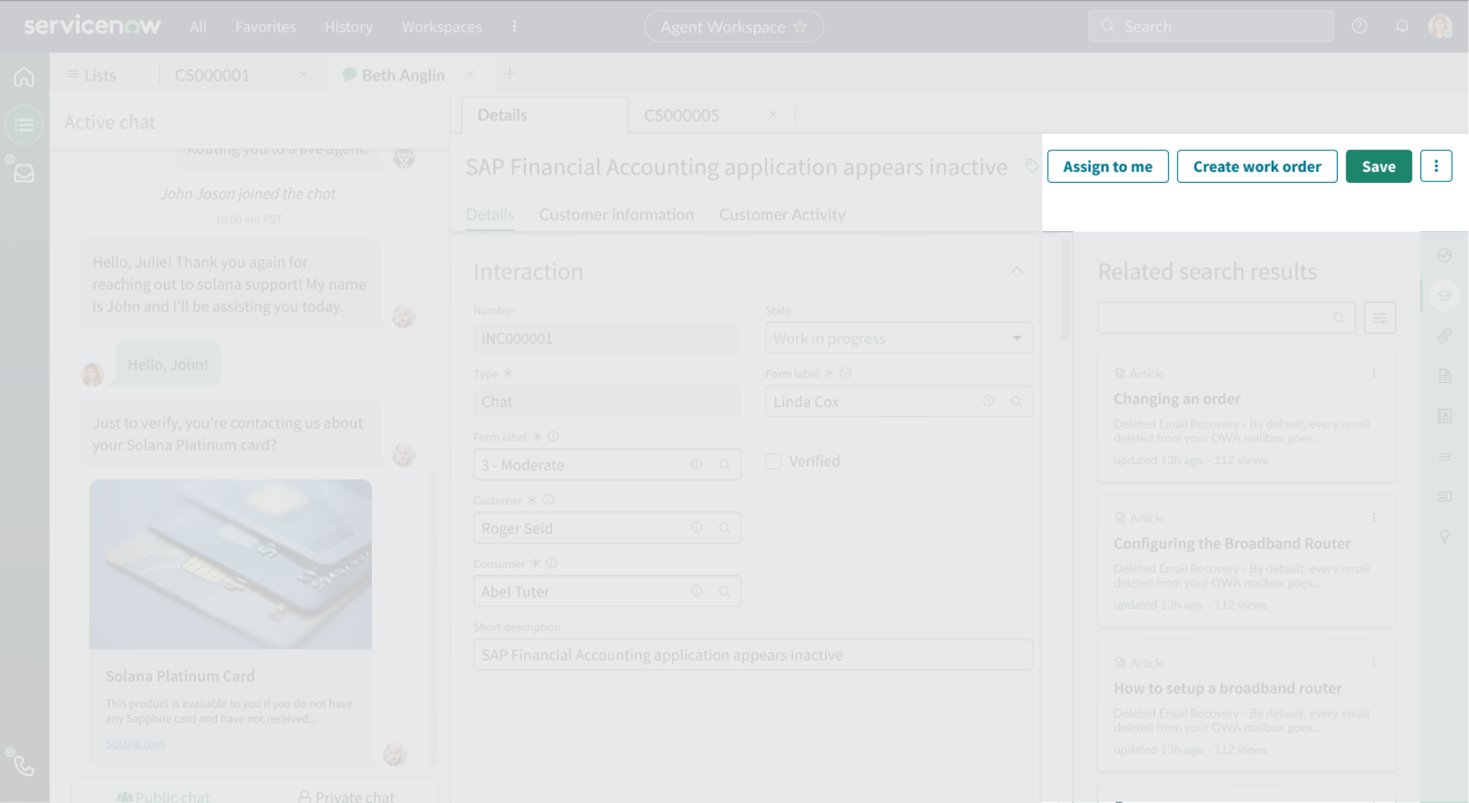
Action bar
The action bar component contains buttons and menu items that enable users to interact with and take actions on a page. This component offers presets. For more information, see the usage guidelines for action bar.
Interactions and behaviors
Selecting a button or menu option executes the associated UI action for the record.
Defaults
By default, the action bar component displays these elements:
- Buttons: “Assign to me,” “Create work order,” and “Save” actions
- Iconic button: Overflow menu with “Copy Task” and “Delete” actions
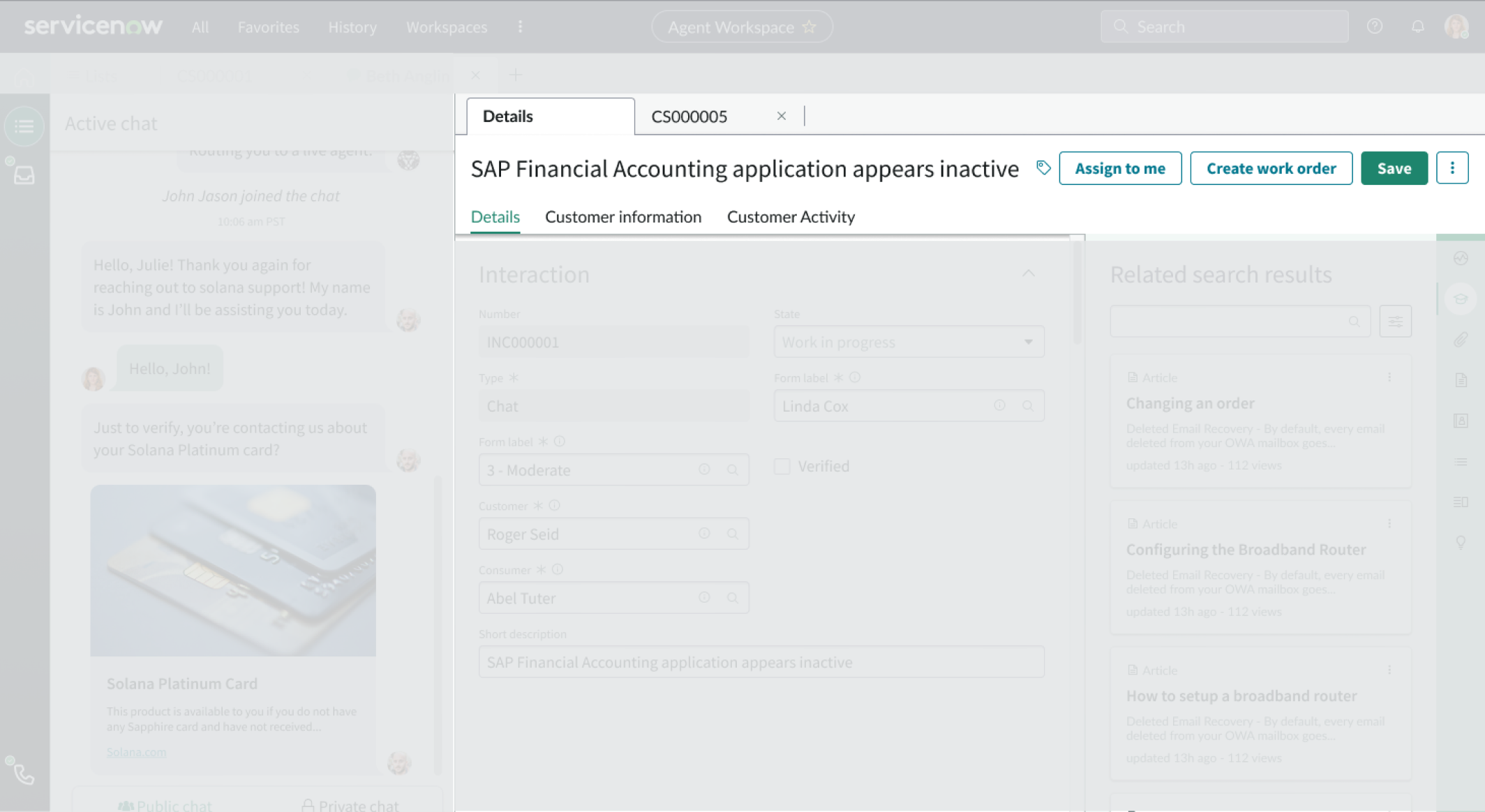
Record
The record component displays information from the linked record. The tabs enable navigation between form details, customer information, and customer activity.
Interactions and behaviors
Users can resize the record container and move between tabs to view more information.
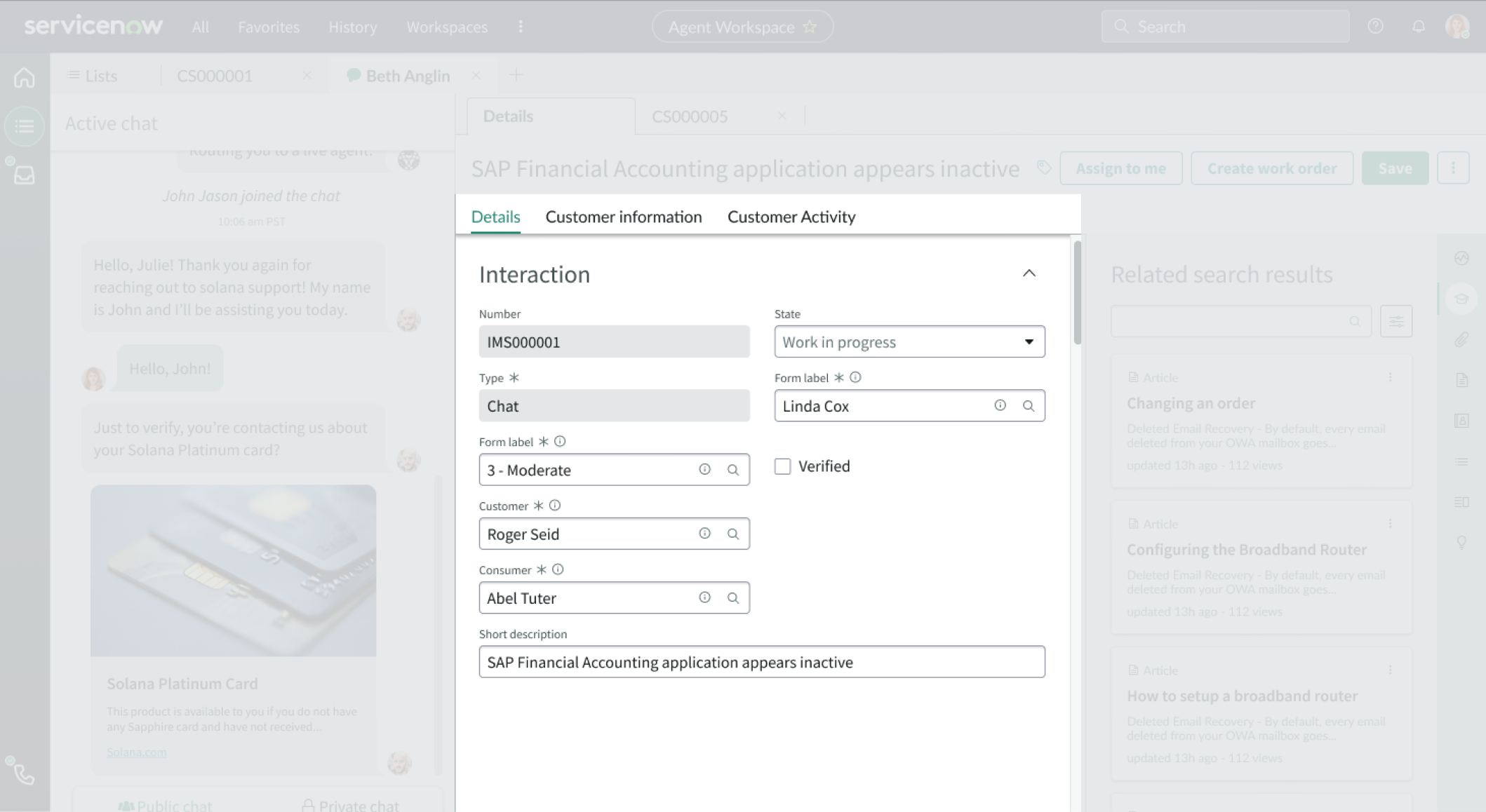
Tabs
The tabs component is a navigational element attached to a record that helps a user view different sets of information, including related lists. Tabs enable the user to access information without having to display long lists on a single record page. For more information, see the usage guidelines for tabs.
Interactions and behaviors
- When the number of tabs exceeds the width of the container, excess tabs are moved to an overflow menu marked “more.”
- Selected tabs are marked with an active indicator.
- Users select a tab to display the information from that tab in the content area.
- Users can add comments and worknotes to records they are viewing.
Defaults
By default the tabs component displays only the “Details” tab. To add the “Customer information” and “Customer Activity” tabs, see the contextual sidebar section below.
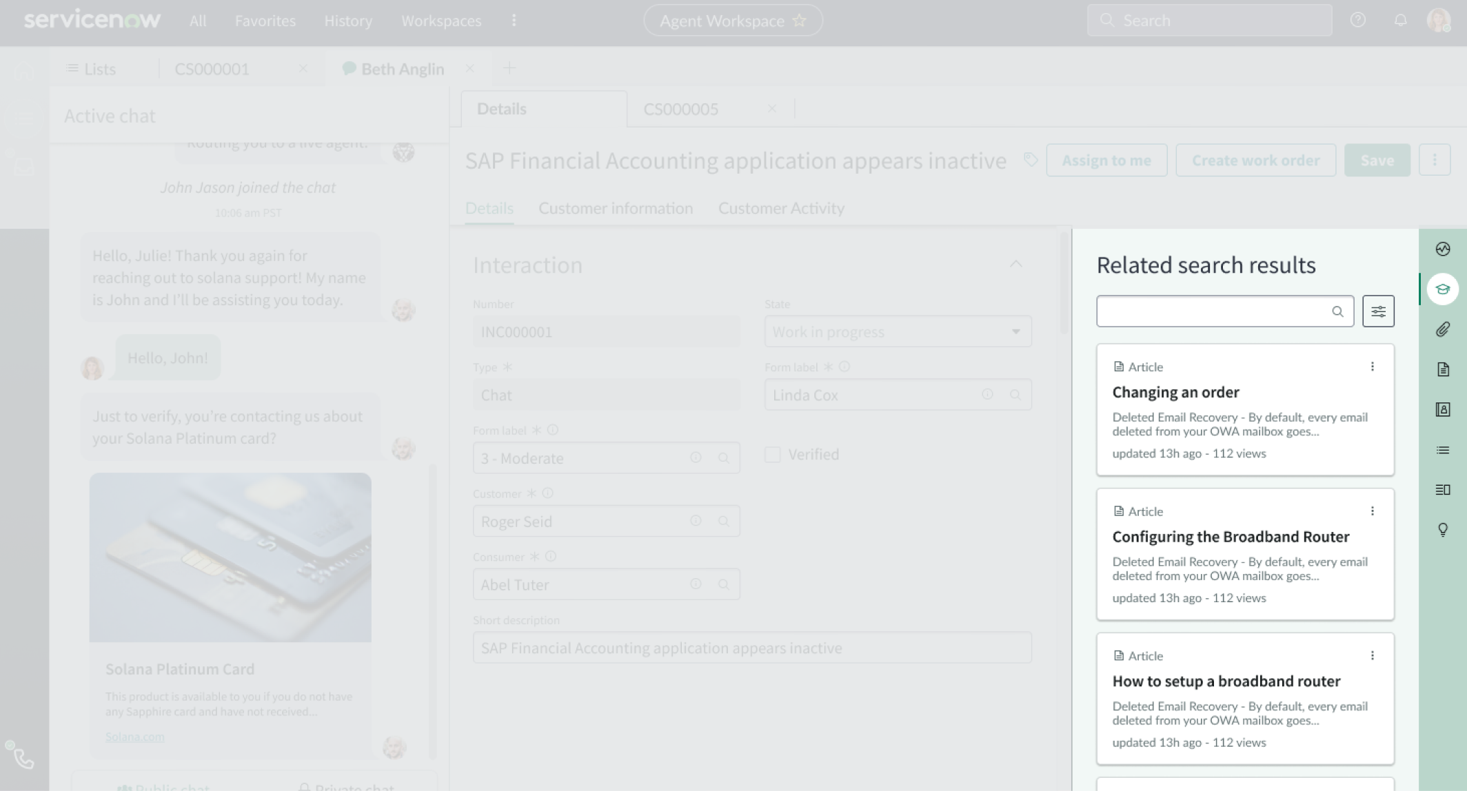
Contextual sidebar
The contextual sidebar contains a search field and vertical tabs that open sub-components related to the current record in a larger panel.
Interactions and behaviors
- Users can use the search field to filter for related records.
- Users can use the “Look and Verify” option from the sidebar to find a customer to link to the interaction record. Linking a customer to the record adds the “Customer information” and “Customer Activity” tabs to the top of the record.
- By default, the tabs sidebar component has these behaviors:
- The tabs sidebar is open by default.
- Related search results (agent assist), attachments, and templates can also appear as tabs in the sidebar.
Defaults
- By default, the tabs sidebar component has these behaviors:
- The tabs sidebar is open.
- Related search results (agent assist), attachments, and templates can also appear as tabs in the sidebar.
Configurations
The CSM Interaction Record page is intended to be used as-is in your experience and provides default functionality that fits most use cases. The page is created from a template that is updated automatically. If you copy the template in UI Builder and customize the page, you won’t receive template updates, and your page might not function properly after an upgrade.
User preferences
Users can control specific behaviors and features of the page through the user preferences menu options. The selections that users make in this menu are saved until the user’s next session. Examples of user preferences options offered in workspaces are:
- Wrapping text in lists
- Showing banners
- Showing a counter on badges
- Show sidebar
Usability
The CSM Interaction record page template complies with all internationalization and accessibility requirements.
Internationalization
When this page template is used in an instance configured for a right-to-left (RTL) language, the individual components have their own behaviors. See the usage guidelines for the components used in the page for details.
Accessibility
For accessibility behaviors of specific components, see the usage guidelines for those components.
Keyboard interactions
Each component used in the CSM Interaction Record page template has its own tab order and keyboard interactions. See the usage guidelines for those components.
Screen readers
When you apply ARIA labels to a component, screen readers announce the controls and content of each component in the prescribed tab order. See the usage guidelines for those components.