

Anatomy
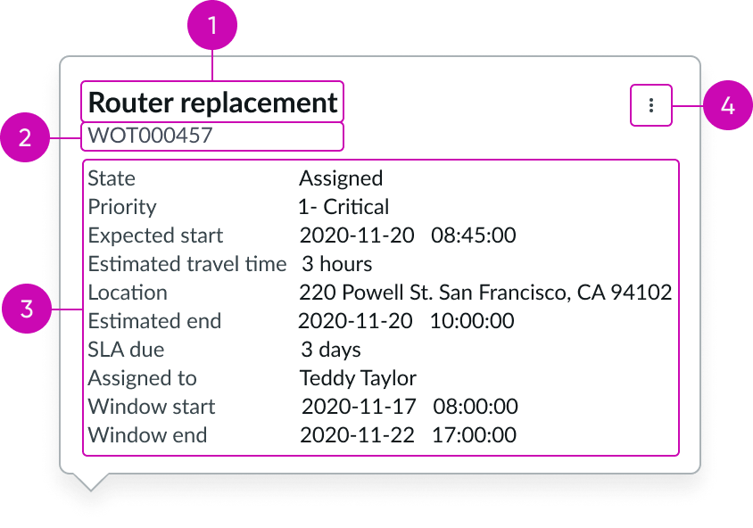
- Heading: Title of the popover that describes the content shown; for example, a short description of a record
- Subhead (optional): Text that adds additional context to the content in the popover
- Content area: Label value pairs that populate with data from a record
- Additional actions (optional): Button that when selected shows a menu with contextual actions
Subcomponents
See usage guidance for heading
See usage guidance for button iconic
See usage guidance for label value tabbed
See usage guidance for popover
Usage
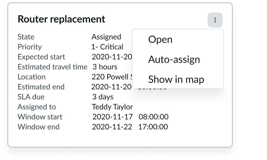
Include the field service popover to show content that adds context to a record. An icon (for example, the eye icon) should always trigger the popover.
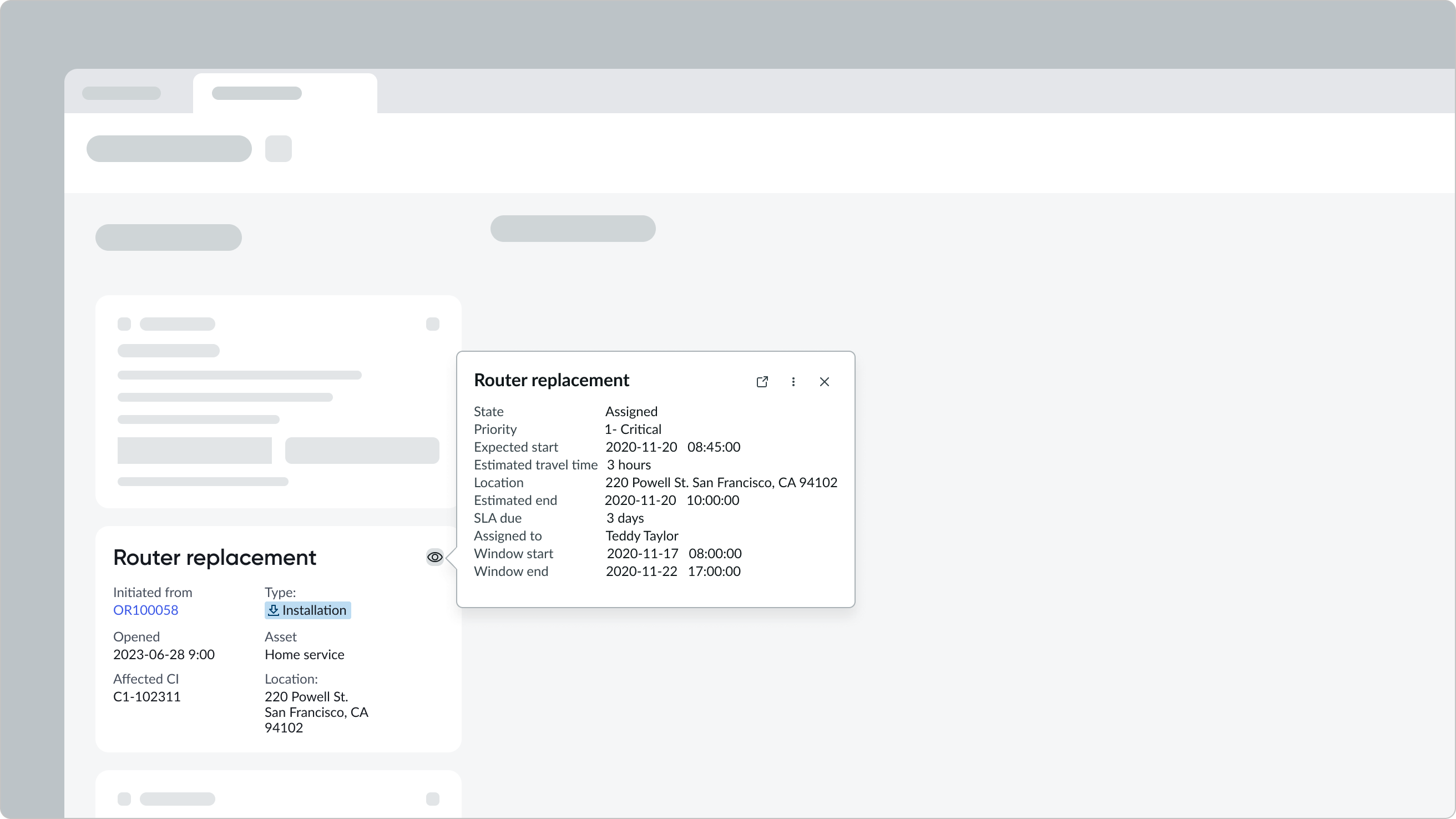
In this example, the field service popover is used to surface additional task details.
Variants
Learn about field service popover and find out how to use it in your design.
Sizes
An admin can set a popover total width, and content will adjust accordingly.
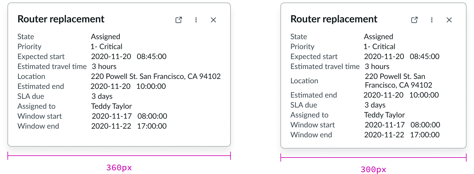
In this example, the same popover is configured in different widths.
Configurations
Learn how to customize field service popover by configuring the available properties.
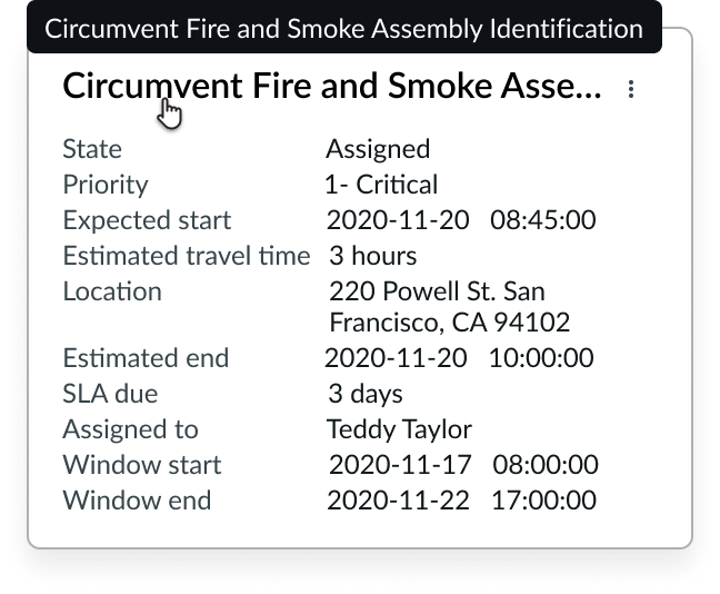
Heading
The heading pulls information from the short description field in the work order task record.
Subhead
The subhead pulls information from the number field in the work order task record.
Additional actions
An admin or app designer can enable actions in the popover that are surfaced in an overflow menu.

Label value pairs
Label value pairs surface information from the work order task record. An admin or app designer can configure the number of label value pairs to display in the field service popover.
Behavior
Learn how field service popover behaves when the display changes or a user interacts with the component.
Responsive behaviors
Learn how field service popover responds to changes in a container or display.
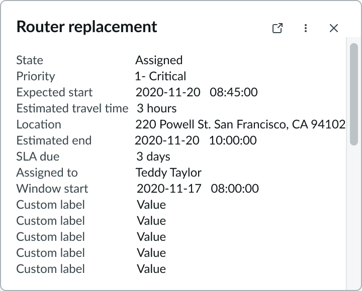
Maximum height
When a field service popover is configured to accommodate more than 15 lines of text a scrollbar appears.
Interactions
Learn how field service popover responds when a user interacts with it.
Opening the popover
The user can open the popover by selecting the triggering icon button on the user interface.
Accessing actions
The user can select the button in the popover and choose an action from the panel. Actions are contextual to the type of record displayed.
Truncation
When heading and subheading text exceeds the width of the content area, then it truncates with an ellipsis, and a tooltip shows the full content on hover. Label value pairs don’t truncate but wrap to more lines if they exceed the width of the columns in the content area.
Usability
Field service popover complies with all internationalization and accessibility requirements.
Internationalization
When the display translates to a right-to-left (RTL) language, the component follows the same behavior as LTR, except with a reversed right-justified orientation.
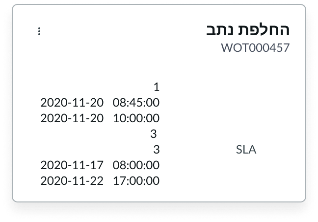
In this example, the field service popover appears in a RTL language.
Accessibility
Learn how to access the actionable elements of field service popover through keyboard interactions and screen readers.
Keyboard interactions
You can only access the additional actions button (if available) within field service popover.
When the popover is in focus:
- Tab
- Shift + Tab
- Space or Enter
- Esc
Screen readers
Field service popover has no specific screen reader considerations.