

Anatomy
Learn about the individual parts of feedback.
Feedback buttons
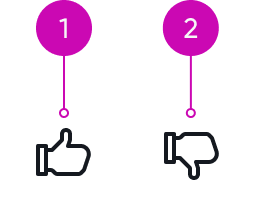
- Thumbs-up: Clickable button denoting positive feedback; opens a positive feedback popover when selected
- Thumbs-down: Clickable button denoting negative feedback; opens a negative feedback popover when selected
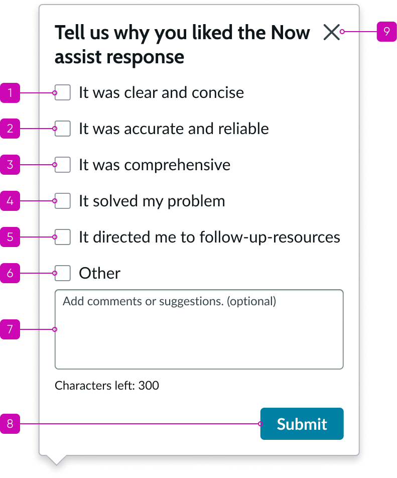
Negative feedback popover
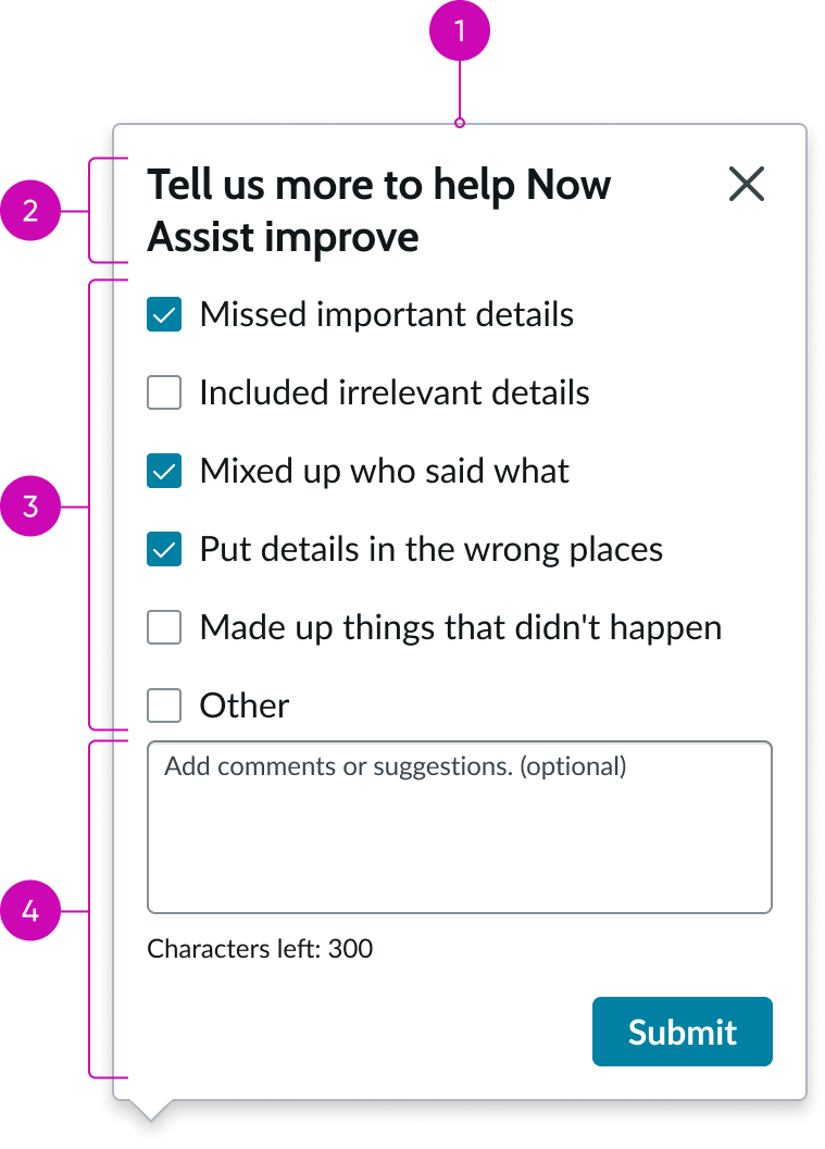
- Popover: Temporary panel that contains the feedback header, options, text box, and submit button
- Header: Feedback title and popover close button (X)
- Content area: List of selectable options for the feedback; can be checkboxes or radio buttons
- Footer: Text area for comments and submit button for submitting the granular feedback
See the usage guidelines for button.
See the usage guidelines for checklist.
See the usage guidelines for popover.
See the usage guidelines for radio button.
See the usage guidelines for text area.
Usage
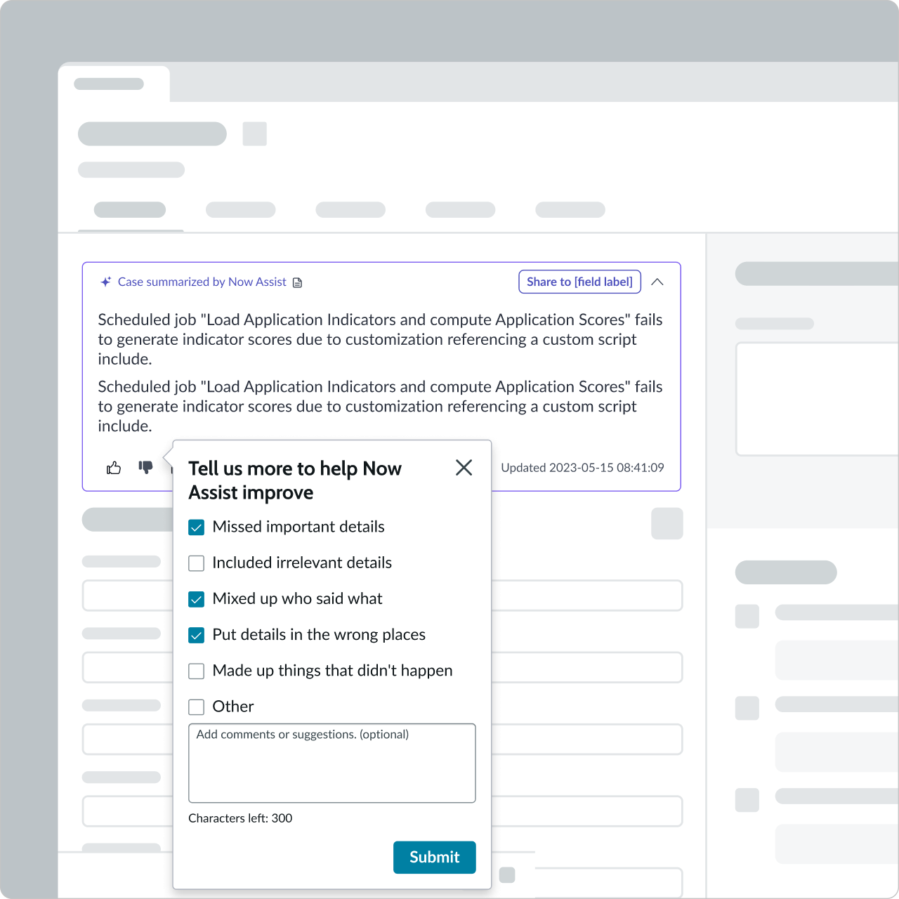
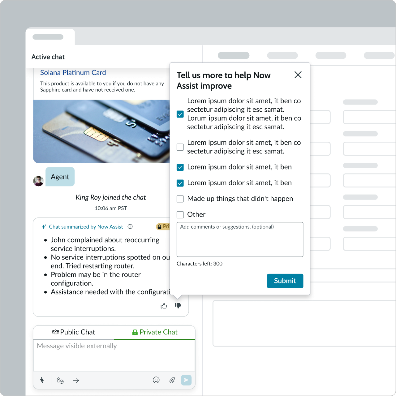
Use the feedback component to capture granular feedback from the user in an environment that has thumbs-up and thumbs-down icons to collect feedback. For example, in a case summary, chat summary, Now Assist panel, and Now Assist popover. The user is prompted with the feedback popover after selecting either feedback icon. The user can select from the displayed options and also use the text area to provide additional details before submitting their feedback. The options are configurable to be radio buttons or checklists to enable users to select one or multiple options in their feedback.
Variants
Learn about the variants of feedback.
Sizes
Feedback doesn’t have any size variants; however, some of the subcomponents might. For size information about sub components of feedback, see the individual component usage guidelines.
Configuration
Feedback doesn’t have any size variants; however, some of the subcomponents might. For size information about sub components of feedback, see the individual component usage guidelines.
Design recommendations
- Use this component whenever there’s AI generated output that you want to get user feedback for
- Use the feedback popover in conjunction with the thumbs-up and thumbs-down buttons
- The checklist or radio button content should be two lines or less
- The checklist or radio button row content should be clear and concise
- When possible, use the existing checklist or radio button row options
- Remove unnecessary checklist or radio button row options
- If you want to change the checklist or radio button options, work with your AI or machine learning (ML) scientist and content designer
If the current options aren’t relevant to your use case, work with your AI or ML Scientist and content designer to create new ones
Don’t edit checklist or radio button row content to be more than two lines of content
UI text guidelines
These are some recommendations for using text within feedback:
- Use sentence case for all titles, labels, and column headers
- Keep all text labels informative and short to increase readability and scanning
For more information, see the usage guidelines for checklist, radio buttons, and text area when configuring the options and text areas in this component.
Behavior
Learn how feedback behaves when the display changes or a user interacts with the component.
States
Feedback has the following states: Default, Hover, and Selected.
| State | Example |
|---|---|
| Default |  |
| Hover |  |
| Selected |  |
Interactions
When the user selects the thumbs-up or thumbs-down icon, the granular feedback popover displays. For checklist or radio button options, the selected options are highlighted. For interaction information about sub components of feedback, see the individual component usage guidelines.
Usability
Feedback complies with all internationalization and accessibility requirements.
Internationalization
When the display translates to a right-to-left (RTL) language, all elements in the popover flip and align right.
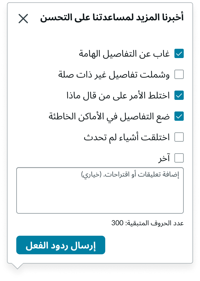
In this example, the feedback popover appears in a right-to-left (RTL) language.
Accessibility
Learn how to access the actionable elements of feedback through keyboard interactions and screen readers.
Feedback tab order
This is the tab order for feedback.
Keyboard interactions
Users can interact with feedback using the keyboard.
You can access the actionable elements of feedback with these keyboard keys:
- Tab: Moves focus to the next element in feedback
- Shift + Tab: Moves focus to the previous element
- Esc: Closes the granular feedback popover
- Spacebar: Selects or deselects feedback options when focus is on the options
When the focus is on text area :
- Up or down arrow: Moves the cursor to the previous or next lines if any
- Left or right arrow: Moves the cursor to the previous or next character
- Shift + up or shift + down arrow: Selects the text starting from the cursor position to the previous or next lines
- Shift + left or shift + right arrow: Selects the characters starting from the cursor position to the previous or next characters
Focus on the submit button:
- Spacebar or Enter: Submits the granular feedback and closes the popover if there is not error; on error, displays an error message and doesn’t close the popover
Screen readers
When you apply ARIA labels to a component, screen readers announce the controls and content of feedback in the prescribed tab order.