

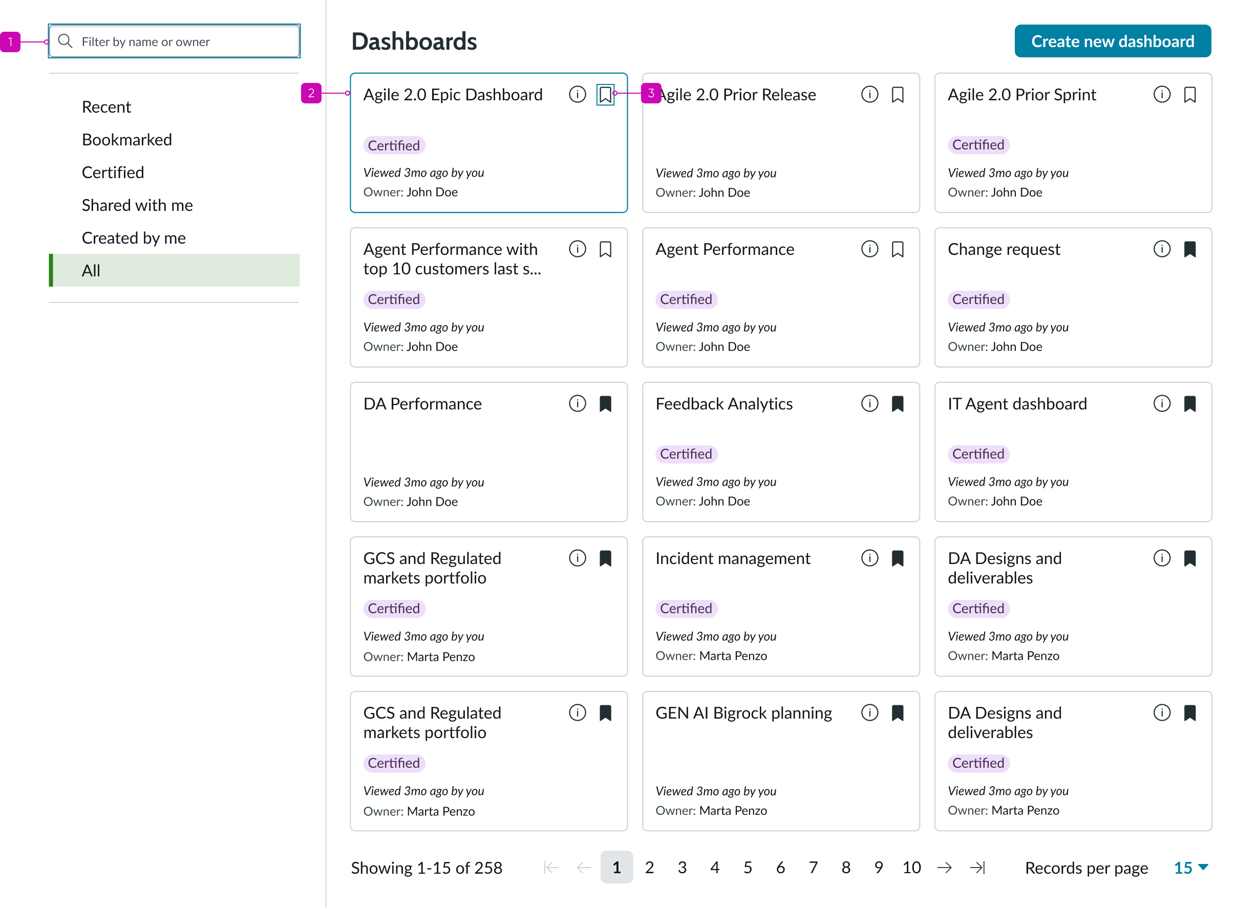
Anatomy
Learn about the individual parts of dashboards overview.
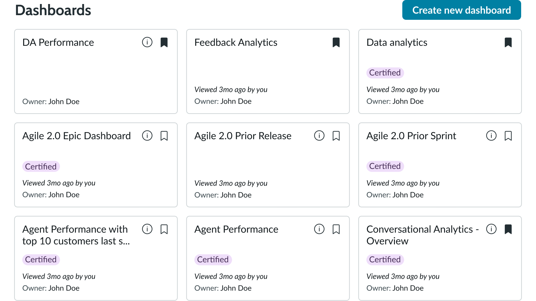
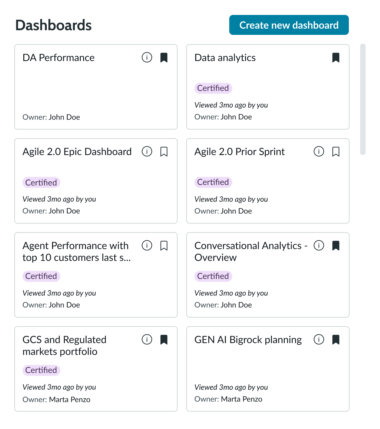
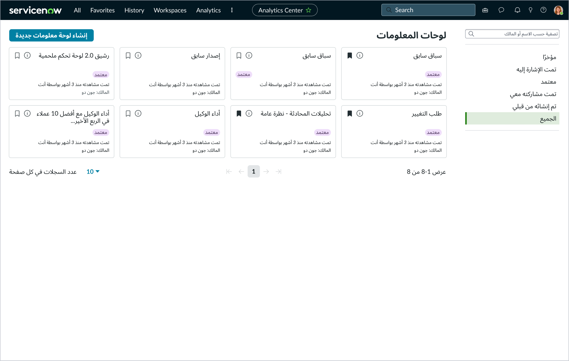
Dashboards overview
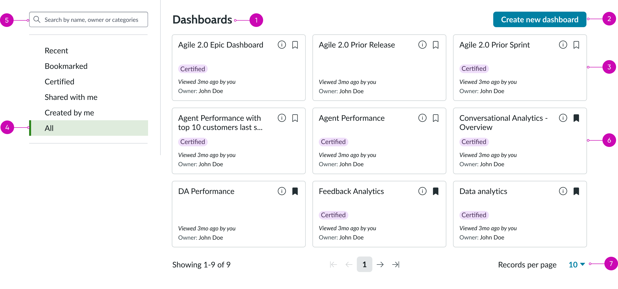
- Heading: Title of the component
- Action button: Bare button that takes the user to the all-dashboards page
- Dashboard card: Direct link to a specific dashboard page
- Filter panel: Contains search and filtering capabilities
- Search input field: Allows the user to search for a dashboard by name or owner
- Dashboard card: Represents a specific dashboard; when selected, the user goes directly to the dashboard
- Pagination control: Subcomponent that helps the user navigate between pages
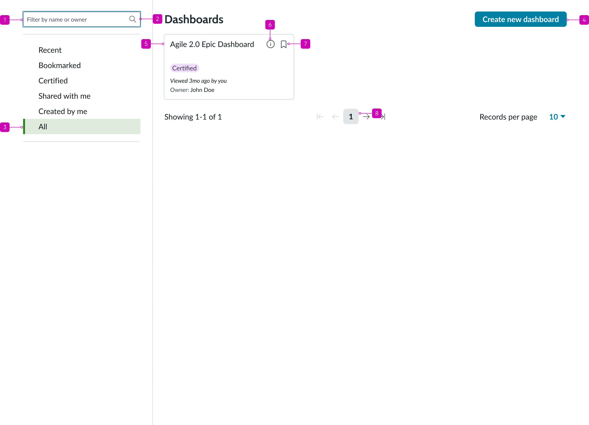
Dashboard card
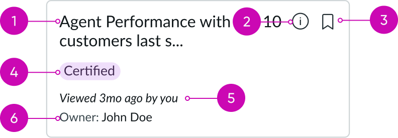
- Dashboard title: Name of the dashboard
- Info/Description: Description of the dashboard
- Bookmark: Bookmark the artifact over the card
- Certified: Artifacts that are certified
- Last viewed: Shows the last viewed information
- Dashboard owner: Name of the dashboard owner
Subcomponents
See usage guidance for heading
See usage guidance for button bare
See usage guidance for search input field
See usage guidance for pagination control
Usage
Use the dashboards overview component to help users easily view and access all available Dashboards directly from one page.
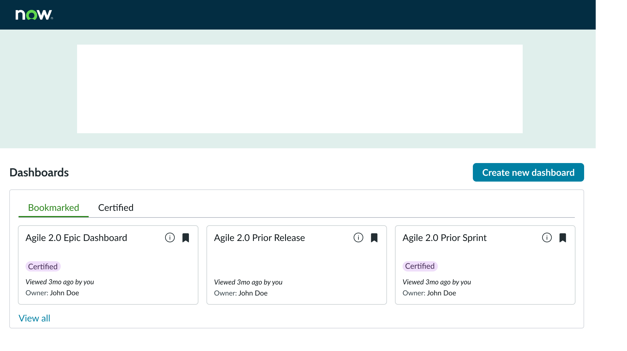
In this example, the dashboards overview component helps users access dashboards.
Configurations
You can customize the dashboards overview by configuring the following properties.
Heading name
You can change the titles of the dashboards overview and all-dashboards views to suit your use case.
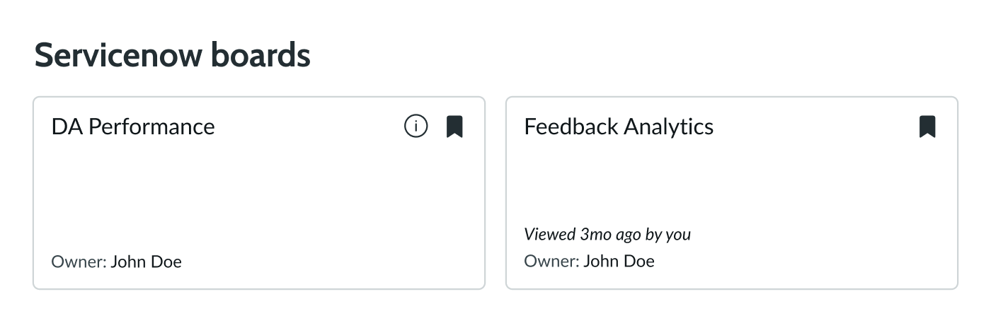
Number of cards
You can display as many cards as you want within the dashboards overview component. The default number of cards is 6.
Design recommendations
Learn how to apply dashboard overview in your design.
UI text guidelines
These are some recommendations for using text within dashboards overview:
- Use sentence case for all titles
- Keep titles informative and short to increase readability and scanning
- Capitalize only the first letter and any proper nouns in a string of text
Behavior
Learn how dashboards overview behaves when the display changes or a user interacts with the component.
Responsive behaviors
Learn how dashboards overview responds to changes in a container or display.
Card size
Dashboard card width automatically adjusts, based on the configured height and width of the component.
Card overflow
When the total number of cards doesn't fit the dashboards overview size, a scrollbar appears to let the user scroll through the complete list of cards within the dashboards overview.
Interactions
Learn how dashboards overview responds when a user interacts with it.
Selecting dashboard card
When the user selects an individual dashboard card, they go to that dashboard.
Selecting dashboard link
When the user selects the bare button link, they go to the all-dashboards pages.
Truncation
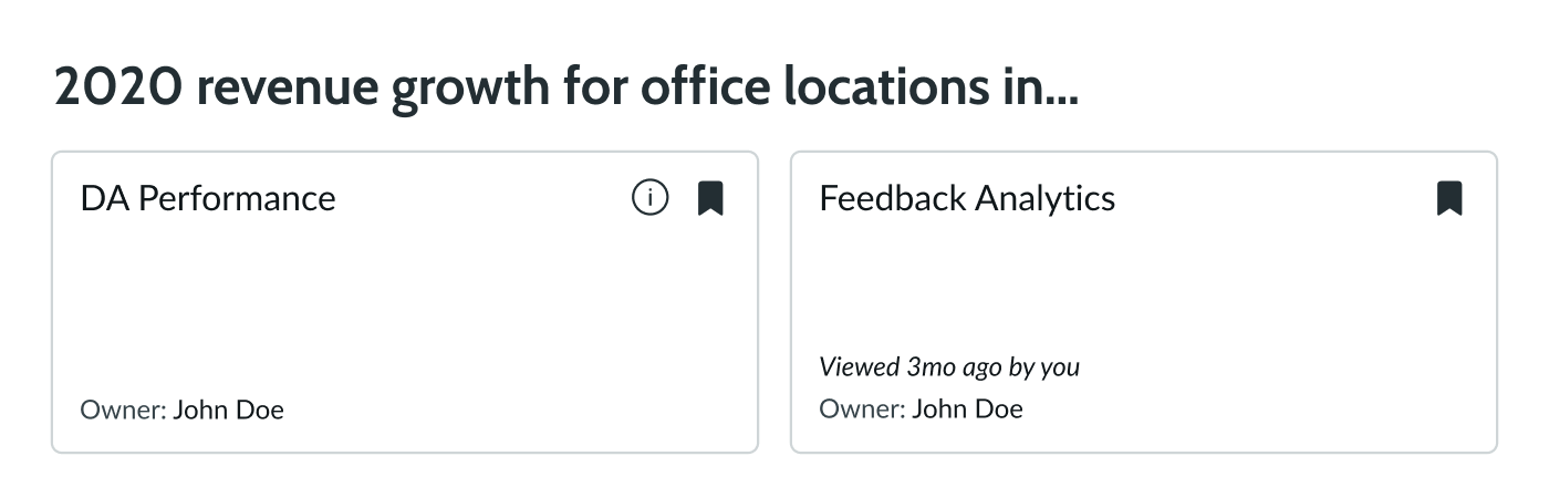
When the heading of the dashboards overview exceeds the width of the container or content area, the text truncates. A See all link appears, allowing users to display the entire heading.
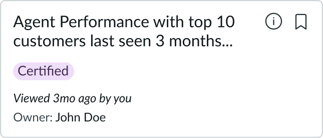
When the dashboard name in a dashboard card exceeds the width of the container or content area, the text goes to the next line. If the dashboard name exceeds the width of the second line, the name truncates. If the dashboard owner's name exceeds the width of the container or content area, the name truncates.
Usability
Dashboards overview complies with all internationalization and accessibility requirements.
Internationalization
When the display translates to a right-to-left (RTL) language, the component heading aligns on the right and the button link aligns on the left. Dashboard cards orient from the top-right, going to the bottom-left.
All subcomponents follow their own internalization rules.

Alignment on all-dashboards pages follows the same principle. However, the filters panel aligns to the right.
Accessibility
Learn how to access the actionable elements of dashboards overview through keyboard interactions and screen readers.
Keyboard interactions
You can access the actionable elements of dashboards overview with these keyboard keys:
- Tab: Navigates through actionable items in the dashboards overview in the specified order
- Shift + Tab: Navigates through actionable items in reverse order
- Arrow up, down, right, left: Scrolls up and down the entire page in the dashboard card section and navigate between the items in the filters section
- Enter: Opens related page, dashboard, or interacts with subcomponents (for example, a search input field, bookmark and info icons in the dashboard cards)
This is the tab order for dashboards overview:
This is the tab order for the all-dashboards page:
Screen readers
When you apply ARIA labels to a component, screen readers announce the controls and content of pagination control in the prescribed tab order.