

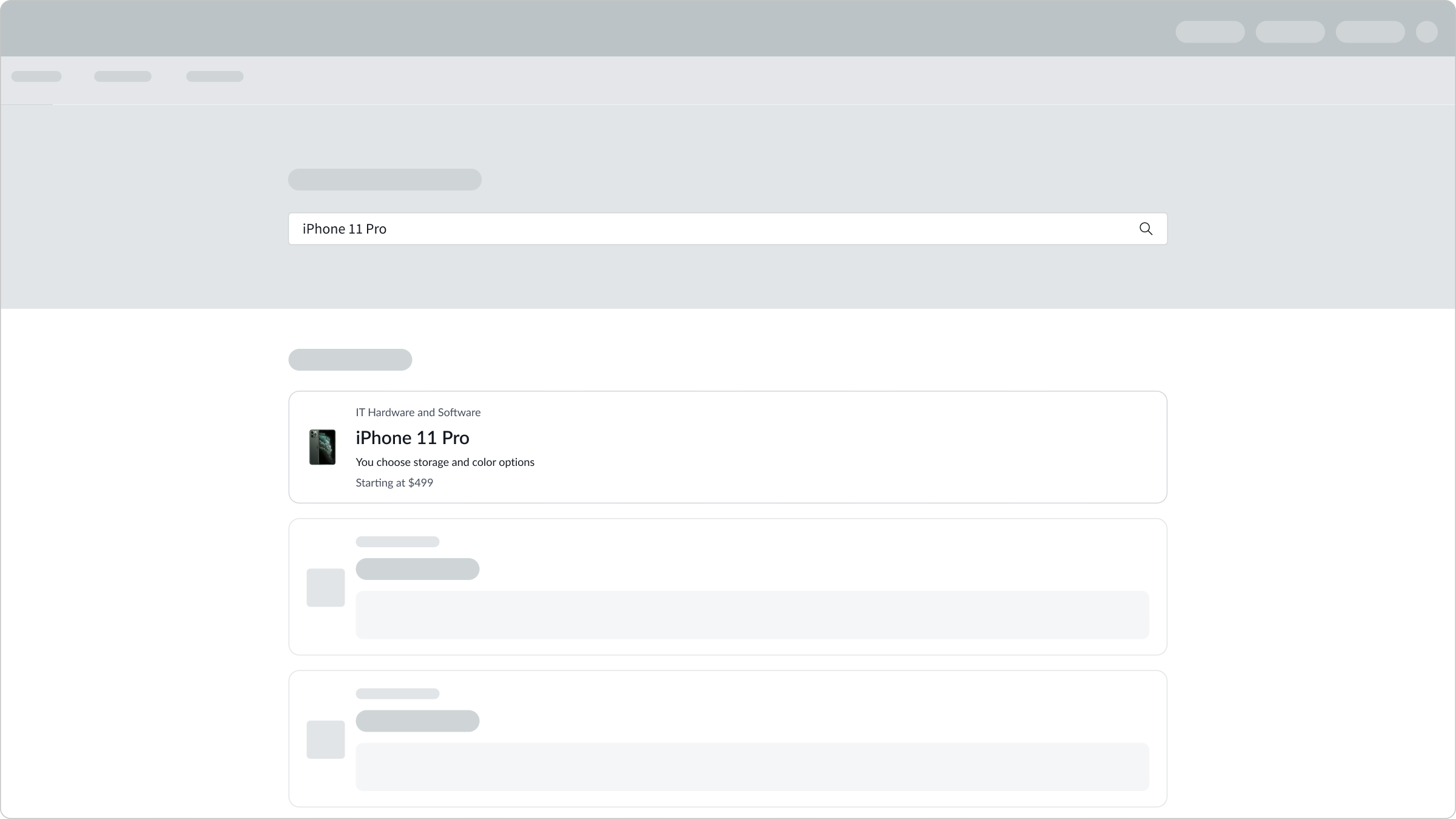
Anatomy
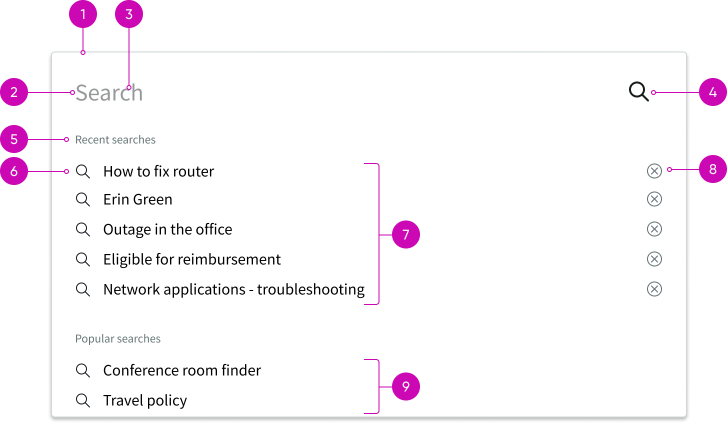
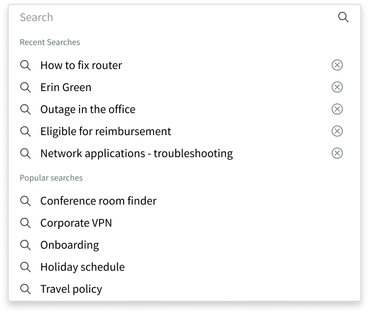
- Search flyout: Container for the search field, results, and suggestions
- Search field: Input field for a user's query
- Placeholder text: Suggested queries for a user, based on information types
- Search button: Initiates the search based on the user's query
- Section title: Description of suggested queries or results that have been grouped together
- Identifier: Visual indicator for categorizing the suggested queries
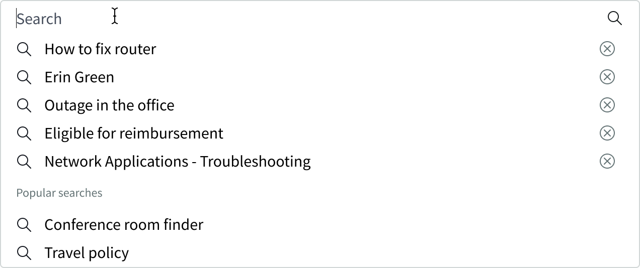
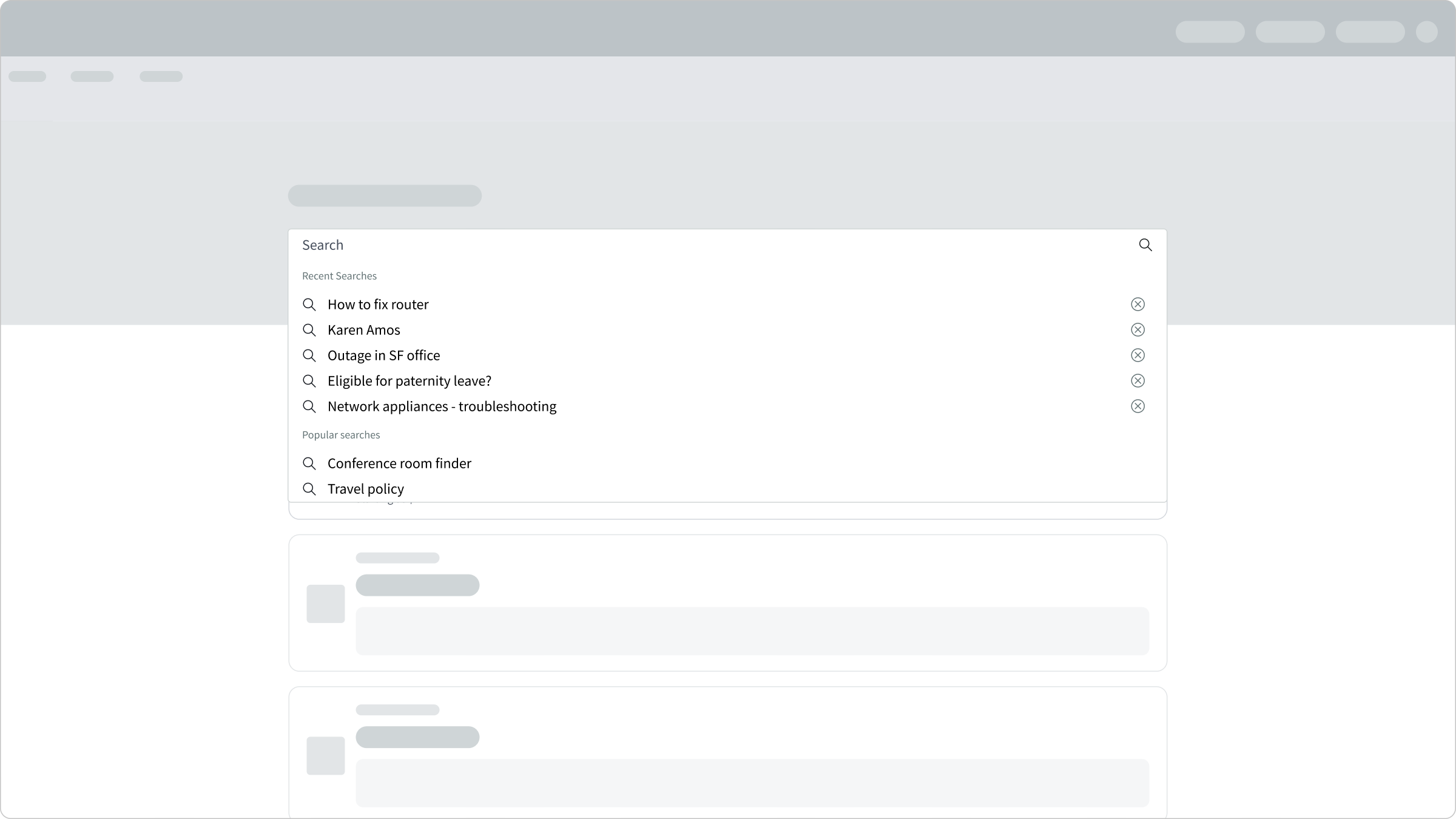
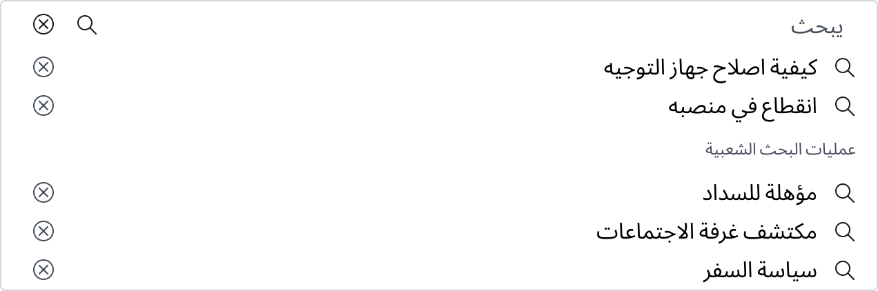
- Recent searches: User's previous search queries, listed in order, with the most recent query at the top
- Delete button: Deletes the query items in the user's recent searches list
- Popular searches: Popular content searched for by other users, listed in alphabetical order
Subcomponents
See usage guidance for search facets
See usage guidance for button iconic
See usage guidance for tooltip
See usage guidance for typeahead
See usage guidance for typeahead multi
Usage
Learn about search input and find out how to use it in your design.
Use the search input component for sitewide or page-based searches. Use the flyout menu to guide users to things they might want to search for or to recent queries. If you want the user to filter their searches, use the search facet component in conjunction with the search input. Search facets offers a panel for narrowing down results by attribute, or a tab bar for filtering by search source.
Variants
Learn about the variants of search input.
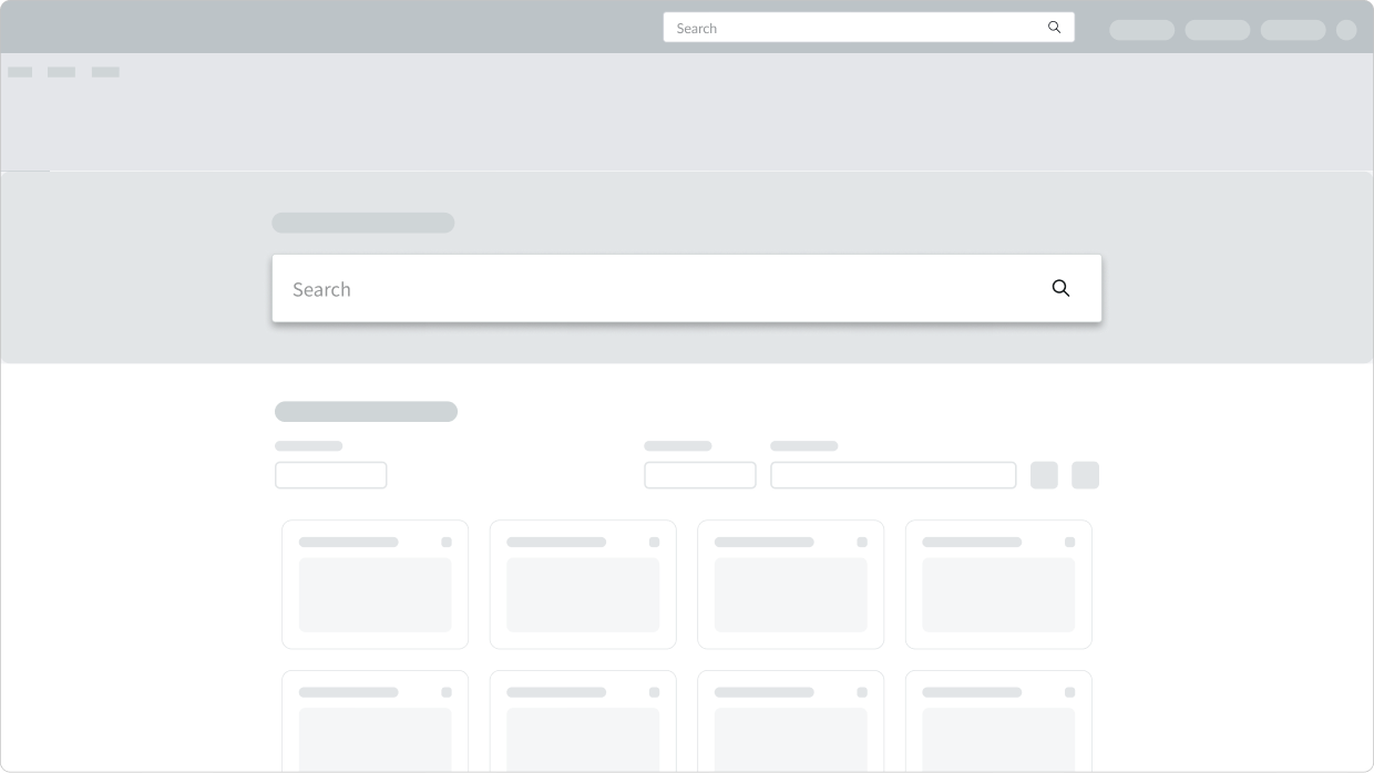
Sizes
The search input component has two sizes: large (lg) and small (sm).
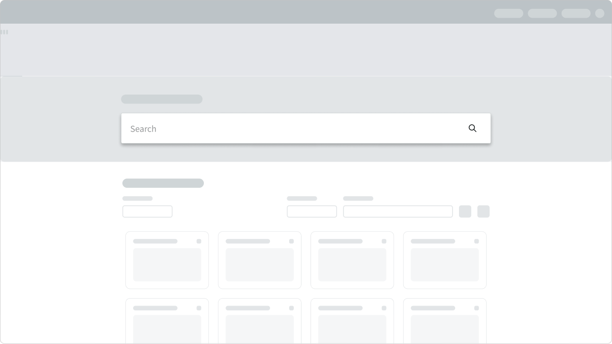
Large
Use this type when search is the dominant action on a webpage, such as on a home page or a search results page. Its size immediately draws the user's attention. Always use a large search input on the search results page.
Small
Use this type in a header on a secondary webpage. This focuses the user's attention on the content of the page instead of the search input.
Configurations
Learn how to customize search input by configuring the available properties.
Placement
Decide if you want search input to appear in the body or header of your page. By default, the component is configured for placement in the body of your page. If you plan to use it in a header with a background, use the header placement instead.
Placeholder text
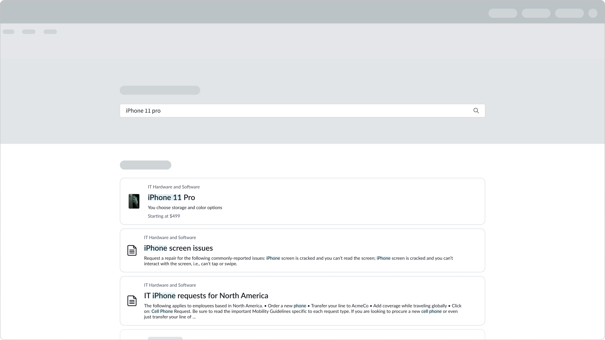
You can configure custom placeholder text that helps users create appropriate queries. Suggest search categories that reflect the theme of the page or form. For example, placeholder text on an employee portal might suggest queries for requests, knowledge base articles, IT support, or company news.

Autocomplete
You can disable the feature that autocompletes a user's partial input. Autocomplete is enabled by default.
Design recommendations
Learn how to apply search input in your design.
A single, prominently located search input field clearly indicates to users where to enter their queries.
Avoid using more than one search input field per page, which can confuse users.
Use a maximum of 2 search sections to reduce information overload for the user.
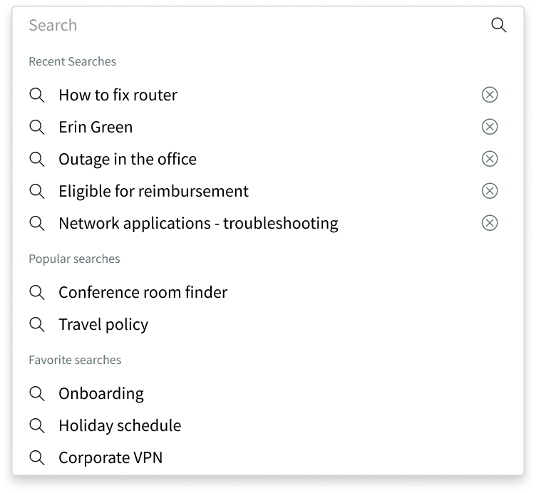
More than 2 search sections can clutter the flyout menu and make content hard to find.
Alignment and positioning
Position the search input component at the top or in the middle of a page, so that the flyout menu can extend below the search input field.
Position the home page search input and the results page search input in similar positions on their respective pages. That way, the home page transitions smoothly to the results page when the user enters a search query.
UI text guidelines
These are some recommendations for using text within search input:
- Placeholder text should be helpful and easy to read
- Search section names should be broad enough to include many possible search suggestions
Behavior
Learn how search input behaves when the display changes or a user interacts with the component.
States
The search input only has a focus state. However, the subcomponents within it have both a hover and focus states.
Search input
The user can tab to the search input to display the focus state.
| State | Example |
|---|---|
| Default | 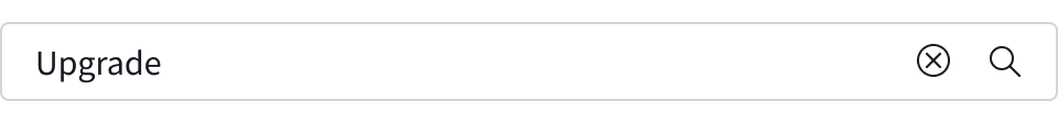 |
| Focus | 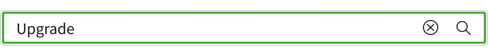 |
Buttons
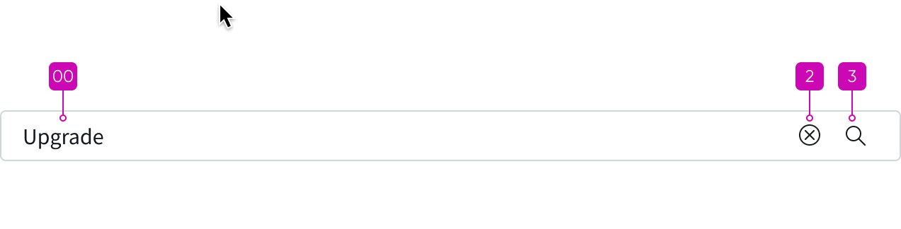
The user can interact with the clear field button and the search icon. These buttons adopt the same states as the iconic button.
| State | Example |
|---|---|
| Default |  |
| Hover | 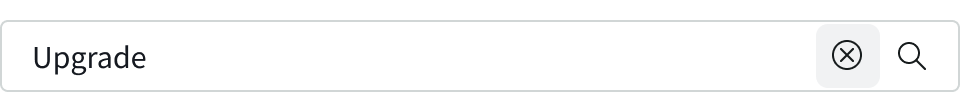 |
| Focus | 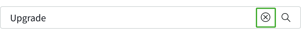 |
Flyout menu
Hovering over an entry in the flyout menu highlights the item.
| State | Example |
|---|---|
| Default | 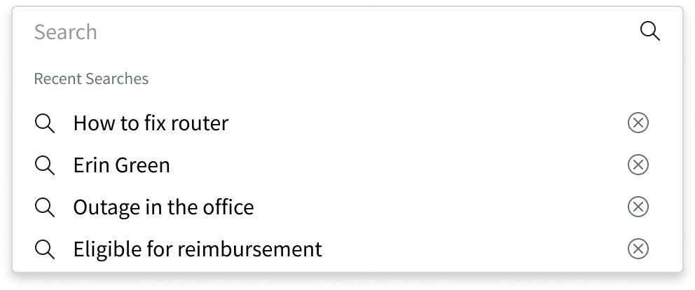 |
| Hover | 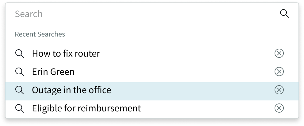 |
| Focus | 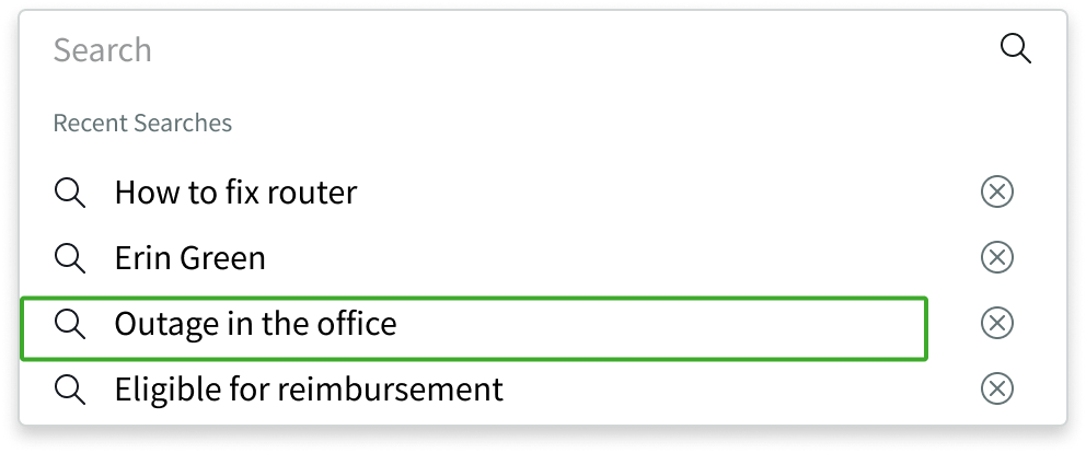 |
Responsive behaviors
Learn how search input responds to changes in a container or display.
Flyout menu overflow
If multiple sections overflow the flyout menu, a scroll bar appears so that users can see all options.
Empty sections
If a search doesn’t return any items in a section, then that section doesn’t appear. If neither "Recent searches" nor "Popular searches" contain items, the search flyout doesn’t appear.
Interactions
Learn how search input responds when a user interacts with it.
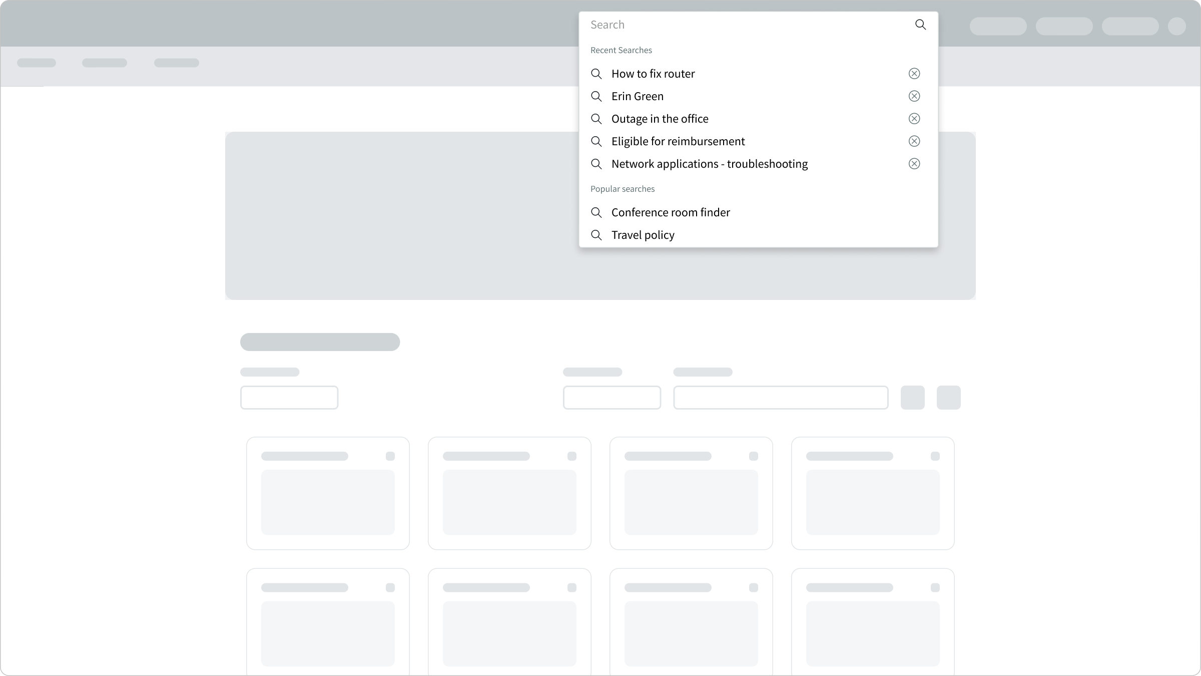
Click in
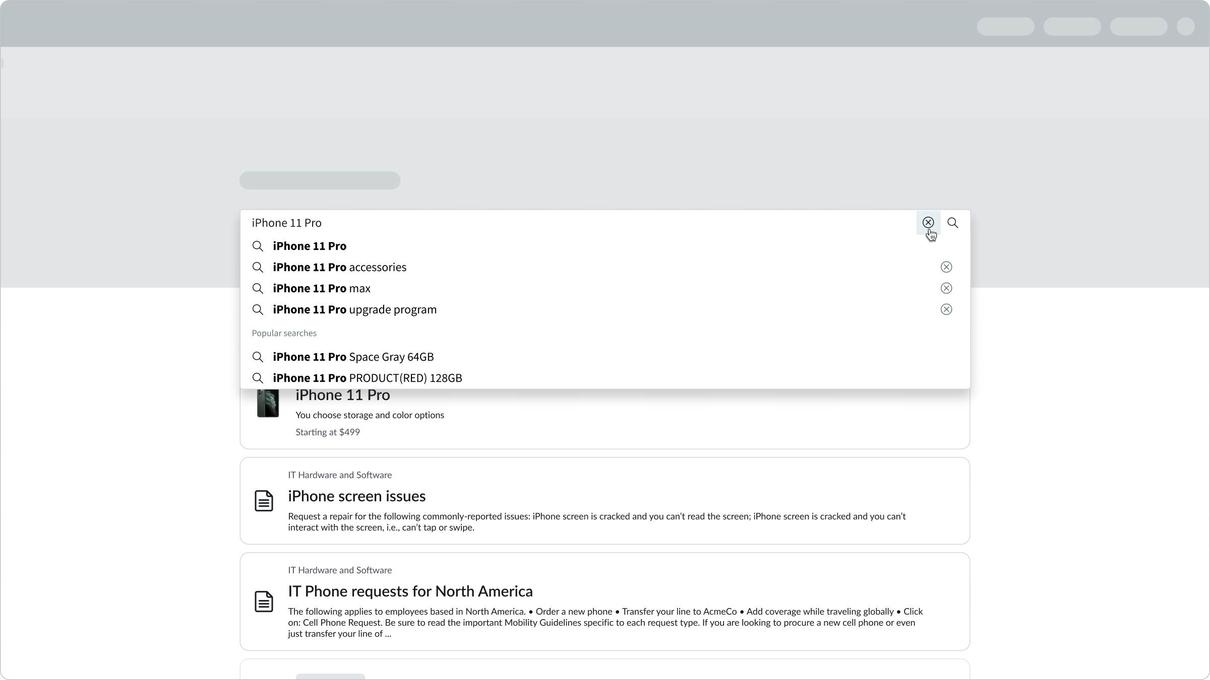
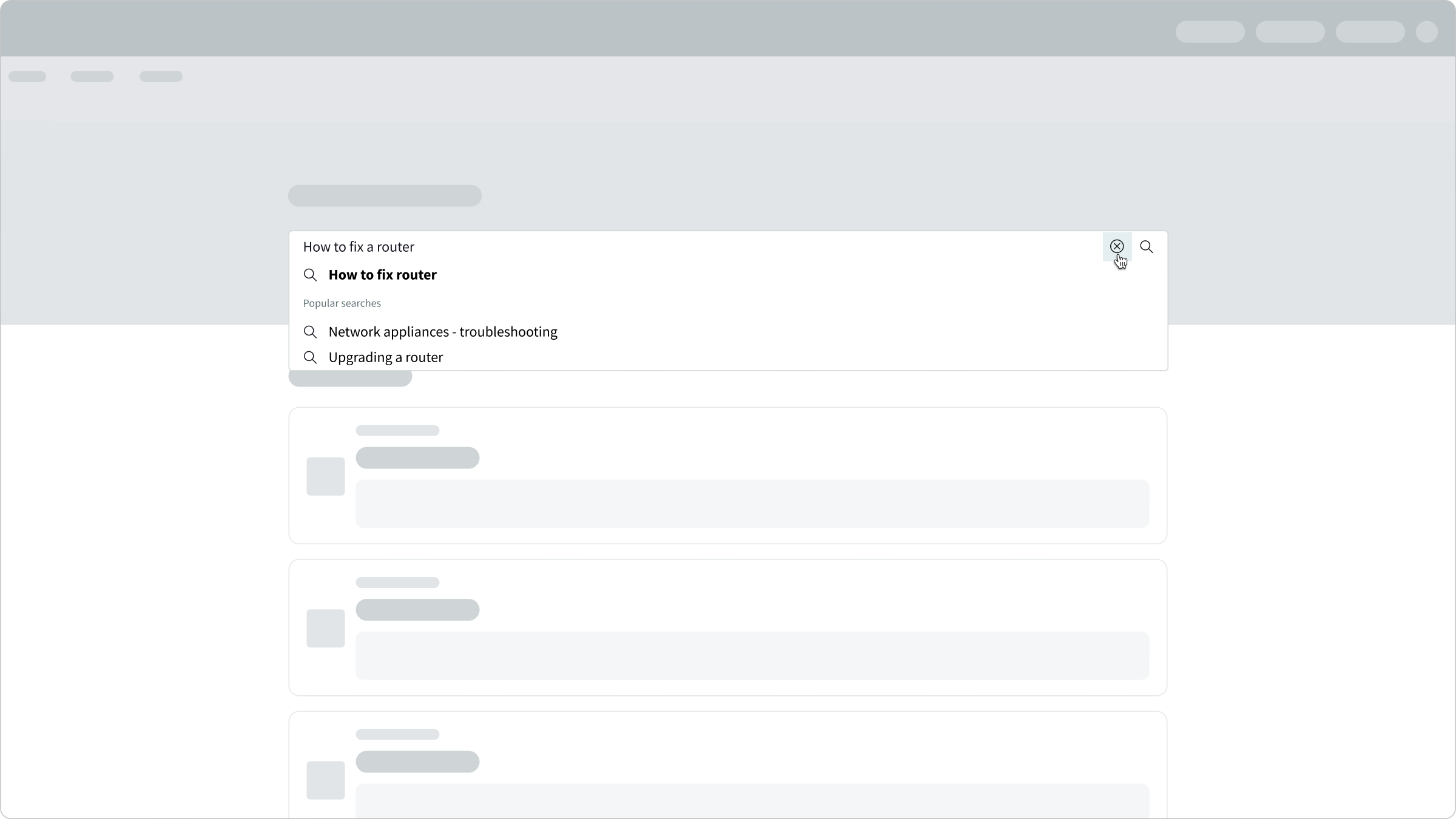
When the user places the cursor in the search input field or tabs into the field, a flyout menu appears with recent and popular searches. The user can select a menu item to initiate a search.
Type-in
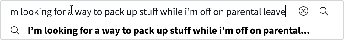
As the user begins to enter in a query in the search input field, the placeholder text and search sections disappear and are replaced by the user's input, suggested queries, and suggested results.
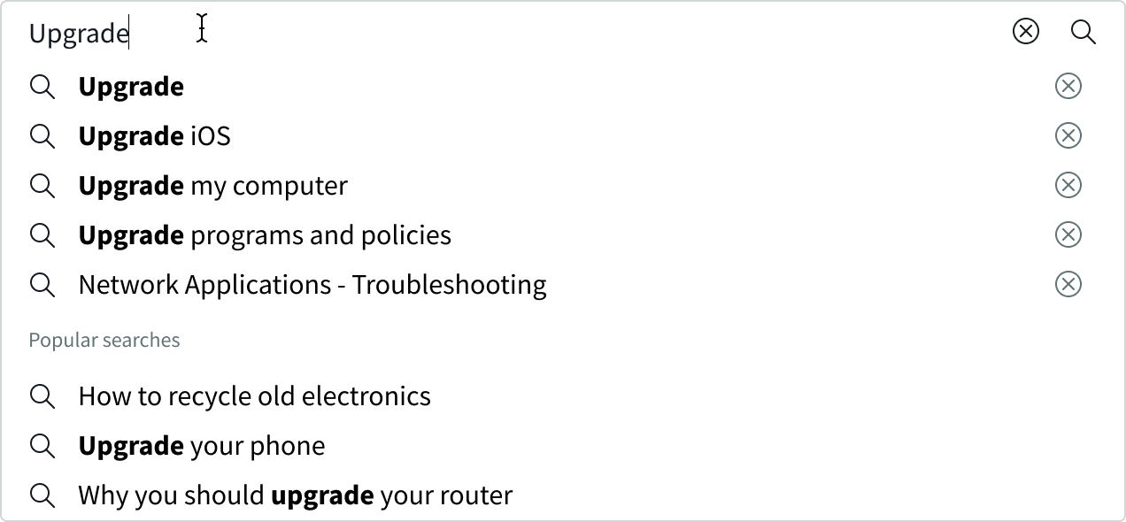
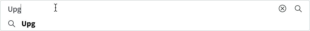
There is always at least one suggested query, which exactly matches the user's input.
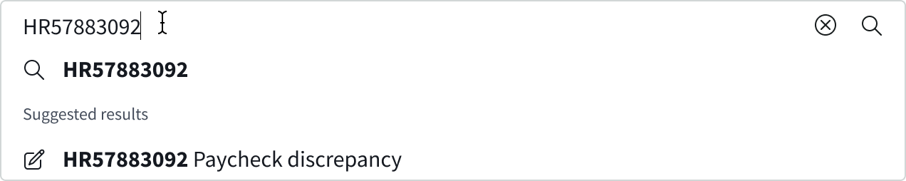
If the user repeats a query, such as a record number, that query is the only entry that appears in the flyout menu.
Click-out
The user can press the escape key or select anywhere outside of the flyout menu to close it. Any characters that the user has already entered remain in the search field.

Delete a query
The user selects the delete button to remove any query from the query lists. After the user deletes a query, the user's next oldest search query appears in the flyout menu. The search input component does not remember the deletion. For example, if the user searches for a previously deleted query, the query appears again in the flyout menu.
Submit a query
To submit a query, the user first types in an input. Then, they either select the search icon or a suggestion from the flyout menu. The search results, as well as the search input containing the original query, appear on a different page.
The user can submit another query using the search input field on the results page. The user can select the search input field to view suggested queries or results in the flyout menu.
Clear the input field
To clear a search entry, the user can click the iconic delete button in the search input field. When the entry disappears, any placeholder text reappears, and the "Recent searches" and "Popular searches" sections appear.
User can delete a search entry by clicking the delete button within the search input
The search entry is empty and reverts back to the "Search" placeholder text
Truncation
If the user enters a search query longer than the search input field, the beginning of the query scrolls off the field. If the entries in the flyout are longer than the flyout menu, they truncate at the end of the query. When the user hovers over the entry, they can see a tooltip that shows the entire entry.
Usability
Search input complies with all internationalization and accessibility requirements.
Internationalization
When the display translates to a right-to-left (RTL) language, the search input field aligns to the right, and the search icon aligns to the left. Additionally, the search suggestions and identifiers align to the right in the flyout menu, and the delete buttons align to the left.
Accessibility
Learn how to access the actionable elements of search input through keyboard interactions and screen readers.
Keyboard interactions
You can access the actionable elements of the search input component with these keyboard keys:
When focus is in the search field:
- Tab: Moves in order between the search field, cancel button, and search icon
- Enter: Submits the query if focus is on the search field or search icon
When focus is in the flyout menu:
- Arrow down: Moved focus to the next option from left to right and right to left
- Arrow up: Moves focus to the previous option from left to right and right to left
- Escape: Closes the flyout menu and changes focus to the search field
Screen readers
When you apply ARIA labels to a component, screen readers can announce the controls and content of the search input component in the prescribed tab order.
The entire search input component on the home page has a Search ARIA landmark. The search input component on a secondary page follows WAI-ARIA authoring guidelines for a search input component with a flyout.