

Anatomy
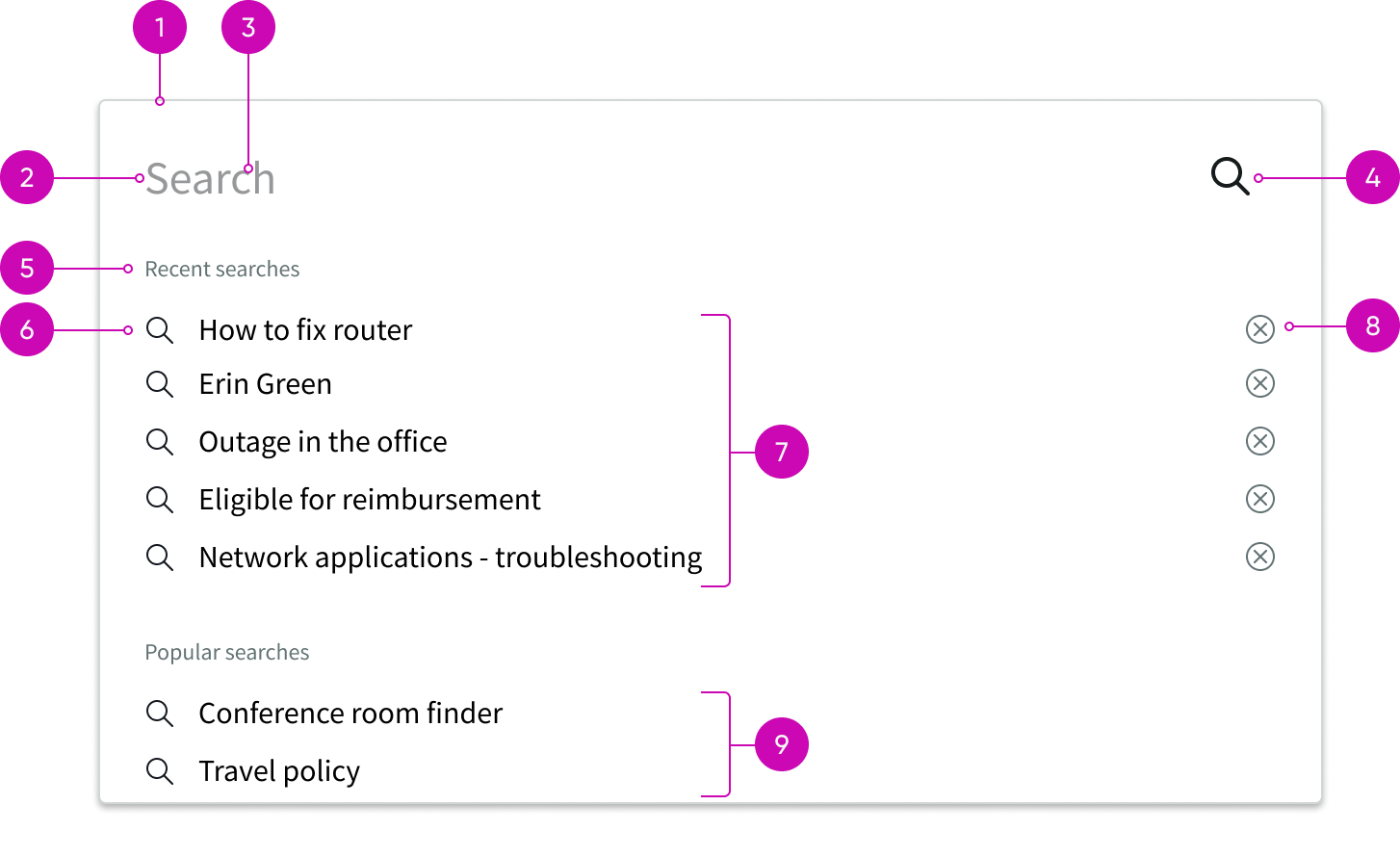
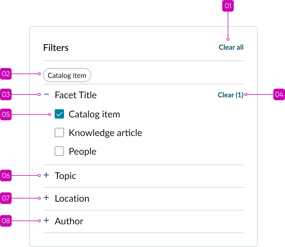
- Facet pane: Container for one or more expandable facet sections; can be hidden or exposed
- Pane title: Label that identifies the purpose of the pane
- Facet pill: Pills that show all the facets selected by the user; pills are not configurable and are not actionable
- Facets: Content attributes that filter the results set when selected
- Expand and collapse control: Control that expands and collapses a facet section; each section can be expanded or collapsed independently
- “Clear all” button: Resets all filters in the pane to an inactive state; appears if one or more facets in the pane has an active filter
- Clear facet button: Resets all filters in the facet section to an inactive state; includes all currently active filters
- Facet count: Shows the number of selected facets within each section
Subcomponents
See usage guidance for accordion
See usage guidance for checkbox
See the usage guidance for pill
Usage
Learn about search facets and find out how to use it in your design. Users can select multiple facet values to easily narrow their area of focus in result sets. Because facets only display when they produce results, they can never take the user down a dead end.
Configurations
Learn how to customize search facets by configuring the available properties.
Facet sections
There is no limit on the number of facet sections you can configure in a pane. To appear in the pane, each section must contain at least one filter.
Tab filter
Tab filter is a separate component offered in UI Builder that is included in search facets. Tab filter enables users to narrow a search result set from broad content categories. You can configure filters to appear in a filter tab bar at the top of the results. The bar can contain 3 or more tabs including the “All” selection, which displays all types combined. Each tab filters results by content type or source. You can configure each filter name and the tab order.
Each tab represents a content or source type, such as Knowledge, or a source from an external integration, such as SharePoint. You can configure the results from a search of an external source to display in a facet section specific to that source. Filter tabs persist when the user selects a facet.

Design recommendations
Learn how to apply search facets in your design.
UI text guidelines
Keep labels short for readability and to avoid truncation; concise labels are important for the facet pills
Behavior
Learn how search facets behave when the display changes or a user interacts with the component.
Responsive behaviors
Learn how search facets responds to changes in a container or display.
Section display criteria
A facet section can be empty. When there are no facets, the search results container takes the place of the facet section.
Scrolling behavior
A scroll bar appears when a facet section contains more than 12 items. As the user scrolls the page, the facet pane also scrolls. It does not remain in a fixed position.
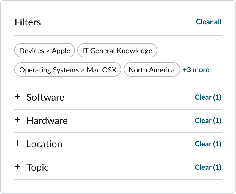
Facet pills
Each facet that a user selects with the check box appears at the top of the pane as a pill. Facet pills act as labels only and are not actionable.
Facet pills stack from top to bottom and wrap from left to right, in the order the facets were selected. After 6 selected facets, a pill containing a counter appears, indicating the number of hidden facets. There is no limit to the number of pills that can appear.
Interactions
Learn how search facets responds when a user interacts with it.
Selecting facets
Users expand facet groups by selecting the title. To enable or disable a facet within a group, users select or clear the check box next to it. Open tab filter tabs persist when the user selects a facet.
Facet dependencies
Some facets are independent and persistent, while others are only available when certain filters are active. As the user interacts with the filters in one section, other sections may appear or disappear.
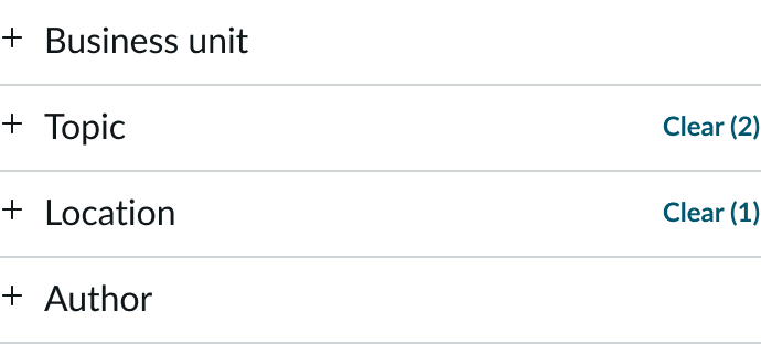
Applied facet count
When selecting a facet, the number displayed at the top of the facet group increases as the user selects more facets within the group. Clearing a facet decrements the count. When the user selects the “Clear” button, the count is removed, and no number appears. Facet counts always equal the number of facet pills displayed at the top of the panel.
In this example, there are two (2) Topics selected and one (1) Location selected.
Interacting with pills
Each time a user selects a facet, a pill appears at the top of the pane. When more than 6 facet pills appear, a counter pill appears, showing the number of hidden pills. The user can select the counter pill to reveal the hidden pills.
Truncation
When facet names exceed the width of the container, they wrap to two-lines, then truncate with an ellipsis. A tooltip shows the full content on hover.
Usability
Search facets complies with all internationalization and accessibility requirements.
Internationalization
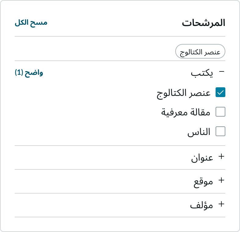
When a filter pane translates to a right-to-left (RTL) language, the check boxes switch positions with the labels and align on the right.
Accessibility
Learn how to access the actionable elements of search facets through keyboard interactions and screen readers.
Search facets tab order
Keyboard interactions
You can access the actionable elements of search facets with these keyboard keys:
When focus is in the filter pane:
- Tab or SHIFT + Tab: Moves focus between elements in the search facet including the expand/collapse arrow, in the tab order
- Enter or Space: When the expand/collapse arrow in an accordion has focus, collapses or expands a section
When focus is in a filter group: - Tab: If a filter is selected in the group, sets focus on the first selected filter; if none of the filters is selected sets focus on the first filter in the group
- Space: Toggles a filter between selected and unselected states
- Arrow right or Arrow down: Moves focus to the next option
- Arrow left or Arrow up: Moves focus to the previous option
- Tab + SHIFT: Moves focus out of the filter group
Screen readers
If the source uses the native <input> and <label> HTML tags, no additional ARIA tags are necessary.
ARIA roles and labels for check boxes
- Check box needs the role
checkbox - A selected check box has the state
aria-checkedset totrue - A clear check box has the state
aria-checkedset tofalse
Configure an accessible label for the check box, using one of these methods: - Assign the
roleofcheckboxto the visible text contained within the element - Reference the visible label by setting
aria-labelledbyon the element with theroleofcheckbox - Set
aria-labelon the element with theroleofcheckbox
Icons and images
Decorative icons and images don’t need to be announced to a screen reader. However, functional images that provide context for a link should have descriptions applied via alt or title attributes. Functional icons include accordion controls and check box icons for selected and indeterminate states.