

Anatomy
Learn about the individual parts of keypad.
Embedded Native Voice Controls
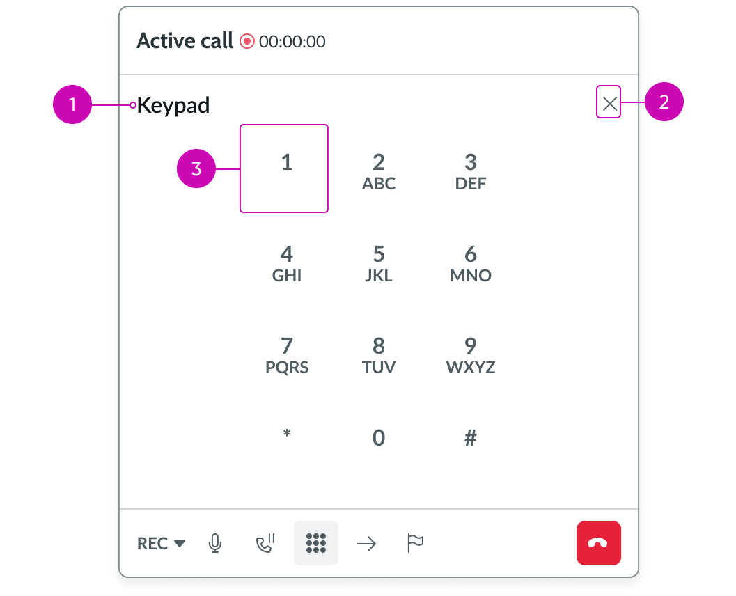
- Title: Displays the title of this view
- Close action: Closes the keypad
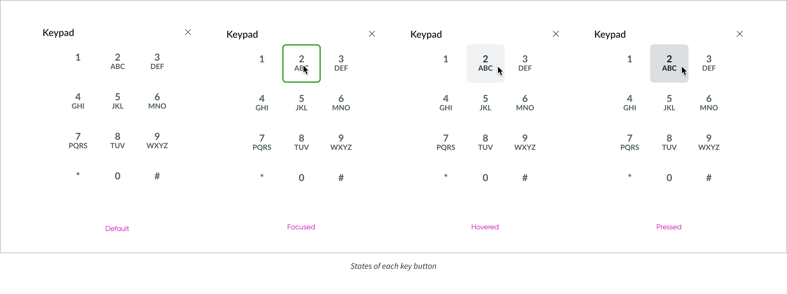
- Key: A button that represents numbers or letters
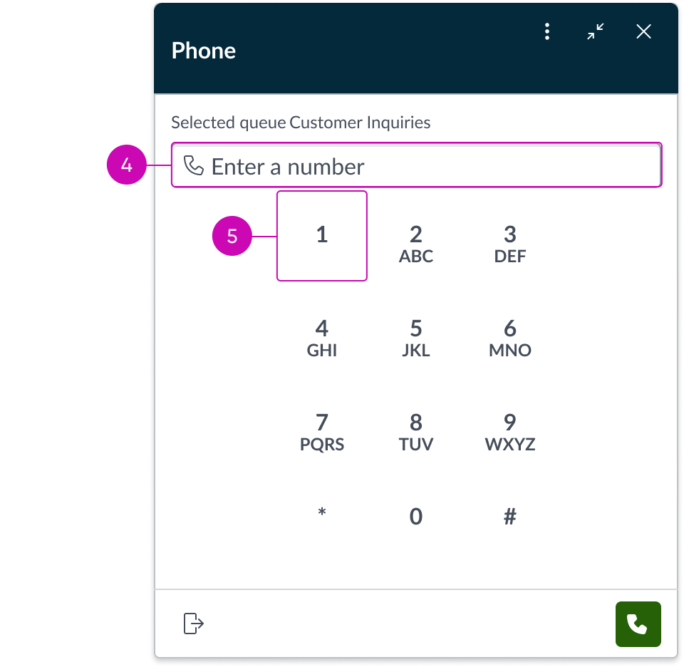
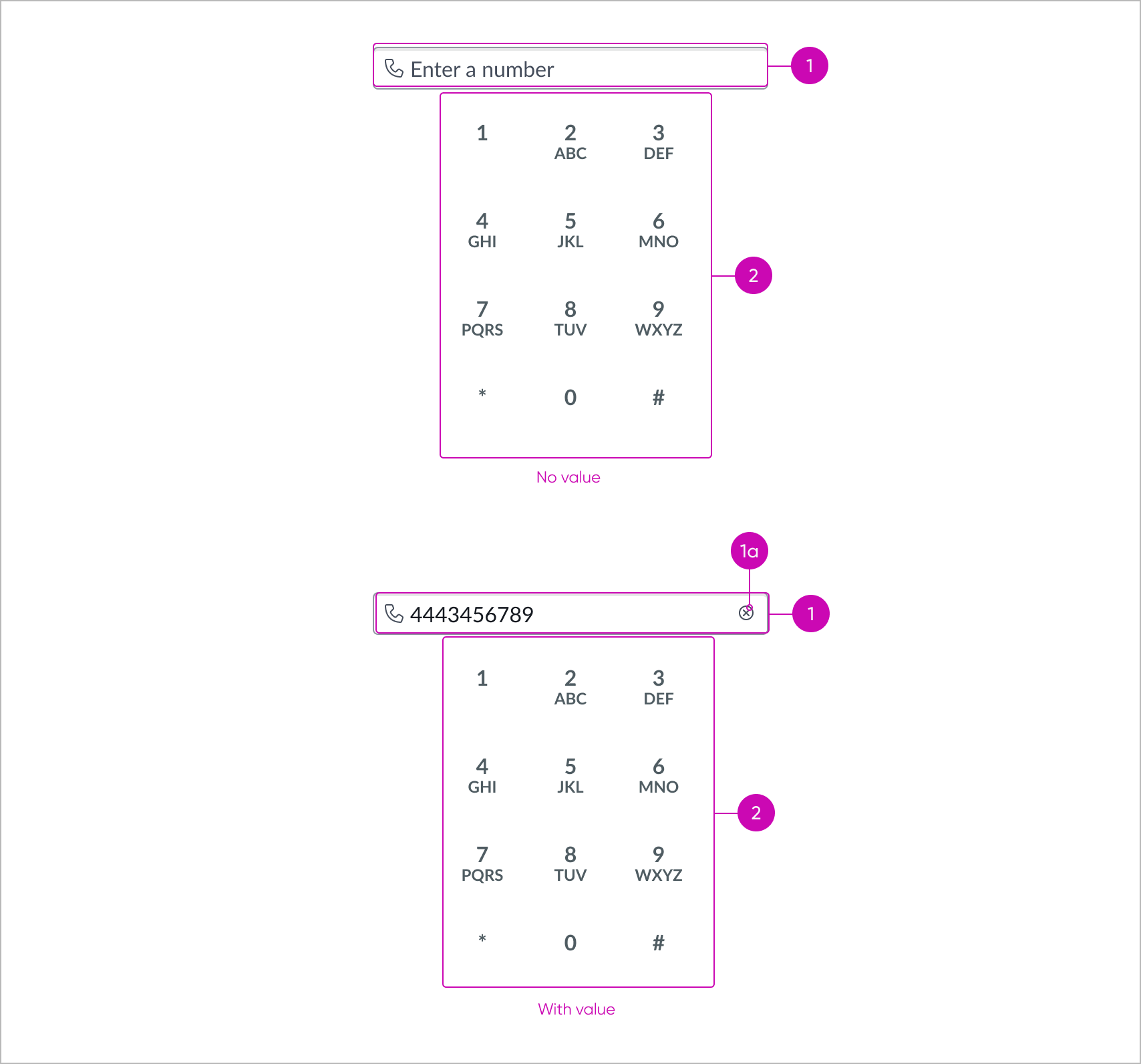
Embedded Native Voice Controls - No calls
- Input: Field to enter a phone number to call; Agents can enter a number using their mouse or keyboard
- Key: A button that represents numbers or letters
Subcomponents
See the usage guidelines for Button bare.
See the usage guidelines for Button Iconic.
See the usage guidelines for Input.
See the usage guidelines for Heading.
See the usage guidelines for Label value tabbed.
See the usage guidelines for Text link.
Usage
The Keypad component streamlines efficiency by allowing agents and supervisors to make outgoing calls within Workspace. The native phone controls display a keypad to dial numbers or letters. The keypad can also be used when interfacing with a self-service application on the Interactive Voice Response (IVR). This component is predominantly used inside Native Voice Controls.
Views
Embedded NVC keypad
Use this keypad when in a connected call with another person. This keypad enables the user to enter keys needed to select IVR menu options (for example, “Press 0 to speak with a representative”).
Global NVC keypad
Use this keypad to make an outbound phone call. This keypad enables the user to enter keys needed to make a call.
Presets and controllers
This component contains a preset configuration that automatically configures properties and event handlers for a component, making the component ready to work when you add it to a page. A preset is designed to suit a specific use case. However, you can override preset property values with a custom configuration if you find it necessary for your design. Preset values that you override aren’t upgraded when updates are available. If you don’t want to use the preset values provided, select the option to configure the component manually. You can apply one preset to a single instance of a component on a page. For more information, see Presets.
A preset is always associated with a controller, which acts as a data resource for the component. Controllers provide the configuration data and event bindings the component needs to function in your experience. By selecting a preset, the required controller is added to the page. By adding a controller to the page, any new applicable components will have that controller's preset. For more information about how controllers work, see Controllers. For instructions on using the data inspector to view the default presets for a component, see View properties and events in the Controller API.
Design recommendations
Learn how to apply Keypad in your design.
States
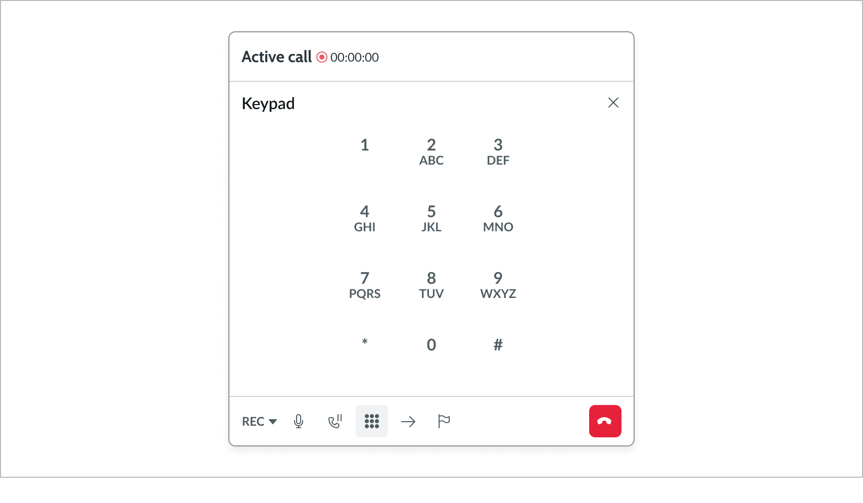
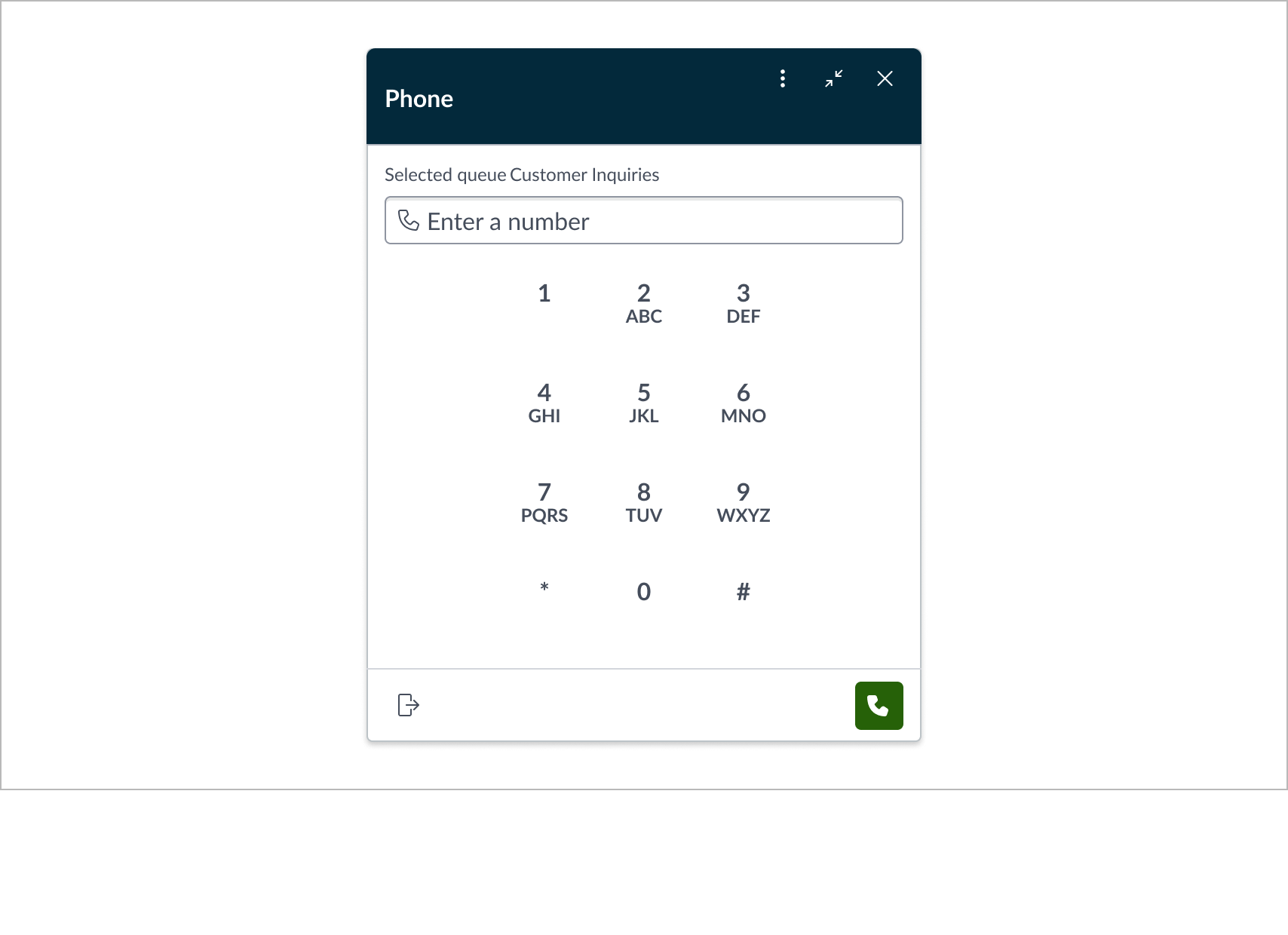
Keypad has the following states: active call keypad and idle state keypad
| State | Example |
|---|---|
| Active call keypad | 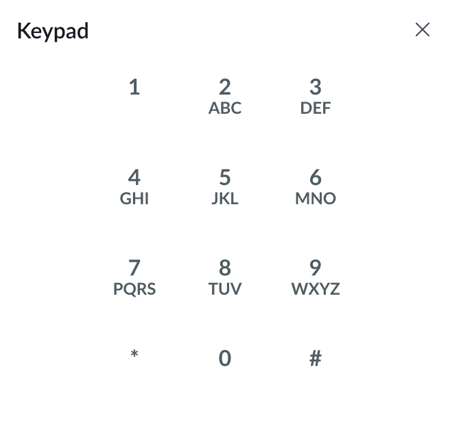 |
| Idle state keypad | 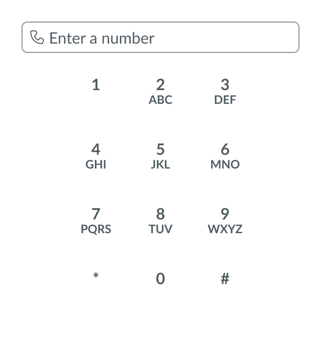 |
Responsive behaviors
Learn how Keypad responds to changes in a container or display.
Resizing
The keypad is responsive and will resize to fit its container’s width and height. Note that the keypad buttons remain in the top-center when its container is resized.
Truncation
If text does not fit inside the keypad, it will truncate.
Scrolling
Ideally, the keypad should always fit in its parent container so users can see the entire keypad.
However, when the keypad is placed inside a parent container and its content does not fit in it, the user should be able to scroll vertically (up and down) only, never scrolls horizontally (left and right).
Interactions
Learn how Keypad responds when a user interacts with it.
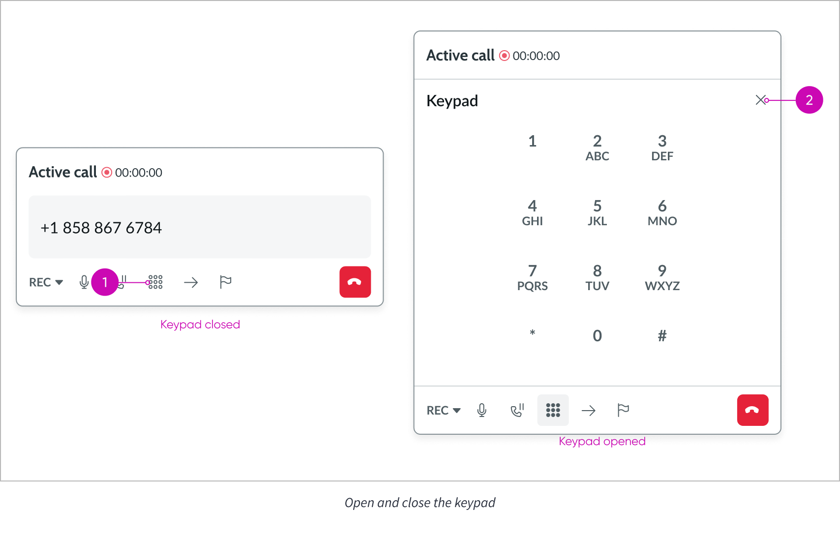
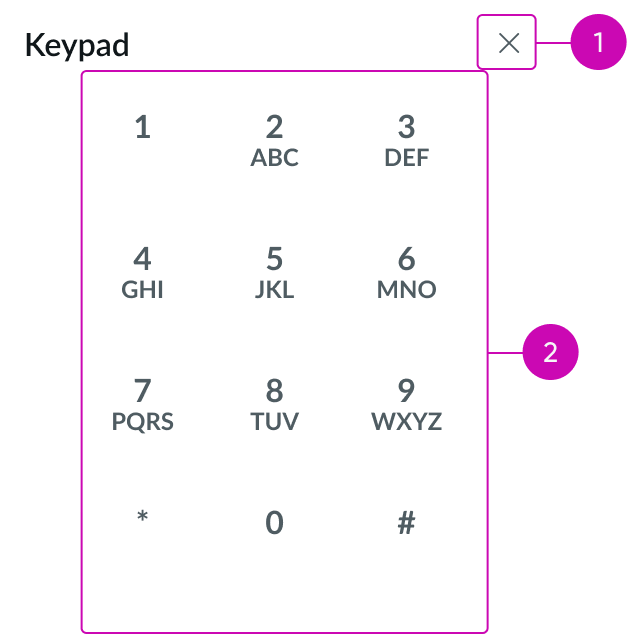
Show/hide active call keypad
Select the keypad button (1) to display the keypad. Select the close button (2) to hide the keypad and return to the active call view.
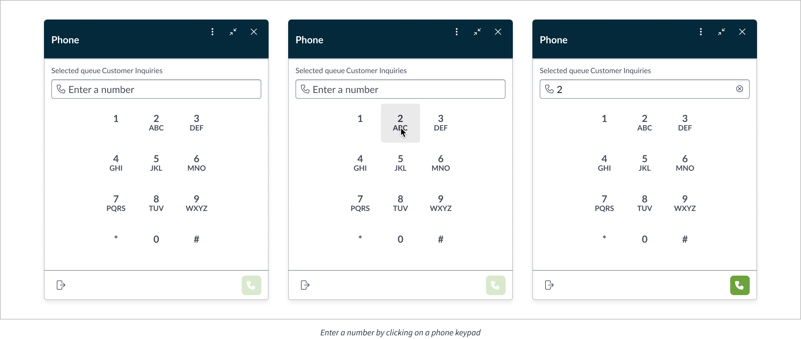
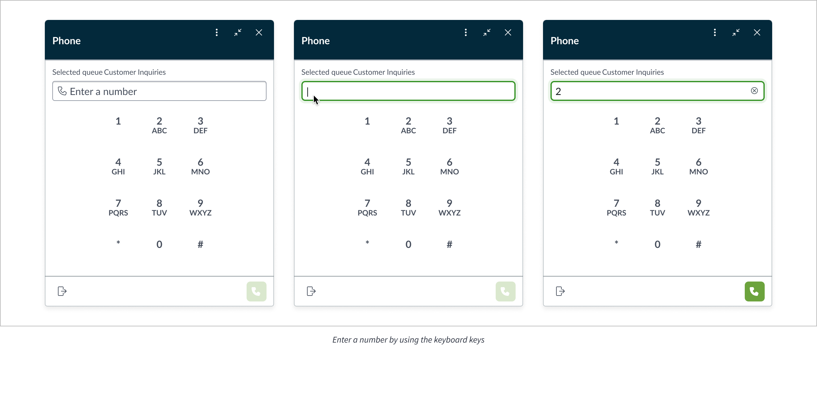
Enter a number (key buttons)
You can enter a number using the key buttons.
Enter a number (input field)
Users can enter a number using the input field.
Key buttons
Key buttons behave like Button bare; see usage guidelines for more info.
Usability
Keypad complies with all internationalization and accessibility requirements.
Internationalization
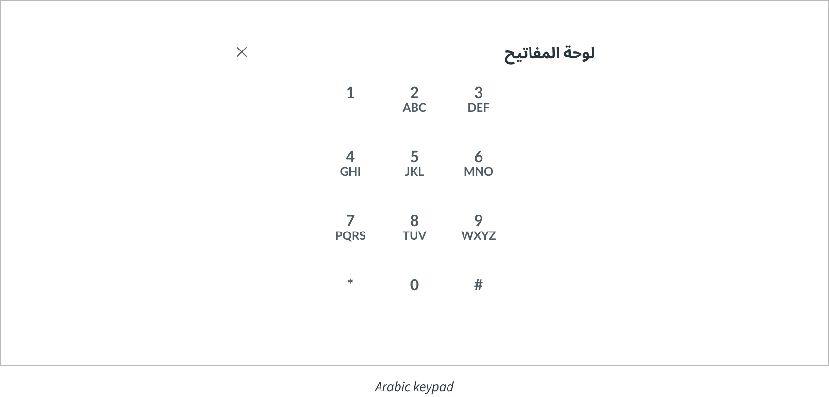
When this component is used in a platform configured for a right-to-left (RTL) language, the text in the keys (the number and letters) remain the same in both left-to-right and right-to-left languages.
Accessibility
Learn how to access the actionable elements of Keypad through keyboard interactions and screen readers.
Keypad tab order
This is the tab order for Keypad.
Note: For tab stop information about subcomponents of Keypad, see the individual component usage guidelines.
Keyboard interactions
Users can interact with Keypad using the keyboard.
Active call keypad: When the focus is on the Close button:
- Tab: Moves focus between Close button and any interactive elements in the standard tab order
- Shift + Tab: Moves focus to the previous element
- Enter/Space: Activates the close button. Closes the keypad view. The tab focus resets to the first interactive element of its parent component or page
Active call keypad: When the focus is on the key buttons:
- Tab or Shift + Tab: Moves focus between the key buttons and any interactive elements in the standard tab order
- Enter/Space: Activates the key button: Enters a number/letter. The tab focus remains on the same key that was entered
Idle state keypad: When the focus is on the Input field:
- Tab: or Shift + Tab: Moves focus between the input field and any interactive elements in the standard tab order
- Enter/Space: Nothing; does not call the number
Idle state keypad: When the focus is on the input field close button
- Tab or Shift + Tab: Moves focus between the input field and any interactive elements in the standard tab order
- Enter/Space: Clears the entire field. The tab focus remains on the input field
Idle state keypad: When the focus is on the key buttons
- Tab or Shift + Tab: Moves focus between the key buttons and any interactive elements in the standard tab order
- Enter/Space: Activates the key button; enters a number/letter. The tab focus remains on the same key that was entered
Screen readers
Standard introduction:
When you apply ARIA labels to a component, screen readers announce the controls and content of Keypad in the prescribed tab order.