

Anatomy
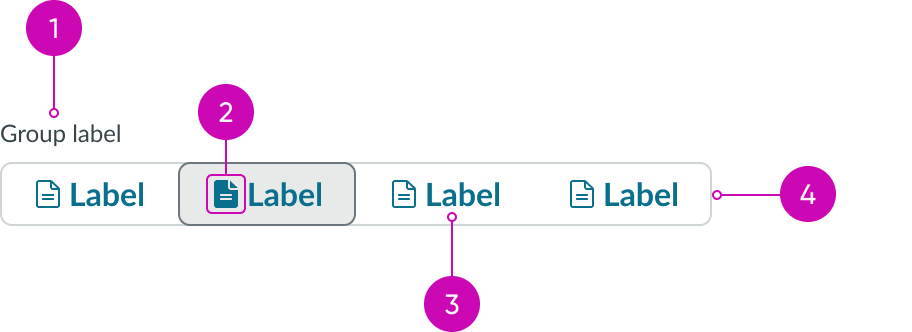
- Group label (optional): Text that describes the group of button options; if you don't include this label, include text above the button group that describes the options
- Icon (optional): Visual element next to the label that emphasizes the action
- Label: Describes the action of the button; label is optional if there is an icon
- Container: Contains all button segments
Usage
Use grouped button to present related buttons in a single row. Grouped button supports single and multi select modes, enabling users to select one or multiple options from the group.
Variants
Learn about the variants of grouped button.
Colors
Grouped button has 6 different color variants: primary, secondary (default), tertiary, primary selection, secondary selection, tertiary selection.
| Variant | Default style |
|---|---|
| Primary |  |
| Secondary (Default) |  |
| Tertiary |  |
| Primary selection |  |
| Secondary selection |  |
| Tertiary selection |  |
Sizes
Grouped button has the following sizes: sm, md, lg. The size you choose depends on your use case.
Small

Medium

Note: medium is the default size.
Large

Configurations
Learn how to customize grouped button by configuring the available properties.
Selection
You can choose a single or multi selection option for your grouped button.
Single select
Enables users to select one button from the group at a time. Selecting a new button will deselect the previously selected one.

Multi select
Enables users to select multiple buttons from the group simultaneously. Each selected button remains selected until it is deselected by the user.

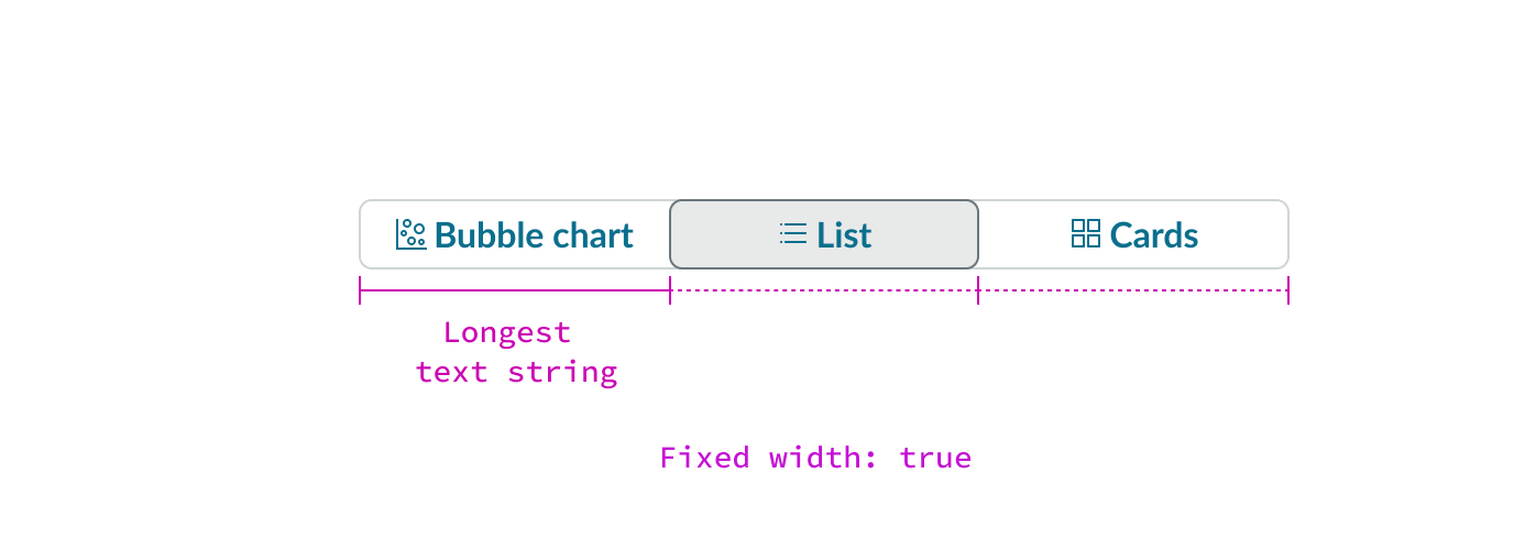
Width
Configure the minimum button width or assign a fixed width.
Minimum width
Sets a custom minimum width for each button. When this property is empty, the component applies a default minimum width.

Fixed width
When true, all buttons share the same width based on the longest button label. By default, this property is set to true.
Labels
You can configure the button group label, label position, or choose to hide button labels.
Group label
Sets the label text for the button group.
Group label position
Sets the position of the label relative to the button group. Options include top (default) and start.
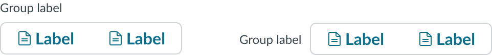
Grouped button with group label positioned at the top (left) and at the start (right)
Hide label
When this property is set to true, hides the label on buttons that have both a label and an icon.

Accessibility
You can configure the ARIA properties for your grouped button.
Design recommendations
Learn how to apply grouped button in your design.
For more design recommendations, view the usage guidelines for the button type you are using.
See usage guidance for bare button
See usage guidance for iconic button
See usage guidance for split button
See usage guidance for stateful button

Use an appropriate minimum width for your use case that is still legible.

Avoid using a minimum width that makes the button labels difficult to read.
Behavior
Learn how grouped button behaves when the display changes or a user interacts with the component.
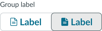
States
Grouped button has the following states: default, hover, active, focus, and disabled.
Single select states
| State | Example |
|---|---|
| Default |  |
| Hover |  |
| Active |  |
| Focus |  |
| Disabled |  |
Multi-select states
| State | Example |
|---|---|
| Default |  |
| Hover |  |
| Active |  |
| Focus |  |
| Disabled |  |
Responsive behaviors
Learn how grouped button responds to changes in a container or display.
Reflow
Buttons will wrap to a new row when:
- The container width is smaller than the combined width of all buttons at their minimum width
- The buttons don't fit in a single row while respecting their minimum width constraints
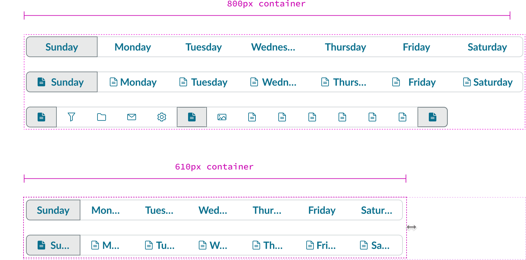
As container size decreases, each button width is reduced and truncates until it reaches the min width.
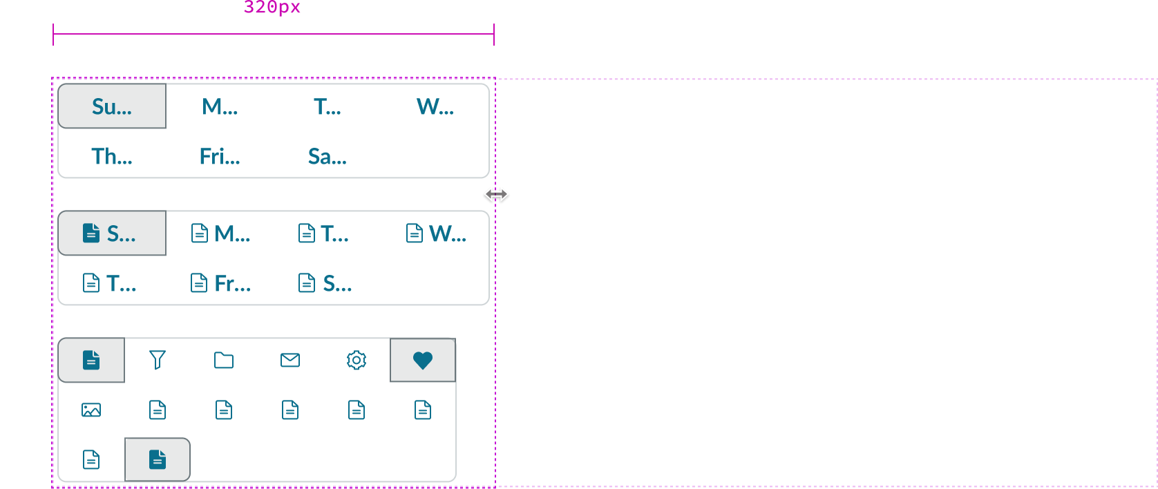
Once buttons reach its minimum width or can no longer all fit in one row, the buttons start to wrap.
Tooltip
When text in the grouped button exceeds the width of the container or content area, text truncates with an ellipsis, and a tooltip shows the full content on hover.
Truncated text tooltip
If the user has not configured a custom tooltip, truncated text appears in a tooltip on hover.
Custom tooltip
If users configure a custom tooltip, custom tooltip content appears on hover, even if there’s truncated text.
Note: If a button is disabled, a tooltip doesn’t display, even if there’s tooltip content assigned.
Interactions
Grouped button interactions depend on the selection mode. In single select, selecting a button deselects the previously selected one. In multi select, buttons are selected and deselected independently. When a user selects a button, the component displays a brief ripple animation to confirm the interaction.
Usability
Grouped button complies with all internationalization and accessibility requirements.
Internationalization
When this component is used in a platform configured for a right-to-left (RTL) language, the position of the icon and direction of the label will directionally change according to the language. Grouped button only supports one icon; right-to-left support will only impact directional icons.

Accessibility
Learn how to access the actionable elements of grouped button through keyboard interactions and screen readers.
Keyboard interactions
Users can interact with grouped button using the keyboard.
Single select grouped button
- Tab: If no buttons are selected, creates focus on the first button segment in the group; if buttons are selected, auto-focuses to the first selected button
- Up or left arrow: Moves focus to and selects the previous button segment; focus may wrap from the first button to the last button
- Down or right arrow: Moves focus to and selects the previous button segment; focus may wrap from the last button to the first button
- Space/Enter: Selects the button that currently has focus; if no button is selected, selects the first button in the group
Multi-select grouped button
- Tab: Moves focus to the next button in the group
- Space: Selects or deselects the focused button