

Anatomy
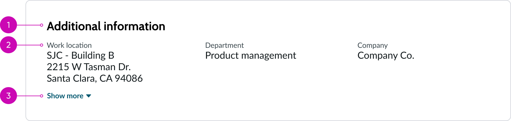
- Header (optional): Text describing the block of data
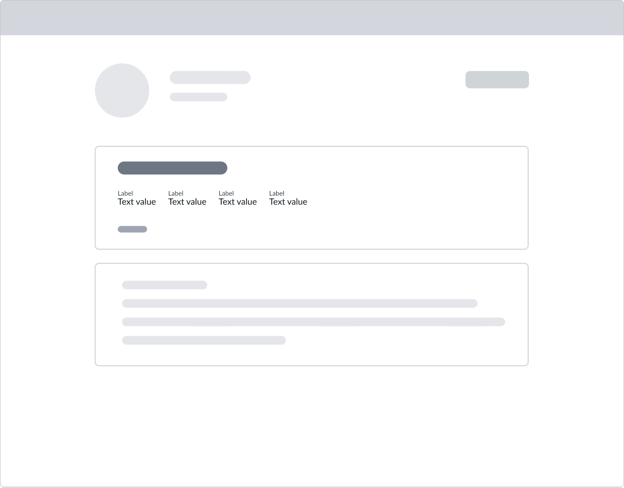
- Label-value pair container: Container for label value pairs, highlighted value, and bare button components
- Disclosure control (optional): Shows or hides more label-value pairs. When collapsed, it shows one row of label-value pairs, and when expanded, it shows all the label-value pairs.
Subcomponents
See the usage guidance for button bare
See the usage guidance for highlighted value
See the usage guidance for label-value pair (stacked)
See the usage guidance for label-value pair (inline)
See the usage guidance for label-value pair (tabbed)
Usage
Use the display value block where relevant read-only fields provide the necessary context for a user to perform their tasks. You can also use this component to display grids or tables of non-editable text as label-value pairs in multiple areas of a page.
In this example, a display value block shows relevant information about an incident.
Variants
Configure the options that are offered for this component and learn how to use them in your design. See tips on how to avoid display problems in your design that can reduce its effectiveness.
Types
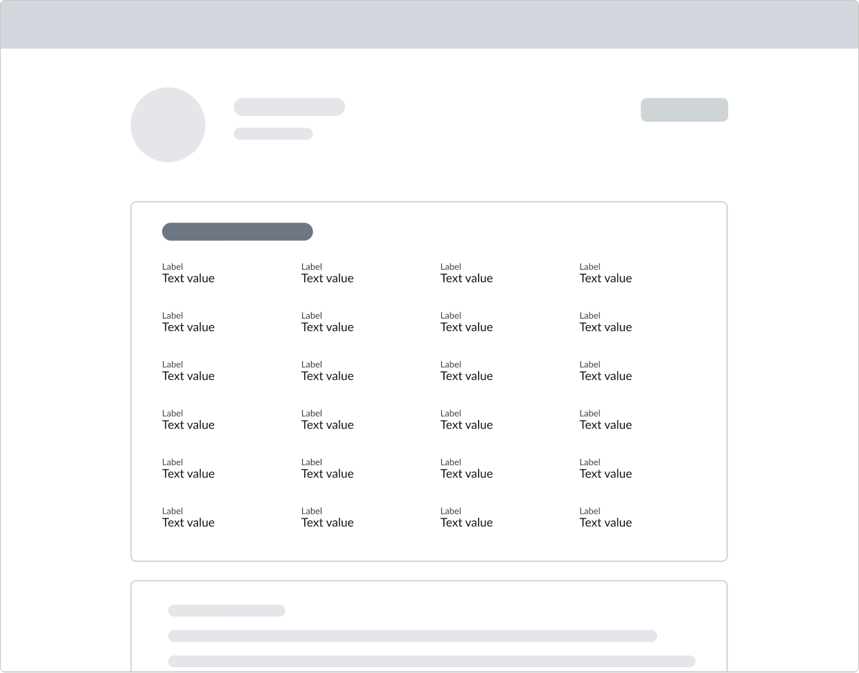
The display value block component has two types: distributed and dynamic.
Distributed
In the distributed type, all label-value pairs have the same width and are evenly distributed. The maximum width of the block is determined by the width of the container and/or display size. The distributed type is the default layout.

Dynamic
In the dynamic type, the width of the label-value pairs is determined by the length of the text in each one.

Sizes
The display value block doesn't have any specific sizes. Its dimensions are controlled by the size of the container. For the sizes of any sub-components used in a display value block, see the usage guidance for those components.
Distributed
Overall width is determined by the parent container. Overall height is determined by the number of lines in each label-value pair and the total label value pairs in the block.
Dynamic
The overall width of dynamic blocks is determined by the parent container.
Configurations
You can customize display value block options by configuring the available properties.
Presets and controllers
This component has a preset configuration that sets properties and event handlers, making it ready for use. You can override preset values with a custom configuration if needed. Preset values won’t upgrade with updates. To avoid using presets, configure manually. One preset can apply to a single component instance. See presets for more info.
A preset is linked to a controller, which serves as a data resource. Controllers provide configuration data and event bindings for the component. Selecting a preset adds the required controller to the page, allowing new components to use its preset. For more on controllers, see controllers. For default presets, see view properties and events in the controller API.
Label-value pairs
You can configure different types of label-value pairs for either the distributed or the dynamic display blocks, based on your individual use case. However, you can't mix label-value pair types in the same block.
Expand and collapse feature
You can configure a Show more disclosure control button that a user can select to display additional information by expanding hidden rows of label-value pairs. When selected, the button label then changes to Show less, allowing the user to hide the rows again. The default behavior is to show all label-value pairs in the block, without the disclosure control.
You can configure the block to never show additional information, or you can disable the feature completely.
Alignment of label-value pairs
You can align label-value pairs side-by-side, stack them, or display them inline with internal tab spacing to allow for more visual distinction. Label value pairs can only be aligned horizontally. Vertical display is not supported.
| Alignment type | Example |
|---|---|
| Stacked |  |
| Inline |  |
| Tabbed |  |
Data types
These are the available label-value pair data types.
| Data type | Example |
|---|---|
| Plain text |  |
| Hyperlink |  |
| Highlighted value |  |
Display grid
The display value block arranges the label-value pairs in a grid that automatically spaces the elements based on the display type you've selected (distributed or dynamic), the number of label-value pairs, and the configured number of rows.
The columns are populated from left to right, from top to bottom.
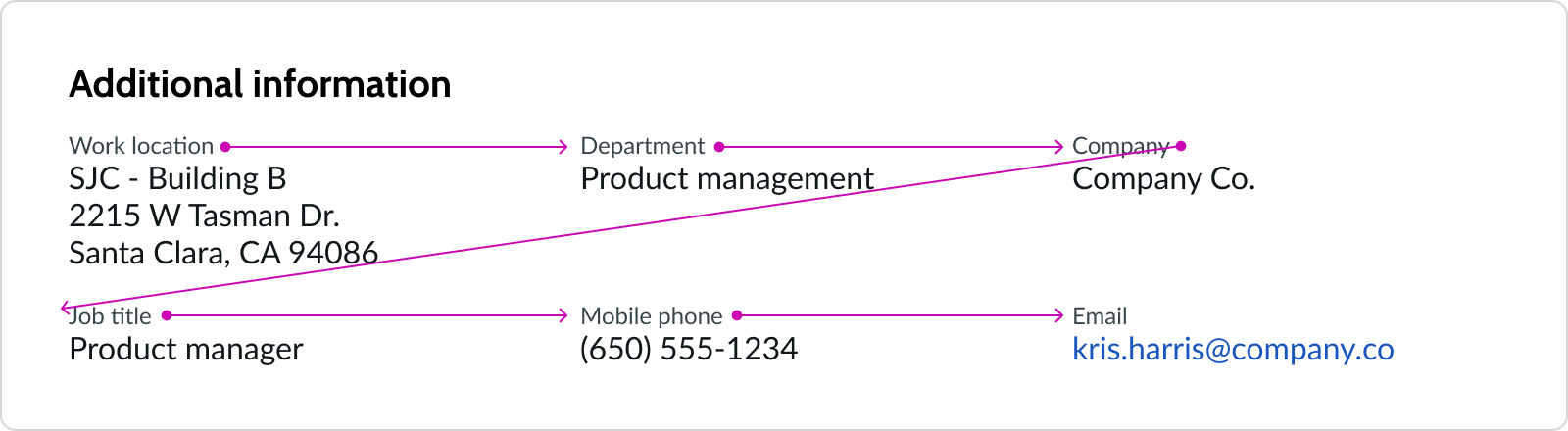
This example shows label-label pair columns laid out for the distributed display type.
Delimiters
Use delimiters to separate value strings from one another. Delimiters can be commas, pipes, or slashes. See the usage guidance for label-value pair (stacked) and label-value pair (inline) for details. Delimiters are only available for dynamic display value block types.
Design recommendations
Learn how to apply display value blocks in your design.
Use the distributed display type for center aligned page layouts.
Don't use the dynamic display type for center-aligned page layouts.

Position expanding and collapsing sections of important information toward the top of the page. This reduces cognitive load and enhances the mobile experience.
Don't expose too many label-value pairs, which might hinder core tasks on a given page. Consider what the experience would be like on mobile devices.
Behavior
Learn how display value block behaves when the display changes or a user interacts with the component.
Responsive behaviors
Learn how display value block responds to changes in a container or display.
Overflow
The display value block component adjusts automatically to an overflow condition created by showing hidden rows. The number of rows and columns adjusts appropriate to the layout type. Both dynamic and distributed layouts accept an unlimited number of rows and 1-5 columns of label-value pairs.
Container size
The underlying grid of columns reacts dynamically to changes in container width. As the container size changes, the column widths readjust appropriately, and the number of rows increases or decreases.
Interactions
The only user interaction is with the disclosure control at the bottom of the block. If you configure the block to expose the Show more bare button, the page loads with the additional information collapsed. Selecting the button expands the view to reveal all available label value pairs and changes the button label to Show less.
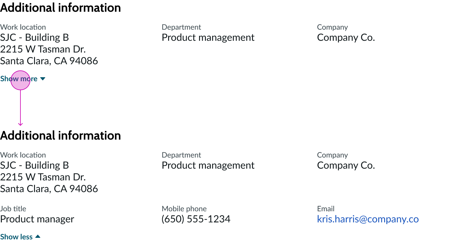
The “Show more” button reveals hidden label-value pairs. The label changes to “Show less”, allowing the user to collapse the rows again.
Usability
Display value block complies with all internationalization and accessibility requirements.
Internationalization
When a display value block translates to a right-to-left (RTL) language, label-value pairs switch their orientation and align on the right. Label-value pairs are ordered from right to left, up to down.
See the usage guidance for the sub-components for additional internationalization details.

Accessibility
Learn how to access the actionable elements of display value block through keyboard interactions and screen readers.
Display value block tab order
This is the tab order for display value block.

Keyboard interactions
Focus is in the accordion:
- Tab: Shifts focus in the tab order; tab doesn't focus on hidden components or sub-components, such as labels or section headers
- Space or Enter: Launches hyperlink or activates the disclosure control and toggles the visibility of the disclosure content
- Tab + Shift: Moves focus to the previous focusable element; all focusable elements in an open accordion section are included in the page tab order
Focus is outside the accordion:
- Tab: Moves focus from the previous collapsed item to the next
Screen readers
When you apply ARIA labels to this component, screen readers announce the controls and content of display value block in the prescribed tab order.
Configure the aria-expanded attribute on the tag wrapping each expandable section. The attribute value is "true" if the panel is expanded and "false" if the panel is collapsed. Configure the aria-labelledby attribute on the expandable section's title element and set it to "id".
Configure a role of "group" wrapping around all the options.
Accessible names
- Component: Link | Accessible name: Hyperlink
- Component: Disclosure (show/hide) | Accessible name example: Hide 3 of 7 pieces of content